10,000 search results
(0.028 seconds)
- Biosphere by Fype Co,
$16.00 Biosphere is inspired by industrial style typeface that's will give look a modern and technical industrial display font. That will take any design idea to the next level, covering a wide range of project types such as poster design, book covers, prints, headlines, id cards, packaging, branding.
 - Skywalker by Dirtyline Studio,
$17.00 Skywalker is a hand brushed typeface, with authentic dry brush imperfections, and a very bouncy baseline It has a perfectly paired complimentary marker font , and a super handy set of bonus Swash. Ideal for logos, handwritten quotes, product packaging, header, poster, merchandise, social media & greeting cards.
 - Panoramic by Supfonts,
$9.00 Panoramic will be perfect for wedding lettering, beautiful frame for your home, book covers, greeting cards, logos, marketing, magazines or anything that requires cute handwritten lettering :) What's inside: Panoramic Script Multilingual support Cricut support If you have any questions, please contact me directly or in instagram @superdizigner
 - Walahard by JprintStudio,
$10.00 Introducing Walahard, Walahard is a sweet, soft handwritten font. Get inspired by its authentic feel and use it to create gorgeous wedding invitations, beautiful stationary art, eye-catching social media posts, and cute greeting cards. Ready to use for projects, texts, letters, or whatever you want!
 - Nestor Quirky Typeface by Hipfonts,
$18.00 Nestor is a retro inspired display typeface that's unique, lovable, and quirky. It's perfect for headlines, advertising, posters, branding, social media, quotes, prints, and much more. If you're in need of a typeface that has groovy curves with a bold personality, then Nestor is for you.
 - Ottmar by Atom,
$17.00 Ottmar is a bold casual script font, created using a brush that is etched on paper with care to produce a unique and organic character. With contextual alternate and ligature it will give a very special nuance if used in the design. Hope you like it!
 - Procent by GRIN3 (Nowak),
$26.00 Procent is an all-caps, handwritten font with two variations for each letter. Procent can be used for scrapbooks, greeting cards, invitations, announcements, signs, menus, restaurant themes and more... Language support includes Western, Central and Eastern European character sets, as well as Baltic and Turkish languages.
 - Oraden Naloch by madeDeduk,
$14.00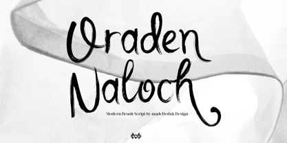 Oraden Naloch is a modern handwritten Brush. This font perfect for poster design, book covers, merchandise, fashion campaigns, newsletters, branding, advertising, magazines, greeting cards, album covers, and quote designs and more. Feature Uppercase & Lowercase Number & Symbol International Glyphs Multilingual support Alternative Ligature Hope you enjoy it.
 - Paula Fluiton by Raditya Type,
$12.00 Paula Fluiton is a font in an elegant signature style. This typeface is suitable when used for writing a brand name, as a logo or naming a product. When used for an invitation or greeting card, it will make the greeting you write more beautiful and luxurious.
 - Troquel by Pau Lamuà,
$28.00 Troquel is a fat font, with feminine curves. Soft edges give this slightly overweight typeface a big and beautiful happy style. Combining fatty with his sister outline version helps to provide a nice contrast between each weights glyphs. Troquel has uppercase characters, numbers, and the basic punctuation.
 - ITC Black Tulip by ITC,
$29.00ITC Black Tulip was designed by Dudley Rees and inspired by the modular simplicity of the Greek fret band, an ancient repeating pattern formed by tracing a line at right angles between two horizontal rules to form an interlocking motif. Rees admired the discipline of the motif, I saw how that simple rigid rectangular network suggested an alphabet that would need little or no kerning," he says. He describes ITC Black Tulip as a "dramatic headline face"." - Amoonk by Product Type,
$18.00 techno, fancy, racing, super, movie, race, superhero, tech, film, automotive, calendar, font, motor, running, typography, futuristic, speed, drive, display, fast, power, action, game, branding, logotype, rally, sport, modern, car, esport
 - Remora Sans by G-Type,
$39.00 Remora is an extensive new humanist sans serif which comes in 2 style variations, the effervescent Remora Sans and its corporate business partner Remora Corp . Both styles include 5 individual width sets ranging from the condensed W1 to the extra-wide W5. Furthermore, with an impressive 7 weights (Thin to Ultra) and true matching italics in each pack Remora is an ultra versatile super family comprising 140 individual fonts, perfect for any typographic assignment or design brief. Remora was designed by G-Type founder Nick Cooke. Both the Sans and Corp families share the same proportions, with the exception of certain key characters that change the overall appearance. Remora Sans is an exuberant and characterful typeface while Remora Corp, as its name suggests, is a businesslike typeface more suited to corporate typography. Quite early on in the design process Nick decided to give Remora Corp equal billing instead of incorporating these glyphs as alternates or a stylistic set that may get overlooked. “I created two separate families after learning a valuable lesson with one of my earlier typefaces, Houschka”, says Nick. “Houschka contained distinctive rounded A’s W’s and w’s, with ‘straight’ styles as character alternates. Even though style sets and alternates are easy to activate they are rarely used, so after many requests for customised versions of the fonts with the straight characters as defaults it was decided to create the separate ‘Alt’ family. So I cut straight to the chase with the two Remora variants and created two complementary families.” Both sets contain many shared letterforms, but it is the alternate characters that significantly alter the appearance of each font. Remora has been carefully designed for optimum legibility at large and very small sizes. Although fairly monolinear in appearance, especially in the lighter weights, particular attention has been paid to optical correction like the overshoots of the curved characters. Open counters and painstaking attention to detail (e.g. weight contrast between horizontal and vertical strokes, junctions of shoulders and stems etc) all boost readability and make Remora a great choice across all media. Remora Sans and Corp are ‘humanist’ rather than ‘geometric’ in style, meaning they’re not strictly based on rectangles and circles, resulting in a warm and friendlier feel. The slightly ’super-elliptical’ rounded forms create generously attractive curves. Remora has very distinctive italics in that they are only inclined by 8 degrees, but are not just based on slanted uprights. The italic styles are very alluring when used for display at large sizes and the good news is they come bundled free with their respective uprights. Each family also contains many OpenType features including proportional and tabular numbers, small caps, discretionary ligatures, plus five stylistic sets for ultra versatile typography.
 - Remora Corp by G-Type,
$39.00 Remora is an extensive new humanist sans serif which comes in 2 style variations, the effervescent Remora Sans and its corporate business partner Remora Corp. Both styles include 5 individual width sets ranging from the condensed W1 to the extra-wide W5. Furthermore, with an impressive 7 weights (Thin to Ultra) and true matching italics in each pack Remora is an ultra versatile super family comprising 140 individual fonts, perfect for any typographic assignment or design brief. Remora was designed by G-Type founder Nick Cooke. Both the Sans and Corp families share the same proportions, with the exception of certain key characters that change the overall appearance. Remora Sans is an exuberant and characterful typeface while Remora Corp, as its name suggests, is a businesslike typeface more suited to corporate typography. Quite early on in the design process Nick decided to give Remora Corp equal billing instead of incorporating these glyphs as alternates or a stylistic set that may get overlooked. “I created two separate families after learning a valuable lesson with one of my earlier typefaces, Houschka”, says Nick. “Houschka contained distinctive rounded A’s W’s and w’s, with ‘straight’ styles as character alternates. Even though style sets and alternates are easy to activate they are rarely used, so after many requests for customised versions of the fonts with the straight characters as defaults it was decided to create the separate ‘Alt’ family. So I cut straight to the chase with the two Remora variants and created two complementary families.” Both sets contain many shared letterforms, but it is the alternate characters that significantly alter the appearance of each font. Remora has been carefully designed for optimum legibility at large and very small sizes. Although fairly monolinear in appearance, especially in the lighter weights, particular attention has been paid to optical correction like the overshoots of the curved characters. Open counters and painstaking attention to detail (e.g. weight contrast between horizontal and vertical strokes, junctions of shoulders and stems etc) all boost readability and make Remora a great choice across all media. Remora Sans and Corp are ‘humanist’ rather than ‘geometric’ in style, meaning they’re not strictly based on rectangles and circles, resulting in a warm and friendlier feel. The slightly ’super-elliptical’ rounded forms create generously attractive curves. Remora has very distinctive italics in that they are only inclined by 8 degrees, but are not just based on slanted uprights. The italic styles are very alluring when used for display at large sizes and the good news is they come bundled free with their respective uprights. Each family also contains many OpenType features including proportional and tabular numbers, small caps, discretionary ligatures, plus five stylistic sets for ultra versatile typography.
 - American Christmas by Mans Greback,
$79.00 American Christmas is a funky and decorative season's typeface. As a cozy winter script, it brings a festive touch to every word, with letters that seem to dance joyously across the page. Its bold flow is reminiscent of retro holiday signage, evoking a sense of nostalgia and warmth. This typeface is adorned with stars that twinkle like lights on a tree, adding a sparkle to your seasonal greetings. This typeface family is provided in three starry versions and one clean, and also comes with an extra symbol font for beautiful Xmas icons. Use parenthesis symbols () [] {} to make stars around any word. Example: {Xmas}[Songs] Use underscore _ after any word to make a swash. Example: Santa_ Multiple underscores make longer tails. Example: Yuletide____ The font is built with advanced OpenType functionality and guaranteed top-notch quality, containing stylistic and contextual alternates, ligatures and more automatic and manual features; all to give you full control and customizability. It has extensive lingual support, covering all Latin-based languages, from North Europa to South Africa, from America to South-East Asia. It contains all characters and symbols you'll ever need, including all punctuation and numbers. With American Christmas, Mans Greback has crafted a typeface that captures the essence of the holiday spirit. Each character is designed to convey the excitement and heartfelt connection of the season, making it an ideal choice for those moments when you want your message to be wrapped in the warmth of the holidays.
 - Biscuit Recipe by Forberas Club,
$16.00 Biscuit Recipe is handwritten font with pressure style. This font is good to application for wedding, tees, simple letter, notes, invitation, celebration, cute moment and many more.
 - Bantublesh by Forberas Club,
$16.00 Bantublesh is handwriting style. This font create and nice to application for wedding invitation, tees design, cover, writing text, wedding moment, logo photography , signature and many more.
 - Resist Mono by Groteskly Yours,
$25.00 Resist Mono is a highly functional monospaced type family designed for optimal performance both in print and on the web. Inspired by the distinctive features of the original Resist Sans family, it showcases deep inktraps, angled terminals, and exceptional legibility. With its bold personality and style, Resist Mono remains highly readable even at small sizes. Suitable for coding, UX, web, and graphic design, Resist Mono offers versatility and visual impact for a wide range of applications. Resist Mono comes in 16 styles (14 static fonts) and two variable fonts. Each font contains over 1300 glyphs, including letters, small capitals, numbers, punctuation, symbols, etc. Resist Mono supports more than 200 Latin-based languages and has extensive Cyrillic support for languages like Russian, Bulgarian, Ukrainian, Serbian, and many more. In addition to this, Resist Mono also includes special Powerline symbols for coding. OpenType features in Resist Mono include Small Capitals, Case Sensitive Punctuation, Stylistic Alternates, Fractions, Subscript, Superscript, Ligatures and many more. Resist Mono Type Family Features: - 1300+ characters per font - 14 static fonts - 2 variable fonts - True Italics - Small Capitals - Extensive OpenType features - Supports 200+ Languages (Latin & Cyrillic) - Special Symbols and Features - Free Trial Fonts Available Resist Mono has been meticulously developed to prioritize functionality and legibility, making it an ideal choice for coding. It offers true italics with a calligraphic influence, adding a unique touch to the font. Additionally, users can access the regular slanted letterforms through OpenType by selecting the corresponding stylistic set. With its versatility, Resist Mono can be applied beyond coding, finding relevance in various contexts like product and graphic design, web design, publishing, and more, thanks to its visually appealing features and bold stylistic choices. Explore Resist Mono Dynamic Specimen for more features, type testers, etc.
 - Ah, the Confinental FREE font by Inspiratype – a name that evokes the elegance of a continental breakfast in Paris but with the 'FREE' tag dangling like a cherry on top that says, "Bonjour, mon ami! ...
- Alright, picture this: Zekton Free, a font that looks like it moonlights as a futuristic secret agent. Designed by the font wizard Ray Larabie, this typeface isn't just another font in the crowd. Oh ...
- Missing Stone by Pesic,
$29.00 Missing Stone features grunge rough, lapidary, antique look inspired by letters carved in stone plates. Capital glyphs are, although damaged, satisfactorily legible, whereas instead of lowercase letters, capital glyphs are placed, also featuring nearly abstract, hardly legible look, cross cut with rough horizontal lines and dots. The overall visual experience is rough, reminiscent of erosion of stone and disintegration. Capitals are legible and of small size, whereas the second group can be used only in bigger size, whereby rendering an interesting text texture in the course of alternate use. The font contains all the Latin accented characters used in European languages.
 - Calps by Typesketchbook,
$55.00 Calps is a condensed sans serif font. An unfussy design, the font is designed to be consistent across such letters as a, b, d, q, p, g and C, G, O, Q, creating a uniformity for the set. Each corner of the line is carved to decrease its sharpness, adding a touch of friendliness. If the standard font is not sufficiently condensed, there is a slim variation offering narrower proportions. In addition to the slim variation, the font also comes in roman and italic versions in 9 weights, offering a total of 36 variations for the font.
 - 1483 Rotunda Lyon by GLC,
$38.00 Towards the end of the 1400s, in Lyon (France), was living Barthélémy Buyer, descendant of a rich family of merchants. In the end of 1472, he engaged a typographist from Liège (Belgium): Guillaume Le Roy. The first book stemming from their print shop was the Compendium breve ( by Pope Innocent III.) using Blackletter “textura”. Many books followed, most often illustrated with wood carving. In 1483, to print a French translated “Eneide”, they used a venetian “Rotunda” blackletter. Our font was inspired by this “Rotunda” set, with historical forms and ligatures enriched with accented letters and other characters not existing in the original.
 - Ermou by TEKNIKE,
$199.00 Ermou is a display monospace font. The typeface has a distinct geometry using sharp angled corners as a tribute to writing and carvings of Ancient Greece. The name is derived from Ermou Street (Οδός Ερμού) or “Street of Hermes” named after the Ancient Greek messenger God and "the bringer of good luck" Hermes (Ἑρμῆς). The famous street was one of the first roads designed in modern Athens, Greece. Today Ermou is Athens’ commercial heart and top ten most expensive retail streets in the world. Ermou is great for team sports, display work, invitations, writing, architecture, fashion, posters, titles and headings.
 - The Auratype by Auratype Studio,
$9.00 Hai Folks! The Auratype is retro and classic typeface who inspired by the 60s - 80s designs with more unique explored style like swosh and alternate character. This font made from manual sketch with many many scratch then finished to font. Make your designs project with this font and extras illustration to give more superb. This font also suitable to design like logo, sticker, tees design, banner, poster, sign, display design, packaging and more superb designs! Enyoy with our product and feel free contact us for support! Features : Full set of Upper & Lowercase Character Number & Punctuation Swosh Alternate Extras Illustration Multilingual Language PUA encoded Opentype Features _________ ▼To using the feature OpenType Stylistic alternate (including swosh), you must use program that supports OpenType such as Adobe Illustrator CS, Adobe Indesign, Corel Draw X6-X7 and Microsoft Office 2010 or later versions. Additional way to access alternate/swoshes are using Character Map (Windows), Nexus Font (Windows), Font Book (Mac), or more program which has Pop Character. ▼For more information about accessing alternative, you can see on this link : http://adobe.ly/1m1fn4Y ✌ Get in touch with author https://www.instagram.com/wahyudwi.cc/ https://www.instagram.com/auratype/ https://www.behance.net/fontsfighters ❤ Thank you for purchasing our product and supporting us! We hope this font can be part of your designs project. If you have other queries, questions or issues, just feel free and have fun to contact us directly. We are glad if we can help you more! If you are happy with our product, please put your star into our design reviews, it was so fantastic moment for us. Thanks! :)
 - VTC-FreehandTattooOne - Personal use only

- VTC-BadEnglischOne - Personal use only

- JoyRider by The Northern Block,
$12.80 JoyRider is an 8-font family consisting of 4 weights with italics. Its bold appearance is strongly influenced by motor racing and the fast car modification culture, hence the name JoyRider.
 - The font "Soul Handwriting" free version, crafted by the creative minds at Fonts Cafe, exudes a deeply personal and authentic touch, reminiscent of a handwritten note from a cherished friend. In a di...
- Flintlock by CozyFonts,
$25.00 The Flintlock Font Family has a Bold personality. The 'Rough' version of the Flintlock Font has a hand-carved or hand-etched edge, carefully crafted for each of over 300 glyphs. Caps, lower case, all numbers, fractions, accents and European characters that work in over 70 languages. 'Classically Built with a Vintage Flair'. Vintage in the American West Tradition that might have been forged and implemented from the 1860s through the 1930s and consequently fresh again. Flintlock Rough can be envisioned on many things dated from 1860 to present day. The font is available in 3 basic weights as of this release date. There are other versions on the drawing board... Flintlock Rough works extremely well with Posters, Branding, Movie Titles, Invites, Stationary, Signage, Embroidery, Letterpress, Ads, Logos and anything that feels Industrial or Hand-Crafted, eg. Coffee, Breweries, Antiques, Woodcuts, Western Styles, Sports Styles, Holidays, Menus, and more. Flintlock Flat & Flintlock Flat Italic are the siblings to Flintlock Rough without the hand-carved edge but rather clean with slightly rounded corners and edges. Extremely Legible, Bold and best used in all the same application descriptions mentioned above and more, specifically contemporary uses and settings, eg. Sports, Titles, Branding, Headlines, Logos and more. Curiously the Flat & Italic versions of Flintlock work extremely well in 1960s and 1970s settings.
 - FS Rome by Fontsmith,
$50.00 Trajan The original template for this one-weight, all-caps font was the inscription on Trajan’s Column, carved in AD 113 to celebrate the emperor Trajan’s victory in the Dacian Wars. College student Jason Smith copied the stone lettering from the cast on display in London’s Victoria & Albert Museum. In Roman times, the signmaker would paint letters onto stone with a wide brush for the stone mason to chisel out later. The signwriter would end each stroke with a flick of his brush, which the mason would also carve into the stone. Ecce (as they would have said in Rome): the serif was born. Hand-crafted “I first drew this typeface when I was 17,” says Jason. “I drew it with a very sharp 9H pencil on polydraw film. “Then, using a Rotring pen, I inked the letters in and scraped back the serifs so they were perfectly sharp. These letters were then reduced on a PMT camera. I’d designed my first typeface, although it wasn’t digitised till much later.” Digitised Years after Jason had drawn the original typeface, its transfer into digital form made further refinements necessary. The serifs and weights needed thickening slightly, creating a crisp, new version whose delicate elegance is best appreciated in larger sizes. A classically-inspired font, timeless and perfectly-proportioned, to reflect the refinement of premium brands.
 - Shentox by Emtype Foundry,
$69.00 During a visit to London in 2008 I fell in love with the square font used on the British car number plates. I was immediately inspired to start working on this font and have been developing it intermittently ever since. Several more trips to London and the project evolved before it finally took off and became Shentox. Despite the starting point being inspired by simple, everyday car plates, the font soon evolved into something fine and very rich in detail. Even though the square genre is very restrictive, Shentox is a highly legible contemporary font with a full range of weights, useable not only as a display family for headlines and posters, but as a distinct, clean font family for branding and general editorial use (Especially magazines). It has been carefully drawn paying extra attention to the details, high end finishes that makes Shentox a safe font for use in large scale work. For example, the curves of every individual corner have been adjusted character by character to avoid the common problems encountered with square fonts (Eg. darker corners between weights or a visually inconsistent radius between the Upper and Lowercases as a result of copy/paste). Shentox italic, which has a 12 degree slant, has been corrected to avoid distortion when slanted. The radius of the upper-right and lower-left corners are more pronounced, giving it a more fluid Italic feel. Shentox is available in Open Type format and includes ligatures, tabular figures, fractions, numerators, denominators, superiors and inferiors. It supports Central and Eastern European languages. This type family consists of 14 styles, 7 weights (Thin, UltraLight, Light, Regular, Medium, SemiBold and Bold) plus italics. Shentox PDF
 - Lemy Butter by Forberas Club,
$16.00 Lemy Butter is handwritten font with monoline style. This font is good to application for christmas wedding, tees, simple letter, notes, invitation, celebration, cute moment and many more.
 - Greatday - Personal use only

- Shade of Adelyne - Personal use only

- La Flama y La Espina - Personal use only

- Nose Bleed - Unknown license

- More than Enough - Personal use only

- The World Is Yours - Personal use only

- Sue Ellen Francisco - Personal use only


