10,000 search results
(0.044 seconds)
- Grethania Script by Romie Creative,
$12.00 Grethania Script is a calligraphic script font that comes with beautiful alternative characters. a mixture of copper plate calligraphy with handlettering style. Designed to convey the elegance of style. Grethania is interesting because it is smooth, clean, feminine, sensual, glamorous, simple and very easy to read. Classic style is very suitable to be applied in all types of formal work such as invitations, labels, menus, logos, fashion, make up, stationery, letterpress, romantic novels, magazines, books, greeting / wedding cards, packaging, labels. Grethania Script displays 310+ glyphs and 122 alternative characters. including multiple language support. With OpenType features with changes in style, binder and character swash, which allows you to mix and match pairs of letters to fit your design. To activate the OpenType Stylistic alternative, you need a program that supports OpenType features such as Adobe Illustrator CS, Adobe Indesign & CorelDraw X6-X7, Microsoft Word 2010 or newer versions. (Windows), Font Book (Mac) or software programs such as PopChar (for Windows and Mac). How to access all alternative characters using Adobe Illustrator: https://www.youtube.com/watch?v=XzwjMkbB-wQ How to use font styles that are set in Microsoft Word 2010 or later: https://www.youtube.com/watch?v=NVJlZQ3EZU0 There are additional ways to access alternatives / swash, using Character Maps (Windows), Nexus Fonts (Windows) Font Book (Mac) or software programs such as PopChar (for Windows and Mac). How to access all alternative characters, using Windows Character Map with Photoshop: https://www.youtube.com/watch?v=Go9vacoYmBw
 - Misyalli by DonyaDesign,
$12.00 Misyalli is a romantic typeface, a bold, elegant & fun vintage script font. Can be used for various purposes such as logos, wedding invitation, t-shirt, letterhead, signage, news, posters, badges etc. View all glyphs here: http://s28.postimg.org/7osts7ezx/All_Glyphs.jpg To enable the OpenType Stylistic alternates, you need a program that supports OpenType features such as Adobe Illustrator CS, Adobe Indesign & CorelDraw X6-X7. How to get access alternate glyphs from open type fonts: http://youtu.be/iptSFA7feQ0 There are additional ways to access alternates/swashes, using Character Map (Windows), Nexus Font (Windows), Font Book (Mac) or a software program such as PopChar (for Windows and Mac). How to access all alternative characters, using Windows Character Map with Photoshop: https://www.youtube.com/watch?v=Go9vacoYmBw
 - School Hand by Scrowleyfonts,
$15.00 School Hand is a font designed for use with young children. There is the Dotted version, which is designed to be traced over with a larger dot to show where to start and automatic lines. Then there is the Regular version which can be used for reading or can be printed light grey for tracing. School Hand Cursive is a cursive font which is designed using contextual alternates. Contextual alternates cannot be activated in the Myfonts preview window so please see the gallery images which show how the smooth flow of letters is achieved. Contextual alternates are available in Adobe applications and MS Word 2010 or later. If you want to see how particular text will be rendered please contact me.
 - Brantley Script by Shape Studio,
$12.00 Brantley Script is a romantic and vintage script. It Can be used for various purposes such as logos, wedding invitations, t-shirts, letterhead, signage, news, posters, badges and more. Brantley Script features 300+ glyphs and extruded fonts, alternative characters, binders. To activate the OpenType Stylistic alternative, you need a program that supports OpenType features such as Adobe Illustrator CS, Adobe Indesign & CorelDraw X6-X7. How to get alternative glyphs from open type fonts: http://youtu.be/iptSFA7feQ0 There are additional ways to access alternatives, using Character Map (Windows), Nexus Fonts (Windows), Font Book (Mac) or software programs such as PopChar (for Windows and Mac). How to access all alternative characters, using Windows Character Map with Photoshop: https://www.youtube.com/watch?v=Go9vacoYmBw
 - IM FELL FLOWERS 1 - Unknown license

- Plusquam Sans by Typolis,
$40.00 Plusquam Sans is a humanist sans serif family in eight weights, roman and italic. It’s neutral character and legibility in smaller sizes recommend it as a text face, and wide range of weights and swash capitals make it usable for various designer purposes. While roman fonts are simple, although in humanist spirit, italics are more vivid. Typographic variants are supported through OpenType features. Several kind of numerals are offered: lining and Oldstyle, tabular and proportional, superior and inferior, fractions. Small caps and math symbols are provided. There is a range of standard and discretionary ligatures. Alternates sorted in three stylistic sets are created to soften the overall appearance. Most distinguished feature is a set of swash capitals balanced to match sans serif characters. Plusquam Sans comprises multilingual Latin and monotonic Greek characters.
 - Zebramatic by Harald Geisler,
$14.99 Zebramatic - A Lettering Safari Zebramatic is a font for editorial design use, to create headlines and titles in eye-catching stripes. Constructed to offer flexible and a variety of graphical possibilities, Zebramatic type is easy to use. The font is offered in three styles: POW, SLAM and WHAM. These styles work both as ready-made fonts and as patterns to create unique, individualized type. The font design’s full potential is unleashed by layering glyphs from two or all three styles in different colors or shades. Working with the different styles I was reminded of the late Jackson Pollock poured paintings—in particular the documentation of his painting process by Hanz Namuth and Paul Falkernburg in the film Jackson Pollock 51. In Pollock’s pictures the complex allure arises from how he layered the poured and dripped paint onto the canvas. Similar joyful experience and exciting results emerge by layering the different styles of Zebramatic type. Texture In the heart of the Design is Zebramatics unique texture. It is based on an analog distorted stripe pattern. The distortion is applied to a grade that makes the pattern complex but still consistent and legible. You can view some of the initial stripe patterns in the background of examples in the Gallery. Zebramatic POW, SLAM and WHAM each offer a distinct pallet of stripes—a unique zebra hide. POW and WHAM use different distortions of the same line width. SLAM is cut from a wider pattern with thicker stripes. The letter cut and kerning is consistent throughout styles. Design Concept Attention-grabbing textured or weathered fonts are ideal for headlines, ads, magazines and posters. In these situations rugged individuality, letter flow, and outline features are magnified and exposed. Textured fonts also immediately raise the design questions of how to create alignment across a word and deal with repeated letters. Zebramatic was conceived as an especially flexible font, one that could be used conveniently in a single style or by superimposing, interchanging and layering styles to create a unique type. The different styles are completely interchangeable (identical metrics and kerning). This architecture gives the typographer the freedom to decide which form or forms fit best to the specific project. Alignment and repetition were special concerns in the design process. The striped patterns in Zebramatic are carefully conceived to align horizontally but not to match. Matching patterns would create strong letter-pairs that would “stick out” of the word. For example, take the problematic word “stuff”. If Zebramatic aligned alphabetically, the texture of S T and U would align perfectly. The repeated F is also a problem. Imagine a headline that says »LOOK HERE«. If the letters OO and EE have copied »unique« glyphs - the headline suggests mass production, perhaps even that the designer does not care. Some OpenType features can work automatically around such disenchanting situations by accessing different glyphs from the extended glyph-table. However these automations are also repeated; the generated solutions become patterns themselves. Flip and stack To master the situation described above, Zebramatic offers a different programmatic practice. To eliminate alphabetic alignment, the letters in Zebramatic are developed individually. To avoid repetition, the designer can flip between the three styles (POW, SLAM, WHAM) providing three choices per glyph. Stacking layers in different sequences provides theoretical 27 (3*3*3) unique letterforms. A last variable to play with is color (i.e. red, blue, black). Images illustrating the layering potential of Zebramatic are provided in the Gallery. The design is robust and convenient. The font is easily operated through the main font panel (vs. the hidden sub-sub-menu for OpenType related features). The process of accessing different glyphs is also applicable in programs that do not support OpenType extensively (i.e. Word or older Versions of Illustrator). International Specs Zebramatic is ready for your international typographic safari. The font contains an international character set and additional symbols – useful in editorial and graphic design. The font comes in OpenType PostScript flavored and TrueType Format.
 - Julietrose by Monotype,
$29.99Julietrose debuted in May of 2006 and was quickly embraced by members of the graphic design community, who found it as charming as its name. The playful, full-bodied script began to show up in all forms of graphic communication. However, it soon became apparent that a bold weight would add more versatility to the design. Martin Wait, Julietrose’s designer, happily obliged by drawing a new and more forceful weight of the typeface. Where Julietrose is vivacious and lighthearted, Julietrose Bold is assertive and speaks with authority. They are clearly sisters, though – both weights feature flamboyant swashes and elegantly long ascenders and descenders. Both designs also offer a suite of swash and alternate characters, and are available in OpenType format The Julietrose family is small but irresistible. This pair can easily charm their way into such diverse uses as posters, restaurant menus, social announcements and even product brochures. - Cal Uncial Rough by Posterizer KG,
$19.00 Cal Uncial Rough is a calligraphic font based on sketches written with cane calligraphy pen and ink on coarse-textured paper. Because of the fact that the Uncial don't have lowercase letters, there are small capitals instead of the lowercase. As the Latin version of the Uncial was created from the Greek Uncial script (translating the Bible from Greek into Latin), in addition to the standard Latin graphemes, the font contains the Greek alphabet (and also the Cyrillic letters (Ustav), derived from the Greek Uncial too). Regardless of the stylistic connection, there is a difference between the morphology of related Greek, Latin and Cyrillic letters. Most of the graphemes are based on traditional roman and insular uncial calligraphy. Cal Uncial Rough is suitable for the preparation of calligraphic sketches as well as an application in typography that should bring us closer to historical topics (European literature, quotes, history, film ...).
 - Eclectic Pixel Web by Altered Ego,
$45.00Eclectic PixelWeb is a collection of three sizes of popular web icons in the pixel aesthetic. With 80+ icons designed for creating e-commerce, navigation, and interface designs. Use it as a starting point in your favorite vector program, or use the icons as is - they are optimized for sizes at 20 point and will work in Flash and other web graphics programs. Shopping carts, directional arrows, buttons galore! It's like a pinata in font format, surprises for everyone! This font includes: a new and search buttons, home, security, email, search, and a host of other icons and images to make designing your next website a breeze!. Available in Mac and PC formats, in TrueType, PostScript and OpenType formats. - ArTarumianKhachatur by Tarumian,
$40.00 This is a font imitating the stage of outline construction of letters using drawing tools - compass and ruler. It is very geometric (with auxiliary lines, axes, centers of circles, tangents, and conjugation of circles), although the circles are somewhat compressed from four sides. The second style, which plays the role of Bold style, is a hatched version of the Regular style. The font has very small elements that appear in a sufficiently large size, so it is better to use it for large compositions, in particular, advertisements, posters, large headings, etc. The family is named "Khachatur" after the name of the father of designer Ruben Tarumian — architect Khachatur Hakobyan, his first master.
 - Final Six by Type-Ø-Tones,
$64.00 FinalSix is the typographic adaptation of a lettering. Working on the graphic image for a sports event (the European Waterpolo Final in 2014) we had the idea of creating a character set that reflected the idea of the undulating movement of water in a pool. In practice, we draw characters with rounded tops, bottoms and diagonals and using the word WATERPOLO as a visual reference for a wavy feeling, in a process that we could define as “form follows meaning.” To preserve its personality as much as possible, the most idiosyncratic characters are found in the Default set, while we can find more standardized variations for editorial use in a Stylistic set.
 - Typist Slab Prop by VanderKeur,
$25.00 The Typist SlabSerif is part of a big family, the Typist Family. The family consists of a monospaced, a SlabSerif and a SansSerif version. The idea behind this family originated from the research into the design of typewriter typestyles, which is also the reason why the monospaced version was released first. Since it was decided from the start to make a SlabSerif and a SansSerif version of these monospaced fonts, it was also a logical consequence that the proportional variants also became available in these versions. The monospaced SansSerif fonts have been given the name 'Code' since they are designed to be used while writing code for a software program, for example. The proportional variants with each 6 weights of the Typist Slab Serif and Code (SansSerif) are now available. Although the name may seem a bit strange, it is a logical consequence from the monospaced variant. The SlabSerif variant therefore has Typist Slab Prop, written in full the Typist SlabSerif Proportional. After all, who wants to be bothered with long font names in their font menu. The entire Typist family is designed as a font for use in editorial and publishing publications. A lot of attention has been paid to the spacing and kerning of the fonts. Due to the many variants and weights, this font is versatile. Typist Font Family was designed by Nicolien van der Keur and published by vanderKeur design. Typist Slab Prop and Typist Code Prop contains each 6 styles (Thin, Light, Regular, Medium, SemiBold and Bold, each weight also designed as a true italic) and has family package options. The links to the monospaced version of The Typist are here: https://www.myfonts.com/collections/typist-slab-font-vanderkeur https://www.myfonts.com/collections/typist-code-font-vanderkeur
 - Typist Code Prop by VanderKeur,
$25.00 The Typist Code SansSerif is part of a big family, the Typist Family. The family consists of a monospaced, a Slab Serif and a SansSerif version. The idea behind this family originated from the research into the design of typewriter typestyles, which is also the reason why the monospaced version was released first. Since it was decided from the start to make a SlabSerif and a SansSerif version of these monospaced fonts, it was also a logical consequence that the proportional variants also became available in these versions. The monospaced SansSerif fonts have been given the name 'Code' since they are designed to be used while writing code for a software program, for example. The proportional variants with each 6 weights of the Typist Slab Serif and Code (SansSerif) are now available. Although the name may seem a bit strange, it is a logical consequence from the monospaced variant. The SansSerif variant therefore has Typist Code Prop, written in full the Typist Code Proportional. After all, who wants to be bothered with long font names in their font menu. The entire Typist family is designed as a font for use in editorial and publishing publications. A lot of attention has been paid to the spacing and kerning of the fonts. Due to the many variants and weights, this font is versatile. Typist Font Family was designed by Nicolien van der Keur and published by vanderKeur design. Typist Slab Prop and Typist Code Prop contains each 6 styles (Thin, Light, Regular, Medium, Semi-Bold and Bold, each weight also designed as a true italic) and has family package options. The links to the monospaced version of The Typist are here: https://www.myfonts.com/collections/typistslabfont-vanderkeur https://www.myfonts.com/collections/typist-code-font-vanderkeur
 - Effendi by NJ Studio,
$19.00 Hi...Thank for your visit :) Effendi Modern Calligraphy Fonts are font designs that are made for various vector designs, printing such as digital wedding invitations, blogs, online shops, social media, while printing can be used in the field of product clothing, accessories, bags, pins, logos, business cards, watermarks and many others ... Effendi is equipped with complete alternates and very beautiful ligature, so it can make your product look elegant and attractive, and also Multilingual support!!! Happy design ...
 - Rollcake by NJ Studio,
$19.00 Hi...Thank for your visit :) Rollcake Modern Script Fonts are font designs that are made for various vector designs, printing such as digital wedding invitations, blogs, online shops, social media, while printing can be used in the field of product clothing, accessories, bags, pins, logos, business cards, watermarks and many others ... Rollcake is equipped with complete alternates and very beautiful ligature, so it can make your product look elegant and attractive, and also Multilingual support!!! Happy design ...
 - Sunbunny by NJ Studio,
$19.00 Hi...Thank for your visit :) Sunbunny Modern Calligraphy Fonts are font designs that are made for various vector designs, printing such as digital wedding invitations, blogs, online shops, social media, while printing can be used in the field of product clothing, accessories, bags, pins, logos, business cards, watermarks and many others ... Sunbunny is equipped with complete alternates and very beautiful ligature, so it can make your product look elegant and attractive, and also Multilingual support!!! Happy design ...
 - Habibie by NJ Studio,
$19.00 Hi...Thank for your visit :) Habibie Modern Script Fonts are font designs that are made for various vector designs, printing such as digital wedding invitations, blogs, online shops, social media, while printing can be used in the field of product clothing, accessories, bags, pins, logos, business cards, watermarks and many others ... Habibie is equipped with complete alternates and very beautiful ligature, so it can make your product look elegant and attractive, and also Multilingual support!!! Happy design ...
 - Lhont Down by Alit Design,
$15.00 Introducing Lhont Down Typeface The Lhont Down font is designed with a serif font concept that has a decorative display style. Irregular dynamic shapes but impressively bold and unique make the font "Lhont Down" different and steal attention. The "Lhont Down" font has 2 font styles, namely decorative ones with irregular shapes with standard or normal font styles. Can be combined so that the designed design has a different rhythm. The lhon Down font is perfect for serious or non-serious design concepts, also suitable for classic retro designs, fashion, pop designs and so on. Serif typefaces such as "Lhont Down" are very easy to apply to any design, especially those with an retro and classic concept, besides that this font is very easy to use both in design and non-design programs because everything changes and glyphs are supported by Unicode (PUA). The "Lhont Down"contains 692 glyphs with many unique and interesting alternative options.
 - Technical Stencil VP by VP Type,
$24.00 Technical Stencil VP is the stenciled version of Technical Standard VP and the two typefaces can be used either on their own or together seamlessly. The initial inspiration for their design came from examining the various types of precisely machined labels on tools from cameras to cars, which need to be perfectly legible at all sizes. The unique streamlined look such processes achieve was carefully reinterpreted and the resulting fonts are at the same time robust and stylish, both universal and unique. Technical Stencil VP includes ten distinct styles, offering great versatility. All styles in this family include an extensive Latin character set, the Greek alphabet, multiple sets of numerals, a large set of punctuation marks, and other symbols. With 1120 glyphs in each style, it guarantees full support for all Latin languages. To make the family even more powerful, twenty OpenType features are included, such as multiple vertical positions, diagonal fractional forms, optional slashed zeros, separate old-style and lining figures, small capitals, and contextual alternates.
 - Peppo by Paweł Burgiel,
$38.00 Peppo is an informal, simple, readable and easy-on-the-eyes handwritten typeface inspired by hand-written script. Each font providing an organic and spontaneous hand lettering feel. Combination of 12 styles (3 widths and 4 weights) and wide range of glyphs guarantee high freedom and flexibility of typographic work. Peppo typeface includes extended Latin characters with capitals, small letters and small capitals, lining and old style figures, superscripts, scientific inferiors, currency symbols and arrows. You can use this font to create childrenís publications, posters, CD labels, T-shirts, coffee mugs, and banners. Important technical notice: Combining diacritical marks (U+0300, U+0301, U+0303, U+0309, U+0323) are only 'compatibility characters' for codepage 'MS Windows 1258 Vietnamese'. Combining diacritical marks (U+0312, U+0315, U+0326) are only 'compatibility characters' for Czech, Latvian, Romanian and Slovak language. OpenType features 'Mark to Base' and 'Mark to Mark' is not supported. Kerning is prepared as single ('flat') table for maximum possible compatibility with older software.
 - Drillos by Hanzel Space,
$25.00 Introducing our new product "Drillos" Inspired by the shape of a balloon which has rounded curves so that the font looks elastic and feels soft. Which has a thick volume in each character of the letter. There are lots of script fonts that have character, but this time the font that I created this time is no less interesting and unique. The function of this font is very suitable for use as branding, posters, logos, packaging, labels and other design needs. So this font is one solution that is quite capable for the needs of designers to complete a project. Uppercase & Lowercase, Numeral, Punctuation, Miltilingual, Swash Thanks so much Happy creating! Cheers! Hanief - Hanzel Space
 - Mophend by Typebae,
$16.00 Mophend is a beautiful and elegant serif font crafted with joy and luxury. For those of you who are needing a touch of stylish, classy, chic and modernity for your designs, this font was created for you! Features: Multilingual Ligatures Alternates PUA encoded
 - Deadline Remastered by Comicraft,
$29.00 The hands on the clock tick inexorably on... the numbers on the digital display roll inevitably toward zero... time is tight, the fuse is getting shorter and the beads of sweat on your forehead are glistening in the red light of the LCD... you have come to a place where the only thing you feel are loaded guns in your face... can YOU handle the DREADED DEADLINE DOOM?!? TICK TICK TICK TICK TICK TICK TICK TICK TICK THRAKAKAKATHOOM! Uh oh… you blew it. Deadline Remastered features 18 static weights, including the new nearly square "Block", each with complete Western & Central European language support. Use the Solid & Open Variable fonts to access unlimited width and angle options.
 - Castley by Suza Studio,
$14.00 Introducing the monoline calligraphy script font, Castley is a beautiful and elegant script font designed for signature logos, wedding invitations, custom branding, websites, social media and is perfect for a couple's name or anything that needs a soft and romantic touch. Italic versions are included for a more organic analog handwriting feel. To enable the OpenType Stylistic alternative, you need a program that supports OpenType features such as Adobe Illustrator CS, Adobe Indesign & CorelDraw X6-X7, Microsoft Word 2010 or a later version. There are additional ways to access the swashes, using the Character Map (Windows), Nexus Fonts (Windows), Font Books (Mac) or a software program such as PopChar (for Windows and Mac).
 - Krimhilde by FDI,
$25.00 Krimhilde was originally designed by Albert Auspurg and released in 1933 with the type foundry Ludwig & Mayer. The design mixes elements of German blackletter typefaces and geometric sans-serif designs, which became popular in the 1920s in the movement known as New Typography. The FDI version of Krimhilde offers both original styles (regular and bold) as “version A” with a full Latin 1 character set. “Version B” has alternative shapes for some letters to make the design more legible for people who are not familiar with the German blackletter shapes. In addition, there are optional display styles available (outline, shadow and fill), which can be used separately or together to create a chromatic layout.
 - Casemiro by Cooldesignlab,
$15.00 Casemiro is an elegant new font! This font is made especially for those of you who need a touch of elegance and love to design your next project with perfect and amazing results. Casemiro is equipped with lines that are perfect for use for various purposes. Such as titles, signatures, logos, correspondence, wedding invitations, letterhead, sign boards, labels, bulletins, posters, badges, Branding, Greeting Cards, etc. Casemiro includes alternative glyphs and stirs beautifully in fonts including set styles, ligatures etc. The Open Type feature can be accessed by using Open Type savvy programs such as Adobe Illustrator CS, Adobe Indesign & CorelDraw X6-X7 and Microsoft Word. And this font has provided a unicode PUA (special code font). so all alternative characters can be easily accessed in full by craftsmen or designers. If you do not have a program that supports OpenType features such as Adobe Illustrator and CorelDraw X Version, you can access all alternative glyphs using Font Book (Mac) or Character Map (Windows). If you have questions, don't hesitate to contact me via Gmail: Cooldesignlab@gmail.com. Thank you and love to design :-)
 - Quartila by Tegaki,
$16.00 Hi all, I proudly present this "Quartila" script font . Quartila created with stylist and handwritten characters. This great font was PUA encoded . Quartila is a natural handwritten style that comes with Extended Latin Characters. Quartila works perfectly for logos, display, product branding, wedding invitation card, stationary, packaging, clothing, flyer, apparel, magazines, brochures, lable, posters, badges, etc. Quartila comes with 339 glyphs and 52 alternate characters contain with opentype features. Quartila also comes with 67 ligatures that allowing you to make stuff looks more exclusive and pro standard. You can access all those alternate characters by using OpenType savvy programs such as Adobe Illustrator, Adobe InDesign and CorelDraw X6-X7, Microsoft Word 2010 or later versions. There are additional ways to access alternates/swashes, using Character Map (Windows), Nexus Font (Windows), Font Book (Mac) or a software program such as PopChar (for Windows and Mac). For other programs that doesn't support OpenType features or Glyphs Panel such as Photoshop, you can use Character Map in Windows to access the alternate characters. Files included: Quartila (otf)
 - Sansha by Tegaki,
$16.00 Proudly presenting: Sansha! Sansha is created with stylistic and rough characters. This great font is also PUA encoded. Sansha is a radical script typeface that comes with Extended Latin Characters. You express your creativity with this font more easily. Sansha works perfectly for logos, display, product branding, wedding invitation card, stationary, packaging, clothing, flyer, apparel, magazines, brochures, labels, posters, badges, etc. Sansha comes with 376 glyphs and 107 alternate characters contain with opentype features. Sansha has many stylistic alternate characters that allowing you to make stuff looks more exclusive and pro standard. You can access all those alternate characters by using OpenType savvy programs such as Adobe Illustrator, Adobe InDesign and CorelDraw X6-X7, Microsoft Word 2010 or later versions. There are additional ways to access alternates/swashes, using Character Map (Windows), Nexus Font (Windows), Font Book (Mac) or a software program such as PopChar (for Windows and Mac). For other programs that doesn't support OpenType features or Glyphs Panel such as Photoshop, you can use Character Map in Windows to access the alternate characters. Files included: Sansha (otf)
 - Khatt by Arabetics,
$39.00 Khatt tries to mimic the concept behind the meaning of the Arabic word Khatt: a straight horizontal line. The word Khatt is also the word for calligraphy in the Arabic language. Even though Khatt is a cursive style font it offers clearly distinguished and visually unified letter shapes in every position of a word. Khatt supports all Arabetic scripts covered by Unicode 6.1, and the latest Arabic Supplement and Extended-A Unicode blocks, including support for Quranic texts. It comes with five weights, regular, medium, bold, light, and ultra-light. Each weight has normal and left-slanted “italic” styles. The script design of this font family follows the Arabetics Mutamathil Taqlidi style and utilizes varying x-heights. The Mutamathil Taqlidi type style uses one glyph per every basic Arabic Unicode character or letter, as defined by the Unicode Standards, and one additional final form glyph, for each freely-connecting letter in an Arabic text. Khatt includes the required Lam-Alif ligatures in addition to all vowel diacritic ligatures. Katts’s soft-vowel diacritic marks (harakat) are positioned with most of them appearing on similar lower or upper positions to emphasize they are not part of letters.
 - Love Notes JNL by Jeff Levine,
$29.00 Love Notes JNL is a total reworking of one of Jeff Levine's old freeware fonts. This revised version has an alphabet set jogged left and right in different upper and lower case variations. Playing around with the shift key will bring you the optimum results. On the left and right parenthesis keys are blank hearts logged left and right, and the corresponding fill fonts are on the bracket keys. (NOTE: You may have to do some manual adjustments, as the overlay placement can vary slightly in some programs.) There are numerals as well, and scattered around the keyboard are classic "message hearts" - just like in the boxes of candy. A backfill glyph for the numerals and message hearts is on the backslash key.
 - Brewery No 2 Paneuropean by Linotype,
$103.99An entry in the Second Linotype Design Contest, Linotype Brewery, designed by Gustavs Andrejs Grinbergs, became part of the TakeType Collection in 1997. Brewery No 2 represents a significantly improved version of its precursor, and the typeface has been both extended and enhanced. When asked about prototypes, Grinbergs cites German typefaces of the early 20th century. It is thus not surprising that the characters of Brewery™ No 2 are based on geometrical forms. However, this is no mere synthetic Grotesque-derived typeface. It has significant contrasts in line thickness and triangular line terminals that are not unlike serifs, placing it in the middle ground somewhere between a Grotesque and serif font. The contrast between the features of a synthetic Grotesque and an Antiqua gives the characters of Brewery No 2 their distinctive charm and is the distinguishing attribute of this contemporary typeface. Additional vibrancy is provided by bevelled line endings (as in the case of the 'E' and the 'F'), the circular punctuation marks and the slight curve of the descending bar of the 'k'. Thanks to a generous x-height and its open counters, Brewery No 2 is also highly legible in small point sizes. Only in its bolder versions is another aspect of Brewery No 2 apparent; Grinbergs has here made the linking elements more rectangular and has emphasized the counters, so that the Bold variants of Brewery No 2 exhibit elements typical of a broken typeface. Brewery No 2 is available in seven finely graduated weights, ranging from Light to Black. Every variant has a corresponding, slightly narrower Italic version. In addition, the lowercase 'a' is given a closed form, the 'e' is more rounded and the 'f' has a descender. The character sets of Brewery No 2 leave nothing to be desired. In addition to small caps and ligatures, there are various numeral sets with old style and lining figures for setting proportional text and table columns. In its most extensive form (the Pan-European variant), Brewery No 2 can be used to set texts in many languages that employ the Latin alphabet and also texts in international languages that use Cyrillic or monotonic Greek orthography. Although some of the features of Brewery No 2, such as the tiny serifs, are only evident in the larger point sizes, this typeface is not just at home when used to set headlines. Brewery No 2 also cuts a good figure in short or medium length texts. This contemporary typeface with its formally elegant quality looks good, for example, on posters, in newspapers and promotional material. It can also be used for websites as it is also available as a web font. - Brewery No 2 by Linotype,
$40.99 An entry in the Second Linotype Design Contest, Linotype Brewery, designed by Gustavs Andrejs Grinbergs, became part of the TakeType Collection in 1997. Brewery No 2 represents a significantly improved version of its precursor, and the typeface has been both extended and enhanced. When asked about prototypes, Grinbergs cites German typefaces of the early 20th century. It is thus not surprising that the characters of Brewery™ No 2 are based on geometrical forms. However, this is no mere synthetic Grotesque-derived typeface. It has significant contrasts in line thickness and triangular line terminals that are not unlike serifs, placing it in the middle ground somewhere between a Grotesque and serif font. The contrast between the features of a synthetic Grotesque and an Antiqua gives the characters of Brewery No 2 their distinctive charm and is the distinguishing attribute of this contemporary typeface. Additional vibrancy is provided by bevelled line endings (as in the case of the 'E' and the 'F'), the circular punctuation marks and the slight curve of the descending bar of the 'k'. Thanks to a generous x-height and its open counters, Brewery No 2 is also highly legible in small point sizes. Only in its bolder versions is another aspect of Brewery No 2 apparent; Grinbergs has here made the linking elements more rectangular and has emphasized the counters, so that the Bold variants of Brewery No 2 exhibit elements typical of a broken typeface. Brewery No 2 is available in seven finely graduated weights, ranging from Light to Black. Every variant has a corresponding, slightly narrower Italic version. In addition, the lowercase 'a' is given a closed form, the 'e' is more rounded and the 'f' has a descender. The character sets of Brewery No 2 leave nothing to be desired. In addition to small caps and ligatures, there are various numeral sets with old style and lining figures for setting proportional text and table columns. In its most extensive form (the Pan-European variant), Brewery No 2 can be used to set texts in many languages that employ the Latin alphabet and also texts in international languages that use Cyrillic or monotonic Greek orthography. Although some of the features of Brewery No 2, such as the tiny serifs, are only evident in the larger point sizes, this typeface is not just at home when used to set headlines. Brewery No 2 also cuts a good figure in short or medium length texts. This contemporary typeface with its formally elegant quality looks good, for example, on posters, in newspapers and promotional material. It can also be used for websites as it is also available as a web font.
 - Amorie by Kimmy Design,
$12.00 Amorie is a tall and skinny hand drawn font. It comes in various weight and styles, and with an array of opentype options. Built to appear completely hand crafted, different designers could produce completely different results, selecting either Modella (classic and chic), Nova (fun and fancy) or SC (Small Caps and all business.) Each style comes in light, medium and bold and has an accompanying italics version. Opentype for this font includes Contextual Alternatives, which produces three versions of each character, making sure no two identical letters appear next to each other thus giving your design a fully authentic look. There are also stylistic alternatives, which offer different style to a select few characters, including capital letters: A, K, R, Q, Y and lowercase letters: a, e, k, t, y. Lastly, is a large set of swashes, 3 for each letter they accompany. For the most part this includes the whole uppercase alphabet as well as lower case letters with an ascender or descender. Amorie includes a large set of graphic extras, including stylish frames, arrows, line breaks, corners, flourishes and more. The complete package gives you one unbeatable font family. If you do not use Opentype but are using a program that includes a full glyph panel, you will be able to access each of the style variations you want.
 - BD Gitalona by Balibilly Design,
$22.00 We introduce our high-complex typeface. A wide range of serifs for text and display titles are divided into one prominent sub-family and four display sub-families. Comes shifted from serif to sans serif to fulfilling the completeness of this font family that we named BD Gitalona. In addition to these massive things, this font family is filled with an explorative and experimental decorative version that we present separately. Figure out the decorative version BD Gitalona Moxa to make the aesthetic appeal of this whole typeface! Inspiration The world of entertainment moves non-stop. One by one, figures appeared and left. We expect to create something to entertain previous trends with packaging more relevant to the present. More specifically, we admire and are inspired by some of the world's leading and top singers with a segmented nature. We imagine so many figures that can affect every viewer. However, each artist or singer has a segment because almost all of them have characteristics. The Design The basic design of this typeface begins with a transitional serif shape with sharp, shapeless corners. Then in the middle of the invention, there was an opportunity to explore it further from the readability side by adding an optical variable that can adjust the serif thickness when used together between large, medium to paragraph text sizes for editorials. The shift from serif to sans-serif with the contrast initiated by the shift of the serif family form as a different variable also makes this font richer in terms of the features it contains. Parts are expected to add to the user satisfaction with the complexity of this font. The Features BD Gitalona consists of one sub-family intended for body text with nine weights from Thin(100) to Black(900) and four other display sub-families such as Display serif, Flick, Harmony Sans and Contrast Sans. Each consists of four weights Thin(100), Regular Weight(400), Bold(700), and Black(900). And again, there are also retailed separately; the BD Gitalona Variable font, which is designed to accommodate all Subfamily in 1 font file, and BD Gitalona Moxa, an experimental typeface. A total of 700+ glyphs in each style. Advanced OpenType features functionally and aesthetically, such as Case-sensitive forms, small caps, standard and discretionary ligatures, stylistic alternates, ordinals, fractions, numerator, denominator, superscript, subscript, circled number, slashed zero, old-style figure, tabular and lining figure. Supports multi-languages including Western Europe, Central Europe, Southeast Europe, South America, and Oceania.
 - Meltisia Script by Rastype Studio,
$12.00 Meltisia Script is a romantic and sweet calligraphy typeface with characters that dance along the baseline. It has a casual and yet elegant touch. It can be used for various purposes such as logos, wedding invitations, headings, t-shirts, letterhead, signage, lables, news, posters, badges etc. The fonts include OpenType features with stylistic alternates, ligatures and multiple language support. To enable the OpenType Stylistic alternates, you need a program that supports OpenType features such as Adobe Illustrator CS, Adobe Indesign & CorelDraw X6-X7, Microsoft Word 2010 or later versions. There are additional ways to access alternates/swashes, using Character Map (Windows), Nexus Font (Windows), Font Book (Mac) or a software program such as PopChar (for Windows and Mac). How to access all alternative characters, using Windows Character Map with Photoshop: https://www.youtube.com/watch?v=Go9vacoYmBw How to access all alternative characters using Adobe Illustrator: http://youtu.be/iptSFA7feQ0 How to use stylistic sets font in Microsoft Word 2010 or later versions: https://youtu.be/x1A_ilsBsGs
 - Love Bird Script by Suza Studio,
$15.00 Love Bird Script is a romantic and sweet calligraphy typeface with characters that dance along the baseline. It has a casual and yet elegant touch. It can be used for various purposes such as logos, wedding invitations, headings, t-shirts, letterhead, signage, lables, news, posters, badges etc. The fonts include OpenType features with stylistic alternates, ligatures and multiple language support. To enable the OpenType Stylistic alternates, you need a program that supports OpenType features such as Adobe Illustrator CS, Adobe Indesign & CorelDraw X6-X7, Microsoft Word 2010 or later versions. There are additional ways to access alternates/swashes, using Character Map (Windows), Nexus Font (Windows), Font Book (Mac) or a software program such as PopChar (for Windows and Mac). How to access all alternative characters, using Windows Character Map with Photoshop: https://www.youtube.com/watch?v=Go9vacoYmBw How to access all alternative characters using Adobe Illustrator: http://youtu.be/iptSFA7feQ0 How to use stylistic sets font in Microsoft Word 2010 or later versions: https://youtu.be/x1A_ilsBsGs
 - Glistening Script by Suza Studio,
$12.00 Glistening Script is a romantic and sweet calligraphy typeface with characters that dance along the baseline. It has a casual and yet elegant touch. It can be used for various purposes such as logos, wedding invitations, headings, t-shirts, letterhead, signage, labels, news, posters, badges etc. The fonts include OpenType features with stylistic alternates, ligatures and multiple language support. To enable the OpenType Stylistic alternates, you need a program that supports OpenType features such as Adobe Illustrator CS, Adobe Indesign & CorelDraw X6-X7, Microsoft Word 2010 or later versions. There are additional ways to access alternates/swashes, using Character Map (Windows), Nexus Font (Windows), Font Book (Mac) or a software program such as PopChar (for Windows and Mac). How to access all alternative characters, using Windows Character Map with Photoshop: https://www.youtube.com/watch?v=Go9vacoYmBw How to access all alternative characters using Adobe Illustrator: http://youtu.be/iptSFA7feQ0 How to use stylistic sets font in Microsoft Word 2010 or later versions: https://youtu.be/x1A_ilsBsGs
 - Solidaritas Script by Rastype Studio,
$12.00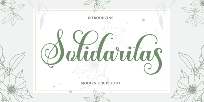 Solidaritas Script is a romantic and sweet calligraphy typeface with characters that dance along the baseline. It has a casual and yet elegant touch. It can be used for various purposes such as logos, wedding invitations, headings, t-shirts, letterhead, signage, lables, news, posters, badges etc. The fonts include OpenType features with stylistic alternates, ligatures and multiple language support. To enable the OpenType Stylistic alternates, you need a program that supports OpenType features such as Adobe Illustrator CS, Adobe Indesign & CorelDraw X6-X7, Microsoft Word 2010 or later versions. There are additional ways to access alternates/swashes, using Character Map (Windows), Nexus Font (Windows), Font Book (Mac) or a software program such as PopChar (for Windows and Mac). How to access all alternative characters, using Windows Character Map with Photoshop: https://www.youtube.com/watch?v=Go9vacoYmBw How to access all alternative characters using Adobe Illustrator: http://youtu.be/iptSFA7feQ0 How to use stylistic sets font in Microsoft Word 2010 or later versions: https://youtu.be/x1A_ilsBsGs
 - My Dream by Suza Studio,
$12.00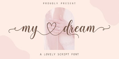 My dream is a romantic and sweet calligraphy typeface with characters that dance along the baseline. It has a casual and yet elegant touch. It can be used for various purposes such as logos, wedding invitations, headings, t-shirts, letterhead, signage, lables, news, posters, badges etc. The fonts include OpenType features with stylistic alternates, ligatures and multiple language support. To enable the OpenType Stylistic alternates, you need a program that supports OpenType features such as Adobe Illustrator CS, Adobe Indesign & CorelDraw X6-X7, Microsoft Word 2010 or later versions. There are additional ways to access alternates/swashes, using Character Map (Windows), Nexus Font (Windows), Font Book (Mac) or a software program such as PopChar (for Windows and Mac). How to access all alternative characters, using Windows Character Map with Photoshop: https://www.youtube.com/watch?v=Go9vacoYmBw How to access all alternative characters using Adobe Illustrator: http://youtu.be/iptSFA7feQ0 How to use stylistic sets font in Microsoft Word 2010 or later versions: https://youtu.be/x1A_ilsBsGs
