10,000 search results
(0.114 seconds)
- Restraining Order Pro AOE by Astigmatic,
$24.00 Restraining Order Pro brings the unique style of a vintage typewriter keyset to the digital age. Antique typewriters have an incredible warmth and appeal to them, primarily because of their unpredictable "grunge" results that were a mix from the force of keystrokes to the wear of the ribbon and paper texture. This typeface is further fleshed out with SmallCaps and extensive figure sets to add a more serious note to the nature of the typeface, when needed. WHAT'S INCLUDED: Extensive language support. Restraining Order Pro has accented and special characters that support the following languages: Afrikaans, Albanian, Basque, Bosnian, Breton, Catalan Cornish, Corsican, Croatian, Czech, Danish, Dutch, Embu, English, Esperanto, Estonian, Faroese, Filipino, Finnish, French, Galician, German, Hungarian, Icelandic, Irish, Indonesian, Italian, Kurdish, Leonese, Luxenbourgish, Malay, Maltese, Manx, Maori, Meru, Morisyen, North Ndebele, Norwegian Bokmål, Norwegian Nynorsk, Nyankole, Occitan, Oromo, Polish, Portuguese, Rhaeto-Romanic, Romanian, Scottish Gaelic, Scots, Serbian (Latin), Slovak, Slovenian, Spanish, Swahili, Swedish, Tagalog, Turkish, Walloon, & Welsh. Antique typewriters are incredible, but they aren't something easily accessible to everyone, nor do most people want to fiddle with white out edits and the like. That's why typewriter fonts that capture the flavor of vintage typewriters are a no brainer (convenient and easily editable). I hope you enjoy playing with it just as much as I had fun making it.
 - Lovelope by Ridtype,
$10.00 Lovelope is a cute handwriten font sans serif style. This font is inspired by the expression of happiness from the activities carried out by a little girl in the expression of joy. So we created these fonts to get and feel what they feel. This font is perfect for stickers, printing, logos and other purposes. Thanks for your support of our product, and using it in your project.
 - Phantom Isles by Wing's Art Studio,
$26.00 The Phantom Isles: Retro Tiki Font A Textured Retro Font Inspired by Tropical Tiki Style and South Sea Adventures! The Phantom Isles is a hand-drawn font inspired by 1950s Tiki culture, tales of exotic locations and south sea adventures. It features the textured look of weathered wood and is the perfect choice for book covers, movie titles, theme parks or vintage themed events. The font includes a complete set of uppercase and lowercase characters, along with numbers, punctuation, symbols and language support. You’ll also find a set of specially illustrated underlines, shapes and icons including flora and fauna, old rope, skulls and more. A Brief History of Tiki Culture Originating from Māori mythology, a tiki is a wooden or stone carving that represents deified ancestors found in most Polynesian cultures. The mainstream and commercialised Tiki Culture that became popular across America from the 1930s to 50s was inspired by the sentimental appeal of an idealised South Pacific, particularly Hawaii, as viewed through the experiences of those who had visited such areas during World War II and cinematic depictions of beautiful scenery, forbidden love and the potential for danger. Over time it selectively incorporated more cultural elements of other regions that affected Polynesia, such as Southeast Asia. The Americanised form of Tiki Culture maintains a dedicated following today, particularly among those interested in 1950s graphic and interior design, history and the escapist lounge aesthetic it inspires. Learn more about the history of Tiki and Polynesian culture.
 - Sapore by Fonderia Serena,
$23.90 Sapore is a script font family, mostly monoline, inspired by the elegant handmade signs in the beautiful city of Venice, Italy, where I work and live. Many of these signs were made at the beginning of the 20th century by skillful craftsmen and artists, carrying that distinct vintage Italian flavour, and this is why I named the font Sapore, which means precisely flavour (also, one of the signs is from a pastry shop that makes the most delicious things). The design takes this retro vibe into the 21st century, making it up-to-date and fresh, while keeping it authentic. It is a script font, but I added some stand alone capitals that you can use in all caps words and texts effortlessly, as the open type code is taking care of using the right set of letters at the right time, I could have made two separate fonts, but I wanted to give you the best value I could and ease of use. Make sure contextual alternates are always on! There are also swashes, alternate styles, stylistic sets, small caps, 2 figure sets and decorative elements, all accessible through open type. I think the font is particularly suited for display use, as in logos, packaging design, branding, but it is readable enough for small text blocks. You can access the non-linking caps by clicking on the discretionary ligatures button. You can access the loopy caps by clicking on the titling alternates button. The main version has straight terminals but I included a round version and a calligraphic one, called “classico”. Hope you like it!
 - Contagia by Rockboys Studio,
$26.00 Contagia is a trendy and stylish serif font. It is PUA encoded which means you can access all of the glyphs and swashes with ease! This font reads as strong, confident, and dynamic and can add tons of nostalgic character to your designs.
 - Cyclo by Cubo Fonts,
$39.00 Ainsi que le considérait Geoffroy Tory, typographe et philosophe de la Renaissance, chaque lettre de l'alphabet peut être dessinée à partir d'un cercle et d'un trait. La fonte "cyclo" actualise et radicalise ce principe graphique visionnaire. Le pack contient une version "regular" assez sage et une version "alternate" plus fantaisiste dans les accents et des signes de ponctuation. La fonte cyclo est dont adaptée à tous les usages (titres, sous-titres, chapitres et blocs de text), et peut servir efficacement l'identité visuelle de votre projet.
 - Farfa by Eurotypo,
$44.00 The Farfa fonts were designed for institutional use, commissioned by the City of Fara in Sabina, Italy. This project started from the study of the manuscripts found in the Abbey of Farfa, penned in a variant of the lower case of “Carolingian” typical style of that area. The Capital, ligatures and Small Caps, however, are based on the uncial writing that often appears in those codes and manuscripts. Farfa Abbey is a territorial abbey in northern Lazio, central Italy. It is one of the most famous abbeys of Europe. It belongs to the Benedictine Order and is located about 60 km from Rome, in the commune of Fara Sabina The origin of the Abbey is still unknown. Archaeological discoveries seem to prove that the first monastic establishment was built on the ruins of a pagan temple. The Vandals destroyed the first monastery in the fifth century. Only a few documents from the sixth-century prove the early presence of the monastic community. It had the heritage of Charlemagne (S VIII), the Lombard chiefs, and later the Carolingians, succeeded in withdrawing Farfa from obedience to the Bishops of Rieti, and in securing many immunities and privileges for the monastery. Farfa was at this period the most important monastery in Italy both from the point of view of worldly possession and ecclesiastical dignity.
 - Naveid by NamelaType,
$19.00 Inspired by Germany Type, Naveid comes with Old Style with different nuances. It was carefully designed to combine the cuppped serif on top and the tinny Subtle Flaring on the terminal, which makes this font look elegant. Naveid designed with low contrast, consists of 18 styles from thin to black with each matching italics, it makes this font not only great for Headlines, but also great for paragraph, text and printing.
 - Curro by Bon Bon Lab,
$12.00 Curro is a handwritten font that radiates joy and happiness. With playful and charming curves, this typeface adds a lighthearted touch to any design. Whether it's crafting greeting cards, designing invitations, or adding a touch of whimsy to your branding. Curro will uplift and captivate your audience. Unlock a world of positivity and vibrant creativity with this font, and let your designs come alive with the infectious spirit of happiness.
 - Menlawai by ahweproject,
$9.00 Menlawai is a gorgeous and bold handwritten font, crafted to give your headlines and logotype projects a retro touch. This font reads as strong, confident, and dynamic and can add tons of nostalgic character to your designs. Menlawai is PUA encoded which means you can access all glyphs and swashes with ease!
 - Haarlem Nights NF by Nick's Fonts,
$10.00A 1920 Dutch poster for Public Placement Services by Johan Dijsktra provided the inspiration for this crisp geometric typeface. Instead of the normal underscore (_), this font features a set of parallel lines flush to the tops of the caps and small caps, which offers some intriguing design possibilities. Both versions of this font include the complete Unicode 1252 Latin and Unicode 1250 Central European character sets. - Quinoa by Catharsis Fonts,
$29.00 Quinoa is display typeface by Catharsis Fonts that unites the seemingly opposed concepts of clean geometric architecture and organic humanist warmth. While it is designed for display and editorial purposes, its accessible forms make for comfortable reading even at small text sizes. Its exuberant adaptive "f", "j", "Q" and refreshing titling alternates bring display text to life. Quinoa covers multilingual Latin, Cyrillic, Greek, Hebrew, Arabic, and Armenian. The Quinoa family spans four stylistic cuts (Quinoa, Quinoa Titling, Quinoa Round, and Quinoa Text) with matching hand-slanted obliques, each of which comes in nine weights. The Titling cut offers a number of alternate capital letter designs with lowercase-inspired forms for a refreshing unicase look, and the Round cut additionally removes the spurs from arched letters like n. The text cut introduces true diagonals and a two-storey "a" for a more sober, reading-friendly look. A host of other OpenType features including ligatures, contextual alternates, small caps, figure sets, and character variants are built into all cuts. Furthermore, the small caps of Quinoa, Quinoa Titling, and Quinoa Text are available as dedicated font files under the names "Quinoa SC", "Quinoa Unicase" and "Quinoa Text SC" for ease of use. Acknowledgements: I am thankful to the TypeDrawers and the Typografie.info communities for great feedback and support. In particular, Thorsten Daum has been tremendously helpful with suggestions and quality control. Thanks to Craig Eliason and Jan Willem Wennekes for their help with the Latin, Alexander L. Stetsiuk for Cyrillic, Ofir Shavit and Jonathan N. Washington for Hebrew, Khaled Hosny for Arabic, and Hrant H. Papazian for Armenian.
 - Leonardo Sans by Factory738,
$10.00 Leonardo Sans is a modern sans serif with a geometric touch. It comes in 10 weights, clean and modern caps, thereby creating more variability. Designed with powerful opentype features in mind. Each weight includes extended language support, fractions, tabular figures, arrows, ligatures and more. Perfectly suited for graphic design and any display use. It could easily work for web, signage, corporate as well as for editorial design. 10 Weights (Thin, UltraLight, Light, Regular, Medium, SemiBold, Bold, ExtraBold, Black, Heavy) Oblique font is available Numbers & Punctuation Extensive Language Support Thanks for looking, and I hope you enjoy it. Check out Newgate which is a great pair for Leonardo Sans.
 - Hypeblox by Arendxstudio,
$15.00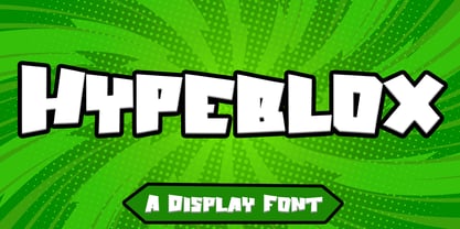 Hypeblox - Display Font is a font with distinctive Display characters perfect for branding projects, logos, media posts, advertisements, product packaging, product designs, labels, photography, watermarks, invitations, stationery, and any project Features : • Character Set A-Z • Numerals & Punctuations (OpenType Standard) • Accents (Multilingual characters) • Ligature Multilingual Support : Afrikaans, Albanian, Asu, Basque, Bemba, Bena, Catalan, Chiga, Cornish, Danish, English, Estonian, Faroese, Filipino, Finnish, French, Friulian, Galician, German, Gusii, Icelandic, Indonesian, Irish, Italian, Kabuverdianu, Kalenjin, Kinyarwanda, Low German, Luo, Luxembourgish, Luyia, Machame, Makhuwa-Meetto, Makonde, Malagasy, Malay, Manx, Morisyen, North Ndebele, Norwegian Bokmål, Norwegian Nynorsk, Nyankole, Oromo, Portuguese, Romansh, Rombo, Rundi, Rwa, Samburu, Sango, Sangu, Scottish Gaelic, Sena, Shambala, Shona, Soga, Somali, Spanish, Swahili, Swedish, Swiss German, Taita, Teso, Vunjo, Zulu There it is! I really hope you enjoy it
 - Thinker Justice by Balpirick,
$15.00 Thinker Justice is a Modern Handwritten Font. Thinker Justice is a trendy and modern handwritten font. Simple and natural, this font will become your top choice for formal and informal designs in no time! Thinker Justice also multilingual support. Enjoy the font, feel free to comment or feedback, send me PM or email.
 - Belyna by Sealoung,
$15.00 Belyna is a dazzling script font with a lovely atmosphere and spotless form, inspired by timeless classic calligraphy. Not too thin and not too thick, balanced and varied, Belyna was designed to enhance the beauty of your projects. This font is PUA encoded which means you can access all of the glyphs and swashes with ease!
 - Mistella Script by Ajibatype,
$14.00 Mistella is an elegant script font with a contemporary atmosphere and impeccable form, inspired by timeless classic calligraphy. Not too thin and not too thick, balanced and varied, Mistella was designed to enhance the beauty of your projects. This font is PUA encoded which means you can access all of the glyphs and swashes with ease!
 - Good Night Kiss by Epiclinez,
$15.00 Good Night Kiss is a fun and stylish handwritten font. Not too thin and not too thick, balanced, and varied, this font was designed to enhance the beauty of your projects. It is the best choice for creating eye-catching logos, branding, and quotes. Every letter has a unique and beautiful touch, which will make your design come alive!
 - Helveticrap - 100% free

- Vulpa by Eclectotype,
$36.00 Vulpa is a charming serif family in regular, italic and bold, informed by the proportions of a personal favorite, Plantin. The quirky foxtail terminals (inspired in part by my script font, Gelato Script) can be seen across all three styles. These little details make the typeface very expressive at display sizes, but practically disappear at text sizes, making for a very versatile face. Across the three styles there are a number of useful OpenType features which make Vulpa capable of demanding typographic work, even though there are only three styles. Regular, italic and bold are all you really need anyway! The regular and bold weights both include small caps, and the italic features swash capitals for most letters. The italic also features quaint discretionary ligatures, and all styles include standard ligatures, automatic fractions, proportional and tabular, lining and oldstyle figures. If this isn't enough, the Vulpa family also includes Ornaments and Drop-Cap fonts. There is an ornament for A to B, a to b and 0 to 9. These have been carefully designed to match the feel of the text fonts, and many are influenced by ornaments and fleurons from the ATF 1912 Type Specimen book. The drop-caps have an engraved look, and two color versions can be made by overlaying upper and lower case. Despite the lack of weights compared to ‘workhorse’ faces, the charm and versatility of Vulpa make it a really useful typeface, that I hope you'll enjoy using as much as I enjoyed making.
 - Sunday Popice by Nathatype,
$29.00 Sunday Popice is a delightful display font that brings a dose of cuteness and whimsy to your designs. With its rounded shapes and high contrast, this typeface exudes a unique charm that is perfect for adding a touch of playfulness to any project. Designed with love and attention to detail, Sunday Popice captures the essence of childlike joy and innocence. Each character is carefully crafted with rounded edges, creating a friendly and approachable appearance. The high contrast between thick and thin strokes adds a dynamic and lively quality to the font, making it truly stand out. This font's rounded and soft shapes evoke a sense of warmth and coziness, reminiscent of a Sunday afternoon spent in the company of loved ones. Because of the unique style, for the best readability use this font at large text sizes. Enjoy the available features here. Features: Multilingual Supports PUA Encoded Numerals and Punctuations Sunday Popice fits in children's books, product packaging, greeting cards, headlines, logos, and any design project that requires a touch of whimsical elegance. Find out more ways to use this font by taking a look at the font preview. Thanks for purchasing our fonts. Hopefully, you have a great time using our font. Feel free to contact us anytime for further information or when you have trouble with the font. Thanks a lot and happy designing.
 - 1456 Gutenberg by GLC,
$38.00 Font designed from that used by Gutenberg in Mayence to print the 42-line bible in 1456. The original font has too many characters for a true type font. Many of them have - in 2008 - no more utility. This font include "long s", naturally, as typicaly medieval, but also a lot of ligatures and abbreviations as "...us", "...rum" "...s" "...r...". A render sheet, added, help to identify them on keyboard. Uses include web-site titles, posters and flier designs, editing ancient texts or greeting cards as a very decorative font... This font support easily as enlargement as small size, remaining clear and easy to read.
 - Michiana Pro by BluHead Studio,
$39.00 Michiana Pro is my new, hand-crafted connecting script! I've been hand lettering cards and envelopes to my wife and family in this type style for years and decided it was time to make a font based on it. I typically start with a single thin stroke for each letter, then build up the weight of the heavy stroke, so there ends up being a lot of charming variations in terms of style and color. The overall finish is rough, yet friendly. Perfect for invitations, place cards, love notes, and with its large x-height, it sets nicely for text. I grew up running around the dunes and beaches along Lake Michigan in northwest Indiana, and I think the shoreline and dune grass has inspired my aesthetic. Michiana Pro takes the name from a small area along the lake between the Indiana and Michigan state lines. There are a lot of nice, modest homes nestled in the duneland forests. Thinking about what it's like back there, it's like having a bowl of steaming hot comfort food. So I hope Michiana Pro feels that way to you too. Michiana Pro features include: + extended character set for Western European language support + 1,205 glyphs + lowercase beginning and ending swashes + contextual initial and final letterforms + alternates for L, R, Z, f, g, p, t and y + 140+ ligatures + superior and inferior figures for unlimited fractions + ordinals (st, nd, rd, th) + 4 ornamental swashes + available in both OTF and TTF formats
 - Hug Shack by Yumna Type,
$12.00 A beautiful and easy-to-style font duo to elevate your design. Hug Shack expresses a feeling of joy and cute overall. Through the script font, Hug Shack brings your design to delve deep into the world of cuteness, while the display font creates modern look. You can mix and match this harmonious font duo to make gorgeous result in your design. This font become more special with awesome clipart as bonus. Features: Stylistic Sets Ligatures Multilingual Supports Numerals and Punctuation It can be used for branding, logos, social media quotes, stickers, posters, vintage designs, wall art, merchandise, social media, and many more. Get more inspiration by seeing the preview. Thank you for purchasing our premium fonts! Happy Designing!
 - RAN by URW Type Foundry,
$35.99 RAN Reformed Typeface for Beginners by Georg Salden - a headstrong and courageous approach to an improved handling of handwriting. Diverse and sometimes irreconcilable theories exist about how beginners are supposed to learn writing and reading. This has led to fierce discussions among experts already. We don’t want to pour more oil on the fire, but hope to create a new awareness for this topic, which is important to everyone of us. For beginners the combination of single characters (sounds) to whole words is essential during the acquirement of reading and writing. In this process they develop the skill to recall entire terms from memory. Therefore, after current practice, every word shall be written in a single stroke without lifting the pen in between. Georg Salden contradicts this postulate and warns, that coercively holding the pen down within a word can easily lead to exaggerated loop formations and a general meandering of the written text. The intellectual process in connecting single sounds to words while writing would happen anyway and the prohibition to lift the pen would often lead to tensions. To still support the necessary connections in general and to simplify the connecting, he teaches to write all round letters like a, e, g, o with inclusion of the connecting stroke, so that the spacing and combining with the next character arise by themselves. By settling the stroke at certain points and with a clear and logical writing method, a conscious and careful contact with the various strokes arises. All this automatically leads, together with a certain deceleration, to an increase of beauty and readability in the handwriting. The repeatedly discussed topic »connected or unconnected« appears to be solved in the most comfortable way as, depending on the particular character combination, both solutions are possible.
 - Lido STF by Storm Type Foundry,
$39.00Times with a Human Face: In my article of the same name which appeared in the magazine Font, volume 2000 I described the long and trying story of an order for a typeface for the Czech periodical Lidové noviny (People’s Newspaper). My task was to design a modification of the existing Times. The work, however, finally resulted in the complete re-drawing of the typeface. The assignment, which was on the whole wisely formulated, was to design a typeface which would enable “a smooth flow of information in the reader’s eye”, therefore a typeface without any artistic ambitions, from which everything which obstructs legibility would be eliminated. A year later Lidové noviny had a different manager who in the spring of 2001 decided to resume the cooperation. The typeface itself definitely profited from this; I simplified everything which could be simplified, but it still was not “it”, because the other, and obviously more important, requirement of the investor held: “the typeface must look like Times”. And that is why the above-mentioned daily will continue to be printed by a system version of Times, negligently adjusted to local conditions, which is unfortunately a far cry from the original Times New Roman of Stanley Morison. When I was designing Lido, the cooperation with the head of production of Lidové noviny was of great use to me. Many tests were carried out directly on the newspaper rotary press during which numerous weak points of the earliest versions were revealed. The printing tests have proved that the basic design of this typeface is even more legible and economical than that of Times. The final appearance of Lido STF was, however, tuned up without regard to the original assignment – the merrier-looking italics and the more daring modelling of bold lower case letters have been retained. The typeface is suitable for all periodicals wishing to abandon inconspicuously the hideous system typefaces with their even more hideous accents and to change over to the contemporary level of graphic design. It is also most convenient for everyday work in text editors and office applications. It has a fairly large x-height of lower case letters, shortened serifs and simplified endings of rounded strokes. This is typical of the typefaces designed for use in small sizes. Our typeface, however, can sustain enlargement even to the size appropriate for a poster, an information table or a billboard, as it is not trite and at the same time is moderate in expression. Its three supplementary condensed designs correspond to approximately 80% compression and have been, of course, drawn quite separately. The intention to create condensed italics was abandoned; in the case of serif typefaces they always seem to be slightly strained. I named the typeface dutifully "Lido" (after the name of the newspaper) and included it in the retail catalog of my type foundry. In order to prevent being suspected of additionally turning a rejected work into cash, Lido STF in six designs is available free of charge. I should not like it if the issuing of this typeface were understood as an “act out of spite” aimed against the venerable Times. It is rather meant as a reminder that there really are now alternatives to all fonts in all price categories. - Ds Hand by CozyFonts,
$25.00 Ds Hand Font Family is a handwritten font designed by Tom Nikosey, based on Danielle Nikosey’s printing style. Tom is an American Graphic Designer specializing in Typographic Design and Illustration. Ds Hand is available in Regular & Bold weights CozyFonts Foundry is Tom's intro into the world of font design. Ds Hand Family is a tribute and gift to his daughter. Ds Hand, at first glance, gives a hand drawn aesthetic feel but on closer inspection, when set as text, this font gives off a cool, organized, legibly organic read. Also available in Bold. This is the 5th Hand Drawn Font Family from CozyFonts!
 - LD Baskin Sundae by Illustration Ink,
$3.00LD Baskin Sundae is as cute as it can be, and versatile too! Use this font to make perfectly designed layouts ...you know, you can complete your paper or scrapbooking creation in minutes! - 1523 Holbein by GLC,
$28.00 This typeface is an attempt to offer as a font the well known marvelous Hans Holbein “Death Alphabet”, first published in 1523. We have tried to preserve as much as possible the spirit and appearance of the original Initials set — incredibly fine and enriched with detailed figures — trying at the same time to create a font not too complex to be usable. Neverteless, the font files are large, and when used, the decorated initials may appear on screen more slowly than ordinary characters. (Minimum size recommended : 96 pts) We are offering here two complete standard sets (no accented characters) : Initials and capitals. We have reconstructed the missing letters : J and U, Eth, Lslash, Thorn and Oslash. The font may be used with all our Humane and Garalde fonts, like 1543 Humane Jenson or 1592 GLC Garamond and others from the GLC foundry catalog.
 - Cabrito Inverto by insigne,
$- Life’s always more fun when you reverse the stress. The same goes for the new member of the Cabrito family. Cabrito itself is a recently developed slab serif made for the kid’s book The Clothes Letters Wear. Cabrito proved to be more popular than I thought, and I promised I would create an inverted style for this new addition to the font world--a variant that would pair well with the original or even stand well on its own. And so now, here it is. Cabrito Inverto, which features the reversed stress of the strokes from a font’s “normal” traits. Inverted stress fonts are most often associated with cowboys and the Old West. The inverted stress gives it a happy-go-lucky appearance, not to be taken too seriously. It’s a pleasantly rounded, not-so-strictly geometric typeface with handwriting-inspired forms. Whew, that’s a mouthful! Inverto’s bundle of alternates is accessible in any OpenType-enabled program. It contains a workforce of alternates, swashes, and alternate titling caps to embellish the font. Also bundled are swash alternates, aged design and style figures, and compact caps. Peruse the PDF brochure to examine out these solutions in action. OpenType-enabled purposes such as Adobe suite or Quark will allow ligatures and alternates. This font family also includes the glyphs for 72 different languages. Cabrito Inverto does pair well with Cabrito. There is even an extra font weight, Black, for when you want to punch it up a bit. Jeremy Dooley designed Inverto to be a welcoming, day-to-day font family. Use it to express friendliness on just about anything, from candy to food to children’s toys. Cabrito Inverto’s one-of-a-kind visual appearance brings a bundle of fun to the party. Buy Cabrito Inverto to give a boost to your designs every day of the week.
 - Alberta Script by Factory738,
$15.00 Alberta Signature Script is ideal for branding projects, logos, wedding designs, social media posts, advertisements, product packaging, product designs, label, photography, watermark, invitation, stationery, and any other project that requires a handwritten touch. Alberta Signature Script (Regular, Caps, and Tails) Basic Latin A-Z and a-z Numerals & Punctuation Stylistic Alternates Multilingual Support for ä ö ü Ä Ö Ü … Free updates and feature additions Thanks for looking, and I hope you enjoy it.
 - Mike Sans by Factory738,
$10.00 Mike Sans is a modern sans serif with a square style. It comes in 8 weights, clean and modern glyphs, thereby creating more variability. Designed with powerful opentype features in mind. Each weight includes extended language support, currency, and more. Perfectly suited for graphic design and any display use. It could easily work for web, signage, corporate as well as for editorial design. Thanks for looking, and I hope you enjoy it.
 - Routerline by Viaction Type.Co,
$15.00 Routerline is a script monoline with 4 styles, nice applied in various products. Complete with multilingual characters, ligature and alternate. It is suitable for quote, clothing design, vintage logo, label, poster, packaging design and other designs. File Include (All Family) : Routerline.otf Routerline.ttf Routerline Slant.otf Routerline Slant.ttf Routerline Bold.otf Routerline Bold.ttf Routerline Bold Slant.otf Routerline Bold Slant.ttf Features (PUA Encoded) : UPPERCASE. LOWERCASE. MULTILINGUAL. PUNCTUATION & SYMBOL. STYLISTIC SET. LIGATURE. I hope you enjoy and thank you.
 - Cita Pro by XdCreative,
$29.00 About Cita Pro Hi there please say hello to "Cita Pro" the latest collection from @faldykudo, Cita Pro is a serif typeface with a taste of old style, its very beautiful with a timeless aesthetic and has a very wide range for various design situations. Cita Pro is perfect for both display and body text because it has a very good readability. Cita Pro has 14 style and 7 weights, - from Thin to Bold and Matching calligraphic italic. Cita Pro also has special alternate characters in complete uppercase from A-Z . it is to give a different look for your display design. thanks, hope you would like and accept "Cita Pro" as part of your family. thank you in advance
 - Zig Zag ML - Personal use only

- Quintet by Lauren Ashpole,
$15.00 Quintet is a narrow, stylized sans serif font made up of thin, looping lines. This font tries to walk the line between retro and modern and to incorporate some hand drawn imperfections without being too obvious about it. I kicked off designing without any particular inspiration in mind but, as time went on, started associating it in my head with an old-timey, swingy jazz aesthetic. So hopefully it captures the spirit of the Jeeves and Wooster throwback theme song and opening credits, the music of Stéphane Grappelli and Django Reinhardt (who the name is a nod to), and countless album covers from that era.
 - Kerp by aRc,
$10.00 Kerp introduces the new trend in handwriting practice for kids in preK-Kindergarten. It's fun, unique and visually stimulating that will encourage any young "alphabet tracers" to find joy while learning their ABCs. This TrueType font is great for creating personalized tracing worksheets, flashcards and even home-made greeting cards. For best results, big fonts are highly recommended to see the fine details of each character. Kerp was conceptualized in 2007 to inspire a 4 year-old boy to stop from his hectic schedule of playing. It started from hand-drawn apples forming the letter A to non-stop digital editing until 2008. The images selected are things that are associated to a preschooler's life varying from food to school supplies.
 - Glupsk by Hökarängens Bokstavsfabrik,
$19.00 Do you remember that kid from Lord of the Flies? Why do I even remember that kid, I’m too young for that. However, his name was Piggy, and I wanted to make a typeface that resembled him. So this is my tribute to Piggy who got killed by that falling plastic rock in the movie. May he live forever through this typeface, on birthday cards, or maybe some sweet candy packaging or why not through an graphic identity for a toy company?
 - Prussak BC by Jujumisur’s Ficus,
$19.00 I wanted to do somewhat like Blackletter, but Blackletter is hard to read sometimes, so I tried to solve this problem and to do something unique. This font is able to be used with all European languages including ancient and reconstructed languages like Old Church Slavonic (it can be written by Cyrillic or Glagolitic script), Proto Slavic, Ancient Greek etc. It also includes IPA, so it can be used in education.
 - Boo Boo Kitty by Lauren Ashpole,
$15.00 Boo Boo Kitty is a blocky font with a halftone style gradient texture. One of the big inspirations for this font was retro comic printing so I tried to keep the background slightly messy to capture that look. It was originally released in 1997 as an all-caps font with mixed plain and textured characters but was recently updated it to include lowercase letters and full versions of both background options.

