10,000 search results
(0.025 seconds)
- Yolk by Monotype,
$31.99 Yolk is an Eggcentric Sans Serif Typeface consisting of nine weights in both roman and italic. Essentially, this is a geometric sans typeface that has been inspired by the shape and proportions of an egg. With its bottom-heavy glyphs, Yolk has an unusual personality – it’s not too awkward to be off-putting, and it’s not too uniform to be associated with the myriad of generic geometric sans fonts that are available. Yolk has a distinctive presence in its upright form, while the italics exude a more flamboyant nature. When combined, your typographic results will be pleasing and perhaps a little quirky too. This 18-font type family achieves a good balance of personality, versatility, and usability. Small Caps are available at the click of a button, then add Stylistic Set 1 to achieve Petite Caps. The petite caps harmonise with the regular lowercase forms, so that you can create unicase-style typography too. All Latin-based languages are covered within the 1000+ glyphs of each Yolk font. Key Features: • 18 font family – 9 weights in Roman and Italic • Small Caps, Petite Caps, with Proportional, Old Style, and Small Cap figures, plus Fractions, Numerators, Denominators, Superiors, and Inferiors • Full European character set (Latin Extended) • 1,000+ glyphs per font.
 - Actium by Type Mafia,
$45.00 Actium is a contemporary multilingual sans serif typeface developed to help perfect typography automatically. Type Mafia has focussed on words with odd combinations of capital letters and numbers, such as product names and postal codes such as WD40 and H1N5, jump out of the text. They sit awkwardly together as the numerals have been designed to work with the lowercase, not the uppercase letters – affecting readability.To fix this Type Mafia invented Smart Capo™. Smart Capo™ Smart Capo is a feature that automatically activates once you type an uppercase letter together with a number. When a capital letter is sat next to a numeral, Smart Capo converts the letter to a mid-cap — a contemporary alternative to small caps — and the default old-style numeral to a lining numeral. Actium’s mid-caps and lining numerals have been designed with the same height (between cap and x-height) so they sit comfortably next to each other and fit more harmoniously into text. Smart Capo applies equal attention to capitalised words without any numbers, such as NAVO and USA, and are also automatically set into mid-capitals. Working on its own, Smart Capo saves time and money for the typographer — taking the pain out of text formatting — and makes it a more pleasurable experience for the reader. This feature is made possible by the use of ‘contextual alternates’, an OpenType feature used in modern font software, working with a set of characters specially designed at mid-cap height. By default these changes automatically take place so it doesn't need to be switched on, it will just work. Actium Actium’s design has an unusual diagonal contrast — much more common in a serifed face than in a sans serif — giving it more bite. The typeface looks elegant when set in large sizes and remains very legible when shown in small sizes. The family consists of six weights in two styles, making a dozen fonts. Weights range from light to black in roman and true italic. All fonts are fully loaded with functional elements. Actium boasts an extended Latin character set and with Greek. This means a wide range of Western languages are supported: perfect for use in bilingual publications and packaging. For numerals, each font includes old-style and lining figures in both proportional and tabular widths, with superiors and inferiors. These allow you to select the right set of numbers for the right task.
 - Sunblock Pro by Grype,
$19.00 Clean and geometric deco sans typefaces have been used in a range of scientific publications, corporate logotypes, and beauty products over the years. However, a typeface of this style has yet to have an expansive range of widths and weights to become a design workhorse, until now. The Sunblock family finds its origin of inspiration in the Coppertone sunscreen company logo, and from there expands to type megafamily. Sunblock celebrates the rounded geometric forms of deco and bauhaus lettering through a compressed lens, transcending its brand inspired origin to give birth to a font family that pulls on modern and historical styles. It inherited its soothing tone from the limited character logotype that inspired it, and goes on to include a lowercase, small caps, and a comprehensive range of widths and weights, creating a straightforward, uncompromising collection of typefaces that lend a solid foundation and a broad range of expression for designers. Here's what's included with the Sunblock Collection bundle: 643 glyphs per style - including Capitals, Lowercase, Numerals, Punctuation and an extensive character set that covers multilingual support of latin based languages. (see the 7th graphic for a preview of the characters included) 21 fonts in 5 width subfamilies: Ultra Condensed, Extra Condensed, Condensed, Semi Condensed, & Standard. 5 weights per subfamily (except Ultra Condensed): Thin, Light, Regular, Bold, & Black. Fonts are provided in both TTF & OTF formats. The TTF format is the standard go to for most users, although the OTF and TTF function exactly the same. Here's why the Sunblock Collection is for you: You're in need of a deco geometric font family with a big range of weights and widths You're love that Coppertone letter styling, and want to design anything within that genre You're looking for an alternative to Chalet Comprime with a more versatile range of styles You're looking to start up your own derivative Sunscreen product line You just like to collect quality fonts to add to your design arsenal
 - Radical Fortune by Hanoded,
$15.00 One day my kids asked me: ‘would you rather be healthy and poor or super rich and sick?’ Without a doubt I answered: ‘healthy and poor’. Having money is nice, but it is not what life is about. At least, that is what I believe. Radical Fortune is a font I made after a period in my life that could have ended with a really nice sum of money in my hands - but which I didn’t take. I had to give up too much of myself and that just didn’t feel right. I made Radical Fortune to keep me from thinking too much - and, symbolically, I used a really old and cheap marker pen to draw out the glyphs!
 - Imagine a font that strolled out of a whimsical art project, tip-toeing between creativity and readability with the grace of a ballet dancer. That, my dear reader, is CAC Lasko Even Weight, crafted b...
- Saint Petersburg by Haksen,
$14.00 "Saint Petersburg" fonts were created to look as close to a natural handwritten script as possible by including over 20 ligatures. With built-in OpenType features, this script comes to life as if you are writing it yourself. It's highly recommended to use it in OpenType capable software - there are plenty out there nowadays as technology catches up with design. Other than Photoshop, Illustrator and Indesign, many standard simple programs now come with Opentype capabilities - even the most basic ones such as Apple’s TextEdit, Pages, Keynote, iBooks Author, etc. Even Word has found ways to incorporate it. Your download will receive 4 font files, designed to work as perfect companions or simply as strong standalone typefaces. WHAT'S INCLUDED : 1. Saint Petersburg • A clean, free-flowing script font containing upper & lowercase characters, numerals and a large range of punctuation. 2. Saint Petersburg Alt • This is a second version of Saint Petersburg Script, with a completely new set of upper & lowercase characters. If you wanted to avoid letters looking the same each time to recreate a custom-made style, or try a different word shape, simply switch to this font for an additional layout option. 3. Saint Petersburg Slant • The Slant Version of the point 1. 4. Saint Petersburg Slant Alt • The Slant Version of the point 2. I surveyed mostly common letter combinations and made 20 Discretionary ligatures with following letter combos: aa bb ee ff ll ss tt at et it ot sl st rt ut att ett itt ott utt (in Saint Petersburg & Slant Version) aa bb ee ff ll ss tt at et it ot sl st rt ut att ett itt ott utt (in Saint Petersburg Alt & Slant Version) By using these ligatures, you can give realistic handlettered style, escaping font "pattern" effect.
 - Soft Serve by Sentinel Type,
$24.90Looking like happy frosting on a cupcake at a twiddle bug party, this bouncy food entry from Canadian designer Haley Fiege turns the original Jellybrush type into organic happiness you can spread on pancakes, ice-cream, sorbets, sauces and condements, oh peanut butter! Yeah, all kinds of sandwich fillings. Anything really. What else? People who own rubber factories. Anybody in the food business, like green grocers or your local bakery. Thrift stores. Falling somewhere between cushions and cat food, this flexible and inviting letter mixes simplicity with organic character and humor for a wide range of uses. Soft Serve’s compact cursive forms and bouncy friendliness draw on artbrush scripts and the typo-italic model of Renaissance Vatican scribe Ludovico Arrighi. A versatile workhorse ideal for: * Dairy & beverage * Sweets & soft drink * Five minute food & sauces * Pet food & accessories * Bathroom & kitchen * Cushions, pillows, rubber & swimming pool, etc. - Raljon by Mmarkk,
$22.22 Raljon is a display typeface created by designer and lettering artist Mark Robinson. It is a collaboration between the Mmarkk and Teen-Beat Graphica visual design studios. This single font was created over a period of five years. Mark took great care in finessing each character and making sure that each character would stand on its own and yet simultaneously, be an integral part of the whole. The typeface is inspired by Gothic letterforms, horror novels, speed metal bands of the 1980s, techno and electronic music of the 1990s, and Washington, DC football teams whose stadiums lie in the Maryland suburbs. While it doesn’t have multiple weights, Raljon does have a deep depth and breadth. It has a seemingly endless amount of alternate characters and ligatures. There are nine letter Ms, eight letter As and Fs, seven Rs and Ts, and the list goes on. Even the figures have alternates.
 - Rangarang by Si47ash Fonts,
$24.00 "At last, something beautiful you can truly own!" This is the first Persian Arabic & Latin COLOR font ever designed! Chromatic or Color fonts are fairly new. And Persian Arabic color fonts are extremely rare. Here, you get a font that supports both Arabic and Latin! Rangarang [means colorful] font comes in with a wonderful color set and variety in forms. Every single glyph has a unique palette of colors. If you look closely at the glyphs, you'll see complex paths and connections in every single one of them. Each glyph could be seen as a typographic artwork! Rangarang font is great for entertainment design, posters, business cards, website titles, magazine illustrations, logotypes, book covers, banners, billboards,... There are countless options! Notes: - SVG fonts contain vector letters with gradients and transparency. - These fonts will show up in apps that are compatible with color fonts, like Adobe Photoshop CC 2017.0.1 and above, Illustrator CC 2018. Learn more about color fonts and their support in third-party apps on: www.colorfonts.wtf - Don't worry about what you see here in the preview section in your browser. You may see the glyphs in black here, but this font is working EXACTLY how you can see it in the font pictures I put here. So if you use it in apps that support colored fonts, you can be sure that after installing the font on the system you will be able to use it like every other font. Shahab Siavash, the designer has done more than 30 fonts and got featured on Behance, Microsoft, McGill University research website, Hackernoon, Fontself, FontsInUse,... Astaneh and Hezareh text and headline fonts, Yaddasht and Yadgar handwriting fonts,... already got professional typographers, lay-out and book designers' attention as well as some of the most recognizable publications in Persian Arabic communities.
 - Nyata by Marsnev,
$14.80 Nyata™ — Clearly Visible, No Matter What. I love London for its finest visual branding, especially its Johnston typeface spreading all over the city. It inspired me to create this new font family: Nyata™. Nyata means clearly visible in Indonesian. The typeface is designed to be clean, unique, and legible. It is a great combination for any display requiring high legibility, such as city’s way finder. Long ascenders help some characters more obvious. You will never confuse wether it is an h or an n. Moreover, I tried to create all the letters are distinguishable. Of course, no time for people to doubt between Uppercase “I” and lowercase “l” when seeing a way finder. Last but not least, it is equipped with tons of OpenType features such as slashed zero to help the words more obvious, or stylistic sets if you don’t fancy the serifed uppercase I. Nyata™ is also delivered in Variable Font format. Enjoy all the styles and everything in between in one variable font only sized less than 150kb.
 - Harri Text by Blancoletters,
$39.00 Harri Text is more than an extension of Harri. It shares its origin, a certain flavour and a great deal of its idiosyncrasies, but while Harri is an uppercase-only typeface intended for display uses, Harri Text is conceived as a text type family, including a new extra-light weight, italics, small caps and other additions that make it suitable for editorial purposes. As its predecessor Harri Text addresses several concerns regarding the dualism neutrality vs. idiosyncrasy, or in other words, how local features meet global design in the context of a modern society (as is the case in the Basque Country in recent times). The origin of Harri Text —vernacular Basque lettering for the most part— is full of idiosyncrasies and peculiarities that, while giving them its special character, may hinder readability in some cases. The default set in Harri Text tones its essence down a little bit. It is still present, although less obstrusive. Stylistic sets 1, 2 and 3 are a chance to recover gradually this essence modifying some characters —specially the characteristic design of letter A– for those who seek a more local flavour. Stylistic set 4, on the other hand, does the opposite job, this is, removes asymmetrical serifs and other small details in order to create a more neutral atmosphere. Any traces to its origin are this way diluted resulting in a crisp and clean incise variant. Stylistic set 6 is available in the italic styles. It provides a more fluid and cursive flavour to some letters in case a calligraphic mood is desired. Harri Text comes with 1054 glyphs in its character set (1078 in the italics) with support for more than 220 languages.
 - Machin by Hanoded,
$15.00 Machin is a French word meaning 'thing'. Apparently, it is also a species of macaque from the Philippines, but I named this font after the French word! Machin is based on a really old font I made back in the day. It was called Whynot and (because I didn't know a thing about making fonts at the time) I could not get it to work properly, so it had its 15 minutes of fame before it was pulled off of the internet. Machin was made using the recycled glyphs from Whynot and it does work. It comes with extensive language support (yes, Vietnamese and Sami too), some handy ligatures and a lot of scribbly panache.
 - Brush Up by PintassilgoPrints,
$24.00 Brush Up is the cool handpainted typeface you are looking for. Swiftly painted on paper and carefully translated into a font, it brings 3 glyphs for each letter and 2 for each number, plus variations for some punctuation marks. The font is nicely programmed to cycle these alternate glyphs when Contextual Alternates engines of applications are turned on. Or, you can always pick up your choices manually through a glyphs palette. Either way it will certainly turn out refreshing! Surprisingly versatile, Brush Up is available in two cuts – upright and oblique – and will greatly fit tons of purposes. Is it a headline? A small chunk of text? Maybe not that small? Ok, just Brush'em all!
 - Face Your Fears II by Hanoded,
$15.00 When I created Face Your Fears some years ago, it was an instant hit. I have seen it on Gangsta Rap albums, metal albums, books and on movie posters. It has been used for T-shirts, websites and, believe it or not, for a beer label as well. I have always toyed with the idea of redoing the original font, as some of the glyphs were a bit off. Face Your Fears II is similar in nature to the original font, but comes with a lot of improvements, has slightly altered glyphs and (probably) better kerning. But maybe, just maybe, it isn't your cup o' tea. In that case, you can always just go for the original!
 - Ah, Urban Brigade, the font that struts down the street of typography like it owns the place. Imagine, if you will, a graffiti artist and a highly disciplined calligrapher had a love child; Urban Bri...
- Audy Script by Dieza Design,
$9.00 Thanks for checking out Audy Script Font, a fabulously fun yet elegant script font with tons of energy, allowing you to create beautiful typography in an instant. With extra bouncy curves & loops, Audy Script is guaranteed to make your text stand out - perfect for logos, printed quotes, invitations, cards, product packaging, headers and whatever your imagination holds. Audy Script is also suitable for branding, wedding invitations, magazine. Audy Script looks modern and stylish.
 - Voire by Creativemedialab,
$22.00 Introducing Voire is an Elegant stylish and playful modern serif family. Voire comes with two versions display and Regular, and it has 9 weights from thin to Black with tons of alternates and ligatures This modern pretty serif family is perfect for all sorts of elegant designs like wedding invitations, but can also work great for logo, branding, website font and headers, or product labels. It's easy to read and the alternates are visually interesting
 - Mintaka by Hoperative Design,
$12.00 Mintaka is a gorgeous and retro-styled script font crafted to add tons of stylish character to your designs. This font is PUA encoded, which means you can access all of the glyphs and swashes with ease! This font can be used for logos, branding, invitations, stationery, wedding designs, social media posts, and much more! Mintaka Features : Ligature Kerning Stylistic Alternates Swash PUA encoded which means you can access all glyphs Multilingual Support
 - Shark Snack by Comicraft,
$19.00 Dumm DUM. Dumm DUM. Duh dum duh dum duh dum DUMMMM... Just when you thought it was safe to get back in the water, this font surfaces to take one last bite out of your summer vacation skinnydip! Scream and scream again — it won’t do you any good, SHARKSNACK is rough and ready to EAT YOU ALIVE! It’s too late to close the beaches, Chief Brody, this particular set of saw tooth letters has already consumed Dracula, the Werewolf, the Frankenstein Monster and any number of 70s comic book characters foolish enough to dip a toe in its maw!
 - Easy Answer by Bogstav,
$17.00 Is there such a thing as an easy answer, or is it just because you know the question? Anyway, as a kindergarten teacher I like to make these quizzes with the kids. The object of the game is not to answer right, but to get a feeling of knowing a lot. I thought of these questions as being logical and really easy, but I also found out that it is a great way for the kids to remember and recall their knowledge! This font is easy to read, even if you use some of the many choices of swashes!
 - Jollin Family by Creativemedialab,
$14.00 Jollin Family is a pretty, attractive and fashionable sans serif, has ton of alternates that you can use to create a simple but pretty letters. Jollin has 8 weights and 3 Widths and also available in Variable version Jollin Family Variable contain three configurable axes: weights, width, and slant, you can adjust the font axis setting to get the desire size. Jollin Perfect for Heading, logo creation, Advertisements, Christmas, Label, business card, branding and more! Get inspired by its fashionable appeal! to access alternate Adobe Photoshop go to Window - glyphs Adobe Illustrator go to Type - glyphs
 - Eclectic One by Altered Ego,
$45.00STF Eclectic One is a visual cornucopia of symbols, like the junk drawer in your kitchen. Stuff you'll need someday for a graphic element, bullet or dingbat application. Perfect for website icons! The Eclectic family is legendary, with a cult-like following among the inititated. As one of the first dingbat fonts available on the web, it gain popularity after its design in the early 1990s. With over 150 characters in the complete set, you'll find yourself using Eclectic One almost daily to add spice to your otherwise san-serif typographic existence. This font is essentially a soap opera of typographic image elements, created for projects when I couldn't find the "thingbat" I needed. Almost more of a collection of illustrations, there are many characters which connect to form patterns, and of course it's like a "small neutral European country" army knife for the creative community. EcOne features complete hour, quarter, and half-hour notations in an analog clock design glyph, recycled/recyclable symbols, a registration mark, a toaster, globes, sideways diamond arrows, spaceships, stoplights, the "running man," several atomic references, da buzz saw, target icons, the unusual smiley face floating in a ball (with a drop shadow, no less!), and the fish skeleton which complements the fallout shelter symbol, and more. Make your own juxtapositions! One reviewer proclaims "for whatever you do, Eclectic One is an excellent dingbat source." Available in Mac and PC formats. License it today! - Allrounder Monument by Identity Letters,
$22.00 An inscriptional titling font for truly epic headlines. Allrounder Monument is an inscriptional, dignified member of the Allrounder superfamily. This all-caps typeface with delicate serifs was inspired by ancient inscriptions on columns, monuments, and buildings in Rome: letters as old as two millennia that radiate their own classic charm. Allrounder Monument picks up this atmosphere in order to create a typographic tool that lives up to contemporary demands. It infuses today’s designs with a hint of history and an air of exclusivity. Allrounder Monument is a timeless titling typeface. You might use it for posters, magazines, book covers, greeting cards, advertising or packaging work, and even signage. If you want an even more spectacular and exciting headline or title, additional Discretionary Ligatures and a Stylistic Set provide the necessary OpenType power to achieve this goal with ease. As Allrounder Monument is a part of the Allrounder superfamily, you can combine the three weights Book, Regular and Medium with the corresponding weights of Allrounder Grotesk. The Allrounder superfamily is a series of typefaces sharing the same color and horizontal metrics (cap height, small cap height and x-height): a typesetting system whose components match each other perfectly. Any other part of this design kit, e. g., Allrounder Grotesk or Allrounder Antiqua, may be easily combined with Allrounder Monument. Whenever you need a truly epic headline, Allrounder Monument is the best horse in your barn. Ad astra!
 - Tipo Movin CDMX by Ixipcalli,
$- La versión propuesta por la SEMOVI (Secretaria de Movilidad) es un estilo más angosto y ortográfico, creadó con la finalidad de aligerar las aplicaciones tipográficas del sistema. Se emplea oficialmente en todas las aplicaciones del sistema de Movilidad Integrada de la Ciudad de México. El creador de la tipografía es Lance Wyman. En esta edición, los tipos minúsculas son una adaptación “no oficial” para el Tipo Movin CDMX, enriqueciendo la tipografía a un estilo visual de altas y bajas, por lo que se prescinde del diseño base como trabajo propio para enfatizar los tipos minúsculas exclusivamente, además de que se han añadido algunos caracteres de acentuación extendiendo su uso a otros lenguajes. Los tipos son una nueva propuesta por Ixipcalli en el presente año 2023. The version proposed by SEMOVI (Secretary of Mobility) is a narrower and more orthographic style, created with the purpose of lightening the typographic applications of the system. It is officially used in all the applications of the Integrated Mobility system of Mexico City. The creator of the typeface is Lance Wyman. In this edition, the lowercase types are an “unofficial” adaptation for the Tipo Movin CDMX, enriching the typography to a visual style of highs and lows, so the base design is dispensed with as my own work to emphasize the lowercase types exclusively, In addition, some accentuation characters have been added, extending their use to other languages. The types are a new proposal by Ixipcalli in the current year 2023.
 - P22 Klauss Kursiv by IHOF,
$29.95 P22 Klauss Kursiv is the first ever digital revival and expansion of the last face Karl Klauß designed for the Genzsch & Heyse foundry in Stuttgart before he died in 1956. Karl Klauß’s classical training in the graphic arts gave him solid chops to use as a springboard for design ideas that remained relevant among the countless trends fleeting around the turmoil of two world wars. By the mid-1950s, a kind of ornamental deco aesthetic was well on its way into mainstream design in post-war Europe, and demand was high for unique, lively and non-minimal ad faces. Klauß, a reliable designer with a proven track record of calligraphic faces, pushed the envelope on his own calligraphy and designed something that packages elegance in a boldness seldom seen before in luxury scripts. Quite a bit of talent is on display in Klauss Kursiv. In spite of the restraint this kind of design imposes on itself almost by default, the interplay between thick and thin never seems forced or challenging. Clear, natural strokes build a compact alphabet that demonstrates the wrist control of a veteran calligrapher. Creative nib angling segues into very clever start-and-stop constructs to make attractive forms that work quite well together, yet stand well to individual scrutiny. P22 Klauss Kursiv comes with a load of built-in alternates and ligatures in a font of over 470 glyphs, providing extended support for Latin languages.
 - Oceanwide Pro by California Type Foundry,
$47.00 A font perfect for not just one, but many projects! Introducing Oceanwide Pro, a sans that loves to be used in just about any situation! Designed with ultra clean lines and versatility in mind, Oceanwide wants to be your new favorite sans! Oceanwide’s ultra clean letters work anywhere you want to communicate orderliness and competence, and designed to build trust and rapport with your audience. Its wide proportions make it ideal for display and logo use. Oceanwide especially shines for white/bright letters on black/dark backgrounds! That’s because the inside shapes are nearly perfect circles in many weights. Here's a quick video tour of Oceanwide Pro by Dave Lawrence, including all the great things Oceanwide can be used for! We've tested Oceanwide for these industries, with stunning results!: Tech Arts Fashion & Style Business & Branding Corporations Logistics Architecture Food and many more... Oceanwide can be used for: Headers Subheadlines Logos Even body text, if tracked. Print & Screen The styles it can take are also many. It's great for: Modern/minimalist design Flat design Cut out design User Interface (UI) Technical designs In combination with text effects, even for grunge and other situations. And many others... DESIGN FEATURES Simplicity Tall x-height Hand-sloped obliques (italics) Narrow spacing Semi-wide proportions Expert kerning Well proportioned, usable lights & extra lights Large caps Great ALL CAPS MODE Uppercase punctuation Uppercase spacing with California Type Foundry’s Smart Tracking™ Advanced fraction support Proportional lining figures Thick joins Smooth curves Sturdy—great for textures and effects Variable font available Latin Pro character set for Central European languages. That's the writing for over 782 languages and transliterations worldwide! DESIGN STORY—THE FORGOTTEN SANS by Dave Lawrence, Lead Designer, California Type Foundry Adrian Frutiger was the 20th century master of sans, but I didn't realize he had made—not one—but TWO geometric sans! It wasn't until I had purchased the book “Adrian Frutiger: Typefaces”. I had hoped to someday meet Adrian Frutiger, but he passed away that very same year. Here is the story of Frutiger's forgotten sans. Back in 1968, Frutiger was approached by Pentagram to make a design for British Petroleum. They wanted a "new version of Futura". However, they wanted him to make a couple adjustments. First, they felt that Futura was "too fiddly." By this, they meant that it narrowed too much at the joins. (Joins are for example where the round and straight parts of the 'd' meet.) This is something that is necessary for small print text (to prevent ink clogging), but is not necessary at large sizes. Second, they wanted it to be entirely geometric, using the circular shape with minimal optical corrections. Unfortunately this font was not even used very consistently in the BP brand. A haphazard mix of Futura and Frutiger's BP font ensued. It was then replaced by another font design very soon after. My design is different in several ways. First, the commas and quotes are a more modern style. I tried his original commas, but these just didn’t work to 21st century eyes. Second, in his drawings, Frutiger went for a more standard u with a downstroke on the right. However, Oceanwide has a simpler u. Third, I made more optical adjustments. At the direction of his employer, Frutiger reluctantly put no font optical corrections into the letters. So I think my optical adjustments are similar to what Frutiger would have wanted. Fourth, I extended the weight into the light and extra light ranges. Fifth, the rest of the font I created according to the principles of Adrian Frutiger, but with no sources for inspiration. Here is Frutiger’s design philosophy, in his own words: “If you remember the shape of your spoon at lunch, it has to be the wrong shape. The spoon and the letter are tools; one to take food from the bowl, the other to take information off the page... When it is a good design, the reader has to feel comfortable because the letter is both banal and beautiful.” The words about the spoon were the ones I kept in my mind as I tried to make the curves ultra smooth, and the shapes ultra simple. Hopefully this font is a worthy successor to the font that inspired it. Released on the 93rd birthday of Adrian Frutiger, to celebrate the life and achievements of this amazing designer. ——————— Simplicity. Versatility. Oceanwide.
 - Esperanto by Linotype,
$29.99Franko Luin, Esperanto's designer, on this typeface: Esperanto has a lot in common with classic typefaces, and newer interpretations of the classics. The italic reminds of the lettering idea of the Renaissance and their manuscripts. This typeface's name refers to the international language Esperanto, of course. The font is not compatible with the character set of the Esperanto language - Rasputia by Putracetol,
$16.00 Rasputia is a luxury, elegant, and beautiful calligraphy font. It is full featured with tons of alternate characters and OpenType features. This font designed to work together in harmony that makes it very suitable for wedding media, book covers, greeting cards, logos, branding, business cards and certificates, even for any design work that requires an elegant or luxurious style.
 - Braggadocio by Monotype,
$29.99 Braggadocio is a very black typeface. Braggadocio is a strange hybrid with characteristics of both sans serif and modern faces; and it belongs very much to its time. Like high society in the 1920's, it should not be taken too seriously. Use the Braggadocio font for display lines in advertising, magazines and light hearted communications.
 - Lorcan Mist by Here East Fonts,
$16.00 LORCAN MIST is a powerful super modern editorial unicase font with vintage vibes, designed with love and care for amazing projects. It's great for social media, headlines, large-format print, editorial, branding, posters, fashion designs and websites — it's designed not to take too much attention but at the same time be a powerful accent. It's mysterious, elegant and sexy.
 - Valky by Kaligra.co,
$29.00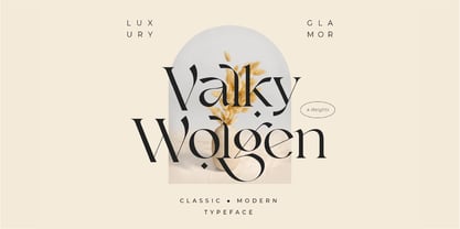 Valky is a Fancy Modern vintage serif typeface with beautiful ligatures, tons of special alternative glyphs, ornament and multilingual support. It's a very versatile font that works great in large and small sizes. Perfect for editorial projects, Logo design, Clothing Branding, product packaging, magazine headers, or simply as a stylish text overlay to any background image.
 - ID Larques One by Izouuss Design,
$16.00 Introducing Larques One, a display sans-serif typeface that brings a fun, friendly and delightful vibe to your projects. Larques One is not too serious and has a touch of playfulness that makes it perfect for branding, packaging, headlines, posters and more. Larques One is also equipped with multi-language support and offers excellent versatility and customisation.
 - 2010 Cancellaresca Recens by GLC,
$38.00 This font was inspired by the Cancellaresca pattern (look at our 1491 Cancellaresca and 1610 Cancellaresca), in particular Spanish one, from Francisco Lucas, who was working in the late 1500s. It is a modern variation, including West European accented characters and a lot of initial and final alternates (not in the Mac TT version for technical reasons).
 - Elegance Karin by Kaligra.co,
$29.00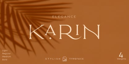 Karin is a Minimalist Modern Elegant vintage font with beautiful ligatures, tons of special alternative glyphs, ornament and multilingual support. It's a very versatile font that works great in large and small sizes. Elegant Karin is perfect for branding projects, Logo design, Clothing Branding, product packaging, magazine headers, or simply as a stylish text overlay to any background image.
 - PiS HansHand Pro by PiS,
$28.00 HansHand started out in 2003 as a simple free font, the adaption of my grimy handwriting. For its 10th anniversary it got a complete overhaul and lots of new characters. Now also available in BOLD for the first time, featuring scribbles, strokes, circles and boxes to underline the fast taking-notes-while-on-the-phone look!
 - La Vieste by Reyrey Blue Std,
$18.00 La Vieste is a Bold, Elegant and Modern font with beautiful ligatures, tons of special alternative glyphs, ornament and multilingual support. It is suitable for branding, signature, wedding invitation, promotion, product packaging, and other needs. Fall in love with its incredibly versatile style and use it to create spectacular designs! Includes: Uppercase and Lowercase Ligatures PUA Encode Support
 - Lautren by Azzam Ridhamalik,
$16.00 Introducing Lautren, a new delightful bold script with reversed contrast typeface. The Ideas of this fonts came from funny summer vibes mood which is made more neater and smoother. Lautren created with a tons of opentype features like contextual alternates, stylistic sets, ligatures, and swashes at the ending of the letters. A fun typeface to play with!
 - Aure Nox by Aure Font Design,
$23.00 Aure Nox inspires the chill whimsy of a haunted forest. The roughhewn forms of this decorative, sans-serif font engage the reader with a subtext of rakish charm. Surprisingly legible, Nox adds a bit of rebelious sass to text and titles, and a daring stance to astrological expressions and chartwheels. Nox is an original design developed by Aurora Isaac. After more than a decade in development, 2018 marks the first release of the CJ and KB glyphsets in regular, italic, bold, and bold-italic. The CJ glyphset is a full text font supporting a variety of European languages. A matching set of small-caps complements the extended lowercase and uppercase glyphsets. Supporting glyphs include standard ligatures, four variations of the ampersand, and check-mark and happy-face with their companions x-mark and grumpy-face. Numbers are available in lining, oldstyle, and small versions with numerators and denominators for forming fractions. Companion glyphs include Roman numerals, specialized glyphs for indicating ordinals, and a variety of mathematical symbols and operators. The CJ glyphset also includes an extended set of glyphs for typesetting Western Astrology. These glyphs are also available separately in the KB glyphset: a symbol font re-coded to allow easy keyboard access for the most commonly used glyphs. Though Nox stands well on its own as a text font, the more traditional sans-serif forms of Aure Jane pair well as an innocuous foil to Nox's brazen presence. Give Aure Nox a trial run! You may discover a permanent place for this font family in your typographic palette. AureFontDesign.com
 - Neuzeit Office by Linotype,
$50.99 The Neuzeit Office family is designed after the model of the original sans serif family Neuzeit S™ , which was produced by D. Stempel AG and the Linotype Design Studio in 1966. Neuzeit S itself was a redesign of D. Stempel AG’s DIN Neuzeit, created by Wilhelm Pischner between 1928 and 1939. Intended to represent its own time, DIN Neuzeit must have struck a harmonious chord. DIN Neuzeit is a constructed, geometric sans serif. It was born during the 1920s, a time of design experimentation and standardization, whose ethos has been made famous by the Bauhaus and De Stijl movements in art, architecture, and design. Upon its redesign as Neuzeit S in the 1960s, other developments in sans serif letter design were taken into account. Neuzeit S looks less geometric, and more gothic, or industrial. Separating it from typefaces like Futura, it has a double-storey a, instead of a less legible, single-storey variant. Unlike more popular grotesque sans serifs like Helvetica, Neuzeit S and especially the redesigned Neuzeit Office contain more open, legible letterforms. Neuzeit Office preserves the characteristic number forms that have been associated with its design for years. After four decades, Neuzeit has been retooled once again, and it is more a child of its age than ever before. Akira Kobayashi, Linotype’s Type Director, created the revised and updated Neuzeit Office in 2006. His greatest change was to retool the design to make its performance in text far more optimal. Additionally, he created companion oblique to help emphasize text.
 - Boardwalk Avenue Rough by Fenotype,
$30.00 Boardwalk Avenue Rough is a textured version of Boardwalk Avenue. It’s a robust type collection of three styles and two weights of each. It’s divided into Boardwalk Pen, Boardwalk Antiqua and Boardwalk Serif. Boardwalk Avenue’s core is a connected mono linear script that works fantastic when paired with either of the impressive serif styles. All the fonts work great on their own but try putting them all together for a complete display font setup for a project. Here’s a short introduction on what’s included: Boardwalk Avenue Rough Pen is a connected Script. It’s great for headlines, quotes or in packaging. It has a casual hand drawn vibe to it but it’s clean and legible. It’s equipped with automatic Contextual Alternates that keep the connections smooth and versatile. For instance when you type double letter another of them will automatically change to add variation. Or if you type “i” for example, as a first letter after space or after capital letter the code will add starting point to the letter to keep the letterforms more balanced. If you need more ambitious letterforms you can try Swash or Titling Alternates -there’s alternates for every standard letter and seek for even more alternates from the glyph palette. Boardwalk Avenue Rough Antiqua is a high contrast serif with strong character. It’s great for glamorous headlines or as a logotype. Boardwalk Avenue Rough Serif is a low contrast serif with bulky character. It’s great for strong and sturdy headlines or as a logotype.