10,000 search results
(0.036 seconds)
- Hocus Pocus by Anastasia Kuznetsova,
$14.00 I present my funny font with "Hocus Pocus"cutouts This is a playful font in the style of a cut-out "all capital letters". Lowercase letters are filled with letters (A, O, B, etc.), and uppercase keys have ordinary black letters. :) Great for sweet greeting cards and invitations, for playful branding and quotes, for unusual packaging and much more! This font is unique and simple:) Font Features • character set A-Z, A-Z; • 1 languages (English); • numbers It is recommended to use it in Adobe Illustrator or Adobe Photoshop Made with love ♡ Thank you for stopping by, and I wish you a creative day!
 - Soup Du Jour by PizzaDude.dk,
$18.00 "Soup Du Jour" is French and simply means "Soup Of the Day" - may not sound interesting, but I can tell you that I have had several tasty soup of the day served. I wanted to make a font that resembles that feeling of not really knowing what you get served, but you got a feeling that it is something good! The font has got 6 different versions of each letter, and they automatically changes as you type - it makes your text organic and lively, and probably quite tasty too! :) "Soup Du Jour" is also a well-known quote from one of my favourite movies: "Dumb and dumber"
 - Moon Slayer by Letterhend,
$19.00 Moon Slayer is a display brush script font with fun and pop feel. The strokes make this font outstanding and looks great for title. This type of font perfectly made to be applied especially in logo, headline, signage and the other various formal forms such as invitations, labels, logos, magazines, books, greeting / wedding cards, packaging, fashion, make up, stationery, novels, labels or any type of advertising purpose. Features : numbers and punctuation multilingual alternates / swashes and ligatures PUA encoded We highly recommend using a program that supports OpenType features and Glyphs panels like many of Adobe apps and Corel Draw, so you can see and access all Glyph variations.
 - Marker Aid by PintassilgoPrints,
$24.00 This expressive face was drawn with a dry chisel felt-tip marker, resulting in two striking, detail-rich fonts. Beyond its remarkable face, Marker Aid is a generous one, packed with 4 alternates for each letter, 2 for each number and yet some handy ornaments for creating a convincing - and rather cool - organic look. It is also equipped with OpenType features to instantly cycle the alternate glyphs and access stylistic alternates and ornaments. Marker Aid is available in two cuts, upright and oblique, for added flexibility. Make your mark! * Please note that these fonts have complex outlines and quite a load of glyphs, which may slow down some applications.
 - Palsam Pro by Abjad,
$110.00 Since the beginning, Palsam was intended to be a super multilingual family, with a real cursive Arabic companion, and a display cut. The typeface was designed to be used for setting text and titles of contemporary Arabic content, specially magazines, and websites. The Arabic and Latin scripts were designed at the same time, to make a true authentic bilingual typeface. Both scripts have affected each other in several ways through the entire design process, which happened within ten years. Palsam has an inviting, approachable, fashionable and humanist look. Thanks to its low contrast, open apertures, detailed calligraphic strokes, and smooth counters, which also make it easy to read at smaller sizes. The main highlight for Palsam was the Cursive companion. For the first time, the calligraphic Ijaza style was used as a model for designing the Arabic cursive. Since the Ijaza is a hyper combination of Naskh and Thuluth, which makes it perfect to be a companion for the upright Naskh. Moreover this script was used in margins, and to highlight specific content inside a paragraph in older manuscripts. With true cursive companions in five weights, and many opentype features, Palsam grants all the tools needed to set complex information and editorial designs applications. More than 1000 characters are included per weight, including small caps, fractions, old style and lining numbers, ligatures, contextual ligatures, and discretionary ligatures. It supports over 40 languages that use the Latin extended, as well as Arabic, Farsi, and Urdu Languages. The latin script was designed in collaboration with the Slovenian type designer Alja Herlah.
 - Anselm Sans by Storm Type Foundry,
$63.00One of the good practices of today’s type foundries is that they release their type families as systems including both serif and sans serif type. Usually, the sources of inspiration need to be well tried with time and practice, since production of a type family is such a laborious and complex process. From the beginning, it needs to be clear that the result will be suited for universal use. Such systems, complete with the broad, multi-lingual variations permitted by the OpenType format, have become the elementary, default instrument of visual communication. Non-Latin scripts are useful for a wide scope of academic publications, for packaging and corporate systems alike. And what about outdoor advertisement designated for markets in developing countries? Cyrillics and Greek have become an integral part of our OpenType font systems. Maybe you noticed that the sans serif cuts have richer variety of the light – black scale. This is due to the fact that sans serif families tend to be less susceptible to deformities in form, and thus they are able to retain their original character throughout the full range of weights. On the other hand, the nature of serifed, contrasted cuts does not permit such extremes without sacrificing their characteristic features. Both weights were drawn by hand, only the Medium cut has been interpolated. Anselm Ten is a unique family of four cuts, slightly strengthened and adjusted for the setting in sizes around 10 pt and smaller, as its name indicates. The ancestry of Anselm goes back to Jannon, a slightly modified Old Style Roman. I drew Serapion back in 1997, so its spirit is youthful, a bit frisky, and it is charmed by romantic, playful details. Anselm succeeds it after ten years of evolution, it is a sober, reliable laborer, immune to all eccentricities. The most significant difference between Sebastian/Serapion and Anselm is the raised x-height of lowercase, which makes it ideal for applications in extensive texts. Our goal was to create an all-round type family, equally suitable for poetry, magazines, books, posters, and information systems. - Anselm Serif by Storm Type Foundry,
$63.00 One of the good practices of today’s type foundries is that they release their type families as systems including both serif and sans serif type. Usually, the sources of inspiration need to be well tried with time and practice, since production of a type family is such a laborious and complex process. From the beginning, it needs to be clear that the result will be suited for universal use. Such systems, complete with the broad, multi-lingual variations permitted by the OpenType format, have become the elementary, default instrument of visual communication. Non-Latin scripts are useful for a wide scope of academic publications, for packaging and corporate systems alike. And what about outdoor advertisement designated for markets in developing countries? Cyrillics and Greek have become an integral part of our OpenType font systems. Maybe you noticed that the sans serif cuts have richer variety of the light – black scale. This is due to the fact that sans serif families tend to be less susceptible to deformities in form, and thus they are able to retain their original character throughout the full range of weights. On the other hand, the nature of serifed, contrasted cuts does not permit such extremes without sacrificing their characteristic features. Both weights were drawn by hand, only the Medium cut has been interpolated. Anselm Ten is a unique family of four cuts, slightly strengthened and adjusted for the setting in sizes around 10 pt and smaller, as its name indicates. The ancestry of Anselm goes back to Jannon , a slightly modified Old Style Roman. I drew Serapion back in 1997, so its spirit is youthful, a bit frisky, and it is charmed by romantic, playful details. Anselm succeeds it after ten years of evolution, it is a sober, reliable laborer, immune to all eccentricities. The most significant difference between Sebastian/Serapion and Anselm is the raised x-height of lowercase, which makes it ideal for applications in extensive texts. Our goal was to create an all-round type family, equally suitable for poetry, magazines, books, posters, and information systems.
 - Baluno by Luxfont,
$22.00 Introducing is a fun and playful pouty Baluno font. Font has embodied the graphic trend of cartoon flat illustrations and will successfully complement modern designs. The font has 2 types of faces, which can be used both independently and together by alternating letters in one word to avoid repeating letters, creating a unique heading. Family is ideal for children's themes, because the font resembles inflated balloons. Creates a relaxed mood and has fun. Set comes in many different carefully selected colors and gradient color options. Check the quality before purchasing and try the FREE DEMO version of the font to make sure your software supports color fonts. P.s. Have suggestions for color combinations? Write me an email with the subject "Baluno Color" on: ld.luxfont@gmail.com Features: Free Demo font to check it works. 2 types of faces. Lots of ready-made matched colors. Gradient color variants. Kerning. IMPORTANT: - Multicolor OTF version of this font will show up only in apps that are compatible with color fonts, like Adobe Photoshop CC 2017.0.1 and above, Illustrator CC 2018. Learn more about color fonts & their support in third-party apps on www.colorfonts.wtf -Don't worry about what you can't see the preview of the font in the tab "Individual Styles" - all fonts are working and have passed technical inspection, but not displayed, they just because the website MyFonts is not yet able to show a preview of colored fonts. Then if you have software with support colored fonts - you can be sure that after installing fonts into the system you will be able to use them like every other classic font. Question/answer: How to install a font? The procedure for installing the font in the system has not changed. Install the font as you would install the other fonts. How can I change the font color to my color? · Adobe Illustrator: Convert text to outline and easily change color to your taste as if you were repainting a simple vector shape. · Adobe Photoshop: You can easily repaint text layer with Layer effects and color overlay. ld.luxfont@gmail.com
 - Bumpy Road - Unknown license

- Comic Tantrum by David Engelby Foundry,
$25.00 Comic Tantrum is a versatile font – you can use it for headline posters, for infographics, for web pages or other media, when you need an expressive comic font. And you can skew it and squeeze it. It also has many special designed alternates, swash versions and ligatures. Have fun!
 - Aryaka by Letterafandi Studio,
$14.00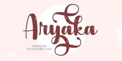 Aryaka is a modern handwritten font. It can be used for various purposes such as logos, wedding invitations, headings, t-shirts, letterhead, signage, labels, news, posters, badges and so much more. Aryaka is PUA encoded which means you can access all of the glyphs and swashes with ease!
 - Airwave by A New Machine,
$19.00 Airwave is suitable for display and logo work. It comes in three faces and would work well for technical designs or for giving a fresh, modern look. It is an all cap font with a few (A, E, N, R) lower cap alternates and contains West European diacritics.
 - Bogitha by Letterafandi Studio,
$14.00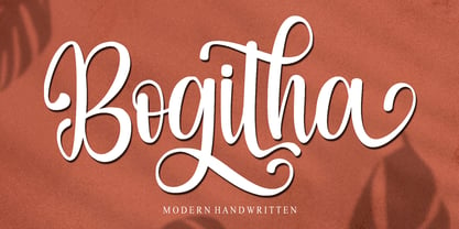 Bogitha is a modern handwritten font. It can be used for various purposes such as logos, wedding invitations, headings, t-shirts, letterhead, signage, labels, news, posters, badges and so much more. Bogitha is PUA encoded which means you can access all of the glyphs and swashes with ease!
 - Shinigami by Hoperative Design,
$19.00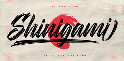 Shinigami is modern brush script font. It has a classy, elegant and modern look that can be used for T-Shirt, branding, invitations, Poster, wedding designs, social media posts, and much more! Shinigami Features : Ligature Stylistic Alternates Swash PUA encoded which means you can access all glyphs Multilingual Support
 - Display Prominent by Gerald Gallo,
$20.00 Display Prominent is a display font not intended for text use. It was designed specifically for display, headline, logotype, branding, and similar applications. In place of a lowercase there are short caps that are centered horizontally on the tall caps. There are also short numbers, punctuation, and miscellaneous characters.
 - Lavana by Nirmalagraphics,
$12.00 Lavana is made with a style brush. If you like natural fonts in a bold and handwriting style, you must have it. You can use Lavana for any needs, can be for logos, flyers, magazines, clothes, business card brochures and others. Lavana is also equipped with multi-lingual support.
 - Zaptron by Patria Ari,
$15.00 Zaptron is a modern sci-fi fonts with different shapes on uppercase and lowercase. With this difference, you can explore different combinations, also with more than 100 discretionary ligatures you can access by hit capslock/uppercase. This logo perfect for logotype especially on technology, construction, automotive, and more.
 - Heading Now by Zetafonts,
$39.00 Heading Now is the new incarnation of Heading Pro, developing the original typeface family designed by Francesco Canovaro for Zetafonts into a superfamily with 160 variant combinations. Built around 10 different widths, ranging from ultra-compressed to ultra-wide, and eight weights from thin to heavy, Heading Now provides a full spectrum of sans serif type solutions to your design problems. Born as a space-optimizing typeface for headers and titles, Heading Now can be used in its compressed widths to manage space on the printed page and on the screen. In these widths Heading Now excels in titles and subheadings, timetables, infographics and in situations of exuberant and excessive copywriting. On the other side of the width spectrum, you can find extended width variants, ready to be used for titling where style and energy matter more than pixel or paper economy. Heading family is not only made of extreme widths: you can use the medium width range to design body text. Matching italics provide versatility in text use, as well as a dynamic display alternate to the bolder weights. Heading Now keeps the original design of Heading, but extends the width and weight range while keeping its (post) modernist attention to readability and details. Each Heading Now font includes over 1100 characters with coverage for 200+ languages using Latin, Cyrillic and Greek alphabets. A full array of open-type features is included in each weight featuring also stylistic alternates, small caps, old-style and tabular numerals and positional figures. • Suggested uses: born as a space-optimizing typeface for headers and titles, Heading Now can be used in its compressed widths to manage space on the printed page and on the screen. Perfect for contemporary branding, web design, packaging and countless other projects; • 162 styles: 8 weights + 8 italics x 10 different widths + 2 variable fonts; • 1100 glyphs in each weight; • Useful OpenType features: Access All Alternates, Small Capitals From Capitals, Case-Sensitive Forms, Glyph Composition / Decomposition, Denominators, Fractions, Kerning, Standard Ligatures, Lining Figures, Localized Forms, Mark Positioning, Mark to Mark Positioning, Numerators, Oldstyle Figures, Ordinals, Proportional Figures, Stylistic Alternates, Scientific Inferiors, Small Capitals, Stylistic Set 1, Stylistic Set 2, Stylistic Set 3, Stylistic Set 4, Subscript, Superscript, Tabular Figures, Slashed Zero; • 220 languages supported (extended Latin, Cyrillic, Greek alphabets): English, Spanish, Portuguese, French, Russian, German, Javanese (Latin), Vietnamese, Turkish, Italian, Polish, Afaan Oromo, Azeri, Tagalog, Sundanese (Latin), Filipino, Moldovan, Romanian, Indonesian, Dutch, Cebuano, Igbo, Malay, Uzbek (Latin), Kurdish (Latin), Swahili, Greek, Hungarian, Czech, Haitian Creole, Hiligaynon, Afrikaans, Somali, Zulu, Serbian, Swedish, Bulgarian, Shona, Quechua, Albanian, Catalan, Chichewa, Ilocano, Kikongo, Kinyarwanda, Neapolitan, Xhosa, Tshiluba, Slovak, Danish, Gikuyu, Finnish, Norwegian, Sicilian, Sotho (Southern), Kirundi, Tswana, Sotho (Northern), Belarusian (Latin), Turkmen (Latin), Bemba, Lombard, Lithuanian, Tsonga, Wolof, Jamaican, Dholuo, Galician, Ganda, Low Saxon, Waray-Waray, Makhuwa, Bikol, Kapampangan (Latin), Aymara, Zarma, Ndebele, Slovenian, Tumbuka, Venetian, Genoese, Piedmontese, Swazi, Zazaki, Latvian, Nahuatl, Silesian, Bashkir (Latin), Sardinian, Estonian, Afar, Cape Verdean Creole, Maasai, Occitan, Tetum, Oshiwambo, Basque, Welsh, Chavacano, Dawan, Montenegrin, Walloon, Asturian, Kaqchikel, Ossetian (Latin), Zapotec, Frisian, Guadeloupean Creole, Q’eqchi’, Karakalpak (Latin), Crimean Tatar (Latin), Sango, Luxembourgish, Samoan, Irish, Maltese, Tzotzil, Fijian, Friulian, Icelandic, Sranan, Wayuu, Papiamento, Aromanian, Corsican, Breton, Amis, Gagauz (Latin), Māori, Tok Pisin, Tongan, Alsatian, Atayal, Kiribati, Seychellois Creole, Võro, Tahitian, Scottish Gaelic, Chamorro, Greenlandic (Kalaallisut), Kashubian, Faroese, Rarotongan, Sorbian (Upper Sorbian), Karelian (Latin), Romansh, Chickasaw, Arvanitic (Latin), Nagamese Creole, Saramaccan, Ladin, Kaingang, Palauan, Sami (Northern Sami), Sorbian (Lower Sorbian), Drehu, Wallisian, Aragonese, Mirandese, Tuvaluan, Xavante, Zuni, Montagnais, Hawaiian, Marquesan, Niuean, Yapese, Vepsian, Bislama, Hopi, Megleno-Romanian, Creek, Aranese, Rotokas, Tokelauan, Mohawk, Onĕipŏt, Warlpiri, Cimbrian, Sami (Lule Sami), Jèrriais, Arrernte, Murrinh-Patha, Kala Lagaw Ya, Cofán, Gwich’in, Seri, Sami (Southern Sami), Istro-Romanian, Wik-Mungkan, Anuta, Cornish, Sami (Inari Sami), Yindjibarndi, Noongar, Hotcąk (Latin), Meriam Mir, Manx, Shawnee, Gooniyandi, Ido, Wiradjuri, Hän, Ngiyambaa, Delaware, Potawatomi, Abenaki, Esperanto, Folkspraak, Interglossa, Interlingua, Latin, Latino sine Flexione, Lojban, Novial, Occidental, Old Icelandic, Old Norse, Slovio (Latin), Volapük;
 - Geomatrix by Type Innovations,
$39.00 The font Geomatrix is an original design by Alex Kaczun. It is a dynamic stencil interpretation based on his extremely successful Contax Pro family of geometric sans typefaces. Geomatrix is a contemporary stencil typeface based on generous proportions and clean, crisp lines.The stencil treatment is balanced visually with the stem weight of the font which creates a uniformity and harmony within the design. Geomatrix makes for easy reading and is ideal for long lines of copy. It exudes a strong sense of sophistication for a true stencil design. However, this is no ordinary stencil typeface. That's putting it mildly. Geomatrix is a font on STEROIDS! This unique OpenType font incorporates hundreds of CAPITAL alternate letter forms and glyph substitutions, automatically and on the fly, within InDesign and other Open Type applications. To turn this feature on, just typeset ALL CAPS and go into InDesign's OpenType>Stylistic Sets and select Set 1 from the menu. Turn character kerning from Metrics to Optical, adjust tracking to minus 20-30, and start typing to create some visually interesting letter substitutions and unique word combinations. Geomatrix was specifically designed to take advantage of the OpenType format, allowing the Graphic Designer a unique tool to achieve the desired degree of possible visual typographic effects. And finally, the character sets in Geomatrix have been expanded to include old-style figures and all Eastern European accented glyphs. Strap in and hold on to your seats. A revolution in new font technologies has begun! GEOMATRIX IMPORTANT PLEASE READ HOW TO ACCESS "ALTERNATE" STYLISTIC "SET 1" LETTER FORMS: Geomatrix is a unique OpenType font which incorporates hundreds of CAPITAL alternate letter forms and glyph substitutions, automatically and on the fly, within InDesign and other OpenType applications. To turn this feature on, just typeset ALL CAPS and go into InDesign\'d5s OpenType>Stylistic Sets and select "Set 1" from the menu. Turn character kerning from Metrics to Optical, adjust tracking to minus 20-30, and start typing to create some visually interesting letter substitutions and unique word combinations. This feature "stylistic set 1" can be toggled "on" or "off" anytime, allowing you to go back and forth, or select only the letters that you want to change. Geomatrix was specifically designed to take advantage of the OpenType format, allowing the Graphic Designer a unique tool to achieve the desired degree of possible visual typographic effects. And finally, the character sets in Geomatrix have been expanded to include old-style figures and all Eastern European accented glyphs. Strap in and hold on to your seats. A revolution in new font technologies has begun!
 - Rolphie by Aah Yes,
$9.95 Rolphie can be your go-to sans-serif, with 16 easy-to-read weights and 10 versions for each weight, and the subtlety of choice that represents. The versions contained in each weight are: Regular; Condensed; Half-Condensed; Expanded; Small Capitals: and their italic counterparts. (At heavier weights particularly it seemed to be justified to have two Condensed versions). Plus there's 20 funky versions with the letters all shook up (that would make a good title for a song), or jumbled around, plus some Shadow, Doubled-Up, College, and other FX versions. In total there's 180 variations, giving a comprehensive selection of both standard and funky fonts, and that subtle degree of choice of weight. To make things easier, the weights are put in ascending numerical order from 01 to 16, and the FX versions have been stuck in the 80s and 90s, (like two musicians I know). There are grouped packages available for certain weights (which have 10 fonts in them) and the complete family package (180 fonts) which represent better value than the individual fonts, and there's a basic package containing the Normal and Italic versions of all 16 weights (32 fonts). A limit of 5 sub-family packages has been imposed, unfortunately, which precludes a more comprehensive selection. To let you know what's in the font that you might otherwise never know about . . . With Discretionary Ligatures on, you get special characters if you type Mc St. Rd. Bd. Ave. c/o No. (p) (P) - include the full-stop/period. With Stylistic Alternates switched on, you get plenty of extra characters - including a WiFi symbol (type Wifi or WiFi) / bullet numbers instead of ordinary numbers / that different U-dieresis / special characters for c/o No. Mc / an upside down ~ / a huge bullet, and different forms for cent, dollar, percent, per-thousand. As you'd expect, there's all the accented characters for all Western European scripts using Latin letters, and standard ligatures, plus other Open Type features including Class Kerning, Slashed-Zero, Historical Forms, Sub- and Superscript numbers, fractions for halves, thirds and quarters, Ornamental forms giving bullet numbers, etc. There's also the main mathematical operators, symbols like card-suits and male/female signs and so on, and some more obscure stuff like schwa and O-horn, U-horn - and there's lots more if you can Access All Alternates. Much will depend on what your software recognises. The Small Caps versions have (intentionally) lost the ligatures for lower case ff, fi, fj, fl, fr, fu, ffi, ffj, ffl, ffr, ffu. The names for the weights are not absolute - we had to make up some names to make them stretch out to sixteen - so rather - see them as relative to each other, being in ascending numerical order by weight.
 - Coffee Morning by me55enjah,
$10.00 Handmade sans serif with rugged and imperfect edges shapes. Coffee Morning with Milk has rounded edges bring a vintage look and alternate character make it more stylish. And Coffee Morning Sans has rough stroke, imperfect shapes, make this typeface has its own taste, like coffee in the morning, raw and strong. * COFFEE MORNING WITH MILK features: All Caps, small caps, numeral, punctuation, alternate characters & ligatures. * COFFEE MORNING SANS features: All Caps, numeral, and punctuation. Have a wonderful day with a cup of coffee in the morning :)
 - Arinar by Hackberry Font Foundry,
$24.95 Arinar is a well modulated, rounded, humanist sans serif font family based on Brinar. A distant ancestor the basic letterforms is Minister (a Dutch bible font of the 19th century) through my first font, Diaconia. There are many OpenType features with over 600 characters: Caps, lower case, small caps, ligatures, discretionary ligatures, swashes, small cap figures, old style figures, numerators, denominators, accent characters (including CE), ordinal numbers (1st-infinity: lining and oldstyle), and so on. It is designed for text use in body copy.
 - Danah by Eyad Al-Samman,
$35.00 Danah” is the first name of a very close and cherished classmate, friend, and peer. Danah is a Palestinian woman who used to study with me in the same university where I was honorably introduced to her several years ago. In fact, I decided to dedicate this typeface wholly to her in return for all the years of friendship that we had spent together as classmates during the late 1990s. She was—and absolutely still—a source of support and inspiration for me in life due to her brilliant, big-hearted, and philanthropic personality. Danah likes different things in life and among them the sea, horses, reading, and also travelling. She lives and works now in Palestine, and yearns for being granted a new life—like many other free Palestinians—full of freedom, peace, and happyness. Danah® is a handwriting and scribbly Arabic display typeface. The main trait of this typeface is the realistic handwriting design of its letters and ligatures. This feature renders it as one of the stylish typefaces used for headlines and also texts. Among the distinguished letters of Danah® typeface are the “Qaaf”, “Kaaf”, “Meem”, “Noon”, and others. Moreover, Danah® typeface has a character set which supports Arabic, Persian, Urdu, and Latin letters/numerals with a limited range of specific Arabic and Latin ligatures. This font comes in a single weight (i.e., regular) with exactly 639 distinctive glyphs. Due to its free and streamlined design, Danah® typeface is appropriate for heading and text in Arabic, Persian, and Urdu. It can be graphically and visually exploited in magazines, posters, and interfaces of different things such as clothes and equipment. Moreover, it can be pleasingly used in writing personal, friendly, and unofficial letters, messages, documents, invoices, notes, dispatches and menus which require a smoothed handwritten touch and trend. It is also elegantly suitable for signs, books’ covers, advertisement light boards, and titles of flyers, pamphlets, novels, and books of children and adults. In brief, Danah® typeface is one of the new hand-drawn typefaces which can be brought into play efficiently in diverse graphic, typographic, calligraphic, and artistic works in different languages and cultures. 2018-09-13 00:00:00.000 10.0000 F25946-S114426 10913 Timeless URW Type Foundry https://www.myfonts.com/collections/timeless-duplicate-font-urw NULL NULL 2016-01-08 00:00:00.000 89.9900 F10913-S42560 54569 Jellofries Maulana Creative https://www.myfonts.com/collections/jellofries-font-maulana-creative https://cdn.myfonts.net/cdn-cgi/image/width=417,height=208,fit=contain,format=auto/images/pim/10000/JtHgrbkPi7YU282OWix69Tqb_97b690350e4b3ed453d7c27fe0eb6664.png Jellofries is a fancy brush script font. With brush bold contrast stroke, fun character with a bit of ligatures and alternates. To give you an extra creative work. Jellofries font support multilingual more than 100+ language. This font is good for logo design, Social media, Movie Titles, Books Titles, a short text even a long text letter and good for your secondary text font with sans or serif. Make a stunning work with Jellofries font. Cheers, Maulana Creative 2022-05-06 00:00:00.000 12.0000 F54569-S252887 38361 Alt Moav ALT https://www.myfonts.com/collections/alt-moav-font-andreas-leonidou https://cdn.myfonts.net/cdn-cgi/image/width=417,height=208,fit=contain,format=auto/images/pim/10000/70046_aa489c02cd589f8f924b405c901a8014.png Moav is a geometric experimental display typeface for use on logos,posters etc. 2011-12-13 00:00:00.000 15.0000 F38361-S179452 42255 M Elle HK Monotype HK https://www.myfonts.com/collections/m-elle-hk-font-monotype-hk NULL HK series fonts are in Unicode encoding and consists of BIG 5 character set and HKSCS characters. The character glyphs are based on the regular Traditional Chinese writing form and style. It is generally used in Taiwan ROC, Hong Kong and Macau. 2011-05-11 00:00:00.000 523.9900 F42255-S193845 71839 Kaerobi Kulokale https://www.myfonts.com/collections/kaerobi-font-kulokale https://cdn.myfonts.net/cdn-cgi/image/width=417,height=208,fit=contain,format=auto/images/pim/10004/ieVtB18gl4EgKrVVDIPLtX8b_33d93ffd2cd339b2544feb3d7a0a3121.png Kaerobi is an condensed display font, and with a style that is very different from the others. This font comes in four styles, Regular, Oblique, Rough, and Outline Version. Kaerobi is well-suited for posters, social media, headlines, magazine titles, clothing, large print formats - and wherever you want to be seen. Inspired by the style of design that is currently popular, and this is the answer to all the needs of every idea that you will pour in this modern era. We highly recommend using a program that supports OpenType features and Glyphs panels such as Adobe Illustrator, Adobe Photoshop CC, Adobe InDesign, or CorelDraw, so you can see and access all Glyph variations. This font is encoded with Unicode PUA, which allows full access to all additional characters without having special design software. Mac users can use Font Book, and Windows users can use Character Map to view and copy one of the extra characters to paste into your favorite text editor / application. Thank You. 2022-08-16 00:00:00.000 17.0000 F71839-S298671 52588 The Heather Romie Creative https://www.myfonts.com/collections/the-heather-font-romie-creative https://cdn.myfonts.net/cdn-cgi/image/width=417,height=208,fit=contain,format=auto/images/pim/10000/Lc4estBSB0wCiDunz9GNDUcb_097035319875b31f0a18a4bb2e8e675b.png The Heather Script is a formal calligraphy design, including Regular. This font is casual and pretty with a stroke. Can be used for various purposes. such as logos, product packaging, wedding invitations, branding, headlines, signage, labels, signatures, book covers, posters, quotes and much more. Heather Script featuring OpenType style alternatives, ligatures and International support for most Western Languages is included. To enable the OpenType Stylistic alternative, you need a program that supports OpenType features such as Adobe Illustrator CS, Adobe Indesign & CorelDraw X6-X7, Microsoft Word 2010 or a later version. How to access all alternative characters using Adobe Illustrator: *https://www.youtube.com/watch?v=XzwjMkbB-wQ Heather Script is coded with PUA Unicode, which allows full access to all additional characters without having to design special software. Mac users can use Font Book , and Windows users can use Character Map to view and copy any additional characters to paste into your favorite text editor/application. How to access all alternative characters, using the Windows Character Map with Photoshop: *https://www.youtube.com/watch?v=Go9vacoYmBw 2022-02-23 00:00:00.000 19.0000 F52588-S242949 16709 Pastina Lebbad Design https://www.myfonts.com/collections/pastina-font-lebbad-design https://cdn.myfonts.net/cdn-cgi/image/width=417,height=208,fit=contain,format=auto/images/pim/10000/220264_a574aa9e49d2f9f1da3950f1fef09123.png Pastina is an elegant serif font consisting of caps, lower case, and alternate characters. Soft serifs and the graceful flow of each character add to the classic feel of this font. 2008-07-31 00:00:00.000 24.9500 F16709-S66588 2367 Munira Script Picatype https://www.myfonts.com/collections/munira-script-font-picatype https://cdn.myfonts.net/cdn-cgi/image/width=417,height=208,fit=contain,format=auto/images/pim/10000/309621_5c93006e7517281c082dc7c75bfd1c2b.png Munira Script is a modern calligraphy design. This font is casual and pretty with swashes. It can be used for various purposes. such as logos, product packaging, wedding invitations, branding, headlines, signage, labels, signature, book covers, posters, quotes and more. Munira Script features OpenType stylistic alternates, ligatures and International support for most Western Languages. To enable the OpenType Stylistic alternates, you need a program that supports OpenType features such as Adobe Illustrator CS, Adobe Indesign & CorelDraw X6-X7, Microsoft Word 2010 or later versions. How to access all alternative characters using Adobe Illustrator: https://www.youtube.com/watch?v=XzwjMkbB-wQ How to access all alternative characters, using Windows Character Map with Photoshop: https://www.youtube.com/watch?v=Go9vacoYmBw Munira Script is coded with PUA Unicode, which allows full access to all the extra characters without having special designing software. Mac users can use Font Book , and Windows users can use Character Map to view and copy any of the extra characters to paste into your favourite text editor/app. If you need help or have any questions, please let me know. I'm happy to help :) Thanks & Happy Designing! 2019-07-05 00:00:00.000 10.0000 F2367-S10062 27004 Ketimun Hanoded https://www.myfonts.com/collections/ketimun-font-hanoded https://cdn.myfonts.net/cdn-cgi/image/width=417,height=208,fit=contain,format=auto/images/pim/10000/306179_8517cd9a57ccc15cff68737e17de4e85.png Ketimun means ‘cucumber’ in Bahasa Indonesia. At home we eat a lot (A LOT) of Indonesian food, which often includes Acar Ketimun (Sweet/sour cucumber salad). I usually make the simple version, but sometimes I go for the more elaborate cucumber salad (the recipe of which you’ll find on poster 2). Ketimun font is a rather delicious script font; uneven, organic and full of life. Comes with a fresh taste and lots of diacritics. 2019-06-06 00:00:00.000 15.0000 F27004-S120951 38675 Psalterium Alter Littera https://www.myfonts.com/collections/psalterium-font-alter-littera https://cdn.myfonts.net/cdn-cgi/image/width=417,height=208,fit=contain,format=auto/images/pim/10000/204202_94b78204200645ccd1daa5d5f1a63916.png A clean, smooth adaptation of the magnificent gothic types used by Johann Fust and Peter Schöffer in their famous Mainz Psalter (Psalterium Moguntinum) of 1457, also used in their Canon of the Mass (Canon Missae) of 1458, and in their Benedictine Psalter (Psalterium Benedictinum) of 1459. [Although these works were published after Gutenberg’s break with Fust, it is generally agreed that Gutenberg was working along with Fust and Schöffer on the Mainz Psalter while the 42-line Bible was still being printed.] In addition to the usual standard characters for typesetting modern texts, the font includes a comprehensive set of special characters, uncial initials (adapted from both the Mainz Psalter and early sixteenth-century Dutch types by Henric Pieterszoon), alternates and ligatures, plus Opentype features, that can be used for typesetting (almost) exactly as in the Mainz Psalter and later incunabula. The main historical sources used during the font design process were high-resolution scans from the copy of the Mainz Psalter preserved at the Österreichische Nationalbibliothek, Vienna (the only copy whose colophon includes the famous printer’s mark of Fust and Schöffer). Other sources were as follows: Masson, I. (1954), The Mainz Psalters and Canon Missae, 1457-59, London: Printed for the Bibliographical Society; Kapr, A. (1996), Johann Gutenberg - The Man and his Invention, Aldershot: Scolar Press (ch. 8); Füssel, S. (2005), Gutenberg and the impact of printing, Burlington: Ashgate (ch. 1); and Man, J. (2009), The Gutenberg Revolution, London: Bantam (ch. 8). Specimen, detailed character map, OpenType features, and font samples available at Alter Littera’s The Oldtype “Psalterium” Font Page. Note: Several uncial initials in The Oldtype “Psalterium” Font have been derived from corresponding characters in The Initials “Gothic C” Font, adjusting them to cope with the special (large) x-height and letter spacing of the Psalterium font (so the two sets of initials are not directly interchangeable). 2012-07-06 00:00:00.000 25.0000 F38675-S178340 23791 VLNL Donuts VetteLetters https://www.myfonts.com/collections/vlnl-donuts-font-vetteletters https://cdn.myfonts.net/cdn-cgi/image/width=417,height=208,fit=contain,format=auto/images/pim/10001/190114_ca5047d6d6754375933067862f9328a8.png VLNL Donuts’ first incarnation was designed already in 2005 by DBXL as a logo for Dutch funky house music outfit Hardsoul, and since then has been used for lots of music related projects. Donuts is heavily infused by hip 1970s geometric fonts like Blippo, Pump and ITC Bauhaus, but nonetheless has both feet in this modern day and age. Meticulously designed and tightly spaced, VLNL Donuts is very suitable for logos, headlines and music artwork. We especially recommend using it on big 12 album covers. Oh, and it got its name for obvious reasons (“the O looks like one...’) VLNL Donuts is deep fried, glazed and can be covered in a variety of sweetness: sprinkles, cinnamon, coconut, chopped peanuts, powdered sugar or maple syrup. They also can be filled with cream, custard or jam. As a very sweet and saturated snack should, VLNL Donuts is fitted with a full set of alternate swoosh caps that can be deployed to liven up your already ‘out there’ designs.
 - Address Sans Pro by Sudtipos,
$39.00 History is always in sight; it is constantly being reconsidered and reformulated in the context of now. We see approaches to art, fashion, textiles, homewares, furnishings … not to mention music, graphics and everything else that culturally enriches our daily lives, revisited and made anew for today. Address Sans indulges in the spirit and aesthetics of mid-century Modern – Italian industrial design, sleek coffee makers, stylish cars, seductive jazz pressed on vinyl – with a charm and charisma that defies time. It evokes history but is decisively created for today. Its design, in reality, is rooted in the condensed structure and block modulation of early 1950s German lettering intended for use in street signage, but when we started to work on the various weights and widths, the result was a set of fonts in a style similar to the typographic work developed by Butti and Novarese in the 60s. The multitude of potential applications for Address Sans then became clear. In a range of 3 widths and 8 weights each, Address Sans includes little verses, true italics, small caps and numerous alternative signs for a total of 48 fonts. The result is a functional typeface that is effortlessly seductive, with geometric features and design details that ooze cool, and take it away from mere reinterpretation towards typographic forms that adapt perfectly for contemporary use.
 - Totally Terrific by Set Sail Studios,
$12.00 I love Tea. Do you love Tea? Good. Because there's a whole load of T's in the Totally Terrific Typeface! Bursting with fun and bouncy brush-strokes, this typeface will undoubtedly add a dash of cheeky playfulness to your text - ideal for greeting cards, branding, merchandise, invitations & hand-made quotes. The awesome thing about this typeface is that it's so easy to mix up the various font styles and create totally unique, hand-made looking words each time. The lowercase characters can be connected (Totally Terrific Regular) or un-connected (Totally Terrific Two), and will work in any combination of these two versions. Not only does it also look great in all-caps, but the uppercase letters will fit in with the lowercase at any location - I'm serious! Just throw one in the middle of a word, I dare you ;). Your download will contain 2 font files: Totally Terrific Regular • Contains a full set of connected lowercase letters, uppercase letters, a large range of punctuation, numerals, and multilingual support. Totally Terrific Two • A second version of the Totally Terrific Typeface, with a completely new set of un-connected lowercase characters. These are designed to work in perfect harmony with the connected set from the other font file. Just keep switching between the two fonts to create unique word layouts!
 - BlincType Letterpress Fontpak by Chank,
$99.00 Add some old fashioned charm to your designs with the distressed alphabets in the new BLINCtype Letterpress Fontpak, a brand new font collection containing 8 letterpress-inspired fonts from the creative minds at Blinc Publishing in St. Paul, MN. The BLINCtype Letterpress Fontpak contains a handy concise assortment of old-school display fonts. From the old Western "WANTED" poster look of Prospect Modern, to the no-nonsense all-caps classic Goshen and its lowercase companion Gideon, these fonts are inspired by wooden letterpress blocks and other archaic technologies. It's like having your own letterpress print studio! Except it's all instantly downloadable right now as easy-to-use fonts! Designers love working with the Cheltenham-esque Gomorrah and its grittier, grungier counterpart, Sodom. The bouncy Golgotha has a rough and tumble readiness that exudes a hand-made charm, while Hamilton Offset has a cryptic, experimental look and feel that gives the impression of double-vision. You also get the newest member of the Blinc font family, Player Piano, which was based on punch-cut stencil letters on an old player piano paper song roll. Purchase the BLINCtype Letterpress Fontpak today and you'll be able to download and start using these 8 great fonts right away! The BLINCtype Letterpress Fontpak contains the fonts: Gideon, Golgotha, Gomorrah, Goshen, Hamilton Offset, Player Piano, Prospect Modern and Sodom.
 - Touvlo by Monotype,
$49.99 New from the Monotype Studio’s Creative Type Director, Emilios Theofanous, Touvlo – meaning brick in Greek – is an homage to London and the view from his studio window. A zestful, modern interpretation of a classic genre, Touvlo skillfully captures the spirit of early British grotesque typefaces through playful terminals and lively curves. Touvlo offers an array of styles, from clean uprights to characterful Italics, and exuberant Backslants. Its regular upright weights are optimized for long text, with prominent and visible vertical contrast, creating rhythm and texture for comfortable reading. The Italics are designed to be visibly distinct, with narrower proportions and calligraphic shapes, offering brightness and emphasis wherever needed. The Backslants are an unexpected and energetic addition, providing an element of surprise while following similar design choices as the Italics, packing a particular punch. With a total of 24 weights in 3 styles across 3 variable fonts, Touvlo’s variety adds flavor in any use case, and can withstand complex typographic layouts or unexpected and peculiar settings. Touvlo’s weights range from Thin to Black, giving it an expressive edge for headlines. Its lyrical Drop caps are the finishing touch, featuring exquisite birds and creatures inspired from ornaments found in type specimen books. Touvlo’s spirit is radiant; becoming more than a voice; a reimagining of a classic genre and a must have for every designer's typographic palette.
 - Touvlo Variable by Monotype,
$229.99 New from the Monotype Studio’s Creative Type Director, Emilios Theofanous, Touvlo – meaning brick in Greek – is an homage to London and the view from his studio window. A zestful, modern interpretation of a classic genre, Touvlo skillfully captures the spirit of early British grotesque typefaces through playful terminals and lively curves. Touvlo offers an array of styles, from clean uprights to characterful Italics, and exuberant Backslants. Its regular upright weights are optimized for long text, with prominent and visible vertical contrast, creating rhythm and texture for comfortable reading. The Italics are designed to be visibly distinct, with narrower proportions and calligraphic shapes, offering brightness and emphasis wherever needed. The Backslants are an unexpected and energetic addition, providing an element of surprise while following similar design choices as the Italics, packing a particular punch. With a total of 24 weights in 3 styles across 3 variable fonts, Touvlo’s variety adds flavor in any use case, and can withstand complex typographic layouts or unexpected and peculiar settings. Touvlo’s weights range from Thin to Black, giving it an expressive edge for headlines. Its lyrical Drop caps are the finishing touch, featuring exquisite birds and creatures inspired from ornaments found in type specimen books. Touvlo’s spirit is radiant; becoming more than a voice; a reimagining of a classic genre and a must have for every designer's typographic palette.
 - Osmane by Skiiller Studio,
$20.00 Osmane is a beautiful script type script designed with a neat concept, , even businesses, companies, clothing, and much more What's include: Stylistic alternate for lowercase PUA Encoded Characters - Fully accessible without additional design software. Basic Latin Language Support How to access alternate glyphs? you can see it on this link ( http://goo.gl/1vy2fv )
 - Grasstrack by Gassstype,
$33.00 Hello Everyone, introduce our new product Font Grasstrack This Is Rough Brush Font.This is a Textured Natural Style and classy style with a clear style and dramatic movement. That is has charming, authentic and relaxed characteristic more natural look to your text. You can activate 29 Ligatures and 5 Alternate glyphs OpenType panel.
 - Italia by ITC,
$29.00Italia is the work of Colin Brignall, a refreshingly different serif typeface. At first glance, Italia might seem comparable to any other square serif typeface, but it has a distinctive pattern all its own. Italia can be used as either a display or text typeface and will give any text a unique look. - Nekst by Serebryakov,
$35.00 Nekst is geometric sans-serif. So it can only seem at first glance. Non-standard forms of some letters, behave unexpectedly and eccentric in a text line. It’s add notes of old grotesques and futuristic aesthetics to the modern-nordic image. Nekst font family includes seven weights supporting Cyrillic and extended Latin.
 - FM Bebel by FontMeister,
$29.95 Bebel is a straight forward font. A modern geometric typeface influenced by architectural reproduction drawings such as blueprints and dyelines. It's medium weight makes it very legible, even in small sizes. You can use this font to create posters, greeting cards, scrapbooks, CD labels, T-shirts, coffee mugs, digital videos websites and banners.
 - West Hood by Letterhend,
$16.00 West Hood is a Classic Wild West style font that ready to rock! This old fashioned font is really something since it has many styles. This item consist of 6 fonts in various styles which you can play around with it. Suitable for design needs with a touch of the classic western look.
 - Careista by AEN Creative Studio,
$12.00 Careista is a sweet and flowing handwritten font. It is PUA encoded which means you can access all of the glyphs and swashes with ease! It maintains its classy calligraphic influences while feeling contemporary and fresh. Fall in love with its incredibly distinct and timeless style and use it to create spectacular designs!
 - Flimsy by Bogstav,
$17.00 Flimsy is 100% handmade, but digitally remastered. I removed some blobs here and there, but kept enough of the original handmade line in order to make the Flimsy stand out as an organic and powerful ALL CAPS font! I've also added 5 slightly different versions of each letter, along with multilingual support!
 - Regalia by Philatype,
$30.00 Regalia is an angular display face created with octagonal forms. There are 4 fonts to suit your needs. Regalia Basic and Regalia Basic Stamped includes only the alphabet and numerals; perfect for simple poster or logo work. For more comprehensive typesetting needs, you can find full character sets in Regalia and Regalia Stamped.
 - Ornamental Heritage by Haniefart,
$15.00 Ornamental Heritage is a classic hand-drawn style font modified with various ornaments to make it look attractive and look modern and elegant. Ornamental Heritage can be used for company brands, logos, movie titles, drink bottles, drinking glasses and so on. Ornamental Heritage also includes punctuation, quotation marks, numbers, symbols and more.
 - Office Squeeze by Hanoded,
$15.00 Office Squeeze was made with a Japanese brush pen. I kind of like the fact that, despite its roughness, Office Squeeze still maintains a very neat appearance. Office Squeeze can be used for just about anything, but product packaging, logos and posters spring to mind. Comes with a generous square footage of diacritics.
 - Palm Honey by PeachCreme,
$19.00 We were quite often asked to create heart font with modern letters, stepping back a little from a calligraphic look (Hi, Sophia Ronald!) Palm Honey beautifully works for modern wedding stationery projects. Palm Honey has beginning lowercase, ending lowercase, connecting heart lowercase alternates. You can test your custom text in the box above!
