10,000 search results (0.013 seconds)
  1. Born To Ride by Gassstype, $25.00
    Here comes a New font, Introducing BORN TO RIDE It's Weird Display Typeface is a Natural Brush Style and Authentic classy style, this font is great for your creative projects such as watermark on photography, and perfect for logos & branding, invitation,advertisements,product designs. It also features a wealth of special features including You can activate 22 Ligatures OpenType panel.
  2. VLNL Tp Kurier by VetteLetters, $35.00
    VetteLetters is proud to bring you the TpKurier-family. It is cooked up by our German chef Martin Lorenz currently living in lovely Barcelona! Chef Lorenz about the TpKurier recipe: “TpKurier is the second redesign we did of Courier. The first redesign in 2000, although based on a five-unit grid, was drawn completely by hand. Six years later we designed another grid version of Courier, and the TpKurier family was born. This version is completely constructed up till its last detail. We didn't want to correct ‘mistakes’ deriving from the use of the grid, but instead make them visible (see “S”). TpKurier is based on a very simple grid, composed a proportion of four units high by two units wide. A series of other links between them make it possible to form a font from this grid. We felt it was important to consistently work within these limitations so that any unexpected asperities would help provide the font with its character. Even though it is a rough constructed typeface it was important to us to design real italic lower case letters and not just a sloped roman (see “a”, “g” or “s”). The first family published contained a serif and sans-serif version of the TpKurier, with italic and bold.”
  3. Home To Rome by Typefactory, $14.00
    Home to Rome is a classy and lovely script font. It has a elegant style and is perfect for creating original designs. This lovely casual brush font is really great for a logo, clothing, quotes, headings, wedding invitations, posters, and many others.
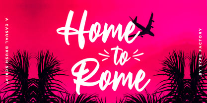
  4. Going to School by Tlatous Type, $19.00
    Introducing Going to School Font by Tlatoustype Going to School is a Fun Modern Handwritten Font. Going to School is perfect for Book Cover, product packaging, branding project, megazine, social media, wedding, or just used to express words above the background. Going to School also multilingual support.
  5. Back To School by MDF, $4.00
    The Back to School Doodle font is a delightful and imaginative typeface that captures the essence of the back-to-school season with its playful doodles and vibrant charm. Each letter is adorned with whimsical illustrations, reminiscent of a child's doodles on a classroom desk. This font features hand-drawn characters filled with fun and colorful details. From doodled stars, pencils, and books to playful arrows, apples, and globes, every letter is an artwork in itself. The doodles add a sense of excitement and creativity to the font, making it perfect for capturing the spirit of going back to school.
  6. Jungle to jungle by Aminmario Studio, $20.00
    This is a supercharged font, with natural brush, quick strokes and sharp details. Perfect for challenging jobs, titles, movie,logos, apparel, t-shirts, hoodies, quotes, product packaging, or anything that needs a typographic turbo-boost and a typographic unique style. Thanks for checking out this font. I hope you enjoy it!
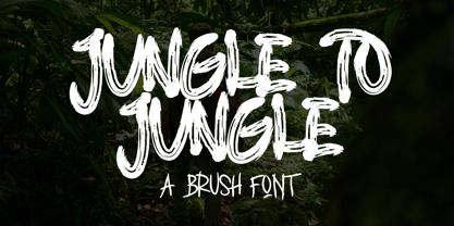
  7. Things To Remember by Orenari, $14.00
    Things To Remember is a chill and friendly display font. Its natural and unique style makes it incredibly fitting to a large pool of designs. Level up your creative project with this thin yet memorable font.
  8. Mono To Go by buero bauer, $20.00
    Mono To Go is a monospace typeface with a constructed, grid-based body and a playful and quirky spirit. Built from circles and other simple geometric shapes, it sees itself as a contemporary interpretation of the early, consistently reduced typefaces of modernism. With its modular concept, the typeface invites you to "build" individually combined word pictures. Depending on your preference for the type of composition, stylistic alternatives and open typeface features offer you a wide range of possibilities. The rhythm of the glyphs and their distinctive ascenders and descenders give the typeface a confident character for bold designs. The typeface works best in larger sizes, e.g. for brands, poster and cover designs, film titles, exhibition displays or generally for striking headlines. The character set contains 600 glyphs, including full language support for Western, Central and Eastern Europe, digits and oldstyle figures, punctuation, currency and mathematical symbols, and the entire set as small caps. mono to go was designed by buero bauer (2019–2021). Special thanks to Franziska Weitgruber for her support.
  9. BACK TO SCHOOL - Personal use only
  10. Geoffrey - Personal use only
  11. ThreadFun - Unknown license
  12. I Want My TTR! (Condensed) - Unknown license
  13. This family was created inspired from two French (one so common and a very rare large one) "toy print" boxes, named Le petit imprimeur, with rubber stamp characters from the 1920's. The big difference from our 1920 My Toy print is that this font is complete, with upper and lower cases, accented, complete punctuation and some symbols. The doubly of each usual character in each style (A-Z/a-z and numerals) allow to give a rich and variously uneven appearance, looking like the results of the real use of those old rubber stamps, with bad kernings and alignement. The font is containing West (including Celtic), Central, East European, Turkish and Cyrillic characters. The bold style may be used as a reinforcement, mixed with normal style without disadvantage, allowing finally four choices for each usual letter... The original size is 6mm (about 17 pts).
  14. Talking to the Moon - Personal use only
  15. Janda Closer To Free - Personal use only
  16. KR Off To Work! - Unknown license
  17. Talk to the hand - Unknown license
  18. An ode to noone - Unknown license
  19. Balls to the Wall - Unknown license
  20. KR Coffee To Go - Unknown license
  21. KR Back To School - Unknown license
  22. Back to the Futurex - Unknown license
  23. How To Consume Oxygen by Vic Fieger, $8.99
    How To Consume Oxygen was created with the plan of emulating words written on a fluted-steel 'warehouse'-type door in advanced state of rusting.
  24. RM True To Type by Ray Meadows, $19.00
    Throw away the carbon paper, ribbons and Tippex ... now you can get that typewritten look with RM True to Type. Legible at all sizes, it is available in regular and bold. That faithful old typewriter has given many years of valiant service, but now the keys are worn and blocked with ink. The Old styles replicate the wear and tear of years of use. Includes: Western European, Central European, Baltic & Turkish sets Due to the modular nature of this design there may be a slight lack of smoothness to the curves at very large point sizes (around 100 pt and above).
  25. KG Next To Me by Kimberly Geswein, $5.00
    Hand sketched lettering in a chalkboard, Pinterest inspired style.
  26. Music To My Eyes by Comicraft, $19.00
    This singsong font is Chock Full o’Notes to help semibreviate your lettering with melodic minims, quarter notes and quavers! NOTE, however that we cannot take responsibility for any arrangement that my seem out of tune to the trained eye.
  27. Nouveau To Go JNL by Jeff Levine, $29.00
    Nouveau To Go JNL is the digital version of the hand lettered title found on the 1915 sheet music for the song "Don't Bite the Hand That's Feeding You", and is available in both regular and oblique versions.
  28. Fd Bored To Death by Fortunes Co, $19.00
    This font is inspired by a horror film title or opening, taking inspiration from underground bands, made from watercolor brushes and so you get sharp textured results, with its defiant shape, rough edges and unadulterated imperfections. and give a spooky, firm, horror impression. There are several unique ligatures that can make sentences more unique. Regular Stylistic alternates SS01-SS03 Ligatures os, St, fl, ff, ffi, ffl, ae, si, ss, ha Multilanguge Support Latin Pro Uppercase & Lowercase Numerals & Punctuation 443 glyphs
  29. East To West JNL by Jeff Levine, $29.00
    Sheet music for a song featured in "East to West", a film starring Mexican bombshell Dolores Del Rio, had the movie's name lettered in a bold sans style with early Art Deco influences. East to West JNL preserves not only the name, but all of the characteristics of this wonderful bit of typographic nostalgia.
  30. Janda Closer To Free by Kimberly Geswein, $5.00
    This chunky serif handwriting is fun but still completely legible for children.
  31. Back To Teacher Outline by NJ Studio, $19.00
    Hi...Thank for your visit :) Back to school (Outline & Inline) a simple handwritten font. It features fun characters that will take your projects to the next level! This font is PUA code which means you can easily access all the glyphs that are full of simple! It also features many special features including glyphs. font designs that are made for various vector designs, printing such as digital wedding blogs, online shops, social media, while printing can be used in the field of product clothing, accessories, bags, pins, logos, business cards, watermarks and many others ... so it can make your product look simple and attractive, and also Multilingual support!!! Happy design ...
  32. Go To Town JNL by Jeff Levine, $29.00
    Vintage sheet music for a song from the 1941 animated feature "Mr. Bug Goes to Town" featured a casual, hand-lettered inline type style on its cover page. Recreated as the digital font Go to Town JNL, this design is presented in all the imperfect glory of pen and ink lettering. Go to Town JNL is available in the regular inline version as well as a solid version. A bit about the cartoon: The project was created by the legendary Fleischer Studios in Miami, Florida (they had relocated from New York City), after they could not obtain the rights to adapt Maurice Maeterlinck's "The Life of the Bee". Beset by the expenses of relocating to Florida, growing production costs on the full-length feature cartoon and other problems; mid-way through the making of "Mr. Bug Goes to Town" the Fleischer brothers were forced to sell their studio to their distributor (Paramount Pictures) in order to continue in operation. It was released on Dec. 5, 1941 - just two days before the Japanese attack on Pearl Harbor. The release [and subsequent re-release by Paramount as "Hoppity Goes to Town"] was a disappointing failure, earning [as late as 1946] only $241,000 of the initial cost of $713,511 it took to make the film.
  33. KG Ways to Say Goodbye - Unknown license
  34. KG Something to Believe In - Personal use only
  35. Set Fire to the Rain - Personal use only
  36. KR Back To School Dings - Unknown license
  37. Ms to try a bon? - Unknown license
  38. KG Something To Believe In by Kimberly Geswein, $5.00
    Highly legible writing with a painted, stamped effect.
  39. CA Hail To The King by Cape Arcona Type Foundry, $19.00
    Created exclusively for an exhibition catalog for the exhibition 'Hail to the King, Baby!'. CA Hail to the King is based upon different letters taken from handmade signs from all over the world. You will find a lot of unexpected specials: irregular character sizes and styles (uppercase characters are bold; lowercase characters are in regular style) everything that makes CA Hail to the King so varied and unpredictable. In addition to west European diacritics an extensive central European character set were added including some very nice stylistic alternates.
  40. Set Fire To The Rain by Kimberly Geswein, $5.00
    This font was drawn with a round marker and is very bubbly and girly.
Looking for more fonts? Check out our New, Sans, Script, Handwriting fonts or Categories
abstract fontscontact usprivacy policyweb font generator
Processing