10,000 search results
(0.019 seconds)
- CoffeeBreak by Andinistas,
$36.00 The coffee made typography. CoffeeBreak is a typefamily designed by Carlos Fabian Camargo G. Its purpose is to communicate similar feelings to the ones you get when you first try the best roasted Colombian coffee early in the morning. That is the reason of the waiting, accompanied, or when you only want to be, nuances your design with its fonts full of flavor, texture and passion. For each time, every time, it gives you hints of flavor to design your day. It unleashes your artistic streak mixing possibilities as you wish, to your taste or the taste of your friends or that special someone. From handwriting to every warm drop of your first mug of the morning, we've always got something for you. Eye catching, modern, beautiful, cool and adventurous styles in the CoffeeBrwak shop ready for you to purchase. - CoffeeBreak A & B: 2 typographic tools with countless swashes and ligatures ideal for use at the beginning, in the middle or end of words that need italics, flavored dancers and rhythm masterfully expressed in gestural strokes for his calligraphic experimental logic. - Coffee Break Script 1 & 2: write them you can easily with decorative letters advocating a return to the artisan product ingenuity of the primacy of man over machine so your upper and lower case letters travel in a single line. - CoffeeBreak Words & WordsBold: It contains words specially designed to attract attention. - CoffeeBreak Dingbats: They are figurative silhouettes with textures that add warmth and a highly communicative environment. All are easily activated glyphs using the Glyphs panel in Illustrator, InDesign and Photoshop. Special thanks: Ilustrations: Eduardo Gomes. Photos: Karen Salvatierra. Texts: Javier Lineares- Description: Ernesto Googolplex. French translation: Marta Cano
 - Rae's Monogram Family by Outside the Line,
$19.00 Rae's Monogram Family is a contemporary take on monograms. Rae's Monogram One letters are best used as the right and left letters. You can add Rae's Monogram Two for the middle letter. Rae's Monogram Doodles One are 50 small illustrations to use with the monogram. If you don't see the one you want take a look at over 1,000 others in Outside the Line's Doodle font library. Of course just because it was planned this way doesn't mean you have use them this way. Use your imagination! You can use just one font, or two or all three. Commercial Licensing: Rae's Monogram Doodles One uses Outside the Line's normal licensing if you are using an illustration alone or not in a monogram on commercial goods. Plz read the http://www.outside-the-line.com/license/ Rae's Monogram One and Two offers Impression Licensing. If you don't intend to sell any items made from these fonts you don't need an additional license. But if you do, to make it easier Outside the Line offers the added ability to buy this license upgrade at the time you place your order. Plz contact Rae directly to do that. By default, you're allowed to sell 250 items in total without any additional licensing required and should you intend to sell more items, additional levels of licensing can be purchased now or at any time in the future. To be clear, 250 items doesn't refer to how many different items you may create but rather refers to the number of total sales of any item or items created with these fonts. If you have any questions or need additional commercial licensing feel free to contact Rae at hello@outside-the-line.com She is always happy to hear from you.
 - Affair by Sudtipos,
$99.00 Type designers are crazy people. Not crazy in the sense that they think we are Napoleon, but in the sense that the sky can be falling, wars tearing the world apart, disasters splitting the very ground we walk on, plagues circling continents to pick victims randomly, yet we will still perform our ever optimistic task of making some little spot of the world more appealing to the human eye. We ought to be proud of ourselves, I believe. Optimism is hard to come by these days. Regardless of our own personal reasons for doing what we do, the very thing we do is in itself an act of optimism and belief in the inherent beauty that exists within humanity. As recently as ten years ago, I wouldn't have been able to choose the amazing obscure profession I now have, wouldn't have been able to be humbled by the history that falls into my hands and slides in front of my eyes every day, wouldn't have been able to live and work across previously impenetrable cultural lines as I do now, and wouldn't have been able to raise my glass of Malbeck wine to toast every type designer who was before me, is with me, and will be after me. As recently as ten years ago, I wouldn't have been able to mean these words as I wrote them: It’s a small world. Yes, it is a small world, and a wonderfully complex one too. With so much information drowning our senses by the minute, it has become difficult to find clear meaning in almost anything. Something throughout the day is bound to make us feel even smaller in this small world. Most of us find comfort in a routine. Some of us find extended families. But in the end we are all Eleanor Rigbys, lonely on the inside and waiting for a miracle to come. If a miracle can make the world small, another one can perhaps give us meaning. And sometimes a miracle happens for a split second, then gets buried until a crazy type designer finds it. I was on my honeymoon in New York City when I first stumbled upon the letters that eventually started this Affair. A simple, content tourist walking down the streets formerly unknown to me except through pop music and film references. Browsing the shops of the city that made Bob Dylan, Lou Reed, and a thousand other artists. Trying to chase away the tourist mentality, wondering what it would be like to actually live in the city of a billion tiny lights. Tourists don't go to libraries in foreign cities. So I walked into one. Two hours later I wasn't in New York anymore. I wasn't anywhere substantial. I was the crazy type designer at the apex of insanity. La La Land, alphabet heaven, curves and twirls and loops and swashes, ribbons and bows and naked letters. I'm probably not the very first person on this planet to be seduced into starting an Affair while on his honeymoon, but it is something to tease my better half about once in a while. To this day I can't decide if I actually found the worn book, or if the book itself called for me. Its spine was nothing special, sitting on a shelf, tightly flanked by similar spines on either side. Yet it was the only one I picked off that shelf. And I looked at only one page in it before walking to the photocopier and cheating it with an Argentine coin, since I didn't have the American quarter it wanted. That was the beginning. I am now writing this after the Affair is over. And it was an Affair to remember, to pull a phrase. Right now, long after I have drawn and digitized and tested this alphabet, and long after I saw what some of this generation’s type designers saw in it, I have the luxury to speculate on what Affair really is, what made me begin and finish it, what cultural expressions it has, and so on. But in all honesty it wasn't like that. Much like in my Ministry Script experience, I was a driven man, a lover walking the ledge, an infatuated student following the instructions of his teacher while seeing her as a perfect angel. I am not exaggerating when I say that the letters themselves told me how to extend them. I was exploited by an alphabet, and it felt great. Unlike my experience with Ministry Script, where the objective was to push the technology to its limits, this Affair felt like the most natural and casual sequence of processions in the world – my hand following the grid, the grid following what my hand had already done – a circle of creation contained in one square computer cell, then doing it all over again. By contrast, it was the lousiest feeling in the world when I finally reached the conclusion that the Affair was done. What would I do now? Would any commitment I make from now on constitute a betrayal of these past precious months? I'm largely over all that now, of course. I like to think I'm a better man now because of the experience. Affair is an enormous, intricately calligraphic OpenType font based on a 9x9 photocopy of a page from a 1950s lettering book. In any calligraphic font, the global parameters for developing the characters are usually quite volatile and hard to pin down, but in this case it was particularly difficult because the photocopy was too gray and the letters were of different sizes, very intertwined and scan-impossible. So finishing the first few characters in order to establish the global rhythm was quite a long process, after which the work became a unique soothing, numbing routine by which I will always remember this Affair. The result of all the work, at least to the eyes of this crazy designer, is 1950s American lettering with a very Argentine wrapper. My Affair is infused with the spirit of filete, dulce de leche, yerba mate, and Carlos Gardel. Upon finishing the font I was fortunate enough that a few of my colleagues, great type designers and probably much saner than I am, agreed to show me how they envision my Affair in action. The beauty they showed me makes me feel small and yearn for the world to be even smaller now – at least small enough so that my international colleagues and I can meet and exchange stories over a good parrilla. These people, whose kindness is very deserving of my gratitude, and whose beautiful art is very deserving of your appreciation, are in no particular order: Corey Holms, Mariano Lopez Hiriart, Xavier Dupré, Alejandro Ros, Rebecca Alaccari, Laura Meseguer, Neil Summerour, Eduardo Manso, and the Doma group. You can see how they envisioned using Affair in the section of this booklet entitled A Foreign Affair. The rest of this booklet contains all the obligatory technical details that should come with a font this massive. I hope this Affair can bring you as much peace and satisfaction as it brought me, and I hope it can help your imagination soar like mine did when I was doing my duty for beauty.
 - Retrio by Luxfont,
$18.00 Introducing Retrio. Original glyphs with echoed behind. As if the letters were moved, but the kinetic trail remained. Colored, gradient, with transparency or solid - many options in one family for any task and for every taste. The font will emphasize the style of the 20th century in illustration. Discos, electro music, records, nostalgia - these are the associations that this font family evokes, which is very important in design. At the same time, the Retrio font is not outdated, it was created taking into account modern trends in retro themes. A unique family in which there are both color and classic monochrome versions. Great versatility in use is provided by the many fonts in the set. Great for ad designs, posters, headlines and covers. Check the quality before purchasing and try the FREE DEMO version of the font to make sure your software supports color fonts. P.s. Have suggestions for color combinations? Write me an email with the subject "Retrio Color" on: ld.luxfont@gmail.com Features: - Free Demo font to check it works. - Uppercase and lowercase the same size. - With transparency and without. - Mega high-quality gradients in letters. - Kerning. IMPORTANT: - Multicolor version of this font will show up only in apps that are compatible with color fonts, like Adobe Photoshop CC 2017.0.1 and above, Illustrator CC 2018. Learn more about color fonts & their support in third-party apps on www.colorfonts.wtf -Don't worry about what you can't see the preview of the font in the tab "Individual Styles" - all fonts are working and have passed technical inspection, but not displayed, they just because the website MyFonts is not yet able to show a preview of colored fonts. Then if you have software with support colored fonts - you can be sure that after installing fonts into the system you will be able to use them like every other classic font. Question/answer: How to install a font? The procedure for installing the font in the system has not changed. Install the font as you would install the classic fonts. How can I change the font color to my color? · Adobe Illustrator: Convert text to outline and easily change color to your taste as if you were repainting a simple vector shape. · Adobe Photoshop: You can easily repaint text layer with Layer effects and color overlay. ld.luxfont@gmail.com
 - Varietta by Sudtipos,
$39.00 Varietta is the result of my fascination with photographing the type designs of some marquees in Spanish markets. In them you can see many letter designs with reversed contrast and in different widths, probably based on the possibilities of photocomposition. At the same time I was working on the expansion of the Hastile typeface designed by Alessandro Butti for the Nebiolo foundry in Italy in the late 1930s, of which I had not seen any digitization. As I am not a fan of perfect revivals, I thought it could be interesting to connect Spain and Italy in a single typeface. The first step was to expand Butti's design to 27 styles, ranging from thin condensed to black expanded. To look for the Spanish connection and its characteristic inverse contrast I took advantage of the current technology that allows variable typefaces with many axes. From this, three scenarios of horizontal contrast were incorporated (top, bottom and mixed) which allows infinite possibilities of use. The final result is a collection of 108 static typefaces or a single variable file.
 - Ouido by Hanken Design Co.,
$30.00 The Ouido typeface has tastefully narrow characters with enough default spacing for comfortable reading at small sizes. Equipped with features like letter-spaced small caps and conservatively drawn italics for emphasizing words that maintain the reading speed—providing the reader a pleasant overall experience. Ouido (pronounced as “widow”) is derived from the Portuguese word OUVIR which means to hear or to listen. Ouido refers to the ability to play a song on any musical instrument after listening to it a couple of times and without reading the notes. The Ouido typeface is a modernized nostalgia for music enthusiasts, a whimsical revamp of the classic serif font. It bears resemblance with printed classical music scores, characterized by each letter’s rounded strokes like how one drew clefs with passion. Each dot is a twin of the quarter note minus the stem, so weaving sentences together could feel like composing a melody. Inspired by the astounding phenomenon of absolute pitch, the visual appeal of this typeface may hone your imaginative ability to embellish your creation without needing a reference.
 - Jazmo by URW Type Foundry,
$49.99 Jazmo is an offspring of an assignment I did for a Dutch architect. A classic building and coincidently the place of my studio in my hometown Zwolle, Netherlands, needed to be renovated. My job was to design the house numbers and signs for this building. This building I refer to was built in 1932 and designed according to the ‘New objectivity’ architecture. Now it accommodates several artist and craftsmen and also houses students. In my design I used elements of the Art Nouveau, which is related to the ‘New Objectivity’. Words as stately, angular, linear, stylish, artful, playful and frolic came to mind. It should be a design with a hint of the past and a flirt with the future. This house numbering is the root wherefrom Jazmo arises. The name Jazmo cites to the Jazz scene, which was a new and very popular artistic influence that time and age and is still a vibrant source of musical renewal. Mo stands for my Name Marit Otto. Together with my intern Arie Blok I created the missing characters and completed the font. Welcome Jazmo!
 - Caslon #540 by Linotype,
$29.99The Englishman William Caslon punchcut many roman, italic, and non-Latin typefaces from 1720 until his death in 1766. At that time most types were being imported to England from Dutch sources, so Caslon was influenced by the characteristics of Dutch types. He did, however, achieve a level of craft that enabled his recognition as the first great English punchcutter. The original Caslon specimen sheets and punches have long provided a fertile source for the range of types bearing his name. Identifying characteristics of most Caslons include a cap A with a scooped-out apex; a cap C with two full serifs; and in the italic, a swashed lowercase v and w. A few of the many interpretations from the early twentieth century were true to the source, as well as strong enough to last into the digital era. These include two from the American Type Founders company, Caslon 540 and the slightly heavier Caslon #3. Both fonts are relatively wide, and come complete with small caps, old style figures, and italics. - ITC Arecibo by ITC,
$29.99 In ITC Arecibo, Argentinean type designer Luis Siquot has created a typeface of subtle typographic turns. At first glance, ITC Arecibo has a sturdy 19th century wood type flavor, yet the delicate hairline shadow is decidedly Art Deco. Its condensed proportions and character shapes have been carefully modeled to ensure legibility. Siquot added uniqueness and versatility to the face by drawing two sets of small caps: one in which the central horizontal strokes share the same plane (ITC Arecibo) as those in the full-size letters, and another where the horizontal strokes are proportional with the small caps(ITC Arecibo Too). Another intriguing subtlety is what Siquot calls the “soul of the face,” the distinctive highlight/shadow. “This ambiguous line is an effect I have wanted to incorporate into a design for some time,” says Siquot. “Is it a black hairline that surrounds the letters, or a white line incised into the left and bottom of strokes?” ITC Arecibo and ITC Arecibo Too: distinctive, powerful and economical of space. What more could you ask from a headline face?
 - ITC Merss by ITC,
$29.99ITC Merss proves that sometimes accidents work out just fine. Late one evening Eduardo Manso, an Argentinean graphic and type designer, spilled coffee on his desk. When he began to wipe up the mess, he noticed that one of the splashes looked like a roman letter 'l' - complete with serifs. This triggered his imagination. “What if a complete alphabet was created with this same irregular flow to the character designs?” ITC Merss was the result of Manso's experiments with “fluid” letter shapes. The oddly handsome design looks aged and spontaneous at the same time. Its irregular texture is striking-the result of careful modeling of character shapes. While Manso wanted to maintain the free-form character of spilled liquid, he also knew the individual letters had to work together with an underlying harmony. When not experimenting with typefaces - or spilled coffee - Manso creates award-winning graphic and publication designs. A contributor to the design magazine el Huevo (the Egg), he also writes articles on type and typography and is part of the publication's design team. - Last Episode by Hanoded,
$16.00 I was watching a nice series the other day, which I quite enjoyed, but then I realised that the episode I was watching was in fact the last one. That kinda upset me, as I was just getting into the story. Last Episode is a handmade, all caps font - great for titling, book covers and posters. It comes with a set of alternates and some really interesting discretional ligatures.
 - Rock Concert JNL by Jeff Levine,
$29.00 Rock Concert JNL is a playful free form type design inspired by the opening title and credits for the 1964 motion picture comedy “Send Me No Flowers” starring Rock Hudson, Doris Day, and Tony Randall. Strongly resembling hippie movement poster lettering of the mid-1960s, this fonts fits well with any retro project emulating the “Peace and Love” movement or (as its name implies) re-creating period piece rock concert posters.
 - Summer Dear Font Duo by Lucky Type,
$12.00 Let me introduce the latest beautiful combination of handwritten font Summer Dier Font Duo + Extras. The Summer Dier Font typeface is designed to make your next great project look more natural and stand out. The Summer Dier Font includes several Opentype Ligatures included to make the typeface look more natural and lastly, it has over 30 handcrafted additions to help your future designs look prettier. Thank you very much for viewing.
 - Ferguson Hunter by Balpirick,
$15.00 Ferguson Hunter is a Modern Calligraphy Font. Ferguson Hunter is a lovely script font featuring charming, playful characters that seem to dance along the baseline. Whatever the topic, this font will be a wonderful asset to your font library, as it has the potential to enhance any creation. Ferguson Hunter also multilingual support. Enjoy the font, feel free to comment or feedback, send me PM or email. Thank you!
 - IM FELL FLOWERS 1 - Unknown license

- Ruina One by RodrigoTypo,
$25.00 Ruina One is a Rough and distressed font, but at the same time very gestural. It is especially great for youth and child graphics, but can be applied in many other domains too. Ruina One contains various ligatures.
 - Didyma by Hurufatfont,
$19.00 Didyma display font has at the same time an entertaining appearance with its double-line structure and a luxurious feeling with its sharp and fluid serif structure. Didyma offers designers creative alternatives to create brands, packaging and titles.
 - Turlock JNL by Jeff Levine,
$29.00Turlock JNL is a more traditional-looking slab-serif Western Font along the line of Brogado JNL. With its hand-drawn, old-time look and feel, Turlock JNL is perfect for anything with a Western or cowboy motif. - Loure by Bunny Dojo,
$23.00 Formal yet light-hearted, Loure is an ideal font for the best of times. Modest Art Deco influences imbue a century of history behind Loure's fresh 2022 gaze, while a few unexpected swoops deliver intrigue alongside clean legibility.
 - Ventoux by Wiescher Design,
$39.50 The highest and windiest mountain of Provençe is the Mont Ventoux. That is where I saw a pretty windy signpost in a very windy typeface that inspired me to design Ventoux. I recently added a Small-Caps style to it and overhauled the font a little bit without destroying its shaky appearance. Your not so windy Gert Wiescher
 - Simpleoak by Balpirick,
$15.00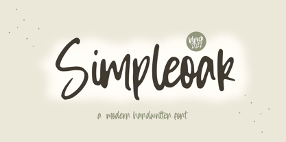 Simpleoak is a Modern Handwritten Font. Simpleoak is a cute and vintage styled handwritten font. Whatever the topic, this font will be a wonderful asset to your font library, as it has the potential to enhance any creation. - also multilingual support Enjoy the font, feel free to comment or feedback, send me PM or email. Thank you!
 - Obelisk Stone by Balpirick,
$15.00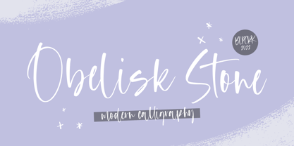 Obelisk Stone is a Modern Calligraphy Font. Obelisk Stone is a dazzling script font. Whatever the topic, this font will be a wonderful asset to your font library, as it has the potential to enhance any creation. - also multilingual support - Ligatures Enjoy the font, feel free to comment or feedback, send me PM or email. Thank you!
 - Fabulous Rabbit by Balpirick,
$15.00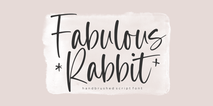 Fabulous Rabbit is a Handbrushed Script Font. Fabulous Rabbit is a cute and slim handwritten font. Whatever the topic, this font will be a wonderful asset to your font library, as it has the potential to enhance any creation. - also multilingual support Enjoy the font, feel free to comment or feedback, send me PM or email. Thank you!
 - Exotile by Sylvain Zimmer,
$15.99 Hexagons are all over the place in nature : from honeycombs to snowflakes and the tiling patterns seen on fruits. That form guided me in the creation of this new font. So Exotile is a font inspired by nature. This typeface is ideal for display purposes. It comes in 3 different weights and support for different languages.
 - Auguste Boutique by Balpirick,
$15.00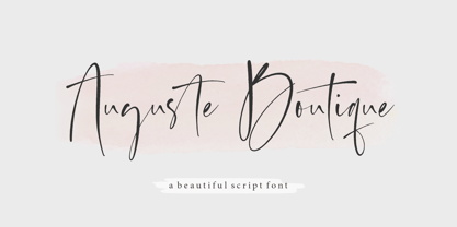 Auguste Boutique is a Modern Calligraphy Font. Auguste Boutique is a dazzling script font. Whatever the topic, this font will be a wonderful asset to your font library, as it has the potential to enhance any creation. - also multilingual support - Ligatures Enjoy the font, feel free to comment or feedback, send me PM or email. Thank you!
 - Dolphin Dolls by Balpirick,
$15.00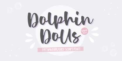 Dolphin Dolls is a Handbrushed Script Font. Dolphin Dolls is a cute and vintage styled handwritten font. Whatever the topic, this font will be a wonderful asset to your font library, as it has the potential to enhance any creation. - also multilingual support Enjoy the font, feel free to comment or feedback, send me PM or email. Thank you!
 - Lupo by Typoforge Studio,
$19.00 Font Lupo is the younger brother of Kapra. However, unlike Kapra it is characterized by the sharpness of the finish. It is inspired by a You And Me Monthly published by National Magazines Publisher RSW „Prasa” that appeared from Mai 1960 till December 1973 in Poland. Font Lupo is designed in one version – lower and uppercase characters.
 - Original Quotes by Balpirick,
$15.00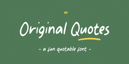 Original Quotes is a Fun Quotable Font. The font looks casual and playful. It's perfect for handwritten notes, sweet greeting cards, beautiful quotes, and stand-out branding as well. The set contains additional items for your design also multilingual support Enjoy the font, feel free to comment or feedback, send me PM or email. Thank you!
 - Donkey Monster by Balpirick,
$15.00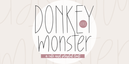 Donkey Monster is a Cute & Playful Font. Donkey Monster is a cute and slim handwritten font. Whatever the topic, this font will be a wonderful asset to your font library, as it has the potential to enhance any creation. - also multilingual support Enjoy the font, feel free to comment or feedback, send me PM or email. Thank you!
 - Grovelane by Balpirick,
$15.00 GROVELANE is a Condensed Handbrushed Font. Grovelane is a simple and clean display font. It is the ideal choice for a variety of designs, so add it confidently and you will love the relaxed and neat final result.. GROVELANE also multilingual support. Enjoy the font, feel free to comment or feedback, send me PM or email. Thank you!
 - Pabean Market by Nasir Udin,
$24.00 Pabean Market is an interpretation of the incription on the oldest market in Surabaya, Indonesia, which was established on 1849. The unique character inspired me to make a complete set of typeface. It’s a retro typeface but has a futuristic aura yet a festive vibes. This font comes in single style and has several Discretional Ligatures. -- Uppercase
 - Victorian Orchid by Dharma Type,
$19.99 Victorian Orchid is a gorgeous vintage flower. Victorian Orchid is a beautiful, organic serif font family available for both text and display. Its bizarre serifs for A and other diagonal letterforms came from decorative types and letterings in old Victorian era. These unusual serifs support and enhance the horizontal flow of the eyes and vertical alignments. Very eye-catching lowercase g also came from the Victorian era and this is one of the most dramatic letterform of this font. Lowercase such like n and d also have horizontal serifs which designed in the same theory. Victorian Orchid is somewhat organic, humanistic and soft-impression font like Transitional Serif as typified by Times New Roman. But at the same time, this font has horizontal serif and vertical stressed letterform like Modern Serif. They make this font sharp, handsome and neat. In addition, Victorian Orchid has low contrast and the serifs are not too flat and not too coved. By them, Victorian Orchid create strong and casual impression like Slab Serif fonts. Victorian Orchid family consist of 5 weights from Light to Bold including about 500 glyphs, international accented letters, some OpenType features. Italics are "True" italics which designed very carefully to match Romans.
 - Mir by Juliasys,
$22.00 Мир is Mir. The Russian word Мир (Mir) means both World and Peace. The rendezvous of the two terms seems quite unique and utopistic today, but it is comforting to see that it was natural at some time deep down in Russian history. Bits of both meanings were going through my mind while I was designing this typeface. Mir’s character set is multiscript – Latin, Cyrillic and Greek – and extends to many parts of the linguistic world. In fact it covers more than 100 languages. Stylistic consistency between the language systems make typographic border crossings painless even where national borders are still closely guarded. And in regions where mathematics, physics or chemistry are to be expressed, a rich set of OpenType features lets Mir master also these situations. Serious things are best be said in a relaxed, unpretentious way. So Mir doesn’t put on a show. Mir has authority without being authoritarian, it is serious but not stern. It can explain difficult things and stay calm and down to earth at the same time. Mir Medium has another useful feature: It can be freely downloaded and used by anybody anywhere. You can test the Mir Family with free Mir Medium and get more styles when you need them. @juliasys
 - Recolors by Din Studio,
$29.00 It can be a time-consuming, difficult process to find an elegant font to present classic impressions to your audience despite the abundant options available for you. Moreover, it takes the risks to disappoint and to leave bad impressions to your audience without having the right font. Therefore, let us introduce you to our serif font, Recolor. It is a capitalized serif font to help you create elegant, classic nuances on your designs. Our serif font has tiny lines to add formal, professional touches on each quality, consistent letter to ease the reading process. However, such capitalized font designs are eligible to apply for big text sizes for a legibility reason. Additionally, you can enjoy the available features here. Features: Multilingual Supports PUA Encoded Numerals and Punctuations Recolor fits best for various design projects, such as brandings, posters, banners, headings, magazine covers, quotes, printed products, merchandise, social media, etc. Find out more ways to use this font by taking a look at the font preview. Thanks for purchasing our fonts. Hopefully, you have a great time using our font. Feel free to contact us anytime for further information or when you have trouble with the font. Thanks a lot and happy designing.
 - Testament by Canada Type,
$24.95 From the standpoint of calligraphy, a font family of capitals and uncials makes perfect sense. The Roman square capitals, the quadrata, are matched by round capitals of older Greek origin; the word "uncus" means hook-shaped like a beak or talon. Interrelated and often interchangeable, these capital letters served as book hands for both the Latin West and the Greek-speaking East before they evolved into minuscule alphabets. The Testament family is based on the few formal capital manuscripts of the Bible, Virgil and Homer that have survived from the ancient world. Throughout the Middle Ages both uncials and square capitals were used, often together, for headings and initial characters. By their nature the Roman capitals are the voice of Caesar and hold the place of authority, while the uncials speak for the Church in a balanced relationship. In ancient times church and state were not as separate as they are now, and the alphabets were not as different as typographic tradition has made them. In this calligraphic rendering it is clear that they are of the same substance and can be written in the same style, conveying even to the modern eye the eternal and classical quality of epic and scripture. Testament comes in all popular font formats, and includes support for a vaster-than-usual range of Latin-based languages.
 - Bebas Neue Pro by Dharma Type,
$14.99 Thank you for waiting. Finally, Bebas Neue has got lowercases! Bebas Neue is a world wide, the most popular font family with all caps released in 2010. Bebas Neue has been used from by big companies to by startup designers for many projects. In spite of the fact that Bebas Neue has only Uppercases, it became very popular font for these 10 years. At the same time, we received many requests for adding lowercases. To be honest, we had been developing whole new Bebas Neue with lowercases secretly for long time. Thinner Uppercase from thin to regular weights were redesigned for Pro. New lowercases were designed to match the Uppercases very carefully. You can access Tabular figures by using OpenType tnum features. Almost all European languages are supported by Pro. One more big thing is... Bebas Neue Pro has Italics! Please don't use sloped Bebas Neue. Pro has proper Italics! Bebas Neue “Pro” can extend your possibilities. Be the first to use this professional and premium Bebas Neue!
 - Robusto by Galapagos,
$39.00Thirteen or 14 years ago I admired, out loud, a book I found on a shelf in Matt Carter's office. That Christmas I was pleasantly surprised to find that Matt had found another copy of the book and he gave it to me. The book was about the life of Oswald Cooper and it contained numerous specimens of Cooper's lettering jobs. Among them was an interesting image of 7 letter that spelled out the word 'Robusto'. These letters were used as the model for the font Robusto. All I needed to do was develop 221 other glyphs to finish the font. - Karol by Type-Ø-Tones,
$60.00 Karol was designed in 2011 as a project in the MA in Advanced Typography from EINA/UAB, in Barcelona. It was born as text typeface inspired by the work of East European type designers. Two years later, Karol is ready for public release, in a collection of eight styles (four weights and matching italics) with high readability, strength and character. A few days before its publication, we received the news that Karol had been awarded the Certificate of Typographic Excellence (Judges’ Choice) of the Type Directors Club. Please check the ‘Read me’ file located in the gallery for more specifications.
 - Blue Sheep by Hanoded,
$15.00 It's been a while since I named a font after a sheep, so I figured it was about time. The Blue Sheep, or Naur (Pseudois nayaur), is actually an existing species of sheep. It is found in the Himalayas and is a major food for the very rare snow leopard. Peter Matthiessen wrote a book about it called The Snow Leopard. My Blue Sheep font is not rare, nor threatened. It is an uplifting text font. It is very legible and fun to use and will keep you bleating for more. Comes with a flock of diacritics.
 - K haus 105 by Talbot Type,
$19.50 K-haus 105 is inspired by the work of graphic designer and typographer, Herbert Bayer, during his time at the Bauhaus around 100 years ago — work that kick-started graphic design as we know it, to this day. It owes something to the simple geometry of Bayer’s hand-drawn, ‘universal typeface’, updated and expanded to deliver a clean, balanced, geometric sans for today. Also available as K-haus 205 , featuring a few, more 'daring' characters here and there, chiefly in the lower case set. Both variations include an extended character set, featuring accented characters for Central European languages.
