10,000 search results
(0.204 seconds)
- AnglicanText - Personal use only

- Sanctuary - Unknown license

- Caswallon Demo - Unknown license

- Lohengrin - Personal use only

- ScribbledFraktur-XHeavy - 100% free

- Giureska by URW Type Foundry,
$39.99 I always admired the beauty of Gothic letters, but lamented their low readability. The revivals of Gothic faces are beautiful, but they revive everything, including the traits that prevent readability. Blackletters are fine in ads and titles, but can’t be used in long texts (like books on Middle Ages, Medieval romances etc) where they would be the perfect historical choice. And I wanted to change this scenario. With Giureska, instead of taking one particular face to revive, I chose the best traits from many Gothic faces, i.e. the forms that were pleasant to look and easy to read. For the ‘small caps’, I studied uncial scripts and made a similar selection, adapting everything to make a unified font. With three weights, true italics and the uncials, Giureska can endure a variety of projects, bringing the appeal of Middle Ages much beyond the cover.
 - Binner - Unknown license

- MC Yorks by Maulana Creative,
$15.00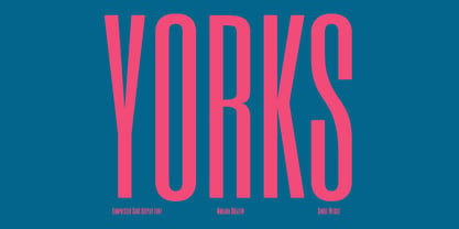 Yorks is a Compressed sans Display font. Regular stroke, fun character with a bit of ligatures and alternates. To give you an extra creative work. Yorks font support multilingual more than 100+ language. This font is good for logo design, Social media, Movie Titles, Books Titles, a short text even a long text letter and good for your secondary text font with script or serif. Make a stunning work with Yorks font. Cheers, Maulana Creative
 - Gramary by Maulana Creative,
$14.00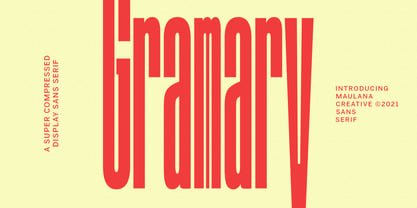 Gramary is a Super Compressed display font. With bold weight stroke, upright and fun character with a bit of ligatures. To give you an extra creative work. Gramary font support multilingual more than 100+ language. This font is good for logo design, Social media, Movie Titles, Books Titles, a short text even a long text letter and good for your secondary text font with script. Make a stunning work with Gramary font. Cheers, MaulanaCreative
 - Kareen by Maulana Creative,
$14.00 Kareen is a soft rounded compressed display font. With high legibility structure letter form. To give you an extra creative work. Kareen font support multilingual more than 100+ language. This font is good for logo design, Social media, Movie Titles, Books Titles, a short text even a long text letter and good for your secondary text font with script or signature typeface. Make a stunning work with Kareen font. Cheers, Maulana Creative
 - Baltra by Galapagos,
$39.00After researching the type styles contemporary graphic designers have been using over the past few years, I noticed a consistent use of Copperplate Gothic, and its derivative designs, for various corporate advertising campaigns. That level of usage gave me the inspiration to design a display font possessing subtle characteristics of Copperplate Gothic, and various Latin Condensed designs. The font I ended up designing was semi-condensed, with more contrast between thicks and thins than in Copperplate. Baltra also has a subtle flair in its otherwise traditional lowercase, while possessing a larger than average lowercase x-height. Copperplate Gothic, on the other hand, has minimal contrast and uses small capitals for its lowercase. After examining extensive type specimens from wood type, metal type, phototype and digital type, I was not able to find a single design possessing a majority of Baltra's characteristics. Consequently, I consider Baltra to be a truly unique design, sharing with Copperplate Gothic only its flairs on stems, and having only subtle characteristics in common with traditional Latin designs. - Ink Line by Atom,
$13.00 Ink Line is a modern font script that gives a unique impression. With ligature, titling, swash, and multi language features, Ink Line is very easy to use in the application of posters, flyers, titles, bloggers, Instagram stories, web banners, etc. Happy Design :)
 - Amherst by Linotype,
$29.99Amherst is a family of blackletter-inspired typefaces. This family, created by British designer Richard Yeend in 2002, is unique in that it mains the feel of blackletter/medieval type without relying directly on historical forms. Amherst is split into two different sub-families, Amherst and Amherst Gothic. Amherst is very geometric interpretation of Fraktur. Fraktur was a style of German type very popular in central Europe from 1517 until the early 20th Century. Its letters appear "broken" at certain angles and joints. Still, we recommend using it primarily for display purposes. Amherst is available in three weights: Regular, Bold, and Heavy. Amherst Gothic is very loosely inspired by late medieval letterforms, often called Texturas or Gothics. However, the letterforms of Amherst Gothic seem just as inspired by the Art Deco movements of the 1920s and by contemporary sans serif type design as anything else. Nevertheless, certain letters in this typeface do appear more "gothic" than others, especially A, D, M, Y, d, r, and x. Amherst Gothic is made up of three fonts, Amherst Gothic Split, Amherst Gothic Split Alternate, and Amherst Gothic Italic. Amherst Gothic Split has in-lined characters, and appears very ornamented. The alternate characters in Amherst Gothic Split Alternate are quite medieval in their appearance. Amherst Gothic Italic is the least medieval-looking of the set; its characters are very round, and more geometric. All six styles of the Amherst Family are OpenType format fonts, and include old style figures. - HK Nova by Hanken Design Co.,
$30.00 HK Nova is a geometric sans inspired by the Century Gothic and Futura. It formalizes Century Gothic and softens Futura.
 - TG Praktikal by Tegami Type,
$30.00 TG Praktikal is new modern geometrics sans with 8 styles & 1 variable font. Inspired by geometrics and gothic typefaces like Bell Centinel, Whitney and Metric, with an additional touch of monospace characters. That makes that TG Praktikal has a unique character set and fit perfectly for body text. Coupled with 3 flavors that can provide different impressions, including approximately 90 multilingual with various OpenType features.
 - Krylon - Unknown license

- Poynter Old Style by Font Bureau,
$40.00 In the 1670s, Christopher Plantin was the largest publisher of his day. Hendrik van den Keere cut for him an astounding series of romans. As Stanley Morison once observed, such types adopted features of Flemish blackletter to strengthen elegant French romans. Large on the body, strong in color, economical in fit, widely (if anonymously) distributed, they established effective standards for all that followed; FB 1997–2000
 - Skyline by Font Bureau,
$40.00 Skyline was commissioned from Font Bureau by Condé Nast specifically as a headline typeface for Traveler magazine. This strongly personal work by Imre Reiner from 1929 and 1934 was known in Europe as Corvinus. Skyline Black and Bold Condensed offer immediate headline recognition through Reiner’s variations on the themes found in the classical Modern structure. Both styles were adapted by Jane Patterson; FB 1992
 - Apres by Font Bureau,
$40.00 David Berlow and staff drew Apres as part of a series designed originally for the Palm Pre smart phone, for use both on the device and in print marketing. Simple, open letterforms and generous proportions provide a clear, comfortable, and inviting experience for navigation and readability. The plain-spoken geometry is regular and balanced, without being static or mechanical, for a friendly and forthright familiarity; FB 2008
 - Trigot by Volcano Type,
$19.00 Trigot is a modular typeface. Every form and every character is constructed from the basic geometric form of the triangle. The simple construction trigot resembles strongly is a gothic blackletter font. The letters are inspired by the ductus and forms of medieval typefaces and have a similar complex expression. The main singularity of Trigot lies in the strong contrast between clear geometry and the complex expression of a blackletter typeface. The name, "Trigot", hints the gothic influence and the triangular modules. Trigot is a modern display font -- it can be used for posters, striking visuals and titles but also for longer phrases and quotes.
 - Rama Slab by Dharma Type,
$19.99 Rama Slab is an antique slab serif designed inspired by 1800s-style wood type. All glyphs have been designed carefully to be retro-looking to fill the viewer with nostalgia. This condensed font family with 18 styles is a great solution for posters, titles and anywhere you need impact. To complete your work perfectly, Gothic Extras family is ready for free. They include borders, ornaments and frames designed using vintage catalog of Hamilton in 1800s as a model. Incidentally, -r- has its alternative glyph that can be used with OpenType salt feature. Be sure to check out the sans serif style of this Rama series named Rama Gothic.
 - Stately GG by Baseline Fonts,
$39.00 TWO LAYERED FONT: Be sure to get both the FRONT and the BACK! Maintaining simultaneous shades of whimsy and versatility is no simple feat, but the meticulously constructed Stately Gothic accomplishes just that, elegantly. Stately Gothic is a redrawn version of Grit Gothic. The strong vertical character of this stacking/layered typeface make it an ideal solution for use where legibility matters most: posters, logos, book and album covers, and so on. It is part of Grit History Series B along with Heirloom Artcraft, Worn Gothic, Grit Sans, and Grit Gothic.
 - Legal Obligation Serif by Wing's Art Studio,
$4.00 Legal Obligation - Serif Version A dedicated compressed Serif font for movie poster credit blocks and cinematic title designs. A workmanlike tool for adding extensive cast and crew information to movie posters without dominating the overall layout. Supplied with lowercase characters and three weights. Contents: - Legal Obligation (Serif Version) - Light, Regular and Bold Weights
 - MC Balwey by Maulana Creative,
$15.00 Balwey is a Compressed round sans serif Display font. Bold stroke, fun character with a bit of ligatures and alternates. To give you an extra creative work. Balwey font support multilingual more than 100+ language. This font is good for logo design, Social media, Movie Titles, Books Titles, a short text even a long text letter and good for your secondary text font with script or serif. Make a stunning work with Balwey font. Cheers, Maulana Creative
 - Xwisth by Allouse Studio,
$16.00 Proudly Presenting, Xwisth a Gothic Handwritten Font that will bring an a classical type. Xwisth is perfect for any titles, logo, product packaging, branding project, megazine, social media, wedding, or just used to express words above the background. Xwisth also come with Multi-Lingual Support. Enjoy the font, feel free to comment or feedback, send me PM or email. Thank You!
 - Cartella NF by Nick's Fonts,
$10.00This no-nonsense titling face is based on a Morris Fuller Benton 1934 offering for American Type Founders called, simply, Poster Gothic. Its crisp, clean lines and subtle Art Deco modeling make for attractive and attention-getting headlines. Available in plain and prismatic styles. Both versions of this font include the complete Unicode Latin 1252 and Central European 1250 character sets. - Becker Monoline Modern NF by Nick's Fonts,
$10.00The first in a series of typefaces based on the work of legendary lettering artist Alf Becker, whose works appeared in Signs of the Times magazine for almost thirty years. Originally titled "Extreme Thin Gothic", this was Becker’s 185th design for the magazine. Both versions of the font include the 1252 Latin and 1250 CE character sets (with localization for Romanian and Moldovan). - Cocomat Pro by Zetafonts,
$39.00 Cocomat has been designed by Francesco Canovaro and Debora Manetti as a development of the Coco Gothic typeface system created by Cosimo Lorenzo Pancini. It shares with all the other subfamilies in the Coco Gothic system a geometric skeleton with open, more humanistic proportions, a sans serif design with slightly rounded corners and low contrast proportions, without optical compensation on the horizontal lines, resulting in a quasi-inverted contrast look in the boldest weights. What differentiates Cocomat from the other subfamilies in Coco Gothic are some slight design touches in the uppercase letters, with a vertical unbalancing reminiscent of art deco design, notably evident in uppercase "E", "A","F","P" and "R" - while lowercase letters have been given some optical compensation on the stems, like in "n","m", "p" and "q". These design choices, evoking the second and third decade of the last century (Cocomat is also referred as Coco 1920 in the Coco Gothic Family) all give Cocomat a slight vintage feeling, making it a perfect choice every time you need to add a period vibe or an historical flair to your design, like in food or luxury branding. The typeface, first published in 2014, has been completely redesigned by the original authors in 2019 as Cocomat PRO to include eight extra weights (thin, medium, black and heavy in both roman and italic form), extra open type features (including alternate forms, positional numerals), and extra glyphs making Cocomat cover over two hundred languages using latin, cyrillic and greek alphabets.
 - FF Good Headline by FontFont,
$72.99 FF Good is a straight-sided sans serif in the American Gothic tradition, designed by Warsaw-based Łukasz Dziedzic. Despite having something of an “old-fashioned” heritage, FF Good feels new. Many customers agree: the sturdy, legible forms of FF Good have been put to good use in the Polish-language magazine ‘Komputer Swiat,’ the German and Russian edition of the celebrity tabloid OK!, and the new corporate design for the Associated Press. Although initially released as a family of modest size, the typeface was fully overhauled in 2010, increasing it from nine styles to 30 styles, with an additional 30-style sibling for larger sizes, FF Good Headline. In 2014, the type system underwent additional expansion to become FontFont’s largest family ever with an incredible 196 total styles. This includes seven weights ranging from Light to Ultra, and an astonishing seven widths from Compressed to Extended for both FF Good and FF Good Headline, all with companion italics and small caps in both roman and italic. With its subtle weight and width graduation, it is the perfect companion for interface, editorial, and web designers. This allows the typographer to pick the style best suited to their layout. As a contemporary competitor to classic American Gothic style typefaces—like Franklin Gothic, News Gothic, or Trade Gothic—it was necessary that an expanded FF Good also offers customers both Text and Display versions. The base FF Good fonts are mastered for text use, while FF Good Headline aims for maximum compactness. Its low cap height together with trimmed ascenders and descenders give punch to headlines and larger-sized copy in publications such as newspapers, magazines, and blogs.
 - Aabak by Polimateria,
$39.00 Aabak is a sumptuous modern typeface family. The high contrast, super elegant, didone like shapes were infused with a little fluidity from 60’s psychedelic lettering, the results is a contemporary face that screams freshness. It is ideal for branding, advertising, headlines, posters, movie titles, and much more! This design deliberately sabotages a lot of white space to have that compressed punchy look. The tear drop terminals and the melting serifs create a surprisingly superb combo. Sharp joints were smoothen to convey a warm and subtle feeling. Aabak comprises a total of 18 styles, 6 weights in 3 different cuts: Upright, Italic and Swash. The Swash styles have also a terminal forms feature that gives that extra lush feel. Have fun playing with it!
 - Dimor by Nine Font,
$20.00 Dimor is a modern display type family with 6 styles. Specially designed for headlines and short sentences. We hope this will contribute to your impressive and distinctive title
 - CrappyGothic - Unknown license

- VTCSuperMarketSaleTallTilt - Unknown license

- Berlin Sans by Font Bureau,
$40.00 Berlin Sans is based on a brilliant alphabet from the late ’20s, originally released by Bauer with the name Negro, the very first sans that Lucian Bernhard ever designed. Assisted by Matthew Butterick, David Berlow expanded this single font into a series of four weights, all complete with expert character sets, plus a dingbat font. Imaginative & little-known, it promises enticing opportunities to the adventurous typographer; FB 1994
 - Meyer Two by Font Bureau,
$40.00 Meyer Two captures the early Hollywood flavor and nostalgia of silent-film intertitles. From 1922 through 1928, Mergenthaler Linotype cut five fonts to Louis B. Meyer’s personal specifications. Meyer Two, drawn in 1926, curiously combines Cleland’s ATF Della Robbia capitals of 1902 with lowercase and figures from ATF Post Monotone No. 2, also from the same period. Meyer Two was revived, with a Condensed added, by David Berlow; FB 1994
 - Famosa Core Edition by TypeThis!Studio,
$50.00 Modern aesthetic meets classy handmade elegance. Famosa is designed for all your stylish fashion magazines, clothing brands, and logos as well as your elegant blogger themes. The highlights are for sure the beautiful ligatures, such as sh, ct, fb and more. If you need more features like small caps, special symbols, extensive language support like Vietnamese, please visit: https://typethis.studio -- Famosa is well known from Netlix' Series 'Sweet Magnolias'
 - Vonnes by Font Bureau,
$40.00 Vonnes was designed by David Berlow working closely with Neville Brody on corporate redesign for Jim Von Ehre at Macromedia. Core weights are loosely based on Bauer’s Venus, 1907–1910. Berlow expanded the ideas behind the series to 56 fonts, the heart of the redesign. The Macromedia program was hailed as one of the most successful models of modern total design for innovative cutting edge companies; FB 2007
 - Belucian by Font Bureau,
$40.00 The Belucian series offers a distinguished text design supported by dynamic headline structure. In need of a distinctive display style, Smart magazine asked Font Bureau in 1990 to revise the work of Lucian Bernhard from 1925. David Berlow prepared Belucian Demi, now accompanied by Kelly Ehrgott-Milligan’s 1994 Demi Italic, added Book and Book Italic for text, and designed Ultra for dynamic impact in headlines; FB 1990–94
 - Belizio by Font Bureau,
$40.00 The eight-part Belizio series updates the first Font Bureau typeface. David Berlow’s family is based on Aldo Novarese’s Egizio, designed in 1955 for Nebiolo. It was first prompted by the popularity of Haas Clarendon, designed by Hoffmann and Eidenbenz, an impeccably Swiss revival of the traditional English letterform. Aldo Novarese was among the first to investigate a true italic designed in the Clarendon style; FB 1987–98
 - Benton Modern by Font Bureau,
$40.00 Benton Modern was first prepared as a text face by Font Bureau for the Boston Globe and the Detroit Free Press. Design and proportions were taken from Morris Fuller Benton’s turn-of-the-century Century Expanded, drawn for ATF, faithfully reviving this epoch-making magazine and news text roman. The italic was based on Century Schoolbook. These display cuttings were prepared by Dyana Weissman and Richard Lipton; FB 2008


