1,887 search results
(0.039 seconds)
- Draughtwork by Scriptorium,
$18.00Draughtwork is a special decorative font designed to have the look of a work in progress, showing the process of constructing letters using a ruler and a compass on a grid. It's in the tradition of our very popular Roughwork font, but more detailed and with additional features. Unlike Roughwork, Draughtwork includes a full upper and lower case character set plus some special alternate character variants. Developing Draughtwork was a monstrous task. The complexity of the 9x9 grids with each character were a challenge to the rendering capacity of Fontographer and required an extraordinary amount of fine tuning - but the result was worth the effort. - Snoogle by Linotype,
$29.00Snoogle is a friendly, round display typeface. Its character set contains 99 ligatures, which may be automatically implemented in OpenType-savvy applications. These give Snoogle the feeling of a script face, as opposed to normal rounded types. Snoogle's text variant is complimented by a Dingbats font, including further design elements as well as pictogram figures. - La Primera by Letteralle,
$19.00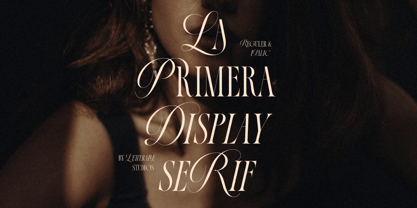 Introducing, La Primera! Luxurious and elegant font with a mix of classic calligraphy and modern serif. La Primera carries 99 ligatures that make this font even more unique. La Primera is a versatile font, perfect for editorial projects, Logo design, Wedding, Clothing Branding, product packaging, magazine headers, or simply as a stylish text overlay to any background image.
 - Fyra by Jonathan Hughes,
$- Fyra is a family of fonts ideal for diagrams and signage. Included in the family are versions with uppercase letters in circles and squares, as well as numbers 0-99 in circles and squares. The characters themselves were designed to be very neutral, so they should pair well with whatever other typefaces you are using on your project.
 - Schoolroom JNL by Jeff Levine,
$29.00 Based on the type style used for the Superior Sign and Chart Printer No. 929, this simple and clean sans serif font was perfectly suited for use by teachers in the classroom and for businesses and organizations that needed to make signs, price cards, charts and notices. Digitally redrawn as Schoolroom JNL, it is available in both regular and oblique versions. The Superior Marking Equipment Company [formerly of Chicago] was not only a major supplier of materials for the rubber stamp industry, but for most of its existence manufactured date and numbering stamps, sign and chart printers (such as the one used for this font), and a line of children’s printing toys (amongst other items).
 - FF Karbid Display by FontFont,
$58.99 German type designer Verena Gerlach created this display and sans FontFont between 1999 and 2011. The family has 10 weights, ranging from Light to Black (including italics) and is ideally suited for advertising and packaging, editorial and publishing as well as logo, branding and creative industries. FF Karbid Display provides advanced typographical support with features such as ligatures, alternate characters, case-sensitive forms, fractions, super- and subscript characters, and stylistic alternates. It comes with a complete range of figure set options – oldstyle and lining figures, each in tabular and proportional widths. This FontFont is a member of the FF Karbid super family, which also includes FF Karbid, FF Karbid Slab, and FF Karbid Text.
 - Ultra Condensed by Outside the Line,
$19.00 Ultra Condensed is a three-font family with a full character set. Ultra Condensed is a remastering of Tall Skinny Condensed from 1999 which continues to be a favorite. While similar, the fonts are not interchangeable. Shapes of some letters have changed, kerning and spacing are different. Tall Skinny Condensed does not have a full character set. Ultra Condensed Lettered is a hand lettered version of the hard edged Ultra Condensed. Ultra Condensed Line also hand lettered, is a thinner version of Ultra Condensed Lettered. These three fonts work well together or with a non condensed font, great for headlines at a large size. Works well for lots of copy in a small space.
 - Linotype Sansara by Linotype,
$29.99Linotype Sansara, from Swiss designer Grégoire Poget, is part of the TakeType Library, chosen from the entries of the Linotype-sponsored International Digital Type Design Contest 1999 for inclusion on the TakeType 3 CD. This fun font is a type experiment behind whose oriental facade hide Arabic letters, recognizable only at second glance. This font displays generous, pointed ascenders and descenders as well as a bar-like emphasis on the upper third of the figures which connects lines and words and gives them a decorative look. Linotype Sansara reveals an astounding variety of details which bring to mind 1001 Arabian Nights, flowing gowns and snake charmers. This font is best for display in point sizes of 14 or larger. - Molly Script by Seniors Studio,
$21.00 Molly Script is modern handwritten calligraphy typeface with dancing up and down the baseline. that comes with lovely alternates. It works perfectly for logos, fashion, stationery, letterpress, magazines, menus, books, invitations, wedding / greeting cards, packaging, labels, apparel, marketing etc. Molly Script features 515+ glyphs and 299 alternate characters. including initial and terminal letters, alternates, ornaments, ligatures and multiple language support. To enable the OpenType Stylistic alternates, you need a program that supports OpenType features such as Adobe Illustrator CS, Adobe Indesign & CorelDraw X6-X7, Microsoft Word 2010 or later versions. There are additional ways to access alternates/swashes, using Character Map (Windows), Nexus Font (Windows), Font Book (Mac) or a software program such as PopChar (for Windows and Mac).
 - Linotype Sicula by Linotype,
$29.99Linotype Sicula, from German designer Roberto Manella, is part of the TakeType Library, chosen from the entries of the Linotype-sponsored International Digital Type Design Contest 1999 for inclusion on the TakeType 3 CD. It is available in two weights, regular and oblique. Linotype Sicula will quickly win over any nostalgic spirits. Ornamental and sweeping, the figures line up on the paper, their contrasting strokes and playfully irregular forms giving them an exuberant, decorative character. The careful details of each figure come to light best when used in larger point sizes. Linotype Sicula is therefore best for headlines and can easily inspire typographic experiments and its capitals can serve as initials combined with other typefaces, especially sans serif. - P22 Tai Chi by IHOF,
$24.95 Experimental lettering Stephen Rapp created in 1999 became the spark that Stephen's imagination transformed into the Tai Chi design. Tai Chi is a display face but it could also be used as a textured calligraphic script. Its delightful sense of movement distinguishes it from other scripts. Individual characters stand poised in a vertical Zen-like balance while at the same time displaying an inner rhythm that makes them appear to dance along the line. Rich in texture and variation, Tai Chi works very well at medium and large point sizes. The font contains several alternate letters that help maintain a hand-lettered look. Tai Chi includes both upper and lowercase letters but works well in all uppercase settings.
 - Estefania Bold Script by Shaltype Co,
$12.00 Estefania is based on Retro Bold Script Typeface that could fit any Graphic Project. Using bold and contrast strokes to get eye-catchy and smooth looking, this project is just born and will come with other styles and more glyphs in the future. Drawn manually by hands, and reform into a clean Typeface. Natural stroke from original lettering. It can be used for Titles or even for writing. In this font, you will get : - TTF & OTF files - WOFF & WOFF2 - Over 299 Glyphs - 11 OpenType features - Support Multilingual languages Get Estefania now! It will be best used for any design requirement, many fonts will come with a unique concept. Thank you! Best Regards, FM-STCO.
 - Zinc Boomerang - Unknown license

- Cholla by Emigre,
$49.00 The Cholla typeface family was designed by Sibylle Hagmann in 1998-99 and named after a species of cactus she encountered in the Mojave Desert. Cholla was originally developed for the Art Center College of Design in Pasadena, California. There, art director Denise Gonzales Crisp and associate designer, Carla Figueroa, collaborated with Hagmann to create a series of fonts that would offer a great deal of variation. The variety was needed to echo the school's nine different departments, yet together the fonts had to exude a unified feel. It was first used in the radically designed 1999/2000 Art Center catalog which won a honorable mention in I.D. magazine and was featured in Eye No. 31. Originally Hagmann set out to design a typeface that, as she recalls, "I could feel comfortable making, first of all, and one that would serve a purpose and had a clear idea behind it, and something that I would want to use myself." Stylistically Hagmann set out to create "12 cuts with slightly different personalities, with different ideas applied. For example the bold weight isn't simply the Regular with weight gain, but has bold letterforms with their own peculiar details. What all weights share and what is the necessary unifying detail is the tapered curve - marked out, for example, in the lowercase b's left top and bottom of the bowl." Gonzales adds: "The forms seemed classical as well. This combination could have a long life, and be timely. I also saw - at least in the beginnings of Cholla - forms that connoted hybrid, of inter-connection, of human and machine growing together. These notions seem appropriate for a school that teaches design and art." Greek version by Panos Haratzopoulos.
 - Gravitica Mono by Ckhans Fonts,
$34.00 Features: • Support for 28 languages: Afrikaans Albanian Catalan Croatian Czech Danish Dutch English Estonian Finnish French German Hungarian Icelandic Italian Latvian Lithuanian Maltese Norwegian Polish Portugese Romanian SlovakSlovenian Spanisch Swedish Turkish Zulu Swedish Turkish Zulu • Contains OpenType features with alternates or substitutes • Tabular Figures • Ordinal numbers • 74 icons (It will keep updating.) • 72 graphic patterns for designer (It will keep updating.) • 28 brand symbols (It will keep updating.) • 27 arrows glyphs • 0-99 line circled glyphs • 0-99 solid circled glyphs • A-Z line circled glyphs • A-Z solid circled glyphs Gravitica Mono family consists of 18 styles (6 weights, 6 Italics, 6 Icons), in each of which there are more than 508+ glyphs. In the typeface, each weight includes extended language support, fractions, tabular figures, arrows, ligatures and more. Perfectly suited for graphic design and any display use. Useful links: Gravitica PDF Type Guide and Specimen (You can know how to use icons and arrows, other glyphs.)
 - Zabatana Poster - 100% free

- Scarab - Unknown license

- Forgotten Futurist - Unknown license

- Darmhagh Underwood by Evertype,
$20.00Darmhagh Underwood is a “rough” monowidth font based on the face used on the old Underwood manual typewriter. Darmhagh Underwood was first digitized in 1999 by Michael Everson and originally used the MacGaelic character set on the Macintosh platform, and ISO/IEC 8859-14 on the PC. In 2008 Darmhagh Underwood version 3 was released in OpenType format, completely compliant with Unicode encoding and with an extended character set. The particular Underwood typewriter from which samples were taken to design Darmhagh Underwood is on display in the National Library of Ireland. It belonged to Conradh na Gaeilge and was used to draft armistice documentation which led to the end of the Irish War of Independence in 1921. Darmhagh is pronounced [ˈdaɾuː]. - Linotype Flamingo by Linotype,
$29.99Linotype Flamingo, from German designer Michael Leonhard, is part of the TakeType Library, chosen from the entries of the Linotype-sponsored International Digital Type Design Contest 1999 for inclusion on the TakeType 3 CD. The figures of this font have pieces missing, the curve of an a, the stroke of an n. The eye fills in the gaps, allowing the designer to present a unique font with reductionist forms which can still communicate written ideas to the reader. A small number of forms come together to create the alphabet and the 'missing pieces' make a light and airy overall impression. Linotype Flamingo should be used in point sizes of 18 and larger and because of reduced legibility should be used only for very short texts. - NewLibris by Hubert Jocham Type,
$39.00 The first version of Libris I designed in London in 1997 when I worked for Frank Magazine. Later Libris was used in the magazine for text and display. In 1999 Libris was chosen as the corporate typeface of Bally Switzerland. I also was involved in the design of the entire branding. NewLibris is the version that was published in my own shop. - What was the inspiration for designing the font? NewLibris is an elegant contemporary easy to read sans serif. It has a wide variety of weights and proportions that are easy to use in corporate branding and magazines. - What are its main characteristics and features? contemporary humanist legible sans serif - Usage recommendations: corporate branding and magazines and other publications
 - Linotype Bix by Linotype,
$29.99Linotype Bix Plain, from Argentinian designer Victor Luis Garcia, is part of the Take Type Library, chosen from the entries of the 1999 International Digital Type Design Contest for inclusion on the Take Type 3 CD. The font is composed exclusively of capital letters. The figures have constructed basic forms and show the influence of the advertisement types of the 1920s, with all their well-mannered details. The lower sections of the graceful letters are white and set against a black background, the upper sections are black on white. This makes the overall picture look as though written on stripes and gives the delicate letter stability. The nostalgic-modern Linotype Bix Pleain is best for headlines in point sizes of 18 or larger. - Linotype Startec by Linotype,
$29.99Linotype Startec, from Jan Tomás, is part of the TakeType Library, chosen from the entries of the Linotype-sponsored International Digital Type Design Contest 1999 for inclusion on the TakeType 3 CD. This is another fun font from Tomás, who also designed Alphabat, and the two share some characteristics. Linotype Startec is an outline font whose unique forms are reminiscent of futuristic dreams and space adventures. It should be used in point sizes of at least 18, but the phrase 'the bigger the better' fits this font well. The careful details and figures of the alphabet turn into UFOs and space ships from another world when set in very large point sizes. Linotype Startc is best for very short texts and headlines. - FF Karbid by FontFont,
$58.99 German type designer Verena Gerlach created this display and sans FontFont between 1999 and 2011. The family has 10 weights, ranging from Light to Black (including italics) and is ideally suited for advertising and packaging, editorial and publishing, logo, branding and creative industries, small text as well as web and screen design. FF Karbid provides advanced typographical support with features such as ligatures, alternate characters, case-sensitive forms, fractions, super- and subscript characters, and stylistic alternates. It comes with a complete range of figure set options – oldstyle and lining figures, each in tabular and proportional widths. This FontFont is a member of the FF Karbid super family, which also includes FF Karbid Display, FF Karbid Slab, and FF Karbid Text.
 - Belly Laugh by Comicraft,
$19.00 When we asked Dave Gibbons to name the typestyle he created for the sound effects in GIVE ME LIBERTY, he must've thought we were kidding. So we humored him, and now you can get in on the joke when you order BELLY LAUGH and Dave's signature font for just $99. It's a rib-tickler alright, and it's also available separately for those of you who like to laugh alone.
 - Modern Vision - 100% free

- Planet N - Personal use only

- Planet NS - Unknown license

- Planet S - Unknown license

- Scarab Solid - Unknown license

- Planet X - Unknown license

- Beta Block - Unknown license

- Scarab Border - Unknown license

- Linotype Notec by Linotype,
$29.99Franciszek Otto of Poland designed Linotype Notec in 1999. Linotype Notec is a low-tech" (or even "no tech!") typeface. By embracing handwriting's spontaneity, it has gotten as far away from technology as it can. Classified as an "inky"-style script face, for lack of a better term, Linotype Notec's informal design seems immediately artful and full of expression. Its irregularity and unexpectedness enlivens any composition, similar to how jazz or modern dance animate a room. Quite full of "ink," Linotype Notec's "strokes" are written in a sort of short-note-handwriting-style, which a slow-writing, thoughtful humanist might theoretically scribble to himself late at night. Yet Linotype Notec's character still maintains a jolt of energy; try Linotype Notec in small applications, in any size from 12-point on up." - Pushkin by ParaType,
$25.00 Designed for ParaType in 1999-2004 by Gennady Fridman. The Pushkin type family is based on the autographs of Alexander Pushkin, the eminent Russian poet (1799-1837). Alternative letters typical for Pushkin's hand are included. There are several variants of Pushkin's hand. Pushkin Script in 2 styles was based on the manuscripts of 1815 and covers Western and Russian character sets. Pushkin One was developed on the basis of thoroughly written documents. Pushkin Two imitates small but nevertheless rather legible hand. Pushkin Three in 2 weights was created on the basis of the autographs distinguished by sprawling hand. Pushkin One, Two and Three series covers just the Russian character set. This set of Russian fonts was amended by Pushkin French font that is based on French writings and covers Western character set.
 - Guild of Professional Actors - Unknown license

- Poynter Gothic by Font Bureau,
$40.00 Morris Fuller Benton’s drawings at the Smithsonian show a creative concern for effects of scale on typeface design. Tobias Frere-Jones began with 4pt ATF Franklin Gothic drawings, modifying proportions to mix with Poynter Oldstyle and Benton Gothic, and adjusting ends of the curved strokes of C G S a c e r s to suit news printing conditions. Poynter Gothic Text excels as subheads used with Poynter Oldstyle Text; FB 1997–99
 - Hollywood 69 by Fonts of Chaos,
$10.00 This is not Hollywood. You may be surprised but I am not inspired by the famous Hollywood sign for this type but a grid on a roof of Barcelona. I walked down the street observing the architecture of buildings in the area of the Marina when I saw a grid on a roof. One of the workers put a board on them and the magic happen. Hollywood 69 is now free with 99 !
 - Bunaero by Buntype,
$24.50 Buntypes Bunaero™ combines classical and contemporary characteristics to a unique and distinctive font family with extravagant but also harmonious appearance. The characters are clear, open and sometimes bellied. Especially the caps have a very high waistline. The font was manually hinted and contains extensive handcrafted kerning tables to ensure flawless appearance in all media. It supports at least 99 languages incl. Vietnamese and provides ligatures, alternative glyphs, special localized forms and even more enjoyable OpenType® features. Feature Summary*: - 9 weights, 18 styles: Hair, Light, Thin, SemiLight, Regular, SemiBold, Bold, ExtraBold and Heavy and corresponding italics - Supports at least 99 Languages incl. eastern european and vietnamese languages - Overall width: Narrow or Space-Saving - Advanced f- ligature set including fb - Discretionary s- and c- ligatures - Alternative Characters: a, e, f, g, i, k, l, t, v, w, y, J, K, Q, R, and more - Capital German Eszett - Extra characters with Polish Kreska - Catalan Punt Volat - Extra characters with alternate minimalistic Cedille * Some features may only be available in OpenType®-savvy applications
 - Happenstance by Just My Type,
$25.00 Happenstance came out of a play session with Bezier curves with a sense of fun built into its being. First came play, then came work. Thomas Edison once said,”Creativity is 1% inspiration and 99% perspiration.” Nikola Tesla thought the opposite. In this case, what started as inspiration took a lot of perspiration to corral into a usable font. So maybe the reality is a) different for different people or b) somewhere in the middle. Just sayin’.


