10,000 search results
(0.022 seconds)
- Ardina Text by DSType,
$50.00 Ardina was designed for the Portuguese newspaper Jornal de Notícias. Right after the exclusivity period, we decided it was a wonderful addition to our type library, therefore we redesigned it and included an extended set of characters. Ardina is a soft and warm news typeface, with five weights and matching italics, three grades (Display, Title, and Text), and slightly narrow proportions but with a very nice x-height. It’s the right typeface for a serious newspaper that intends to achieve a very contemporary feeling.
 - Mellnik Text by ParaType,
$25.00Mellnik is a sans serif of humanist style (in a way) that was developed by Oleg Karpinsky and released by ParaType in 2006. The type family contains 9 styles with a number of alternate characters in each ones. For use as a text font in long text passages of advertising booklets, catalogues or magazines, as well as for accident setting. Mellnik may be also applied as a corporate typeface. Giant ink traps (or something like that) produce an original image of the family. Five condensed styles were added in 2007 by the same designer. Mellnik Text in 12 styles (added in 2008) has more narrow proportions and it is rather appropriate for text setting. - Brandon Text by HVD Fonts,
$40.00 Brandon Text is the companion of the famous Brandon Grotesque type family. It has a higher x-height than the Grotesque version and is optimized for long texts, small sizes and screens. This sans serif type family of six weights plus matching italics was designed by Hannes von Döhren in 2012. Influenced by the geometric-style sans serif faces that were popular during the 1920s and 30s, the fonts are based on geometric forms that have been optically corrected for better legibility. Brandon Text has a functional look with a warm touch and works perfectly together with Brandon Grotesque . It is manually hinted and optimized for screens, so it will be a good choice for Websites, eBooks or Apps. The whole Brandon series is equipped for complex, professional typography with different sets of numbers, alternate letters, fractions and an extended character set to support Central and Eastern European as well as Western European Languages.
 - Modesto Text by Parkinson,
$25.00 The Modesto Text Family is text in name only. It’s called Text because it has a Lower Case, and also to distinguish it from the rest of the Modesto clan. Modesto is a loose-knit family based on a signpainters lettering style popular in the late-19th and early-20th centuries. It evolved from the lettering I used for the Ringling Bros. and Barnum & Baily Circus Logo. The Modesto family was not planned. It just happened, a few fonts at a time over about fifteen years. In 2014 seven new Italic fonts and two Chromatic families were added. There is a downloadable MODESTO USER MANUAL PDF in the Gallery section for this family.
 - Keiss Text by DSType,
$50.00 The Keiss type family is our interpretation of the popular nineteen century Scotch Roman typefaces. We intended to keep a very classic approach while introducing a couple of new elements that differentiate this type family from it’s ancestors. This design, with short descenders and ascenders, along with three very distinct optical sizes makes this type family well suited for contemporary newspapers. The Title and Big versions range from Thin to Heavy, with matching italics, in order to be used in big sizes and stand out in the design. The Text ranges from Thin to ExtraBold and is a standalone type family for text usage, with narrow proportions and wider and open italics for improved text setting. The Condensed versions, ranging from Thin to Bold, don’t have italics, although they can be matched with the italics of the Title and Big versions, due to the fact they are very condensed.
 - Text Book by ParaType,
$30.00 Designed at Polygraphmash in 1958 by Elena Tsaregorodtseva; Latin characters and italic were added in 1987 by Emma Zakharova. An early sans serif ('Grotesque'), it was developed for primers and the first level school textbooks.
 - Quant Text by Hoftype,
$49.00 Quant Text is the optimized text version of the Quant family. It comes with a slightly greater width, stronger hairlines and stronger serifs which make it very stable for small text, but also gives it a forceful appearance when used for headlines. Quant is well-equipped for ambitious typography. The Quant family consists of 8 styles, comes in OpenType format with extended language support for more than 40 languages. All weights contain small caps, proportional lining figures, tabular lining figures, proportional old style figures, lining old style figures, matching currency symbols, fraction- and scientific numerals.
 - Alio Text by R9 Type+Design,
$35.00 Alio™ Text is the workhorse of the Alio family . It works beautifully as display type, body copy and anything in between. We redesigned Alio Text with taller x-height, more pronounced accents, and wider letter spacing than its siblings, Alio Pro. We also cut down from 6 weights/12 styles to 4 weights/8 styles. All of these is to ensure the legibility and readability and to maximize the weight contrast at small sizes. Whether your designs call for all caps, title case, sentence case or all lowercase, Alio Text has got you covered with the case-sensitive punctuations. No more baseline shift all your punctuations. Alio Text supports most Latin-based languages and even the Chinese Pin-Yin. This typeface also packs with Open-Type features similar to Alio Pro. For examples, both recognize fractions vs. dates; Both features several alternate positions for the legal symbols (3 in Alio Text; 5 in Alio Pro). If you’re looking for a go-to, versatile typeface for most occasions, Alio Text is for you. (4 weights/8 font styles, 500+ glyphs each).
 - Bergen Text by Mindburger Studio,
$40.00 Bergen Text is the younger twin and a lifetime companion of Bergen Sans with perfect legibility and adorable personality. It has been carefully crafted to improve readability experience particularly on small text sizes. Bergen Text is a family of of 6 fonts. While being a small font family it has plenty of Open Type features for highly professional use and Extended Latin, Cyrillic (including Bulgarian character set) and Greek language support.
 - Quase Text by DSType,
$40.00 Quase is a very free interpretation of the types found in the “Specimen of Printing Types” by William Caslon from 1785. We didn’t want to follow any of the models introduced in the Specimens, but rather gather a series of typographic aspects that we found useful and interesting from the several sizes and styles available and then give them consistency and new proportions so they could fit our very own purpose. We wanted to start with Caslon and then transform it into an editorial typeface, hence the increase of the x-height and the radical reduction of the ascenders and descenders. Despite the Display, Headline and Text fonts we also wanted to make a single weight Poster version with, inspired by the mechanical script introduced in the Double-Pica Script, to be used in magazines or as a complementary display typeface.
 - Narziss Text by Hubert Jocham Type,
$39.00 Narziss is a very popular display typeface. People really love the thin hairlines and the swirls. But the basic idea is so strong that I decided to create a text version. The swirls of the display do not work in small sizes but the alternative drops do. So for each weight of Narziss Text, there is a Regular, an Italic and a Drops version. Narziss Text is ideal for fashion magazines, Jewelry or perfumes and may be used in conjunction with Narziss.
 - Glosa Text by DSType,
$55.00Glosa is a type family designed for editorial purposes. Glosa is delicate and highly readable at very small sizes but reveals all its strength and personality when used at big sizes. The contrast of the sharped serifs and ball terminals provides a fresh and very contemporary look. Glosa Text is a bracketed serif, softer, smooth and less idiosyncratic, suitable for text settings. Both styles have four weights and italics in a workhorse typeface, full of OpenType features such as Small Caps, Tabular Figures, Central European characters and Historical Figures, among others. Glosa Headline is ideally suited for nameplates and headline typography, with four weights and with lowercase matching the small caps. In Glosa most of the diacritics were designed to fit the gap between the x-height and the caps height, avoiding some common problems with the accented characters. - Matthew's Text by Matthias Luh,
$16.00 A very scary font. Good to do graffiti-like labels or scary text...
 - Abdo Text by Abdo Fonts,
$99.00 Abdo Text is an Arabic Naskh font for books and magazines discriminate accurately design and clarity of reading, it comes in one weight. Will later add mor weights and a copy of it to write the Koran Ottoman drawing. This is an OpenType Font supporting Arabic,and compatible with the various operation systems and modern software. This font also contains many of Stylistic Sets, Ligatures and Justification Alternatives - 775 glyphs.
 - Cristal Text by Johannes Krenner,
$5.00 »Cristal Text« has nice to read lower case letters. It contains 636 letters per font style and some Open Type features: Different stylistic alternates and different sets of numerals. It is not monospaced: Therefor it stays not true to an underlying grid like it’s bigger brother »Cristal True«. But this offers a better legibility. The basis of this font is a Union-Jack or sixteen-segment display (SISD). I have found myself in the need of a precise and well-made font, that simulates the look of such a LCD display. Also it should offer enough letters and language support for the whole European region as well as different font styles.
 - Cogenta Text by SRS Type,
$25.00 Cogenta Text is a geometric sans-serif typefaces. It showcases reduced contrast and a more neutral appearance compared to the lowercase joint of Cogenta. Its low cap height makes it an ideal choice for mobile and web applications. Precise kerning enhances readability, ensuring a satisfying user experience. Cogenta Text effortlessly complements diverse design applications, including logos, branding, posters, editorial design, websites, and more, consistently delivering exceptional quality results.
 - Museo 300 - 100% free

- lelim 200 - Personal use only

- lelim 300 - Personal use only

- Impossible - 500 - Unknown license

- Skylab 600 - Personal use only

- Kuenstler 480 by ParaType,
$30.00 The Bitstream version of Trump Mediaeval of Linotype, 1954-60, by Georg Trump, a prolific German type designer. It seems to be his best typeface. It has a vigorous and assumed oldstyle roman and italic that is the sloped roman, except for the letters a, e, f. With its crisp angularity and wedge-shapes serifs, Trump Mediaeval appears carved in stone. It is a strong text typeface that is highly legible and especially useful for low-resolution output. It is useful in display work too. Cyrillic version developed for ParaType by Vladimir Yefimov and Isabella Chaeva and released in 2010. Cyrillic italics maintain the main feature of Trump Mediaeval to be the sloped roman, except for the letters г, д, и, й, n, т. There are old style figures, additional ligatures and fractions available at all styles and small caps at the Roman 55. Black style was added in 2011 by Vladimir Yefimov.
 - Zoo 300 by Green Type,
$37.00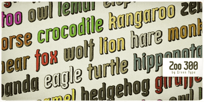
- Aramaic 450 by Archaica,
$30.00This font provides a typical set of characters for the ancient Imperial Aramaic language (the form of Aramaic that saw widespread use in the Persian Empire during the sixth to fourth centuries BC). It includes a full set of alphabetic characters, including some variant shapes, as well as the ancient numeral forms. - Aldine 401 by ParaType,
$30.00Aldine 401 is a Bitstream version of Bembo type family. It was designed on the base of artwork of Francesco Griffo for Aldus Manutius. Originally the font appeared in “De Aetna” in 1495 — the book by Pietro Bembo about his journey to Mount Etna. Griffo’s design was one of the first old style typefaces followed by Garamond. It was the forerunner for the standard text types in Europe for the next two centuries. A modern version of Bembo was designed at Monotype under the supervision of Stanley Morison in 1929. Aldine 401 is still very popular in book design due to its well-proportioned classic letterforms and lack of peculiarities. Italic was based on the handwriting of Giovanni Tagliente. Books and other texts set in Aldine 401 can encompass a large variety of subjects and formats because of its classical beauty and high readability. Cyrillic version was developed by Isabella Chaeva and released by ParaType in 2008. - Kuenstler 480 by Bitstream,
$29.99 - Aldine 401 by Bitstream,
$29.99 - 500 Guitars by Rocket Type,
$14.00 A chunky, whimsical number that strikes just the right chord for modern and retro projects. Loaded with stylistic alternatives, ligatures and Vietnamese support.
 - Texas - Unknown license

- LT Carpet Text - 100% free

- Fancy Card Text - Personal use only

- Komika Text Kaps - Unknown license

- Komika Text Kaps - Unknown license

- Komika Text Tight - Unknown license

- Komika Text Kaps - Unknown license

- Komika Text Kaps - Unknown license

- Square Text Tryout - Unknown license

- Komika Text Tight - Unknown license

- Kaleko 105 Text by Talbot Type,
$19.50 Kaleko 105 Text is the text specific variation of stablemate, Kaleko 105 . With a shallower x-height and longer ascenders and descenders, its more traditional proportions make it more economical with space and better suited to continuous text. It's a well-balanced, versatile, modern sans, highly legible as a text font and with a clean, elegant look as a display font at larger sizes. The Kaleko 105 Text family comprises of four weights and includes old style non-aligning (lower case) numbers, both proportional and tabular as well as accented characters for Central European languages. It is closely related to Kaleko 205 Text , which offers variations in some characters, most notably a two-storey lower case a and g.
 - Titan Text OT by DSType,
$19.00Originally designed in 2003, TitanText now becomes TitanTextOT and it's available in Regular, Italic, Bold and Bold Italic. Includes plenty of OpenType features, like SmallCaps, Alternates, Ligatures and Swashes.


