10,000 search results
(0.041 seconds)
- Renais by Wiescher Design,
$39.50 Renais is a set of Renaissance Initials. The embellished letters are on the keys A through Z. The letters without embellishments are on the lowercase letters a through z. The embellishments without the letters are in alphabetical order on the following keys: 1234567890!§$%&/()=?,.-;:_ You can superimpose the three forms for special effects, they are designed to fit exactly over each other. Have fun! Gert Wiescher - forever discovering old fonts!
 - Martian Grotesk by Martian Fonts,
$35.00 Martian Grotesk is a large typeface family originally designed for the screen which consists of a variable font with 2 axes of variation and 63 styles: Condensed to Ultra Wide, Thin to Ultra Black. Aesthetics The font style is characterized by some brutality and assertiveness. Overhanging terminals, a closed aperture, and an almost complete lack of contrast lead to this effect. Additionally, some elements of the letters are especially enlarged. This font gives any text the impression of being a “signature” style. Nevertheless, we still maintain the golden mean between its rebellious nature and readability. Perfect for web development We created Martian Grotesk for the web and digital project world. When laying out web pages, frontend developers are constantly faced with the fact that uneven metrics do not allow text to be evenly placed on some design element, for example, on a button. Instead, they have to compensate in some way, like making the top padding smaller and the bottom padding larger in CSS. This little deal really hurts. Also, if your project adheres to design system principles, you might be unable to stand a lack of systematic approach when working with fonts. We researched and calculated vertical metrics and set them up in a way that guarantees equal space above the cap height and under the baseline. This enables the text labels to be evenly placed on buttons, inputs, lists, and forms. In addition, we found a proper ratio of the letter heights, so, with commonly used font sizes—10, 15, and 20 pixels—the glyph heights stick to the pixel grid. As a result, the letter shapes become sharper, which reduces the load on the reader's eyes and simply looks much better. The typeface also comes equipped with OpenType and TrueType hinting, and Martian Grotesk appears legible on most platforms, even when being rendered in small sizes. When coupled together, all the above features make Martian Grotesk a reasonable choice for any user interface design. Roadmap Martian Grotesk right now is a work-in-progress product. The font is completely ready for professional use, however, many great features are still ahead! For example, support for Extended Cyrillic characters, and italics. Pricing Purchasing an early version of the font presents the opportunity to get it at a very attractive price! That’s because with every new version, costs will go up to reflect the additional value that comes with every release. But after purchasing Martian Grotesk, all its future updates are included for free!
 - Logika Nova by Designova,
$35.00 Logika Nova is a simple, clean typeface with a modern design and remarkable appearance. This is a perfect choice for creating logotypes, branding, headlines, corporate identities, and marketing materials for web, digital & print alike. The typeface will be a great option for branding, logo/logotype design projects, marketing graphics, banners, posters, signage, corporate identities, and editorial design. Adding extra letter spacing will make this font the perfect choice for minimal headlines and logotypes, as shown in the promo designs attached. Handcrafted and designed with powerful OpenType features in mind, each weight includes extended language support with Western European, Central European, and South Eastern European sets. A total of 280 glyphs are available. Logika Nova typeface includes 12 fonts, with six upright weights (Thin / Light / Book / Regular / Bold / Heavy) and Italic equivalents of all six weights.
 - Circe by ParaType,
$50.00 Circe™ is a geometric sans-serif with some humanist qualities. It consists of seven weights from Thin to Extra Bold in both Normal and Italic styles. Circe, like the Greek goddess it is named after, is capable of metamorphosis. While being clean and simple in its basic form, Circe can become intricate and fancy with its numerous decorative glyph variations. The extensive character set provides support for almost all European languages based on Latin and Cyrillic scripts. Abundant alternates and swash variants organized in stylistic sets inspire creative design options. Circe is good for small point size paragraphs as well as for headlines and posters. The typeface was designed by Alexandra Korolkova and released by Paratype in 2011. The Italic styles were added in 2018 by Alexandra Korolkova and Maria Kharlamova (Selezeneva).
 - Antiquesta by Almarkha Type,
$35.00 Introducing Antiquesta – Signature brush Script font with a Signature Style and classy style, this font is great for your creative projects such as watermark on photography, and perfect for logos & branding, photography, invitation, watermark, advertisements, product designs, stationery, wedding designs, label, product packaging, special events or anything that need handwriting taste. What’s Included : + Standard glyphs + Ligatures + Multilingual + OpenType Ligatures + Web Font + Works on PC & Mac + Simple installations Accessible in the Adobe Illustrator, Adobe Photoshop, Adobe InDesign, even work on Microsoft Word. PUA Encoded Characters – Fully accessible without additional design software. Fonts include multilingual support Image used : All photographs/pictures/vector used in the preview are not included, they are intended for illustration purpose only. Cheers! Thank You
 - Cosan by Adtypo,
$45.00 The idea was to find common intersections between the humanistic and the neo-grotesque model of sans. This variable font offers everything from the world of sans serif in one place – a broad range of weights, adjustable contrast, and a lot of alternative glyphs. As a bonus, you can choose the “cold” or “warm” impact of the text. The Cosan Cold variant has closed apertures and minimal tension in the manner of Helvetica, and the Cosan Warm is open, more dynamic, and airy. Cosan is very suitable for a parallel bilingual setting, as both types are equivalent in their proportions and text color. Like Yin and Yang, each has a piece of the other in him. The Warm version is not totally dynamic, nor is the Cold version totally rigid.
 - Nyala by Microsoft Corporation,
$49.00Nyala is an Ethiopic font designed by John Hudson and Geraldine Wade. The Nyala font features Ethiopic harmonized with Latin characters for bilingual documents. The Nyala typeface is named for the Mountain Nyala, a native antelope found in the mountains of Ethiopia. The Ethiopic characters in the Nyala font were designed by John Hudson based on initial drawings by Geraldine Wade. The Latin characters in Nyala were designed by John Hudson to be in harmony with the Ethiopic characters. The Nyala font supports Ethiopic, Amharic, Tigrinya and Tigre, and also other modern tongues of Ethiopia and Eritrea including Ge'ez - the ancient scriptural language. View Nyala Type Specimen (PDF) - Sinkin Sans Narrow by K-Type,
$20.00 Sinkin Sans Narrow is a simple, pleasantly proportioned and easy to read sans-serif, available in all 9 standard web weights, 100 to 900, plus italics, so the face is a comprehensive illustration of the CSS web font numerical scale. Sinkin Sans fonts are designed with tiny, inconspicuous notches that sink into verticals at the intersections of strokes, adding highlights to congested corners. The incisions make right angles appear sharper and improve definition in more intricate characters. Sinkin Sans Narrow inherits the enviable clarity and readability of the luxuriously wide original family. The Narrow typeface, however, is designed to economise on space within busy web pages and has been sensitively condensed for maximum legibility. Each weight of Sinkin Sans Narrow is supplied with a free Italic.
 - Ravensara Antiqua Stencil by NaumType,
$19.00 Ravensara Stencil - elegant high contrast classic serif. Ravensara family was born from the idea of taking the Didone concept to weight extremes. In light and medium weights Ravensara transmits a very elegant and high fashion style attitude, but stays readable in small sizes and can even be used as a text font. That makes it an ideal solution for projects, that needs an injection of contemporary sophistication. Heavy weights perfectly complement light and medium ones and also works great by their own in large sizes. It is a part of the Ravensara superfamily, united by the same anatomy, which currently also includes Ravensara Sans and Ravensara Serif. Ravensara Stencil is available in 9 weights, including Thin, Light, Regular, Medium, SemiBold, Bold, ExtraBold, Black and ExtaBlack. Ravensara font family, combining its classic origins and contemporary elegance, is a perfect choice for bold headlines, oversize typography, fashion logos, branding, identity, website design, album art, posters, advertising, etc. Ravensara Stencil extends multilingual support to Basic Latin, Western European, Euro, Catalan, Baltic, Turkish, Central European, Pan African Latin and Afrikaans.
 - Autovia by Santi Rey,
$25.99 Autovia is a condensed sans-serif based on the typeface created for the US Highway signs in the 50s. Autovia comes in 6 weights. Has more than 350 glyphs and 8 stylistic sets, and supports all the Latin based languages. A new and more casual addition for the Highway fonts sub-genre ideal for big headlines.
 - KvadratZ by ParaType,
$25.00 An original type family designed for ParaType in 2001 by Zakhar Yaschin. The fonts were created within 'One Touch' project. The aim of the experiment was searching for a grapheme through primitive forms and intentional avoiding 'adjusted' characters. The family includes Wood style imitating woodcut letters, and a set of pictograms. For use in advertising and display typography.
 - Brinton Signature by Aminmario Studio,
$20.00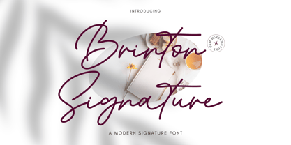 Introducing Brinton Signature Font Brinton Signature is a modern signature font. Its charm makes it appear wonderfully, readable, and, ultimately, incredibly versatile. Comes in Regular and Italic styles. This font will look outstanding in any context, whether it’s being used on busy backgrounds or as a standalone headline! Thank you for the purchase. Happy creating design :)
 - Jasna by Naghi Naghachian,
$95.00 Jasna is designed by Naghi Naghashian. This Font is developed on the basis of specific research and analysis on Arabic characters and definition of their structure. This innovation is a contribution to modernisation of Arabic typography, gives the font design of Arabic letters real typographic arrangement and provides more typographic flexibility. This step was necessary after more than two hundred years of relative stagnation in Arabic font design. Jasna supports Arabic, Persian, and Urdu. It also includes proportional and tabular numerals for the supported languages. Jasna Font is available in two weights, Jasna Regular and Jasna Bold. Jasna design fulfills the following needs: A Explicitly crafted for use in electronic media fulfills the demands of electronic communication. Jasna is not based on any pre-digital typefaces. It is not a revival. Rather, its forms were created with today's technology in mind. B Suitability for multiple applications. Gives the widest potential acceptability. C Extreme legibility not only in small sizes, but also when the type is filtered or skewed, e.g., in Photoshop or Illustrator. Jasna's simplified forms may be artificial obliqued in InDesign or Illustrator, without any loss in quality for the effected text. D An attractive typographic image. Jasna was developed for multiple languages and writing conventions. E The highest degree of geometric clarity and the necessary amount of calligraphic references. This typeface offers a fine balance between calligraphic tradition and the contemporary sans serif aesthetic now common in Latin typography.
 - Ridtype Pro by Ridtype,
$30.00 Ridtype Pro is a custom font for our brand, and later this font will work in all roles in the type of brand we use. both in units of typography, printing, and type texting. This font is equipped with a modern semi-classic category type, so this font can work in all lines of business, both for supporters of implementation in modern and classic business. This font has been designed as best as possible, both in terms of letter design and the type of weight that is made to be compatible in all roles.
 - Voynich - Personal use only

- Zapfino Extra X by Linotype,
$29.99Today's digital font technology allowed the world-renowned typeface designer/calligrapher Hermann Zapf to finally realize a vision he first had more than fifty years ago: creating a typeface that could capture the freedom and liveliness of beautiful handwriting. The basic Zapfino™ font family, released in 1998, consists of four alphabets with many additional stylistic alternates that can be freely mixed together to emulate the variations in handwritten text. In 2003, Herman Zapf completely reworked the Zapfino design, creating Zapfino™ Extra. This large expansion of the Zapfino family was designed in close collaboration with Akira Kobayashi. Zapfino™ Extra includes a cornucopia of new characters. It features exuberant hyper-flourishes, elegant small caps, dozens of ornaments, more alternates and ligatures, index characters, and a very useful bold version, named Zapfino™ Forte. A version of the 1998 Zapfino typeface ships as one of the pre-installed fonts included with Mac OSX. The Mac OSX version's letters are four times larger than the Linotype standard. In order to minimize compatibility problems for Macintosh users, Linotype has created OSX versions of its Zapfino Extra Pro typefaces, which have been enlarged to correlate visually with the Mac OS Zapfino system font. These special Linotype fonts can be distinguished by the letter X" in their name. Zapfino Extra is an OpenType format font, which is available in two versions. Which version you purchase should depend on which software applications you use the most and what features they support! The Contextual version of Zapfino Extra Pro contains a treasure-trove of extra contextual features. When created in 2004, this was the most advanced OpenType font released to date. By purchasing this version, users of OpenType-supporting applications, such as Adobe InDesign, may access all of the features available in the entire Zapfino family through just two fonts, Zapfino Extra LT Pro (Contextual) and Zapfino Forte LT Pro! Unfortunately, most non-Adobe applications currently do not support the contextual features made possible by recent OpenType developments. Users of Quark XPress and Microsoft Office should instead purchase all of the non-contextual fonts of Zapfino Extra Pro family, in order to access all of the Zapfino Extra family's 1676 glyphs. The Zapfino Extra family's character set supports 48 western and central European languages. Use Zapfino Extra to produce unusual and graceful advertisements, packaging, and invitations. Zapfino Extra is so joyously abundant that it's tempting to over-indulge, so be sure to check out the tips for working well with the possibilities." - Scientia by ParaType,
$30.00Scientia (means 'knowledge', 'science' in Latin) is a neutral serif typeface in eight styles. It contains four weights (Regular, Medium, Bold, Black) with corresponding italics. All the styles support Western and Central European Latin, basic and Asian Cyrillic and Greek. Regular and Medium styles include smallcaps for all supported languages. In addition to the standard set of non-alphabetic characters Scientia has arrows and some supplemental mathematical symbols. The font was created by Natalia Vasilyeva. Being a professional book designer, Natalia uses Scientia in astronomy books. Scientia is a good choice for literary fiction and academic non-fiction texts. The typeface was released by ParaType in 2016. - Tecna Dark Down Triangle BNF by Descarflex,
$30.00 The Tecn@ Dark&Light Triangle Background Nomenclature Font family is differentiated by the direction of the triangle tip in the 4 cardinal points. The family were designed to head, enumerate, indicate or highlight writings or design plans, for this reason, the characters are available only in capital letters and some signs or symbols that can serve such purposes. A triangle or empty character is included so that the user can use it overlaying any character of his choice or to be used alone.
 - Tecna Light Down Triangle BNF by Descarflex,
$30.00 The Tecn@ Dark&Light Triangle Background Nomenclature Font family is differentiated by the direction of the triangle tip in the 4 cardinal points. The family were designed to head, enumerate, indicate or highlight writings or design plans, for this reason, the characters are available only in capital letters and some signs or symbols that can serve such purposes. A triangle or empty character is included so that the user can use it overlaying any character of his choice or to be used alone.
 - Tecna Light Left Triangle BNF by Descarflex,
$30.00 The Tecn@ Dark&Light Triangle Background Nomenclature Font family is differentiated by the direction of the triangle tip in the 4 cardinal points. The family were designed to head, enumerate, indicate or highlight writings or design plans, for this reason, the characters are available only in capital letters and some signs or symbols that can serve such purposes. A triangle or empty character is included so that the user can use it overlaying any character of his choice or to be used alone.
 - Tecna Dark Right Triangle BNF by Descarflex,
$30.00 The Tecn@ Dark&Light Triangle Background Nomenclature Font family is differentiated by the direction of the triangle tip in the 4 cardinal points. The family were designed to head, enumerate, indicate or highlight writings or design plans, for this reason, the characters are available only in capital letters and some signs or symbols that can serve such purposes. A triangle or empty character is included so that the user can use it overlaying any character of his choice or to be used alone.
 - Tecna Dark Left Triangle BNF by Descarflex,
$30.00 The Tecn@ Dark&Light Triangle Background Nomenclature Font family is differentiated by the direction of the triangle tip in the 4 cardinal points. The family were designed to head, enumerate, indicate or highlight writings or design plans, for this reason, the characters are available only in capital letters and some signs or symbols that can serve such purposes. A triangle or empty character is included so that the user can use it overlaying any character of his choice or to be used alone.
 - Tecna Light Right Triangle BNF by Descarflex,
$30.00 The Tecn@ Dark&Light Triangle Background Nomenclature Font family is differentiated by the direction of the triangle tip in the 4 cardinal points. The family were designed to head, enumerate, indicate or highlight writings or design plans, for this reason, the characters are available only in capital letters and some signs or symbols that can serve such purposes. A triangle or empty character is included so that the user can use it overlaying any character of his choice or to be used alone.
 - Mihaly Display by Alfab,
$55.00 Mihaly is a geometric sans serif with a low contrast. It was designed with care to conserve the feeling of geometric rigor, referring to the constructivist ideal of the 20s. But the homogeneity of its proportions gives it a very modern neutrality, making Mihaly an interesting alternative to classic low-contrasted sans-serif like Din or Interstate. Designed for display setting, Mihaly Display is the first in a family of fonts, with the rest to be completed in the coming future.
 - Tecna Light Up Triangle BNF V1.0 by Descarflex,
$30.00 The Tecn@ Dark&Light Triangle Background Nomenclature Font family is differentiated by the direction of the triangle tip in the 4 cardinal points. The family were designed to head, enumerate, indicate or highlight writings or design plans, for this reason, the characters are available only in capital letters and some signs or symbols that can serve such purposes. A triangle or empty character is included so that the user can use it overlaying any character of his choice or to be used alone.
 - We Love Nature Summer Flowers by kapitza,
$79.00 We Love Nature Summer Flowers is a picture font inspired by a late summer visit to an organic flower farm in the south of England. The farm specializes in growing local seasonal flowers for lovely bouquets and arrangements. This picture font features 52 hand-drawn illustrations inspired by these flowers. The contemporary flower illustrations can used on their own or in combination with the other illustrations in the We Love Nature font collection to create striking designs.
 - Keiss Title by DSType,
$50.00 The Keiss type family is our interpretation of the popular nineteen century Scotch Roman typefaces. We intended to keep a very classic approach while introducing a couple of new elements that differentiate this type family from it’s ancestors. This design, with short descenders and ascenders, along with three very distinct optical sizes makes this type family well suited for contemporary newspapers. The Title and Big versions range from Thin to Heavy, with matching italics, in order to be used in big sizes and stand out in the design. The Text ranges from Thin to ExtraBold and is a standalone type family for text usage, with narrow proportions and wider and open italics for improved text setting. The Condensed versions, ranging from Thin to Bold, don’t have italics, although they can be matched with the italics of the Title and Big versions, due to the fact they are very condensed.
 - Keiss Big by DSType,
$50.00 The Keiss type family is our interpretation of the popular nineteen century Scotch Roman typefaces. We intended to keep a very classic approach while introducing a couple of new elements that differentiate this type family from it’s ancestors. This design, with short descenders and ascenders, along with three very distinct optical sizes makes this type family well suited for contemporary newspapers. The Title and Big versions range from Thin to Heavy, with matching italics, in order to be used in big sizes and stand out in the design. The Text ranges from Thin to ExtraBold and is a standalone type family for text usage, with narrow proportions and wider and open italics for improved text setting. The Condensed versions, ranging from Thin to Bold, don’t have italics, although they can be matched with the italics of the Title and Big versions, due to the fact they are very condensed.
 - Keiss Condensed by DSType,
$50.00 The Keiss type family is our interpretation of the popular nineteen century Scotch Roman typefaces. We intended to keep a very classic approach while introducing a couple of new elements that differentiate this type family from it’s ancestors. This design, with short descenders and ascenders, along with three very distinct optical sizes makes this type family well suited for contemporary newspapers. The Title and Big versions range from Thin to Heavy, with matching italics, in order to be used in big sizes and stand out in the design. The Text ranges from Thin to ExtraBold and is a standalone type family for text usage, with narrow proportions and wider and open italics for improved text setting. The Condensed versions, ranging from Thin to Bold, don’t have italics, although they can be matched with the italics of the Title and Big versions, due to the fact they are very condensed.
 - Keiss Condensed Big by DSType,
$50.00 The Keiss type family is our interpretation of the popular nineteen century Scotch Roman typefaces. We intended to keep a very classic approach while introducing a couple of new elements that differentiate this type family from it’s ancestors. This design, with short descenders and ascenders, along with three very distinct optical sizes makes this type family well suited for contemporary newspapers. The Title and Big versions range from Thin to Heavy, with matching italics, in order to be used in big sizes and stand out in the design. The Text ranges from Thin to ExtraBold and is a standalone type family for text usage, with narrow proportions and wider and open italics for improved text setting. The Condensed versions, ranging from Thin to Bold, don’t have italics, although they can be matched with the italics of the Title and Big versions, due to the fact they are very condensed.
 - Keiss Text by DSType,
$50.00 The Keiss type family is our interpretation of the popular nineteen century Scotch Roman typefaces. We intended to keep a very classic approach while introducing a couple of new elements that differentiate this type family from it’s ancestors. This design, with short descenders and ascenders, along with three very distinct optical sizes makes this type family well suited for contemporary newspapers. The Title and Big versions range from Thin to Heavy, with matching italics, in order to be used in big sizes and stand out in the design. The Text ranges from Thin to ExtraBold and is a standalone type family for text usage, with narrow proportions and wider and open italics for improved text setting. The Condensed versions, ranging from Thin to Bold, don’t have italics, although they can be matched with the italics of the Title and Big versions, due to the fact they are very condensed.
 - Litho Display by Arkitype,
$9.00 Litho Display is a bold display typeface, it has 8 fonts in the family with four different styles. Litho Display has been created with bold headline and poster typography in mind. It is perfect for use on typography heavy posters, packaging or on screen idents. The four different styles Litho Display comes in is Regular, Rounded, Rough and Press each with an italic pairing. With these styles Litho Display is versatile for various different uses whether it needs to be clean type for a poster or on screen or a more rough and rustic style for some packaging.
 - KG Fractions by Kimberly Geswein,
$5.00 This font was created with math teachers in mind. It is hard to represent fractions in a way that can print easily in black and white on worksheets or tests. The extra outlines on these shapes are created just for that purpose- so your student can easily identify how many parts are shaded in the image. Blanks are also included so students can color in parts of a whole.
 - Caslon Titling by Monotype,
$29.99Monotype Caslon Titling was made available for hot metal casting in 1932. The capital Monotype Caslon Titling letters were based on types from the Stephenson Blake Foundry, previously the Caslon Foundry. Originally designed by William Caslon in the eighteenth century, Caslon is considered an old face although it has characteristics which were later found in the transitional typefaces. The Monotype Caslon Titling font has a distinctive style, generous width and strong color, ideal for use in advertising, magazines and on book jackets. - Wayfinding Sans Pro by FDI,
$49.00 Ralf Herrmann, the designer of Wayfinding Sans, started this project with extensive field studies, driving tens of thousands of miles to explore the legibility of road signage typefaces in dozens of countries around the world. After building his own theoretical framework of relevant legibility parameters, the design process used a unique custom real-time simulation software, which could simulate difficult reading conditions (distance, fog, halation, positive/negative contrast) while the letters were actually being designed. This process made it possible to optimize even the tiniest details of each letter for maximum legibility. Being made specifically for wayfinding purposes, this type family does not compromise on any aspect of legibility — and yet, the typeface is a beautiful, clean and modern sans serif. With its broad language support and the large number of available styles it is perfectly suitable for any possible signage project anywhere in the world. In an independent empirical study at the University of Applied Sciences “htw” in Berlin different typefaces were recently tested when used on signs and Wayfinding Sans Pro was the winner in all conducted tests, being significantly more legible and therefore superior to all other styles of the tested typefaces. Check out the PDF specimen for more information: wayfinding-sans-pro.pdf
 - Sleepy Bear by Missy Meyer,
$12.00 I've been learning to read Cyrillic and Greek letters lately, mainly because I've been playing the game GeoGuessr. (If you haven't played it, I highly recommend! It plops you down somewhere in the world in Google Street View, and you have to figure out where you are.) Cyrillic shows up in so many more places than Russia! You can see it in Bulgaria, Mongolia, Serbia, Montenegro, Kyrgyzstan, and more. Because of that, I made sure to include a fun double-uppercase version of those alphabet sets in Sleepy Bear. They're styled the same way as the Latin characters: all uppercase height, with some lowercase-styled letters thrown in at that same height for a fun look for all ages. I've also made two weights of Sleepy Bear: a plump and smooth regular weight, and a lighter weight that's built to stack on top of the regular (though you can use it on its own). Just type out a word in Sleepy Bear, copy it, and then change the copy to Sleepy Bear Light. You'll get a great outline look in seconds! All characters are extensively cleaned up, with smooth curves and rounded ends. Sleepy Bear is great for all print projects, and also cuts out of all materials like a dream. It's a cute and quirky monoline font family that's great for all of your family's designs. Each font contains over 850 glyphs, and includes: - Latin and extended Latin characters to support over 100 languages; - Cyrillic and Greek double-uppercase alphabet sets; - 18 fractions; - Punctuation galore; - 38 double-letter ligatures for variety (including international pairs like KK and II); - And a half-dozen alternates for even more variety!
 - Fresh Garden by Epiclinez,
$18.00 Fresh Garden is an elegant, cursive font. It's a great fit for any project you have in mind! Use it as your wedding invitation text or to create a logo design with a feminine touch. Whether you're taking on a fun project or tackling something serious the script font will always please and soothe your senses. So what’s included : Basic Latin Uppercase and Lowercase Numbers, symbols, and punctuations Ligatures Multilingual Support. Simple Installations Works on PC & Mac
 - Artho by Twinletter,
$12.00 Our newest font named Artho has a strong and bold character but is relaxed and fun to look at. so it is appropriate if you use this font for your project that is friendly fun but has a strong impression and attracts attention. This font is also equipped with three choices of thin, regular, and bold. makes it easier and more flexible for you to combine them to suit your needs. This handwritten font is perfect for children’s magazines, drink banners, games, posters, beverage, outdoor events, thumbnails, food banners, cheerful writing, film titles, quotes, titles, logos, and various kinds of projects you need, of course, your various design projects will be perfect and extraordinary if you use this font because this font is equipped with a complimentary font family, both for titles and subtitles and sentence text. start using our fonts for your amazing projects.
 - Explosion by Suomi,
$25.00 This font is an experiment in building dynamics into a typeface. Explosion has two variants to be put on top of each other for more dimension.
 - Greeting Monotone by Monotype,
$29.99Based on Art Nouveau models, Greeting Monotype was created by M.F. Benton in 1927. The Greeting Monotone font works well for titling, packaging and greeting cards.
