10,000 search results
(0.013 seconds)
- Bound AOE by Astigmatic,
$19.95 - Sound Bubble by Hanoded,
$15.00 Sound Bubble is a nice, uncomplicated cartoon-ish font. It will liven up your designs, especially book covers, posters and packaging. Comes in a normal and a dotty version.
 - Ground Castle by Letterhend,
$19.00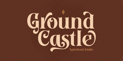 Introducing, Ground Castle - A Modern high contrast serif font with swashes. The stylistic alternates and ligatures make this font event more unique and stands from the crowd. This font perfectly made to be applied especially in logo, and the other various formal forms such as invitations, labels, logos, magazines, books, greeting / wedding cards, packaging, fashion, make up, stationery, novels, labels or any type of advertising purpose. Features : uppercase & lowercase numbers and punctuation multilingual alternates, swashes & ligatures PUA encoded We highly recommend using a program that supports OpenType features and Glyphs panels like many of Adobe apps and Corel Draw, so you can see and access all Glyph variations.
 - Ten Pounds by Up Up Creative,
$29.00 Introducing Ten Pounds, a fun, hand-drawn serif font with tons of character (and tons of characters!). Ten Pounds is perfect for branding, poster design, t-shirts, invitations, design for children, and editorial design. It comes with more than 1300 glyphs, including more than 100 ligatures. OpenType features include stylistic sets, character variants, initial and final forms, and multilingual support (including multiple currency symbols). The OpenType features can be very easily accessed by using OpenType-savvy programs such as Adobe Illustrator and Adobe InDesign. (To access these awesome features in Microsoft Word, you'll need to get comfortable with the advanced tab of Word's font menu.)
 - The Bounde by Cititype,
$12.00 The Bounde is a bold script, carefully handcrafted to become a true favorite. Its casual charm makes it appear wonderfully down-to-earth, readable and, ultimately, incredibly versatile. The Bounde will look outstanding in any context, whether it’s being used on busy backgrounds or as a standalone headline!
 - Brown Sound by Epiclinez,
$18.00 The Brown Sound is an authentic signature script font. This handwritten beauty is suitable for high-end, sophisticated branding, movie poster, album cover or for simple, memorable Instagram quotes.
 - The Ground by Balevgraph Studio,
$10.00 The ground is a minimal and neat sans serif font with plenty of stylistic alternatives. This typeface is perfect for an elegant & luxury logo, book or movie title design, fashion brand, magazine, clothes, lettering, quotes, and so much more. What's Included? Uppercase & Lowercase, Number, Punctuation Ligatures & Alternates Multilingual support PUA Encoded Reguler & Italic TTF
 - Not Found by Gassstype,
$23.00 Hello Everyone, Introduce our new collection Font Not Found This is a Unique Display Font that is written casually and quickly.this a Authentic Style and classy style Inspired by famous logos of Technology and brands that have very strong characteristics, this font is great for your creative projects such as watermark on photography, and perfect for logos & branding, invitation,advertisements,product designs, stationery, wedding designs,label ,product packaging, special events or anything that need handwritting taste. Font Not Found has charming, authentic and relaxed characteristic more natural look to your text with a more natural look to your text.
 - Black Ground by Letterhend,
$16.00 Black Ground a unique brush typeface with bold and strong feel. This font perfectly made to be applied especially in logo, and the other various formal forms such as invitations, labels, magazines, books, greeting / wedding cards, packaging, fashion, make up, stationery, novels, labels or any type of advertising purpose. Features : uppercase & lowercase (alternates) numbers and punctuation Ligatures and alternates multilingual support PUA encoded We highly recommend using a program that supports OpenType features and Glyphs panels like many of Adobe apps and Corel Draw, so you can see and access all Glyph variations. Email us to letterhend@gmail.com if you need something! Happy Designing!
 - Hot Ground by Hatftype,
$15.00 Is a comic display font with distinctive handwritten characters perfect for branding projects, logos, wedding designs, media posts, advertisements, product packaging, product designs, labels, photography, watermarks, invitations, stationery, and any project who need handwritten dishes. Features : 1. Uppercase & Lowercase 2. Multilingual support 3. Number 4. Symbol 5. Punctuation 6. Support in Mac and Windows OS I really hope you enjoy it.
 - Floats Around by Epiclinez,
$18.00 Are you looking to add some personality to your next project? Then Floats Around is the answer! This fun, playful font is just what your work needs to stand out. With its unique character, Floats Around can create bold headlines that grab attention. Plus, it's also great for branding and logotypes, making it a versatile choice for any project. Floats Around Font includes : Standard Latin Uppercase & Lowercase Numbers, symbols, and punctuations Multilingual Support. Fully accessible without additional design software Simple Installations Works on PC & Mac Thank You.
 - Roaming Around by Olivetype,
$18.00 Roaming Around is a typeface that is perfect for any design project. With its graffiti-inspired style, it's guaranteed to give your designs a hand-painted, stand-out feel. Fight the monotony of clean fonts by giving your designs true character with Roaming Around. So what’s included : Basic Latin Uppercase and Lowercase Numbers, symbols, and punctuations Ligatures Multilingual Support. PUA Encoded and fully accessible without additional design software Simple Installations works on PC & Mac Thank You and Happy Designing!
 - KG What A Time - Personal use only

- KG The Last Time - Personal use only

- KG How Many Times - Personal use only

- Star Time Too JL - Unknown license

- KR Christmas Time 2 - Unknown license

- Once upon a time - Unknown license

- Question of time [simple] - Unknown license

- KR Lotsa Time Dings - Unknown license

- KR Party Time Dings - Unknown license

- Fun Time Nouveau JNL by Jeff Levine,
$29.00 “One Hundred Alphabets for the Show Card Writer” was published in 1919 to afford sign artists the ability to create signs and show cards in then-contemporary lettering styles. One such alphabet was big, bold and representative of the Art Nouveau stylings popular in the early part of the 20th Century. Most likely it was applied to store sales and public events that were casual and informal, for its letter forms are free of any constraints. This design is now available as Fun Time Nouveau JNL in both regular and oblique versions.
 - Times New Roman Seven by Monotype,
$67.99In 1931, The Times of London commissioned a new text type design from Stanley Morison and the Monotype Corporation, after Morison had written an article criticizing The Times for being badly printed and typographically behind the times. The new design was supervised by Stanley Morison and drawn by Victor Lardent, an artist from the advertising department of The Times. Morison used an older typeface, Plantin, as the basis for his design, but made revisions for legibility and economy of space (always important concerns for newspapers). As the old type used by the newspaper had been called Times Old Roman," Morison's revision became "Times New Roman." The Times of London debuted the new typeface in October 1932, and after one year the design was released for commercial sale. The Linotype version, called simply "Times," was optimized for line-casting technology, though the differences in the basic design are subtle. The typeface was very successful for the Times of London, which used a higher grade of newsprint than most newspapers. The better, whiter paper enhanced the new typeface's high degree of contrast and sharp serifs, and created a sparkling, modern look. In 1972, Walter Tracy designed Times Europa for The Times of London. This was a sturdier version, and it was needed to hold up to the newest demands of newspaper printing: faster presses and cheaper paper. In the United States, the Times font family has enjoyed popularity as a magazine and book type since the 1940s. Times continues to be very popular around the world because of its versatility and readability. And because it is a standard font on most computers and digital printers, it has become universally familiar as the office workhorse. Times?, Times? Europa, and Times New Roman? are sure bets for proposals, annual reports, office correspondence, magazines, and newspapers. Linotype offers many versions of this font: Times? is the universal version of Times, used formerly as the matrices for the Linotype hot metal line-casting machines. The basic four weights of roman, italic, bold and bold italic are standard fonts on most printers. There are also small caps, Old style Figures, phonetic characters, and Central European characters. Times? Ten is the version specially designed for smaller text (12 point and below); its characters are wider and the hairlines are a little stronger. Times Ten has many weights for Latin typography, as well as several weights for Central European, Cyrillic, and Greek typesetting. Times? Eighteen is the headline version, ideal for point sizes of 18 and larger. The characters are subtly condensed and the hairlines are finer." - KG The Last Time by Kimberly Geswein,
$5.00 Playful, whimsical unicase chunky bold lettering.
 - Hand Scribble Sketch Times by TypoGraphicDesign,
$19.00 CHARACTERISTICS A state-of-the-art OpenType-Feature (like Contextual Alternates (calt) and Stylistic Alternates (salt)) of “Hand Scribble Sketch Times” is, that each uppercase and each lowercase letter has automatically alternated two variations to bring humanly-random characteristics of handwriting to life. The character of the rough, ruggend and raw handwritten classic serif typeface is a very unique warmly atmosphere. An pro-version of the font “Hand TIMES”. APPLICATION AREA warmth, love, handmade. For support of human warmth. Of cooking recipes, menus in the restaurant across party flyer, music cover Art to logo (word marks), headings in magazines and websites. TECHNICAL SPECIFICATIONS ? Font Name: Hand Scribble Sketch Times ? Font Weights: Regular, Rough, Invert ? Font Category: Grunge Serif Display for Headline Size ? Font Format: OTF (OpenType Font for Mac + Win) ? Glyph coverage: 601 ? Language Support: Basic Latin/English letters, Central Europe, West European diacritics, Baltic, Romanian, Turkish ? Specials: Alternative letters, Standard & Discretionary Ligatures, extras like symbols, dingbats, Old-style Digits, Lining Figures, accents & €, incl. OpenType-Features like Contextual Alternates (calt), Glyph Composition/Decomposition (ccmp), Discretionary Ligatures (dlig), Kerning (kern), Standard Ligatures (liga), Numerators (onum), Ordinals (ordn), Stylistic Alternates (salt), Stylistic Set 01 (ss01), Stylistic Set 02 (ss02), Stylistic Set 03 (ss03), Slashed Zero (zero), Lining Figures (lnum), Tabular Figures (tnum), Old Style Figures (onum), Proportional Figures (pnum) ? Design Date: 2013 ? Type Designer: Manuel Viergutz
 - Old Time Nouveau JNL by Jeff Levine,
$29.00 The 1914 sign lettering instruction book “Art Alphabets and Lettering” by J. M. Bergling showcased many hand lettered alphabets as an inspiration to both up-and-coming and established sign painters. One page in particular featured a classic free-form Art Nouveau style with rounded shapes. This style of lettering was emulated in the 1960s by designers of rock concert posters, so the style is reminiscent of the Art Nouveau period as well as the 1960s. Old Time Nouveau JNL is available in both regular and oblique versions.
 - Kidnapped At Old Times by Intellecta Design,
$11.90 Kidnapped at Old Times, by Intellecta Design, is a collection of 35 fonts (and growing) of some of the most decorative caps we have ever carried. Decorative caps can capture the attention of anyone when used well. These caps are remarkably interesting and very detailed. So many to choose from - the entire family has over 2000 exotic, intrincate and historical letters. Easier to just order the whole family!
 - Times New Roman WGL by Monotype,
$67.99 In 1931, The Times of London commissioned a new text type design from Stanley Morison and the Monotype Corporation, after Morison had written an article criticizing The Times for being badly printed and typographically behind the times. The new design was supervised by Stanley Morison and drawn by Victor Lardent, an artist from the advertising department of The Times. Morison used an older typeface, Plantin, as the basis for his design, but made revisions for legibility and economy of space (always important concerns for newspapers). As the old type used by the newspaper had been called Times Old Roman," Morison's revision became "Times New Roman." The Times of London debuted the new typeface in October 1932, and after one year the design was released for commercial sale. The Linotype version, called simply "Times," was optimized for line-casting technology, though the differences in the basic design are subtle. The typeface was very successful for the Times of London, which used a higher grade of newsprint than most newspapers. The better, whiter paper enhanced the new typeface's high degree of contrast and sharp serifs, and created a sparkling, modern look. In 1972, Walter Tracy designed Times Europa for The Times of London. This was a sturdier version, and it was needed to hold up to the newest demands of newspaper printing: faster presses and cheaper paper. In the United States, the Times font family has enjoyed popularity as a magazine and book type since the 1940s. Times continues to be very popular around the world because of its versatility and readability. And because it is a standard font on most computers and digital printers, it has become universally familiar as the office workhorse. Times?, Times? Europa, and Times New Roman? are sure bets for proposals, annual reports, office correspondence, magazines, and newspapers. Linotype offers many versions of this font: Times? is the universal version of Times, used formerly as the matrices for the Linotype hot metal line-casting machines. The basic four weights of roman, italic, bold and bold italic are standard fonts on most printers. There are also small caps, Old style Figures, phonetic characters, and Central European characters. Times? Ten is the version specially designed for smaller text (12 point and below); its characters are wider and the hairlines are a little stronger. Times Ten has many weights for Latin typography, as well as several weights for Central European, Cyrillic, and Greek typesetting. Times? Eighteen is the headline version, ideal for point sizes of 18 and larger. The characters are subtly condensed and the hairlines are finer."
 - Greatest All of Time by Struggle Studio,
$16.00 Greatest All the Time - is a Duo Handwritten with Extras and petite (handwritten and modern look) Font Duo, featuring a sweet and gentle look. This original look will appeal to a variety of crafty ideas, from letterhead and titles to writing implements.
 - Hand Retro Sketch Times by TypoGraphicDesign,
$19.00 CONCEPT/ CHARACTERISTICS A serif typeface with modern and fancy handmade haptics. Take the 3 layers for unique designs and create many different variations. From light and warm outline (take the regular style), about heavy and pithy filling (take the bold style) till fancy and modern 3d shadows (take the 3d style). The combination of all 3 font styles = bulky design freedom. Game with it! Handemade sketched for display size. APPLICATION AREA The vintage but modern, the raw but friendly serif font »Hand Retro Sketch Times« with many language support (for a display font) would look good at headlines. Editorial Design (Magazine or Fanzine) or Webdesign (Headline Webfont for your website), party flyer, movie poster, music poster, music covers or webbanner. And and and… TECHNICAL SPECIFICATIONS Headline Font | Display Font | Serif Layer Font »Hand Retro Sketch Times« OpenType Font with 341 glyphs, alternative letters and ligatures (with accents & €) & 3 styles & 3 layers (regular, bold, 3d)
 - Times New Roman PS by Monotype,
$67.99In 1931, The Times of London commissioned a new text type design from Stanley Morison and the Monotype Corporation, after Morison had written an article criticizing The Times for being badly printed and typographically behind the times. The new design was supervised by Stanley Morison and drawn by Victor Lardent, an artist from the advertising department of The Times. Morison used an older typeface, Plantin, as the basis for his design, but made revisions for legibility and economy of space (always important concerns for newspapers). As the old type used by the newspaper had been called Times Old Roman," Morison's revision became "Times New Roman." The Times of London debuted the new typeface in October 1932, and after one year the design was released for commercial sale. The Linotype version, called simply "Times," was optimized for line-casting technology, though the differences in the basic design are subtle. The typeface was very successful for the Times of London, which used a higher grade of newsprint than most newspapers. The better, whiter paper enhanced the new typeface's high degree of contrast and sharp serifs, and created a sparkling, modern look. In 1972, Walter Tracy designed Times Europa for The Times of London. This was a sturdier version, and it was needed to hold up to the newest demands of newspaper printing: faster presses and cheaper paper. In the United States, the Times font family has enjoyed popularity as a magazine and book type since the 1940s. Times continues to be very popular around the world because of its versatility and readability. And because it is a standard font on most computers and digital printers, it has become universally familiar as the office workhorse. Times?, Times? Europa, and Times New Roman? are sure bets for proposals, annual reports, office correspondence, magazines, and newspapers. Linotype offers many versions of this font: Times? is the universal version of Times, used formerly as the matrices for the Linotype hot metal line-casting machines. The basic four weights of roman, italic, bold and bold italic are standard fonts on most printers. There are also small caps, Old style Figures, phonetic characters, and Central European characters. Times? Ten is the version specially designed for smaller text (12 point and below); its characters are wider and the hairlines are a little stronger. Times Ten has many weights for Latin typography, as well as several weights for Central European, Cyrillic, and Greek typesetting. Times? Eighteen is the headline version, ideal for point sizes of 18 and larger. The characters are subtly condensed and the hairlines are finer." - KG How Many Times by Kimberly Geswein,
$5.00 A cute, markered skinny font that is tall and neat with plenty personality to spare.
 - Rund Marker - Unknown license

- Almonet Ronded by Gian Studio,
$16.00 About Product Almonet Ronded is a modern script font with a bold rounded style with a bold and modern look. This font is suitable for logos, branding, product design, product packaging, photography, watermarks, social media posts, advertisements, invitations, stationery, labels, logos, magazines, books, greeting/wedding cards, fashion, makeup, and more. other. What's Included: - Uppercase & lowercase - Numbers and punctuation marks - Multilingual support - Ligature - Alternative - Washing - Works on PC & Mac - Simple installation Accessible in Adobe Illustrator, Adobe Photoshop, Adobe InDesign, even works in Microsoft Word. PUA Coded Characters – Fully accessible without additional design software. Thank you for your purchase! Hope you enjoy with our fonts!
 - Runde Wien by Wannatype,
$36.00 Runde Wien Pro, the rounded sans serif by Ekke Wolf. Typeface lovers looking for a modern, well-developed sans serif font with a touch of retro and warm, individual lettering will get excited about a new addition to the font market. The more than complete Runde Wien Pro front comes in three styles and four different weights. In addition to the upright Runde Wien Pro there is the Runde Wien Pro Oblique with a moderate 6° slant and the Runde Wien Pro Superoblique with an 18° slant. Available weights are light, regular, medium, bold and black. These fonts are equipped with extended Latin alphabet for Central and Eastern Europe and also Cyrillic and Greek alphabet. The set of characters includes nine different sets of numbers, plus its own set for the small caps, as well as alternative characters and groovy ligatures. In addition, all Runde Wien Pro styles are also available as unicase with upper case and lower case x-height alignment. The style, metrics and proportions of Runde Wien Pro combine perfectly with the Liebelei Pro and the script fonts of the Calafati Pro.
 - Simple Ronde by JBFoundry,
$20.00 Simple Ronde is conceived for young pupils. This upright script is based on the french use at primary schools. A large set of ligatures make the links between characters more natural, especially with o, b, v and w.
 - Ronde Pro by RMU,
$35.00 Ronde Pro is an expressive and decorative broad-nib font for multilingual usage.
 - Ronde Script by GroupType,
$19.00 Ronde Script (Ronde meaning "A kind of script in which the heavy strokes are nearly upright, giving the characters when taken together a round look.") is based on the original design named Parisian Ronde released in 1878 by the Chappelle Foundry in Paris. Other versions of this script include Inland French Script, French Script, French Plate, and Typo Upright. Different type foundries tied to the releases of this design include Mayeur (Paris), Stephenson Blake (London), Bernhardt Brothers & Spindler (Chicago), and ATF (Elizabeth, NJ). This style of script has been a very popular choice in designing wedding invitations and so many other formal announcements for over 130 years. Its very readable, formal and elegant with an antique or retro feel.
 - Bousni Ronde by Linotype,
$29.99The Bousni family's six faces display links unexpected by most readers of western alphabets. Inspired by both by Arabic calligraphy, and contemporary bitmap design, Bachir Soussi Chiadmi created this playful series of faces. Letters in each of the six typefaces link together, but not in the ways normally expected from script fonts. Suited for a wide array of fun functions, Bousni Carre and Bousni Ronde (each available in Light, Medium, and Bold weights) bring new a style and flavor to your collection. All six fonts in the Bousni family are included in the Take Type 5 collection from Linotype GmbH. The Bousni family espouses similar construction traits with other fonts from Linotype. Specifically, the straight lines and joints in the three Bousni Carre fonts are based off of a grid system similar to Anlinear, another member of the Take Type 5 collection from Linotype GmbH. The letter connections throughout the Bousni family are similar to Arabic kashidas, a typographic feature found recently in many non-Arabic typefaces, such as Linotype Atomatic." - Daddy Tie - Unknown license


