10,000 search results
(0.047 seconds)
- The Gloves by Aestherica Studio,
$12.00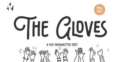 Introducing the new Fun Handwritten Font by Aestherica Studio. Proudly Present, The Gloves The Gloves is perfect for product packaging, branding project, megazine, social media, wedding, or just used to express words above the background. The Gloves also multilingual support. Enjoy the font, feel free to comment or feedback, send me PM or email.
 - Moxy Rush by Alit Design,
$21.00 Introducing "Moxy Rush" Font: Redefining Modern Blackletter Elegance Unleash the power of typography with "Moxy Rush," a remarkable font that seamlessly blends the timeless essence of blackletter style with a captivating contemporary twist. This font is a true masterpiece, meticulously designed to elevate your designs, projects, and artworks to new heights of sophistication and creativity.
 - Audrena by Putracetol,
$19.00 Audrena is a new elegant modern script font. A lovely, elegant and sweet script font. Audrena is perfect for styling logos, stationery, wedding event, invitation, quote, social media, websites and so much more! Come with Opentype feature with a lot of alternates, its help you to make great lettering.This font is also support multi language.
 - InkArt Labels by John Moore Type Foundry,
$24.95 Inkart is a font dingbats, shapes for new labels or frames that the user can supplement according to the requirements and purposes. It consists of a set uppercase containing the forms, and a set is lower case which has areas of the same shapes to be colored by layers. Contains retro and modern styles.
 - Caracas by John Moore Type Foundry,
$20.00 Caracas is a new family of sans serif fonts, looking friendly, sweet and comfortable to read. Where text flow between straight lines and round by becoming transparent in the interest of readability. Caracas is ideal for working in small letters and texts of a technical nature. Caracas is a humanistic approach to reading sans forms.
 - LA QATRIE by Hishand Studio,
$15.00 Experience refined design with La Qatrie, a display font that boasts an elegant look and a touch of luxury, setting a new standard for sophistication in typography. Perfect for those needing a touch of elegance, classy, stylish, beautiful bold type, and modernity for their design. Complete with ligatures alternates regular hollow icon kerning multilingual support
 - Unranked by Gassstype,
$23.00 Here comes our new font Unranked this is a sans handwritten that is written casually and quickly. this font are made with brushes on Procreate. Then crafted carefully drawn into vector format. That is why Unranked has Rough and strong characteristic more natural look to your text with a more modern look to your text.
 - Drakoheart Revofit Sans by G3 Typefaces,
$- Drakoheart Revofit is an initiative to make sans fonts. It’s one of my personal favorites, in fact. In its first release, this font had a cool appearance but was improved with better kerning and a cool look in this new release. Perfect to write some digital texts as in web articles, blogs and branding.
 - Sharplion by Zeki Michael,
$30.00 Sharplion is a typeface family designed by Zeki Michael and Leyla Melis Aslan. It’s a simple, but sharp display typeface with a clear yet powerful personality, created to not only optimize space, but also build contrast on the printed page and on the screen. Sharplion, coming in two weights and a matching slanted version, is designed to give that neo-vintage industrial feel in 'titles and hierarchic subheadings, logotypes and cases of short and simple copywriting for the artisan, hand-made and small batch look.’ The first 4 letters for what is now Sharplion, were designed in 2018 by Zeki Michael to be used as a logotype for Depo Coffee Roasting’s branding project. In early 2019 after Zeki designed all the letters, numbers and glyphs, he teamed up with talented designer, Leyla Melis Aslan to add strength to the project. The full Sharplion type system includes Regular, Black and Slanted styles – providing a simple but sharp contrast type solution for digital and print design work.
 - PM Doorbuster Casual by Paper Moon Type & Graphic Supply,
$17.00 The PM Doorbuster Collection is based on retro hand-painted paper signs primarily seen in grocery stores from the 1940s through today. We meticulously hand-drew each font, modeling the spacing and uneven baseline found in vintage sign painting. The purposely organic ascenders and descenders, along with a huge set of ligatures/contextual alternates to avoid the same letters repeating when paired, give it a real hand-lettered look. PM Doorbuster Casual is perfect for both vintage-inspired and contemporary marketing, branding, and packaging designs. It's a classic uppercase sign painter font that has been used from the 1950s thru today. You've probably seen hand-lettered versions used in tattoo studios, workshops, and chalkboard menus. Now it's available in a digital format with all of the authentic look and feel of actual hand-painted letters. Check out a few of the samples included in the thumbnails to see what can be done with it.
 - Centennial Script by Canada Type,
$24.95 Centennial Script was designed and cut by Hermann Ihlenburg in 1876 (the centennial of American independence, hence the typeface's name) for the MacKellar, Smiths & Jordan foundry in Philadelphia. Ihlenburg was then only 33 years old, and these beautiful forms put him on his way to become the most prolific and innovative deco, ornamental and script typeface designer and punch cutter of the nineteenth century. In trying to be a true homage to the history of the new world, Centennial Script transcends its then-contemporary deco fashion to embrace script elements historically similar to lettering found on maps or political documents of the 18th century. Letters like the p and s extend themselves high and mighty to accentuate words and lines of text in a fancy hand-drawn manner. The dots on the i and j are those of a careful scribe who acknowledges the importance of the document being lettered. The lowercase letters connect with two slight angular motions of the hand, also very carefully and elegantly. Even the ligatures and ending swashes Ihlenburg made for this face were reminiscent of a mapmaker's patient hand, though Ihlenburg's elegant touch in them cannot be mistaken. Although Centennial Script was one of the few Ihlenburg faces to make it to film type technology, the transition was neither credited nor faultless. The film type version was a bit sloppy in the way the connectors were made, so the lowercase needed a lot of manual work to typeset properly. To alleviate such waste of time for the user of this digital version, the connectors were redrawn according to the original metal ones made by Ihlenburg himself, and tested thoroughly in print to ensure the quality of the typeface's flowing cursive nature. This wasn't an easy task, and very time-consuming, since the changing angles on both ends of the connection made it impossible to escape from having to build every lowercase letter with both left and right connectors that would fit with the rest of the letters. This is one typeface that couldn't be revived in any other manner than the way it was originally made, regardless of more than 130 years of technological advances since the face was designed. Centennial Script comes in all popular font formats, and supports most Latin-based languages. Also included is an Alts fonts that contains alternates, ligatures, snap-on swash endings, some ornaments, as well as a complete set of the lowercase without left side connectors, for a more natural combination when following a majuscule, or just in case the user finds it fit to set the copy in a non-connecting script instead of the face's original connected flow. Centennial Script Pro, the OpenType version, combines the main font with the Alts font in a feature-packed single font. Use the ligature feature to set wordmarks like Mr, Ms, Mrs, Dr, and &Co, the stylistic alternates feature to replace some letters with their alternative forms, the contextual alternates feature for better uppercase-lowercase sequences, and the titling feature to set your text in a disconnected script. Centennial Script is the only script we currently know of that can be set connected or disconnected simultaneously, either using the titling feature in the OpenType Pro version, or manually in the other formats.
 - Ysobel by Monotype,
$29.99 The Ysobel™ typeface family is not only elegant; it is also exceptionally legible and space economical. A collaborative design effort between Robin Nicholas, as lead designer and project director, Delve Withrington and Alice Savoie of Monotype Imaging, the project had the primary design goal of creating a typeface family for setting text in newspapers and periodicals. The result, however, is also ideal for any application that requires quick and easy assimilation of text. According to Nicholas, “The idea for the design started when I was asked to develop a custom version of Century Schoolbook. I wanted to give the design a more contemporary feel, although the client ultimately decided to keep their typeface closer to the original. The project nevertheless gave me ideas for a new design. Since designing Nimrod, some 30 years ago, I had wanted to make a more modern typeface family for newspapers and magazines – this seemed the ideal candidate.” Ysobel (pronounced “Isabel”) has the soft, inviting letter shapes of Century Schoolbook but contrasts these with more incised serifs and terminals. Its capitals are also narrower than those of Century Schoolbook, and care was taken to ensure that they harmonize perfectly with the lowercase. Ysobel’s x-height is full-bodied without disrupting lowercase proportions. In addition, curved terminals, such as those in the “C,” “c” and “e,” were drawn more open as an aid to legibility and readability in text copy. Weight stress is near vertical, and hairlines are robust to ensure character fidelity in small point sizes. Development began with the text version of the family, which has four weights, each with an italic companion. All weights feature lining and old style numerals, fractions, superiors and extended Latin language coverage. Small caps are also available in the Roman Regular design. Ysobel Display is a completely redrawn version of the typeface; it is narrower, and has a slightly smaller x-height, thinner hairlines and subtle design changes to improve its appearance when set at large sizes. The Display Italic received particular attention to make it ideal for setting headlines, subheads and short blocks of copy. Changes include a slightly greater italic angle and more cursive treatment of some letter shapes. Alternative styles of capital “J” and “Q,” to provide variation, are available in all weights.
 - Caribantu Agora by Lamatype,
$24.00 Caribantu Agora is an update of the Caribantu Grotesque typeface, with a new, more consistent and refined design. Being a 100% Latin Plus typeface, it features a wide range of characters for all Latin languages, making it a versatile option for designers worldwide. The kerning has been adjusted to ensure readability and text cohesion, providing a pleasant and professional reading experience. Additionally, Caribantu Agora includes all braille characters, making it accessible, inclusive, and ready for complex signage and packaging projects. With four stylistic sets, this typeface allows users to further customize their designs. Alternative glyphs allow you to change the look to a more modern and tech form, giving even more dynamism to web pages, packaging, and signage. Check out some of the features present in Caribantu Agora: 7 weights and a variable option; 100% Latin Plus; 15 OpenType features; 4 stylistic sets; Monetary symbols for all circulating currencies; Braille character sets; Math symbols; Arrows pointing in all directions.
 - Ah, EnglishTowne-Normal, the font that transports you back to a time when feather quills were the peak of writing technology, candlelight was the latest trend in ambient lighting, and sending a messa...
- Paverify by Esintype,
$14.00 Paverify is an all-caps geometric slab serif display face inspired by a particular pavement tile component which is evoking a blocky “I” letter. All other characters were interpreted based on its look and drawn accordingly. There are three uppercase Roman fonts in different weights and widths substantially. With the additional versions, type family consisting of 7 fonts in total. Over 220 Latin, Cyrillic and Greek script languages supported. Each font contains an extensive multilingual support with more than 1600 glyphs and OpenType features, including number forms, fractions, and stylistic alternate sets those provide different looks by the typographic preferences. For the lowercase letters there are small caps variants, i.e., shorter caps. These also have identical glyphs and matching marks to enable “Small Capitals From Capitals” feature. Narrower Medium and Bold styles was produced to accompany the Black first design. Paverify comes with an ornaments font named as “Extras”, which contains geometric graphical elements, i.e., paver stone patterns, banner/sticker background sets, star comps and a collection of catchwords to simplify creating feature rich layouts. As is known as interlocking paver in certain regions — a rectangular shape with the distinctive diagonal tabs — transcribing the simplest letter to draw into the whole alphabet was a challenging task. Not only it was the single thing that can be used as a source, considering its thick form in roughly 1.2:1 proportions compared to the sophistication of letterforms was the challenge. Starting point was keeping design consistent while both avoiding and preserving a particular appearance to achieve a similar texture, basically a repeating pattern on the streets. In contrary of a traditional approach, Paverify tend to have more contrast than the other slab serifs which helps to reduce massive stem weight of the source form. This look contributes to its hand painted sign effect achieved in a certain degree, which may otherwise impractical to transform because the source material is an inorganic, static form by definition. Tight and even spacing of the pavement tiles was inspirational for the kerning balance of the letters. Although the lighter weights have more space between the letter pairs, black weight adjusted as to be close to each other as the original grid. Tight spacing can be ignored by using Capital Spacing OpenType feature for the Outline versions as layer fonts. In one stroke, this gives an extra space between the letters to avoid diagonal armed letter terminals overlap. Black typographic colour and texture gives a sturdy appearance to the lines, it is useful for the projects where a robust display faces preferred for the titling, strong headlines, letter stacks, dropcaps, initials, short names on materials such as advertisements, book covers, posters, logotypes, wordmarks, package designs, and more in print or digital. Paverify can be paired as a complimentary face in a combination with broader type systems, where vintage look compositions and woodcut style fusions requiring an extra stunning texture.
 - Actium by Type Mafia,
$45.00 Actium is a contemporary multilingual sans serif typeface developed to help perfect typography automatically. Type Mafia has focussed on words with odd combinations of capital letters and numbers, such as product names and postal codes such as WD40 and H1N5, jump out of the text. They sit awkwardly together as the numerals have been designed to work with the lowercase, not the uppercase letters – affecting readability.To fix this Type Mafia invented Smart Capo™. Smart Capo™ Smart Capo is a feature that automatically activates once you type an uppercase letter together with a number. When a capital letter is sat next to a numeral, Smart Capo converts the letter to a mid-cap — a contemporary alternative to small caps — and the default old-style numeral to a lining numeral. Actium’s mid-caps and lining numerals have been designed with the same height (between cap and x-height) so they sit comfortably next to each other and fit more harmoniously into text. Smart Capo applies equal attention to capitalised words without any numbers, such as NAVO and USA, and are also automatically set into mid-capitals. Working on its own, Smart Capo saves time and money for the typographer — taking the pain out of text formatting — and makes it a more pleasurable experience for the reader. This feature is made possible by the use of ‘contextual alternates’, an OpenType feature used in modern font software, working with a set of characters specially designed at mid-cap height. By default these changes automatically take place so it doesn't need to be switched on, it will just work. Actium Actium’s design has an unusual diagonal contrast — much more common in a serifed face than in a sans serif — giving it more bite. The typeface looks elegant when set in large sizes and remains very legible when shown in small sizes. The family consists of six weights in two styles, making a dozen fonts. Weights range from light to black in roman and true italic. All fonts are fully loaded with functional elements. Actium boasts an extended Latin character set and with Greek. This means a wide range of Western languages are supported: perfect for use in bilingual publications and packaging. For numerals, each font includes old-style and lining figures in both proportional and tabular widths, with superiors and inferiors. These allow you to select the right set of numbers for the right task.
 - Kingthings Trypewriter Pro by CheapProFonts,
$10.00 I have made this font properly monospaced (all characters are the same width) as that is how an old typewriter worked. In addition to correcting and expanding the character set, of course. Keving King says: "Kingthings Trypewriter is a deconstructed typewriter face. I have always loved decayed fonts, this is the first of mine - and yes, I know there are lots of these around - this one is MINE". ALL fonts from CheapProFonts have very extensive language support: They contain some unusual diacritic letters (some of which are contained in the Latin Extended-B Unicode block) supporting: Cornish, Filipino (Tagalog), Guarani, Luxembourgian, Malagasy, Romanian, Ulithian and Welsh. They also contain all glyphs in the Latin Extended-A Unicode block (which among others cover the Central European and Baltic areas) supporting: Afrikaans, Belarusian (Lacinka), Bosnian, Catalan, Chichewa, Croatian, Czech, Dutch, Esperanto, Greenlandic, Hungarian, Kashubian, Kurdish (Kurmanji), Latvian, Lithuanian, Maltese, Maori, Polish, Saami (Inari), Saami (North), Serbian (latin), Slovak(ian), Slovene, Sorbian (Lower), Sorbian (Upper), Turkish and Turkmen. And they of course contain all the usual "western" glyphs supporting: Albanian, Basque, Breton, Chamorro, Danish, Estonian, Faroese, Finnish, French, Frisian, Galican, German, Icelandic, Indonesian, Irish (Gaelic), Italian, Northern Sotho, Norwegian, Occitan, Portuguese, Rhaeto-Romance, Sami (Lule), Sami (South), Scots (Gaelic), Spanish, Swedish, Tswana, Walloon and Yapese.
 - Boogie Nights NF Pro by CheapProFonts,
$10.00 A typical Art Deco font. I have redesigned the uppercase “S” to mach the lowercase, tweaked a little here and there - and completely redesigned all the diacritics (which didn't really match the letter designs). Nick Curtis says: "The inspiration for this font came from a poster for an Austrian trade show from the 1920s, credited simply to Wasserman." ALL fonts from CheapProFonts have very extensive language support: They contain some unusual diacritic letters (some of which are contained in the Latin Extended-B Unicode block) supporting: Cornish, Filipino (Tagalog), Guarani, Luxembourgian, Malagasy, Romanian, Ulithian and Welsh. They also contain all glyphs in the Latin Extended-A Unicode block (which among others cover the Central European and Baltic areas) supporting: Afrikaans, Belarusian (Lacinka), Bosnian, Catalan, Chichewa, Croatian, Czech, Dutch, Esperanto, Greenlandic, Hungarian, Kashubian, Kurdish (Kurmanji), Latvian, Lithuanian, Maltese, Maori, Polish, Saami (Inari), Saami (North), Serbian (latin), Slovak(ian), Slovene, Sorbian (Lower), Sorbian (Upper), Turkish and Turkmen. And they of course contain all the usual “western” glyphs supporting: Albanian, Basque, Breton, Chamorro, Danish, Estonian, Faroese, Finnish, French, Frisian, Galican, German, Icelandic, Indonesian, Irish (Gaelic), Italian, Northern Sotho, Norwegian, Occitan, Portuguese, Rhaeto-Romance, Sami (Lule), Sami (South), Scots (Gaelic), Spanish, Swedish, Tswana, Walloon and Yapese.
 - Gyllene Elgen by Mans Greback,
$69.00 Gyllene Elgen, created by Mans Greback, is a delicate and captivating handwriting font that exudes romance and charm. With its thin, beautiful lines, and loopy, decorative swirls, this typeface brings a touch of elegance and sophistication to your design projects. Perfect for invitations, personal notes, and other heartfelt communications, Gyllene Elgen captures the essence of delicate, handcrafted beauty. The font was inspired by the golden hues of the Swedish landscape during autumn, as well as the mythical golden elk that roams the forests. Mans Greback sought to bring this enchanting story to life through the graceful curves and fine details of Gyllene Elgen. The font is built with advanced OpenType functionality and has a guaranteed top-notch quality, containing stylistic and contextual alternates, ligatures, and more features; all to give you full control and customizability. It has extensive lingual support, covering all Latin-based languages, from Northern Europe to South Africa, from America to South-East Asia. It contains all characters and symbols you'll ever need, including all punctuation and numbers. Mans Greback is a Swedish typeface designer, celebrated for his innovative and diverse portfolio. With a keen eye for detail and innovative designs, Mans has earned a reputation for creating fonts that resonate with people across the globe, inspiring creativity and capturing the imagination.
 - Orangerie by Mans Greback,
$69.00 Orangerie is a soft, delicate, and beautiful typeface that captures the essence of fashion, sweetness, and nature. Its flowing, thin lines evoke a sense of calm and loveliness, making it the perfect choice for romantic, professional, and light-hearted projects alike. Inspired by the serene beauty of blooming flowers in a sunlit orangerie, the typeface was meticulously crafted to convey a sense of warmth, tranquility, and sophistication. The result is a font that feels both contemporary and timeless, perfect for a wide range of applications, from branding and packaging to wedding invitations and personalized stationery. Use character ¤ to make decorative nature element such as leaves. Use multiple for different versions. Example: Sweet¤¤¤¤Morning (Download required.) This elegant font comes in four versatile styles: Regular, Bold, and their italic versions, allowing you to craft the perfect tone and atmosphere for your designs. The font is built with advanced OpenType functionality and has a guaranteed top-notch quality, containing stylistic and contextual alternates, ligatures, and more features; all to give you full control and customizability. It has extensive lingual support, covering all Latin-based languages, from Northern Europe to South Africa, from America to South-East Asia. It contains all characters and symbols you'll ever need, including all punctuation and numbers.
 - Wooden Nickel NF Pro by CheapProFonts,
$10.00 A nice, black display face - for a retro/western poster look. I have kept the quirky “t”, increased the dot above “i” and “j” slightly, improved the spacing/kerning and modified/added all the usual diacritics. A pretty easy reworking of a good quality font. Nick Curtis says: "An old favorite, Bernhard Antique Bold Condensed, cleaned up and fattened up. Warm, charming, personable … suitable for any occasion." ALL fonts from CheapProFonts have very extensive language support: They contain some unusual diacritic letters (some of which are contained in the Latin Extended-B Unicode block) supporting: Cornish, Filipino (Tagalog), Guarani, Luxembourgian, Malagasy, Romanian, Ulithian and Welsh. They also contain all glyphs in the Latin Extended-A Unicode block (which among others cover the Central European and Baltic areas) supporting: Afrikaans, Belarusian (Lacinka), Bosnian, Catalan, Chichewa, Croatian, Czech, Dutch, Esperanto, Greenlandic, Hungarian, Kashubian, Kurdish (Kurmanji), Latvian, Lithuanian, Maltese, Maori, Polish, Saami (Inari), Saami (North), Serbian (latin), Slovak(ian), Slovene, Sorbian (Lower), Sorbian (Upper), Turkish and Turkmen. And they of course contain all the usual “western” glyphs supporting: Albanian, Basque, Breton, Chamorro, Danish, Estonian, Faroese, Finnish, French, Frisian, Galican, German, Icelandic, Indonesian, Irish (Gaelic), Italian, Northern Sotho, Norwegian, Occitan, Portuguese, Rhaeto-Romance, Sami (Lule), Sami (South), Scots (Gaelic), Spanish, Swedish, Tswana, Walloon and Yapese.
 - MARIAMNE by Type Innovations,
$39.00 MARIAMNE is an original design by Alex Kaczun. It is an elegant, modern and traditional interpretation based on and modeled after his successful "Contax Pro" and "New Age Gothic" typeface series. As such, it has generous proportions with clean, crisp lines—ideally suited for easy reading and long lines of copy. Alex felt that the skeleton for "Contax" was perfectly suited to transform the design into a modern version of 'old-style', somewhat reminiscent of German Black Letter. Numerous modifications where made to the body proportions, stems and shapes. True 'old-style' serifs and unusual 'cross-strokes' where added for a touch of distinction. The 'cross-strokes' where added at exactly visual mid-point on the overall heights. This gives the typeface a romantic, female-like quality to the overall design. Strong, yet delicate. Visually stimulating in appearance and function. The result is a truly unique transitional and modern design. Unlike other typefaces, MARIAMNE incorporates uniform stems throughout the capitals, lower case and figures. This gives the design a uniform appearance in overall color and strength. There is a perfect visual balance between inter-letter spacing, stem weights and proportions. The accents are equally large, bold and command attention. This font includes a large 'Pro' character set, which supports most Central European and many Eastern European languages. As a result, the design is ideally suited for display copy as well as text composition. In the near future, Alex plans to expand the typeface series to include a light and heavy weight, along with true italics.
 - TOMO Claire by TOMO Fonts,
$10.00 TOMO Claire is a handmade typeface with a relaxed style and committed to the environment. It comes in two styles, Regular and Waste with a distressed look. This typeface is ideal for all types of projects related to the care of the environment and everything else. Be green! Act now!
 - Destroyer by Comicraft,
$19.00 You wanted the best and you got the best - the hottest fonts in the world jumping off the pages of the hottest comic in the world -- KISS: PSYCHO CIRCUS. Now you can all journey into the void with the KissAndTell and Destroyer fonts handcrafted by headbangin' John Roshell. Lick it up!
 - Chase by Device,
$39.00 Type that preserves the over- and under-inked textures of true old-fashioned wood faces, now available without ink on your fingers straight from your keyboard. Based on samples taken from early and mid Nineteenth century Clarendons, the font carefully preserves all the battered idiosyncracies of vintage print shop type.
 - Gundrada ML by HiH,
$12.00 Gundrada ML was inspired by the lettering on the tomb of Gundrada de Warenne. She was buried at Southover Church at Lewes, Sussex, in the south of England in 1085. The Latin inscription on her tomb, STIRPS GUNDRADA DUCUM, meaning “Gundrada, descendant of the Duke” may have led to the speculation that she was the daughter of William, Duke of Normandy and bastard son of Robert the Devil of Normandy and Arletta, daughter of a tanner in Falaise. In 1066 William defeated Harold at the Battle of Hastings and was crowned William I of England. More commonly known as William the Conquerer, he commissioned a string of forts around the kingdom and charged trusted Norman Barons to control the contentious Anglo-Saxon population. William de Warenne, husband of Gundrada, was one of these Barons. There has also been the suggestion that Gundrada may have been the daughter of William’s wife, Matilda of Flanders, by a previous marriage. According to the Dictionary of National Biography (Oxford University Press, Oxford, England 1921-22), both of these contentions are in dispute. Searching the past of a thousand years ago is like wandering in a heavy fog: facts are only dimly in view. Regardless, I know that I found these letterforms immediately engaging in their simplicity. Unadorned and unsophisticated, they have a direct honesty that rests well in the company of humanistic sans serifs like Franklin Gothic or Gill Sans, appealing to a contemporary sensibility. The lettering on the tomb is in upper case only. Although Gundrada does not sound Norman French to me, her husband certainly and her father probably were Norman French. Nonetheless, the man that carved her tombstone was probably Anglo-Saxon, like most of the people. For that reason, we are quite comfortable with a fairly generic lower case from an Anglo-Saxon document of the time. The time was a time of transition, of contending language influences. This font reflects some of that tension. Features 1. Multi-Lingual Font with 389 glyphs and 698 Kerning Pairs. 2. OpenType GSUB layout features: onum, dlig, liga, salt & hist. 3. Tabular Figures and Alternate Old-Style Figures. 4. Alternate Ruled Caps (line above and below, matching to brackets). 5. Central Europe, Western Europe, Turkish and Baltic Code Pages. 6. Additional accents for Cornish and Old Gaelic. 7. Stylistic alternates A, E, y and #. 8. Ligatures ST, Th, fi and fl. 9. Historic alternate longs. The zip package includes two versions of the font at no extra charge. There is an OTF version which is in Open PS (Post Script Type 1) format and a TTF version which is in Open TT (True Type)format. Use whichever works best for your applications.
 - Carmilla Demo, crafted by the notable typographer David F. Nalle, is a distinctive font that reflects a blend of timeless elegance and artistic flair, making it a standout choice for various design p...
- Go by Canada Type,
$24.95 Five years into the 21st century and the promise of nanotechnology, high-end popular culture design seems to thrive on combining opposites and drawing a fine line between traditionally contradictory ideas. This is seen in modern society's usual cultural frontrunners - like consumer electronics, fashion items, music packaging and publications, where it is evident that traditionally complex marketing statements of fashionability and lifestyle are attempted with simple minimalism. But at the typographic end of this realm, the creative majority still uses old faces that help the modern statement only in passing. Some of the more adventurous creative professionals actively seek new elements to emphasize contemporary impact in their modern design. To those adventurous types (pun intended), Canada Type presents this new face called Go. It is very much a child of the new millennium, inspired by the unmistakable minimalist style of modern 21st century corporate logos, recent design shifts in electronic music and club-marketing collateral, and disc jockeys who have enthusiasm, energy, precision and total control of each and every vibration traveling from mixer to speakers. Go is an original modern techno-lounge face that offers the eyes pleasing collages of friendly minimal forms that give the words an impression of simplicity and depth at once. This is a font that prides itself on its precise grouping of elements and just enough original creativity in combining those elements. The precision builds the sharp edge sought for modern statements, while the creativity keeps the message rejuvenated, clear and interesting. Go's character set consists of a versatile and unexpected, yet mild mix of the uppercase and lowercase forms, with multiple variations on the majority of the letters. The e being a vertical mirror of G is only the first of the pleasant surprises. More than 30 alternates are inside the font. All the accented characters in Go have been meticulously (perhaps obsessively) drawn to be unusual for logos and short statements. Take a look at the character map and be ready for a space-age surprise. To borrow a Star Trek cliché, this font can Go where no font has gone before.
 - Aldus Nova by Linotype,
$50.99 Hermann Zapf and Akira Kobayashi redeveloped Palatino for the 21st Century, creating Palatino nova. The Palatino nova family also includes revised versions of Aldus (now called Aldus nova). A bold weight is added into the font family. The character set support is similar to Palatino nova, but Greek and Cyrillic are not available in book weight fonts.
 - Caesar Pro by RMU,
$35.00 In 1913, Leipzig-based foundry C. F. Ruehl released a hot-metal font called Caesar-Schrift which was cut by the engraver and medalist Georg Schiller (1858-1937). This humanist sans combines successfully traditional classic forms with the flowing lines of the Art Nouveau period. Now revived as Caesar Pro, this font was carefully extended and made multilingual.
 - Hullabaloo by Solotype,
$19.95We saw a few letters of this in a catalog, and liked it so well we drew it up and made it as a film font for photolettering. Due to a surplus of interesting types in our shop this one never made it into our catalog, so we can¹t tell you anything about its popularity. - Poster Linear by Jehansyah,
$9.00 Poster Linear Natural sans serif font is simple but looks very futuristic and very stylish, it adds to your confidence to make your designs look bolder and modern. Perfect for stickers, media posts, social media statuses, magazines, books, covers, game covers, banners, wall magazines, sports shades, and more, plus a few families you can incorporate into your designs.
 - Deco Power JNL by Jeff Levine,
$29.00 A June 18, 1929 issue of the Hollywood trade paper “The Film Daily” ran an ad for a film called “The Power House”. The film’s title was hand lettered in an extra bold sans serif design with strong Art Deco influences. This is now available digitally as Deco Power JNL in both regular and oblique versions.
 - ITC Musclehead by ITC,
$29.99ITC Musclehead is the work of type designer Timothy Donaldson, a robust, densely packed handwriting typeface. It almost looks like brushwork but was in fact made with a ruling pen which Donaldson had bought from a company in Salem, Massachusetts. He says, The world's gone ruling-pen mad at the moment [late 1990s] and I was beginning to tire of all the skinny splashiness of the letters that most people were making with them. I wanted to do something heavy and robust with the tool, so that's what I did."" - Florati by Proportional Lime,
$19.99 Can you imagine the delight that the printers of the Incunabula era would have had if they had such a tool as this font with a hundred and fifty glyphs of decorative capitals. The printers of that era were lucky to have more than a handful such delights. These Decorated initials and drop caps are all based on early period exemplars, dating to prior to 1525, from a wide range of printers such as Thomas de Blavis to Günther Zainer. Every Proportional Lime Font comes equipped with a complete character map.
 - Bike Decals JNL by Jeff Levine,
$29.00Bike Decals JNL captures the fun and nostalgia of the 1950s and 1960s when kids all around the country ran to their local five and dime or hobby store to purchase water applied decals. The "cool" thing would be to customize your bike, little red wagon or anything that would be fair game with various racing symbols, weird space creatures or other unusual images. In this font, Jeff Levine has put his own spin on some of the classic designs of yesteryear, drawing from scratch some of the most popular of their day. - Sublime by Coniglio Type,
$19.95 Sublime45-Regular Sublime Revised for 2021. One font in Opentype format as Sublime45. Families and all TT Truetype versions eliminated in this wonderful stand alone. The Spring 1997 original release of Sublime —borne an organic creature of black water soluble ink & digitized by Coniglio Type. Sublime is a fun font to use in commercial layouts. It is soft and fluid as ink. Like the wrinkles of time, it is imperfect. That in itself makes it incredibly attractive, warm and “human factor”. Sublime offers legibility so sorely missed in the current recreational font market. Sublime was inspired by World War II US fighter pilot Donald Alling. He flew missions over Nazi Germany. His squadron also dropped food, medicine and relief supplies over the Netherlands. Known as “the Colonel” to his friends. Don as a civic engineer ruled literally miles of ink letter callout’s with a template device called a LeRoy in peacetime on vellum and mylar across his career as a technical illustrator. You didn't want to screw up inking into a template with wet black permanent ink. You really had to have a steady hand and it was all done by hand. You can say Don worked “unplugged”. And that is cool! He was part of the broad stroke of postwar industrial expansion that helped keep America strong, rendering exploded views on top secret projects. Many of us were not even born yet when all this was going on. Today at over 80 years young Don is like a national treasure, savvy and bright—and the ladies love him! The Colonel remains a dedicated master airbrush man, stand–up man, caricature artist and letterman all without use of a computer! He was lucky enough to retire before a desktop cathode tube was put in his face. Today the Colonel enjoys restoring VW’s, flying and freelance consulting when not being called to supper by his lovely wife Rea.
 - Quintus by JOEBOB graphics,
$22.00 This font is an adaptation of the typeface I designed for TJX Europe, which was used in their branding campaigns for the TK MAXX stores all over Europe. Most characters were given a major facelift and also a few extra ligatures were added in the process. Quintus comes with a regular and a bold version so it offers more variety in use. It also works well in all caps.
 - Motorix by Ampersand Type Foundry,
$24.00 Motorix is a typeface of alternatives. A versatile and highly flavorful constructivist design in three weights with corresponding italics, and hundreds of variant forms. Motorix’ interchangeable letterforms yield a multitude of combinations that elicit electronic rhythms and at times take on humanistic forms. The name Motorix is a pseudo-feminized variant (the ‘-ix’ suffix being derived from ‘-trix’) of the German word ‘motorik’, which refers to both electronic music and human motor skills. The typeface lives up to its energetic name, synthesizing precise rhythms and alphabetic waveforms into a uniquely upbeat and spunky typeface.
 - Arcaro JNL by Jeff Levine,
$29.00 There are times when a typeface is used so consistently that it becomes somewhat synonymous with the subject it's used in. The opening and end titles for the ABC-TV series "Naked City" (1958-1963) were set in a bold version of a popular font emulating the look of calligraphic hand lettering. Arcaro JNL is a somewhat lighter and slightly modified version of this typeface and is offered in both regular and oblique versions. The name Arcaro comes from one of the regular characters in this superbly-written police drama, Detective Frank Arcaro.