7,358 search results
(0.014 seconds)
- Kapra Neue by Typoforge Studio,
$29.00 Kapra Neue was the #1 bestselling Grotesque Sans released in 2017 on MyFonts. Kapra Neue is a younger brother of Kapra. This new family has refreshed proportions, rounded corners, and a new shape of glyphs. It is characterised by a wide range of instances – 24 new weights, from Thin Condensed to Black Expanded, allowing use of the family in complex ways, depending on the user’s needs. Every instance comes with its italic version. The font has a glyph set for latin script and old-style figures. Kapra Neue is inspired by a “You And Me Monthly” magazine, published by National Magazines Publisher RSW "Prasa” in Poland, from May 1960 till December 1973.
 - Rivea by Magpie Paper Works,
$36.00 Rivea is two-font, hand-lettered script family designed to mimic real calligraphy. Each font dances along a natural, variable baseline and has a distinctive slant. Long, thin upstrokes contrast with rich downstrokes in a style reminiscent of "wet noodle" pen writing. Each Opentype font includes eight different ampersands, a swash feature that automatically substitutes beginning & end of word letters, a set of alternate letters, old style numerals, arbitrary fractions, six common "word-art" prepositions and six common honorifics. All Opentype features have been duplicated in Stylistic Sets for Microsoft Word users. To enable alternate ampersands, simply turn on the contextual alternates feature and type &1, &2, &3, etc. Opentype coding automatically substitutes the new "and".
 - Loncherita by Fabio Godoy,
$29.95 Loncherita is a typeface created by Fabio Eduardo Godoy Angel and has 5 files: Fill, Fill Outline, Shadow 1, Shadow 2 and dingbats variables. Its purpose is to serve as a childish fantasy modular typography useful in logo design and merchandising. It is also recommended to compose expressive titles that need the option in which letters can be colored by layers. In that sense Loncherita is a typeface with logic italic vertical logical and its amount of contrast between thick and thin strokes is monoline, its antlers are mullets and rounded ends. It is also important to note that ii has 26 Dingbats designed to be point of attention and illustrate countless children and playful issues.
 - Redsema by Twinletter,
$18.00 Looking for a unique, stylish, and fun font for your next project? Look no further than this one. Meet Redsema groovy font. With an anatomical shape between thin and thick lines, beautiful from any angle. It also features alternative lettering, ligatures, and decorative elements to add a unique flair to your work. Make the most of your designs using this font today! What’s Included : Standard glyphs Iso Latin 1 Simple installations We highly recommend using a program that supports OpenType features and Glyphs panels like many Adobe apps and Corel Draw, so you can see and access all Glyph variations. PUA Encoded Characters – Fully accessible without additional design software. Fonts include Multilingual support
 - Fester by Fontfabric,
$150.00 Get inspired with Fester Behance presentation After several years of iterations, our brand new sans family of 16 styles is ready to take over with vector excellence! Fester is a semi-condensed Grotesque developed to beam big messages across the galaxy with a clear, bold voice. Emerging as if from the future, this low-contrast sans warps slick lines and sharp terminals into unexpected geometric shapes for extra flair. Ranging from Thin to Heavy, the typeface is loaded with 8 weights + italics, one variable style, over 760 glyphs, and Extended Latin + Cyrillic for flawless work at hyper-speed. Fester syncs with designs that feature big type, sharp layouts, interfaces, outlines, and raster images to help decipher any cutting-edge idea and make a memorable first contact. Family overview: 8 weights (from Thin to Heavy) + italics Extended Latin Cyrillic 760 glyphs Variable Font 1 free font - Fester-ExraLight 130+ languages OpenType Features: Localized Forms Subscript and scientific inferiors Superscript (Superiors) Numerators and Denominators Fractions Lining Figures Tabular Figures Oldstyle Figures Case-Sensitive Forms Standard and Discretionary Ligatures Stylistic Alternates Contextual Alternates Slashed Zero
 - Alpha Delta by Wiescher Design,
$39.50 The standard paperclip is the basic idea behind this Alpha Delta. By working on it, I changed it so that it doesn't look too much like a paperclip any more. Things happen, Gert Wiescher
 - Ames' Weathered by Greater Albion Typefounders,
$16.00 Ames’ Weathered is the ‘antique’ accompaniment to our Ames’ typeface families. It has that ‘tumbled’, weather knocked about look. Just the thing for posters, headings and signage where there’s a need to suggest age.
 - Anno by Linotype,
$29.99The impulse behind André Maaßen’s design of the Anno typeface was the design of a New Year’s card for the year 2000 (Anno 2000). His desire to create the perfect printed image developed into a family with four styles: Anno 1, Anno 1 Italic, Anno 2, and Anno 2 Italic. Anno 1 and its Italic are semi-classicist typefaces, with a high degree of stroke contrast, while Anno 2 and its Italic are semi-grotesks, with less stroke contrast. Both Anno 1 and Anno 2 are sans serifs typefaces, but they each offer a new interpretation of the genre. The Anno typeface may be used in a number of applications and sizes. And it is naturally suitable for New Year’s greetings and other cards, of course! - Professor Minty by Chank,
$99.00 Professor Minty is a cartoon-inspired kind of comic font with a lotta bounce and a whole buncha spooky fun. Both regular and bold are based on Chank’s first fonts, Mister Frisky and Uncle Stinky. The Bold version is brand new in 2011, never before available. But here both of those fonts are combined into one extra-savvy font that does all kinds of tricks. It has many extra special OpenType features, like Swash, Contextual Alternates and Small caps and more. There’s even a “decaf” feature (Stylistic Set #1) which tones it down a bit if the account people think it is just too exciting. Works good for Halloween, Christmas and Valentine’s Day, oddly enough. Who knew those three holidays had anything in common?
 - Rolling Pen by Sudtipos,
$79.00 After doing this for so many years, one would think my fascination with the old history of writing would have mellowed out by now. The truth is that alongside being a calligraphy history buff, I'm a pop technology freak. Maybe even keener on the tech thing, since I just can't seem to get enough new gadgets. And after working with type technologies for so many years, I'm starting to think that writing and design technologies as we now know them, being about 2.5 post-computer generations, keep becoming more and more detached from what the very old humanity arts/tasks they essentially want to facilitate. In a world where command-z is a frequently used key combination, it’s difficult to justify expecting a Morris-made book or a Zaner-drawn sentence, but accidental artistic “mutations” become welcome, marketable features. When fluid pens were introduced, their liquid saturation influenced type design to a great extent almost overnight an influence professional designers tend to play down. Now round stroke endings are a common sight, and the saturation is so clean and measured, unlike any liquid-paper relationship possible in reality. Some designers even illustrate their work by overlaying perfect circles at stroke ends, in order to illustrate how “geometric” their work was. Because if it’s measured with precise geometry, it’s got to be meaningful design. And once in a while, by a total freak accident, the now-cherished mutations prove to have existed long before the technology that caused them. Rolling Pen was cued by just such a thing: A rounded, circular, roll-flowing calligraphy from the late nineteenth century seemingly one of those experimental takes on what inspired Business Penmanship, another font of mine. Looking at it now it certainly seems to be friendlier, more legible, and maybe even more practical and easier to execute than the standard business penmanship of those days, but I guess friendliness and simplicity were at odds with the stiff manner business liked to present itself back then, so that kind of thing remained buried in the professional penman’s oddities drawer. It would be quite a few years before all this curviness and rounding were thought of as symbolic of graceful movement, which brought such a flow closer to the idea of fine art. Even though in this case the accidental mutation just happens to not be a mutation after all, the whole technology-transforms-application argument still applies here. I'm almost sure “business” will be the last thing on people’s minds when they use this font today. One extreme example of that level of disconnect between origin and current application is shown here, with the so-called business penmanship strutting around in gloss and neon. Rolling Pen is another cup of mine that runneth over with alternates, swashes, ligatures, and other techy perks. To explore its full potential, please use it in a program that supports OpenType features for advanced typography. Enjoy the new Rolling Pen designed by Ale Paul with Neon’s visual poetry by Tomás García.
 - Encient German Gothic - Unknown license

- Teddyber V1.1 - Unknown license

- Hawaii Killer - Personal use only

- Wild Ride - 100% free

- Wolf's Bane Expanded Italic - Personal use only

- Irezumi - Personal use only

- Appetite - Unknown license

- Fantasy One - Unknown license

- PLATSCH 2 - Unknown license

- wetalmorker - Unknown license

- Zillah Modern - Unknown license

- Anke Print - Unknown license

- Casper Comics - Personal use only

- Author - Unknown license

- Cry Uncial - Unknown license

- aeogo - Personal use only

- nuixyber - Personal use only

- Tritto by Cool Fonts,
$24.00 Tritto is what happens after you give up a pencil and start using a mouse. It's some wild handwriting that you definitely didn't learn in school. Fun with attitude, great for all sorts of things.
 - Merci by Atlantic Fonts,
$26.00 “Merci” is a playful, cool, hand-drawn font ready to mix things up with interchangeable upper and lower case letters and double letter ligatures. Get artsy, go graphic, feel the groove, and spread some love.
 - Another Wonder by Seemly Fonts,
$12.00 Another Wonder is a sweet and simple handwritten font. This font is ideal for stationery, logos, t-shirts, papers, print designs, website headers, picture frames, flyers, album covers, posters, image sliders, and many other things.
 - Sigeboy by Sulthan Studio,
$12.00 Handwritten font using pen with one line and not thickened, ideal for all things sketch pens, engravings, and foil pens! Sigeboy is perfect for greeting cards, logos, clothing designs, home decor, prints, quotes and more!
 - Buttoni by Letterhend,
$9.00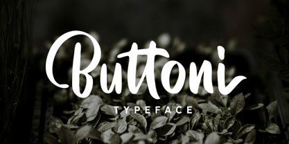 Buttoni is a playful font that you can use for many things. Perfect for quote or anything you want. This font also includes numbers, symbols, and multi-lingual support. Also comes with ligatures and alternates.
 - The Embossing Tape 1 (BRK) font, designed by AEnigma, is a distinctive and captivating typeface that draws inspiration from the classic appearance of embossed tape labels. This type of font reflects ...
- Quarter Braille by Echopraxium,
$20.00 Presentation QuarterBraille (Abbreviated as "QB" thereafter) is a decorative, steganographic and lattice font. Its core design concept is that Braille dots are represented as "quarters of a square"[1]. This is illustrated by posters 1 and 2 (NB: these glyph parts will be called "QB dots" thereafter). The other glyph parts (see poster 3) are purely decorative and meaningless in terms of Braille dots encoding[2]. All glyph parts are meant to generate a wide variety of patterns from horizontal and vertical combinations of glyphs. There is also a graphic convention to differentiate uppercase from lowercase letters with the presence or absence of shape subparts (in the "endings", "quarter of a circle with a ring" and "quarter of a diamond with a small square in the middle") like shown by poster 4. This font is suitable for very short texts (e.g. logos, acronyms, quotes, ambigrams, pangrams, palindromes, etc...) but on the other hand it may be used for steganographic purpose like geocaching as well as fictive alphabets (e.g. Alien/SciFi/Fantasy/Antique civilizations). Posters 1. Font Logo: the displayed text is " Quarter " followed by " Braille". There's a rainbow layer above the text to highlight the "QB dots", this is achieved by A..Z glyphs with "only QB dots" (codes 230..255) 2. Anatomy of a Glyph (L) and "QB Dots" (quarters of a square) 3. Glyphs Parts: Square and Cross (Inverted square), Circle and Inverted Circle (with or without the small circle in the middle), Diamond (with or without the small square in the middle), Inverted Square and Circle, Shape combos, Ending 4. Uppercase vs Lowercase (tiny shape subparts are shown in red) 5. Sample 1: Bathroom sink with QB tiles on the credence 6. Sample 2: Hands knuckle tatoos: "LOVE/HATE"[4] 7. Sample 3: Poker Hand: pocket Aces. It's an Ace of Hearts (Ah) on the left and an Ace of Spades (As) on the right. Like in regular cards, the card value (e.g. Ah) is displayed twice: at the top and rotated by 180 degrees at the bottom. This poster also illustrates that QB could be used to print embossed playing cards with tactile and visual display of card values. 8. Sample 4: Pangram: "Adept quick jog over frozen blue whisky mix" 9. Sample 5: Latin Magic Square: "SATOR AREPO TENET OPERA ROTAS" (NB: for compensation of the 2/3 glyph ratio, letters on each line are separated by a space: "S A T O R", ...). 10. Sample 6: Quote of Mahatma Gandhi: "Learn as if you will live forever, live like you will die tomorrow.". This is also a demonstration of border glyphs combinations. 11. Sample 7: Steganography use case: the text is a sequence of 64 aminoacids (1 Letter notation), this protein was described in a research paper "The complete Aminoacid sequence of an amyloid fibril protein AA of unusual size (64 residues) 1975". 12. Sample 8: Border Glyphs with the provided styles and mixed styles. The words are the same than in poster 9 ("SATOR AREPO TENET OPERA ROTAS"). Despite the 2/3 glyph ratio, the "TENET cross" was achieved by both inserting spaces in horizontally ("T ENE T") and by using the "thin borders glyphs". Notes a. Border glyphs[3] are meant to enhance the esthetics of text samples displayed with QB b. Special characters (e.g. *$()[].,;:&@# ...) are provided and follow the NABCC (North American Braille Computer Code) convention. c. A..Z Glyphs with only the "QB dots" are provided as demonstrated by posters 1 and 2 (A/N: this was very useful to create them). d. Glyph Map: 32..64: Special characters - 161..187: "Thin variant" of Border glyphs, 192..229: Border glyphs, 230..255: A..Z with only the "QB dots" - Codes 176 an 181 are "regular SPACE" (empty glyph). Footnotes 1. There is indeed two shapes which represent the braille dot: the "quarter of a square" and the "quarter of a cross". It's because a cross may be considered as an "inverted square" because the square corners are merged in the center. 2. That's why the SPACE glyph is only made of decorative/meaningless glyph parts (i.e. no "QB dots"). 3. For other fonts with border glyphs, please take a look at my other "decorative Braille fonts" (GoBraille, HexBraille, KernigBraille, StackBraille, MaBraille, DiamondBraille, LorraineBraille). 4. LOVE/HATE knuckle tatoos are inspired by the anthology scene from "The Night of the Hunter" movie (Charles Laughton 1955), it also appearead in "Do The Right Thing" movie (Spike Lee 1989). Disclaimer This font is not appropriate and not meant to print text documents in Braille for the blind readers audience.
 - Hwaiting Serif by Konstantine Studio,
$20.00 Inspired by the emerging Korean culture that grabbing the worldwide actuation in so many realms of the industry. To bridge the vibes and to make it easier to consume, we found the gap to fill with simple things in life that are useful for it, and yes, it's a new day it's a new font. So without any further ado, please welcome Hwaiting Serif. 3/3 series of Korean vibes typefaces. It's a serif font with a thick and thin style of visuals, aiming the luxury and glamorous tone to catch up with high-fashion branding and today's graphic design trends Crafted with deep research about Korean traditional letters, shaped up with the approach of universal Latin letters. This is the last drop of 3 series from the Hwaiting family. Thank you for your engagement with us.
 - Lekton04 - Personal use only

- Halogen Flare by Positype,
$29.00 When I released Halogen, I asked ‘Who doesn't want or need an expansive contemporary extended sans that has a sense of style and swagger… what if it had a lowercase, small caps and various numeral options… how could you say no?’ Go, click on the Halogen link and read on, if you're interested. Halogen was well-received, so I decided to take it further with Halogen Flare (the name kinda tips you off as to what kind of typeface it is, don't ya think?). As always, I prefer not to take short cuts and provide an anemic offering of glyphs — a modern typeface offered today must provide more than just the basics and this one does — lowercase, smallcaps, old style numerals, tabular forms, stylistic and titling alternates, fractions, case-sensitive features, and even an alternate uppercase ordinal set is included. Now, go make cool print and digital things with it.
 - FatStack BB - Personal use only

- Germanica - 100% free

- BStyle - 100% free


