10,000 search results
(0.037 seconds)
- Constaline Script by Invasi Studio,
$17.00 Constaline is a super versatile pairing font monoline script and sans typeface with tons of alternate decorative characters. The Constaline font duo has a Rough Grunge texture and a clean style. Script Regular, Script Stamp, Sans Regular, and Sans Stamp are the four varieties available. They can be used for a wide variety of purposes. This font has been carefully hand-drawn to make sure its characters look consistent. Constaline font duo is suitable for logotype, badge, emblem, clothing design, signage, posters, packaging, and much more! Features: Uppercase & Lowercase Numerals & Punctuation Alternates and Ligatures Multilanguage Supports 60+ Latin based languages
 - Plaquette by FaceType,
$24.00 ‘Plaquette’ is a collection of retro typefaces ranging from victorian to bauhaus to the sixties. They are all equipped with a load of OpenType features such as alternates, catchwords, stylistics sets and others. Plaquette 3D A chromatic set of fonts including gradient and outline layers. Crisp and precise. Plaquette Lovecraft A vintage typeface with some sweet discretionary ligatures to make your typography exciting. Take a look at the many alternates. Plaquette Sittl A clean geometric style with many alternative letters, some inspired by Paul Renner’s original Futura. Plaquette Labels This set provides you with 220 different shapes ideal for logos, plates and… labels.
 - Boule Plus by Ingo,
$33.00 CAPITALIZED, geometric, bold and round. If the typographer sees a font like that, it's enough to make his toes curl. But sometimes it just has to be that way. Geometrically constructed fonts do not necessarily have to be pointed and angular; It also works consistently around. And if I say it consistently, then in this case, that's done consistently. The basis for the BOULE is the circle. The letters are drawn with constant line width, the “corners“ and endings all have the same radius, the lines are all the same thickness. The BOULE consists only of capitals. There is only one difference in the use of uppercase and lowercase letters: in the uppercase letters, the round letters are circular, while the lowercase letters are narrow. The character set of the Boule contains all letters and accents to support the Western, Northern, Central and Eastern European languages with Latin alphabet. The BOULE is not only very fat, it also runs very tight; that is, the glyphs are very close to each other. To avoid "holes" due to unfortunate letter combinations, the BOULE contains ligatures for FT, ST, TT and TZ. There are also other versions of the font: BOULE Brillant on the one hand. In this version, simple highlights simulate a light incidence from the top right. These light edges give the font a decorative effect that makes it easy to think of wet sausages or balloons in some shapes. And finally the BOULE Contour. As the name implies, it is the outer contour of the letters, combined with a shadow at the bottom left. The name BOULE (French for ball) says it already: this font is globated. Therefore, it is also very suitable for all three-dimensional alienation effects. With simple light and shadow you can achieve a very convincing 3D effect with little effort.
 - Galderglynn Esquire by Typodermic,
$11.95 Welcome to the world of Galderglynn Esquire. This typeface is a celebration of the sans-serif types from the 1800s, with a unique twist that sets it apart from the rest. Galderglynn Esquire is not just a simple revival of a specific typeface, but rather, it’s a concoction of them all. With a bold personality and a distinct voice, Galderglynn Esquire is full of inconsistencies that make it stand out. It’s as if the letters have a mind of their own, dancing and shifting on the page. This typeface is perfect for those who want to add a touch of whimsy to their designs. And speaking of designs, Galderglynn Esquire has a variety of numerals to choose from. Whether you need standard, monospaced, old-style, inferior, or superior numerals, Galderglynn Esquire has got you covered. It’s a typeface that’s as versatile as it is unique. But don’t take our word for it, try it out for yourself. Galderglynn Esquire comes in seven weights and italics, giving you even more options to play with. And if you prefer a more well-behaved version of this typeface, check out Galderglynn 1884. With Galderglynn Esquire, you’re not just getting a typeface, you’re getting a piece of history. This typeface pays homage to the sans-serif types of the past. It’s a typeface that’s as timeless as it is modern, perfect for designers who want to create something truly unique. So why settle for the ordinary when you can have the extraordinary with Galderglynn Esquire. Most Latin-based European, and some Cyrillic-based writing systems are supported, including the following languages. A Afaan Oromo, Afar, Afrikaans, Albanian, Alsatian, Aromanian, Aymara, Bashkir (Latin), Basque, Belarusian (Latin), Bemba, Bikol, Bosnian, Breton, Bulgarian, Cape Verdean, Creole, Catalan, Cebuano, Chamorro, Chavacano, Chichewa, Crimean Tatar (Latin), Croatian, Czech, Danish, Dawan, Dholuo, Dutch, English, Estonian, Faroese, Fijian, Filipino, Finnish, French, Frisian, Friulian, Gagauz (Latin), Galician, Ganda, Genoese, German, Greenlandic, Guadeloupean Creole, Haitian Creole, Hawaiian, Hiligaynon, Hungarian, Icelandic, Ilocano, Indonesian, Irish, Italian, Jamaican, Kaqchikel, Karakalpak (Latin), Kashubian, Kikongo, Kinyarwanda, Kirundi, Komi-Permyak, Kurdish (Latin), Latvian, Lithuanian, Lombard, Low Saxon, Luxembourgish, Maasai, Macedonian, Makhuwa, Malay, Maltese, Māori, Moldovan, Montenegrin, Ndebele, Neapolitan, Norwegian, Novial, Occitan, Ossetian, Ossetian (Latin), Papiamento, Piedmontese, Polish, Portuguese, Quechua, Rarotongan, Romanian, Romansh, Russian, Sami, Sango, Saramaccan, Sardinian, Scottish Gaelic, Serbian, Serbian (Latin), Shona, Sicilian, Silesian, Slovak, Slovenian, Somali, Sorbian, Sotho, Spanish, Swahili, Swazi, Swedish, Tagalog, Tahitian, Tetum, Tongan, Tshiluba, Tsonga, Tswana, Tumbuka, Turkish, Turkmen (Latin), Tuvaluan, Uzbek (Latin), Venetian, Vepsian, Võro, Walloon, Waray-Waray, Wayuu, Welsh, Wolof, Xhosa, Yapese, Zapotec Zulu and Zuni.
 - Invincible Duo Script by Prestige Artsy Studio,
$19.00 Introducing Invincible Duo, a sleek, modern, and clean font package designed to elevate your creative projects. This dynamic duo consists of two fonts that perfectly complement each other, offering endless possibilities for your designs. The first font, a beautiful script, exudes elegance and charm. With an abundance of ligatures — over 170 ligatures, with every word becomes a work of art. Its flowing strokes and intricate details add a touch of sophistication, making it ideal for invitations, logos, branding, and other projects where a touch of beauty is desired. The second font, a bold sans, brings a contemporary edge to the table. With its clean lines and strong presence, it grabs attention and exudes confidence. Perfect for headlines, titles, and bold statements, this font adds a bold and modern touch to your designs, creating impact and visual appeal. Invincible Duo is carefully crafted to ensure seamless harmony between the script and sans font. When used together, they create a stunning visual contrast that captivates the audience. Whether combined or used individually, these fonts make a lasting impression and deliver a powerful, cohesive message.
 - Universal MICR Pi by Monotype,
$29.00MICR The MICR font has a very practical application. MICR numerals, when printed in magnetic inks, can be read by special scanners that recognize the characters from their magnetic fields rather than just their shapes. - DeDisplay by Ingo,
$24.99 A type designed in a grid, like on display panels Type is not only printed. There were always and still are a number of forms of type versions which function completely differently. Even very early in the history of script there were attempts to combine a few single elements into the diverse forms of individual characters and also efforts to construct the forms of letters within a geometric grid system. The “instructions” of Albrecht Dürer are probably most well-known. But although designers of past centuries assumed the ideal to basically be an artist’s handwritten script, the idea which developed in the course of mechanization was to “build” characters in a building block system only by stringing together one basic element — the so-called grid type was discovered, represented most commonly today by »pixel types.« But even before computers, there were display systems which presented types with the help of a mechanical grid display, like the display panels in public transportation (bus, train) or at airports and train stations. In a streetcar, I met up with a modern variation of this display which reveals the name of each tram stop as it is approached. This system was based on a customary coarse square grid, but the individual squares were also divided again diagonally in four triangles. In this way it is possible to display slants and to simulate round forms more accurately as with only squares. The displayed characters still aren’t comparable to a decent typeface — on the contrary, the lower case letters are surprisingly ugly — but they form a much more legible type than that of ordinary [quadrate] grid types. DeDisplay from ingoFonts is this kind of type, constructed from tiny triangles which are in turn grouped in small squares. The stem widths are formed by two squares; the height of upper case characters is 10, the x-height 7 squares. DeDisplay is available in three versions: DeDisplay 1 is the complex original with spaces between the triangles, DeDisplay 2 forgoes dividing the triangles and thus appears somewhat darker or “bold,” and DeDisplay 3 is to some extent the “black” and doesn’t even include spaces between the individual squares.
 - PharmaCare - Unknown license

- HWT Borders One by Hamilton Wood Type Collection,
$24.95 Wood Type Catalogs of the 19th century often offered tools and accessories alongside alphabets of wood type. Probably the most closely related was wood type borders and ornaments. Decorative Borders were often sold by the foot and accompanied by corner pieces that matched the designs. These borders could be assembled in almost any size dimensions as needed. The digital version uses the same principals of modular assembly to create the exact size border that is needed. Along with the borders, included in this font are a selection of "streamers". These banners would have been made to order with the font designs reversed out along a horizontal banner with decorative end caps. The digital version allows for a modular assembly by selecting choice of end caps and then typing the = as many times as needed to achieve the desired length. 10 styles of 9 piece borders can be created in any size variations as well as 8 styles of streamers in any desired length. Some of the designs can be mixed and matched for unusual contemporary design interpretations of these historic styles. It is recommended that the line height (leading) is set to the same size as the point size setting, this will visually lock all elements together.
 - Hiragino Sans Rounded by SCREEN Graphic Solutions,
$210.00 Hiragino Sans Rounded (Maru Gothic) is derived from the basic design of the Hiragino Sans (Kaku Gothic) with its wide counters and comfortable appearance. It features gentle typeface that provides graceful roundedness to the tips of all the strokes of a character. On the flip side of this gentle impression is the fact that every single element in the Hiragino Sans upon which this typeface is based has been carefully polished down in every respect in pursuit of an elegant roundness that makes it possible to handle carefully executed typesetting. That approach is clearly different from the general rounded typeface that makes full use of the body, and makes it possible to respond the requirement of professional typesetting. It is never-uninteresting design whose letterform is rooted in the traditions of traditional printing type. It is a font that of course can be used on its own and easily formatted just like Hiragino Sans while adding splendid coloring to the page. Furthermore, when used with other Hiragino fonts such as Hiragino Sans or Hiragino Serif (Mincho), the fact that all their designs are oriented on the same vector creates a multiplier effect. The user may be surprised at the sense of unity that cannot be experienced when combining it with other typefaces.
 - Fyne Fish NF by Nick's Fonts,
$10.00The pattern for this face was designed by Will Bradley in 1894 for the cover of Inland Printer magazine, and was licensed the following year to American Type Founders. Its classic lines and condensed footprint make this typeface a natural for elegant and inviting headlines. All versions of this font include the Unicode 1250 Central European character set in addition to the standard Unicode 1252 Latin set. - Haarlem Nights NF by Nick's Fonts,
$10.00A 1920 Dutch poster for Public Placement Services by Johan Dijsktra provided the inspiration for this crisp geometric typeface. Instead of the normal underscore (_), this font features a set of parallel lines flush to the tops of the caps and small caps, which offers some intriguing design possibilities. Both versions of this font include the complete Unicode 1252 Latin and Unicode 1250 Central European character sets. - Pagnol by Typorium,
$15.00 The Pagnol typeface has been designed with a principle developed by A. M. Cassandre in 1937, when the great French designer created the Peignot typeface following paleographic studies on the evolution of letterforms. Researches in the history of writing have proved that the lowercase "a" is at its origin nothing but the "A" shape transformed through centuries by scribes until the invention of printing. A large number of lowercases meanwhile kept their original shapes. If the scribes’ hand didn’t find the necessity to simplify them, it is only because these letters could be easily written. Integrating the classical shapes of capitals to the lowercases has already been used, keeping the lowercases which are only a deformation of capitals. Nevertheless, the respect of readability imposes to keep ascendants and descendants from traditional lowercases which serve as optical focus points in a text and make reading easier. The particularity of Pagnol is to use rounded shapes on top and bottom of pointed capital letters to make them fit with corresponding lowercases (Aa, Mm, Nn, Vv, Ww, Zz). Lowercases proportions are wide, to be in tune with classic lowercase shapes in order to optimize readability. Five weights in roman and italic have been designed to offer a wide palette of typographic possibilities in all sizes and all paper and screen supports.
 - Snow Job JNL by Jeff Levine,
$29.00 Snow Job JNL was inspired by the hand lettered titles for the 1964 Rankin-Bass animated holiday classic "Rudolph the Red Nosed Reindeer". Because of the variable heights of the characters they float about the baseline in a free-form design. Available in both regular and oblique versions, the typeface gets its name from both the winter theme of the TV special along with the old term for deceiving someone with compliments while hiding one's true intent.
 - Gridlock by I Can Be Your Type,
$10.00A condensed font using constructivism history to convey the cold hearted steel of machinery and progress. Gridlock tries it's best to fit as much info as possible in a small space neatly in line and with the subtle curves and smoothness of bent steel. The inspiration for Gridlock actually came accidentally after designing some lettering for a self-promo project and it needed something that just was condensed with visual appear. So imagining about how condensed fonts feel, I imagined them being squished together just like cars in traffic are forced to work together to make it to their end destination. - Algiant by Canden Meutuah,
$15.00 Allegiant is a beautiful handwritten font. this font is so simple that I write very carefully. Even though it looks simple, this font still looks cool and stylish. Handwritten script font. These Fonts are perfect for: logos, branding, wedding invitations, business cards, greeting cards, posters, magazines, social media, proliferate fonts, planner prints, and websites. Get creative with their unique fun, and use them to brighten up any craft project! Get this font now and boost your creativity with it! If you have any questions, before or after your purchase, don't hesitate to contact us. Thank You
 - Robot Frangky by Canden Meutuah,
$12.00 Robot Frangky is a beautiful handwritten font. this font is so simple that i write very carefully. Even though it looks simple, this font still looks cool and stylish. Handwritten script font. These Fonts are perfect for: logos, branding, wedding invitations, business cards, greeting cards, posters, magazines, social media, proliferate fonts, planner prints and websites. Get creative with their unique fun, and use them to brighten up any craft project! Get this font now and boost your creativity with it! If you have any questions, before or after your purchase, don't hesitate to contact us. Thank You
 - Flourishes A by Wiescher Design,
$39.50 FlorishesA are a set of flourishes, that serves well for frames and other elegant embellishments, they are beginning of last century American. Your I-found-them-somewhere type-designer, Gert Wiescher
 - Punchado Punch by MyAnvil,
$20.00 This font was inspired by the original "Punchado" font; and this evolved font is named the "Punchado Punch". The "Punchado Punch" font features similar sharp edges and measured right angles with a greater impact of design . The theme of this font is perhaps best suited for: science, science fiction, engineering, mathematics, future, video games, gaming, computers, etc.
 - Wahwoh by 38-lineart,
$14.00 WAHWOH is a heavy allcaps font which is perfect for heavy titles and headlines. The uppercase looks rough while the lowercase looks sharp. This typeface gives the impression of street style, bold, retro, urban and modern style. Clear and bold, easy to combine with other artwork and typefaces, this is the reason why you should have this font.
 - CAL Bodoni Palazzo by California Type Foundry,
$47.00 The Greatest Caps Of The Greatest Font Designer Bodoni's Most Beautiful Display Caps, Finally Available in Digital This font is the largest display caps that Bodoni ever made, painstakingly handcarved and now digitized to wow in any situation. It is one of the most beautiful fonts for whenever you need a stunning all caps display. The obvious and easy choice over tired standards like Trajan, Palazzo will be a highlight in your font collection. Bodoni Palazzo was updated in 2021 to include Small Caps and other new features. Previously only included the "old style" figures (top); Now with lining figures to better match all caps, and small caps numbers to match the small caps. CAL Bodoni Palazzo is a member of our Origin Series. Origin Fonts are designed to be true to the original designer's intentions and fonts. Our Bodoni origin fonts ARE Bodoni fonts, not imitations or interpretations. They were drawn by Bodoni, our team just expanded it for modern use.
 - Lightbox 21 by Protimient,
$21.00 Lightbox 21 is a radical update of my previous version of a geometric sans serif. The design of the original Lightbox was fundamentally based on the idea of incorporating the proportions of the ‘Golden Ratio’ into each letterform; Lightbox 21 greatly improves on this concept by entirely abandoning it. The result is a much more readable, ‘natural’ typeface that retains elements of the original without being bound to it. Overall, Lightbox 21 has been designed to convey that classic feel of a geometric sans that makes the genre so tremendously enduring and versatile, as well as providing an effortless sense of class to whatever they are applied. Primarily intended for editorial work (i.e. short to medium length texts) or display settings, Lightbox 21 has a reasonably extensive character set, including support for Vietnamese, many currency symbols, arrows, and small caps. It also has OpenType support for nut fractions (via a stylistic set) and a barred alternate uppercase i and an alternate curled j.
 - Chonky by Typesenses,
$39.00 Chonky is a bold script font based on English calligraphy but with touches of the vitality that the commercial lettering of 1950s had, and it is mostly inspired in the work of the master Doyald Young and his lessons. Its rounded terminals, friendly look and heavy weight make Chonky a perfect option for advertising, packaging and visual identities. In the Regular font, the ascenders, descenders and capitals are the shorter they could be; while in Poster, they are larger, in order to achieve more graceful forms. Both options include stylistic sets and ligatures to embellish the words. Use professional software that widely support Open Type features. Otherwise, you may not have access to some glyphs. Keep the Standard Ligatures and Contextual Alternates features always active. For further information about features and alternates, see the User Guide Chonky has extensive Western, Central and Eastern European language support. Enjoy!
 - NAKED - Personal use only

- Fox Christmas Doodle by Fox7,
$15.00 Fox Christmas Doodle is a cute dingbat font specially designed for the Xmas season, Its versatility makes it great for a wide pool of craft projects, designs, planners, diaries, activity books, or anything that your heart desires. Add this beautiful doodle dingbat font to each of your creative ideas, and notice how it makes them stand out.
 - Fox Valentine by Fox7,
$14.00 Fox Valentine Doodle is a cute dingbat font specially designed for the Valentine’s season and party., Its versatility makes it great for a wide pool of craft projects, designs, planners, diaries, activity books, or anything that your heart desires. Add this beautiful doodle dingbat font to each of your creative ideas, and notice how it makes them stand out.
 - Fox Xmas Doodle by Fox7,
$14.00 Fox Xmas Doodle is a cute dingbat font specially designed for the Xmas season, Its versatility makes it great for a wide pool of craft projects, designs, planners, diaries, activity books, or anything that your heart desires. Add this beautiful doodle dingbat font to each of your creative ideas, and notice how it makes them stand out.
 - Love Lea by Sakha Design,
$14.00 Love Lea is a lovely calligraphy font. It has beautiful and well balanced characters and as a result, it matches a wide pool of designs. Add it to your most creative ideas and notice how it makes them come alive! This font is PUA encoded which means you can access all of the glyphs and swashes with ease
 - Sawah by Din Studio,
$29.00 Sawah is a modern and elegant display font. It celebrates abstract shapes in all their eclectic beauty. This font will look truly outstanding in a wide range of contexts. It is the best for logos, branding and quotes. Featured : Accents (Multilingual characters) PUA encoded Numerals and Punctuation (OpenType Standard) Thank you for downloading premium font from Din Studio.
 - Christmas Doodles Too by Outside the Line,
$19.00 Christmas Doodles Too is the follow up font to Christmas Doodles. More Christmas icons including a tree, fun new ornaments, a dove, gifts, pine trees, a church, drinks, sleigh, tree lights, drum, horn, Santa hat, holly, snowflakes, stockings, candy, and mistletoe. This font works well with Holiday Doodles and Holiday Doodles Too which also have Christmas icons in them.
 - Betrayer by Andrew Tomson,
$10.00 Hi, Friend! How often do people create their own logo? I think creative people, often do it. The question remains about originality and uniqueness... When I created this font, I thought about creating company and personal brand logos. You can use it to add a little bit of originality to your creation. Good luck and love to you!
 - Luckangle by Balpirick,
$15.00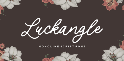 Luckangle is a Monoline Script Font. Luckangle is a lovely and delicate script font that exudes elegance and class. This font was particularly crafted for those who need a beautiful and refreshing look to their designs. Luckangle also multilingual support. Enjoy the font, feel free to comment or feedback, send me PM or email. Thank you!
 - Goldie Boxing by Balpirick,
$15.00 Goldie Boxing is a Bold Brushed Handdrawn Font. Goldie Boxing is a bold display font with an autumn theme. Add this chunky lettered font to your designs and notice how it makes them come alive! Goldie Boxing also multilingual support. Enjoy the font, feel free to comment or feedback, send me PM or email. Thank you!
 - Arlequin by TipografiaRamis,
$29.00 Arlequin is a high-contrast sans serif decorative font. The most distinguished characteristic of this typeface is its lowercase letters. Their shapes, a high-contrast clash of bold angular fragments with arched thin counterparts, make for a dramatic impact on entire font visual impression. Arlequin is recommended for use as a headline or short-text font.
 - Blackbone by Balpirick,
$15.00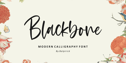 Blackbone is a Modern Calligraphy Font. Blackbone is a lovely and delicate script font that exudes elegance and class. This font was particularly crafted for those who need a beautiful and refreshing look to their designs. Blackbone also multilingual support. Enjoy the font, feel free to comment or feedback, send me PM or email. Thank you!
 - Netra by Sign Studio,
$15.00 Netra Slab is a minimalist and modern font. Having 9 thicknesses from Thin to Black will provide an easy choice as needed. With 390+ characters it can support more than 30 languages. If you want typography that looks smooth then choose the Rounded version. This font is suitable for writing general text, titles, even for brand logos.
 - Sync by Peter Huschka,
$28.99 The Sync font family is a layered system for chromatic typesetting. With its stylistic variety it enables a wide range of eye-catching combinations with colors and patterns. The very first sketches were inspired by some hand-painted characters on a weathered beach sign at the French Côte d’Argent and currently the font family comes with a total of 28 single fonts. The primary font »Sync Base« is a powerful, condensed Sans Serif. Sharp cut edges, narrow wedge-shaped counters and low ascenders and descenders make the compact character of the typeface. In perfect sync with the primary font, the family includes the retro styles Lines, Engravings, Stripes and Shadows and the texture styles Invisible and Jungle. Each one of them with multiple fonts. As all Sync fonts have the same metrics, they can easily be layered in different colors to create the desired effects by using graphic applications that allow utilizing layers. Sync fonts work especially well in larger sizes and were designed for large display purposes, covers, branding, packaging, headlines, editorials, advertising, posters and the like. Check the gallery for examples. By the way, the graphics in some of the visuals come from the Linotype »Picture Yourself™« collection designed by Karin Huschka and Peter Huschka. Sync & enjoy!
 - Celtic Astrologer Symbols by Deniart Systems,
$15.00 Containing over 130 symbols. Unlike traditional western zodiacs, the Celtic zodiac contains 13 signs instead of 12. This series contains the zodiacs, the planets as well as the Ogham numbers. NOTE: this font comes with an interpretation guide in pdf format.
 - Bushwhacked NF by Nick's Fonts,
$10.00Central Type Foundry of St. Louis issued this quirky little gem under the name of Quaint Roman around the turn of the twentieth century. This version is a little less gnarly than the original, but retains all of its eccentric charm. - Snappy Patter NF by Nick's Fonts,
$10.00The pattern for this delightful gem was found in Dan X. Solo's "Rustic and Rough-Hewn Alphabets" book under the name "Antique No 14." For this font, the rough-hewn lines have been cleaned up, but the underlying fun remains.

