10,000 search results
(0.037 seconds)
- Thistails Font Duo by Panatype Studio,
$9.00 Thistails is font duo with modern vintage look design style, available as a script and Display Sans serif typeface. These two lovely fonts would be perfect to combine in your design. Suitable for digital lettering, logo, t-shirt, print, business cards, branding materials, quotes, nature photography, etc, made with hand painted and carefully crafted. OpenType Features: Ligatures, Stylistic Set
 - Meritoriously by Haksen,
$14.00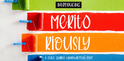 Introduce my New Product "Meritoriously" a cute quirky handwritten font. Very suitable for greeting cards, branding materials, business cards, quotes, posters, and more! These fonts are perfect for all brand :) Features : - UpperCase & Lowercase Numerals & Punctuations - Ligatures Multilingual characters (AÀÁÂÃÄÅCÇDÐEÈÉÊËIÌÍÎÏNÑOØÒÓÔÕÖUÙÜÚÛWYÝŸŸÆßÞàáâãäåæçèéêëìíîïðñòóôõöøùúûüýÿ) PUA ENCODEDZIP INCLUDED: Thanks for visited and Please contact me if you have any questions. My Best, Haksen
 - Fontazia Y3K by Deniart Systems,
$24.00 Invite all your weird and wonderful friends to your next party! Fontazia Y3K is a unique typeface featuring 72 hand-drawn futuristic creatures! Whether you're looking for humanoids, alienoids, androids or simple robots, these unusual characters are sure to bring all your designs to life (...even your postcards, photos, or whatever - we think special guests should always be welcome!).
 - Thigles by Abbasy Studio,
$15.00 Thigles, is a font inspired by Signs Painting, these pretty hand painted letters that you can see on buildings, billboards and signboards. Thigles font comes with some alternates and ligature as well to create your design more unique. With additional shadow font you will be able to create the beautiful combination and bring retro touch to your artworks!
 - French Voyager by SilverStag,
$14.00 Vintage & chic, nostalgic & super elegant, modern & art deco! French Voyager is a brand new nostalgic serif font revival that brings all these and even more. It is perfect for logos & quotes, posters & branding, website headlines, newsletters & more! It includes over 60 ligatures and some chic alternate letters, so you can combine it to get the look you want!
 - Mostly Bonny by Haksen,
$12.00 Introduce my New Product "Bonny" The new fresh handmade script font. Very suitable for greeting cards, branding materials, business cards, quotes, posters, and more! These fonts are perfect for all brand :) Features : - UpperCase & Lowercase Numerals & Punctuations - Ligatures Multilingual characters (AÀÁÂÃÄÅCÇDÐEÈÉÊËIÌÍÎÏNÑOØÒÓÔÕÖUÙÜÚÛWYÝŸŸÆŒßÞàáâãäåæçèéêëìíîïðñòóôõöøùúûüýÿ) PUA ENCODEDZIP INCLUDED Thanks for visited and Please contact me if you have any questions. My Best, Haksen
 - Loredana by Larin Type Co,
$10.00 Loredana - a new handwritten font duo will give you the opportunity to make amazing compositions. These fonts fit into any project, due to its simplicity. Use those fonts for branding or to create a logo, a beautiful frame for your home, or use them for book covers, stationery, marketing, a blog, magazines, for your business and much more.
 - Ninth Century MF by Masterfont,
$59.00 OpenType Pro Excellent support for Niqqud (Vowels). All marks are programmed to fit each glyph's shape and width. OpenType Pro includes new advanced features like Dagesh Hazak, ShevaNa, Qamatz Katan, Holam Haser and wide letters. Best used with Adobe InDesign CC that support complex Hebrew text. Please check these advanced features in this link: tinyurl.com/2fbkuy95
 - Kidela Sketch by insigne,
$21.99 Kidela Sketch is an energetic and eccentric serif typeface rendered in a sketchy style. The typeface includes 64 auto-replacing discretionary ligatures to extend the natural sketched look, oldstyle figures and small caps. Please see the sample brochure to see these features in action. Kidela Sketch is an excellent choice when you need a fun and interesting serif.
 - Charisma by Gerald Gallo,
$20.00 Charisma was inspired by the hand lettering used by draftsmen and architects. It is casual and informal and is ideal for use in conveying these qualities. It is excellent for casual text and at large sizes an effective casual display font. The font includes upper and lowercase alphabets, numbers, punctuation, accented characters, symbols, and miscellaneous characters.
 - Transcribed JNL by Jeff Levine,
$29.00 The term "transcribed" takes on many definitions. In sheet music (the source of this type face design) it means to set down onto paper. In the formative days of radio, and until the advent of the tape recorder, radio stations depended on 16 inch wide recordable discs known as transcriptions. These discs were generally aluminum base with a soft lacquer coating that was cut with a heated stylus. This was the only way a program could be recorded and preserved for later broadcast or copied for syndication. Transcribed JNL is a hand lettered sans in the chamfer style of block lettering, based on vintage sheet music displaying the name and address for Zenith Music Publications.
 - Applbitz by Joey Maul,
$10.00 Applbitz is a set of three pixel style fonts which include a matching set of food related pix fonts. The regular style is a text font, which is optimal at 14 points when used in flash. Applbitz Pix Base and Pix Top are corresponding food related glyphs, with the top providing a bit of detail. These "friendly" pix characters can also be used in flash using some TLC (and snap to pixel grid). They are fun to add your own color combinations, and are great for a variety of food icons. View the PDF file in the gallery for color suggestions. Special note: to dress the hamburger use "{" and "½" (left brace and one-half) from Pix Top.
 - Rusticana by Linotype,
$29.99Rusticana is a part of the 1990 program Type before Gutenberg, which included the work of twelve contemporary font designers and represented styles from across the ages. Linotype offers a package including all these fonts on its web page, www.fonts.de. Rusticana was designed by Adrian Frutiger and appeared with Linotype in 1993. Its historical roots go back to the Roman Capitalis, the all caps engraved writing of ancient Rome which reached its peak in the first century. From this style evolved other Roman forms, and one, Rustica, proved particularly good for text on bronze, as opposed to in stone. The Rusticana of Frutiger has open, seemingly irregular forms which lend a distinctive rhythm to text. - TF Hustler Blood by Teenage Foundry,
$19.00 TF Hustler Blood Graffiti Font - a unique and exciting design that is sure to add a splash of creativity to your projects! Our font features a monoline style that is complemented by a vibrant splash of paint, giving your designs a unique and eye-catching look. we've also included several alternative that are perfect for supporting the graffiti style. These alternative give you even more flexibility and allow you to create designs that are truly unique and individual. The monoline style gives the font a clean and modern look, while the splash of paint adds a touch of creativity and spontaneity. Features: Uppercase, Lowercase, Numeral, Punctuation & Multilingual. For any questions please contact me 🙂 Thanks!
 - Discordia by Naipe Foundry,
$60.00 Discórdia is a type-family of contrasting contrasts. Each of the four members of the family has a different contrast type. Regular has broad-nib contrast, Bold has horizontal contrast, the Italic is monoline, which means it has no apparent contrast, and Bold Italic is... Well, it’s probably best if see for yourself. These different design structures were fine-tuned to work well together in the same line, creating emphasis and hierarchy through a mini-super-family that groups a wedge-serif Regular, a slab-serif Bold, a sans-serif-ish Italic and a twisted Bold Italic. Naipe teamed up with Ben Nathan of Hafontia to extend Discórdia and give full Hebrew Support. Coming soon!
 - Gradable by Ditatype,
$29.00 Introducing Gradable, a mesmerizing script font that seamlessly blends elegance with boldness. This unique typeface is characterized by its graceful, connected letters that flow effortlessly from one to the next. With a low-contrast design, this font exudes a sense of stability, What sets Gradable apart is its distinctive swinging endings on select letters, adding a touch of playful sophistication to your text. These stylish flourishes give your words an air of dynamic movement, making your message stand out with a touch of charm. Gradable fits in headlines, logos, posters, flyers, branding materials, print media, editorial layouts, and many more designs. Find out more ways to use this font by taking a look at the font preview.
 - Woolworth by The Northern Block,
$32.95 Woolworth is a modern sans serif font inspired by the grotesque designs of the late 19th century. Each letter has been developed with careful attention towards balance and purity of form, creating a clean, functional and optically correct typeface. These handcrafted details make a warm personality throughout the design without any single character being too overwhelming. It's a contemporary grot typeface fully equipped to tackle a wide variety of text setting scenarios. Woolworth is now available as version 2.0 (2022). Details include six weights and italics, over 600 characters with alternative lowercase a, e, g, and basic punctuation. Open type features include seven variations of numerals, small caps, ligatures, and language support covering Western, South and Central Europe.
 - Hummingbird by Laura Worthington,
$39.00 Hummingbird is reminiscent of old-fashioned cursive penmanship found in treasured letters bundled together by silken ribbons or in worn leather-bound ledgers. Hummingbird is graced with an impressive number of contextual alternates (214!) that bring a flowing randomness to the typeface, creating a more natural handwritten appearance. The font also has 266 swashes including an entire set of decorated uppercase letters that add personality, emphasis, and beauty. See what’s included! http://bit.ly/2cdVw4d *NOTE* Basic versions DO NOT include swashes, alternates or ornaments These fonts have been specially coded for access of all the swashes, alternates and ornaments without the need for professional design software! Info and instructions here: http://lauraworthingtontype.com/faqs/
 - Aksen by Tokotype,
$40.00 Aksen is a humanist sans-serif typeface that draws influence from Roger Excoffon’s Antique Olive. Its design is formed by the rounded, curving letters found in ancient Greek and Roman inscriptions but is implemented with a contemporary and pragmatic approach. This typeface comes in 56 styles consisting of four widths and seven weights, each with matching italics. Also available in variable font format, Aksen Variable boasts three variable axes: width, weight and italic. These axes open up a plethora of stylistic choices making this typeface highly adaptable. Aksen is a versatile typeface that seamlessly blends contemporary humanistic aesthetics with a touch of historical sophistication, making it a perfect fit for a wide range of design applications.
 - Alternate Gothic by Linotype,
$20.99 Alternate Gothic was designed by Morris Fuller Benton for American Typefounders Company in 1903. All three weights of Alternate Gothic are bold and narrow. In fact, this face is essentially a condensed version of Benton’s other well-known sans serif types, Franklin Gothic and News Gothic. In the early twentieth century, the modern concept of type “families” had not yet been formed — and though Benton designed these sans serifs to harmonize with each other, the foundry gave them different names. Robust, dark, and coolly competent, Alternate Gothic is a good choice when strong typographic statements must fit into tight spaces. As a modern usage, it is currently the font of YouTube’s homepage logo.
 - Abygaer by Sealoung,
$25.00 Abygaer - a stylish OpenType rich serif with letters that seem to dance and twist harmoniously together - to form unique & elegant typography designs. A large selection of interwoven Opentype ligatures and alternates, means ample selection and variety in your finished look. To access these OpenType features, you will need Opentype capable software such as : Word, Textedit, Photoshop, Sketch, Pages, Keynote, Numbers, iBooks Author, QuarkXPress, Indesign and Illustrator. A wide range of useful glyphs are included - see preview image of all glyphs. Abygaer is also included full set of: -uppercase and lowercase letters -multilingual symbols -numerals -punctuation -stylish alternates -ligature Wish you enjoy our font and if you have a question, don't hesitate to drop message & I'm happy to help :)
 - Bureau Grot by Font Bureau,
$40.00 Bureau Grot is now accepted as the essence of tooth and character in an English 19th-century sans. The current family was first developed by David Berlow in 1989 from original specimens of the grotesques released by Stephenson Blake in Sheffield. These met with immediate success at the Tribune Companies and Newsweek, who had commissioned custom versions at the behest of Roger Black. Further weights were designed by Berlow for the launches of Entertainment Weekly and the Madrid daily El Sol, bringing the total to twelve styles by 1993. Jill Pichotta, Christian Schwartz, and Richard Lipton expanded the styles further, at which point the family name was shortened from Bureau Grotesque to Bureau Grot; FB 1989–2006
 - Typesetter Ornaments JNL by Jeff Levine,
$29.00 The pages of vintage type foundry catalogs yield so much wonderful type design and artwork. Found within their pages are hundreds of classic text and display faces alongside delicately engraved cuts as well as print shop borders, ornaments and embellishments. These books are treasure troves of their respective times, and Typesetter Ornaments JNL preserves some of that art in digital form. Redrawn from this source material are twenty-six basic design elements that include corner pieces, end pieces, pointing hands, spot illustrations and other designs. Also included are old style parentheses, brackets, an Rx (prescription symbol), two cent signs and a few extra elements located on the number keys and their caps shift counterparts.
 - Dyna Pro by Anatoletype,
$33.00 Elena Albertoni on Dyna: “While studying in Paris, I worked for a design studio specialized in packaging. French supermarkets are full of lettering with a handwriting flavor, which seems to go very well with a wide range of very different products. With the aim to analyze and summarize the qualities of these letterings in one typeface, I faced choices and limits similar to the ones encountered with handwriting. The letters are sloped at different angles, which gives them rhythm; their open shapes suggest movement and gesture. Letters want to dance!” Dyna Pro’s extended character set provides support for a wide range of European languages that share the Latin and Cyrillic scripts. Cyrillic characters designed by Elena Novoselova
 - Congenial by Laura Worthington,
$19.00 I wanted to design my own sans-serif typeface for my web site to complement the rest of my type library; I designed Congenial as an understated, highly legible complement to my more decorative display faces. Of course, I’m never far from my calligraphic roots, so Congenial retains some hand-drawn elements, visible particularly in the heavier weights of this generous 10-face family. As befits its name, Congenial is a friendly and inviting face with a generous x-height and highly differentiated characters. See what’s included! http://bit.ly/1Agnkio These fonts have been specially coded for access of all the swashes, alternates and ornaments without the need for professional design software! Info and instructions here: http://lauraworthingtontype.com/faqs/
 - P22 Nudgewink Pro by IHOF,
$39.95 P22 Nudgewink is a funky font family with humorous retro 1960s attitude and crazy bouncy baseline now in four weights (That is one louder!) Each character in the Pro fonts has four different variations accessible with any OpenType friendly application. The "P22 Randomizer" feature makes sure that variations of each letter keep the look of hand lettering with slight variations of up to four versions of the same letter appearing automatically. Along with stylistic alternates, Pro versions include automatic fractions, ligatures, superiors, inferiors, ordinals and a whole bunch of groovy graphic dingbats. With all these options at your disposal, dynamic handcrafted effects can be achieved with just a little bit of goofing around. So check it out, load it up and turn it on!
 - Privilege Sign JNL by Jeff Levine,
$29.00 The above-the-store signage for many newspaper stands, soda shops, candy stores, luncheonettes and pharmacies of the 1950s and early 1960s were what was referred to as “privilege signs” provided by one of the major cola brands. Consisting of the brand’s emblems on the left and right, the remainder of the sign would carry the desired message of the storekeeper (such as “Candy – Soda – Newspapers”) in prismatic, embossed metal letters. Inspired by these vintage signs, Privilege Sign JNL recreates the condensed sans serif lettering style in both regular and oblique versions. The typefaces are solid black, but adding a selected color and a prismatic effect from your favorite graphics program can reproduce the look and feel of those old businesses.
 - Truesdell by Monotype,
$29.99 Frederic Goudy drew Truesdell in 1930 and first used it for an article in a quarterly journal for book collectors. Since it was a small family and not promoted, Goudy received few orders for fonts. The original drawings and matrices for the face were lost in the fire that destroyed Goudy's studio in 1939.The only known examples of Truesdell fonts reside in the extensive collection of typographic material at the Rochester Institute of Technology School of Printing. It was proofs from these fonts that served as the basis for Monotype's digital revival of the family. Monotype Truesdell was released in March of 1994, just slightly over fifty-five years after fire destroyed Goudy's original work. Truesdell font field guide including best practices, font pairings and alternatives.
 - Estella Gardens by Timurtype,
$14.00 Introduced by Timurtype Studio! Estella Gardens is a Handbrushed Script Font This font showcases the timeless elegance of handbrush script fonts, where each stroke tells a story and adds a twist to your design. With organic lines and graceful curves, these fonts effortlessly blend modern sophistication with a touch of artisanal craftsmanship, creating a harmonious balance that elevates any project to a level of refined beauty and individuality. Let the art of hand-brushed script fonts transform your words into visual poetry, capturing the essence of your message with a touch of bespoke charm. Estella Gardens Font also supports multilingualism. Enhance your designs with our original fonts, feel free to comment or provide feedback, Enjoy the fonts 😊 Thank You
 - Geogrotesque Stencil by Emtype Foundry,
$69.00 Geogrotesque Stencil is a member of the popular Geogrotesque family, and despite being thought as a display typeface, it goes one step further and tries to solve some of the typical problems with stencils fonts. Geogrotesque Stencil comes with 3 widths of cut (A, B and C). These cuts not only allow a better performance when printing at different sizes, you can also move across versions A, B or C in accordance to the rigidity of the material used. The family consists of 42 styles, 7 weights with 3 versions each plus italics, all of them in Open Type format including ligatures, tabular figures, fractions, numerators, denominators, superiors and inferiors with support for Central and Eastern European languages. For more details see the PDF.
 - La Taqueria by Sudtipos,
$39.00 Mexico’s storied culture is one of the most recognizable today. Its amazing vibrant art and delicious foods have made the leap to influence many parts of the world in recent years. This proud, intense and diverse identity was the inspiration behind La Taqueria, a set of four fonts that express different characteristics of Mexican pop culture. The heavy and spicy, the light and gentle, the constant dynamism, all come together with one rhythm to produce an explosion of personality. Just like its predecessors Distillery and Scrapbooker, the La Taqueria set contains down-to-earth alphabets perfect for chalkboard art and handmade design. All the fonts include alternates and ligatures, providing plenty of variation for that spontaneous appearance everyone is looking for these days.
 - Busted by Canada Type,
$24.95 Busted is the very strange and out-of-character outburst of Bill Troop, a guy who was classically trained in everything, from classical piano and literature to classical photography and type design. As far as we could tell, Bill Troop is the kind of guy whose appearance and voice instantly trigger thoughts of black and white photos, fedoras, and pre-industrial age Europe. A few years ago, he even moved from the United States to England, where it took him less than a week to feel at home and start sounding like a Norwich native. Then something happened and the poor dude just snapped. Busted is the controversial result of the blood rushing to his head. If you know what exactly happened to him, please let us know. Concern, consideration and human interest story aside, Busted is a fascinating thing. It is a set of four interchangeable thick outline fonts where the same letter forms turn from wild to wilder to broken to somewhat clean. Mix them up in a setting and you have words that snarl with a sneer. Life's too short. Take it all with a grain of salt. Scream whenever you feel like it. Busted Pro is a single font combining all four character sets, and rigged with an OpenType pseudo-randomizer in the contextual alternates feature, which you can disable or enable anywhere in your setting for maximum visual shock just the way you like it. Works just as well in PAL or SECAM. Don't be fooled by imitations, and don't get caught with your drawers down.
 - Top Speed - Unknown license

- Top Speed Outline - Unknown license

- Top Speed Heavy - Unknown license

- Okiku by Hanoded,
$15.00 The tale of Okiku Of The Nine Plates is an old Japanese story full of lust, deceit, murder and revenge. It tells of Okiku, a beautiful servant whose master lusts after her. After she refuses his amorous advances, he accuses her of stealing a costly plate and has her thrown down a well, where she dies. She then turns into an Onryō (a vengeful spirit). Okiku font is a thin, all caps, scratched typeface. Upper and lower case differ and can be interchanged. Okiku comes with an afterlife of diacritics.
 - Hesperides by Scriptorium,
$18.00Hesperides is based on samples of Colonial period calligraphy. Rather than being directly derived from any one sample, some common characteristics have been emphasized to give it a more coherent and distinctive look, with the accentuated single-looped strokes on many of the characters suggesting a fully flourished style, but showing a bit of restraint. The ultimate effect is really striking, in the tradition of our Queensland and Allegheny fonts, but even more distinctive. The full version includes alternate versions of many of the key characters designed to reduce loop interference and add variety. - Devil Inside by Ditatype,
$29.00 Devil Inside is a spine-chilling display font that will send shivers down your spine. Designed in a large, bold font, this typeface demands attention and exudes an aura of darkness. Each letter is meticulously crafted with a square shape, high contrast, and haunting brush details, adding an eerie and sinister touch to the font. The large size of the letters enhances the font's ominous presence, making it impossible to ignore. The square shape of each letter adds a sense of rigidity and sharpness, while the high contrast brings an element of drama and intensity. These design choices contribute to the font's unsettling and sinister look, immersing the viewer into a world of darkness and fear. The brush details in Devil Inside give the font an organic and handcrafted appearance, as if it were inscribed with ancient symbols by a malevolent force. These haunting details add a sense of craftsmanship and enigma, creating an atmosphere of mystery and foreboding. For the best legibility you can use this font in the bigger text sizes. Enjoy the available features here. Features: Alternates Multilingual Supports PUA Encoded Numerals and Punctuations Devil Inside fits in headlines, logos, movie posters, flyers, invitations, branding materials, print media, editorial layouts, headers, and any horror-themed project. Find out more ways to use this font by taking a look at the font preview. Thanks for purchasing our fonts. Hopefully, you have a great time using our font. Feel free to contact us anytime for further information or when you have trouble with the font. Thanks a lot and happy designing.
 - Sinister Plot is a font that seems to have emerged from the darkest corners of a creative mind, encapsulating a feeling of intrigue and mystery with each stroke. Its name itself evokes images of shad...
- Bodrum Sweet by Bülent Yüksel,
$19.00 Bodrum Collection: 1- Bodrum Sans 2- Bodrum Sweet 3- Bodrum Stencil 4- Bodrum Slab 5- Bodrum Styte 6- Bodrum Soft "Bodrum Sweet" is a sans serif type family. Designed by Bülent Yüksel in 2018/19. The font, influenced by style serifs, popular in the 1920s and 30s, is based on optically corrected geometric forms for better readability. "Bodrum Sweet" is not purely geometric; it has vertical strokes that are thicker than the horizontals, an “o” that is not a perfect circle, and shortened ascenders. "Bodrum Sweet" some corner is rounded. These nuances aid in legibility and give "Bodrum Sweet" a harmonious and sensible appearance for both texts and headlines. Bodrum Sweet provides advanced typographical support for Latin-based languages. An extended character set, supporting Central, Western and Eastern European languages, rounds up the family. The designation “Bodrum Sweet 14 Regular” forms the central point. "Bodrum Sweet" is available in 10 weights (Hair, Thin, Extra-Light, Light, Regular, Meduim, Bold, Extra-Bold, Heavy and Black) and 10 matching italics. The family contains a set of 650+ characters. Case-Sensitive Forms, Classes and Features, Small Caps from Letter Cases, Fractions, Superior, Inferior, Denominator, Numerator, Old Style Figures just one touch easy In all graphic programs. Bodrum Sweet is the perfect font for web use. You can enjoy using it.


