10,000 search results
(0.054 seconds)
- Friendly Shaded Sans by Greater Albion Typefounders,
$16.00 ‘FRIENDLY SHADED SANS’ is just what the name says. It’s a chubby and cheerful Sans Serif typeface that is ideal for poster work, headings and informal design generally.
 - Namaste by Latinotype,
$49.00 With open palms, place your hands together at the center of your chest, close your eyes and bow the head slightly. Namaste! Welcome to a beautiful spiritual journey. Namaste is a font collection, designed by Coto Mendoza, consisting of two variants: a capital sans and a script font (based on watercolor calligraphy strokes). Each variant comes in 5 weights—Thin, Light, Regular, Bold and Black—and 2 versions: Essential and Pro. The script font, in its Pro version, provides a wide range of OpenType features such as swashes, alternates, ligatures and different stylistic sets. The Namaste family also includes a set of ornaments inspired by Hindu and Buddhist symbols—that Coto Mendoza saw virtually everywhere on her trip to India—like Mandalas and Yantras, and others found in textiles and monuments. Namaste is the perfect choice for wellness, healing and therapy oriented products. Its smooth shape and soft curves allow the user to create beautiful designs for essential oils, bath salts, quartz crystals, mindfoodness, candles, incense and aromatherapy products packaging. The font is well-suited for publishing design (short text); self-help and healing handbooks; tarot and divination cards; and women’s empowerment and spirituality publications. Namaste is an ideal typeface for yoga (and other body disciplines) center branding; holistic centers; and group meditation, womb blessing and circle of women invitations. Namaste is a beautiful journey full of love and inspiration. Namaste: a spiritual journey.
 - Kamasunday by Alit Design,
$21.00 Introducing Kamasunday Dynamic Blackletter, a typeface that seamlessly blends the timeless elegance of blackletter script with a modern, dynamic twist. This font is a perfect fusion of tradition and innovation, offering an impressive array of 837 meticulously crafted glyphs, ligatures, and alternates that will elevate your designs to new heights. Key Features: Dynamic Wave Design: Kamasunday Dynamic Blackletter features a captivating wave-like design that adds a sense of movement and energy to your text. Each character flows seamlessly into the next, creating a visually stunning and cohesive text. Modern Elegance: This font embodies the essence of modern elegance, making it perfect for a wide range of design projects, from branding and packaging to invitations and posters. Extensive Glyph Set: With a whopping 837 glyphs at your disposal, you have access to a vast selection of characters, including uppercase and lowercase letters, numerals, punctuation, and a variety of special characters, ensuring your design needs are met with versatility. Ligatures: Kamasunday Dynamic Blackletter includes an extensive set of ligatures, allowing you to achieve a more fluid and natural look in your text. These ligatures create seamless connections between characters for a polished and sophisticated appearance. Alternates: The font offers an abundance of alternate characters and swashes, giving you the creative freedom to experiment and customize your text. These alternates add an extra layer of uniqueness to your designs. Versatile Usage: Whether you're designing a vintage-inspired logo, a Gothic-themed poster, or a contemporary Music event poster, Kamasunday Dynamic Blackletter adapts beautifully to various design contexts. Timeless Appeal: While embracing modernity, this font retains the timeless charm of traditional blackletter script, making it a versatile choice for projects that demand a touch of history and sophistication. Elevate your design projects with Kamasunday Dynamic Blackletter, where the past and present merge into a harmonious typographic masterpiece. This font promises to breathe life into your creative visions, making your designs stand out with its unique style and extensive character set.
 - Nadhiratil Mahira by MonoLIne Calligraphy,
$21.00 Nadhiratil Mahira is interesting because the typeface is pleasing to the eye, clean, feminine, sensual, glamorous, simple and very easy to read, because there are many fancy letter connections. I also offer a number of decent stylistic alternatives for multiple letters. Classic styles are very suitable to be applied in various formal forms such as invitations, labels, restaurant menus, logos, fashion, make up, stationery, novels, magazines, books, greeting / wedding cards, packaging, labels or all kinds of advertising purposes. . . Nadhiratil Mahira has alternative characters, including support for multiple languages. With OpenType features with an alternative style and elegant binding. The OpenType feature does not work automatically, but you can access it manually and for the best results required for your creativity in combining these Glyph / Character variations. Font Features : * Lowercase beginning and ending swash * Uppercase beginning swash * Initials * International Language I heavily use programs that support OpenType features and the Glyphs panel such as Adobe Illustrator, Adobe Photoshop CC, Adobe InDesign, or CorelDraw, so that you can view and access all the variations of the Glyph. Nadhiratil Mahira is coded with Unicode PUA, which allows full access to all additional characters without having any special design software. Mac users Mac users, and Windows users can use Character Map to view and copy any of the additional characters to paste into your favorite editor / application. Please send a message if you have questions or problems, and don't hesitate to say hello on Instagram : @monolinecalligraphy Thank you & Happy Designing!
 - Magedo by Craft Supply Co,
$20.00 Introducing Magedo Vintage – Fluid Font Looking for a font that’s both fluid and exudes vintage charm? Look no further than Magedo Vintage – Fluid Font. This versatile typeface offers a blend of modern fluidity and classic vintage aesthetics display that will elevate your designs to the next level. Fluid Elegance Magedo Vintage boasts a fluidity that adds a touch of sophistication to your projects. Its smooth curves and flowing lines make it perfect for logos, headings, and invitations, creating a sense of dynamic movement that captures attention. Rustic Hand-Drawn Appeal Embrace the hand-drawn trend with Magedo Vintage. Its rustic, imperfect strokes give your text a unique character and a cozy, artisanal feel. Whether you’re designing a rustic wedding invitation or a quaint cafe menu, this font adds that charming touch. Timeless Stamp Effect Magedo Vintage also offers a stamp-like effect, reminiscent of classic imprints. This effect adds a sense of authenticity and nostalgia to your designs, making it ideal for vintage-themed posters, packaging, and labels.
 - FS Alvar by Fontsmith,
$80.00 The classic modernist FS Alvar grew out of a library of pure modular shapes gathered by Fontsmith’s master of the abstract starting point, Mr Phil Garnham. “It was a collection that just had to be explored and brought to life in a typographic voice. “We debated long and hard about this. It was big decision to make a shift away from the typefaces that people knew us for. And we didn’t want to compromise our reputation of well crafted typographic quality”. Modular forms A headline font that’s both graphic and functional, in the modernist tradition, FS Alvar focused Fontsmith’s eyes on the bigger issue of what makes a font show its age. “Looking at those fonts from the 1980s that were supposed to represent the ‘future’,” says Phil, “they looked so dated now. With Alvar, we weren’t concerned with creating future-thinking typography but with exploring form for form’s sake, and how that can evolve to create letterforms. Modular forms with a typographic eye.” Stencilled The concept for Alvar first materialised back in 2001 with some sketches Phil made while still at Middlesex University. Eight years later, something made him dig them out again. “There was something really nice about the proportions of that first design. Working on it again, I thought about it properly, but it still needed something to give it that edge. “Jason stood up in the studio and supplied the missing link: ‘Why don’t we make it stencilled?’ He didn’t mean in an obvious way, but by building a kind of architectural stencil into the form. It worked and the idea of using an architect’s name (Alvar Aalto) to describe the font felt perfect.” Featured in... The three weights of FS Alvar are made for standout headlines in advertising campaigns and magazines. Alvar has had a starring role in campaigns for brands from Nike to Amnesty International, as well as on CD covers, record labels and packaging.
 - Evander by Punchform,
$29.00 Evander allows graphic designers to create advanced typographical layouts by offering 64 alternative glyphs and 3 stylistic sets. The family has 18 weights — 9 uprights and 9 italics — ranging from Thin to Black.
 - Grotesk Remix Monospace by bb-bureau,
$65.00 GroteskRemix monospace is the monospaced version of the GroteskRemix - Grotesk revisited, notably used for the (Latin) communication of Typojanchi 2019. It availabe in 3 different weights: light, regular and medium. Language: latin glyphs
 - Mythica by K-Type,
$20.00 MYTHICA is a slightly condensed roman with spur serifs, derived from incised lettering on early twentieth century memorial stones and monuments. The typeface is available in 3 weights each with a complimentary italic.
 - Neonrec by Ditatype,
$29.00 Neonrec is an innovative display font that merges futuristic aesthetics with the mesmerizing allure of neon lights. With its bold uppercase letterforms and a luminous neon backlight, this typeface commands attention, creating a visually stunning and forward-thinking experience. The special characteristic of this font lies in the sleek and cutting-edge design, embodying the essence of a futuristic world. Each letter is meticulously crafted with precision and sharp lines, exuding a sense of technological advancement and modernity. The neon backlight adds a striking visual element that elevates the font to new heights. Inspired by the captivating glow of neon lights, Neonrec infuses a sense of energy and innovation into each character. The luminous backlight creates a radiant glow that casts a captivating hue, reminiscent of the neon signs that adorn the streets of a futuristic metropolis. This futuristic neon effect adds depth and dimension to the font, creating an eye-catching visual impact. Features: Ligatures Multilingual Supports PUA Encoded Numerals and Punctuations Neonrec is perfect for attention-grabbing headlines, logos, and sleek branding applications that require a touch of futuristic sophistication. It is thrives in designs that embrace a forward-thinking and cutting-edge style. Whether you're creating posters, digital interfaces, sci-fi themed artwork, or anything in between, this font will add a captivating futuristic element that sets your project apart. It shines particularly bright in applications related to technology, gaming, science, and futuristic-themed designs. Find out more ways to use this font by taking a look at the font preview. Thanks for purchasing our fonts. Hopefully, you have a great time using our font. Feel free to contact us anytime for further information or when you have trouble with the font. Thanks a lot and happy designing.
 - Afrobeat Light by Resistenza,
$39.00 Inspiration The pounding tribal rhythms of Afrobeat music is expressed through this psychedelic brand new font, Afrobeat. Every letter becomes art as every letter is elegantly placed side by side, like music notes, creating music for the eyes. Afrobeat is a musical style performed by many African artists such as Fela Kuti, Femi Kuti, Antibalas and many more, which is a fusion of jazz,funk, and psychedelic rock, originating from the 60s and was based on the political movements of Nigeria. The Font This font is perfect for when you want to use eye-catching big texts for anything from posters and flyers for concerts, events, parties, to CD covers, advertisements, and art, but it´s especially striking for printed projects. Afrobeat Light thinks green Think green. With Afrobeat light you save up to more than 35% of your ink toner. Being green in no longer a luxury, but an an essential. By using Afrobeat light you openly demonstrate that your company integrates the 3 Ps into its operations: People, Planet. Profit. Go ahead - be green! Check out also the original ‘Afrobeat’
 - Coegit by insigne,
$32.00 In the world of webfonts, Condensed proportions are key to maximizing your page's premium real estate while keeping your copy clean and catchy as you cut down to the essentials. Soon after the introduction of webfonts, I began to see Insigne's Le Havre used frequently for web headlines, not so much for its Art Deco look as for its more compact proportions. There seemed to be a need for a font that was designed to be used solely for the web's unique constraints. Enter Coegit Sans. Coegit is built specifically for web applications. Its highly Condensed forms range from thin--offering the greatest number of uses--to the attractive, accenting black. With three widths--Compressed, Compact, and the widest, Condensed --the family holds a total of sixteen fonts. The typefamily has also been hinted for excellent, onscreen display quality, even at small sizes. Overall, its lighter, humanist features provide the reader a more congenial welcome than its square, sans-serif counterparts can offer. Coegit is equipped for complex professional typography with stems, small caps and plenty of alts, including titling capitals. The face includes a number of numeral sets, including fractions, old-style and lining figures with superiors and inferiors. OpenType-capable applications such as Quark or the Adobe suite can take full advantage of automatically replacing ligatures and alternates. You can find these features demonstrated in the .pdf brochure. The family also includes glyphs to support a wide range of languages, including Central, Eastern and Western European languages. In all, Coegit supports over 40 languages that use the Latin script, making the new addition a great choice for multi-lingual publications and packaging. While the advanced OpenType features of webfonts are not currently supported in many browsers, the near future promises wide support. As acceptance of these features grow, Coegit Sans will prove to be a versatile element for your wide range of web projects.
 - Hughetta by Hrz Studio,
$16.00 Hughetta is the font of choice for writing things beyond words. This typeface is designed with great detail to convey stylish elegance. So, it can be said, the character of the transformation is very beautiful, a kind of classic ornamental copper script. Hughetta provides alternative variants of most fonts, binders and many calligraphy tips, ideal for elegant labels, high-end packaging, stationery and composition for select brands, beautiful titles, paragraphs, fonts and short text, meant to be read only with eyes or meant to whisper into someone's ear. Hughetta has 368 , including multiple language support. It features OpenType with alternative styles and elegant binding. The OpenType features don't work automatically, but you can access them manually and for best results your creativity will be required in combining variations of these Glyphs. And also a touch of ornament makes this font look elegant. To enable the OpenType Stylistic alternative, you need a program that supports OpenType features such as Adobe Illustrator CS, Adobe Indesign & CorelDraw X6-X7, Microsoft Word 2010 or a later version. (Windows), Font Book (Mac) or a software program such as PopChar (for Windows and Mac). How to access all alternative characters using Adobe Illustrator: https://www.youtube.com/watch?v=XzwjMkbB-wQ How to use the font style set in Microsoft Word 2010 or later versions: https://www.youtube.com/watch?v=NVJlZQ3EZU0 There are additional ways to access alternatives/swashes, using the Character Map (Windows), Nexus Font (Windows) Font Book (Mac) or a software program such as PopChar (for Windows and Mac). How to access all alternative characters, using the Windows Character Map with Photoshop: https://www.youtube.com/watch?v=Go9vacoYmBw If you need help or advice, please contact me by email Thank you for watching!
 - Cute Love Story by Putracetol,
$24.00 Introducing a lovely quirky font called "Cute Love Story", a fun and playful font with 5 different font versions. Each version of the font has a different heart decoration. Great for projects related to love. Cute Love Story best uses for valentine, wedding, invitation, heading, cover, poster, logos, quotes, product packaging, header, merchandise, social media & greeting cards and many more. This font is also support multi language.
 - Boughy by Craft Supply Co,
$17.00 Boughy – Font Family is a versatile display serif font family with 9 weights from ultra condensed to extra expanded. perfect for headings, titles, branding and much more. Boughy – Font Family contains everything you need to create stunning typography – from headline fonts to body text fonts – all in one place. Whether you’re starting out or you’ve been designing for years, Boughy has everything you need.
 - Alabama Book by Krafted,
$10.00 Looking for a cute and playful font to delight your guests? If you’re hosting a baby shower, birthday party, or need a versatile font for printed materials - then we’ve got the font that’ll make your branding sparkle! Introducing Alabama Book - A Cute Playful Font This adorable, fun, and stylish font can be used for a host of different content needs and projects. Create gorgeous party invitations, printed quotes, standout packaging, or beautiful t-shirts! You can even use it to create amazing headings, logos, resumes, and social media graphics. Inspire your audience, clients, or guests with this beautiful, statement font. What you’ll get: Multilingual & Ligature Support Full sets of Punctuation and Numerals Compatible with: Adobe Suite Microsoft Office KeyNote Pages Software Requirements: The fonts that you’ll receive in the pack are widely supported by most software. In order to get the full functionality of the selection of standard ligatures (custom created letters) in the script font, any software that can read OpenType fonts will work. We hope you enjoy this font and that it makes your branding sparkle! Feel free to reach out to us if you’d like more information or if you have any concerns.
 - Auberge Script by Sudtipos,
$79.00 It took me a long time, but I think I now understand why people of my generation and older feel the need to frame current events in an historical context or precedents, while most of the young couldn't care less about what happened ten years ago, let alone centuries back. After living for a few decades, you get to a point when time seems to be moving quite fast, and it’s humbling to see that your entire existence so far can be summed up in a paragraph or two which may or may not be useful to whoever ends up reading the stuff anyhow. I suppose one way to cope with the serenity of aging is trying to convince yourself that your life and work are really an extension of millenia of a species striving to accept, adapt to, and improve the human condition through advancing the many facets of civilization -- basically making things more understandable and comfortable for ourselves and each other while we go about doing whatever it is we are trying to do. And when you do finally convince yourself of that, history becomes a source of much solace and even a little premonition, so you end up spending more time there. Going far back into the history of what I do, one can easily see that for the most part it was ruled by the quill. Western civilization’s writing was done with quill pens for more than thirteen centuries and with newer instruments for about two. By the mid-18th century, the height of the quill experience, various calligraphy techniques could be discerned and writing styles were arranged in distinct categories. There are many old books that showcase the history of it all. I recommend looking at some whenever the urge comes calling and you have to get away from backlit worlds. Multiple sources usually help me get a better perspective on the range of a specific script genre, so many books served as reference to this quill font of mine. Late 17th century French and Spanish professional calligraphy guides were great aides in understanding the ornamental scope of what the scribes were doing back then. The French books, with their showings of the Ronde, Bâtarde and Coulée alphabets, were the ones I referenced the most. So I decided to name the font Auberge, a French word for hotel or inn, because I really felt like a guest in different French locales (and times) when I going through all that stuff. Because it is multi-sourced, Auberge does not strictly fit in a distinct quill pen category. Instead, it shows strong hints of both Bâtarde and Coulée alphabets. And like most of my fonts, it is an exercise in going overboard with alternates, swashes, and ornamental devices. Having worked with it for a while, I find it most suitable for display calligraphic setting in general, but it works especially well for things like wine labels and event invitations. It also shines in the original quill pen application purpose, which of course was stationery. Also, as it just occurred to me, if you find yourself in a situation where you have to describe your entire life in 50 words or less, you may as well make it look good and swashy, so Auberge would probably be a good fit there as well. This is one quill script that no large bird had to die for. A few technical notes The Auberge Script Pro version includes 1800 glyphs, everything is included there. Also latin language support. We recommend you to use the latest design application to have full access to alternates, swashes, small caps, ornaments, etc. The images from the gallery uses this version. For better results use the fonts with “liga” feature on. Awards During 2014 the early develop of Auberge Script was chosen to be part of Tipos Latinos, the most important type exhibition in South America.
 - Oh, HandPrinting! If fonts were people, HandPrinting would be that fun, quirky friend who shows up to a digital party dressed in a tie-dye T-shirt, holding a handmade sign that says, “I'm here to mak...
- Beauticella by Almarkha Type,
$35.00 Introducing Beauticella - Casual Signature Script is a Quality script that is written casually and quickly with 12 ligature. Letters are made with Sign on paper. Then scanned and carefully drawn into vector format. Beauticella is perfect for homeware designs,branding projects, Logo, design, Quotes, Product packaging, Photography, Watermark.
 - Chicago Doodles by Outside the Line,
$19.00 Armchair travel to the Windy City with Chicago Doodles. 31 illustrations of buildings, skylines, transportation, food, Chicago landmarks, signs and a script word Chicago. For other city, state and country doodles take a look at Paris, London, Waikiki and New Orleans Doodles. Also Cowboy and Lake Vacation Doodles too.
 - Philips Dutcher by Almarkha Type,
$35.00 Philips Dutcher - Stylish Ligature Script is a Quality script that is written casually and quickly with 41 ligature. Letters are made with Sign on paper. Then scanned and carefully drawn into vector format. Philips Dutcher is perfect for homeware designs,branding projects, Logo, design, Quotes, Product packaging, Photography, Watermark.
 - Signattimes by Almarkha Type,
$35.00 Introducing Signattimes - Stylish Signature Script is a Quality script that is written casually and quickly with 73 ligature. Letters are made with Sign on paper. Then scanned and carefully drawn into vector format. Signattimes is perfect for homeware designs,branding projects, Logo, design, Quotes, Product packaging, Photography, Watermark.
 - Albion's Black Holly by Greater Albion Typefounders,
$12.00 Black Letter typefaces always have an association with Christmas in the modern psyche. Albion’s Black Holly reinforces that association with an ornamentation of hooky-sprigs throughout all its letter forms. This is a design best used at large point sizes, but ideal for Christmas Mastheads, banners and signs.
 - Dx Slight by Dirtyline Studio,
$39.00 Dx Slight a new fresh & modern Sans with a Ultra Condensed style. The font it’s look good in posters, it is ideally suited for setting titles. However, the font has gained wide popularity among designers, and now you can find Dx Slight on the covers of magazines, on restaurant signs and on the main pages of websites. Dx Slight Display Typeface is the part of a strong and modern display family. This typeface both impressive at display sizes and easily readable in text size, while the sharp shapes of the triangular sans and the distinctive letter shapes show their strength in logo design and impressive editorial use. Dx Slight comes with elegant style, strength, and contrasts, with features an extended Latin character set of 366 glyphs covering over 88 languages. It has been designed as a variable font to give lots of options and access to unique type looks, however, it also includes nine weights, three axis H-height and Slant to give just as much access to creativity to those without access to variable supporting software. Its distinctive character and many variables make it a versatile, stylish workhorse, great for interfaces and design.
 - SF Khaled by Sultan Fonts,
$19.99 About this font family: Khaled Typeface for different titles and manchites. Khaled is An Arabic typeface for desktop applications, for websites. Khaled font family is Modern style and contains 3 weights: Regular, Medium and Bold. The font includes support for Arabic, Persian, and Urdu. It also includes proportional and tabular numerals for the supported languages. Khaled typeface comes with many opentype features. Designer: Sultan Maqtari Design date: 2019 Publisher: Sultan Fonts
 - Pravoslavnie by Simeon out West,
$25.00 This is the first of several Eastern fonts I have created and is the prize of the collection. The Pravoslavnie font is highly decorative, with a more complicated letter ‘a’ and a series of flourishes substituting for punctuation. Like its sister font, Pravoslavnie 3 is highly decorative. It differs from the first version of this font, as it has a less decorative ‘a,’ full punctuation marks, and less ornate number forms.
 - Easy Game by PizzaDude.dk,
$18.00 Easy Game is my laid back, easy to read, fun to watch comic and all-purpose font!
 - Fulgora by Sudtipos,
$39.00 Fulgora is a sort of ‘calligraphic typography’ or ‘typographic calligraphy’, depending on the point of view. Inspired by late-medieval Bâtarde and Civilité blackletter styles, the Kannada and Sinhala writing systems from Southern India, Celtic uncials, and diverse vernacular Mexican scripts, Fulgora was created straight from pen on paper as a personal calligraphic style where fantasy in the chief ingredient. The idea to take it to the digital realm came later, as an extension of the creative process. To this end, originals for each character were made, directly traced with the nib with no retouching, then vectorized to be digitally assembled. Work has been done on spacing and kerning with the aim to digitally reproduce an utterly calligraphic outcome keeping the natural, imperfect, manual finish of all signs. Fulgora has two variants: Blanca (white) and Negra (black), executed with different nib widths but the same style and proportions.
 - Milky by Fenotype,
$35.00 Milky is a brisk Brush Script with smooth and bold characters. Milky is both legible and characteristic. It's strong and friendly, perfect for logotypes, packaging and other branding use. In addition to Milky Brush Milky family contains Milky Casuals which is an all caps sign painting style casuals drawn with the same proportions as Milky Brush. On top of that there's Milky Ornaments which contains ending swashes designed to be used with the Brush, and a selection of bold brush strokes with the Milky signature style to complete your designs. Milky Brush is equipped with Contextual Alternates that add variation to the text and help to maintain the smooth flow. Contextual Alternates are automatically on. For extra flair try Stylistic, Titling or Swash Alternates or seek for even more alternates from the glyph palette. Milky Brush is PUA encoded so you can access the alternates in any graphic design software.
 - Belwe by ITC,
$29.99The typeface Belwe, created in 1926 by German typographer and teacher Georg Belwe, has an uncommon style that is difficult to describe. It is a synthesis of many different genres: it is a slab serif with Art Nouveau style but also with many blackletter influences. The angled serifs on the ascenders and the calligraphic flourishes on the the upper and lowercase V, W, and Ys reference marks made by pens. There are also many other special characters that are unlike any other designs. Have a look at the fun lowercase a, the quirky lowercase f and g, and the unique C, F, L, and R for the uppercase. This design works especially well for display sizes, but is also good for short amounts of text. The mood and image suggested by this typeface is great for menus, invitations, and signs when you want to send a personal and friendly message. It's Art Nouveau roots also give it a place in history for designs from the Victorian period up through the 1920's and 30's - Belwe Mono by ITC,
$29.99 The typeface Belwe, created in 1926 by German typographer and teacher Georg Belwe, has an uncommon style that is difficult to describe. It is a synthesis of many different genres: it is a slab serif with Art Nouveau style but also with many blackletter influences. The angled serifs on the ascenders and the calligraphic flourishes on the the upper and lowercase V, W, and Ys reference marks made by pens. There are also many other special characters that are unlike any other designs. Have a look at the fun lowercase a, the quirky lowercase f and g, and the unique C, F, L, and R for the uppercase. This design works especially well for display sizes, but is also good for short amounts of text. The mood and image suggested by this typeface is great for menus, invitations, and signs when you want to send a personal and friendly message. It's Art Nouveau roots also give it a place in history for designs from the Victorian period up through the 1920's and 30's
 - Crippy MF by Masterfont,
$59.00 Horror movies? Tattoo? Yes, here is the ideal font for you.
 - Penzance by TEKNIKE,
$45.00 Penzance is a display monospace handwriting font. The typeface is a distinct hand drawn font using a fountain pen quill ink style. The Penzance name means "holy headland" in the Cornish language and is derived from the town on the English coast of Cornwall. Penzance is great for display work, invitations, writing, books, posters, logos and headings.
 - Owl by Pesic,
$29.00 Owl is an amusing, childish, ornamental font whose features include spontaneity of thick, curved and smooth strokes with sharp edges. This font includes lowercase and uppercase capital letters. Character map contains all Latin and Cyrillic glyphs of European languages. It is suitable for various headings designed for children: logotypes, books, packages, leaflets, posters, T-shirts, television, advertisements.
 - Blackway Brush by Stringlabs Creative Studio,
$25.00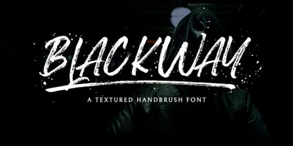 Blackway is a raw and natural handdrawn display font that radiates authenticity. Fall in love with its modern charm! Blackway is a handbrush font with a great personality for outdoor or events. It will elevate a wide range of design projects to the highest level, be it branding, headings, wedding designs, invitations, signatures, logos, labels, and much more!
 - Yeah Baby by Comicraft,
$29.00Mmm-hmmm! Dig that crazy beat! Following the success of Lilou's GIRLS!GIRLS!GIRLS! font, we couldn't wait to give you More!More!More! Yeah, Baby! It's a font and it's clip art and it's bound to make heads turn and temperatures rise. Get up on the dance floor, girl, and dance the way you've never danced before! - Klubovka by artsterdam,
$15.00 Klubovka is a modern typeface with a vintage style. The font is made in a combined style, so you can't call it a serif or sans-serif typeface. Latin and cyrillic alphabets are available with a modern letter design, as well as support for other languages. The font looks good in both headings and body copy.
 - Dew by ParaType,
$25.00 Dew is a script font with blobs on the stems that according to author’s imagination resemble dew drops on the caules. It gives an impression of fragrance and freshness and thus can be used for informal headings and short advertising texts for perfumes and cosmetics. The font was developed by Ekaterina Pulenko and released by ParaType in 2009.
 - Adieu Two Pro by Hackberry Font Foundry,
$24.95 AdieuTwo is a radical revision of Adieu which was a revision of my original font, Chivalry, that was traced from Chevalier back in the mid-1990s. Its roots are obvious, but this one has small caps, small cap figures, oldstyle figures, ligatures, and more. This is a thoroughly up-to-date font ready to be used for stylish heads.
 - Ithaka by TEKNIKE,
$39.00 Ithaka is a display monospace handwriting font. The typeface is a distinct hand drawn font using a fountain pen quill ink style. The Ithaka name is derived from the legendary home of the hero Odysseus in Homer's epic poem, The Odyssey (Ancient Greek: Ἰθάκα). Ithaka is great for display work, invitations, writing, books, posters, logos and headings.