10,000 search results
(0.039 seconds)
- Campeno by Craft Supply Co,
$20.00 Geometric Precision Let’s step into the world of Campeno, a Geometric Sans Serif font that embodies precision and order. This font is the epitome of geometric perfection, making it an ideal choice for various editorial applications. Editorial Excellence Campeno’s geometric form is what sets it apart and makes it a top choice for editorial needs. Whether you’re working on magazines, long-form text, or other editorial projects, its geometric precision enhances readability and offers editorial excellence. Versatile Typography What makes Campeno even more exceptional is its versatility. It seamlessly adapts to diverse design contexts, ensuring that it can be used for a wide range of projects, from magazines to websites and beyond. Engaging Readability Beyond its geometric aesthetics, Campeno excels in providing engaging readability. It guides the reader through the content, focusing on the message while maintaining a visually appealing design. In Conclusion In summary, Campeno – Geometric Sans Serif is the font that brings precision and clarity to your editorial projects. Its geometric form ensures that your content is not only engaging but also visually appealing, catering to a broad readership while maintaining a high standard of clarity. Whether you’re working on magazines, websites, or other editorial endeavors, Campeno stands out as a font that combines aesthetics with functionality, offering editorial excellence for your projects.
 - Clover Font Duo by Pen Culture,
$15.00 Introducing The Clover, a stunning duo font that combines the timeless elegance of a serif typeface with the fluid grace of calligraphy. This versatile font set includes two complementary styles that work together seamlessly to add sophistication and charm to your design projects. The serif font is a classic and refined typeface that exudes elegance and professionalism. Its clean lines and sharp angles create a sense of precision and authority, making it perfect for formal documents, headlines, and branding materials. In contrast, the calligraphy font is a more decorative and ornate style that evokes a sense of fluidity and movement. Its graceful curves and flowing lines create a sense of beauty and grace, making it ideal for invitations, wedding materials, and other special occasions. When used together, the serif and calligraphy fonts complement each other perfectly to create a stunning visual contrast that captures attention and creates a lasting impression. Whether you're designing a logo, brochure, or wedding invitation, The Clover is the perfect choice for adding a touch of sophistication and style. I really hope you enjoy it – please do let me know what you think, comments & likes are always hugely welcomed and appreciated. More importantly, please don’t hesitate to drop me a message if you have any issues or queries. Thank you
 - TurvyTopsy by Greater Albion Typefounders,
$9.00 TurvyTopsy offers all the fun of delightful hand-drawn irregularity, captured in a typeface. Designing this was a wonderful exercise in ignoring all the rules of precise geometric construction to which we normally work. These irregular forms somehow achieve a delightful character & legibility all of their own.
 - Sweet Flower Monogram by AEN Creative Studio,
$14.00 Sweet Flower Monogram is an incredibly beautiful and romantic monogram with handwritten script font, featuring little hearts as ornaments. It looks stunning on wedding invitations, logos, labels, business branding, thank you cards, quotes, greeting cards, business cards and every other design which needs a handwritten touch.
 - Architect by Australian Type Foundry,
$30.00Based on the text on architect's plans. The designer asked friends and relatives for the plans for their house extensions, and he studied plans in the public library, then blended the best features of all the characters he could find. Architect was designed originally in 1999. - P22 Insectile by P22 Type Foundry,
$24.95 Programmers often try to knock the "bugs" out of their computers, but P22 allows you to install them and use them to your advantage. Insectile is a set with 38 accurate insect illustrations and a font (Infestia) made up of actual scanned and rearranged insect parts.
 - Cult by ITC,
$29.99Cult is the work of designer Timothy Donaldson and its forms alone evoke a sense of mystery. The wide capitals with their unusual forms complement perfectly a condensed, angular lower case alphabet. The unique Cult is especially suited to work dealing with anything mystical or New Age. - Valentine's Letters by Greater Albion Typefounders,
$5.00 Remember party banners made out of string and letters on cutout card shapes? Well, Valentine's letters is the typeface equivalent of these joyful banners. Valentine's Letters will let you string heart shapes, each bearing an individual character across the page, making a romance filled banner. Have fun!
 - MPI Roman Condensed by mpressInteractive,
$5.00 Roman Condensed is a condensed, classic roman typeface. It has a medium contrast in stroke weight, slightly rounded serifs, and is easy to read. This version is based on a typeface from Showcard Machine Company, which was made specifically to be used with their proof presses.
 - Mixbox by Sabrcreative,
$20.00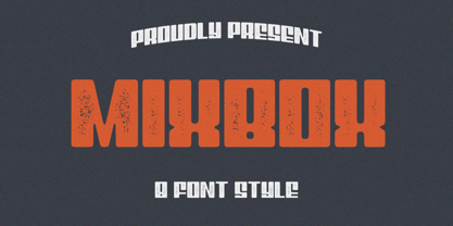 Evoke the spirit of a bygone era in your designs with the enchanting Mixbox Vintage Retro Display Font. This typeface seamlessly merges vintage charm with modern versatility, making it an ideal choice for designers seeking to infuse their projects with a touch of nostalgia and sophistication.
 - Chromium One by ITC,
$29.99Chromium One is the work of British designer David Harris. With their rounded edges and shiny appearance, the characters seem to be made of smooth pieces of chrome joined seamlessly together. The unusual and distinctive Chromium One can be used for a variety of display applications. - Grota by Latinotype,
$26.00 Grota is a very expressive font, has a gestural character inspired by the hand lettering . Grota is grotesque, unicase and exceptional. It has six weights ranging from thin to black with their italics. It is ideal for logos, brands, magazines, headlines, books. etc. Photography by Matías Troncoso
 - LGSH Davit by Edik Ghabuzyan,
$30.00 LGSH David has 7 upright weights and their Italics. The typeface supports Latin, Armenian and Cyrillic alphabet systems. It is an easily readable two side easily readable serif font. LGSH David is a contrast style font with very delicate lines which are quite bright and clear.
 - Kelso Round by Talbot Type,
$18.00Kelso Round is a highly original, outline display font. Each character is represented by a single continuous line to create a fluid and rhythmic look. A friendly and distinctive typeface that’s both easy to read and easy on the eye. Also available as Kelso, with sharper edges. - Barkley by AdultHumanMale,
$20.00 BARKLEY is a messy pencil drawn display font. It has over 200 glyphs and several variations on the standard alphabet and those extra pesky foreign features. I wanted it to look messy and rough but also with a little heart. Buy it, I know I might.
 - Relix by Intellecta Design,
$11.25 Relix, emulating the old videogame's screen fonts, that's a good font to non-formam small texts, names, logotypes, titles, headers, topics etc., developed from the original Reliant's Intellecta typeface. Big sizes of this font can be used for texts on posters, t-shirts and other surfaces.
 - Recreation JNL by Jeff Levine,
$29.00 Recreation JNL is Jeff Levine's own take on a popular vintage typeface from the late 50s or early 60s that's seen a resurgence in recent years. While the basic alphabet is somewhat modeled from the classic design, all the other characters in the font are original.
 - Gambino by Monotype,
$15.99 Childlike, sure; utterly affable, yes, but ultimately actually very cool. Yup, that’s Gambino. This chalky, super textured, semi connected script is a kooky playground pal and a grown-up technically savvy typeface all rolled into one. Upright yet tumbling, these simple, crayon-like letterforms are a delight.
 - Oleragie by Hishand Studio,
$15.00 Introducing Oleragie, a classic modern serif with an aesthetic look inspired by the Egyptian and middle east atmosphere. Perfect for those who need a touch of elegance, stylish, classy, beautifully thin, and modernity for their design. Complete with ligatures alternates regular italic icon kerning multilingual support
 - Lettering Project JNL by Jeff Levine,
$29.00 Lettering Project JNL was based on one of the many templates made by the Wood-Regan Instrument Company (also known as Wrico). Their sign making kits allowed anyone using the templates, special ink pens and alignment guides to create professional looking lettering with a minimum of experience.
 - MuX1ne by Machine Cult,
$14.00 A geometric-ish font family that's a bit off-kilter, offering three families: Regular, Rounded and Hatch as well as the bonus Noise, catchwords and dingbats for some occasions. Each font comes in Light, Regular and Bold styles. Complete latin character set with a range of ligatures.
 - Fixture by Sudtipos,
$39.00 Fixture is our massive 72-font take on plentiful offerings of the late 19th century’s typefaces, posters and wood letterpress sundry done in the Grotesk genre. Four widths ranging from Ultra Compressed to Expanded each come in nine weights and accompanying italics. Some common sans-serif alternates, such as the a and g, are included in all the fonts. The idea with this design was to put together a workhorse font family with enough functional flexibility to work in multiple environments, from the subtlety of magazine layout or film credits to the visual drama of billboards or packaging. Aesthetically speaking, it is quite interesting — though in retrospect quite unintentional — that each different width and/or weight of this face ended up pulling a different dominant trait from the melting-pot origins of the entire family. It’s almost like a tribute album to some famous band’s covers of older songs. It may also be a good conversation piece on our tools shaping the very things for which they’re used. Can’t really get any more post-Grotesk than this. In the 21st century, this is the one genre to rule them all.
 - Speakeasy by Sudtipos,
$79.00 Speakeasy is a 5-font combo thematically built as a toolset for designing menus and liquor labels as well as coffees, restaurants and signs when the desire is to communicate with style. Originally put together to be used by the most famous speakeasy in Buenos Aires, this set contains a script, a minor (almost flat) wedge serif, a flare serif, a sans serif, and a bold Didone. The seed for the script was found in a German lettering book, and the other fonts reflect the familiar advertising and announcement styles of the early 20th century. The Speakeasy script comes with two different ways to connect the letterforms. Also included are many alternates, swashes, endings and flourishes — all accessible via OpenType features or glyph palettes. Speakeasy Modern and Speakeasy Flare are small cap fonts, and come with a few alternates. Speakeasy Sans and Speakeasy Gothic come with full sets of majuscules and minuscules, but contain small caps and a few alternates as well. A few rules and ornaments are also sprinkled throughout the set. This combination of fonts worked wonderfully for the project that called for it. Hopefully it will work just as well for your project.
 - FHA Eccentric French by The Fontry,
$25.00 The curves are vintage and the serifs are big. They're so big that for years I never had the courage to tackle this intimidating font. But when fellow signmaker Frank Smith laid the groundwork for this intriguing typeface by Frank H. Atkinson, I couldn't pass on the opportunity to take it from paper to keyboard. After all, at over 100 years old, I felt this alphabet had never been given a proper, digital treatment. So how did this face survive the last century? Well, for those who don't know the history, it survived in Atkinson's ubiquitous book, Sign Painting, published first in 1908, the generational standard for anyone interested in sign-related type design. The layouts and lettering treatments in this book have influenced countless designers for more than a hundred years, but most haunting to me was this strange face with the big serifs. Well, I'm haunted no more. The work is done, the kerning is complete, and nothing but a mouse-click separates a very old idea from the modern world. It's wide, it's big, and with those crazy serifs, it is definitely eccentric-!!!
 - LT Sweet Nothings - Personal use only

- Chrysotile by Typodermic,
$11.95 In a world of cookie-cutter fonts and uninspired typefaces, Chrysotile stands out as a bold and unconventional choice. Comprised of rusty metal tiles and spartan block lettering, this typeface is not for the faint of heart. But for those who dare to be different, Chrysotile offers a chance to make a statement that will not be ignored. One of the key features of Chrysotile is its custom letter pairings, which are automatically swapped to achieve a more genuine look. The grainy tablets of Chrysotile give your message a rugged, industrial feel that is sure to make an impression. If you’re looking for a font that will help you stand out from the crowd, Chrysotile is the perfect choice. With its unique blend of rusty metal tiles and spartan block lettering, this typeface is unlike anything you’ve ever seen before. So why settle for the same boring old fonts when you can make a statement with Chrysotile? Try it out today and see the difference it can make in your designs. Most Latin-based European writing systems are supported, including the following languages. Afaan Oromo, Afar, Afrikaans, Albanian, Alsatian, Aromanian, Aymara, Bashkir (Latin), Basque, Belarusian (Latin), Bemba, Bikol, Bosnian, Breton, Cape Verdean, Creole, Catalan, Cebuano, Chamorro, Chavacano, Chichewa, Crimean Tatar (Latin), Croatian, Czech, Danish, Dawan, Dholuo, Dutch, English, Estonian, Faroese, Fijian, Filipino, Finnish, French, Frisian, Friulian, Gagauz (Latin), Galician, Ganda, Genoese, German, Greenlandic, Guadeloupean Creole, Haitian Creole, Hawaiian, Hiligaynon, Hungarian, Icelandic, Ilocano, Indonesian, Irish, Italian, Jamaican, Kaqchikel, Karakalpak (Latin), Kashubian, Kikongo, Kinyarwanda, Kirundi, Kurdish (Latin), Latvian, Lithuanian, Lombard, Low Saxon, Luxembourgish, Maasai, Makhuwa, Malay, Maltese, Māori, Moldovan, Montenegrin, Ndebele, Neapolitan, Norwegian, Novial, Occitan, Ossetian (Latin), Papiamento, Piedmontese, Polish, Portuguese, Quechua, Rarotongan, Romanian, Romansh, Sami, Sango, Saramaccan, Sardinian, Scottish Gaelic, Serbian (Latin), Shona, Sicilian, Silesian, Slovak, Slovenian, Somali, Sorbian, Sotho, Spanish, Swahili, Swazi, Swedish, Tagalog, Tahitian, Tetum, Tongan, Tshiluba, Tsonga, Tswana, Tumbuka, Turkish, Turkmen (Latin), Tuvaluan, Uzbek (Latin), Venetian, Vepsian, Võro, Walloon, Waray-Waray, Wayuu, Welsh, Wolof, Xhosa, Yapese, Zapotec Zulu and Zuni.
 - Restore by Typodermic,
$11.95 Introducing Restore, the headline typeface that pays homage to the early 20th century German sign lettering. Its geometric structure and logical design might fool you into thinking it’s straightforward. But take a closer look, and you’ll see how each letter is visually adjusted and perfectly balanced, giving it a unique industrial edge. But what really sets Restore apart is its interlocking letterforms. The tight spacing and intentional overlap of certain letters, such as “RS” and “ST”, create a striking, dynamic effect that adds depth and dimension to any design. Whether you’re looking to create eye-catching headlines, bold logos, or sleek branding, Restore has got you covered. And with seven different weights to choose from, you can find just the right balance of strength and style for your project. So if you’re ready to elevate your designs with a typeface that seamlessly blends the past with the future, give Restore a try. Your audience won’t be able to take their eyes off it. Most Latin-based European writing systems are supported, including the following languages. Afaan Oromo, Afar, Afrikaans, Albanian, Alsatian, Aromanian, Aymara, Bashkir (Latin), Basque, Belarusian (Latin), Bemba, Bikol, Bosnian, Breton, Cape Verdean, Creole, Catalan, Cebuano, Chamorro, Chavacano, Chichewa, Crimean Tatar (Latin), Croatian, Czech, Danish, Dawan, Dholuo, Dutch, English, Estonian, Faroese, Fijian, Filipino, Finnish, French, Frisian, Friulian, Gagauz (Latin), Galician, Ganda, Genoese, German, Greenlandic, Guadeloupean Creole, Haitian Creole, Hawaiian, Hiligaynon, Hungarian, Icelandic, Ilocano, Indonesian, Irish, Italian, Jamaican, Kaqchikel, Karakalpak (Latin), Kashubian, Kikongo, Kinyarwanda, Kirundi, Kurdish (Latin), Latvian, Lithuanian, Lombard, Low Saxon, Luxembourgish, Maasai, Makhuwa, Malay, Maltese, Māori, Moldovan, Montenegrin, Ndebele, Neapolitan, Norwegian, Novial, Occitan, Ossetian (Latin), Papiamento, Piedmontese, Polish, Portuguese, Quechua, Rarotongan, Romanian, Romansh, Sami, Sango, Saramaccan, Sardinian, Scottish Gaelic, Serbian (Latin), Shona, Sicilian, Silesian, Slovak, Slovenian, Somali, Sorbian, Sotho, Spanish, Swahili, Swazi, Swedish, Tagalog, Tahitian, Tetum, Tongan, Tshiluba, Tsonga, Tswana, Tumbuka, Turkish, Turkmen (Latin), Tuvaluan, Uzbek (Latin), Venetian, Vepsian, Võro, Walloon, Waray-Waray, Wayuu, Welsh, Wolof, Xhosa, Yapese, Zapotec Zulu and Zuni.
 - Rahere Roman Display by ULGA Type,
$30.00 Rahere Roman Display is an elegant design with flared stems and subtle old style features, influenced by Berthold Wolpe’s wonderful Albertus font and (to a lesser extent) fonts based on Roman square capitals. It’s a classic design for the modern age, appealing to serious typographers, graphic designers and anyone looking for a beautiful, multipurpose font that also offers value for money. Originally conceived as a display companion for the Rahere Sans typeface family, Rahere Roman harmonizes perfectly with its sans counterpart: use it for headings, sub-headings or pull-out quotes. Want an eye-catching introduction? The small caps have been sized to optically align with the x-height of Rahere Sans or start a paragraph with a swash drop cap. There are also ornaments and devices on hand to spice things up. Of course, Rahere Roman Display works beautifully as a standalone font too. Although predominantly a display font, with a quick flick of its lowercase switch, Rahere Roman transforms effortlessly into a readable text font. Like a Swiss Army Knife, this is a hugely versatile font, capable of conveying different messages from classic and romantic to historical and modern. It’s suitable for a wide range of applications including: branding, posters, advertising, packaging, labels, signage, wedding stationery, museums, art galleries and book covers. Weighing in at well over 2,000 glyphs, Rahere Roman contains a myriad of alternative characters (mostly capitals) including two sets of small caps that allow certain letter combinations - such as RO, LA, LI, TY, etc. - to mimic ligatures. The advantage of this is that if letter spacing is increased or decreased, the letter combinations aren’t fixed and can move too, which helps the space between letters to remain even. However, for lovers of ligatures there is still a bucketload of goodies to play with, including the obligatory ‘OO’ ligature. If that’s not enough, the font also contains start & end swashes, alternative numerals, seven ampersands, ornaments and devices. .ss01 - Initial swash capitals .ss06 - Superior small capitals (aligned to the cap height) .ss07 - Small capitals (sitting on the baseline)
 - Miluero by Luxfont,
$18.00 Introducing the stylized Miluero family. Graceful cut, rounded corners combined with austere shapes. Accent fonts with color padding and a classic basic monochrome version in the set. Perfect for logos, headlines and captions. Looks elegant in a minimalist modern design. An assortment of colors will help you get started quickly. This font family is based on the Regular font Pacardo - which means that if necessary you can combine these two families and they will be absolutely stylistically identical and complement each other. Check the quality before purchasing and try the FREE DEMO version of the font to make sure your software supports color fonts. P.s. Have suggestions for color combinations? Write me an email with the subject "Miluero Color" on: ld.luxfont@gmail.com Features: - Free Demo font to check it works. - Uppercase and lowercase the same size but different forms. - Color in letters. - Kerning. IMPORTANT: - Multicolor version of this font will show up only in apps that are compatible with color fonts, like Adobe Photoshop CC 2017.0.1 and above, Illustrator CC 2018. Learn more about color fonts & their support in third-party apps on www.colorfonts.wtf -Don't worry about what you can't see the preview of the font in the tab "Individual Styles" - all fonts are working and have passed technical inspection, but not displayed, they just because the website MyFonts is not yet able to show a preview of colored fonts. Then if you have software with support colored fonts - you can be sure that after installing fonts into the system you will be able to use them like every other classic font. Question/answer: How to install a font? The procedure for installing the font in the system has not changed. Install the font as you would install the classic fonts. How can I change the font color to my color? · Adobe Illustrator: Convert text to outline and easily change color to your taste as if you were repainting a simple vector shape. · Adobe Photoshop: You can easily repaint text layer with Layer effects and color overlay. ld.luxfont@gmail.com
 - Dynatype by Alphabet Soup,
$60.00 Suddenly...it’s the World of Tomorrow! With the push of a button Dynatype automates your typesetting experience. Dynatype is actually Two fonts in One–without switching fonts you can instantly change from Dynatype’s “regular” style to its alternate connecting version with the simple push of a button. For more details download “The Dynatype Manual” from the Gallery Section. What is Dynatype? Dynatype is the upright, slightly more formal cousin of Dynascript. It shares many of the characteristics of it’s slightly older relation, but is drawn entirely from scratch and has it’s own unique character. Dynatype may be reminiscent of various mid-century neon signage, and of sign writing, Speedball alphabets and even baseball scripts. Its design also takes some cues from a historical typographic curiosity that began in Germany in the ‘20s and which lasted into the ‘60s—when Photo-Lettering gave it the name "Zip-Top". Basically it was believed to be the wave of the future—that by weighting an alphabet heavier in its top half, one could increase legibility and reading speed. The jury’s still out on whether or not there’s any validity to this notion, but I think you’ll agree that in the context of this design, the heavier weighting at the top of the letters helps to create some uniquely pleasing forms, and a font unlike any other. Typesetters across the planet will also be able to set copy in their language of choice. Dynatype’s 677 glyphs can be used to set copy in: Albanian, Basque, Catalan, Cornish, Croatian, Czech, Danish, Dutch, Esperanto, Estonian, Faroese, Finnish, French, Galician, German, Hungarian, Icelandic, Indonesian, Irish, Italian, Kalaallisut, Latvian, Lithuanian, Malay, Maltese, Manx, Norwegian Bokmål, Norwegian Nynorsk, Oromo, Polish, Portuguese, Slovak, Slovenian, Somali, Spanish, Swahili, Swedish, Turkish, and Welsh—and of course English. Sorry! Off-world languages not yet supported. PLEASE NOTE: When setting Dynatype one should ALWAYS select the “Standard Ligatures” and “Contextual Alternates” buttons in your OpenType palette. See the “Read Me First!” file in the Gallery section.
 - Korge by Ferry Ardana Putra,
$19.00 Introducing "Korge", a captivating and versatile retro bold slab serif font that seamlessly marries vintage aesthetics with modern functionality. With its bold design, serif form, and a trio of regular, rounded, and extruded versions, Korge offers a wealth of creative possibilities for your design ventures. Korge is a font that transports your projects back to the golden eras of design. Its bold and distinct serifs evoke a sense of nostalgia, lending your creations a classic and enduring appeal. Korge provides not one, but three distinct styles to choose from. The regular version exudes a commanding presence, while the rounded variant softens the edges for a more approachable feel. The extruded version adds depth and dimension, giving your text a 3D, eye-catching quality. Korge is a font that speaks the language of design across borders. With its multi-language support and PUA encoding, it ensures your message resonates with audiences from diverse linguistic backgrounds. From logo design to branding, packaging, posters, and beyond, Korge adapts seamlessly to a wide array of design projects. Its bold slab serifs demand attention, making sure your message is delivered with both authority and style. Korge invites you to embark on a journey of creative exploration. Craft memorable headlines, iconic logos, or striking signage – this font is your canvas for pushing the boundaries of design. With Korge, the possibilities are limitless. Its vintage-inspired bold slab serif design, multi-language support, and versatile styles make it the ideal choice for designers seeking to infuse their projects with timeless charm and contemporary appeal. Get ready to bring your visions to life with Korge, where classic meets cutting-edge. ——— Korge features: A full set of Uppercase & Lowercase letters Numbers and punctuation Multilingual language support PUA Encoded Characters OpenType Features +237 Total Glyphs Rounded Style + Regular Style Extruded Style Korge Includes: Korge Regular Korge Regular Extruded Left Korge Regular Extruded Right Korge Regular Extruded Left Italic Korge Regular Extruded Right Italic Korge Rounded Korge Rounded Extruded Left Korge Rounded Extruded Right Italic Korge Rounded Extruded Left Korge Rounded Extruded Right Italic
 - Draghord by Alit Design,
$19.00 Introducing Draghord, a bold and dynamic typeface that embodies the essence of superheroic power and adventure. This font is a visual journey into the realm of fire, swords, skulls, and wings, capturing the spirit of mighty heroes and formidable villains alike. Characteristics: Flaming Elements: Each letter of Draghord is adorned with fiery accents, reminiscent of a blazing inferno. The flames dance around the characters, conveying a sense of untamed power and intensity. Sword-Inspired Strokes: The letterforms draw inspiration from the sleek and sharp edges of legendary swords. The angular and precise strokes give the font a cutting-edge aesthetic, symbolizing strength and precision. Skull Motifs: Intricately integrated skull motifs within the font add an element of danger and mystery. The skulls serve as a visual reminder of the challenges faced by our superheroic characters, embodying both mortality and defiance. Dynamic Winged Elements: The font incorporates dynamic winged elements that soar across certain letters, emphasizing the theme of flight and freedom. These wings symbolize the superhero's ability to rise above adversity and transcend limitations. Usage Scenarios: Comic Books: Draghord is perfect for comic book titles, captions, and speech bubbles, adding a dramatic and visually striking element to the narrative. Movie Posters: Use Draghord to create attention-grabbing titles and taglines for superhero movies. Its bold and adventurous design will set the tone for epic storytelling. Gaming Graphics: Ideal for in-game text, Draghord adds a heroic touch to video game interfaces, especially in fantasy or superhero-themed games. Event Promotion: For superhero-themed events, Draghord can be utilized in promotional materials, posters, and banners to convey a sense of excitement and power. In Conclusion: Draghord is not just a font; it's a visual experience that transports you into the heart of superheroic tales. With its fiery, sword-inspired design, skull motifs, and dynamic wings, Draghord is the perfect typographic companion for any project seeking to channel the thrilling energy of the superhero genre. Unleash the power of Draghord and let your words ignite the imagination!
 - Gurkner by Typodermic,
$11.95 The spirits have spoken! Introducing Gurkner—the bouncy, round display typeface with two distinct personalities. Say hello to well-behaved Gurkner—the ghost that always follows the rules and marches in a straight line like a row of obedient Caspers. But beware, because there’s also a mischievous side to Gurkner – a poltergeist on crack that loves to play pranks and bounce around like there’s no tomorrow! What sets Gurkner apart is its customizable pairings that automatically swap to create unique combinations for a more natural, springy look. It’s like having your very own ghostly friend who’s always up for a good time. Whether you’re designing for Halloween or just want to add some spooky fun to your project, Gurkner is the perfect typeface for adding a playful touch. So don’t be afraid to let loose and embrace the silly side of Gurkner. After all, who doesn’t love a font that’s equal parts mischievous and well-behaved? Most Latin-based European, and some Cyrillic-based writing systems are supported, including the following languages. A Afaan Oromo, Afar, Afrikaans, Albanian, Alsatian, Aromanian, Aymara, Bashkir (Latin), Basque, Belarusian (Latin), Bemba, Bikol, Bosnian, Breton, Bulgarian, Cape Verdean, Creole, Catalan, Cebuano, Chamorro, Chavacano, Chichewa, Crimean Tatar (Latin), Croatian, Czech, Danish, Dawan, Dholuo, Dutch, English, Estonian, Faroese, Fijian, Filipino, Finnish, French, Frisian, Friulian, Gagauz (Latin), Galician, Ganda, Genoese, German, Greenlandic, Guadeloupean Creole, Haitian Creole, Hawaiian, Hiligaynon, Hungarian, Icelandic, Ilocano, Indonesian, Irish, Italian, Jamaican, Kaqchikel, Karakalpak (Latin), Kashubian, Kikongo, Kinyarwanda, Kirundi, Komi-Permyak, Kurdish (Latin), Latvian, Lithuanian, Lombard, Low Saxon, Luxembourgish, Maasai, Macedonian, Makhuwa, Malay, Maltese, Māori, Moldovan, Montenegrin, Ndebele, Neapolitan, Norwegian, Novial, Occitan, Ossetian, Ossetian (Latin), Papiamento, Piedmontese, Polish, Portuguese, Quechua, Rarotongan, Romanian, Romansh, Russian, Sami, Sango, Saramaccan, Sardinian, Scottish Gaelic, Serbian, Serbian (Latin), Shona, Sicilian, Silesian, Slovak, Slovenian, Somali, Sorbian, Sotho, Spanish, Swahili, Swazi, Swedish, Tagalog, Tahitian, Tetum, Tongan, Tshiluba, Tsonga, Tswana, Tumbuka, Turkish, Turkmen (Latin), Tuvaluan, Uzbek (Latin), Venetian, Vepsian, Võro, Walloon, Waray-Waray, Wayuu, Welsh, Wolof, Xhosa, Yapese, Zapotec Zulu and Zuni.
 - Kengwin by Typodermic,
$11.95 The mighty Kengwin, an awe-inspiring font that commands attention and exudes a powerful presence! Its striking rounded slab serif design is a true marvel of typographic engineering, setting it apart from any other font you’ve seen before. With its pleasantly plump curves and bold, strong lines, Kengwin is a true force to be reckoned with. Its unique shape is sure to captivate the eye and leave a lasting impression on all who behold it. But this font isn’t just a pretty face—oh no! Kengwin has a personality all its own, one that radiates confidence, warmth, and a zest for life. It’s the perfect choice for those who want to communicate their message with power and conviction, without sacrificing that human touch. So go ahead, let Kengwin be the star of your next project. Whether you’re designing a logo, crafting a headline, or creating a stunning poster, this font is sure to deliver the impact you’re looking for. With Kengwin, your message will be impossible to ignore, and your designs will be truly unforgettable! Most Latin-based European writing systems are supported, including the following languages. Afaan Oromo, Afar, Afrikaans, Albanian, Alsatian, Aromanian, Aymara, Bashkir (Latin), Basque, Belarusian (Latin), Bemba, Bikol, Bosnian, Breton, Cape Verdean, Creole, Catalan, Cebuano, Chamorro, Chavacano, Chichewa, Crimean Tatar (Latin), Croatian, Czech, Danish, Dawan, Dholuo, Dutch, English, Estonian, Faroese, Fijian, Filipino, Finnish, French, Frisian, Friulian, Gagauz (Latin), Galician, Ganda, Genoese, German, Greenlandic, Guadeloupean Creole, Haitian Creole, Hawaiian, Hiligaynon, Hungarian, Icelandic, Ilocano, Indonesian, Irish, Italian, Jamaican, Kaqchikel, Karakalpak (Latin), Kashubian, Kikongo, Kinyarwanda, Kirundi, Kurdish (Latin), Latvian, Lithuanian, Lombard, Low Saxon, Luxembourgish, Maasai, Makhuwa, Malay, Maltese, Māori, Moldovan, Montenegrin, Ndebele, Neapolitan, Norwegian, Novial, Occitan, Ossetian (Latin), Papiamento, Piedmontese, Polish, Portuguese, Quechua, Rarotongan, Romanian, Romansh, Sami, Sango, Saramaccan, Sardinian, Scottish Gaelic, Serbian (Latin), Shona, Sicilian, Silesian, Slovak, Slovenian, Somali, Sorbian, Sotho, Spanish, Swahili, Swazi, Swedish, Tagalog, Tahitian, Tetum, Tongan, Tshiluba, Tsonga, Tswana, Tumbuka, Turkish, Turkmen (Latin), Tuvaluan, Uzbek (Latin), Venetian, Vepsian, Võro, Walloon, Waray-Waray, Wayuu, Welsh, Wolof, Xhosa, Yapese, Zapotec Zulu and Zuni.
 - Roc Grotesk by Kostic,
$40.00 Roc is a sans serif grotesk inspired by American wood types from the end of the 19th century. With nine weights in five widths, this family contains 45 fonts in total. The character set supports Western and Central European languages, as well as Turkish. Roc Grotesk comes in a range of five widths: Compressed, Condensed, Normal, Wide and ExtraWide, in order to cover a wide scope of applications. Although the styles at both ends of each range are made in their most pronounced form in terms of width and weight, they are not taken to such extremes as to become absurd, and are quite usable in display settings. The Normal width keeps all its nine styles in proportionally similar widths. The Compressed width, however, is deliberately made to be disproportionate, so that every style takes the least possible horizontal space. That is why the contrast between Compressed Thin and Compressed Heavy style is substantial. As the weights progress from Thin to Heavy, the stroke contrast becomes more prominent. It is intentionally exaggerated in heavier weights, which is particularly apparent in the uppercase E and R of the Black and Heavy style. Roc has a large x-height and relatively short descenders and ascenders. No uppercase letter descends below the baseline, so the lines of an all-caps text can be packed tightly on a poster or a headline. The Regular style is somewhat generously spaced, as it is most likely to be used for setting longer passages of text. Its Bold counterpart is spaced in such a way that the width of the text column will be similar to the text set in Regular. Tabular figures in these two styles have exact matching widths, so for example, you could emphasize one row of numbers in a data column without visually disrupting the vertical order of the table. The lowercase g and r have alternatives to accommodate what most designers expect from a typical Grotesk typeface. The single-story g and the cut-off r are accessible via the OpenType feature.
 - Open Book ING by Ingrimayne Type,
$9.00 OpenBookING is a gimmick or novelty font that has letters on pages of a book. It is caps only and monospaced. The letters on the upper-case keys are on the left-handed pages of an open book and the letters on the lower-case keys are the same letters but on the right-handed pages of an open book. One could alternate upper and lower case keys to get letters on complete books, but the Opentype feature of contextual alternatives (calt) does this automatically. Several previous typefaces from IngrimayneType used the calt feature to alternate shapes that fit together in an interlocking pattern, such as alternating concave and convex shapes. OpenBookING uses the calt feature in a different way, to alternate two halves of a symmetrical shape. To provide two copies of numbers and common symbols, some non-alphabetical characters are unavailable because their slots were taken by the second form of the number or common symbol. If stylistic set one (ss01) is turned on, spaces are replaced with empty pages. This may leave you with unwanted spaces at the end of lines, and to eliminate them, turn off the feature (or change the font) for these spaces. The empty pages can be used in a layer to add color to the text. There is also a second set of empty pages with a filled page that can also be used in layers. (See poster for examples.) These pages are on the (logicalnot multiply) and (register divide) characters for the first set and on the (ordmasculine ellipsis) and (macron trademark) keys for the second set. Finally, OpenBookING has a large set of accented characters if anyone should need them. The letters used on the books were derived from the font Myhota-Bold. For a related typeface of letters on book covers, see NewLibrary. OpenBookING has limited uses and is priced accordingly.
 - Zeneon by Ditatype,
$29.00 Zeneon is an extraordinary display font that combines the captivating allure of neon lights with an intriguing inline design. With its bold uppercase letterforms and electrifying neon style, this typeface creates a visually stunning and unforgettable impact. The defining feature of Zeneon lies in its mesmerizing neon-inspired design, enhanced by a distinctive inline element. Each letter is meticulously crafted to emanate the vibrant glow of neon lights, capturing the essence of urban energy. The inline detail adds an extra layer of visual interest, creating a dynamic and captivating composition. Inspired by the enchanting charm of neon signs, Zeneon infuses a sense of liveliness and modernity into each character. The font embodies the pulsating energy of neon lights, casting a radiant glow that demands attention. This neon style evokes a nostalgic urban atmosphere, adding a touch of excitement and intrigue to your designs. The uppercase letterforms of Zeneon are bold and assertive, making a powerful statement with their distinct design. The combination of the neon style and the intriguing inline element enhances the font's overall composition, creating a captivating visual impact. Zeneon is perfect for headlines, logos, signage, and any design project that seeks to command attention with a touch of neon-inspired flair. Enjoy the various features available in this font. Features: Alternates Multilingual Supports PUA Encoded Numerals and Punctuations Zeneon fits for creating posters, branding materials, digital artwork, or anything in between, this font will elevate your project to new heights. It particularly shines in applications related to nightlife, entertainment, technology, and urban-themed designs, where it adds a futuristic edge. Find out more ways to use this font by taking a look at the font preview. Thanks for purchasing our fonts. Hopefully, you have a great time using our font. Feel free to contact us anytime for further information or when you have trouble with the font. Thanks a lot and happy designing.
 - Xenu by Typodermic,
$11.95 Introducing Xenu—the technical typeface of the future, designed for those who demand precision and efficiency in their communication. Inspired by industrial classics like DIN, Xenu exudes a cold, business-like demeanor that will immediately convey a sense of technical prowess and sophistication. Crafted with a unique blend of traditional scientific letterforms and contemporary aesthetics, Xenu’s impassive letterforms are a perfect representation of the future of industrial design. Its sleek lines and rigid structure make it a perfect choice for any project that requires a technical edge. Whether you’re designing a user manual, technical guide, or an engineering report, Xenu’s four weights and italics will instill your message with mechanical confidence and technological elegance. Its technical look and feel are perfect for businesses that want to project a cutting-edge image and convey a sense of precision. So why settle for a mediocre typeface when you can have Xenu—the ultimate expression of technical perfection? Choose Xenu and experience the future of technical communication. Most Latin-based European writing systems are supported, including the following languages. Afaan Oromo, Afar, Afrikaans, Albanian, Alsatian, Aromanian, Aymara, Bashkir (Latin), Basque, Belarusian (Latin), Bemba, Bikol, Bosnian, Breton, Cape Verdean, Creole, Catalan, Cebuano, Chamorro, Chavacano, Chichewa, Crimean Tatar (Latin), Croatian, Czech, Danish, Dawan, Dholuo, Dutch, English, Estonian, Faroese, Fijian, Filipino, Finnish, French, Frisian, Friulian, Gagauz (Latin), Galician, Ganda, Genoese, German, Greenlandic, Guadeloupean Creole, Haitian Creole, Hawaiian, Hiligaynon, Hungarian, Icelandic, Ilocano, Indonesian, Irish, Italian, Jamaican, Kaqchikel, Karakalpak (Latin), Kashubian, Kikongo, Kinyarwanda, Kirundi, Kurdish (Latin), Latvian, Lithuanian, Lombard, Low Saxon, Luxembourgish, Maasai, Makhuwa, Malay, Maltese, Māori, Moldovan, Montenegrin, Ndebele, Neapolitan, Norwegian, Novial, Occitan, Ossetian (Latin), Papiamento, Piedmontese, Polish, Portuguese, Quechua, Rarotongan, Romanian, Romansh, Sami, Sango, Saramaccan, Sardinian, Scottish Gaelic, Serbian (Latin), Shona, Sicilian, Silesian, Slovak, Slovenian, Somali, Sorbian, Sotho, Spanish, Swahili, Swazi, Swedish, Tagalog, Tahitian, Tetum, Tongan, Tshiluba, Tsonga, Tswana, Tumbuka, Turkish, Turkmen (Latin), Tuvaluan, Uzbek (Latin), Venetian, Vepsian, Võro, Walloon, Waray-Waray, Wayuu, Welsh, Wolof, Xhosa, Yapese, Zapotec Zulu and Zuni.
 - Helvetica Now by Monotype,
$42.99 Every single glyph of Helvetica has been redrawn and redesigned for this expansive new edition – which preserves the typeface's Swiss mantra of clarity, simplicity and neutrality, while updating it for the demands of contemporary design and branding. Helvetica Now comprises 96 fonts, consisting of three distinct optical sizes: Micro, Text and Display, all in two widths. Each one has been carefully tailored to the demands of its size. The larger Display versions are drawn to show off the subtlety of Helvetica and spaced with headlines in mind, while the Text sizes focus on legibility, using robust strokes and comfortably loose spaces. The Micro sizes address an issue Helvetica has long faced – that of being 'micro type challenged'. In the past, the typeface struggled to be legible at tiny sizes because of its compactness and closed apertures. Helvetica Now's Micro designs are simplified and exaggerated to maintain the impression of Helvetica in tiny type, and their spacing is loose, providing remarkable legibility at microscopic sizes and in low-res environments. There's also an extensive set of alternates, which allow designers the opportunity to experiment with and adapt Helvetica's tone of voice. This includes a hooked version of the lowercase l (addressing a common complaint that the capital I and lowercase l are indistinguishable) as well as a rounded G, and a straight-legged R, a single storey a and a lowercase u without a trailing serif. In the past, designers had to nudge, trim and contort the design to create stylish display-type lockups with Helvetica. Helvetica Now Display was designed and spaced with those modifications in mind—saving effort and providing more consistent (and more stylish) results. “Helvetica is the gold standard,' says Monotype Type Director Charles Nix. “To use it is to claim that you are the ultimate expression of whatever your brand aspires to be. Its blankness is its power.” Helvetica Now User Guide PDF. Featured in: Best Fonts for Resumes, Best Fonts for Websites, Best Fonts for PowerPoints
 - Dynascript by Alphabet Soup,
$60.00 Typography enters the Space Age! Dynascript brings the ease of “Pushbutton Automatic” to your typesetting experience. Dynascript is actually Two fonts in One–without switching fonts you can instantly change from Dynascript’s connecting font to the non-connecting italic with the simple push of a button. For more details download “The Dynascript Manual” from the Gallery Section. What is Dynascript? Dynascript is the slanted script cousin of Dynatype. It shares many of the characteristics of it’s sibling, but is drawn entirely from scratch and has it’s own unique character. To some it may be reminiscent of various mid-century neon signage, and of sign writing, Speedball alphabets and even baseball scripts. The design of Dynascript also takes some cues from a historical typographic curiosity that began in Germany in the ‘20s and which lasted into the ‘60s—when Photo-Lettering gave it the name "Zip-Top". Basically it was believed to be the wave of the future—that by weighting an alphabet heavier in its top half, one could increase legibility and reading speed. The jury’s still out on whether or not there’s any validity to this claim, but I think you’ll agree that in the context of this design, the heavier weighting at the top of the letters helps to create some uniquely pleasing forms, and a script unlike any other. Typesetters across the planet will also be able to set copy in their language of choice. Dynascript’s 694 glyphs can be used to set copy in: Albanian, Basque, Catalan, Cornish, Croatian, Czech, Danish, Dutch, Esperanto, Estonian, Faroese, Finnish, French, Galician, German, Hungarian, Icelandic, Indonesian, Irish, Italian, Kalaallisut, Latvian, Lithuanian, Malay, Maltese, Manx, Norwegian Bokmål, Norwegian Nynorsk, Oromo, Polish, Portuguese, Slovak, Slovenian, Somali, Spanish, Swahili, Swedish, Turkish, and Welsh—and of course English. Sorry! Off-world languages not yet supported. PLEASE NOTE: When setting Dynascript one should ALWAYS select the “Standard Ligatures" and “Contextual Alternates” buttons in your OpenType palette. See the “Read Me First!” file in the Gallery section.
