10,000 search results
(0.056 seconds)
- Yaty by Mans Greback,
$59.00 Yaty is a relaxed and spontaneous script font. With its long descenders, bold capital letters and genuine style, this typeface fits perfectly for a down-to-earth logo or headline, emitting familiarity and friendliness. The font contains ligatures and support for an extensive range of world-wide languages.
 - Bettylavia by eyetype,
$16.00 Bettylavia is a script font that has a distinctive handwriting, it is perfect for making certain labels and business events and you can use them for unique works. Alternate characters in the Bettylavia font are divided into OpenType features such as Stylistic Alternate, Stylistic Sets, Swash and Ligature.
 - Red Dog Saloon by FontMesa,
$25.00Red Dog Saloon is an old classic western looking type font and one that never goes out of style. A fill font is included with this font, you will need an application that works in layers in order to use the fill fonts that come with FontMesa fonts. - Ancientos by ZetDesign,
$15.00 ancientos is a font inspired by ancient writings, transporting you to the past that is amazing and full of beauty and strong character. This font is perfect for use on all historical-themed projects and comes with italic style and opentype features that help designers produce stunning work.
 - MBF Bad Motor by Moonbandit,
$15.00 Moonbandit proudly presents Bad Motor typeface, a powerful bold vintage font. Inspired by the glorious old world of route 66, Bad Motor is perfect for that retro look and feel for your projects. This typeface is maxed with anarchy, attitude and attention. OpenType features include ligatures and kerning.
 - Gendis by Surotype,
$20.00 Gendis is a complete fonts pack for build brands, comes in three different styles and extras. This complete package is perfectly for all your creative work such as branding projects, packaging design, ads and more. To enable the opentype stylistic alternates, you need a program that supports opentype features.
 - Hondo by Fontasmic,
$16.99 The Hondo fonts are a collection of ultrabold slab serif typefaces with a dynamic look. Accented with decorative and functional inktraps and complete with Slant and Backslant styles, this heavyweight has a high performance racey feel to it. Ideal for titling, poster work, logos, and small bits of copy.
 - Kegger by Chank,
$59.00Show you school spirit with this sporty, collegiate font. These big chunky serifs let the world know you speak with authority, and they'll read your message clear as a bell. It's like a traditional college font, but it's got a chanky flair. Good for hockey jerseys and house parties. - Pigeon Wing by PizzaDude.dk,
$20.00 Crayon fonts are fantastic! I've always thought it looked so cool with fonts that simulate writing with crayons...but the fonts has always been limited in letters! But that’s where my Pigeon Wing font stands out! Using the smart techniques of the OpenType thing called “Stylistic alternates”, you get 8 different versions of each letter! Yes EIGHT different versions that cycle as you write! That means words with the same letter appearing several times, cycles through the different versions! Besides that, the font is loaded with multi language support! What’s not to like! :)
 - Arendahl by insigne,
$21.99Arendahl is a natural-looking, irregular connected handwriting script. The script has a fluctuating baseline and swirling ending swashes to give the lettering a soothing flow. Arendahl utilizes OpenType ligatures and alternates to prevent duplicate letterforms, and automatically substitutes the best letter combination or word glyph. Arendahl includes 64 discretionary ligatures based on the most common pairs in the English language, a full set of alternates for every English letter, ending swashes and ornaments. The Arendahl family is made up of eight fonts, including an alternate, bold weights and script versions. - arnica by Justi,
$15.00 Arnica is a display font based on a simple geometry that uses circles (and modules) as a structure. It is an experimental project where, in place of upercases, has alternate characters and swashes. Furthermore, arnica has 50 discretionary ligatures which, when activated, give a totally different touch to the font and also has the bold weight, which reinforce the experimentalism of the project. Combining lowercases with upercases, plus discretionary ligatures and bolds, you can write the same word in several different ways. The character set offers more than 400 glyphs and support for many languages.
 - When Suddenly by Comicraft,
$49.00 From completely OUT OF THE BLUE, here’s a font you'll need when, unexpectedly -- with a sense of immediate urgency -- your characters abruptly call out without warning and on the spur of the moment! When Suddenly ’s prompt! It’s abrupt! It responds in a flash! Now you can put all the words you need in your comic book in such a way that they'll come as a complete surprise to all your readers! When Suddenly is BOLD! It’s ITALIC! It’s anything but REGULAR!
 - Nicotine by Chank,
$99.00 Need to cram a zillion words on to a single page? Nicotine is your vice. Cram it. Nicotine Jazz is a bit more musical as it trades uppercase and lowercase letters for an interesting unicase effect. Italic can be used for extra emphasis. The condensed nature of the Nicotine fonts allows for impressive use at larger, poster sizes. Another interesting tidbit? The I in Nicotine is a silhouette of a traditional filtered cigarette; that's how the font got its name.
 - Diecast by Device,
$39.00 A companion piece to Mulgrave, this font is the intermediary design between the chunky Victorian style that Mulgrave reproduces and the Ministry of Transport sans introduced in 1933 and digitised as Ministry. Although they date from between 1910 and 1933, these signs show the beginnings of several features Ministry later incorporated, notably the thinner strokes and the more modern forms of the G, M, R and S. The letter widths are approaching a monospace - the L, F and E are relatively wide compared to the W and M, a feature that may have something to do to the casting process. These idiosyncracies were all ironed out when the first version of the MOT alphabet was produced. The Device digitization, as with Mulgrave, stays true to the worn and repainted original metal source material and preserves the unusual widths.
 - Rekix Black by Twinletter,
$18.00 Create a fresh and fun design with the Rekix Black font. This elegant font can be used in any project from fashion to editorial work. Add some whimsy and spice to your next design project with this font. This font takes inspiration from the most popular vintage and retro fonts while bringing its own unique character. The letterforms have been carefully crafted to offer an elegant, yet playful feel. With a wide variety of binders and alternatives, Rekix Black brings a bit of vintage charm to any design project.
 - Hugh Ultra Wide by Fateh.Lab,
$15.00 Hugh is the development of a wide type font, we create a work of art that combines a very strong spirit of wide type, for those of you artistic art lovers, this good news for you, because Hugh has a high artistic soul. This is the start of a happy year for you, get this font right away and develop your wild ideas, Hugh is the answer for you now. Its weight is superior in posters, social media, headlines, titles, large format print - and wherever you want to be noticed
 - Tang by Suomi,
$19.00 The Tang family came to be, when I started studying fonts made for use in very small point sizes, like Bell Gothic. I studied the use of ink traps and went to town with them. Instead of just using them for their purpose: trapping ink to prevent the type getting blotted; I used them as a design feature. With those features Tang works very well in both headline and text use. I use it as a house type, and I've already seen it in a beer and cider labels.
 - Vatican by Alan Meeks,
$45.00 Vatican is a calligraphic face. The lower case is influenced by the lettering of Arthur Baker but the caps are more formal, the shape of the Cap V reminded me of a Bishops Mitre which led eventually to the name. The lighter weight works particually well in small text pieces
 - Hyper Schlag by Bisou,
$9.00 Made in La Chaux-de-Fonds (Switzerland), Hyper Schlag is born while the designer drinks a beer with friends. One of his fellow beverage partner wears a sweatshirt written in embroidery. The text is quite clumsy, at least this is what he saw. This is how the most spontaneous font ever designed by Bisou is born. Hyper Schlag is thought from ground up to give a strong feeling of friendliness. Clumsy, naive, playful, this handwriting font is best suitable slogans of sweet revolution. It works perfectly with short texts, punk music album covers or underground film festival posters. Be aware that it is not recommended for police stations or administrative office signboard.
 - Refita by Hanzel Space,
$25.00 Refita, is a wedge serif font that is sure to stand out! A little bit retro and a bit modern, Refita. is great for logos, editorial or web design. The unique sharp serifs mixed with thin strokes give off a bold mid century architectural vibe. This modern serif typeface features serifs. Perfect for gorgeous logos & titles, The Refita will pair beautifully with many fonts and work well with whatever project you're working on. Uppercase Lowercase Numbers & Punctuation That's it! If you have any questions at all , feel free to pop me a private message , I'm always more than happy to help you along :) Happy creating! Hanief Studio
 - Brovile by Hanzel Space,
$25.00 Brovile, is a wedge serif font that is sure to stand out! A little bit retro and a bit modern, Brovile. is great for logos, editorial or web design. The unique sharp serifs mixed with thin strokes give off a bold mid century architectural vibe. This modern serif typeface features serifs. Perfect for gorgeous logos & titles, The Brovile. will pair beautifully with many fonts and work well with whatever project you're working on. Web font Uppercase Lowercase Numbers & Punctuation That's it! If you have any questions at all , feel free to pop me a private message , I'm always more than happy to help you along :) Happy creating! Hanzel Studio
 - Tonight Friend by ahweproject,
$9.00 “Tonight Friend” is a bold and quirky display font with a fun, trendy street-style vibe. From posters designs to t-shirts and packaging, Tonight Friend will give your designs that alternative minimal look and make your creative work look supercharged. “Tonight Friend” is drawn by direct hand so that it looks more unique. The modern typeface has a host of ligatures included. Combine its bold shapes to give your work a more unique, hipster attitude. Easily create professional cool-type lockups that look like hand lettering. This font is PUA encoded, which means you can access all of the glyphs and swashes with ease!
 - Miau by Cuchi, qué tipo,
$5.95 “Miau” is a display typeface designed by “Cuchi, ¡qué Tipo”! (Hey, what a type!”). Its name comes from the onomatopoeia of "Meow" in Spanish, and it is only to be used for letters or single words. It is built from the basic skeleton of cursive script letters, and its origin and main concept is based on experimenting with shapes that play the limit of readability. Being a variable format typeface, we have from the thinnest and lightest version ("Hiss"), to the thickest, dense and compact ("Purr"), passing through the average ("meow"). The final result of this experimentation is defined into a very contemporary typeface with a geometric, modular and “no-terrestrial” flavour. It aims to be a representation of the times we live about typographic design, a whole explosion of implausible experiments and formals researches.
 - Alpha Bravo by Wiescher Design,
$39.50 AlphaBravo was born on a napkin. I was just doodling, playing around with letterforms when the ballpoint glided a little bit too far and suddenly I had my first letter with the dash sticking out on the left of the e’s horizontal line. I quickly checked on how many letters I could let a line stick out! Then I wrote a couple of words that way and letters joined in the most unusual places, creating new closed forms. I gave the font a try and quickly discovered, that I had stumbled onto an interesting new typeface. I didn't know how to call it, so I simply used the first two letters of the alphabet, Alpha and Bravo. Looking forward to Charlie and Delta, your very curious, Gert Wiescher.
 - Frank Reaction by Will Stewart,
$40.00 A high quality hand rendered pencil script that includes a variety of contextual alternates to ensure the best handwritten look. Frank Reaction works brilliantly when used for both display and body copy and it is available for both print and web application. Use Frank Reaction to give your work personality and life.
 - Filmtone by Olivetype,
$18.00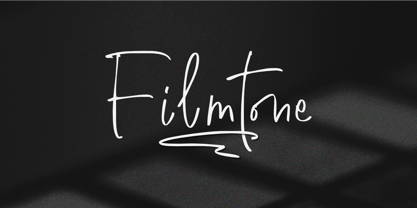 Create beautiful work with Filmtone, the perfect typeface for adding a touch of personality to your designs. With its casual style, Filmtone is perfect for headlines, invitations, posters, and more. So what’s included : Basic Latin Uppercase and Lowercase Numbers, symbols, and punctuations Multilingual Support. Simple Installations works on PC & Mac Thank You.
 - Schism One by Alias,
$55.00 Schism is a modulated sans-serif, originally developed from our Alias Didot typeface, as a serif-less version of the same design. It was expanded to three sub-families, with the thin stroke getting progressively heavier from Schism One to Schism Three. The different versions explore how this change in contrast between thick and thin strokes changes the character of the letterforms. The shape is maintained, but the emphasis shifts from rounded to angular, elegant to incised. Schism One has high contrast, and the same weight of thin stroke from Light to Black. Letter endings are at horizontal or vertical, giving a pinched, constricted shape for characters such as a, c, e and s. The h, m, n and u have a sharp connection between curve and vertical, and are high shouldered, giving a slightly square shape. The r and y have a thick stress at their horizontal endings, which makes them impactful and striking at bolder weights. Though derived from an elegant, classic form, Schism feels austere rather than flowery. It doesn’t have the flourishes of other modulated sans typefaces, its aesthetic more a kind of graphic-tinged utility. While in Schism Two and Three the thin stroke gets progressively heavier, the connections between vertical and curves — in a, b, n etc — remain cut to an incised point throughout. The effect is that Schism looks chiselled and textural across all weights. Forms maintain a clear, defined shape even in Bold and Black, and don’t have the bloated, wide and heavy appearance heavy weights can have. The change in the thickness of the thin stroke in different versions of the same weight of a typeface is called grading. This is often used when the types are to used in problematic print surfaces such as newsprint, or at small sizes — where thin strokes might bleed, and counters fill in and lose clarity, or detail might be lost or be too thin to register. The different gradings are incremental and can be quite subtle. In Schism it is extreme, and used as a design device, giving three connected but separate styles, from Sans-Didot to almost-Grotesk. The name Schism suggests the differences in shape and style in Schism One, Two and Three. Three styles with distinct differences, from the same start point.
 - Schism Three by Alias,
$55.00 Schism is a modulated sans-serif, originally developed from our Alias Didot typeface, as a serif-less version of the same design. It was expanded to three sub-families, with the thin stroke getting progressively heavier from Schism One to Schism Three. The different versions explore how this change in contrast between thick and thin strokes changes the character of the letterforms. The shape is maintained, but the emphasis shifts from rounded to angular, elegant to incised. Schism One has high contrast, and the same weight of thin stroke from Light to Black. Letter endings are at horizontal or vertical, giving a pinched, constricted shape for characters such as a, c, e and s. The h, m, n and u have a sharp connection between curve and vertical, and are high shouldered, giving a slightly square shape. The r and y have a thick stress at their horizontal endings, which makes them impactful and striking at bolder weights. Though derived from an elegant, classic form, Schism feels austere rather than flowery. It doesn’t have the flourishes of other modulated sans typefaces, its aesthetic more a kind of graphic-tinged utility. While in Schism Two and Three the thin stroke gets progressively heavier, the connections between vertical and curves — in a, b, n etc — remain cut to an incised point throughout. The effect is that Schism looks chiselled and textural across all weights. Forms maintain a clear, defined shape even in Bold and Black, and don’t have the bloated, wide and heavy appearance heavy weights can have. The change in the thickness of the thin stroke in different versions of the same weight of a typeface is called grading. This is often used when the types are to used in problematic print surfaces such as newsprint, or at small sizes — where thin strokes might bleed, and counters fill in and lose clarity, or detail might be lost or be too thin to register. The different gradings are incremental and can be quite subtle. In Schism it is extreme, and used as a design device, giving three connected but separate styles, from Sans-Didot to almost-Grotesk. The name Schism suggests the differences in shape and style in Schism One, Two and Three. Three styles with distinct differences, from the same start point.
 - Schism Two by Alias,
$55.00 Schism is a modulated sans-serif, originally developed from our Alias Didot typeface, as a serif-less version of the same design. It was expanded to three sub-families, with the thin stroke getting progressively heavier from Schism One to Schism Three. The different versions explore how this change in contrast between thick and thin strokes changes the character of the letterforms. The shape is maintained, but the emphasis shifts from rounded to angular, elegant to incised. Schism One has high contrast, and the same weight of thin stroke from Light to Black. Letter endings are at horizontal or vertical, giving a pinched, constricted shape for characters such as a, c, e and s. The h, m, n and u have a sharp connection between curve and vertical, and are high shouldered, giving a slightly square shape. The r and y have a thick stress at their horizontal endings, which makes them impactful and striking at bolder weights. Though derived from an elegant, classic form, Schism feels austere rather than flowery. It doesn’t have the flourishes of other modulated sans typefaces, its aesthetic more a kind of graphic-tinged utility. While in Schism Two and Three the thin stroke gets progressively heavier, the connections between vertical and curves — in a, b, n etc — remain cut to an incised point throughout. The effect is that Schism looks chiselled and textural across all weights. Forms maintain a clear, defined shape even in Bold and Black, and don’t have the bloated, wide and heavy appearance heavy weights can have. The change in the thickness of the thin stroke in different versions of the same weight of a typeface is called grading. This is often used when the types are to used in problematic print surfaces such as newsprint, or at small sizes — where thin strokes might bleed, and counters fill in and lose clarity, or detail might be lost or be too thin to register. The different gradings are incremental and can be quite subtle. In Schism it is extreme, and used as a design device, giving three connected but separate styles, from Sans-Didot to almost-Grotesk. The name Schism suggests the differences in shape and style in Schism One, Two and Three. Three styles with distinct differences, from the same start point.
 - Vingo by Poole,
$32.00Vingo is an understated, elegant, sans serif face. This font is among the first in a series of alphabets I am creating that are dignified and sophisticated. I wish these fonts had been available when I was designing wine labels. These fonts are rooted in "old world" tradition, but are more utilitarian. Some of the funky aspects are downplayed, some are enhanced and updated. Any job that requires understated sophistication is perfect for this face. The name comes from the French for wine, "Vin", and "Go" from gothic-wine gothic or Vingo. - Lanoline Script by Letterhend,
$16.00 Please meet Lanoline, a playful script typeface. As you can see, this typeface has a casual look yet still looks bold and stands out from the crowd. The swashes make the font looks even more unique. You can play around and mix and match the swashes, combining into a great logotype! Lanoline works perfect for you who needs a typeface for headline, logotype, apparel, invitation, branding, packaging, advertising and more. This typeface comes in uppercase, lowercase, with punctuation, symbols, numerals, stylistic set alternate, ligatures, and also support multilingual.
 - Galaxus by Sharkshock,
$115.00 Galaxus is an edgy display font defined by its tight spacing, sleekness, and short descenders. Curvature is limited throughout the character set with straightened lines dominating the interior. Traditional diagonals in capitals like M, N, W and Y are given the straight treatment to maintain vertical emphasis. This styling along with the contrast between thick and thin make for a unique look. Galaxus would work well in a logo, on sports apparel, or in a video game. This family is equipped with Basic Latin, Extended Latin, diacritics, punctuation, kerning, and comes in 4 versions.
 - Linea 72 by OLOF Type Foundry,
$25.00 Linea 72 is a typical seventies display typeface that was designed by Roland Hirter back in the phototypesetting days, when typefaces were really drawn by hand. In this static environment each work step took its time. With the decision to digitize this typeface his son Thomas Hirter also chose to develop it further with todays technical possibilities. That’s why the font now includes over 600 glyphs and ten stylistic sets, offering different stylistic alternates of several letters. Linea 72 comes in the two original styles Regular and Kontur.
 - Slinkster by Will Ryan,
$- Big. Bold. Beautiful. Slinkster is an intricately unique display face created by carefully overlapping equally-sized circles. The geometric patterns formed become increasingly mesmerizing the larger the type is set. Slinkster works best for display, headers, logotypes, and any other large-scale applications that allow the viewer to become hypnotized by its complexity. Due to how detailed Slinkster is, you may experience some lagging as it can take a while to render. Like this font? Consider donating to encourage further development and new fonts! Donations accepted through this Paypal address: willryan042@gmail.com
 - Svati Sava by Simeon out West,
$25.00 The Svati Sava font is a Latin Alphabet layout of a Serbian font. The original letterforms of this font struck me in their modern simplicity while retaing a traditional Eastern European feel and I wished to have a variant of it suitable for Latin Alphabets. To create this font I used many of the letterforms from Serbian and recreated a large portion of the miniscule alphabet. Svati Sava comes with full punctuation, a complete character set for most Western European Latin alphabet languages. Being a decorative font, it works best at larger point sizes.
 - Sola by Khaito Gengo,
$25.00 Sola is a simplistic, stylish, and modern san serif type font with the unique addition of rounded corners. When creating this font, Bank Gothic originally influenced me, however when I made the square shapes lower case the font didn't retain its sophistication, so it was designed narrower. The result is this warm and soft looking font that works for all types of design, from posters and fliers to logos and business cards. Sola also features standard ligature, stylistic alternates, titling characters with extended width, and a set of standard pictograms.
 - LTC Francis by Lanston Type Co.,
$24.95 Francis is a design previously offered by the Lanston Type Co. in the early 1990s. It is a revival of a 1955 Günther Gerhard Lange design, but with a heavier overall weight. Coming out of retirement, it has been fully reworked and refined with elegant curves and an expanded character set. This font works well at small sizes and larger display sizes for everything from wine labels to personal stationery. This type evokes the elegant sophistcation of the Jazz age and pairs well with a Martini and a fine selection of charcuterie.
 - Marian Churchland by Comicraft,
$39.00 Tall, thin and elegant, Marian Churchland’s fonts are very much like her.. and now available from those awfully nice chaps at Comicraft to allow you to pretend that you are too! Marian Churchland was born in Canada in 1982, and was raised on a strict diet of fine literature and epic fantasy video games. She has a BA in Interdisciplinary Studies (English Literature and Visual Arts) from the University of British Columbia, and has been doing professional illustration work, including book covers and magazine articles, since she was 17. Last year, she became the first woman to solo-illustrate a CONAN story, and this year she’s illustrating three issues of ELEPHANTMEN for Image Comics. See the families related to Marian Churchland: Marian Churchland Journal.
 - Mestika Arabic by Boharat Cairo,
$20.00 Mestika is a resinous spice, in Arabic means gum, the name is Mestika cause the mestika has a mixture of sharp edges and cursive connections, that mixture gives the typeface an edge to stand out, a low contrast sharp design with 9 weights making it works well with text and headlines. The design is a collaboration with the Iranian designer Kamyab Jafari, The typeface is a modern design, and has a wide range of ligatures and features for better justifications. The typeface comes with 9 weights, and works in variable axes, the typeface now supports only Arabic-based languages, but in the near future, it would support Latin-based languages, the Typeface is based on Naskh calligraphy, something in between the Iranian and the Arabic styles.
 - Ely Rounded by Cory Maylett Design,
$30.00 Smooth and shapely without a trace of fat. A seductively handsome devil without the attitude. This typeface wears a tie at the office, but keeps a pair of sneakers and a beach volleyball in the car. Ely Rounded is a family of four weights plus matching italics (with more on the way). Each weight includes extended language support for European, Cyrillic and Greek. OpenType features include fractions, tabular and proportional figures plus a few ligatures thrown in for good measure. This is a typeface that works well from text sizes to billboards, and is equally at home in print or on the web. Future updates of purchased fonts are, of course, free. Buy the full set and receive yet-to-be-released weights at no charge — even as the price of that growing full package increases.