10,000 search results
(0.052 seconds)
- Janetanice by Essentials Studio,
$16.00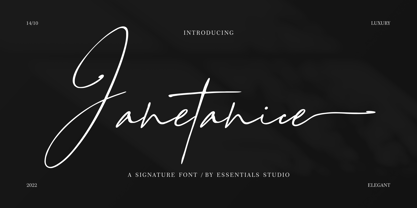 Janetanice Is a Luxury Signature Font Janetanice is perfect for product packaging, branding project, magazines, social media, weddings, or just used to express words above the background. This font is PUA encoded, which means you can access all of the glyphs and swashes with ease!
 - Andrea Handwriting by StuArt,
$9.00 Born out of an insatiable addiction to handwriting fonts, Andrea's Handwriting fonts are simple, readable and easy on the eyes. Each font is cool, casual and fun all at the same time. Perfect for printing your personal thoughts be they silly, pensive or absolutely nonsense!
 - Carabelle by Typejockeys,
$25.00 Carabelle is based on the Nebiolo type foundry’s Calipso design. Newly redrawn and with many original details added, this old typeface has been revitalized. Noble and sweet, Carabelle plays the elegant companion for cup cake shops, wedding invitations or culinary tours through France and Italy.
 - Aldivaro by Sabrcreative,
$20.00 Infuse your designs with a touch of vintage elegance using the Aldivaro Vintage Retro Serif Font. This exquisite typeface seamlessly merges the timeless charm of yesteryears with modern versatility, making it a must-have for designers who want to create impactful and nostalgic visuals.
 - Contigo by Resistenza,
$39.00 Contigo Is our new brushy script for your summer cards and gifts. This script has a lot of contrast created with a lot of pressure and release of the brush pen. The icon set contains tropical elements like leaves, pink flamingos, pineapple and more.
 - Stationer JNL by Jeff Levine,
$29.00 The 1938 sheet music for the official Coast Guard Marching Song "Semper Paratus" "(Always Ready)" offered up a hand lettered title in a bold block style with rounded corners and an inline. This is now available as Stationer JNL, in both regular and oblique versions.
 - Junkyard Plush by PizzaDude.dk,
$20.00 Junkyard plush has six different versions of each letter! This is called “contextual alternates” which makes your text look random and like something authentic hand-made... which of course the font is! Included are ligatures for double-letters... if the contextual alternates aren't enough!
 - Mugpie by PizzaDude.dk,
$14.00 Originally handdrawn, and then digitized by hand. But carefully keeping the characteristics of the handmade lines. Mugpie has that happy-go-lucky feeling to it - use it for your posters, postcards, packaging, wrapping - anything that could need a fresh breath of funkadelic comic boost! :)
 - Fancy Nouveau JNL by Jeff Levine,
$29.00 The 1907 sheet music for "Take Me Back to Dear Old Dixie" had the song title hand lettered in a decorative serif typeface with strong Art Nouveau influences. This design is now available digitally as Fancy Nouveau JNL, in both regular and oblique versions.
 - Sqair by Superfried,
$- Sqair is an experimental display typeface designed by Superfried. It is available in two formats, stencil and solid. The inspiration for this font originates from fond memories of the classic Sinclair Spectrum logo. Consequently Sqair lends itself to any project with a technology related theme.
 - Horas by Yukita Creative,
$14.00 Horas Sans Serif Geometric is a stunning and modern font, designed with a touch of minimalism and attractive geometrics. This font combines the beauty of serif-free design with the boldness of geometric shapes, creating a fresh, clean look for a variety of design projects.
 - Palace Script by Monotype,
$29.99 Palace Script is a formal English script from the 1920s. This typeface, inspired by centuries-old copperplate engravings, could add the perfect touch to any number of holiday cards. You could also make cute little names tags for all of your presents with Palace Script.
 - Cheeky Tommy by Alexander Sharkov,
$3.00 Our new stylish and cheeky font is perfect for a variety of youth brands and projects. The letters are intentionally sloppy, but they look great in the context of any size text blocks! We hope our cheeky font will help you develop your cheeky project!
 - Hex by Hanoded,
$15.00 Hex is an uneven, spiky font with an evil twist. The glyphs look like they have been scratched onto paper (which is indeed the case), so it will be perfect for your scary halloween postcards or posters. Hex font comes with extensive language support.
 - Zamon by Java Pep,
$17.00 Proudly present the newest modern serif font called Zamon. This font is elegant and perfect for the headline, title, logotype, fashion, quote text, publishing, etc. Zamon also comes in an oblique style so you can pair it to make contrast and to highlight purpose.
 - Calmsie by Timurtype,
$14.00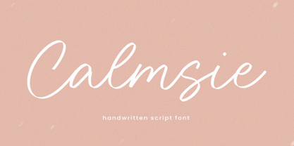 Calmsie A Handwritten Script Font Calmsie is perfect for product packaging, branding project, magazine, social media, weddings, or just used to express words above the background. This Calmsie font includes: Calmsie multilingual support. Embellish your designs with our original fonts. Enjoy the font, Thank you!
 - Starboard by Hanoded,
$15.00 The term starboard derives from the Old English steorbord, meaning the side on which the ship is steered. Before the steering wheel, boats were steered by an oar at the stern of the ship. Since most sailors were right handed, this is where you would find your steering oar! Starboard font is a rough, handmade, brushy kinda font. It was, of coarse, made with my favourite cheep brush and Chinese ink - resulting in a slightly eroded looking font. Starboard comes with all the trimmings, including double letter ligatures for the lower case.
 - Bernhard Fashion by Monotype,
$40.99The German-born designer Lucian Bernhard designed Bernhard Fashion in 1929. An American" typeface, Bernhard's original design was created for the American Type Founders (ATF). It bespeaks the spirit of the roaring 20s. The hairline-thin letters exhibit elongated ascenders (but not descenders), and many stylized elements. The capital letters also all descend visibly below the baseline. In text, the extra large capitals seem almost like drop caps. This typeface is best used sparingly in text. Largely set headlines will allow readers to enjoy the fashionable quality of Bernhard Fashion's design." - 1781 La Fayette by GLC,
$42.00 This font was inspired from the numerous font-types looking like Hand-carved in the 1700's. The capitals are mainly inspired from the font carved by Fournier in year 1781, the year of the famous American and French decisive victory at Yorktown, and drawn by Benjamin Franklin himself, and the lower cases are inspired from the well known "bâtarde coulée" style, ornamented with final loops and enriched with alternates and ligatures. The font is available for English, Western Europe (including Celtic) Icelandic, Baltic, Eastern Europe and Turquish languages.
 - Tangential Rounded by ArtyType,
$29.00 This variation of Tangential (see also the Standard & Semi Serif variants) continues with the angles that give the typeface its name; however, the square terminals are half-rounded to create a softer and slightly more fluid styling. The Tangential style I envisaged for the family is complemented by the prominent use of negative space throughout, most apparent on the drop-shaped ‘o,’ which is a key feature of the typeface and a letterform I'm particularly pleased with. Available in 2 weights, Regular & Bold, in both OpenType OTF & TrueType TTF formats.
 - Sonica by Sonic Savior,
$50.00The Sonica font family represents a modern typeface that is designed the express fluidity of motion. Sonica is the second font designed by the Sonic Savior team, and was specifically build for the group's website. The first font by the hand of this design team was Antediluvian, which consists of solid and down-to-earth glyphs - unearthed in fact, from ancient history. Sonica on the other hand is designed with a most volatile and dynamic geometry. If Antediluvian would be the alchemical Salt, Sonica would be its Mercury. - Erehwon Roman NF by Nick's Fonts,
$10.00This charming font, with its hints of the exotic, originally carried the rather prosaic name of Show Card Roman. It appeared in the book "Art Alphabets and Lettering: an encyclopedia of lettering including the most important standard alphabets and such classics as are in most demand for the use of engravers, designers, and all lovers of art" by the evidently rather verbose J. M. Bergling (1866-1933). As a nod to its exotic overtones, the font is named after the 1872 utopian novel of the same name by Samuel Butler. - Linotype Fehrle Display by Linotype,
$29.99Erich Fehrle designed this robust alphabet for headlines and titles in 1976. The constructed figures of Linotype Fehrle Display were built on the geometric form of the rectangle. Lines of text look closed and compact. The letter forms are the result of fine open spaces. Design-specific characteristics of Linotype Fehrle Display are its serif-like additions to the strokes of the figures a, c, G or M, and the alternating rounded and angular outlines of the figures a, e, s and others. Typefaces similar to Linotype Fehrle Display: Bigband, Frutiger 95. - Monumental Gothic by Scriptorium,
$18.00For Monumental Gothic, we delved into the archives and found some old rubbings and photos of monumental brasses from British tombs of the 12th and 13th centuries. The sources included famous monuments like the tomb of Richard II and less well known inscriptions with similar style lettering. The rubbings were made by Dave Nalle in the 1970s (when they still let you have access to the the brasses). Monumental Gothic includes some alternate characters, plus upper and lower case characters, numbers and a selection of very interesting decorative emblems to complement the text. - Tangential SemiSerif by ArtyType,
$29.00 This variation in the Tangential series (see also the Standard & Rounded families) continues with the angles that give the typeface its name, however a semi-serif is applied wherever appropriate to create a more open, softer variant. The Tangential style I envisaged for the family is complemented by the prominent use of negative space throughout, most apparent on the drop shaped ‘o’ which is a key feature of the typeface and a letterform I'm particularly pleased with. Available in 2 weights, Regular & Bold, in both OpenType OTF & TrueType TTF formats.
 - Hupp Fraktur by RMU,
$25.00 Otto Hupp's blackletter font, released by Klingspor in 1911, took its inspiration from the then dominating Art Nouveau designs. Some of its capitals express this with their lovely swash forms, and make this fraktur font less stiff. Hupp Fraktur contains a bunch of usefull ligarures, and by typing 'N', 'o' and period you get an oldstyle numbersign by activating the Ordinals feature.
 - Nocturne by Scholtz Fonts,
$19.95 The font is based on an alphabet from a mid1920s art deco book. The original seemed to have tapering strokes but it was too small to be sure; I made all strokes parallel & orthogonal and slightly modified the original in a number of other ways to bring it into the 21st Century. The designers of the original were Paul Carlyle and Guy Oring. Nocturne has all the elegance of the Deco fonts of the 1930s. It recalls the romantic, sophisticated Zeitgeist of the early 20th century, that nostalgic time "between the wars". Nocturne comes in two styles: Nocturne Regular, which uses the Art Deco convention of small x height, and long ascenders. This style is perfect for headers, posters, labels etc. Nocturne Book, which, with its higher x height and slightly wider characters, is extremely legible and suitable for small size text.
 - Sydonia Atramentiqua by Wardziukiewicz,
$20.00 Sydonia Atramentiqua is a strange creation. The inspiration was the first releases of "Malleus Maleficarum" (actually the typography used there). I decided I wanted something strange, so Sydonia came into being. Like a blood of all witches who were being hunted down by Malleus Maleficarum's "fans" for their skills and beliefs. Why Sydonia? Sydonia von Borck was a witch from my area. It was probably the last woman executed for witchcraft. The genesis of the name. Sydonia was THE WITCH, and by the name I added "Atramentiqua". It is a combination of the words "Ink" (polish "ATRAMENT") + "Antiqua". The idea of spilling a font is historical. The former Zecer composition was not perfectly sharp. As it was a "wet job", there were always light exits behind the lines. Who supported me? The GENEALOGIA project has been carried out for several years in cooperation with the Academy of Art in Szczecin and the National Museum in Szczecin. The project's supervisors are prof. Waldemar Wojciechowski and MA Patrycja Makarewicz, who runs the Visual Communication Studio. Some information: Sydonia was like that! This is not an everyday font. It is a stylized font, used to imitate old prints made by Zecer. The first version of Sydonia Atramentiqua was created in 2018 for the purposes of the exhibition at the National Museum in Szczecin. Base inspiration: Malleus Maleficarum & Caslon.
 - Judger by Twinletter,
$15.00 Judger is a graffiti typeface that we created with the purpose of producing unique works that can be applied to a number of your projects, prioritizing high flexibility in order to make it easier for you to respond to your diverse needs. This typeface is not only versatile, but it will also make your project look appealing, attractive, and cool. When you use this font, viewers will perceive your project as high quality, professional, and well-designed, and your project will be highly rated. This graffiti font is great for product logos, poster titles, headlines, packaging, film titles, logotypes, gorgeous writing, and trendy graffiti designs, among other things. Of course, if you utilize this font in your numerous creative projects, they will be perfect and outstanding. Use this typeface right away for your one-of-a-kind and remarkable projects.
 - The Bubblegum Superstar font is a vibrant and playful typeface that captures the essence of fun, youthfulness, and enthusiasm. Characterized by its rounded edges and exaggerated forms, the font exude...
- "Flying Colours Don't Run" is a captivating font that truly embodies the essence of resilience and vibrant expressiveness, as hinted by its distinctive name. Although I don't possess direct access to...
- Lektorat by TypeTogether,
$35.00 Florian Fecher’s Lektorat font family is one for the books, and for the screens, and for the magazines. While an editorial’s main goals are to entertain, inform, and persuade, more should be considered. For example, clear divisions are necessary, not just from one article to the next, but in how each is positioned as op-ed or fact-based, infographic or table, vilifying or uplifting. From masthead to colophon, Lektorat has six concise text styles and 21 display styles to captivate, educate, and motivate within any editorial purpose. Magazines and related publications are notoriously difficult to brand and then to format accordingly. The research behind Lektorat focused on expression versus communication and what it takes for a great typeface to accomplish both tasks. In the changeover from the 19th to 20th century, German type foundry Schelter & Giesecke published several grotesque families that would become Lektorat’s partial inspiration. Experimentation with concepts from different exemplars gave birth to Lektorat’s manifest character traits: raised shoulders, deep incisions within highly contrasted junctions, and asymmetrical counters in a sans family. After thoroughly analysing magazine publishing and editorial designs, Florian discovered that a concise setup is sufficient for general paragraph text. So Lektorat’s text offering is concentrated into six total styles: regular, semibold, and bold with their obliques. Stylistic sets are equally minimal; an alternate ‘k, K’ and tail-less ‘a’ appear in text only. No fluff, no wasted “good intentions”, just a laser-like suite to focus the reader on the words. The display styles were another matter. They aim to attract attention in banners, as oversized type filling small spaces, photo knockouts, and in subsidiary headings like decks, callouts, sections, and more. For these reasons, three dialed-in widths — Narrow, Condensed, and Compressed — complete the display offerings in seven upright weights each, flaunting 21 headlining fonts in total. If being on font technology’s cutting edge is more your goal, the Lektorat type family is optionally available in three small variable font files for ultimate control and data savings. The Lektorat typeface was forged with a steel spine for pixel and print publishing. It unwaveringly informs, convincingly persuades, and aesthetically entertains when the tone calls for it. Its sans serif forms expand in methodical ways until the heaviest two weights close in, highlighting its irrepressible usefulness to the very end. Lektorat is an example of how much we relish entering into an agreed battle of persuasion — one which both sides actually enjoy.
 - Hazelton by Type Royal,
$61.00 Hazelton is a neo-humanist typeface inspired by the explorations and development of early British sans-serif typography. Six weight have been developed for Hazelton. The lighter weights are loosely inspired by Edward Johnston’s Underground typeface. The heavier weights glean inspiration from Stephenson Blake’s Granby. Sharp, pointed terminals that are indicative of British typography have been omitted in favour of a more modern sensibility. Subtle humanist characteristics become more exaggerated as the typeface increases in weight, making the lighter weights practical for text purposes and the heavier weights ideal for display use. A unique set of numerals have been developed to infuse them with a humanist quality that is often lacking when typesetting technical data. The result is a diverse typeface that is as powerful as it is beautiful.
 - Dusk Til Dawn by Scholtz Fonts,
$19.95 As with Nocturne, Dusk til Dawn recalls the romantic, sophisticated Zeitgeist of the early 20th century, that nostalgic time "between the wars". It as a number of attractive ligatures and upper-case alternates. I have used Nocturne as a basis for Dusk til Dawn, given the font really bold down-strokes, reduced the width of some upper case characters and changed the shape of many lower case characters. Dusk til Dawn comes in two styles: Dusk til Dawn Regular, which uses the Art Deco convention of small x height, and long ascenders. This Display style is perfect for headers, posters, labels etc. Dusk til Dawn Book, which, with its higher x-height and slightly wider characters, is extremely legible and suitable for longer passages of smaller size text.
 - Vintage Lander by Din Studio,
$25.00 Have you thought about how you can add that touch of magic to your branding and projects? Want to travel your audience to a world of gorgeous, versatile, but still have the retro touch? Then, here we go. Introducing Vintage Lander- A RetroScript Font This vintage font features thick and angular letters. With its strong outlines and fat strokes, this is the font you need when you want to create that classic bubble font look. This font becomes more special with extruding version option. This font can be used for a host of different content needs and projects. Create gorgeous printed quotes, standout packaging, or beautiful t-shirts! You can even use it to create amazing headings, logos, menus, and social media graphics. Our font always includes Multilingual Support to make your branding reach a global audience. Features: Ligatures Stylistic Set Swashes Multilingual Support PUA Encoded Numerals and Punctuation Thank you for downloading premium fonts from Din Studio
 - Saturday Detentions by Bogstav,
$18.00 Saturday Detentions is based on the classic serif "High School" style. However, this version is handmade and a bit rugged here and there - and loose in a legible/organic way. I've added 7 different versions of each letter and they automatically cycle as you type - or you can manually choose the one you prefer from the glyph menu.
 - Cigra by Identitype Co,
$19.00 Cigra is a standout display font that is an ode to fashion typography in present day. It's elaborate curves and unique shapes make it perfect for headings, logos & wedding invitations. Cigra is all class so if you want a stylish font that is guaranteed to draw the eye, then this is it! The alternative characters were divided into several features such as Stylistic Sets, Stylistic Alternates, Contextual Alternate, SWASH and Ligature. The Open Type features can be accessed by using Open Type savvy programs such as Adobe Illustrator, Adobe InDesign, Adobe Photoshop Corel Draw X version, And Microsoft Word. And this Font has given PUA unicode (specially coded fonts). so that all the alternate characters can easily be accessed in full What’s Included : Web Font Hundred of glyphs Alternates and Ligatures Punctional Works on PC & Mac PUA Encoded Characters - Fully accessible without additional design software. Simple installations Accessible in the Adobe Illustrator, Adobe Photoshop, Adobe InDesign, even work on Microsoft Word. Fonts include Multilingual Support Extended Latin
 - Neue Reman Sans by Propertype,
$45.00 Neue Reman Sans 1.0 --- New Update! CONDENSED - SEMI CONDENSED - SEMI EXPANDED - EXPANDED It has 70 fonts style in total family + 2 Variable Style. --- It is a Roman, Humanist, Grotesk and Geometri sans serif family. The family comes in 7 weights with matching italics + Variable Font File and includes multilingual latin characters. Neue Reman Sans contains 306 glyphs - this is the first version of Neue Reman Family with standard ligatures and a variety of figures and fractions. We create Neue Reman typeface to use in multipurpose project such as on website, systems, printing, embedding, servers, screens, display, digital-ads, branding, logos, titles, headlines, teks, and everything else. This font is a project that we are working on for the long term. We has updating the Condensed and Expanded versions. Then we plan to continue working on Latin Pro, Greek and Cyrillic. It all will be updated gradually. So, hope you would like the first version of Neue Reman Sans Serif Typeface. Thank you very much.
 - Inked God Pro by CheapProFonts,
$10.00 This font has that grungy, gritty look, and combines it with some elegant swirls. Weird and wonderful. I have added swirls and decorations to ALL the uppercase letters that did not have them, so there are now wider possibilities to add interesting decorations to your composition. In addition to the expanded language support, of course. ALL fonts from CheapProFonts have very extensive language support: They contain some unusual diacritic letters (some of which are contained in the Latin Extended-B Unicode block) supporting: Cornish, Filipino (Tagalog), Guarani, Luxembourgian, Malagasy, Romanian, Ulithian and Welsh. They also contain all glyphs in the Latin Extended-A Unicode block (which among others cover the Central European and Baltic areas) supporting: Afrikaans, Belarusian (Lacinka), Bosnian, Catalan, Chichewa, Croatian, Czech, Dutch, Esperanto, Greenlandic, Hungarian, Kashubian, Kurdish (Kurmanji), Latvian, Lithuanian, Maltese, Maori, Polish, Saami (Inari), Saami (North), Serbian (latin), Slovak(ian), Slovene, Sorbian (Lower), Sorbian (Upper), Turkish and Turkmen. And they of course contain all the usual "western" glyphs supporting: Albanian, Basque, Breton, Chamorro, Danish, Estonian, Faroese, Finnish, French, Frisian, Galican, German, Icelandic, Indonesian, Irish (Gaelic), Italian, Northern Sotho, Norwegian, Occitan, Portuguese, Rhaeto-Romance, Sami (Lule), Sami (South), Scots (Gaelic), Spanish, Swedish, Tswana, Walloon and Yapese.
 - Once upon a time, in the enchanted lands of typography, nestled between the bold warriors of Arial and the elegant serifs of Times New Roman, there lived a whimsically charming font named TagettesPlu...