10,000 search results
(0.114 seconds)
- Devil's Snare - Unknown license

- Ransom - Unknown license

- Elizabeth - Unknown license

- CircuitBoredNF - 100% free

- Replete Sans by Sudtipos,
$49.00 Sudtipos’ new sans serif font Replete is inspired by the mixture of aesthetics and philosophies found on the streets of metropolitan cities the world over. Buildings constructed throughout the twentieth century, including those made in the Art Deco style or influenced by the Bauhaus’s gospel, stand side-by-side as symbols of their time. Typography is one factor that bonds these vistas, and simultaneously further complexifies them. Art deco letters appear on storefronts and signage in Europe’s oldest cities and as remnants of the Golden Age of economic expansion for Latin America. Typography, like architecture, sometimes coexists in perfect harmony, and other times in ideological opposition. But it is these juxtapositions in places such as Shanghai, New York, London, Buenos Aires and Tokyo that shape each city’s identity. Replete is inspired by this mixture. We wanted to create a useful modern sans serif family – a set of 7 weights with playful geometric alternates – that allows you to combine characters including wide-width and filled letterforms. Replete is apt for long texts, and equally, for instances where letterforms can stand together like a cityscape. Replete means full, packed and abounding … it is a sans, it is grotesque, it is geometric and it is Deco. Replete is a new family that has a little of everything we like, equipped with everything you need to design anything you want.
 - Garcog by Patria Ari,
$24.00 Garcog : The Ultimate Typeface for Mechanical Aesthetics. Inspired by the intricate design of gears and cogs, Garcog features upper shapes cut like precision engineering. This unique font adds a touch of industrial sophistication to your projects, making it the perfect choice for conveying precision, innovation, and mechanical excellence. Ideal for engineering, manufacturing, and tech-related designs, Garcog is the font that propels your message into a new dimension of creativity.
 - ABC Dotted Tracing by Beast Designer,
$15.99 ABC Dotted Tracing Font is a user-friendly typeface designed specifically to aid in early childhood education and handwriting practice. Featuring clear, dotted outlines of each letter, this font serves as a guide for young learners as they trace and familiarize themselves with the alphabet. The dotted lines help children develop fine motor skills and hand-eye coordination while practicing proper letter formation. This font is often utilized in educational materials, worksheets, and apps aimed at supporting kids in mastering the fundamentals of writing in a fun and engaging way.
 - Sharquefin by Linotype,
$29.99Sharquefin is a round, constructed display face, which contains shark fin-like elements that rise out from part of its letterforms. Gary Tennant, a designer from the UK, designed Sharquefin especially for fun uses, like party flyers. - Attention Getters JNL by Jeff Levine,
$29.00In the days of metal type or paper clip art, spot illustrations with stock phrases were used to embellish ads and fliers in order to grab the attention of potential customers. The convenience of digital type puts art like this at a designer's fingertips. Attention Getters JNL contains fifty-two such ad phrases, certain to add a nostalgic, yet functional appeal to your printed or online piece. - Fake Limp by Bogstav,
$17.00 Fake Limp is my layered handmade sans font - use it for your craft project, or anything that needs a handcrafted and organic look. I've added 5 different versions of each lowercase letter, and they automatically cycle as you type. Furthermore There are 4 versions of the font (each with the same amount of lowercase letters!) - mix and match these versions for the result you like! Enjoy! :)
 - RMU Pittoreske by RMU,
$35.00 This great Victorian display font of the late 19th century was revived for today’s use. You also find two frame elements. To start setting a frame, type [shift] + [alt] + p for the corner, and continue with typing [alt] + p. Duplicate and mirror the lines to get a fantastic frame.
 - VTC Letterer Pro - Unknown license

- VTC Bad DataTrip - Unknown license

- VTC SikleCell - Unknown license

- VTC Bad DataTrip - Unknown license

- VTC Optika - Unknown license

- VTC Optika - Unknown license

- VTC SubwaySlam Caps - Unknown license

- Klaud by Tour De Force,
$25.00 Klaud is our new slab serif family with 14 styles. It is compact, stable typeface that's carefully designed to suit in every possible situation where an working horse typeface could be used. Klaud is good balanced, visually equalized family that looks and feels smooth in longer texts and paragraphs, but works well in headlines also cause it's gentle decorative letter parts. Strong look is achieved by more squared then rounded characters design. As mentioned, Klaud is perfect to fit into any designer's project – from editorial use as the main typeface to situations where you are looking for a couple of words only like posters or packages. It is fully legible and versatile as web font also. Klaud is offered with OpenType features like Numerator, Denominator, Fractions, Small Caps, Oldstyle Figures, Lining Figures, Standard Ligatures, Case Sensitive Forms, Arrows, Alternate Annotation Forms.
 - Artnoova by Popskraft,
$18.00 The Artnoova typeface combines the inimitable mastery of the great styles of the early twentieth century and at the same time looks organic among modern ones. Like the famous Art Deco typeface, Artnoova is designed for a strong yet elegant typography. In addition, a balanced set of capital letters allows you to type large sections of text. All this allows the Artnoova font to be used in almost any area of design, such as corporate identity, typography, posters, web design and other design areas.
 - Caravan by Linotype,
$29.99Caravan was designed in 1938 by William Addison Dwiggins and consists of a variety of ornaments. He based the forms of the ornaments on the same lines and curves found in his font Electra. He wanted printers and designers to have the chance to combine the two fonts for a more attractive or outstanding overall picture. Caravan is particularly popular for advertisements in newspapers. Caravan can be easily mixed with other fonts designed by Dwiggins. - Jantar Flow by CAST,
$45.00 Jantar Flow is a humanist sanserif type family tailored for continuous reading for both printing and screen. With its large x-height and low contrast it also performs very well in captions, side notes, and short paragraphs set in small sizes. Jantar Flow Italic is distinct and readable. Following a proper italic construction, it shows the fun side of the family yet keeps the features of the upright. Jantar Flow – as well as its teammate Jantar Sharp – comes in seven weights from ExtraLight to Heavy, each with accompanying italics. It has a tabular and proportional set of figures in both old style and lining options, and also a special set of hybrid figures sitting between x-height and capitals. Superscripts and subscripts are provided together with a vast collection of diacritics covering all European languages as well as a set of case-sensitive characters. Jantar, the pairing superfamily. ‘Jantar’ is an old Polish name for ‘amber’, a fossilised resin – a substance that is robust and organic at the same time. These qualities somehow reflect the feeling behind the Jantar families, ‘Flow’ and ‘Sharp’. Jantar Flow was designed along with Jantar Sharp. As part of the Jantar superfamily these two faces are perfectly paired: though not based on the same skeleton, they share the same design parameters and the same character set, but each one works independently with its peculiar features. Designed for publishing for print and web, as well as for branding, the Jantar superfamily was inspired by common font pairings of the digital age like Helvetica/Times or Verdana/Georgia. Jantar Flow and Jantar Sharp communicate with individual yet complementing voices, just like two trained acrobats can perform alone but also know well how to perform together.
 - Mrs White by Hipopotam Studio,
$40.00 We designed Mrs White for our next book for children. We needed a clean script that would give a feeling of a primary school handwriting. Mrs White is filled with ligatures and contextual alternates which gives her very smooth line of text. Scripts shouldn't be used without lowercase letters so we added a small caps for headlines and acronyms. Check out the manual for more information on how to use Mrs White. Polish language use latin characters but we would like our Eastern neighbors to be able to enjoy Mrs White so we added cyrillic alphabet (script and caps).
 - Cerulean NF by Nick's Fonts,
$10.00An offering from Barnhart Brothers & Spindler’s Catalog No. 9 from 1907, with the rather prosaic name of "Lining Gothic No. 71", inspired this non-nonsense and surprisingly ageless face. As versatile as it is simple, this typeface is a stylish choice for heads and subheads. Both versions of the font include 1252 Latin, 1250 CE (with localization for Romanian and Moldovan). - Angelissa by Rockboys Studio,
$28.00 Angelissa. This beautiful script is for those who are needing of elegance and stylish for their designs and particularly well suited for wedding invitations, save the date cards and feminine branding. This font is PUA encoded which means you can access all of the glyphs and swashes with ease! It features a varying baseline, smooth lines, gorgeous glyphs and stunning alternates.
 - Guilloche B by Wiescher Design,
$24.00 »Guilloche B« is a set of graphics that join with each other to form very sophisticated, op-art-like borders. Try them on lots of different assignments, they form very surprising bands or patterns.
 - BARONK by Twinletter,
$13.00 Introducing BARONK Font – a captivating display typeface that embodies the essence of authentic handwriting! Elevate your projects with the artistic touch of BARONK, a perfect blend of style and individuality. Explore BARONK now and witness your creations come to life! What’s Included : File font All glyphs Iso Latin 1 Alternate, Ligature Simple installations PUA Encoded Characters – Fully accessible without additional design software. Fonts include Multilingual support
 - Xerym by Twinletter,
$13.00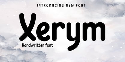 Introducing Xerym Font – a captivating display typeface that embodies the essence of authentic handwriting! Elevate your projects with the artistic touch of Xerym, a perfect blend of style and individuality. Explore Xerym now and witness your creations come to life! What’s Included : File font All glyphs Iso Latin 1 Alternate, Ligature Simple installations PUA Encoded Characters – Fully accessible without additional design software. Fonts include Multilingual support
 - MOLARUD by Twinletter,
$13.00 Introducing MOLARUD Font – a captivating display typeface that effortlessly captures the authenticity of handwriting! Elevate your projects with the artistic touch of MOLARUD, a seamless fusion of style and individuality. Explore MOLARUD today to see your creative visions come to life! What’s Included : File font All glyphs Iso Latin 1 Alternate, Ligature Simple installations PUA Encoded Characters – Fully accessible without additional design software. Fonts include Multilingual support
 - AFJUCK by Twinletter,
$13.00 Introducing AFJUCK Font – a captivating display typeface that effortlessly captures the essence of authentic handwriting! Elevate your projects with the artistic touch of AFJUCK, a perfect blend of style and individuality. Explore AFJUCK now to see your creations spring to life! What’s Included : File font All glyphs Iso Latin 1 Alternate, Ligature Simple installations PUA Encoded Characters – Fully accessible without additional design software. Fonts include Multilingual support
 - DeForme by Ingo,
$39.00 A deconstructive variation of ”Clarendon“ DéFormé was born out of the distortion of the time-honored ”Clarendon“ letterforms, in which the stems and thin strokes have been reversed. Thus, a typeface was created which will remind some readers of a Western typeface, and others of the ordinary typeface of a typewriter. Actually, it is still a robust Clarendon, which has survived ists disfigurement quite well. DéFormé, like its ”mother“, is easily legible, in spite of the inherent emphasis which one is not used to seeing.
 - Fibra One by Los Andes,
$26.00 Fibra One looks like a “soft” version of the Fibra font, but it is actually more than that—the second part of its name suggests that it is a reinterpretation of the original typeface. While this new version maintains the overall structure of Fibra and influence of the Avant Garde font, its shapes are different from those found in its predecessor—Fibra One features both soft corners and smooth transition between curved and straight sections. This gives the font a more dynamic and playful personality. Fibra One keeps the original contrast between curves and straight lines in glyphs such as ’n’ and ‘h’ (not found in rounded glyphs such as ‘a’ and ‘d’); details of display characters (e.g. three upper terminals in ‘W’ and projection off the stem in ‘A’); and exaggerated terminal in ‘R’. All these features give Fibra One a strong personality—a typeface that ‘gives you the chills’. Fibra One was specially designed for display use. The font has a very generous x-height that allows for use in corporate text, thanks to its good readability. Fibra One comes with 2 subfamilies—a more ’normal’ Basic family, with a smaller amount of stylistic features, for use in subheadings or any other type of text that requires formality, and an Alt family that shows off the true potential of the font, making it the perfect choice for magazine headlines, posters and logotypes.
 - Sailem by Kaer,
$19.00 Introducing my new Art Deco inspired typeface Sailem with line in the middle. This is a display font perfect for contemporary magazines, vintage branding, space posters, steampunk headers, and advertising. What's included? * Middle line style * Uppercase * Numbers * Symbols * Punctuation I hope you enjoy this font. Follow my shop to receive updates of products and the very hottest news! If you have any question or issue, please contact me: kaer.pro@gmail.com Please request to add additional characters and glyphs if you need! Thank you!
 - Apex Brush by Hanoded,
$15.00 I like playing around with brushes and Chinese ink. I always have some kind of idea of what the final design should look like, but once it’s done, it never ever looks like what I had in mind. Apex Brush is one of those designs: it started off as a few brush strokes, but before I knew it, I had a really nice set of matching brush fonts! Use it for any design that needs a bit of rough, a splash of ink and a pinch of rebel.
 - Mulier Moderne by HiH,
$8.00 Even though the phrase Art Nouveau originated in Paris at the shop of Siegfried Bing, the French preferred to call it Le style moderne. This very sinuous, very Art Nouveau typeface was designed by an E. Mulier around 1894, probably also in Paris. The organic, vine-like curve forms are frequently seen in the art of the period. Examples include the architecture of Victor Horta, the furniture of Henry van de Velde and the jewelry of Max Gradl. Mulier Moderne is an all-cap font with a full Western European character set plus ST and TH ligatures, an alternate ‘E’ and two glyphs of period printer’s cuts. Warning: do not use for extended text. Duh!
 - Mimolette by The Ampersand Forest,
$20.00 Every designer has a favorite geometric sans serif. For a century, they've been a staple for text that needs to be clear, strong, architectural, and objective. Mimolette offers a sans serif family that's great for text and display alike—the panache of Neutraface, the readability of Avenir, the sleekness of Avant Garde, the strength of Mark, the architecture of Gotham, and the classic lines of Futura—but she's entirely her own creature, and she's designed to offer maximum versatility and beauty at an affordable price. And she's got some nifty features, too! Her italic is a true italic, not just an oblique. Are the uberpointy diagonals (AMVW) not working in a particular context? Activate Stylistic Set 01, and they become flat-topped! Want more playful cursive alternatives in the italic? Activate Stylistic Set 02, and you've got them in the A, E, K, Q, R, and k. She's got true small caps in all styles! She's got true fractions in all styles, as well as oldstyle (small cap) and lining numerals, in both tabular and proportional widths. Best of all, perhaps, Mimolette was made with love, as always, by yer pals in the Ampersand Forest.
 - Hawkes by Kimmy Design,
$15.00 Hawkes is an extensive handmade typeface family that comes with a bundle of weights, widths and styles, all designed to work cohesively. Here is a breakdown of the Hawkes family. Hawkes Sans: The primary subfamily is a sans-serif typeface that includes nine fonts: three weights (light, medium and bold) and three widths (narrow, regular and wide). Within this set are an array of stylistic features; including small capitals, character style alternatives, discretionary ligatures and contextual alternatives. See details below for more information on OpenType Features. Hawkes Variable Width Sans: The secondary subfamily is the same base sans-serif fonts but combined in variating widths. Essentially, it takes all three widths of each weight and randomly mixes them together. This creates a funky and creative alternative to the more traditional sans-serif set. The variations are for the uppercase, lowercase, small capitals, ligatures and numbers. Hawkes Script: The last subfamily is the script typeface. It’s a quirky script with variations of its own, including ligatures, swashes and contextual alternatives (again, see below for further details.) The script font works great as a complimentary style to the sans-serif, or on it’s own. FEATURES Alright, let’s get into all the extra goodies this typeface has to offer. Small Capitals: Small caps are short capital letters designed to blend with lowercase text. These aren’t just capital letters just scaled down but designed to fit with the weight of both the lowercase and capitals. With Hawkes, small caps can either sit on the baseline (in line with the base of the capital and lowercase) or to be lifted to match the height of the capital letters by applying the discretionary ligature setting in the OpenType panel. These small capitals have a dot underlining them that sit along the baseline. The feature offers a unique display affect that is great for logos, titles and other headline needs. Discretionary Ligatures: A discretionary ligature is more decorative and unique combination than a standard ligature and can be applied at the users discretion (as the name indicates.) The specific styling for these ligatures varies for different fonts. With Hawkes, they are used as an all capital styling feature, or to lift the small capitals to align with the height of the capitals. In the former setting, both lowercase and uppercase letters are first changed to all capitals, then a specialized set of letter combinations are transitioned so small characters are positioned within a main capital letter. These combinations only happen with main characters that include an applicable stem, such as C F K L R T Y. Some of these combinations include two or three characters. When Small Caps is turned ‘on’, this feature will lift the small caps to the height of the capital letter. For more information, please check out the user guide! Stylistic Alternatives: Stylistic alternates are a secondary form of a character, often used to enhance the look or style of a font. For Hawkes, these alternatives provide a slightly more handmade feel. A - the capital and small capital A will lose its pointed apex and become rounded. Think of it more as an upside-down U than an up-side-down V ;-) Oo, G, Ss, Cc- these characters’ topmost terminal becomes a loop. The O is applied automatically, the G S and C need to be turn on individually. Titling Alternatives: This feature does sort of the opposite of what it intends. Instead of being used for titling purposes, this feature makes the text look better in paragraph text settings. Kk Rr h n m - curved terminals on the are straightened e - the counter stroke also gets straightened from a more looping motion y - the shape of y is changed from a rounded character to a sharper apex (think more like a ‘v’ than ‘u’) Contextual Alternatives: Contextual alternates are glyphs designed to work within context of other adjacent glyphs. With Hawkes Sans, there are three slightly different variations per character. The feature rotates the application of each variation. This helps with organic authenticity, so if you have two e’s next to each other, they won’t look identical (reflecting the natural variations in handwriting and lettering.) With Hawkes Variable width fonts, I have created a contextual pattern that randomizes the widths of each character. So, when the feature is turned ‘on’ in the OpenType panel, the widths would alternate in a pattern such as: Narrow, Wide, Regular, Narrow, Regular Wide, Narrow, etc. It happens automatically so the user doesn’t have to think or worry about getting a random seed. With Hawkes Script, contextual alternates allow strokes to connect properly from one character to the next while maintaining a believable, natural flow. Connecting strokes are present for two letters next to each other but are replaced by a shorter stroke when located at the end of a word or sentence. Some characters have in-strokes when located at the start of a word. When a character is preceded by a capital letter that doesn’t connect, it too needs an in-stroke or altered spacing. This feature is complicated and messy, but luckily you don’t really have to think about it! I’ve done all the coding so all you have to do is turn ‘on’ the feature in the OpenType panel and you are off to the races! I’m just letting you know what’s happening behind the scenes. Swashes: These are just for Hawkes Script and provide tail swashes to the start and ends of letters. There are three different options. You can pick the basic option by turning ‘on’ the swash feature in the OpenType panel, or you can pick using the Glyph panel. Stylistic Sets: This feature work in new versions of Illustrator CC and InDesign CC. You can pick specific styling sets instead of turning on an entire feature. For example, let’s say you want to have a loopy S, but not a loopy C or O, you can just turn on the S in the Style Set. It also helps create the little drop box that pops up when you hover over a character, showing you the alternates associated with that character. This makes it easy to pick and choose specific styles you want in a word or headline. ---------- And there it is folks! That’s all the basic info on Hawkes, I know it’s been a lot and I appreciate you hanging on. If you are like me and need more of a visual reference to accessing all these goodies, I’ve made a user guide to help navigate Hawkes and everything it has to offer. Altogether this extensive family boasts 14 total fonts in a wide array of styles, weights and widths, making it a great addition to any handmade type collection. Enjoy!
 - 1968 GLC Graffiti by GLC,
$38.00 This font was inspired by the paint brushed letters in use in the 60 - 70s for protest slogans tagged on the cities walls. In those days, we didn't commonly use aerosols like today, so we used paint brushes, with paint or tar cans, drew the letters, and ran away quickly ! Capitals and lower case have the same size, and a lot of alternates characters or ligatures allows the user to vary each letter (until tree alternates for single letters) in each word of a text . Likewise, the words may be easily underscored or intersected by a few stains looking like paint spots, substituted to the following standards characters: [greater], [less], [dagger], [backslash], [bullet], and [underscore].
 - Deco Elongated JNL by Jeff Levine,
$29.00 Tall and narrow in stature, elegant by design and Art Deco in style, Deco Elongated JNL is a wonderful type design for setting long lines of copy in less space. The retro elements of this font conjure up images of fine fashions, fancy nightclubs and big band music…
 - Links by HouseOfBurvo,
$36.00 Links was built adhering to a strict grid of 'linked' squares; and comes with special "Grid Glyphs" that line up perfectly with all characters. These Grid Glyphs can be used to create an invisible grid for your layout or as a background to enhance your design. Perfect for posters, logos and headlines, this font is available in four styles; Round and Square with accompanying obliques. This font was inspired by much of the lettering from the Dutch movement, or Functionalism which in turn was a descendant of the International Style pioneered by the Swiss. In keeping with these traditions, Links was build adhering to a strict grid of linked squares, taking a clear scientific approach to construct each character. One of the main features of International Style is the implementation of a Grid. This font has built in special characters that I call 'Grid Glyphs'; these Grid Glyphs line up perfectly with every character, enabling you to construct your own grid that echoes the form of the characters. These glyphs can also be used to create a background for your layout, as can be seen in the gallery pictures.


