10,000 search results
(0.116 seconds)
- Lonarue by Twinletter,
$13.00 Introducing “Lonarue Font” – Where Playfulness Takes Center Stage! Lonarue Font is your passport to a world of creativity and fun in typography. This whimsical typeface is carefully crafted to bring joy and a touch of playfulness to your designs. With its lively and distinctive characters, Lonarue Font is the ideal choice for projects that demand a dash of imagination. Whether you’re designing children’s books, cheerful greeting cards, or vibrant logos, this font adds a delightful charm that captivates your audience. Embrace the playful spirit of Lonarue Font and let your creativity shine. Elevate your designs, capture attention, and create lasting impressions effortlessly with this versatile typeface. Experience the magic of Lonarue Font and infuse your projects with the joy of playful typography today! – PUA Encoded Characters – Fully accessible without additional design software.
 - Kolage by Runsell Type,
$20.00 Kolage was created from a sans humanist design with a modern twist. Characterized by the large x-height, inktrap and open appertures as the hallmarks of the Kolage a letterform. Kolage was inspired by the strong character of the letter without leaving the aesthetic of the letterforms. Each family member of Kolage also equipped with useful OpenType features such as Ordinals, Superscripts, Subscripts, Stylistic Alternates, Stylistic Sets, Oldstyle Figure, Proportional Lining, Standard Ligatures, Fractions, also Numerators & Denominators. Each font has 530+ glyphs which covers Western & Eastern Europe, and other Latin based languages – over 200 languages supported! Comes with 9 weights from Thin to Black with each matching Italic. Contain several OpenType features: Stylistic Alternates, Figures Variation (fraction, tabular lining, numerator, denominator), and also covered broad latin languages. Provided also variable fonts in two styles; Upright and Italic
 - Dionisio by CastleType,
$49.00 Dionisio, a CastleType original, takes its inspiration from one of the overlooked treasures of the CastleType library: Ransahoff. The latter is extremely condensed and very elegant. I particularly like its hairline slab serifs and cross-bars. I decided to use it as a starting point for a new design, but to make the proportions more classic and to make it more sensuous with gentler curves and bracketed cross-bar serifs. The result is very Bodoni-like, but less extreme and more contemporary looking. Meanwhile, Dionisio maintains a hint of Ransahoff with condensed letterforms and very fine serifs. Dionisio brings together the best of both, making it the perfect choice where a slender, sophisticated typeface is needed. Dionisio is available in two widths: normal and condensed, five fonts each. Includes an extensive character set and OpenType features.
 - Corton by Greater Albion Typefounders,
$14.00 Corton was inspired by the traditional lettering on a gravestone in an English village. While that might sound a rather solemn beginning, Corton has wonderfully lively air, with distinctive lively serifs and beautifully swashed downstrokes. Eight faces are offered: regular and titular each in three weights plus regular condensed. Between them they are ideal signage and display faces, merging 'olde-worlde' charm and fun character, but remaining clear and legible.
 - Gemulir by Twinletter,
$18.00 Gemulir is the embodiment of the beauty of classic serif fonts. With smooth lines and elegant character shapes, this font brings a timeless and classy look to any project. Gemulir gives you the ability to create luxurious and memorable documents, promotional materials or web designs. Gemulir's key features include its ability to customize various types of projects. From use in formal documents to use in branding designs, this font always provides a consistent and professional appearance. Gemulir is the perfect choice for those who appreciate classic beauty in design. With the ability to convey messages elegantly and powerfully, this font will take your projects to the next level. So, don't hesitate to choose Gemulir and let your designs shine with classic elegance.
 - Bream by Hackberry Font Foundry,
$24.95 This is the display version of Librum. Librum means “book” in Latin, which I thought was appropriate. Bream is Latin for proclaim—appropriate for display work. The fonts are very close to Librum-Book and Librum-Italic, with the same OpenType features. The glyphs are modified a bit to make them a little more elegant, but that’s not very noticeable. Mainly, the letterspacing and kerning is tighter and more carefully fit to large point sizes. As for classification, I like oldstyle, Venetian, geralde, English oldstyle. There’s discrete modulation, slanted crossbars, full brackets serifs of medium thickness and sharp cut ends. For a great deal, see Librum Book Design Group, for a package containing all fifteen fonts!
 - Architype Stedelijk by The Foundry,
$99.00 Architype Crouwel is a collection of typefaces created in collaboration with Wim Crouwel, following his agreement with The Foundry, to recreate his experimental alphabets as digital fonts. Crouwel's most recognized work was for the Van Abbe and Stedelijk museums (1954 –72) where he established his reputation for radical, grid-based design. Stedelijk first appeared in the seminal Vormgevers poster, commissioned by the Stedelijk Museum, Amsterdam in 1968. Crouwel created a rigid grid system across the poster of 57 vertical by 41 horizontal lines, also forming the basis for the construction of the letterforms. Although all hand drawn, the resulting typeface had a machine-made appearance. This striking black and white poster with its visible grid became one of Crouwel's most iconic designs. Architype Stedelijk now re-creates these letterforms as a single alphabet typeface in a digital font.
 - Geom Graphic by Dharma Type,
$19.99 Inspired by Japanese robot animations in 80s such like Gundam and Ideon, Geom Graphic is a square geometric sans serif for wide range of usage. The family give an impression similar to Eurostile but is more squared and geometric. The letterforms of Geom Graphic are designed slightly rounded to appear natural, warm and retro. This family consisting of 4 weights with matching Italics. The wide range of languages is designed targeting use for futuristic product of game, movie, logo and so on. We released 4 big Sci-Fi families in 2013. Check it out! Clonoid Controller Geom Graphic Space Colony
 - Teenage Tropics by Teenage Foundry,
$19.00 Teenage Tropics is a vintage typeface display font that exudes a unique blend of retro style and tropical vibes. This font is designed to capture the essence of the 1950s and 1960s, with its bold and playful letterforms that are reminiscent of old-school signages and advertisements. The characters have an artistic touch, featuring curved lines and ornate flourishes that add a sense of whimsy and nostalgia. Teenage Tropics is perfect for projects that aim to evoke a sense of fun, adventure, and a retro aesthetic, such as retro-themed designs, vintage-inspired logos, posters, and packaging.
 - Reardon AOE by Astigmatic,
$19.95 Disco lives on in the alphabet stylings of Reardon AOE. From its uber-fat letterforms to its hole punched counters, Reardon AOE started as a digitization of a film typeface called Joyce Black by LetterGraphics. This flashback typestyle was taken from its limited A-Z and numerals set and fleshed out to include an expanded language glyph set. Reardon AOE finds itself thrown into a late 70’s-early 80’s flashback frame of mind, appealing to all of the disco and video game typography of that time, ready to throw down the vibe for your designs.
 - Cesium by Hoefler & Co.,
$51.99 An inline adaptation of a distinctive slab serif, Cesium is an unusually responsive display face that maintains its high energy across a range of different moods. The Cesium typeface was designed by Jonathan Hoefler in 2020. An energetic inline adaptation of Hoefler’s broad-shouldered Vitesse Black typeface (2000), Cesium is named for the fifty-fifth member of the periodic table of the elements, a volatile liquid metal that presents as a scintillating quicksilver. From the desk of the designer, Jonathan Hoefler: I always felt that our Vitesse typeface, an unusual species of slab serif, would take well to an inline. Vitesse is based not on the circle or the ellipse, but on a less familiar shape that has no common name, a variation on the ‘stadium’ that has two opposing flat edges, and two gently rounded sides. In place of sharp corners, Vitesse uses a continuously flowing stroke to manage the transition between upright and diagonal lines, most apparent on letters like M and N. A year of making this gesture with my wrist, both when drawing letterforms and miming their intentions during design critiques, left me thinking about a reduced version of the typeface, in which letters would be defined not by inside and outside contours, but by a single, fluid raceway. Like most straightforward ideas, this one proved challenging to execute, but its puzzles were immensely satisfying to solve. Adding an inline to a typeface is the quickest way to reveal its secrets. All the furtive adjustments in weight and size that a type designer makes — relieving congestion by thinning the center arm of a bold E, or lightening the intersecting strokes of a W — are instantly exposed with the addition of a centerline. Adapting an existing alphabet to accommodate this inline called for renovating every single character (down to the capital I, the period, and even the space), in some cases making small adjustments to reallocate weight, at other times redesigning whole parts of the character set. The longer we worked on the typeface, the more we discovered opportunities to turn these constraints into advantages, solving stubbornly complex characters like € and § by redefining how an inline should behave, and using these new patterns to reshape the rest of the alphabet. The New Typeface The outcome is a typeface we’re calling Cesium. It shares many of Vitesse’s qualities, its heartbeat an energetic thrum of motorsports and industry, and it will doubtless be welcome in both hardware stores and Hollywood. But we’ve been surprised by Cesium’s more reflective moods, its ability to be alert and softspoken at the same time. Much in the way that vibrant colors can animate a typeface, we’ve found that Cesium’s sensitivity to spacing most effectively changes its voice. Tighter leading and tracking turns up the heat, heightening Cesium’s sporty, high-tech associations, but with the addition of letterspacing it achieves an almost literary repose. This range of voices recommends Cesium not only to logos, book covers, and title sequences, but to projects that regularly must adjust their volume, such as identities, packaging, and editorial design. Read more about how to use Cesium. About the Name Cesium is a chemical element, one of only five metals that’s liquid at room temperature. Resembling quicksilver, cesium is typically stored in a glass ampule, where the tension between a sturdy outer vessel and its volatile contents is scintillating. The Cesium typeface hopes to capture this quality, its bright and insistent inline restrained by a strong and sinuous container. Cesium is one of only three H&Co typefaces whose name comes from the periodic table, a distinction it shares with Mercury and Tungsten. At a time when I considered a more sci-fi name for the typeface, I learned that these three elements have an unusual connection: they’re used together in the propulsion system of nasa’s Deep Space 1, the first interplanetary spacecraft powered by an ion drive. I found the association compelling, and adopted the name at once, with the hope that designers might employ the typeface in the same spirit of discovery, optimism, and invention. —JH Featured in: Best Fonts for Logos
 - Jackalope LP by LetterPerfect,
$39.00 Jackalope is a new original script font from LetterPerfect Fonts. The design is a hybrid of pressure-pen calligraphy infused with whimsy and curlicue terminals. Letterforms are free-spirited and edges are rough, simulating spontaneous writing on rough paper. In addition to the full ANSI western character set, Jackalope includes a full set of small capitals, both lining and old-style numbers, and swash lowercase alternate characters that can be used as terminal letters at the ends of words for additional flourish. The genesis and realization of Jackalope was also a hybrid process. In 1996, LetterPerfect commissioned type designer Kathy Schinhofen to provide pen-written source material based on her commercial handwriting style and specifically on a logo she had designed for its "Viva la Fonts" line of script fonts. This work was digitized by LetterPerfect’s Garrett Boge and later fonticized by former Hallmark Cards type maven Myron McVay who unified the design and contributed additional characters. The design sat unfinished for over 12 years until Garrett Boge revived the project in 2010 filling out the extended character set. Jackalope is released in two versions: Jackalope LP Regular, which is the base font for continuous text setting; and Jackalope LP Expert, which includes swash variants, small capitals, and old-style numerals which can be swapped into text for extra flourish and effect.
 - Secession by HiH,
$14.00 Secession is a very readable typeface, suitable for short blocks of text. If you have grown weary of the standard sans-serif faces one sees all the time, you may want to use Secession as a fresh and distinctive substitute. Like Kunstler Grotesk, Secession is one of a number of typeface designs that attempts to reconcile Germany’s blackletter tradition with the international familiarity of roman letterforms in a simple, robust design suitable for meeting the demands of a modern industrial economy, while rejecting the extraneous ornamentation of the departing Victorian era. Unlike Kunstler Grotesk, Secession was designed with a lower case. Secession Bold was originally jointly released as Halbfette Secession by Bauer & Company of Stuttgart and H. Berthold AG of Berlin around 1898. The rest of the family was designed by HiH. The basic family of four: Text, Oblique, Bold and BoldOblique are available in two versions: one set with the standard contemporary lining or ranging numerals for spreadsheets and tables and one set of old-style figures (with OSF in font name) for use with text. The two versions of the basic family, Secession and Secession OSF were released in July 2006. Cousins include ExtraBold, SCOSF Text, and two multi-lingual versions of the text weight. Secession ML includes the Latin Extended-A character set in unicode format plus 17 ligatures and a few strays. Secession GreekML has all the characters of the ML version plus the unicode Greek set and 17 Greek ligatures. Release of the cousins took place in August and October of 2006. Click on BUYING CHOICES. Click on GLYPHS and use drop-down menus and slider to see the all the glyphs for the various fonts. Similar: Birmingham (Ref 100 Ornamental Alphabets, Solo); Spartana (Art Nouveau Display Alphabets, Solo)
 - Alliance by Degarism Studio,
$40.00 Alliance Update to version 2.0 Alliance™ 28 weights, 14 uprights and matching italics. Each typeface contains over 592 glyphs with extensive Western, Central and Eastern European language support. ALLIANCE NO.1 Inspired by Industrial-era types from the end of the 19th century. Attempts to follow the best traditions of Grotesk typefaces. Features monolinear strokes and a good amount of contrast between the stroke thickness of each weight. With its distinctive inktraps, subtle in light versions and more visible in the black ones, Alliance No.1 was developed with unique glyphs to offer maximum flexibility. An airy metric aids good legibility in short texts. ALLIANCE NO.2 Alliance No.2 is a Display typeface. Developed from the original font family for use in large sizes. Based on the combination of contrasting shapes. This is a set useful for branding and advertising. Symbols for public areas, environment, transportation, digital and urban life. OPENTYPE FEATURES Including tabular figures, alternate characters, ligatures, fractions, case-sensitive forms, superscripts, subscripts etc.
 - Golden Record by Mans Greback,
$59.00 Golden Record is an elegant all caps sans serif typeface with a tall, classic, and high-quality feel. Its timeless design is perfect for adding a touch of sophistication to any project. The font's classiness evokes a sense of luxury and opulence, making it ideal for high-end branding and design applications. Golden Record is a versatile typeface family consisting of the styles Light, Regular, Bold, and Outline, each available in Italic, offering a wide range of creative possibilities. The idea for Golden Record came to life when Mans Greback was inspired by the elegance of vintage vinyl records and their iconic gold labels, merging classic aesthetics with modern design principles. Mans Greback is a Swedish typeface designer known for crafting high-quality fonts with a focus on versatility and aesthetics. He created Golden Records to provide designers with a unique and sophisticated typeface for upscale projects. Greback is committed to delivering exceptional quality in every font he designs, consistently pushing the boundaries of typography.
 - Billie Eilish by Zane Studio,
$15.00 Introducing the new Billie Eilish Modern Ligature Serif!!! Billie Eilish is a modern, elegant and classy serif typeface, best used as a display for headings, logos, branding, magazines, product packaging and invitations. Billie Eilish comes with clean lines and smooth curves that give any project an extra touch of class. Billie Eilish is built with OpenType features and includes 136 ligatures, alternatives, numbers, punctuation, and also supports other languages. If there's anything else you're not sure about, feel free to message me :) That's it! Have fun using Sparkling Modern Serif Ligatures!!! Feel free to follow, like and share. Thank you so much for checking out my shop!
 - Jawbox by Chank,
$49.00In 1995, when indie rock hipness was just reaching its pique, Chank was really into Jawbox, a post-punk band from DC. It was their music he was listening to when he made this font for the Space Ghost web site. The band broke up in 1997, but the font named in their honor lives on. This font family includes Jawbox, Jawbox Chanky, and Jawbreaker. - Gesego by Twinletter,
$18.00 Introducing our newest font called Gasego, this font will bring a unique touch to your design, Gasego Groovy font is one of the right choices. With precise curves and soft lines, this fun font is sure to add something special to your designs. It’s never too late to start incorporating this cool font into your work, so don’t wait and use it now!
 - Amaro by Autographis,
$39.50 Amaro is the Italian word for bitter (amaro) herbal drinks like Ramazotti, Averna and a trillion lesser known ones. These liquors were the literal base for this elaborate set of four fonts. Each has different uppercase letters and some of the lowercase letters vary as well. Amaro-A, B, and C can be mixed freely. The Amaro-D has underlining swashes in two different lengths, the uppercase has the shorter underlines and the lowercase the longer ones. I throw these in for free and the entire set is very reasonably priced. Enjoy and cheers to you!
 - FF Papertape by FontFont,
$41.99 German type designer Matthias Jordan created this display FontFont in 2000. The family contains 4 weights and is ideally suited for music and nightlife, poster and billboards as well as software and gaming. It comes with proportional lining, tabular lining, and tabular oldstyle figures.
 - MeninBlue - Unknown license

- Hophus Roghus by Bombastype,
$35.00 Hophus Roghus is a Display Serif font, inspired by vintage brewery logos. This font family comes with a layer system: Regular, Inset and Shadow. You need to unlock the uppercase alternative character for the main course. This font will be suitable for your any design needs. Like branding, logo, sign, header, etc. So final question: what are you waiting for just looking around like that ? Buy this font asap so your urge will be fulfilled.
 - Nicomedia by Artegra,
$29.00 Nicomedia is a modern sans serif type family with a contemporary, technical look that reflects the high-tech industrial age that we're living in. From thin to black, it contains 18 fonts in 9 weights with their true italic counterparts. With 529 glyphs, it offers support for all the languages with Latin script. When it comes to OpenType features it has stylistic alternates (for a, g, l, 0, 1), tabular lining, ligatures, superscript, subscript, denominators, numerators and fractions. It's perfect to create engaging brands, ads, websites, apps, animations and user interfaces.
 - Asheboro by Parker Creative,
$18.00 Introducing Asheboro, a groovy retro font with modern style! Asheboro pairs the elements of groovy psychedelic lettering of the 1960's and 70's with the clean lines found in a modern geometric sans-serif. This combination creates a completely new aesthetic without losing the familiarity of the iconic typography of the past. With its iconic retro look, Asheboro is a great typeface selection for special branding projects, themed events, websites, even comic books and graphic novels. The Asheboro font family includes nine font weight variations for the ultimate font styling versatility. Each font weight is meticulously balanced and well-kerned for the optimal look. In addition, Asheboro includes a beautifully crafted number set, an expanded symbols set, and a large library of multilingual characters.
 - The font named Not Quite Right BRK by AEnigma is a distinctive and characterful typeface that embodies a unique blend of quirkiness and legibility. This semi-novelty font, designed by the prolific fo...
- ITC Luna by ITC,
$40.99 ITC Luna is the work of Japanese designer Akira Kobayashi. He turned to the designs of the 1930s for his inspiration for both ITC Luna and ITC Silvermoon. Luna is designed to fill the gap between a pure Art Deco display face and an ordinary text face," says Kobayashi. "It has an Art Deco style but is still fairly easy to read. It can be used in short passages of text. As for individual characters, I especially liked the distinctive O, shaded only on one side. Lowercase a and g are also unusual, but they are somehow legible enough in text matter." And for a finishing touch on his Luna, Kobayashi added the charming moon face as an extra character.
 - Ringlovely by Juncreative,
$17.00 Ringlovely is an elegant and flowing handwritten font. It is PUA encoded which means you can access all of the glyphs and swashes with ease! It features a varying baseline, smooth lines, gorgeous glyphs and stunning alternates. It maintains its classy calligraphic influences while feeling contemporary and fresh. Fall in love with this font and bring your projects to the highest levels!
 - Bogota by Din Studio,
$22.00 Bogota is a modern and clean display (Serif) font create from our talented font designer. The design of Bogota will make your design more beautiful and inspiring. This font will suitable for any project, like branding, print template, logo and etc. The font also available in a thin version. Features: Accents (Multilingual characters) Alternates PUA encoded Numerals and Punctuation (OpenType Standard)
 - Marcelo by Din Studio,
$29.00 Introducing the Marcelo engraved font. Marcelo font is designed to be used in display settings. Created by our talented font designer Donis Miftahudin. The design of typeface will make your design more beautiful and inspiring. This font will suitable for any project, like branding, print template, logo and etc. Features: Accents (Multilingual characters) 27 Alternates PUA encoded Numerals and Punctuation (OpenType Standard)
 - Paradisa by Slex Studio,
$11.00 Paradisa is an elegant and flowing handwritten font. It is PUA encoded which means you can access all of the glyphs and swashes with ease! It features a varying baseline, smooth lines, gorgeous glyphs and stunning alternates. It maintains its classy calligraphic influences while feeling contemporary and fresh. Fall in love with this font and bring your projects to the highest levels!
 - Rianna Pauls by Supfonts,
$12.00 Rianna Pauls is a beautiful signature font, fashionable appearance and elegant simplicity of lines. You will fall in love with this font Font is an open type with clean shapes and precise kerning. It includes ligatures encoded by the PUA. Language support: All European languages Don't forget to subscribe so you don't miss out on the new awesome fonts Dima
 - Challiren by Sealoung,
$10.00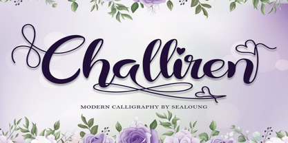 Challiren is an elegant and flowing handwritten font. It is PUA encoded which means you can access all of the glyphs and swashes with ease! It features a varying baseline, smooth lines, gorgeous glyphs and stunning alternates. It maintains its classy calligraphic influences while feeling contemporary and fresh. Fall in love with this font and bring your projects to the highest levels!
 - Marshill by ErlosDesign,
$15.00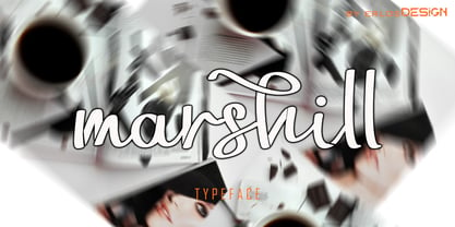 Marshill is an elegant and flowing handwritten font. It is PUA encoded which means you can access all of the glyphs and swashes with ease! It features a varying baseline, smooth lines, gorgeous glyphs and stunning alternates. It maintains its classy calligraphic influences while feeling contemporary and fresh. Fall in love with this font and bring your projects to the highest levels!
 - Mint Monday by Supfonts,
$12.00 Mint Monday is a beautiful handwritten font, fashionable appearance and elegant simplicity of lines. You will fall in love with this font Font is an open type with clean shapes and precise kerning. It includes ligatures encoded by the PUA. Language support: All European languages Don't forget to subscribe so you don't miss out on the new awesome fonts Dima
 - Chantilly Lace NF by Nick's Fonts,
$10.00This little charmer combines an uppercase designed by American lettering artist J. M. Bergling with a lowercase designed by English architect Roland W. Paul. The result has a wiggle in its walk and a giggle in its talk: oh, baby, that’s what I like! Both versions of the font include 1252 Latin, 1250 CE (with localization for Romanian and Moldovan). - Ashley Bergamote by Letterday Studio,
$19.00 Ashley Bergamote is a superb handwritten font that will make your work stand out through its elegant and curvy lines. It is perfect for product packaging, branding project, magazine covers, social media, wedding, or just used to express words above the background. This font is PUA encoded which means you can access all of the glyphs and swashes with ease!
 - Northern Mount by FontsByCheeks,
$14.00 A modern, high impact, display font - Northern Mount is the first in the four part collection of fonts designed by Chike Newman-Greaves. Starting life as a side project on his creative bucket list, and now with over 550+ glyphs, Northern Mount is the perfect font for a bold ad campaign, key artwork or comic book cover. Its high bars and long stems take inspiration from an Art Deco era, its lowercase letters - clean, minimal.
 - Riva by ITC,
$29.00ITC Riva is the work of English designer Martin Wait and appeared with ITC in 1994. Its letters form gently flowing words and sentences and the light stroke contrast makes the font stable yet lively. The contemporary typefaces of the 18th century influenced the forms of ITC Riva and its overall image brings to mind flowing white sundresses, fields of flowers and tea parties. Perfect for invitations and greeting cards, the capitals of ITC Riva can also be used as initials and combined with other alphabets. - Century 751 by Bitstream,
$29.99The year 1914 marked the appearance of Washington Ludlow's first typograph machine. This remarkable invention permitted typesetters to quickly cast a full line of lead type in one operation using supplied brass matrices, a procedure which was for the time a major technological improvement over the usual hand-set foundry type methods. Casting type the Ludlow way necessitated the creation of an entire range of new Ludlow typefaces, a development which made Ludlow not only a major manufacturer of printing machinery, but also one of the world's leading sources of professional type design. Renowned typographers such as Douglas C. McMurtrie and Ernest F. Detterer created original faces at Ludlow's request. Robert Hunter Middleton was Ludlow's design director for over fifty years, and during his distinguished career produced an entire library of typefaces representing virtually every known typographic style. He is recognized as one of the most prolific type designers of all time. Today, new Ludlow computer fonts are in preparation, including optically-correct versions of many classic Ludlow typefaces, drawn directly from the originals in the Ludlow company library. - Ranch Hand JNL by Jeff Levine,
$29.00 Ranch Hand JNL is a tall, condensed wood type with slab serifs. The font is somewhat bolder in weight than Nostrand JNL, but like its counterpart, fully captures the spirit and flavor of Nineteenth Century advertising, fliers and notices.
