10,000 search results
(0.047 seconds)
- Coestral by Nathatype,
$29.00 Coestral is a captivating capital serif font designed with elegance and a touch of interconnected charm. Each letter is meticulously crafted to exude sophistication without being overly heavy, creating a harmonious and visually pleasing appearance. The capitalized letterforms of this font showcase clean lines and refined serifs, striking the perfect balance between elegance and readability. The font's moderate weight ensures a versatile and adaptable design, making it suitable for a wide range of creative projects. What sets Coestral apart is its subtle yet delightful feature of connected letters. Some letters are gracefully linked, creating a seamless and flowing look that adds a touch of uniqueness and artistic flair. This interconnected style adds a sense of continuity and grace to the font, enhancing its overall elegance. On the other hand, its legibility and graceful appearance ensure that it makes a bold statement without overwhelming the viewer. Enjoy the available features here. Features: Ligatures Multilingual Supports PUA Encoded Numerals and Punctuations Coestral fits in headlines, logos, posters, flyers, invitations, greeting cards, branding materials, print media, editorial layouts, website headers, and many more. Find out more ways to use this font by taking a look at the font preview. Thanks for purchasing our fonts. Hopefully, you have a great time using our font. Feel free to contact us anytime for further information or when you have trouble with the font. Thanks a lot and happy designing.
 - Planet Express by Estudio Calderon,
$29.99 Family type designed by Felipe Calderón. This type is a display with a modern style and a different and innovative concept. The development of this type was a challenge because it was set out from the begining as a script font with ornaments and complements, where the round shapes do not have prominence in the result. Planet Express is an interesting job from the aesthetic point of view, it works for big scale texts and contains little shadow-cuts in each character to give it more personality and stand out among other fonts from this gender. I hope this new project works to solve issues in design. Planet Express is composed of Regular & Italics, it has 250 intelligent ligatures to produce the best signs in big scale, it is perfect for branding and works very well with the geometric complements. It is designed with programming in opentype: Ligatures, Discretionary ligatures, Stylistic Alternates, Stylistic set 01, Stylistic set 02, Stylistic set 03, Stylistic set 04, Stylistic set 05, Stylistic set 06, Stylistic set 07, Stylistic set 08 & Stylistic set 09, multiple language support and a complete set of extras like arrows, catchwords, flags, emblems, hands, fleurons & crossed elements. Planet Express can be used in different ways, each character pretends to cover the needs in any circumstance where it is used. It is funny to write words and play with the complements. It also works with current concepts in graphic design like sports, cars, hip hop, music, social network, skateboarding and more. Everybody can use this font, it works with different languages like italian, french, portuguese, danish, german and so forth. See specimen and samples here. Enjoy it!
 - TT Geekette by TypeTrends,
$27.00 TT Geekette is an experimental variable* serif with friendly and flexible character of shapes. In this project, we wanted to get away from simplifications and dry geometry and to experiment with the smoothness, softness and plasticity of forms. And in order to make the project a little more stylish and serious, we decided to make the font monospaced. When creating TT Geekette, we did not rely on traditional writing techniques or on the influence of pen movement on the font pattern. Despite the fact that judging by certain characters TT Geekette is a serif, the font is specifically “built” and “drawn”. There are several systemic techniques in font design, such as “loops” which set the plastic rhythm for the entire typeface. Variability in TT Geekette is influenced by contrast buildup in the font—moving the slider to adjust the variability axis, you gradually move from a completely non-contrast monolinear serif font to a font with a pronounced reverse contrast. In addition, with the help of the variability slider, you can remove serifs from the monolinear essence of the font. The TT Geekette family consists of 3 styles: the TT Geekette Bones—monolinear font, the TT Geekette Muscles—reverse contrast serif, and the TT Geekette Variable font. Each style contains over 450 glyphs. And yes, technically the typeface can be used in programming, at least you are guaranteed to get your share of bright emotions. *An important clarification regarding variable fonts. At the moment, not all graphic editors, programs and browsers support variable fonts. You can check the status of support for the variability of your software here: v-fonts.com/support/
 - Black Street by Jehansyah,
$9.00 Black Street This is a large and bold font, it is very suitable for all design work, it looks elegant and clear and dares to display a unique impression in it for magazines, clothing posters and others.
 - Christmas Philosophy by Yoga Letter,
$18.00 "Christmas Philosophy" is a professional and elegant blackletter font. This font is very suitable for Christmas, birthdays, weddings, engagements, logos, banners, branding, posters, stickers, and others. Equipped with uppercase letters, lowercase letters, numerals, punctuation, and multilingual support
 - Alestha Butterfly by Yoga Letter,
$18.00 "Alestha Butterfly" is a beautiful handwriting font. This font is equipped with capital letters, lowercase, numerals, punctuation, numerals, multilingual support, alternates, swashes, titling, and ligatures. It is suitable for weddings, engagements, Christmas, Valentine's Day, invitations, and others.
 - Zombie by FontHaus,
$15.00 Zombie™ is a cute and playful whimsical font unlike a real Zombie. This monoline display face does not take itself too seriously and is at home in children's books, invitations, headlines or other decorative design projects.
 - Ghostly Whispers by Seemly Fonts,
$12.00 A creepy and gloomy display typeface is called Ghostly Whispers. This typeface is perfect for use in stationary, logos, t-shirts, paper, print design, website headers, picture frames, flyers, album covers, posters, image sliders, and other items.
 - Summer Squash by Yoga Letter,
$15.00 "Summer Squash" is a display font with a floral pattern. This font is equipped with uppercase, lowercase, numerals, punctuation, and multilingual support. It is very suitable for summer, vacation, holidays, camping, natural moments, Father's Day, and others.
 - Christmas Shadow by Yoga Letter,
$18.00 "Christmas Shadow" is a beautiful handwritten font with a love shape. This font is equipped with uppercase, lowercase, numerals, punctuation, and multilingual support. It is suitable for weddings, engagements, invitations, back to school, autumn, Christmas, and others.
 - Hell O Ween by Forberas Club,
$16.00 Introducing Hell O Win by forberas, This font born to be a Halloween Project. But still can be made as a display font, and still suit your other fun project. Your review and response are most welcome.
 - Panther Fighter by Yoga Letter,
$17.00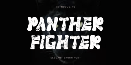 "Panther Fighter" is a modern and elegant brush font. This font is equipped with uppercase, lowercase, numerals, punctuations and multilingual support. It is suitable for logos, movie titles, Halloween, Christmas, business branding, ornaments, mock ups and others.
 - Barbie Doll by Yoga Letter,
$18.00 "Barbie Doll" is a cute and lovely handwritten font. This font is equipped with uppercase, lowercase, numerals, punctuation, ligatures, and multilingual support. It is suitable for promotion, social media, business branding, Barbie, weddings, engagements, birthdays, and others.
 - Best Strong by Yoga Letter,
$18.00 "Best Strong" is an elegant and professional blackletter font. This font is equipped with uppercase, lowercase, numerals, punctuation, and multilingual support. Very suitable for invitations, weddings, engagements, certificates, Christmas, Valentine's, winter, posters, tattoos, stickers, posters, and others.
 - Klint by Linotype,
$40.99 Type designer Hannes von Döhren created Klint. A sans serif typeface with a technical appearance and humanistic streak. The family includes five weights; each weight ships in three widths: condensed, regular, and extended. All of the 15 Klint variants have a companion Italic, rounding out family at 30 fonts. Klint's large x-height makes the design especially legible at small point sizes. In today's day and age, appliance manufacturers and/or companies in the mobile phone, computer hardware and software or Internet sectors are becoming ever more important. Klint fills the rising need for superfamilies with a technical feeling that are also legible in both text and display settings. Through conspicuous letters like R, K, k, or g, as well as the independent nature of its Italic, Klint exudes an ethos that separates it from the competition. Longer text passages in brochures, catalogs, or magazines would be well served by Klint's Light, Regular, and Medium weights. The heavier cuts are optimized for poster settings and headlines."
 - Mayfest by pentagonistudio,
$17.00 Mayfest Is An Elegant Display serif Inspired By Luxury and Elegant Character. FAQ's : Where are the OTF's? They are included in a download link( in a text file) in your main download file. 1 user 2 computers installation (Desktop License) You may NOT use for broadcast or Cinema/Motion Picture. You may NOT resell this font in any platform without further permission from designer. Do NOT embed font files in app/game/e-pub (for desktop license) You may NOT use the fonts in templates for sale/free. ( web/print/app ) For other license use please contact us. SOFTWARE REQUIREMENTS : Fonts and alternate : No special software required they may be used in any basic program /website apps that allows standard fonts That's it folks! You can go ahead and get cracking :) Follow My Shop For Upcoming Updates Including Additional Glyphs And Language Support. And Please Message Me If You Want Your Language Included or If There Are Any Features or Glyph Requests, Feel Free to Send me A Message. Have a Good Day !
 - Lanche by pentagonistudio,
$19.00 Lanche Is An Modern Elegant Serif Font Inspired By Elegant Serif Typeface FAQ's : Where are the OTF's? They are included in a download link( in a text file) in your main download file. 1 user 2 computers installation (Desktop License) You may NOT use for broadcast or Cinema/Motion Picture. You may NOT resell this font in any platform without further permission from designer. Do NOT embed font files in app/game/e-pub (for desktop license) You may NOT use the fonts in templates for sale/free. ( web/print/app ) For other license use please contact us. SOFTWARE REQUIREMENTS : Fonts and alternate : No special software required they may be used in any basic program /website apps that allows standard fonts That's it folks! You can go ahead and get cracking :) Follow My Shop For Upcoming Updates Including Additional Glyphs And Language Support. And Please Message Me If You Want Your Language Included or If There Are Any Features or Glyph Requests, Feel Free to Send me A Message. Have a Good Day !
 - Caslon Graphique by ITC,
$29.99 The Englishman William Caslon punchcut many roman, italic, and non-Latin typefaces from 1720 until his death in 1766. At that time most types were being imported to England from Dutch sources, so Caslon was influenced by the characteristics of Dutch types. He did, however, achieve a level of craft that enabled his recognition as the first great English punchcutter. Caslon's roman became so popular that it was known as the script of kings, although on the other side of the political spectrum (and the ocean), the Americans used it for their Declaration of Independence in 1776. The original Caslon specimen sheets and punches have long provided a fertile source for the range of types bearing his name. Identifying characteristics of most Caslons include a cap A with a scooped-out apex; a cap C with two full serifs; and in the italic, a swashed lowercase v and w. Caslon's types have achieved legendary status among printers and typographers, and are considered safe, solid, and dependable. Caslon Antique was designed by Berne Nadall and brought out by the American type foundry Barnhart Bros & Spindler in 1896 to 1898. It doesn't bear any resemblance to Caslon, but has the quaint crudeness of what people imagine type looked like in the eighteenth century. Use Caslon Antique for that old-timey" effect in graphic designs. It looks best in large sizes for titles or initials. Caslon Black was designed by David Farey in the 1990s, and consists of one relatively narrow and very black weight. It is intended exclusively for titles or headlines. Caslon Black has a hint of the original Caslon lurking in the shadows of its shapes, but has taken on its own robust expression. Caslon Graphique was designed by Leslie Usherwood in the 1980s. The basic forms are close to the original Caslon, but this version has wide heavy forms with very high contrast between the hairline thin strokes and the fat main strokes. This precisely drawn and stylized Caslon has verve; it's ideal for headlines or initials in large sizes."
 - Morning Violetta by Fortunes Co,
$19.00 Morning Violetta is modern contemporary display sans, and well suited for magazines, brochures, logos, headline or quotes, stand alone display, and short paragraphs.
 - Rotis Semi Sans by Monotype,
$40.99 Rotis¿ is a comprehensive family group with Sans Serif, Semi Sans, Serif, and Semi Serif styles, for a total of 17 weights including italics. The four families have similar weights, heights and proportions; though the Sans is primarily monotone, the Semi Sans has swelling strokes, the Semi Serif has just a few serifs, and the Serif has serifs and strokes with mostly vertical axes. Designed by Otl Aicher for Agfa in 1989, Rotis has become something of a European zeitgeist. This highly rationalized yet intriguing type is seen everywhere, from book text to billboards. The blending of sans with serif was almost revolutionary when Aicher first started working on the idea. Traditionalists felt that discarding serifs from some forms and giving unusual curves and edges to others might be something new, but not something better. But Rotis was based on those principles, and has proven itself not only highly legible, but also remarkably successful on a wide scale. Rotis is easily identifiable in all its styles by the cap C and lowercase c and e: note the hooked tops, serifless bottoms, and underslung body curves. Aicher is a long-time teacher of design and has many years of practical experience as a graphic designer. He named Rotis after the small village in southern German where he lives. Rotis¿ is suitable for just about any use: book text, documentation, business reports, business correspondence, magazines, newspapers, posters, advertisements, multimedia, and corporate design.Today Rotis ia also available with pan european caracter set.
 - Rotis Semi Sans Paneuropean by Monotype,
$92.99Rotis¿ is a comprehensive family group with Sans Serif, Semi Sans, Serif, and Semi Serif styles, for a total of 17 weights including italics. The four families have similar weights, heights and proportions; though the Sans is primarily monotone, the Semi Sans has swelling strokes, the Semi Serif has just a few serifs, and the Serif has serifs and strokes with mostly vertical axes. Designed by Otl Aicher for Agfa in 1989, Rotis has become something of a European zeitgeist. This highly rationalized yet intriguing type is seen everywhere, from book text to billboards. The blending of sans with serif was almost revolutionary when Aicher first started working on the idea. Traditionalists felt that discarding serifs from some forms and giving unusual curves and edges to others might be something new, but not something better. But Rotis was based on those principles, and has proven itself not only highly legible, but also remarkably successful on a wide scale. Rotis is easily identifiable in all its styles by the cap C and lowercase c and e: note the hooked tops, serifless bottoms, and underslung body curves. Aicher is a long-time teacher of design and has many years of practical experience as a graphic designer. He named Rotis after the small village in southern German where he lives. Rotis¿ is suitable for just about any use: book text, documentation, business reports, business correspondence, magazines, newspapers, posters, advertisements, multimedia, and corporate design.Today Rotis ia also available with pan european caracter set. - Rotis Semi Serif Paneuropean by Monotype,
$92.99Rotis¿ is a comprehensive family group with Sans Serif, Semi Sans, Serif, and Semi Serif styles, for a total of 17 weights including italics. The four families have similar weights, heights and proportions; though the Sans is primarily monotone, the Semi Sans has swelling strokes, the Semi Serif has just a few serifs, and the Serif has serifs and strokes with mostly vertical axes. Designed by Otl Aicher for Agfa in 1989, Rotis has become something of a European zeitgeist. This highly rationalized yet intriguing type is seen everywhere, from book text to billboards. The blending of sans with serif was almost revolutionary when Aicher first started working on the idea. Traditionalists felt that discarding serifs from some forms and giving unusual curves and edges to others might be something new, but not something better. But Rotis was based on those principles, and has proven itself not only highly legible, but also remarkably successful on a wide scale. Rotis is easily identifiable in all its styles by the cap C and lowercase c and e: note the hooked tops, serifless bottoms, and underslung body curves. Aicher is a long-time teacher of design and has many years of practical experience as a graphic designer. He named Rotis after the small village in southern German where he lives. Rotis¿ is suitable for just about any use: book text, documentation, business reports, business correspondence, magazines, newspapers, posters, advertisements, multimedia, and corporate design. Today Rotis ia also available with paneuropean caracter set. - Rotis Semi Serif by Monotype,
$40.99 Rotis¿ is a comprehensive family group with Sans Serif, Semi Sans, Serif, and Semi Serif styles, for a total of 17 weights including italics. The four families have similar weights, heights and proportions; though the Sans is primarily monotone, the Semi Sans has swelling strokes, the Semi Serif has just a few serifs, and the Serif has serifs and strokes with mostly vertical axes. Designed by Otl Aicher for Agfa in 1989, Rotis has become something of a European zeitgeist. This highly rationalized yet intriguing type is seen everywhere, from book text to billboards. The blending of sans with serif was almost revolutionary when Aicher first started working on the idea. Traditionalists felt that discarding serifs from some forms and giving unusual curves and edges to others might be something new, but not something better. But Rotis was based on those principles, and has proven itself not only highly legible, but also remarkably successful on a wide scale. Rotis is easily identifiable in all its styles by the cap C and lowercase c and e: note the hooked tops, serifless bottoms, and underslung body curves. Aicher is a long-time teacher of design and has many years of practical experience as a graphic designer. He named Rotis after the small village in southern German where he lives. Rotis¿ is suitable for just about any use: book text, documentation, business reports, business correspondence, magazines, newspapers, posters, advertisements, multimedia, and corporate design. Today Rotis ia also available with paneuropean caracter set.
 - West Byanetta Cyrillic by Ira Dvilyuk,
$20.00 I'm happy to present to you luxurious handwritten script font West Byanetta Cyrillic. It's the best option for your branding, logo designs, invitation designs wedding stationery, social media, product packaging and other projects that require an elegant touch. West Byanetta Cyrillic is an elegant, graceful handwritten script font, as well as a West Byanetta Symbols font with 36 lovely hand-drawn flourishes and illustrations. West Byanetta script font contains the Cyrillic glyphs too. West Byanetta script Latin part contains a full set of uppercase letters and 3 full sets of lowercase letters, (standard, initial and final forms). To make a needed form just type a letter with a number such as a1, b1, c1...after that selecting the word and apply the Open Type Features in programmes such as Adobe Illustrator, Photoshop, and others) And 40 ligatures - which can be used to create a handwritten look. The Cyrillic part of the font contains the uppercase letters and 3 full sets of lowercase letters, (standard, initial and final form. To make a needed form just type a letter with a number such as a1, б1 в1... After that select the word and apply the Open Type Features in programmes such as Adobe Illustrator, Photoshop, and others) Also Cyrillic part of the font contains 31 handwritten Cyrillic ligatures. West Byanetta Symbols is a font with over 36 hand-drawn elements, floral illustrations, and swashes and can help to make your design unique and matchless. Combine and merge swashes and illustrations to create your own designs and make borders, frames, dividers, logos, and more (just use A-Z or a-z and 0-9 keys in the included West Byanetta Symbols font). A different symbol is assigned to each uppercase or lowercase standard character, so you do not need graphics software, just type the letter you need. Language Support for 32 languages: Latin glyphs for Afrikaans, Albanian, Basque, Bosnian, Catalan, Danish, Dutch, English, Estonian, Faroese, Filipino, Finnish, French, Galician, Indonesian, Irish, Italian, Malay, Norwegian Bokmål, Portuguese, Slovenian, Spanish, Swahili, Swedish, Turkish, Welsh, Zulu. And Cyrillic glyphs support for Russian, Belorussian, Bulgarian, Ukrainian and Kazakh languages. Works perfectly on the Canva platform. For Cricut & Silhouette recommended.
 - Prillwitz Pro by preussTYPE,
$49.00 Johann Carl Ludwig Prillwitz, the German punch cutter and type founder, cut the first classic Didot letters even earlier than Walbaum. The earliest proof of so-called Prillwitz letters is dated 12 April 1790. Inspired by the big discoveries of archaeology and through the translations of classical authors, the bourgeoisie was enthused about the Greek and Roman ideal of aesthetics. The enthusiasm for the Greek and Roman experienced a revival and was also shared by Goethe and contemporaries. »Seeking the country of Greece with one’s soul«. All Literates who are considered nowadays as German Classics of that time kept coming back to the Greek topics, thinking of Schiller and Wieland. The works of Wieland were published in Leipzig by Göschen. Göschen used typefaces which had been produced by until then unknown punch cutter. This punch cutter from Jena created with these typefaces master works of classicist German typography. They can stand without any exaggeration on the same level as that of Didot and Bodoni. This unknown gentleman was known as Johann Carl Ludwig Prillwitz. Prillwitz published his typefaces on 12th April 1790 for the first time. This date is significant because this happened ten years before Walbaum. Prillwitz was an owner of a very successful foundry. When the last of his 7 children died shortly before reaching adulthood his hope of his works was destroyed, Prillwitz lost his will to live. He died six months later. His wife followed him shortly after. The typeface Prillwitz as a digital font was created in three optical styles (Normal, Book and Display). The typeface Prillwitz Press was created especially for a printing in small sizes for newspapers. »Prillwitz Press« combines aesthetic and functional attributes which make written text highly readable. It was originally designed for a newspaper with medium contrast to withstand harsh printing conditions. Its structure is quite narrow which makes this typeface ideal for body text and headlines where space is at premium. For the Normal – even more for the Book – a soft and reader-friendly outline was created through a so-called »Schmitz« and optimized in numerous test prints. The arris character and the common maximal stroke width contrast of the known classicist typefaces (Didot/Bodoni) were edited by the study of the original prints. This was also done in order to reach a very good readability in small type sizes. This typeface is perfectly suited to scientific and belletristic works. Accordingly it has three styles: Regular, Bold and Italic as Highlighting (1). The typeface Prillwitz is a complete new interpretation and continuing development of the conservated originals from 1790. They have been kept in the German Library in Leipzig. It was always given the priority to keep the strong roughness and at the same time optimizing the readability of this striking font. The type family has all important characters for an efficient and typographic high quality work. ----------- (1) Accentuation of particular words or word orders (e.g. proper names, terms etc.). Typographic means for Highlighting could be Italic, SmallCaps or semi-bold.
 - Lehmann by ParaType,
$30.00 PT Lehmann™ was designed for ParaType in 2002 by Tagir Safayev. Inspired by letterforms of Shiroky (Wide) Renaissance typeface and other fonts of Ossip Lehmann foundry, St.-Petersburg, c. 1874. A face of the so-called Elzevir type has thin triangular serifs and sharp spiral-like terminals. For use in advertising and display typography.
 - Machiato by Letterhend,
$17.00 Machianto is a bold brush script which is purposely made for headline, display or logotype and the other various formal forms such as invitations, labels, logos, magazines, books, greeting / wedding cards, packaging, fashion, make up, stationery, novels, labels or any type of advertising purpose. Features : Uppercase & lowercase Numbers and punctuation Alternates/Ligatures Multilingual PUA encoded
 - Signate Grotesk by Sign Studio,
$18.00 Signate Grotesk comes in 9 weights. The dimensions are synchronous from Thin to Black and are also equipped with an Italic style of 12 degrees. Equipped with Cyrillic characters will provide good language support. Can stand alone or as a support for other typography. Very versatile for writing official documents, logotypes, product branding, website design.
 - Salud by Etewut,
$30.00 Salud is hand-drawn typeface based on light and bold slab serif. It has 8 font styles and supports extended latin. It may be used in presentation for a big company or in flyers for a birthday party. Other words it plays at both sides: can be formal and at the same time funny.
 - Meritage by Aerotype,
$29.00 OpenType users benefit from alternate lowercase characters, crossbar ligatures for common letter pairings, case sensitive quotes and smart apostrophes. Other goodies include optional old style numerals and a few clip-on swash elements, accessible by keyboard or supporting application’s OpenType glyph menu. Meritage Pro extends the character set to support Eastern European and Baltic languages.
 - Gans Neoclassic Fleurons by Intellecta Design,
$23.90 Historical printers ornaments researched by Intellecta Design; from the 1882 very rare Richard Gans first catalogue. See also other font families inspired by Gans' original typefaces: Gans Tipo Adorno, Gans Lath Modern, Gans Titular Adornada, Gans Ibarra, Gans Antigua, Gans Antigua Manuscrito, Gans Fulgor, Gans Radio Lumina, Gans Carmem Adornada, Gans Italiana, and Gans Titania.
 - PaperCutAlmond by PineStreet,
$25.00 PaperCutAlmond breathes just the hands-on self-made authentic happy feeling you may be looking for. Each and every glyph is based on a paper letter cut by hand with a pair of scissors by me in my studio. Ideal for packaging for organic products, illustrated goods, book covers, editorial illustrations and other freestyle projects.
 - Trembling Hands by Olivetype,
$18.00 With its flowing strokes and natural-looking letterforms, Trembling Hands captures the essence of hand-drawn beauty. Each character has a slightly wobbly touch, giving it a charming imperfection that sets it apart from other fonts. Whether you're creating headlines, logos, or branding materials, Trembling Hands adds an artistic flair that will grab attention.
 - Easy Tiles by Intellecta Design,
$21.00 A nice mix of 62 decorative tile images. Designs are reminiscent of rubber stamps of architectural tiles found in historical homes and other buildings through the ages and printed devices from old catalogues. Generic enough to add interesting detail to just about any design. From invitations and greeting cards to book jackets, labels or fabric.
 - August Rush by Callie Sharp,
$13.00 August Rush is a delicate handwritten script font. The font comes in 2 weight options: regular and semi-bold. It's best used as a main headlines or as a secondary headline combed with other simple serif or sans-serif fonts. It can be used for various designs such as packaging, wedding stationery or branding.
 - Gans Headpieces by Intellecta Design,
$24.90 Historical printers ornaments researched by Intellecta Design; from the 1882 very rare Richard Gans first catalogue. See also other font families inspired by Gans' original typefaces: Gans Tipo Adorno, Gans Lath Modern, Gans Titular Adornada, Gans Ibarra, Gans Antigua, Gans Antigua Manuscrito, Gans Fulgor, Gans Radio Lumina, Gans Carmem Adornada, Gans Italiana, and Gans Titania.
 - Mikita Gilmore by Letterhend,
$17.00 Mikita Gilmore is a sophisticated serif with authentic handdrawn style. Perfectly to be applied to the other various formal forms such as invitations, labels, logos, magazines, books, greeting / wedding cards, packaging, fashion, make up, stationery, novels, labels or any type of advertising purpose. Features : Uppercase & lowercase Numbers and punctuation Alternates & Ligatures Multilingual PUA encoded
 - Dimelike by Balpirick,
$15.00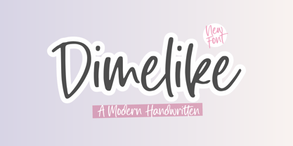 Dimelike is a Modern Handwritten Font. Dimelike feels equally charming and elegant. It looks stunning on wedding invitations, thank you cards, quotes, greeting cards, logos, business cards and every other design which needs a customized touch. - also multilingual support Enjoy the font, feel free to comment or feedback, send me PM or email. Thank you!
 - Southampton by Balevgraph Studio,
$14.00 Southampton is a casual handwritten font. Fall in love with it and bring your projects to the highest levels! What's Included : - Uppercase, Lowercase, Numerals & Punctuations - Ligature & Alternate - Works on PC & Mac - Simple installations - Multilingual support - (PUA Encoded) Compatible with Silhouette Studio, Circuit Design Space, Scan N Cut, Adobe Illustrator and other cutting and design programs.
 - Edo Pro by CheapProFonts,
$10.00 A free-flowing brush script with only uppercase letters. Now with a professional and multilingual character set! Vic Fieger says: "The letters in Edo were hand-drawn using a thick black permanent marker with a flat head. The head was chopped up using a box cutter to create a "brush" effect. The entire font was made while watching Bobobo-bo Bo-bobo. Edo has been used by video game-makers UbiSoft in their game adaptation of the 2007 animated film Surf's Up, as well as ads for the Fuse 2006 Warped Tour. More recently, it has turned up in such places as the cover for the US release of the manga Teru Teru x Shonen, and the logo for A&E's program, "The Cleaner." ALL fonts from CheapProFonts have very extensive language support: They contain some unusual diacritic letters (some of which are contained in the Latin Extended-B Unicode block) supporting: Cornish, Filipino (Tagalog), Guarani, Luxembourgian, Malagasy, Romanian, Ulithian and Welsh. They also contain all glyphs in the Latin Extended-A Unicode block (which among others cover the Central European and Baltic areas) supporting: Afrikaans, Belarusian (Lacinka), Bosnian, Catalan, Chichewa, Croatian, Czech, Dutch, Esperanto, Greenlandic, Hungarian, Kashubian, Kurdish (Kurmanji), Latvian, Lithuanian, Maltese, Maori, Polish, Saami (Inari), Saami (North), Serbian (latin), Slovak(ian), Slovene, Sorbian (Lower), Sorbian (Upper), Turkish and Turkmen. And they of course contain all the usual "western" glyphs supporting: Albanian, Basque, Breton, Chamorro, Danish, Estonian, Faroese, Finnish, French, Frisian, Galican, German, Icelandic, Indonesian, Irish (Gaelic), Italian, Northern Sotho, Norwegian, Occitan, Portuguese, Rhaeto-Romance, Sami (Lule), Sami (South), Scots (Gaelic), Spanish, Swedish, Tswana, Walloon and Yapese.