10,000 search results
(0.056 seconds)
- Beautiful in White by HKL Studio,
$19.00 Hi Font Lovers! Bring back my newest font, Introduce Beautiful in White. Script! This is a modern font script. This font comes in a sleek and italic style, created very slowly for a neat result that will give this font a very elegant impression. There are 410 glyphs in it! so you can get used to it freely and follow the current trends. Please try and hope you enjoy it! With a style like this, this font is suitable for logos, branding projects, home appliance designs, product packaging, mugs, quotes, posters, shopping bags, logos, t-shirts, book covers, business cards, invitation cards, congratulations. cards, and all your other beautiful projects. You can use this font for your work very easily. Because there are many features in it. Contains full set of lowercase and uppercase letters, punctuation, numbers, web fonts, and multilingual support. This font also includes several ligatures and alternative styles for the Stylistic Set for those of you who have software that can work with OpenType (Corel Draw / Photoshop / Illustrator / InDesign). Thank you for purchasing!
 - Mulane by Twinletter,
$12.00 Mulane, our newest sanserif typeface, is now available. Mulane is a versatile font that may be used for a variety of purposes. This typeface is ideal for headlines, product packaging, magazine layouts, invitation cards, advertising, wedding designs, social media posts, and many other branding and design tasks. The fonts’ sleek and appealing appearance is due to their bold and strong letters. Fonts that are robust, bold, and clear, making your work look true and attractive. of course, your various design projects will be perfect and extraordinary if you use this font because this font is equipped with a font family, both for titles and subtitles and sentence text, start using our fonts for your extraordinary projects.
 - FF Sizmo by FontFont,
$50.99 FF Sizmo™ is available in two flavors. One is an honest, industrial strength, somewhat condensed, sans serif family. The other builds on the first, and is a display design with horizontally connecting baseline strokes. The five weights of basic the FF Sizmo typefaces are ideal for print and digital projects. Character spacing is generous, counters are open and apertures are wide and clear. Banners, navigational links, sub heads, and short blocks of contextual copy are natural on-screen uses for the design. Print projects from branding to way-finding also fall easily into FF Sizmo’s range of applications. The “line” versions of FF Sizmo can be arresting stand-alone typefaces – or distinctive complements to the basic roman and italic designs. In either instance, the line designs make powerful statements in headlines, subheads, posters and cover art. OpenType® fonts automatically insert beginning, middle or ending line element characters into the copy. Drawn by Verena Gerlach, both designs were inspired by the same source, a commercial signage system that enabled quick and easy copy changes. “The idea for the typeface,” explains Gerlach, “is a housing complex index board, on which movable white plastic capital letters were fixed by a thick line to the wooden board. This line is an important part of the font’s appearance.”
 - New Age Gothic by Type Innovations,
$39.00 New Age Gothic is an original design by Alex Kaczun. It is a contemporary gothic design based on generous proportions and clean crisp lines. Ideally suited for easy reading and long lines of copy. The concept for the design came from a previously successful font family Contax Pro. Alex felt that the skeleton for Contax Pro was ideally suited to modify the design into a true gothic companion typeface series. Numerous modifications where made to the body proportions, stems and shapes. Serifs where added reminiscent to Copperplate Gothic to solidify the overall design. The result is a truly unique modern gothic font. Unlike other typefaces, New Age Gothic incorporates uniform stems throughout the capitals, lower case and figures. This gives the design a uniform appearance in overall color and strength. There is a perfect visual balance between inter-letter spacing, stem weights and proportions. The large Pro font character set, which supports most Central European and many Eastern European languages, also include small caps to compliment the old style figures. As a result, the design is ideally suited for display copy as well as text composition. In the near future, Alex plans to expand the typeface to include a broad range of weights along with italics.
 - Givry by TypeTogether,
$49.00 The bâtarde flamande is a style of writing used predominantly in France and present-day Belgium in the 15th century. The style shares an ancestry with other writing styles traditionally grouped as blackletter— fraktur, textura, rotunda, and schwabacher. It had evolved, however, into an æsthetic far removed from its relatives. While high-contrast in nature, the bâtarde flamande is more delicate and dynamic than the austere and condensed fraktur and textura. Quick curves lack the rigidity of the schwabacher and rotunda. Flair through swashes is thematic, as are the variations in letterforms. The flowing rhythm, achieved through a letterform axis that is overall slightly rightward, is most noticable in the hallmark f and long s. Round forms are fused together for economy of space. It is a writing hand that, with its syncopation and fluidity, produces a vibrance uncharacteristic of other blackletters. Givry has been created in the spirit of the bâtarde flamande. It melds the particular traits compiled from the works of the style’s prominent scribes—Jean Fouquet, Loyset Liédet, and Jean Bourdichon. While suitable as an elegant and energetic display face, Givry was conceived for setting continuous text. The result of many refinements and adjustments is the preservation of the style’s irregular nature, as well as a consistency that continuous-text typography requires. Carefully researched and developed in OpenType format for a wealth of typographic features and support for more than forty languages, Givry is neither derivative nor experimental, but historically accurate. Of the many blackletter digital typefaces available, fraktur and all its connotations have become representative. In contrast, the bâtarde flamande is essentially non-existent in digital form, and has until now been overlooked. Givry provides designers and anyone searching for typographic expression a lively, delicate, and striking side to blackletter.
 - Major Production NF by Nick's Fonts,
$10.00 This typeface was designed specifically for producing movie posters, as well as VHS and DVD packaging for them. The uppercase letters are ultracondensed, and the lowercase letters are small caps, approximately a third the size of the uppercase. Also included are various logos and symbols suitable for the intended use, including those for MPAA ratings, and various audio and video formats. Both versions of this font include the complete Unicode Latin 1252 and Central European 1250 character sets.
 - Bravado NF by Nick's Fonts,
$10.00 This growing family of friendly faces is based on the typeface Bravour, designed in 1913 by Martin Jacoby-Boy for the D. Stempel AG foundry in Frankfurt am Main. The wide stance and very large x-height shared by the family members makes them warm and inviting, and equally suitable for use in headlines or text blocks. All versions of this font include the Unicode 1250 Central European character set in addition to the standard Unicode 1252 Latin set.
 - Radicals by ITC,
$29.99Calligrapher Margaret Layson works in partnership with Australian typographer Harry Pears, bringing designs such as the wonderful Lindisfarne Nova family to life. They both work on the digital incarnation in a true collaboration. Originally from the UK, Margaret began her professional career as a geophysicist. After arriving in Australia in 1968, she began to work as a freelance calligrapher. Over the years she has maintained an interest in the history of writing, particularly the scripts and decorations in manuscripts. - Type Warmers JNL by Jeff Levine,
$29.00 The name Type Warmers JNL traces its lineage to small catalog booklets issued by Indianapolis' Cobb Shinn for his line of letterpress cuts; of which a few can be found included within this typeface. Presumably type could "warm up to" these stock illustrations and work hand-in-hand to deliver the message, hence the "Type Warmers" sobriquet. Originally known for illustrating many attractive and comical postcards of the early 1900s, Shinn moved into the field of purchasing stock art and redistributing them as electrotypes or "cuts", the predecessor to today's digital clip art. A number of the cartoons he sold can be found in the Shinn Kickers JNL font.
 - Deltras by Abbasy Studio,
$17.00 Deltras is handmade modern vintage display typefaces, which is combining the style of classic typography with an modern handlettering style. The font have smooth edges to make vintage printing, so it will bring a handdrawn classic look feels. It easily cooperating together and perfect for creating the traditional style logos, labels, package design, lettering for t-shirts and much others. There are more than 355 glyphs in the font including Stylistic sets, Contextual Alternates etc. OpenType features with Stylistic Alternates, Contextual Alternate in some characters that allows you to mix and match pairs of letters to fit your design.
 - Big Stomach by Haksen,
$13.00 "Big Stomach" is a stylish modern handwritten font with casual quirky style. It is perfect for branding, birthday/valentine invitation, promotion, product packaging, and other needs. You will get full set of lowercase and uppercase letters, numerals and punctuation, multilingual symbols, ligatures and extra swashes that giving realistic hand-lettered style. In order to use the beautiful swashes, you need a program that supports OpenType features such as Adobe Illustrator, Adobe Photoshop, Adobe Indesign and Corel Draw. Or please check the end of the preview to know how to get the swashes. Thanks and have a wonderful day, Haksen Std
 - Baby Bloom by Haksen,
$14.00 "Baby Bloom" is a stylish modern handwritten font with casual quirky style. It is perfect for branding, birthday/valentine invitation, promotion, product packaging, and other needs. You will get full set of lowercase and uppercase letters, numerals and punctuation, multilingual symbols, ligatures and extra swashes that giving realistic hand-lettered style. In order to use the beautiful swashes, you need a program that supports OpenType features such as Adobe Illustrator, Adobe Photoshop, Adobe Indesign and Corel Draw. Or please check the end of the preview to know how to get the swashes. Thanks and have a wonderful day, Haksen
 - First Prize by Letterhead Studio-VG,
$45.00 First Prize typeface has simple shapes. It is a narrow, heavy sans serif typeface with geometrical logic and quite predictable constructions of characters. The idea behind it was to combine constructed structure of the skeleton and some calligraphic ideas, swashes and cursiveness. At the moment First Prize typeface consists of three narrow styles: bold, upright italic and italic. Cursive weights have beautiful ending swashes and initials. There are few alternative shapes for A&N. As a Display typeface First Prize will work very well with any other typefaces for the good of any project in print or online.
 - Valentine Heart by Haksen,
$13.00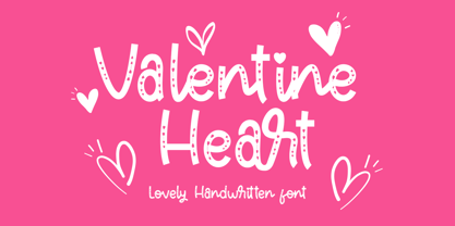 "Valentine Heart" is a stylish modern handwritten font with casual quirky style. It is perfect for branding, birthday/valentine invitation, promotion, product packaging, and other needs. You will get full set of lowercase and uppercase letters, numerals and punctuation, multilingual symbols, ligatures and extra swashes that giving realistic hand-lettered style. In order to use the beautiful swashes, you need a program that supports OpenType features such as Adobe Illustrator, Adobe Photoshop, Adobe Indesign and Corel Draw. Or please check the end of the preview to know how to get the swashes. Thanks and have a wonderful day, Haksen
 - RF Marshall by Magpie Paper Works,
$18.00 RF Marshall was inspired by an 1883 tombstone, tucked away in a pioneer cemetery. The 4-sided marker is sparsely adorned with homespun carvings of a handprint, two tulip poplar leaves, and these words: "RF Marshall died 1883 Aged 72 years." The font faithfully reproduces the stone's hand-carved lettering and artwork, as well as artwork from other 18th and 19th century American headstones. It was drawn with calligraphy nibs dipped in walnut ink and delights in a range of end uses including period films, rustic decor, Halloween decorations, historical logos and branding, and on the pages of children's books.
 - Poster Brush by Fenotype,
$18.00Poster Brush is a hand drawn font pair with lots of character. Poster Brush is packed with OpenType features - Contextual Alternates changes prevents identical double letters from being next to each other. With Stylistic Alternates you can manually change the letters. When you turn on Discretionary Ligatures you’ll get interlocking ligatures when typing with caps. Poster Brush Script is equipped with Standard Ligatures and Contextual Alternates to keep the flow smooth. It also has Swash alternates for certain letters. Poster Brush & Poster Brush Script work great together or as themselves. For the best price purchase the whole family. - CamingoSlab by Jan Fromm,
$45.00 A sturdy and solid presence, CamingoSlab is defined by its heavy serifs, low stroke contrast and elliptic curves. Yet it retains a light touch, and feels vivid and friendly, thanks to the humanistic tone that derives more from handwriting than from strict construction. Special attention has been paid to compatibility with the other members of the Camingo series — With their consistent line heights, an equal grey value and the same formal language it can be seamlessly combined with CamingoDos and CamingoMono. CamingoSlab comes with a Pro version that contains small caps, ligatures, 10 different figure sets, stylistic alternates and two sets of arrows.
 - President by Linotype,
$29.99In 1952, Charles Peignot made a bold and fortuitous move: he invited a young Swiss designer to Paris to be the art director of the Deberny & Peignot type foundry. This started the professional type design career of Adrian Frutiger; and since then he has designed an astonishing range of masterful typefaces. One of the earliest for Deberny & Peignot was Président, a sharp-seriffed Latin titling face. Latin" is a typographic designation for roman typefaces with wedge or triangular-shaped serifs, a stylistic form that Frutiger would return to later with his beautiful typeface Méridien. Président™ has wide, solid shapes; very little contrast between thick and thin strokes; and an air of assurance. Use this titling font for business cards, announcements, or artistic signage." - Ongunkan Varna Vinca by Runic World Tamgacı,
$50.00 The Vinča script is a cache of symbols found belonging to the Vinča culture of the central Balkans over 7000 years ago. The symbols have been a topic of debate amongst historians. The Tărtăria tablets are three tablets discovered in 1961 in the village of Tărtăria(Hungarian: Alsótatárlaka). This is about 30 km (19 mi) from Alba Iulia in Romania.The tablets, dated to around 5300 BC, have symbols inclay: the Vinča symbols. Some claim they are a yet undeciphered language. If this is so, they would be the earliest known form of writing. In 1908 similar symbols were found during excavations, by Miloje Vasić (1869–1956) in Vinča. This is a suburb of Belgrade (Serbia), some 300 km from Turdaș. Later, more were found in another part of Belgrade. Since 1875 over one hundred and fifty Vinča sites have been found in Serbia alone. Many, including Vinča itself, have not been fully excavated. The culture of the whole area is called the Vinča culture. Although some of these symbols look exactly the same as some letters in Etruscan, Greek, and Aramaic, they are generally regarded as a an original, independent development.
 - Mati by Sudtipos,
$19.00 Father's Day, or June 17 of this year, is in the middle of Argentinian winter. And like people do on wintery Sunday mornings, I was bundled up in bed with too many covers, pillows and comforters. Feeling good and not thinking about anything in particular, Father's Day was nowhere in the vicinity of my mind. My eleven year old son, Matías, came into the room with a handmade present for me. Up to this point, my Father's Day gift history was nothing unusual. Books, socks, hand-painted wooden spoons, the kind of thing any father would expect from his pre-teen son. So you can understand when I say I was bracing myself to fake excitement at my son's present. But this Father's Day was special. I didn't have to fake excitement. I was in fact excited beyond my own belief. Matí's handmade present was a complete alphabet drawn on an A4 paper. Grungy, childish, and sweeter than a ton of honey. He'd spent days making it, three-dimensioning the letters, wiggle-shadowing them. Incredible. A common annoyance for graphic designers is explaining to people, even those close to them, what they do for a living. You have to somehow make it understandable that you are a visual communicator, not an artist. Part of the problem is the fact that "graphic designer" and "visual communicator" are just not in the dictionary of standard professions out there. If you're a plumber, you can wrap all the duties of your job with 3.5 words: I'm a plumber. If you're a graphic designer, no wrapper, 3.5 or 300 words, will ever cover it. I've spent many hours throughout the years explaining to my own family and friends what I do for a living, but most of them still come back and ask what it is exactly that I do for dough. When you're a type designer, that problem magnifies itself considerably. When someone asks you what you do for a living, you start looking for the nearest exit, but none of the ones you can find is any good. All the one-line descriptions are vague, and every single one of them queues a long, one-sided conversation that usually ends with someone getting too drunk listening, or too tired of talking. Now imagine being a type designer, with a curious eleven year old son. The kid is curious as to why daddy keeps writing huge letters on the computer screen. Let's go play some ball, dad. As soon as I finish working, son. He looks over my shoulder and sees a big twirly H on the screen. To him it looks like a game, like I'm not working. And I have to explain it to him again. This Father's Day, my son gave me the one present that tells me he finally understands what I do for a living. Perhaps he is even comfortable with it, or curious enough about that he wants to try it out himself. Either way, it was the happiest Father's Day I've ever had, and I'm prouder of my son than of everything else I've done in my life. This is Matí's font. I hope you find it useful.
 - Travel Kit SG by Spiece Graphics,
$39.00 Here’s an intriguing mixture of 1930s deco and modern tech fashion. Travel Kit Medium is a sturdy semi-serif hybrid with one foot in the past and another in the present. It is slightly low-waisted with extended crossbars on the capital A, E, F, H, K, and P. But the capital B, M, R and X are distinctively contemporary with the E and M repeated as unicase letters in the lowercase. Optional retro characters (notably the unicase e and m) have been provided if you prefer a more traditional overall look - and your software allows access to these characters. Simply find and replace the more modern letters with the older ones. In addition, small caps with even more alternate characters have been included for greater flexibility and convenience. Travel Kit Medium with Alternates is now available in the OpenType format. In addition to small caps, lining figures, oldstyle figures, and petite figures, this expanded OpenType version contains additional stylistic alternates and historical forms. These advanced features work in current versions of Adobe Creative Suite InDesign, Creative Suite Illustrator, and Quark XPress. Check for OpenType advanced feature support in other applications as it gradually becomes available with upgrades.
 - Malambo by Sudtipos,
$59.00 The master of the dancing brush, Angel Koziupa, and the node-obsessed perfectionist, Alejandro Paul, offer up another bucket of fun with Malambo. This time Koziupa allows his brush to jitter one whole millimeter, and Paul digitizes with two eyes instead of his usual three. Follow your heart, but consume an ounce of peroxide first. Full of energy and cheeky mischief, Malambo tells the eye amusing stories of mirrorless shaving accidents, wine mistakenly poured over the morning cereal, and someone who trips over his own shadow on the dance floor, yet keeps on dancing. And dancing is what this typeface is all about. Malambo is a traditional Argentine dance performed by the gauchos (the Argentine equivalent of 19th century North American cowboys?). The gauchos are still around in the less than touristic areas of Argentina. And although they dance quite passionately and make the heartiest parrillas, most of them probably don't know what a font is. But you know, and we know. And that's something. Malambo was selected as the Best in show display font at the Biennial Letras Latinas.
 - Kigara by Anatoletype,
$16.00Kigara was Elena’s first attempt at designing a text typeface. The result is not exactly a conventional book face. Strongly influenced by handwriting, Kigara is best suited for short texts set at medium to large sizes. However, its open letter shapes and subtle serifs make it a very readable face in smaller sizes as well. Kigara will also make headlines as a modest, light-hearted display typeface. Kigara is named after an African mushroom - hence the mushroom vignettes and African ornaments in the OpenType version and the ‘B’ set. Both the sets also include small caps, alternate figures, special ligatures and other expert glyphs. - Spencer by The Northern Block,
$30.99 Spencer is a calligraphic semi-serif type family that has been carefully designed to provide easily distinguishable letterforms that are practical in use, as well as aesthetically appealing. It's natural and organic forms comes from a deep consideration of the efficiency of the visible word and provides the typeface with a distinct and unique voice. Named after Herbert Spencer, an educator and researcher of legibility at the Royal College of Art in the sixties and seventies, and influenced by other early typographers and legibility researchers, such as Walter Tracy and John Harris. Spencer was designed as part of a legibility study by Sofie Beier and Kevin Larson.
 - Safran by Hubert Jocham Type,
$29.90 Besides all the display and script typefaces I design, my real passion is to design typefaces for copy. Safran is the first of my sans serif workhorse families available from Myfonts. Starting from a light version there are nine weights up to the strong ultrabold. All with italics. What was the inspiration for designing the font? I wanted to create a clear and elegant typeface with a wide variety of weights and proportions that are easy to use in corporate branding and magazines. What are its main characteristics and features? contemporary humanist legible sans serif Usage recommendations: corporate branding, magazines and other publications Elegant, clear and very legible.
 - Sambia by Sergio Storm,
$19.00 "Sambia" is a geometric sans-serif, straight, extra condensed, monoweight font, accidental with sharp corners and closed aperture. The font family consists of regular and bold fonts. Typeface is great for headlines, logos and posters. The typeface is inspired by the Bauhaus style and tributes to the first half of the 20th century era. It has concise rounded forms, geometricity and a small letter-spacing. - Uppercase and lowercase letters - Numbers, punctuation and symbols - Multilingual support (Latin, Latin Extended, Cyrillic) - Support for more than 20 languages: Albanian, Belarusian, Bulgarian, Croatian, Danish (Norwegian), Estonian, Finnish, German, Hungarian, Icelandic, Italian, Latvian, Lithuanian, Moldovan, Portuguese, Russian, Slovak, Slovenian, Spanish, Swedish, Turkish, Ukrainian and others
 - Boucherie by Laura Worthington,
$30.00 Finding fonts that work together to capture the aesthetic of an era is one of the biggest challenges designers face. Boucherie captures the lively essence of 19th-century French advertising typography with a collection of original designs. Use Boucherie to create typographic compositions that are at once fresh and familiar. Boucherie provides four distinct display fonts – plus ornaments, catchwords, and frames – that beautifully complement each other. See what’s included! http://bit.ly/2dqI1Ov *NOTE* Basic versions DO NOT include swashes, alternates or ornaments These fonts have been specially coded for access of all the swashes, alternates and ornaments without the need for professional design software! Info and instructions here: http://lauraworthingtontype.com/faqs/
 - Cenizas by Sudtipos,
$79.00 Cenizas is another masterpiece of rough-and-tumble script from the prolific Argentine duo of Koziupa and Paul. Although the overall 'wildness' of Cenizas is reminiscent of popular mid-twentieth-century English display scripts, Koziupa's Latin brush humor and ingenuity remain evident in the underlying structure of the design. Casual, care-free and adventurous, Cenizas can be a great choice for design applications relating to active behavior, like outdoor sports and travel. It also is enough of a rough script to be quite useful in a variety of other design contexts, such as the covers of art books or historical novels, museum literature, music sleeves and posters, or even map designs.
 - Sauna Mono Pro by Underware,
$50.00 Sauna Mono Pro is a monospaced typeface with an unusual amount of personality. Monospaced fonts are supposed to be bland, universal, clean and smooth, right? Well, Sauna Mono is everything except that. It has the same touch of curves and warmness as the other existing fonts. Sauna Mono comes in 4 styles: Regular, Italic, Bold and Bold Italic. Sauna Mono belongs to the Sauna Pro family, a set of text and display fonts accompanied by multi-coloured dingbat fonts. Sauna Mono brings the total amount of fonts of the complete Sauna family to 15 styles all together. Comes with Underware’s Latin Plus character set with a support for 219 languages.
 - Rosabella by ParaType,
$30.00 Rosabella is a script typeface with plenty of decorative details — flourishes, swashes, twists and other elements, which impart to the face a gorgeous festive look. An unusually large number of alternates and ligatures make it possible to imitate live calligraphic writing. Lower case letters are divided into several stylistic sets from relatively modest variants to the most decorative contextually-dependent swash shapes. Besides that there are two sets of upper case letters — the second one contains larger and more complex shapes. Letters from the different stylistic sets can be used in a wide variety of combinations with the different levels of embellishments. Rosabella was designated for display material, greetings and advertising.
 - Bornholm Tejn Low by Trine Rask,
$25.00 Bornholm Tejn is named after a village »Tejn« on the only rocky island in Denmark »Bornholm« Bornholm Tejn Low is the lowercase variant of Bornholm Tejn, released in 2012, the first face in a series of rough stone cut typefaces, that shares proportions, but differs in any other aspect like different pieces of rock. It is a powerful face, but still very friendly. Good for very big sizes, but can be used for small texts, movie titles, cartoons … Bornholm Tejn Low has a large x-height which supports the heavy and black look of the typeface. It contains tabular and proportional old style and lining figures.
 - Canaro by René Bieder,
$30.00 Conceived as an exploration of geometrical type designs of the early twentieth century, Canaro was — in its first design stages — heavily rooted in that time period. During its development and the effort to give it a modern appearance, it turned into a contemporary font with a strong historical background, defined by legibility and functionality. In addition, the lack of spurs provide a unique but unobtrusive character and support the contemporary impression. Typographic features like alternative glyphs, ligatures, oldstyle numbers, arrows, fractions and other special characters, round up the family. Canaro is available in nine weights plus matching italics. Ranging from sharp and elegant thinner cuts to sporty and athletic heavy weights.
 - Macha by Positype,
$16.00 Macha shares the same DNA as its sibling Anago, but is a completely different species than the former or any of my other sans serifs (Aaux Next, Air, Akagi Pro or Wasabi). It's no-nonsense construction bears many influences from Gill Sans and Frutiger while stubbornly blending my own humanist touch. The focus on developing Macha was just to get to the point with each letterform and discard the rest. Macha takes a little but gives a lot. A fully-loaded character set includes: Small Caps, Proportional Lining and Oldstyle Numerals, Tabular Lining and Oldstyle Numerals, Fractions, Ordinals, Inferiors, Superiors, Stylistic Alternates, Ligatures, Case-sensitive, and more.
 - Jali Arabic by Foundry5,
$26.00 Jali is a humanist sans serif typeface particularly suited for wayfinding. Jali comes in versions that support Arabic, Greek, and Latin. The name ‘Jali’ means clear in the Arabic language. The design of Jali reflects the ethos of its name. The combination of low-contrast strokes, ample counters, dots, and distinguishable marks make Jali a versatile typeface. With its humanistic voice and clear letterforms, Jali aims at offering a warm and efficient reading experience. Similar to other wayfinding type families, Jali is also well suited for demanding typographic environments. Jali has received two renowned awards: TDC Certificate in Typographic Excellence and Granshan’s 1st Prize, Arabic & Latin Category in 2019.
 - TA Film Fiction Sans by Tural Alisoy,
$25.00 We've already updated and revitalized Film Fiction Sans to ensure it perfectly matches your evolving creative vision. The inclusion of tabular figures, old-style figures and alternative glyphs expands your design palette and allows you to adapt the font to your unique style. TA Film Fiction Sans has been updated experience the appeal – this can be your font of choice to enhance your brand identity, cinematic efforts and editorial design. This brilliant typeface is not just a typographic tool, but a creative catalyst for headlines, logos, web elements, signage, posters and fashion apparel, packaging. TA Film Fiction Sans does not follow trends, it defines them, imbuing each project with a true modern essence. Embrace the possibilities with 9 different styles, each boasting a large set of 758 glyphs. Discover additional features of OpenType features such as aalt, dnom, frac, kern, liga, numr, ordn, salt, sin, ss01, ss02, ss03, ss04, ss05, ss06, ss07, tabular figures, old-style figures and alternative glyphs. Not only does this font speak multiple languages, it also covers a variety of design needs – offering seamless language support for Western European, Central/Eastern European, Baltic, Turkish, and Romanian languages. Test your alphabet, explore the nuances and witness the transformation. And if you're at any creative crossroads, I'm here for you. If you want to customize TA Film Fiction Sans, need font files or have any other questions, please reach out to me at t@taft.work. TA Film Fiction Sans be the cornerstone of your creative journey. Elevate your designs, embrace innovation and redefine possibilities with TA Film Fiction Sans, where each character tells a story.
 - Fibra One by Los Andes,
$26.00 Fibra One looks like a “soft” version of the Fibra font, but it is actually more than that—the second part of its name suggests that it is a reinterpretation of the original typeface. While this new version maintains the overall structure of Fibra and influence of the Avant Garde font, its shapes are different from those found in its predecessor—Fibra One features both soft corners and smooth transition between curved and straight sections. This gives the font a more dynamic and playful personality. Fibra One keeps the original contrast between curves and straight lines in glyphs such as ’n’ and ‘h’ (not found in rounded glyphs such as ‘a’ and ‘d’); details of display characters (e.g. three upper terminals in ‘W’ and projection off the stem in ‘A’); and exaggerated terminal in ‘R’. All these features give Fibra One a strong personality—a typeface that ‘gives you the chills’. Fibra One was specially designed for display use. The font has a very generous x-height that allows for use in corporate text, thanks to its good readability. Fibra One comes with 2 subfamilies—a more ’normal’ Basic family, with a smaller amount of stylistic features, for use in subheadings or any other type of text that requires formality, and an Alt family that shows off the true potential of the font, making it the perfect choice for magazine headlines, posters and logotypes.
 - Lust by Positype,
$49.00 Lust’s original masters were completely redrawn, expanded, with a new optical size added based on customer requests. Lust now sports 6 fonts, instead of the original 4: Standard, Display, Fine, and complementing Italics. The character set has been expanded as well to include more OpenType features and more swashes. The Lust Collection is the culmination of 5 years of exploration and development, and I am very excited to share it with everyone. When the original Lust was first conceived in 2010 and released a year and half later, I had planned for a Script and a Sans to accompany it. The Script was released about a year later, but I paused the Sans. The primary reason was the amount of feedback and requests I was receiving for alternate versions, expansions, and ‘hey, have you considered making?’ and so on. I listen to my customers and what they are needing… and besides, I was stalling with the Sans. Like Optima and other earlier high-contrast sans, they are difficult to deliver responsibly without suffering from ill-conceived excess or timidity. The new Lust Collection aggregates all of that past customer feedback and distills it into 6 separate families, each adhering to the original Lust precept of exercises in indulgence and each based in large part on the original 2010 exemplars produced for Lust. I just hate that it took so long to deliver, but better right, than rushed, I imagine.
 - Adelphi PE by Rosetta,
$70.00 Adelphi is a geometric sans, redefined for the northern side of the English Channel. Typographic modernism was a late arrival in Britain — due partly to the Second World War and to the strong local type tradition. This delay provided for fruitful divergence, thus modernism was not adored in quite the same way as it had been in Germany and central Europe. It was instead rethought and repurposed against the backdrop of the bleak British weather and postwar social reform – a continental fashion statement reshaped into a more humanist variant. Likewise, when crafting Adelphi, Nick Job reimagined the constraints that defined the geometric sans as a genre. Whereas other typefaces seem overly bound by the rules, Adelphi feels relaxed and approachable. Elementary square and circular shapes are merely implied. A keen observer may notice that the uncomplicated letterforms occasionally reveal a subtle naïveté associated with early Grotesques. Brunel’s bridges and Harry Beck’s tube map spring to mind alongside the Bauhaus and Futura. But Adelphi is by no means nostalgic! It is a contemporary, comprehensive, and durable system with a pragmatic set of features. These include a wide array of weights, ‘uniwidth italics’, and variable extenders that go from tall and flat in Adelphi Text to short and sharp in Adelphi Display, with default Adelphi standing midway between these two extremes. You can set the extenders to your preference in the all-inclusive variable font or use one of the three static fonts that come packed together, priced as a single font. The pan-European support for Latin, Cyrillic and Greek scripts already makes for a vast character set, but Adelphi takes things a step further by including alternate glyphs to satisfy the DIN1450 legibility norm, a range of ordinals that can be used to create specialist compositions in all three scripts and two kinds of fractions and arrows. Play with the alternates or use it as-is. Either way, this understated beauty will carry you through.
 - Gianduja by Resistenza,
$39.00 This delicious font family takes its name from the tastiest of Piemonte’s specialities. It has been designed in collaboration with Turin-based calligrapher and artisan Andrea Tardivo. Piemonte soil provides the most delectable hazelnuts, which are the key to creating a mouth-watering chocolate spread called Gianduja. This popular delicacy has a rich graphic history, with lavishly designed packaging. We sought to infuse the sweetness and tradition of Turin’s confectionary into a new font family, reinterpreting Italian models from the first quarter of the last century. All fonts were crafted by hand on paper first and then digitised in a way that retains the handmade quality and aesthetic. This family blends the Turinese touch from the old chocolatiers and the beautifully printed foils they use to wrap each exquisite creation. The extensive display family contains; Gianduja Sans a geometric font based on examples found in Italian art deco era artworks. Gianduja Script has been handwritten with a speedball pen following the standards of “Bella Scrittura” and Gianduja Capitals is a decorative font inspired by the “liberty” lettering signs from Piemonte. To complete the suite we developed an inline Capitals version, a set of icons and decorative elements all with the same handmade characters to perfect partner with each character set.
 - Signsurfers Script by Learning Kiddos,
$18.99 Signsurfer is a unique retro font - a signpainter font, handwritten by me. Inspired by the golden ages of handlettering, this script font highlights: - a bouncy baseline - tight spacing - and full Latin support --- Lots of really cool catchwords & shapes (you will get all the catchwords & shapes seen in the preview pics), five alternates and 37 ligatures help you to really get creative with this one. --- What you can use it for: - branding - logotype - poster - t-shirt designs - all kind of labels - greeting cards - wedding invitations ...and so much more --- This font also works great as a running text, too. = ) --- Process behind it: first I drew all of those fancy letters & catchwords with a brush on paper. I then carefully traced all of those letters & catchwords in Illustrator and transferred them into my Font Creator program. This helped getting the unique sign painters flow. --- Note: You will a need program that support OpenType Features for accessing the alternative glyphs.