10,000 search results
(0.063 seconds)
- Frusta by District,
$20.00 Frusta is an earnest family of slab-serifs softened by tapered serifs and slightly squared curves that give it a warmth often absent in other slabs. Monoline and with a geometric foundation, this three-weight family includes true italics that can be their own headline face. The airy, yet sturdy construction makes this perfect for small text, infographics, and headlines of all sizes.
 - Enchantee by Creativework Studio,
$12.00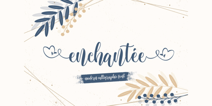 Enchantee feels equally charming and elegant. This stunning script font is a stylish homage to classic calligraphy. It features a varying baseline, smooth lines, gorgeous glyphs and stunning alternates. This font is PUA encoded which means you can access all of the hearty glyphs and swashes with ease It also features a wealth of special features including alternate glyphs and ligatures.
 - Caminito by JVB Fonts,
$15.00 This fontface is inspired on Argentinean classic and traditional art craft named as Fileteado Porteño. Caminito is available in 10 layered styles for compose with multi combinations and a extra of ornaments. Highly recommended to be used for colorized titles and display texts. Fileteado Porteño is a type of artistic drawing, with stylized lines and flowered, climbing plants, typically used in Buenos Aires, Argentina. It is used to adorn all kind of beloved objects: signs, taxis, lorries and even the old colectivos, Buenos Aires’s buses. Filetes (the lines in fileteado style) are usually full of colored ornaments and symmetries completed with poetic phrases, sayings and aphorisms, both humorous or roguish, emotional or philosophical. They have been part of the culture of the Porteños (inhabitants of Buenos Aires) since the beginnings of the 20th century. One of the most highlighted and recognized artists nowadays is Alfredo Genovese, who does a great job of teaching and claim this art and craft. The name Caminito reminds the emblematic and iconic Buenos Aires neighborhood immortalized by Carlos Gardel in music, in the tango.
 - ALS Zwoelf by Art. Lebedev Studio,
$63.00 The design of Zwoelf stems from a letter created by Oleg Pashchenko for the poetry book called “They Talk.” Modified in several ways, the lettering gained readability and a more neutral look. This typeface combines Modern and Gothic styles, ugliness and beauty, the horrifying and the funny. Typographers may highlight any of this. Zwoelf features elements that can be found in both Roman and Gothic styles, but has no real historical prototype. It creates coarse body copy that feels like blackletters. The type is well-suited for use with rough line graphics. Zwoelf is a good choice for short texts, headings, witchcraft potion recipes, madrigals, spells and treasure map naming.
 - Paletone by Bale Type,
$15.00 Paletone is hand lettered sans in two style, Regular & Bold. With the organic and handmade feels, you can use this font for any project. This minimalist font also suitable for the project with earth tone color. Also good for quotes.
 - Watched by Dumadi,
$25.00 Hi, I hope your project is always smooth! Watched is a new font with a unique, quirky, and relaxed style. All uppercase letters have a unique variation and are complemented by combinations of lowercase letters that create a stunning writing style. This font is very suitable for movie titles, such as famous movie titles, with this font, your project will be noticed by many people. try it and feel the difference!
 - Dutch Mediaeval Book ST by Canada Type,
$39.95 Dutch Mediaeval Book ST is a special version of the popular Dutch Mediaeval Book text fonts, engineered specifically for science writing. It is equipped with SciType, a combination of additional characters and OpenType programming included in the fonts to help in typesetting science text. For more information about SciType, please consult the SciType FAQ available in the Gallery section of this page. The Dutch Mediæval design is the historically renowned one made in 1912 by S. H. de Roos. It stands out as one of the most classic Dutch text faces. This Book version comes in two weights and an italic, optimized for body copy use between 8 and 12 pt. Aside from the SciType additions, all the fonts contain OpenType features for ligatures, ordinals, automatic fractions, eight kinds of figures, and a few ornaments. For details about the functionality of Dutch Mediaeval Book ST, please consult its Access Chart PDF available in the Gallery section of this page.
 - Dutch Mediaeval Pro ST by Canada Type,
$49.95 Dutch Mediaeval Pro ST is a special version of the popular Dutch Mediaeval Pro family, engineered specifically for science writing. It is equipped with SciType, a combination of additional characters and OpenType programming included in the fonts to help in typesetting science text. For more information about SciType, please consult the SciType FAQ available in the Gallery section of this page. The Dutch Mediaeval design is the historically renown one made in 1912 by S. H. de Roos. It stands out as one of the most classic Dutch text faces. This digital version comes in two weights and their italic counterparts. Aside from the SciType additions, all the fonts contain OpenType features for small caps and caps-to-small-caps, ligatures, ordinals, automatic fractions, seven kinds of figures, and a few ornaments. For details about the functionality of Dutch Mediaeval Pro ST, please consult its Access Chart PDF available in the Gallery section of this page.
 - Timothea Signature by Timurtype,
$14.00 Introducing by Timurtype Studio! Timothea Signature is a Stylish Signature Font This font resembles handwriting. With attention to detail and stylish strokes in every line, this font adds a touch of sophistication and distinctive style to any design or text it is applied to. The distinctive nature of small lines makes them perfect for creating attention-grabbing titles, logos, or other elements. Timothea Signature Font also supports multilingualism. Enhance your designs with our original fonts, feel free to comment or provide feedback, Enjoy the fonts 😊
 - Queen Smoothie by Timurtype,
$14.00 Introducing by Timurtype Studio! Queen Smoothie is a Handwritten Script Font This font resembles handwriting. With attention to detail and beautiful strokes in every line, this font adds a touch of sophistication and distinctive style to any design or text it is applied to. The distinctive nature of small lines makes them perfect for creating attention-grabbing titles, logos, or other elements. Queen Smoothie Font also supports multilingualism. Enhance your designs with our original fonts, feel free to comment or provide feedback, Enjoy the fonts 😊
 - Aviano Wedge by insigne,
$24.99 Firm and resolute, the sharp, triangular wedge serifs of the new Aviano Wedge stamps your copy with the confidence of late 19th century luxury, wealth, and power. Indicative of banknotes and financial strength, the large, elegant Aviano Wedge is composed in the Latin style. Aviano Wedge takes its original footing from period signage found on a building in Asheville, NC. While shaped largely by engraved faces, the elegant Aviano Wedge maintains the extra-wide comfort and ease found with the rest of the Aviano series. Aviano Wedge comes in six different weights and is packed with OpenType features. As a complement to these characters, Aviano Wedge includes 40 discretionary ligatures for artistic typographic compositions. To see these features in action, please see the informative .pdf brochure. OpenType capable applications such as Quark or the Adobe Creative suite can take full advantage of the automatically replacing ligatures and alternates. Aviano Wedge also includes support for all Western European languages. This new face has also been designed to pair well with the rest of the Aviano series, including our best-selling Aviano, Aviano Serif, Aviano Sans, Aviano Didone, Aviano Flare, Aviano Contrast, and Aviano Slab. Use it alone, or combine Aviano Wedge with any of these other fonts to build the strong presence you’re looking for.
 - Le Havre Titling by insigne,
$24.00 Throughout time, history’s architects have incorporated some of the finest illustrations of type into their great works--cuneiform on Mesopotamian ziggurats; Greek etched into the temples of the gods; inscriptions marking the monuments of mighty Rome. From these Roman inscriptions specifically, we take our capital letters of today; and while we've lost the need for serifs over time, our current characters maintain the classical foundations, even after being distilled to their simplistic forms. Here’s where we have the basis for Le Havre Titling. This updated face is a carefully optimized version of Le Havre that uses purely capital lettering. Originally inspired by the golden period of the passenger ship and the French port that bid a rich bon voyage to so many famed, luxurious ocean liners of the Roaring Twenties and Thirties, the typeface includes an exciting array of ligatures that brings it into the present day and gives designers a tremendous amount of versatility in their work. With its seven weights, Titling looks equally at home on the side of a building as it does in a finely crafted invitation. With over five hundred glyphs, Le Havre Titling offers a multiplicity of options for your projects. Combine ligatures, play around with two sets of art deco forms, use original caps, and more; every one of these is obtainable with the OpenType functionality. The new design also shares five weights with the original Le Havre, allowing you to maximize your potential through its interchangeability. Titling’s Thin weights are delicate but not too fragile, and its geometric forms give each individual composition you create an exquisite and beautiful sense of emotion. Without a doubt, this fresh, fashionable take on the classical forms offers your reader refined, yet unanticipated approach as he or she travels through your text.
 - Rubber B by TwelveTimesTwo,
$40.00 Rubber B is a heavy display typeface with very tight open counters & character spacing and non-existent closed counters. It is an amalgam of styles and influences that demands attention. It is comparable with the highly geometric experimental fonts of the '90s and early '00s, but also heavily inspired by decorative fonts of the '60s and the psychedelic poster art of the '70s. Bold and loud, yet delicate, almost calligraphic in some cases. It works with Latin & Extended Latin, Cyrillic & Extended Cyrillic and Greek. It comes with 1,500+ glyphs, with more than half of them being ligatures. It also contains several Stylistic Alternates as well as Localised forms (available through the Open Type Features and also as ligatures). All these features are available in order to not only make sure that it works with as many languages as possible, but also that depending on the specific glyph or ligature one chooses to use, they have the ability to alter the emotional character of the word(s) they’re setting. Ideal for titles and logos, as it works best in medium and large sizes.
 - Bleecker Street NF by Nick's Fonts,
$10.00This late Victorian typeface flirts with Art Nouveau sensibilities, as evidenced by the graceful curves and the decorative crossmembers in several of the uppercase letters. The result is a font that combines simple, understated elegance with a no-nonsense, workmanlike stance. Both versions of the font include 1252 Latin, 1250 CE (with localization for Romanian and Moldovan). - 57-nao by ILOTT-TYPE,
$49.00 Designed in 1950s Japan by Okanao & Kushiro, the perfect partnership until artistic temperaments drove them apart. The duo spent years crafting the font with the working title “Messenjā”, Okanao bringing technical expertise to craft letterforms, while Kushiro made it his life, obsessively working late into the night to check pages for errors. For him the project was never about making money, it was an artistic endeavor to reprint the great Western works of literature. When he found out Okanao had secretly sold the rights to the font for use as a logo for a major Japanese manufacturer, Kushiro burned all evidence of the designs in a fit of passionate fury. The two reportedly never spoke again. “Messenjā” was thought lost forever until a type specimen was discovered in a vintage typewriter box bought on eBay. Now redrawn and available as 57-nao, a faithful and beautifully crafted monospace characterized by what is considered Okanao’s defining moment, the angular loop on the lowercase ‘a’.
 - Waratah Gothic by Bean & Morris,
$35.00 The Waratah flower is the the emblem of the State of New South Wales, Australia and is unique in its color and design. So too is this new contemporary sans serif typeface that bears its name. With a warmth and friendliness that echoes its origin Waratah Gothic is at home in both text and display and has potential to become a font family with a variety of weights and italics. For corporate, packaging or simple one-line display settings Waratah Gothic is sure to please. Waratah Gothic features a generous x-height and subtle rounding on alternate terminals providing a softness that makes for easy reading.
 - Xanas Wedding Variable by Pedro Teixeira,
$30.00 This font family has derived from a lettering creation for my wedding stationery. One of the most significant momentos for me and my wife Xana (hence the font name - Xanas Wedding). I hope this typography can give a touch of informal elegance and discreet beauty to your projects. There can be multiple applications, since this font is flexible enough to appear as a custom text or a variable, organic, handwritten work. Initial and final swashes: you select a letter (like "a" of xanas wedding inicial swash) and then you type the other letters, but with another font (like xanas wedding bride, for example). In the final of the phrase/name, you type "a" or "d" and select this final letter and switch the font for xanas wedding final swash.
 - Hola Easter by Yoga Letter,
$16.00 "Hola Easter" is a special Easter display font. This font is very unique with the rabbit ears character on the letters. Equipped with uppercase letters, lowercase letters, uppercase rabbit ears characters, lowercase rabbit ears characters, numerals, punctuations, multilingual support. This font has been specially designed, making it easy to use. The procedure for using fonts is found in the 6th preview.
 - ITC Esprit by ITC,
$29.99ITC Esprit is the work of designer Jovica Veljović and blends the classic proportions of a serif typeface with the grace and charm of calligraphy. Highly legible even in small point sizes, the font can also be used as an impressive display face for use with sans serif text. In 2010 Veljovic revised this family and released this as ITC New Esprit. - Spikers by Tigade Std,
$25.00 Introducing - SPIKERS a realistic brush fonts. Spikers font preserves the detail of the original shape of the handwritten characters. It comes with the SVG font that will provide a realistic look of the Fonts. The SVG format requires Photoshop CC 2017 and above or Illustrator CC 2018 and above. With this font, you can enhance your design to the higher level with the realistic looks of the font. It suitable for many projects such as advertising, clothing business, game design, and many others that needs the touch of natural modern handwritten brush font. Not Only that. In this Font, we also include our awesome ATHENA Sans Serif font as a BONUS.
 - Legendum - 100% free

- Librum by Hackberry Font Foundry,
$24.95 This is the serif text family for the book design group of font families which David designed in the process of writing "Practical Font Design With FontLab 5". The letterspacing is set wide for body copy use. The main purpose is readability and reading comfort. There are several whimsical graphics, plenty of OpenType features: oldstyle figures [tabular and not], small cap figures, lining figures [tabular and not], discretionary ligatures, small caps, and so on. The feature set is limited for the italic and bold versions. It produces an exceptional book. See Librum Book Design Group for a package containing all fifteen fonts,
 - Hoban by District,
$40.00 The light and the bold. The thick and the thin. Laverne and the Shirley. Peanut Butter and the Jelly. Hoban is about contrast. Hoban wants to be noticed, but only after a second glance. A friend of a friend to the didones, it has smaller, tapering serifs, slightly calligraphic traits, and spindly little terminals that go where they please. It’s a headline face. Period. Set it big and bold. Or light and airy. But preferably next to something with flair. Cuff links, canapés, or corvettes–it’s up to you. Distinct ligatures, ornaments, and swashy alternates provide plenty of character to tailor your style.
 - Playthings by Fikryal,
$23.00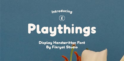 Playthings Handwritten Display Font is a type of font designed by hand to provide a unique and personal touch to your design projects. With its cheerful and gentle handwriting style, this font brings about a relaxed yet captivating ambiance, making it suitable for various creative endeavors. With its soft line details and natural characteristics, the Playthings Handwritten Display Font exudes warmth and familiarity.
 - Starry Night by Lauren Ashpole,
$15.00 This slighty messy handwritten font was inspired by the scrawl of a teenager given a marker. Meaning it was inspired by my own quick writing at the time. Right down to the stars.
 - Cradley by CastleType,
$59.00 Cradley™, a CastleType original, was inspired by the work of William Caslon, considered by some to be the finest type designer of the Baroque era. With its classic proportions, beautifully bracketed serifs, and high contrast, Cradley is a contemporary design with a Baroque spirit. The family of three beautifully crafted fonts support most European languages, including modern Greek and many languages that use the Cyrillic alphabet. Includes over 30 "flowers" (as Caslon called them), useful for creating borders or adding an accent. Спасибо / thanks to Alexei Elfimov for his suggestions for improving the Cyrillic, and to Max Fernandes for his helpful feedback and overall enthusiasm for this design.
 - Wesley JF by Jukebox Collection,
$32.99 Wesley from Jukebox is a geometric sans-serif with a clean and streamlined look. Named after the designer’s paternal grandfather, this font is well suited to any design that needs a sophisticated look. The large x-height helps give the typeface a more approachable feel. The unique lowercase g with its open bowl is a distinctive feature in the font. Jukebox fonts are available in OpenType format and downloadable packages contain both .otf and .ttf versions of the font. They are compatible on both Mac and Windows. All fonts contain basic OpenType features as well as support for Latin-based and most Eastern European languages.
 - Meetha Script by FadeLine Studio,
$18.00 Meetha Script is modern calligraphy script font. This is a beautiful script font with italic style. Made gently and danced to give the character of modern writing that is sweet, simple, stylish and firm. With a style like this, this font will be suitable in use for logo's, branding projects, homeware designs, product packaging, mugs, quotes, posters, shopping bags, logo's, t-shirts, book covers, name card, invitation cards, greeting cards, and all your other lovely projects.
 - Salamat by Sudtipos,
$59.00 Since the release of his first typeface, Zulia Pro, Joluvian has spent his time dedicatedly experimenting with an array of calligraphic styles and typography, before starting on his second typeface, Salamat. The journey began on a trip to Asia, where Joluvian was inspired by his time in the Philippines. After a series of discarded type sketches, the first stroke of what is now Salamat was then born. What at first was a quick sketch, over time, evolved into a stylized typography; that lends to humanistic-expressive calligraphy, optimized with wide variety of swash capitals, contextuals ligatures, ascending and descending, starting and ending letters and a wide range of characters for each glyph. Salamat provides the user absolute freedom to play, create words, sentences and even very stylized paragraphs. Giving one the freedom with type, the way the Philippines gave Joluvian the freedom to explore calligraphy and typography. Joluvian considers Salamat a new benchmark in his career. He now possesses more typography maturity, and a refined focus to put into practice all the knowledge acquired in his recent years of study, for this and much more salamat ('thank you' in Tagalog) to the Philippines.
 - TG Frekuent Mono by Tegami Type,
$30.00 TG Frekuent Mono a new modern geometric sans serif with monospaced style. This typeface is made with precise calculations so that it displays a beautiful and modern appearance. Besides this new typeface is also equipped with six different styles, ranging from ultra light to extra bold plus variable font. This typeface also has various alternative characters that can be used according to the needs in the design. Alternative characters that exist in this type of font have a touch of script typeface so that it makes the alternative character of this type of letter a little quirky and different but still fits well with the combination of modern main characters. And supports approximately 100 languages.
 - Storyville by Canada Type,
$29.95 This is the redrawn and expanded version of an alphabet Rebecca Alaccari made back in 2009 as a bespoke font for a tourism agency looking to recapture the appeal of New Orleans after the hurricane Katrina disaster robbed it of its core industries. The brief back then was to "revive the unique spirit of what always made Nola great for new adults, which is the excellent combination of history, romance, food and music." No word of a lie, the brief actually contained "new adults." Storyville contains two interchangeable sets of forms drawn in the doodly, loose and organic way now conspicuously popular with today's young designers, almost every one of whom thinks they will get to design something for a boutique coffee bar somewhere. Well, this whole thing perhaps means freedom, youth, fun, happiness, good stuff like that. But just in case, a little caution doesn't hurt: Use this font only if you know what you're doing. We don't want to go back to the 1990s. Please. We were nearly done for by that exposure the first time around. The ligatures feature in this font does some pseudo-randomization, so the forms in doubled letters don't repeat. Serious fun can be had by also applying the stylistic alternates feature, or picking a letter in the middle of a setting and disabling the ligatures feature. Or various sequences of all that. If you don't like any of that stuff, just forget about it. Uh, wutever.
 - Brush Type Italic by Brush Art Design Office,
$52.00My name is Teruyoshi Matsui. I am a Brush Artist living in Japan. I artistically write the letters of the alphabet with a Japanese brush. I believe I am the only one in the world as a brush artist. I once declared on my blog that I would be a world artist. This is my ultimate goal once my name is recognized. I have created the font “ BrushType Italic”. It is an artistic product of mine. I consider this my best font. I am sure you can agree that it is “cool and beautiful”. I know you will be very proud if you use my font of BrushType Italic. Everyone will be envious of your works. I truly believe this. Thank you. - Sihmittree by Ingrimayne Type,
$9.00 Sihmitree is a gimmick typeface in which all glyphs have reflective (mirror) or rotational symmetry (or both). Sihmitree has two weights and is caps only, with most of the lower-case letters identical to the upper-case letters. It includes only those accented characters that are symmetrical. The letters of the alphabet are often used to explain symmetry. BCDEK are given as examples of shapes that can easily be formed with symmetry over a horizontal line. AMQTUVWY can easily be formed so that they mirror over a vertical line. Letters HIOX can be formed so they mirror over both horizontal and vertical lines, and as a result they will also have rotational symmetry. Letters NSZ can be formed so that they reproduce themselves with a rotation of 180º. That leaves letters FGJLPR, which are usually considered examples of asymmetry. However, there are script versions of J, L, and R that can be formed with symmetry, and variants of lower-case f and g can be made that are symmetrical. P looks a lot like the thorn character. Some of the numbers also present challenges when trying to form them symmetrically. The symmetrical alphabet is not stylistically harmonious and has limited use other than as an exploration of symmetry.
 - Waylom by Eurotypo,
$26.00 Waylom is based on 19th century letters written in calligraphy. These writings had some glyphs of a height higher than the others, which together with the flowing lines, the elegant curves and the flourishes, gave it a very interesting rhythm and a lot of personality. Using this font you will achieve a very elegant, and warm style. This font is slim, feminine, friendly and sexy. Waylom includes a wide range of latin languages, 720 glyphs with many stylistic variations, initial forms, swashes and ligatures, which you can mix and match to achieve a more interesting effect. I separated the highest glyphs to create Waylom Pro, to which I added some very useful ornaments to improve its possibilities, with a total of 823 glyphs. Waylom is very versatile and is ideal for high-end logos, magazines and book covers, fashion, headlines, cards, posters, websites, and packaging.
 - Philadelphian by FontMesa,
$29.00 Philadelphian is a revival of a MacKellar, Smiths & Jordan font from 1867 by the same name. The regular version with shadow outline was the only style that was offered in 1867. We've taken the original design further by creating two additional weights of medium and bold plus plain black versions. The medium and bold weights are unique because only the horizontal strokes increase in thickness while the vertical strokes remain the same in each weight. Philadelphian Nite is the plain black version of this font family, Nite is the casual spelling of the word Night meaning dark or black. In the late 1800's Philadelphian was a very popular typeface which can be seen on many billheads and letterheads through the early 1900's. If you're looking for a western style font that doesn't look like any other then Philadelphian is the right choice. While the name doesn't remind you of the cowboy genre we've kept the original name for historical reasons because this font was so popular in its day. We plan on going forward with a weathered version of Philadelphian which will be released under a southwestern style name. With Philadelphian we've decided to set the complete family price to an amount that may be considered on sale all of the time.
 - Pioggia by Fontdation,
$15.00 Introducing Pioggia, a modern and playful serif font. This clean and minimalistic serif is crafted with love and high attention to the details. Packed with OpenType features (such as alternate chars, swashes, ligatures, etc), lets you play and explore every characters available. Pioggia is very versatile, suits best for almost everything, whether you're working on classic themed design, or the modern ones. If you're often working with a magazine, layouts, logotypes, hipster-quote writings, t-shirt designs, etc, Pioggia is your next go-to font.
 - Thorben by Studio Buchanan,
$18.00 The old Norse legend of Thorben Odinson is a cautionary tale. And this typeface, like the nebulous kingdom he ruled, is something of a cloudy concoction. Thorben the typeface is something of an inspiration-hybrid, pulling aspects from multiple sources and combining them into a typeface that strangely seems to work (or not – depending on your point of view). What started as a redrawing of some old carvings (on a castle wall in deepest, darkest Suffolk), is now something entirely different. Part Nouveau curves and Celtic script, topped with a few sprinkles of modernism, darkness and some quirky ideas – Thorben absorbs it all, creating a display face that feels antiquated and current at the same time. Each style also comes pre-loaded with a handful of pictograms and icons perfect for adorning your designs with extra Thorben-ness.
 - Catskin by Hanoded,
$15.00 Catskin is a fairytale by The Brothers Grimm. The story is about a king who has a beautiful wife and daughter - you know, the basic fairytale stuff. Long story short: they all live happily ever after (except for the wife, who dies…). Catskin is also a nice, handmade font. I like making fairytale fonts, especially since I have three kids, who love books. And when I see one of my fonts on the cover, I can tell them: ‘daddy made this’. #prouddaddy ;-)
 - Linotype Albafire by Linotype,
$29.99With Albafire, Jürgen Ellenberger has played with flames that come out of the exhausts from Michael Schumachers Ferrari, or the hot rod cars in America or at the tractor pulling contests. This gives this sans serif face a speedy and wavy flavour. It fits ideally for speedy headlines like for bikers couriers. - Smack Game by Beary,
$15.00 Smack game is a fun font with a cute decorative theme. Masterfully designed to become a true favorite, this font has the potential to bring each of your creative ideas to the highest level!. This font is PUA encoded, which means you can access all of the glyphs and swashes with ease!
