10,000 search results
(0.045 seconds)
- Ogilvie - Unknown license

- Manta - Unknown license

- ZirkleOne - Unknown license

- DS CenturyCapitals - Unknown license

- Uchrony Cube - Personal use only

- VAG-HandWritten - 100% free

- Black Bass by Sabrcreative,
$15.00 Introducing Black Bass Display, a captivating and unique sans serif font that combines modern aesthetics with a touch of brush script elegance. With its bold and distinctive letterforms, this font is perfect for making a statement in your designs, whether it's for logos, headlines, posters, or branding projects. The combination of uppercase and lowercase letters in Black Bass Display allows for versatile typography exploration, giving you the freedom to create eye-catching compositions and play with different design elements. Its unique style adds a sense of personality and creativity to your work, making it stand out from the crowd. Black Bass Display doesn't just look great, it also offers functionality. It supports numbers and punctuations, ensuring seamless integration of these elements into your designs. Additionally, its multilingual support enables you to communicate your message in various languages, expanding your reach to a global audience. With PUA encoding, Black Bass Display provides easy access to additional characters and glyphs, allowing you to add flourishes and embellishments to your designs effortlessly. This feature enhances the versatility of the font, giving you endless possibilities for customization. Get ready to elevate your designs with the unique blend of brush script and sans serif aesthetics offered by Black Bass Display. Make a bold impression, express your creativity, and create designs that leave a lasting impact.
 - Between by Monotype,
$40.99 Akira Kobayashi’s Between™ typeface comes in three main states. While different from each other, they all offer human-centered design to ensure that copy set in them is affable and approachable. An added benefit is the ability to transition “between” font designs, choosing different styles – or even individual characters – to create hierarchy, contrast or emphasis. Kobayashi designed the Between typeface in response to the current popularity of rounded, humanist sans serif designs over the cool grotesques of the 20th century. Between 1 melds industrial and humanist sans ethics. Between 2 represents a sans version of Kobayashi’s Cosmiqua® typeface, striking a balance between crisp and legible, organic and friendly. Between 3 is a freestyle sans with an uplifting sprightly mien. Between has 48 styles; each has eight weights of roman with its own italic counterpart. The family offers a large set of alternative glyphs and OpenType® features. A full interactive type specimen can be viewed here: http://www.monotype.com/fonts/between/ Featured in: Best Fonts for Logos
 - Emeralde Chamerions by Almarkha Type,
$29.00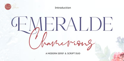 Introducing Emeralde Chamerions - Stylish Font Duo , Display Serif And Signature Stylish Script inspired by famous logo perfect for the purposes of designing templates, brochures, videos, advertising branding, logos and more.
 - MBF Moonlander by Moonbandit,
$15.00 Moonlander, a modern bold and wide sans serif font.This clean and sharp typeface is inspired from the lively urban lifestyle and can be perfect as a headline, title, logo, branding.
 - Berona by Alex Camacho Studio,
$15.00 Berona font family is a variable geometric sans serif with a modern display purpose. The dynamic sharp edges makes it ideal to be used in a medium and big scale.
 - Chervonec Uzkj BT by Bitstream,
$50.99Possessing a distinctive Russian appearance, Chervonec Uzkj, or Chervonec Condensed, is a hybrid semi-serif designed by Russian designer Oleg Karpinsky. The typeface family includes three weights with drawn italics. - Cheyenne JNL by Jeff Levine,
$29.00 Cheyenne JNL is a classic slab serif wood type with chamfered corners. Its tall, condensed design is perfect for short headlines that emulate the Old West and similar nostalgic themes.
 - Patriciana by Green Type,
$46.00 Patriciana is an elegant light sans serif typeface. Great for use in the fashion industry, for magazines and advertising. Patriciana supports Latin, Cyrillic scripts, and includes stylistic alternates and ligatures.
 - Sovetryne by PizzaDude.dk,
$15.00 Ahhh, who doesn't want to sleep late? That’s excactly what a “sovetryne” wants ... even though he/she often sleeps way to much! But that’s not the case with this font. It’s legible, even though it’s slightly worn. Change between upper- and lowercase letters to variate the typing - and turn on ligatures, in order to use the substitution of double letters such as aa, bb, cc and many more!
 - Grotesk Polski FA by Fontarte,
$39.00 Grotesk Polski FA developed in 1998-2006, was inspired by the Polish eminent pre-WWII text typeface - Antykwa Półtawskiego. Adam Półtawski designing his antiqua had took into consideration the special qualities of Polish language. He designed unique letters: k, w, y, z and R, K, Y. Another unique element of his typeface was polygonal dot. Grotesk Polski keeps all that shapes and goes further. It is a contemporary sans serif in four cuts: Regular, Italic, Bold and Stencil. The proportions of the typeface were rebalanced to give it a neo-grotesque form with a Polish twist.
 - Gloriance by Mevstory Studio,
$25.00 Gloriance is a classic serif font adapted from the art deco style, a visual style that emerged in the 1920s and 1930s. This font is characterized by bold geometric shapes, a symmetrical design, and a sense of modernity and glamour. Gloriance is designed to have a distinctive classic impression with the presence of decorative elements such as extended lines, neat and tidy decorative shapes and types. These decorative elements can add a sense of sophistication and luxury to text. With a wide selection of alternates and ligatures, you can create a variety of styles and play with this unique fonts. This typeface is perfect for an elegant logo, jewelry stuff, packaging, magazine design, fashion brand, classic stuff, poster, flyer, wedding invitation, quotes, or simply as a stylish text overlay to any background image.
 - Solitas by insigne,
$- You request perfection--that ideal equilibrium of compact dimensions and geometric underpinnings that leaves you with pure, clean lines of a highly legible sans. We give you Solitas, a 7-weight sans-serif from Jeremy Dooley. Made of 42 fonts, from the slender thin to the powerful bold and their matching italics, this typeface family features typographic options including ligatures, fractions, alternate unicase, upright italics, and titling caps. Coupled with its pure design and style, this makes Solitas a successful workhorse typeface. The result of simplification and reduction, Solitas is well-suited for the headlines and shorter texts of promotions, packaging, editorials and branding, both in print and on your website. That's it. It's that clean, that simple, and possibly that perfect for your next layout. Get it today.
 - Wild Muerayam by Luhop Creative,
$10.00 Wild Muerayam is an elegant, modern and functional unique featuring a calm text and an expressive display. This font looks harmonious in books and other periodicals, on posters or on magazine covers. The scope is not limited to the printing industry, because Wild Muerayam looks aesthetically pleasing wherever text is used. Wild Muerayam a serif display font with a modern yet luxurious style. Aesthetic and unique letterforms, as well as soft curves and wild shape of the letters make this font so iconic. Wild Muerayam Features: Uppercase and lowercase Multilingual Numerals Punctuation PUA Encoded Alternates Ligatures To be able to access alternative fonts, make sure the software you use can support opentype features such as Microsoft Word, Paint, Adobe, Corel draw, Cricut and other applications. I hope you enjoy!
 - ZT Frimpong by Khaiuns,
$12.00 ZT Frimpong is a sans serif look made by hand, all the letters are drawn one by one, so that no one line is exactly the same. This is a closed, low contrast typeface with an emphasis on connecting strokes. Sensational style, potentially unique atmosphere, ZT Frimpong comes in three thicknesses, and each type has a different feel, namely each weight of the font texture is getting denser, so there are fewer cavities. It can be used to create almost any type of design project such as Poster materials, logos and web designs. Just use your imagination and your project will come alive and alive than ever with the ZT Frimpong Font. I hope you have fun using ZT Frimpong Thanks for using this font ~ Khaiuns X zelowtype
 - Buffalo Bill by FontMesa,
$35.00 Buffalo Bill is a revival of an old favorite font that’s been around since 1888, the James Conner’s Sons foundry book of that same year is the oldest source I've seen for this old classic. If you're looking for the font used as the logo for Buffalo Bill’s Irma Hotel in Cody Wyoming please refer to the FontMesa Rough Riders font. New to the Buffalo Bill font is the lowercase and many other characters that go into making a complete type font by today’s standards. The Type 1 version is limited to the basic Latin and western European character sets while the Truetype and OpenType versions also include central and eastern European charcters. William F. (Buffalo Bill) Cody called America’s Greatest Showman was one of the United State’s first big celebrity entertainers known around the world, millions of people learned about the Old West through Buffalo Bill’s Wild West shows which traveled throughout the United States and Europe. William Cody, at age eleven, started work on a cattle drive and wagon train crossing the Great Plains many times, he further went on to fur trapping and gold mining then joined the Pony Express in 1860. After the Civil War Cody went on to work for the Army as a scout and hunter where he gained his nickname Buffalo Bill. In 1872 William Cody started his entertainment career on stage in Chicago along with Texas Jack who also worked as a scout, the Scouts of the Prarie was a great success and the following year it expanded to include Wild Bill Hickok and was eventually named The Buffalo Bill Combination. By 1882 Texas Jack and Wild Bill Hickok had left the show and Buffalo Bill conceived the idea for the traveling Wild West Show using real cowboys, cowgirls, sharpshooters and Indians plus live buffalo and elk. The Wild West shows began in 1883 and visited many cities throughout the United States. In 1887 writer Mark Twain convinced Cody to take the show overseas to Europe showing England, Germany and France a wonderful and adventuruos chapter of American history. The shows continued in the United States and in 1908 William Cody combined his show with Pawnees Bill’s, in 1913 the show ran into financial trouble and was seized by the Denver sheriff until a $20,000 debt (borrowed from investor Harry Tammen) could be paid, Bill couldn't pay the debt and the loan could not be extended so the assets were auctioned off. William Cody continued to work off his debt with Harry Tammen by giving performances at the Sell’s-Floto Circus through 1915 then performed for another two years with other Wild West shows. William F. Cody passed away in 1917 while visiting his sister in Denver and is buried on Lookout Mountain joined by his wife four years later. Close friend Johnny Baker, the unofficial foster son of William Cody, began the Buffalo Bill Memorial Museum in 1921, over the years millions of people have visited William Cody’s grave and museum making it one of the top visitor attractions in the Denver area. William F. Cody romantisized the West creating the Wild West love affair that many still have for it today through books and cinema.
 - News Gothic No. 2 by Linotype,
$40.99News Gothic No. 2 is an enhanced version of News Gothic produced by the D. Stempel AG type foundry in 1984. It added more weights to the News Gothic family than were available in other versions, increasing its use in contemporary design and communication. The lighter weights of the original News Gothic were designed by Morris Fuller Benton in 1908 for American Typefounders (ATF). News Gothic typeface is quite similar to Benton's other sans serifs from the early twentieth century, including Franklin Gothic and Lightline Gothic. The bold weights were added to the News Gothic scheme in 1958. The capital letters in News Gothic No. 2, just like those found in News Gothic, have a similar visual width to each other. The lowercase is compact and powerful. These design attributes contributed to Benton's strong handle on the sans serif genre, and for years his types have been popular for newspaper headlines and many other uses. Still a popular presence on the font charts, News Gothic has proven its ability to get the job done right. - Wien Pro by Wannatype,
$36.00 Wien Pro, the sans serif by Ekke Wolf. Typeface lovers looking for a modern, well-developed sans serif font with a touch of retro and warm, individual lettering will get excited about a new addition to the font market. The more than complete Wien Pro front comes in three styles and four different weights. In addition to the upright Wien Pro there is the Wien Pro Oblique with a moderate 6° slant and the Wien Pro Superoblique with an 18° slant. Available weights are light, regular, medium, bold and black. These fonts are equipped with extended Latin alphabet for Central and Eastern Europe and also Cyrillic and Greek alphabet. The set of characters includes nine different sets of numbers, plus its own set for the small caps, as well as alternative characters and groovy ligatures. In addition, all Wien Pro styles are also available as unicase with upper case and lower case x-height alignment. The style, metrics and proportions of Wien Pro combine perfectly with the Liebelei Pro and the script fonts of the Calafati Pro.
 - Thousands by Dharma Type,
$19.99 This slab serif has an incredible type system. By using power of OpenType alternates, typographic flexibility going up and up as its name indicates. Serifs transform, change to small caps and ligatures give you rich typography.
 - Plinc Flourish by House Industries,
$33.00 Flourish breaks the mold of traditional typography. Part italic, part roman, this iconoclastic font is all style. William Millstein casts the contours of formal pen strokes in a taut upright framework to create a typeface that nods back to its origins while looking defiantly forward. The neat and light semi-serif flaunts crisp geometric touches without conceding warmth or personality. A sophisticated design solution that isn’t stuck up, Millstein Flourish makes invitations, identities, and editorial settings thrive. Originally offered by Photo-Lettering in the early 1940s, Millstein Flourish was digitally updated by Jeremy Mickel in 2011. Like all good subversives, House Industries hides in plain sight while amplifying the look, feel and style of the world’s most interesting brands, products and people. Based in Delaware, visually influencing the world.
 - Hazelton by Type Royal,
$61.00 Hazelton is a neo-humanist typeface inspired by the explorations and development of early British sans-serif typography. Six weight have been developed for Hazelton. The lighter weights are loosely inspired by Edward Johnston’s Underground typeface. The heavier weights glean inspiration from Stephenson Blake’s Granby. Sharp, pointed terminals that are indicative of British typography have been omitted in favour of a more modern sensibility. Subtle humanist characteristics become more exaggerated as the typeface increases in weight, making the lighter weights practical for text purposes and the heavier weights ideal for display use. A unique set of numerals have been developed to infuse them with a humanist quality that is often lacking when typesetting technical data. The result is a diverse typeface that is as powerful as it is beautiful.
 - Craw Modern by GroupType,
$19.00 Craw Modern was designed by Freeman Craw in 1958 and first released by The American Typefounders Company, (ATF). In typography, 'Modern' is a style of typeface (classification) developed in the late 18th century that continued through much of the 19th century. Characterized by high contrast between thick and thin strokes and flat serifs. Bodoni is among the most popular of the Moderns. Moderns are also known as Didone and New Antiqua.
 - Altersan by Eko Bimantara,
$24.00 Altersan is sans serif font family with extraordinary abstract alternative glyphs and icons. The initial style is humanist grotesk sans which fit for various design purposes. The complete family consist of 8 styles from thin to black with each matching obliques. Its contain 477 glyphs which covered broad latin languages. The alternative glyphs can be accessed by activating the opentype feature; Stylistic Alternates and also by opening the glyphs panel.
 - Egg Farm JNL by Jeff Levine,
$29.00 The opening titles and credits of the 1947 film comedy “The Egg and I” were done in a hand lettered casual sans serif typeface which inspired the digital font Egg Farm JNL; available in both regular and oblique versions. “The Egg and I” introduced audiences to Ma and Pa Kettle as portrayed by Marjorie Main and Percy Kilbride, who went on to do a number of additional films as those characters.
 - P22 Speyside by IHOF,
$24.95 Speyside is a round, curved and controlled sans serif with an additional set of decorated uppercase letters, initials and small caps. It's appropriate for text, titling and display. The origin of the name is taken from a small location in Tobago. The font is inspired by the local handicraft, the batik in particular. Each pro font style includes small caps and decorative initials as well as several OpenType features.
 - Neuville by Poetic Poetical,
$29.00 Neuville is a geometric and low-contrast sans serif for everyday use related to typography. The shapes of the characters are clear, simple and balanced to allow for legibility and help the typeface deliver the contents with a neutral and objective voice. The Neuville family includes three weights and has a wide range of OpenType features such as tabular figures, numerators and denominators, superscript and subscript numbers, and case-sensitive forms.
 - Opheline by Nasir Udin,
$19.00 Opheline is modern display serif family of 9 fonts. The family consists of 9 weights, ranging from thin to black. The thin version reflects elegance and soft texture, while the black version represents modern and strong appearance. The vast range of Opheline family will help you to tackle your designs problem that need professional or classical touch; from the professional-look branding of law firm to classic-historical product branding.
 - Middle Earth by Mans Greback,
$59.00 Middle Earth is a Medieval calligraphy serif font. With the historic charm of ancient manuscripts and the ethereal beauty of elven realms, Middle Earth typeface weaves tales of valor and legends. Its calligraphic allure is accentuated by rounded contours, reminiscent of Tolkien's enchanted worlds. The unusually large lowercase, almost circular in its form, seems to echo the undulating hills of the Shire, while its Irish-inspired design lends a timeless elegance.
 - Hermanz Titling by California Type Foundry,
$47.00 Hermanz™ Titling is inspired by the most majestic caps that Hermann Zapf ever drew. They are inscriptional caps, square caps, or “capitalis monumentalis”. These caps are some of the most beautiful letters made by one of the greatest talents of our time; so beautiful they deserve to be seen and appreciated by everyone. If you do any work for churches, wedding, funeral, anniversary, or other ceremonies, for the fine arts, exclusive clubs, or higher education—you will love how these letters make your brochures, pamphlets and announcements look. Hermanz Titling works for anything labeled "fine": fine dining, fine music, fine art (pamphlets, books, posters, cookbooks). It also fits well for religious topics: posters, events, websites, hymnals, for biblical; and ceremonies, religious or otherwise. Emotions It Can Communicate: • Importance • Timelessness • Special Event • Tradition • Reverence • Artistry • Beauty Released June 2021 on the Memorial of Hermann Zapf, as part of the California Type Foundry Memorial Series: Honoring the life and work of the great font designers. FONT STORY The Majestic Caps When I was on one of my visits to rare books rooms I found some large caps of Hermann Zapf, and I knew that I had to make a font inspired by these. I was surprised that no one had ever made them into a font. They were some of the most beautiful caps I had ever seen. These caps were surprisingly difficult to make. I thought it would take me a week or two; to get the detail and spirit right took significantly longer– but it was well worth the effort! When you print Hermanz Titling on a page, you will see what I mean. Even when printed digitally, it’s the closest thing to letterpress. You might even have some people thing it was printed by a traditional method with ink! (Note: Unless printed at very large sizes, this font is not recommended for actual letterpress, because the serifs are too thin.) If you do any work for churches, wedding, funeral, anniversary, or other ceremonies, for the fine arts, exclusive clubs, or higher education—you will love how these letters make your brochures, pamphlets and announcements look. Enjoy this breathtaking font, and may it help inspire people with your messages! –Dave Lawrence & the California Type Foundry
 - Eugenia by Phoenix Group,
$8.00 Eugenia is a font for display and poster needs. Each stroke reflects the strong nature of a woman who hates what she loves. This font is suitable for posters with the theme of art and enthusiasm. The name Eugenia reflects the glory and the figure who likes to do good, we hope that people who use this font can make something that is good for others.
 - LT Sweet Nothings - Personal use only

- MVB Solitaire Pro by MVB,
$39.00 A typeface is a tool. Sure, there are frilly fonts that are more art than craft, showy faces that exist merely to call attention to themselves. But, in the end, any functional typeface worth its salt lives to serve one thing first: the text, the content. Everything else—the fashion of the moment, the allure of individual words and letters—is secondary. MVB Solitaire™ epitomizes this universal typographic mandate. As a tempered sans serif somewhere between a humanist and a gothic, MVB Solitaire captures a 21st-century neutrality. But practical doesn’t have to mean banal. MVB Solitaire has a soul. While some “neutral” type is dead the moment the ink hits the page, MVB Solitaire delivers text that feels lively, contemporary, relevant. Readers will not tire of this type. Behind the useful exterior is an arsenal of thoughtful technical features. It’s no surprise that this family’s creator, Mark van Bronkhorst, was first a graphic designer before becoming a type designer. Mark built all the goodies into MVB Solitaire that he would appreciate as a user: case-sensitive punctuation; alternate forms that can be invoked individually or together; oldstyle and lining figures in both tabular and proportional widths; slightly shorter lining figures that don’t stand out in running text, but also cap-height figures for all-cap settings; and the ability to speak nearly any Latin-based language. MVB Solitaire aspires to be the sort of workhorse that a designer keeps installed on their system at all times. It is a family bound to have a permanent spot in the font menu, always at the ready for projects (those most common of all) where the typography mustn’t mask the message. It has that quality that all truly useful typefaces have: the capacity to get the job done without getting in the way.
 - Diamend by Craft Supply Co,
$15.00 Diamend is an elegant sans-serif font that merges modernity with sophistication. Its sleek lines and refined aura are ideal for infusing projects with a touch of timeless class. Elevate your designs with Diamend's exquisite charm and open the door to a world of creative possibilities. This typeface is ideal for greeting card, packaging, brand identity, poster, or any purpose to make your design project look eye catching and trendy. Feel free to play with this typeface!
 - Eckhardt Titling JNL by Jeff Levine,
$29.00Eckhardt Titling JNL is another treatment of a popular typeface that lends itself well to the hand-lettered sign and display work of days past. A clean sans serif with a slight touch of Art Deco, this font renders well from small point sizes to large posters. As with other fonts in this series, it is named in honor of Jeff Levine’s good friend Albert Eckhardt, Jr. who owned Allied Signs in Miami, Florida from 1959 until his passing. - Revivalisem by Creative17studio,
$10.00 Revivalisem is a sans serif font with a modern style that is very luxurious, seen from its luxurious character. Revivalisem comes with complete upper and lowercase letters, numbers, punctuation marks, ligatures, alternative letters and supports multiple languages to make it easier for you to convey something through this writing font. This font is very versatile for the use of a variety of design projects. especially for fashion branding and editorial design. Any question? Just ask. Free update.


