10,000 search results
(0.068 seconds)
- Island Life by Wing's Art Studio,
$24.00 Island Life is a font inspired by the loose, wavy style of the type associated with 1970s surf culture. Often found on lo-fi surf movie posters, t-shirts, and decals, it’s an aesthetic that promotes a laid-back, summer-loving style. With a zen “be like water” approach, this font has no straight edges. Behaving like letters inside a Lava Lamp, each individual character blends into a harmonious whole; perfect for groovy titles, logos and headers. The Island Life font features unique uppercase and lowercase characters, along with numerals, punctuation and language support, symbols and lots of custom ligatures for a truly hand-made look. All ligatures function automatically and can be turned on/off using the opentype features built into your software of choice. It’s the perfect font for the summer season and works great across posters, logos, t-shirts, menus and more. I recommend first laying out your text and then experimenting with warp, wave and bulge effects for some excellent results. Check out the visuals to see it in action. Enjoy!
 - Calle 26 by Christian Gamba Pardo,
$9.90 This group of icons has graffiti as central theme, based on the most representative images and styles of the artists; Guache, Toxicomano and DjLu. In addition, the 26th Street corridor (also known as El Dorado Avenue) was taken as the main reference because it brings together the work of many important exponents in this type of art; at least locally and nationally. Some icons are characterized by have a similar appearance with the Stencil technique or by have a loose stroke with high contrast. This font can be used in projects and works related to street art.
 - Eventyr by PizzaDude.dk,
$17.00 Eventyr is danish and means fairytale. You may know the name of the famous danish author, HC Andersen, who was well known for his fairytales. Actually I finished this font while listening to one of his fairytales, and that inspired me to call this font Eventyr. Most fairytales include the number 3 (3 choices, 3 wishes ... etc) but this font has the number 4 - because you have 4 slightly different versions of each letter to choose from. Enough to make your project look magical! Of course, the font has multilingual support, because fairytales are well known all around the world! :) Caps only Fonts.
 - ITC Ironwork by ITC,
$29.99ITC Ironwork is the work of Serge Pichii, who was inspired by a piece of decorative lettering done by Jan Tschichold in the early 1920s. Tschichold had interlocked a series of rough sans serif letters and embellished them with scattered decorative elements. The original was of only capital letters, touching and overlapping like an ironwork gate made of letters. Pichii completed the typeface with lowercase forms and smoothed the edges. The scrolls of the capitals were extended to the lowercase and Pichii based them on iron scrollwork he found in Vienna and Prague. A lot of attention was paid to the elements of the typeface in order to 'smooth out' and balance proportional relations between the elements," says Pichii. ITC Ironwork is great for signage and display but also works well in short texts." - Tip Me Cheapy - Unknown license

- PiS VinoZupa by PiS,
$28.00 PiS VinoZupa is based on a logo found on an old Serbian bottle of brandy. The vintage 1971 plum fuel burns down your throat and blinds your eyes, the serifs you draw grow bigger and bigger with every sip you take. A Western-style slab serif font, coming from the finest distilleries in an Eastern European village. Features heavy caps with a few alternating glyphs in the lowercase letters and all the nice diacritics you need for super-drunk Serbian babble.
 - Linotype Venezia by Linotype,
$29.99Linotype Venezia Initiale is part of the Take Type Library, selected from the contestants of Linotype’s International Digital Type Design Contests of 1994 and 1997. Designed by German artist Robert Kolben, the font is based on the classic forms of Roman writing in the 1st and 2nd centuries found chiseled on countless buildings and monuments. Linotype Venezia Initiale is a timeless, elegant font particularly well-suited to headlines or as initials in combination with other fonts, working especiall well with sans serif alphabets. - Goddess by Device,
$39.00 Decadent, baroque and refined. Sinuous curves, ornate swashes and alternates that can be customized to suit your burlesque ball, bodice-ripping romance novel or high-fashion label. The “Swash” version includes swash capitals that can be toggled on or off using the ‘swash’ option in Adobe apps. The “Title” version includes drop-caps that connect with an underline that runs under the regular characters. These again can be toggled on and off using the ‘swash’ option. Also includes optional stylistic alternates and ligatures.
 - Karolina by Studio Indigo,
$17.00 Karolina is a calligraphic serif font. It is inspired by Edward Johnstons (1872–1944) calligraphy and the foundational hand (which was based on the carolingian letters and therefore the name Karolina). The Uppercase letters are based on the perfect proportioned roman capitals. Karolina is a classic and clean typeface with smooth shapes that will give an elegant touch to your projects. It is suitable for formal use and works well both for headlines and as body text in smaller sizes.
 - Cutlass by Hackberry Font Foundry,
$24.95 Cutlass was just for fun. A year ago or so [2009, maybe], someone on typophile showed a scan of the word "Ciruelo". I liked it. Those were the only letters I had and no one ever came up with the name of the original font that I saw. It doesn't matter as I went far afield as I designed, as usual. It's just a swashbuckling bit of fun. OpenType 476 Glyphs from my usual set minus the superior and inferior figures. Enjoy!
 - Deco Francois JNL by Jeff Levine,
$29.00 The 1930s-era French alphabet collection entitled “La Lettre Dans le Decor & La Publicite Modernes” (which somewhat translates to “The Letter in Modern Decor and Advertising”) has page after page of attractive and unusual type interpretations. One particular Art Deco design puts an entirely different spin on the classic “rounded terminals and geometric design”. Unusual character shapes add a fresh new/old take to the “Streamline Movement”. The aptly-named Deco Francois JNL is available in both regular and oblique versions.
 - Monotype Goudy Modern by Monotype,
$29.99First cut by Lanston Monotype, the Goudy Modern font family was based on designs used by French engravers during the eighteenth century. Although called a modern it possesses a number of old style characteristics. Capitals are much shorter than the ascenders, serifs are fully bracketed and round shapes have a slight stress. The overall weight of Monotype Goudy Modern is on the heavy side, giving good emphasis in display sizes but it is not too heavy for use in text. - Alma Mater by Studio K,
$45.00 As the Latin tag for one’s college or university, Alma Mater seemed to me to be an appropriate title for a font family reminiscent of the lettering commonly used on college sweaters and sports jerseys. Essentially Alma Mater is an extension of my Oscar Bravo font family, but the lively demand for Oscar Bravo Blank persuaded me to go the whole nine yards and and offer inline, outline and shadow variations on the theme. Pick 'em up and run with 'em!
 - DNP Shueitai by DNP,
$225.00 Shueitai is a typeface that has been undergoing development for more than a century, starting from the days when Dai Nippon Printing Co., Ltd. (DNP) was still known as Shueisha. As Japan underwent rapid modernization during the early years of the Meiji era, Shueisha, believing that printing was a business befitting a modern civilized society, began operations with a focus on letterpress. Before long the company expanded into developing its own typefaces. In 1912 it completed a full range of Mincho type, in sizes from Sho-go (#0 size, 42pt) through Hachi-go (#8, 4pt), which it called "Shueitai" a new style that came to form one of the two mainstreams of Japanese typefaces and continues to have a significant influence on font design even today. The Shueitai typeface is distinguished by abundant variations matching the size of type and the changing demands of the times. Whether it is the spirited and powerful Sho-go, the delicate and flowing San-go (#3, 16pt), or the bright and solidly reassuring Shuei-Mincho L, all Shueitai typefaces share a vibrant brushwork that adds an expression of eloquence and a burst of brilliance to every printed word. Currently, Shueitai is composed of 17 kinds of fonts useful for various purposes. The world has witnessed vast changes in the environment surrounding the printed world, with the tran-sition first from letterpress to Desktop Publishing, and most recently to e-books. But no matter how this environment might evolve, the written word remains the basis of communication, and the importance of beautiful and readable typefaces stays unchanged. In preparation for the changes that will inevitably come during the future, DNP will continue to evolve the Shueitai designs from now on. Through its continual reinvention, Shueitai, a typeface consistently adopted at the vanguard of the industry, perhaps represents Japanese innovation at its very best.
 - Fabrics - Personal use only

- Athabasca by Greater Albion Typefounders,
$16.00 Athabasca is "Wild West" Tuscan on steroids. Remember those stylised tall and narrow typefaces that used to appear in Wild West comics, Western movies, "Wanted" posters and so forth? Well, here’s a new, 2017 released take on the idea. Have fun!
 - Hefeweizen by David Thometz Design,
$24.95 As seen on Typophile.com, DTD Hefeweizen is a contemporary take on the textura blackletter style. Comprised of straight lines and angles sloped at ratios of 1/2 or 2/1, Hefeweizen is a highly geometric design with extensive alternates and ligatures.
 - Seriatim by David Thometz Design,
$24.95 As seen on Typophile.com, DTD Seriatim is a new and innovative take on the geometric sans-serif, with a wide variety of alternate characters and elegant ornaments to make it a highly versatile type for display or more discreet text use.
 - Nymph's Handwriting - Personal use only

- Mortend by Arterfak Project,
$20.00 Introducing our new exploration named Mortend, a strong expanded font family. Mortend designed with geometric shapes, bold, strong curves, and modern feels. Inspired by the brutalism poster and minimalism design which has been trending nowadays, and gives you more chance to express your creativity. This font family brings a strong feel yet elegant look that you can use for many purposes. Mortend is an all-caps font with the different letterforms of 'small-caps' that you can combine at will. This family is highly recommended for display or headline on your poster, flyer, apparel, motion graphic, logotype, signage, packaging, labels, and more! The regular and light one, also good for short body text and quotes. Fonts featured: Uppercase Smallcaps Numbers Symbols & punctuation Standard accented characters
 - Transitore by PintassilgoPrints,
$- Transitore is a lively hand-drawn font with loads of alternates and ligatures which, managed by advanced OpenType features, help create a convincing handcrafted look. The contextual alternates feature automagically substitute glyphs, providing a cool random effect, while the discretionary ligatures feature bring on witty interlocks and curly elements. Turn on both and multiply the possibilities! But wait; there's more! This font also brings a handy set of swashes for adding that extra special touch. And yet, there are three supplementary fonts: Transitore Color A and Transitore Color B work as stackable layers for easily adding colors, while Transitore Splashes generate irresistible splashes of ink. This family is a smart and complete toolbox that offers endless ways to style your text compositions. Enjoy!
 - P22 Gauguin by P22 Type Foundry,
$24.95A script font set based on the writings and sketches of Post-Impressionist artist Paul Gauguin. This naturalistic writing font was based on Gauguin's notebooks from his travels to Tahiti and the South Seas. This set presents two styles of script fonts (Regular & Brush) and a set of decorative extras featuring Gauguin woodcuts, sketches and imagery from his paintings. P22 Gauguin Pro incorporates the font P22 Gauguin Regular plus over 350 additional characters including: Stylistic alternates for all characters (a-z, A-Z), Central European and Cyrillic character sets, ligatures, swash characters and many OpenType features. Gauguin Pro is an OpenType font but is bundled with Gauguin Regular and Gauguin Alternate for use in applications that do not take full advantage of OpenType fonts. - Josefov by Ingo,
$28.00 A narrow, modern Slab Serif. JOSEFOV is directly derived from the sans serif text font ”Hedwig“. Therefore, of course, it pairs best with “Hedwig”. The basic thought was to create a font with heavy rounded serifs in the style of ”Clarendon“ but which hardly reminds one of that particular font. The form principle of rounded serifs is applied whenever possible — for example at the points where the individual strokes of the characters join one another. JOSEFOV seems very technical, very constructed (and truly is). In order to soften up the rigid impression, the serifs are applied at some points contrary to the tradition handed down, as with the upper case A C G K M V W and the lower case a b d h i j k l s t. Historically there is no example of the laterally oriented serifs of capital and small s (S) and C G. On the other hand, the double-sided serifs on the stems of b d h k l appear at the beginning of modern times in the very first serif types from five hundred years ago. The double-sided serifs of A M V W were also customary in the first decades of printing. JOSEVOV is particularly suitable for topics such as nature, folklore, culture, music, nutrition.
 - Maiers Nr. 8 Pro by Ingo,
$27.00 A handwritten ”font for technicians“ from ca. 1900. Very geometrical, rigid forms borrowed from the typical characteristics of Jugendstil / Art Nouveau. This script is found in an old magazine which was issued sometime in the years shortly before WWI. The original copy, produced by means of a galvanized plate, is just 7 centimeters wide. It served as the model for technical professions in which, at that time, the captions of drawings were still done by hand. ingoFonts has not only digitized this beautiful typeface, we have also extended it to a whole family. In »Maier’s Alte Nr. 8« special attention was given to ensure the ”uneven“ edges, typical of handwritten script, remained effectively noticeable even in the digitized form. As a result, this ”technical“ font retains a handmade touch, while »Maier’s Neue Nr. 8« is the clean version with exact contours. The Art Nouveau forms, which are characteristic for the period of origin around the turn of the century around 1900, look especially pretty. The high degree of abstraction also seems strange in Maier's No. 8, especially when the age of the original is known. It is generally assumed that it was not until the Bauhaus in the late 1920s that such "modern" typefaces were created. Maier's No. 8 is a generation older! So many of today's supposedly "ultramodern" typefaces look quite old in comparison. In addition to the original two weights, Light and Bold, the Maiers Neue Nr. 8 got a regular and a extra-bold weight. Furthermore, the Neue is also available in italics. Although this is only a slanted version, unlike common practice, it is inclined to the left. Maier’s Nr. 8 Pro is suitable for all European languages. It includes ”Latin Extended-A,“ for Central and Eastern Europe incl. Turkish, and even Cyrillic and Greek, too. The font includes several stylistic alternates as well as a number of ligatures.
 - Praktika Rounded by Fenotype,
$25.00 Contemporary grotesk super family If you happened to sleep on Praktika – the previous bestseller of Fenotype – don't worry, as here's its new rounded counterpart. Perhaps even more functional than its predecessor, Praktika rounded has a distinct look & feel of its own – rather contemporary and urban than classicist. Praktika Rounded shares the same seven weights and three widths found in the original Praktika family, as well as the same familiar Open Type features: • Built-in small capitals • Both lining and old style numerals, in tabular or proportional form • Superscript and subscript numerals • Many alternate characters However, if you can't decide on whether you should get original Praktika or the rounded version, they are also available as a bundle for a rather lucrative price.
 - Vogatron by Konstantine Studio,
$9.00 Get yourself ready to jump on into the future-verse realm with the VOGATRON. A solid-strong futuristic sans-serif display fonts with a wide range of possibilities in usage. We're not joking when we say wide. The variety of styles that comes in 15 weights, from Condensed to Expanded, will make you ask no more for another choice. Fortunately, we're living in the best moment in this era of Retro-Futurism trends, when the retro and futuristic vibes are running side-by-side in terms of visual implementation nowadays. Which makes VOGATRON are easier to play with on every occasion. Perfectly fit for futuristic branding, retro gaming vibes, posters, esport logo, visual branding, social media content, streaming overlay design, animation project, you name it.
 - Space Race by Comicraft,
$19.00 Attention Space Rangers -- the Race into Space is on again! Science Fiction long ago became Science Fact and scientists are looking Beyond Earth, Beyond the Moon to Mars, Infinity -- and BEYOND! Comicraft’s Ace Rocket Scientist and Secret Weapon, John “Buzz” Roshell has spent years in our Underground Laboratory developing Accelerated Font Technology for the Space Age in which we live. SPACE RACE has curved contours and a sleek fuselage that will ensure our Rangers will be the FIRST WOMEN (and MEN) on planets in this Solar System and those of other stars! Now available for less than the cost of powdered astronaut ice cream. Space Race has been expanded into Hyperspace Race, a forty-weight family with a variable font.
 - Bumsy by Flavortype,
$24.00 Bumsy, A new carefully crafted Heavy Sans Serif Typeface. It’s Versatile, Fun, Cute and Beauty feel that you get in Bumsy. Bumsy Created with the happy and fun feeling, so the looks it represent how we feel. Bumsy comes with 3 width : Condensed, Narrow and Regular. if you want more width, you can also use the Variable Width. Bumsy also comes with beautiful swashes, Every glyphs for alternates are curated for the best and possible without eliminate characteristic of this fonts. Our creation on the display to give you a reference what it looks like on your project. such as Branding, Header, Logotype, Poster, Magazine, Packaging, Food Menus, and etc. It shows that Bumsy clearly can accommodate various design style.
 - Play Day Stencil JNL by Jeff Levine,
$29.00 The typography on a 1964 children’s activity book published by Whitman entitled “Build with Stencils” was in a bold, condensed design. The only problem was that the ‘rails’ [the parts that divide a letter into stencil pieces] were too narrow and would disappear at smaller point sizes. Widening the ‘rails’ just a bit greatly improved the appearance of the stencil characters. Play Day Stencil JNL is now available in both regular and oblique versions. In its day, the Whitman Publishing Company of Racine, Wisconsin published dozens of activity books for children, including a number of them with stencils. The company was a division of Western Publishers from the early 1900s through the 1970s, but went through a number of sales and name changes. Currently [as Whitman once again] it is owned by Anderson Press, and is known for its line of coin folders and books on coin collecting.
 - Linotype Afrika by Linotype,
$29.99Linotype Afrika, from German type designer Jörg Herz, is part of the TakeType Library, chosen from the entries of the Linotype-sponsored International Digital Type Design Contest 1999 for inclusion on the TakeType 3 CD. Dancing, jumping, and playing, the lively beings of this symbol font exude joy. Ornaments and a few frolicking animals complete the font. Combining the single figures, whether as decoration or border, creates a pattern which will surprise you with its lightness and dynamism. - Air Castles JNL by Jeff Levine,
$29.00 The cover of the 1919 sheet music for "While Others are Building Castles in the Air I'll Build A Cottage for Two" had its title hand lettered in a wonderfully eccentric Art Nouveau serif design that typified the era. Also typical of the time was the habit of various songwriters to come up with wordy titles. This particular one checks in at fourteen words. Nonetheless, the sheet music's title inspired Air Castles JNL and its oblique counterpart.
 - BD Gitalona Variable by Balibilly Design,
$139.00 We introduce our Variable Font from the high-complex BD Gitalona font family. Consisting of 3 axes; weight, optical size, and serif, that will give you a different experience extending the family of BD Gitalona. We don't want to mention how many families can be generated from this variable font. During the development process, we got up to more than 50 families and stopped to allow you to continue to play with the slide buttons. And again, BD Gitalona is filled with an explorative and experimental decorative version that we present separately. Figure out the decorative version BD Gitalona Moxa to make the aesthetic appeal of this whole typeface here! Inspiration The world of entertainment moves non-stop. One by one, figures appeared and left. We expect to create something to entertain previous trends with packaging more relevant to the present. More specifically, we admire and are inspired by some of the world's leading and top singers with a segmented nature. We imagine so many figures that can affect every viewer. However, each artist or singer has a segment because almost all of them have characteristics. The Design The basic design of this typeface begins with a transitional serif shape with sharp, shapeless corners. Then in the middle of the invention, there was an opportunity to explore it further from the readability side by adding an optical variable that can adjust the serif thickness when used together between large, medium to paragraph text sizes for editorials. The shift from serif to sans-serif with the contrast initiated by the shift of the serif family form as a different variable also makes this font richer in terms of the features it contains. Parts are expected to add to the user satisfaction with the complexity of this font. The Features BD Gitalona consists of one sub-family intended for body text with nine weights from Thin(100) to Black(900) and four other display sub-families such as Display serif, Flick, Harmony Sans and Contrast Sans. Each consists of four weights Thin(100), Regular Weight(400), Bold(700), and Black(900). And again, there are also retailed separately; the BD Gitalona Variable font, which is designed to accommodate all Subfamily in 1 font file, and BD Gitalona Moxa, an experimental typeface. A total of 700+ glyphs in each style. Advanced OpenType features functionally and aesthetically, such as Case-sensitive forms, small caps, standard and discretionary ligatures, stylistic alternates, ordinals, fractions, numerator, denominator, superscript, subscript, circled number, slashed zero, old-style figure, tabular and lining figure. Supports multi-languages including Western Europe, Central Europe, Southeast Europe, South America, and Oceania.
 - Paula Natalie by Grezline Studio,
$17.00 Paula Natalie is a cute and playful script font. This font was created to give your headlines and logotype projects a cheerful touch. Paula Natalie font is also usable in a wide range of works such as logos, covers, posters, quotes, product packaging, merchandise, social media and much more! Feature : - PUA Encoded - Multilingual Language - Works on PC & Mac - Simple installations - Accessible in the Adobe Illustrator, Adobe Photoshop, Adobe InDesign, even works on Microsoft Word.
 - Alehna by Afkari Studio,
$13.00 Alehna is A Whimsical Display Playful Font. This typeface is have a playful and casual look, suitable to use for headline, title, logo, book or magazine cover title, or anything related with fun themed or casual design project. Features: - Alternate + Ligatures - Works on PC & Mac - Simple installations - Accessible in the Adobe Illustrator, Adobe Photoshop, Adobe InDesign, even work on Microsoft Word - PUA Encoded Characters - Fully accessible without additional design software. - Multilingual Support
 - Charlie Angela by Almarkha Type,
$35.00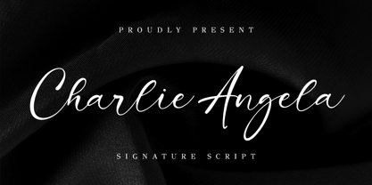 Charlie Angela - Signature Font and classy style, this font is great for your creative projects such as watermark on photography, and perfect for logos & branding, photography, invitation, watermark, advertisements, product designs, stationery, wedding designs, label, product packaging, special events or anything that need handwriting taste. Accessible in the Adobe Illustrator, Adobe Photoshop, Adobe InDesign, even work on Microsoft Word. PUA Encoded Characters - Fully accessible without additional design software. Fonts include multilingual support Cheers!
 - Maraka by Rosario Nocera,
$12.00 Maraka is a handwritten font family, drawn with a paint marker on rough paper, then scanned and turned into vector format. Maraka has a lot of alternative letters and is available in three versions: “Regular”, characterized by an unique look obtained by drawing the letters on a rough sheet, "Solid" and "Serif". Maraka is ideal for large headers, straplines and typographic compositions, but it still gives a great dynamic effect when writing wordy paragraphs.
 - Tocco by Papanapa,
$30.00 Meet the first typographic family designed by Papanapa. Inspired by leftover chunks of wood found in a workshop we conducted with one of our clients, this type carries an elegant and distinctive personality due to its unexpected angles. Tocco is available in 8 weights, from Thin to Black, and it was designed to be used primarily on headlines, titles or small texts. It also supports basic Latin. We hope you enjoy it!
 - Funny Society by NonaNova,
$20.00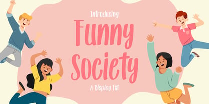 Funny society is a unique handwritten font that has a beautiful touch. This font is perfect for kids designs, branding, invitations, svg designs, logos, birthdays, parties and much more. What's Included : Ligature Uppercase, Lowercase, Numeral and Punctuation, Symbol International Language Works on PC & Mac Simple installations Accessible in the Adobe Illustrator, Adobe Photoshop, Adobe InDesign, even works on Microsoft Word. Thank you for your purchase! Hope you enjoy with our fonts! "NonaNova"
 - Melodi by Diego Berakha,
$20.00 Melodi is the result of years of working with hand made types on my designs. Every time I draw the letters and words that I need for every design piece. One day I decided to go serious and make a real type of it and “Melodi” is the result of this work. It’s a calligraphic font, built using a regular stroke, and carefully crafted to have nice joins between all the letters. It has some playful but stylish capitals that brings lot of personality to the font. It work super nice either in lowercase writing as in all-caps texts. It looks specially good on lists of words or small sentences. Melodi is a playful but very versatile font, it can be used in lots of different scenarios. From creating a logo, writing the tittles of a catalogue or use it in a poster combined with other types (it work really well as counter point of more classical types) to motion graphics animations or advertising work. It can be cute but it also can do hard work!
 - Square Line Icons Insurance by Howcolour,
$17.00 The square icons focus on maximizing the meaning by minimizing the symbols. Let your viewers understand your data without disorientation. Use a metaphorical icon library, designed for fast, intuitive human recognition.


