10,000 search results
(0.034 seconds)
- 1533 GLC Augereau Pro by GLC,
$42.00 This font was inspired by one of Antoine Augereau's three roman typefaces: the Gros Romain (±16 Pts) size, used in 1533 to print Le miroir de l'âme..., a religious poetic compilation by Marguerite de Navarre, sister of the French king François the first. It seems possible that Augereau may have also engraved italic styles. This alphabet, with its complete small caps collection, is covering all West, East and Central European languages (including Baltic and Celtic) and Turkish.
 - Arepo by Stone Type Foundry,
$49.00 Arepo is a display typeface inspired both by the Imperial Roman letter and the forms of Giambattista Bodoni. Together with Stone Print, SFPL, and Cycles it makes up a superfamily of typefaces.
 - Hedonist by Struvictory.art,
$14.00 Hedonist is a modern sans serif. The font is represented by condensed lowercase and extended uppercase. To get an elegant and contemporary design, combine them together. Hedonist is suitable for retro and modern posters, typographic prints, event design and city identity, design of books and magazines.
 - Norwill by Din Studio,
$29.00 Norwill is a modern display font. Made for any professional project especially that related to the sports. Beside that, this font can be used for printing, branding and quotes. Features: PUA Encoded Multilingual Support Numerals and Punctuation Thank you for downloading premium fonts from Din Studio
 - Fastrace by Sealoung,
$15.00 Fastrace is a classic sport font. Made for any professional project especially that related to the sports. Beside that, this font can be used for printing, branding and quotes. Features: PUA Encoded Multilingual Support Numerals and Punctuation Thank you for downloading premium fonts from Sealoung Studio
 - Village by Matteson Typographics,
$19.95 Frederic Goudy’s Village typeface was originally used exclusively for his Village Press publications. Designed in 1903, Village is a Venetian book face with sturdy, open forms. Steve Matteson digitized this typeface from books printed by the Village Press. An excellent companion to any of Goudy’s other typefaces.
 - Verismo by Martin Verstraaten,
$20.00 Verismo (Italian for ‘realism’, from vero, meaning ‘true’) is a genre of operas with scenarios based on contemporary everyday life. This font is inspired by old school sign painting techniques. In addition, the font has a contemporary look and can therefore be used in many different designs.
 - Verismo Inline by Martin Verstraaten,
$20.00 Verismo (Italian for ‘realism’, from vero, meaning ‘true’) is a genre of operas with scenarios based on contemporary everyday life. This font is inspired by old school sign painting techniques. In addition, the font has a contemporary look and can therefore be used in many different designs.
 - Barn Party by Missy Meyer,
$15.00 I'll admit right off the bat here -- I've never been to a party in a barn. I don't even know if they still do barn dances and parties, or if that's something out of the musical Oklahoma! or something. But this font gave me kind of a homey, rustic feel, so the name felt right! Like many of my fonts, this one has been refined with crafters in mind -- smoothed curves and reduced nodes, for easy cutting and printing. It's also packed with over 600 characters total! The usual alphabet, numbers, and punctuation, plus 30 double-letter ligatures, over 300 diacritics, and a full second alphabet coded in as Stylistic Alternates. Enjoy!
 - Ervha by Yukita Creative,
$9.00 Introducing Ervha Modern Sans Serif Typeface Ervha is a modern sans serif font with a minimalist and trendy style. This font has 10 styles from thin to extra black Perfect font for print and digital projects. Quality fonts can help your projects become more modern and classy. This font also supports other languages The clean and sharp lines of sans serif fonts are the main reason many graphic designers prefer this font style for both screen and print use. Clean lines and sharp edges can be displayed more clearly on the screen which improves legibility for users. What do you get when you buy this font? Ervha is one font you need Affordable and versatile Multilingual support and complete character set Designed by a Typeface Designer Get one font for any occasion Multilingual support in this modern sans serif font Well known for its exceptional readability Enhance your Project by using Ervha Sans Serif Modern as your font of choice.
 - Hatchet Job by Wing's Art Studio,
$10.00 Hatchet Job - A Halloween Brush Font Unleashed onto an unsuspecting public this Halloween, Hatchet Job is a brush font inspired by the slasher and cabin-in-the-woods horror movies and comics typical of the 1970s and 80s. This textured all-caps design takes its visual style from old cabins, ghost ships and axe-splintered wood that can only spell danger! With a bold brush strokes and frayed edges, it offers the tools to leave your readers nerves in tatters! The Hatchet Job font family includes all-caps uppercase and lowercase characters, along with numerals, punctuation, symbols and language support. Also included are a complete set of alternative characters and additional paint marks, drips and splashes. Wingsart Studio Design Tip! The uppercase and lowercase characters work great when mixed in an alternating fashion, with shapes that combine to create a dynamic, un-hinged look that's perfect for the Halloween season. Add the alternatives and paint marks into the mix and you'll have yourself a title or header design that looks truly custom-made.
 - Olivine by URW Type Foundry,
$35.00 In an era of typographic neutrality, Pria Ravichandran adds spirit and flavour to the humanist sans, a genre that is known for legibility. Introducing Olivine. Olivine is a versatile type family that performs admirably across sizes. It is designed with maximum care ensuring legibility across various sizes, angles and distances. The sturdy shapes and the exaggerated ink traps fade to produce an even typographic colour and a lively texture in smaller text sizes. In larger display settings, the details become self-conscious and highlight the spectacular quality of the design. Olivine is neither experimental nor minimal, striking a balance between formality and friendliness. Olivine is clean as well as organic at the same time. Consisting of seven weights in roman and italics, the type-family address typographic hierarchy for texts of all kinds and sizes. Distinctive, yet neutral letterforms add personality to the type family. The counter-forms are large and open giving the design plenty of internal space which is balanced against the generous spacing of the characters. These features of Olivine make the reading process enjoyable in digital as well as the print medium. No squinting to read this type-family! If you are looking to add some flavour into your design, try Olivine. It is a trend-setting typeface that we predict is going that extra mile. Try before you buy, Olivine Medium and Medium Italic are available free for unlimited commercial usage.
 - F2F Whale Tree by Linotype,
$29.99Heavy techno music, a personal computer, a font creation program and some inspiration had been the sources to the Face 2 Face font series. Thomas Nagel and his friends had the demand to create new unusual faces that should be used in the leading german techno magazine Frontpage" Even typeset in 6 point to nearly unreadability it was a pleasure for the kids to read and decrypt the messages. WhaleTree is a hommage to Walbaum. The word is a gemanized translation where Wal means Whale and Baum means Tree. :-)" - Freak by HiH,
$10.00 Freak was originally released by The Great Western Type Foundry in 1889. According to Maurice Annenberg, Great Western became Barnhart Brothers & Spindler when the Barnhart brothers bought out the Toepfer family in 1868.The plant superintendent, Charles Spindler, became Secretary of the new firm. Specimen books as late as 1899 show the name Great Western alongside the BB&S name. At some point, prior to 1925, Freak was renamed “Bamboo” by BB&S. It was delisted when BB&S was absorbed by ATF in 1929. Listed in McGrew under “Bamboo”.
 - Brandon Text Condensed by HVD Fonts,
$40.00 Creating the condensed version for the Brandon Text was the missing project to complete the Brandon series. Brandon Text was created as a companion to Brandon Grotesque. When we started to designed Brandon Grotesque Condensed we felt that there should also a condensed counterpart for small sizes; so we made Brandon Text Condensed. While a condensed typeface is not just a squeezed original, we took the Grotesque Condensed as a starting point for the Text Condensed version simultaneously we also kept an eye on Brandon Text to find the perfect missing variables.
 - Slicker - Unknown license

- Typist - Unknown license

- FuturistStencil - Unknown license

- WildWest - Unknown license

- Xpressive - Unknown license

- Frankenberg Pro by RMU,
$35.00 A treasure trove of typographic rarity, found in an old print shop in the Saxon town of Frankenberg, now revived and carefully extended.
 - Venture by Michael Hill Design,
$6.00Venture is an all caps typeface inspired by the great outdoors. Also comes in 2 extra styles, great for that vintage print look! - White Glory by Yumna Type,
$16.00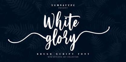 White Glory is a beautiful brush font. The texture from this natural brush font will make your design more beautiful and powerful. This font is suitable for any design like branding, quotes, t-shirt printing and more. Features: Accents (Multilingual Characters) 104 beautiful stylistic alternates PUA encoded Numerals and punctuations (OpenType standard) Design by yumnatype
 - Bandoleer by MADType,
$24.00 The inspiration for this versatile typeface came from both Art Deco and Military sources. It comes with both a clean geometric and hand drawn version so you don't have to get carpal tunnel sketching it out yourself. This typeface is equally at home stenciled with paint on a wall or used on a music poster.
 - HWT Van Lanen by Hamilton Wood Type Collection,
$24.95 In 2002 Matthew Carter was commissioned to create a new design to be cut in wood by the then nascent Hamilton Wood Type Museum. This was significant in that this was the one format for which Carter had not yet designed type. The new design emerged as a two-part chromatic type to be cut specifically in wood. Originally called Carter Latin, the font was renamed Van Lanen after one of the Museum's founders. The first cutting and printing of the type took place in late 2009 and although it has been available through the Museum, contemporary wood-type production is expensive and few have acquired this font in wood. The digital version of the pair of Van Lanen fonts is now available. The design recalls Antique Latin wood type, but with a refined sensibility and intentional quirks (like the sideways ampersand). It is a wonderful addition to Carter's oeuvre, and to the ongoing history of wood type.
 - Yourladies by Balpirick,
$15.00 Yourladies is a Modern Handwritten Font. Yourladies is a sweet and delicate handwritten font. Dainty and joyful, this font will be ideal for writing wedding invitations, cards or any other design that may need a romantic, personalized touch! Yourladies also multilingual support. Enjoy the font, feel free to comment or feedback, send me PM or email. Thank you!
 - Violetail by Balpirick,
$15.00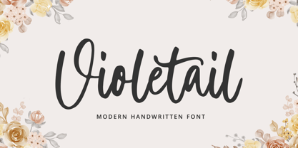 Violetail is a Modern Handwritten Font. Violetail Modern is an elegant and dainty handwritten font that features sweet and delicate swashes. This original look will appeal to a wide range of crafty ideas, from letterheads and titles, to stationery. Violetail also multilingual support. Enjoy the font, feel free to comment or feedback, send me PM or email. Thank you!
 - Librum E by Hackberry Font Foundry,
$24.95 The major focus of my life and ministry at this point is book design. In the brave new world of 21st century self-publishing a new paradigm has arisen: the indie small shop. One of the problems is that all books are published as ebooks, and many books are published only as ebooks. There are two problems with this: character availability and licensing. The licensing problem is solved by including an ebook license with all of the Librum E fonts. The character availability is the core of the design. OpenType features do not work yet with ePUBs [though it is in the spec, if I understand correctly]. Kerning doesn't work, and so on. So these five fonts have only the 256-character [or less] ASCII set. A separate small caps is included. It has lining figures {proportional} and small caps instead of the graphics. The other four fonts have graphics to give bullet choices in lists, oldstyle figures {proportional}, and care given to character shapes so they will work better without kerning. For a great deal, see Librum Book Design Group , for a package containing all fifteen fonts!
 - Saluzzo by Wilton Foundry,
$29.00 The name Saluzzo is given to this font in honor of Giambattista Bodoni (1740–1813). Bodoni was born in the town of Saluzzo, Cuneo, Italy, and died at the age of 30. Saluzzo is a contemporary interpretation of Bodoni, retaining its elegant thin serifs and contrasted with heavy downstrokes. What makes Saluzzo unique is that it was approached from a calligraphic point of view. Also unique in this interpretation is the fact that it is a stencil. Saluzzo is a great choice when you need a font that is contemporary, timeless, and distinctive. Perfect for Advertising, Corporate identities and Packaging design, Fashion, Technology, Hospitality, Travel, and Retail applications. Saluzzo Regular Opentype is a Stencil font that is Contemporary, Distinctive, and Timeless.
 - Scroll by Canada Type,
$24.95Earlier this year, my eyes fell upon a discarded wedding invitation on the sidewalk. A closer look at it revealed that it had at one point been victimized by rain. Some of the fancy script letters were not quite broken, but sort of melted and run-down, while the rest were still somewhat intact. That's how Scroll was conceived, as an idea for a script where thicks and thins blend to produce a wet appearance. Unlike most available broken scripts, the Scroll script was originally drawn in its own juiced context, and not based on any existing script. This font is great for atmospheric antiquity, deep natural poetry, still life captioning, gothic music posters and collateral, or horror literature and poetry covers. - SF Saggar by Sultan Fonts,
$19.99 SF Saggar is an Arabic typeface for Print and screen. Inspired by an alphabet written by the calligrapher and artist Mohamed Said Al-Saggar 40 years ago to simplify Arabic printing. Saggar is from Naskh style and contains 3 weights: Regular, bold and black. SF Saggar is a simple and little detailed font and its three weights are fully harmonized, one letter with one length on the line, and words with a uniform length on the line, gives a comfortable reading look.
 - MSung PRC by Monotype HK,
$523.99 Song style typefaces originated in the age of woodblock printing in Song Dynasty. Being an essential Chinese type style for printing and publishing all since Ming Dynasty. Based on the Kaishu calligraphic script, its structure has evolved, regularised and standardised with thick stems (豎), thin horizontal strokes (橫) and triangular finials. Dots (點), hooks (勾) and downstrokes retained some features of calligraphy, hence an appropriate choice for continuous reading. The typeface is equipped with a variety of stroke weights, all highly legible .
 - Die Bruecke by Hanoded,
$15.00 Die Brücke was a group of German expressionists which formed in Dresden in 1905. Members of the group include Erich Heckel, Fritz Bleyl, Ernst Ludwig Kirchner and Karl Schmidt-Rottluff. Much of the group's work was influenced by primitivism and medieval woodblock printing. Die Bruecke font was based on a printed invitation for an art exhibition from 1906. Although the font is all caps, upper and lower case glyphs differ and can be interchanged. Of course Die Bruecke comes with extensive language support.
 - Prigille Hands by Letterena Studios,
$10.00 Prigille Hands is a modern and clean display (Serif) font create from our talented font designer. The design of Prigille Hands will make your design more beautiful and inspiring. This font will suitable for any project, like branding, print template, logo and etc. This font is inspired by the joining of hands which means good teamwork. Features: Accents (Multilingual characters) Alternates Ligautures PUA encoded Numerals and Punctuation (OpenType Standard)
 - Applbitz by Joey Maul,
$10.00 Applbitz is a set of three pixel style fonts which include a matching set of food related pix fonts. The regular style is a text font, which is optimal at 14 points when used in flash. Applbitz Pix Base and Pix Top are corresponding food related glyphs, with the top providing a bit of detail. These "friendly" pix characters can also be used in flash using some TLC (and snap to pixel grid). They are fun to add your own color combinations, and are great for a variety of food icons. View the PDF file in the gallery for color suggestions. Special note: to dress the hamburger use "{" and "½" (left brace and one-half) from Pix Top.
 - P22 Tai Chi by IHOF,
$24.95 Experimental lettering Stephen Rapp created in 1999 became the spark that Stephen's imagination transformed into the Tai Chi design. Tai Chi is a display face but it could also be used as a textured calligraphic script. Its delightful sense of movement distinguishes it from other scripts. Individual characters stand poised in a vertical Zen-like balance while at the same time displaying an inner rhythm that makes them appear to dance along the line. Rich in texture and variation, Tai Chi works very well at medium and large point sizes. The font contains several alternate letters that help maintain a hand-lettered look. Tai Chi includes both upper and lowercase letters but works well in all uppercase settings.
 - Catsy by Fenotype,
$30.00 Catsy is a cute and curly upright script family. Catsy is great for any kind of display use from packaging to poster to headlines. Catsy makes clear word images but if you want more curly action try Swash, Stylist or Titling Alternates on any OpenType savvy software. If that isn’t enough you can manually select from even more alternates from Glyph Palette: Each version of Catsy contains more than 700 glyphs. Keep Standard Ligatures on for smooth flow. Catsy Printed is a texturised version of Catsy. Catsy Printed also has softer features than Catsy. Catsy Ornaments is a pack of 86 extra swashes, badges, ornaments and swirls designed to play with the font, though they work nice on their own as well. For the best price purchase Catsy Family, Catsy Printed Family or Catsy Complete Family.
 - Evening Gown JNL by Jeff Levine,
$29.00 Evening Gown JNL comes from the lettering displayed on a printed ad for the fictional "Gowns by Roberta" in a scene in the 1935 film of the same name. "Roberta" starred Fred Astaire and Ginger Rogers and was based on the successful 1933 stage play.
 - LTC Winchell by Lanston Type Co.,
$24.95 Winchell is the only identified typeface designed in Buffalo, NY prior to the formation of P22 type foundry. It was created by Edward Winchell of the Matthews-Northrup Printing Works and released by the Inland Type Foundry in 1903. The Winchell typeface was also made in Wood by the Hamilton Manufacturing company in the mid 20th Century. The Winchell typeface is a Clarendon styled slab serif that clearly has the look of a pre-modernist design. E.E. Winchell’s Arts & Crafts tendencies show through in this design
 - Alizé by TypeTogether,
$49.00 Alizé is a three-weight typeface inspired by the chancery italic of the 16th century. It is a high-contrast face, created with syncopations in axes and proportions and subtle irregularities that form a lively and delicate weave, suitable for setting a single word, a special expression, or a short block of prose. The family does not contain a roman, and instead promotes the italic as a primary style, a common printing convention in the 16th and 17th centuries. The italic lowercase predates inclined capitals by about twenty years, and as a nod to this typographic evolution, Alizé’s capitals, small capitals, and figures are very slightly inclined to match the energy of the lowercase. The low x-height and long ascenders and descenders, features associated with finesse and luxury, are reminiscent of the Venetian-style italic, but are further emphasised. Unlike the Venetian italic, however, Alizé has a sharp slope, giving a prominent sweep across the page (alizé is the name of trade wind). Each font of Alizé has a character set count of exceeding 700, and contains an abundance of ligatures, dynamic fractions, ornaments, and pan-European language support. They have also been manually hinted for the highest-quality display on both print and screen.


