10,000 search results
(0.06 seconds)
- Zirphy by ActiveSphere,
$30.00 Zirphy is a rounded geometric display font and works best in display applications, such as posters, headline, magazine, product branding, corporate branding, signage, logos and titles. Each style has a full upper and lower-case, accents, punctuation and a selection of monetary symbols.
 - Calliretta by Ditatype,
$29.00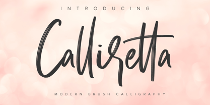 Calliretta is a modern handwritten font. With a classy and natural handwritten style, it brings a classy and chic typeface. Calliretta is best used for weddings, branding, logotype, and quotes. Includes: - Calliretta (OTF) Features: - Beautiful Ligatures - PUA Encoded - Multilingual Support - Numerals and Punctuation
 - Wernardio by Ditatype,
$29.00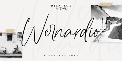 Wernardio is a modern handwritten font. With a classy and natural handwritten style, it brings a classy and chic typeface. Wernardio is best used for weddings, branding, logotype, and quotes. Includes: - Wernardio (OTF) Features: - Beautiful Ligatures - PUA Encoded - Multilingual Support - Numerals and Punctuation
 - Smoothest by Ditatype,
$29.00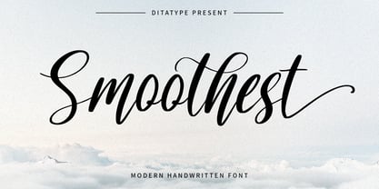 Smoothest is a modern handwritten font. With a classy and natural handwritten style, it brings a classy and chic typeface. Smoothest is best used for weddings, branding, logotype, and quotes. Features: - Beautiful Ligatures - Beautiful Swash - PUA Encoded - Multilingual Support - Numerals and Punctuation
 - Punk Head by Ditatype,
$29.00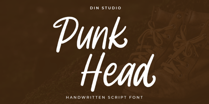 Punk Head is a handwritten font. With a natural and beautiful handwritten style, it brings a classy and chic typeface. Chalk Brush is best used for branding, logotype, and quotes. Includes: - Punk Head (OTF) Features: - Alternates - PUA Encoded - Multilingual Support - Numerals and Punctuation
 - Marlyna by Yumna Type,
$16.00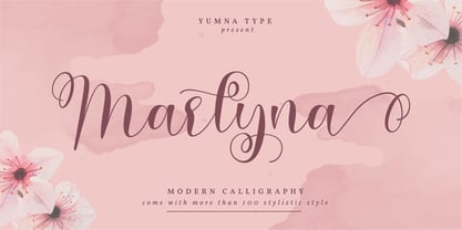 Marlyna is a beautiful and modern script. It brings a beautiful and modern typeface that best used for weddings, branding, logotype, and quotes. Featured : Beautiful Ligatures Beautiful Alternates + Swashes PUA Encoded Multilingual Support Numerals and Punctuation Beginning Swash and Ending Swashes (a-z)
 - Astrospy JNL by Jeff Levine,
$29.00Astrospy JNL is a square-shaped, futuristic techno-style font from Jeff Levine. It is very well suited for short phrases, but caution should be used in setting too many words with it because of legibility issues. Best used in larger point sizes. - Stephanie by ActiveSphere,
$30.00 Stephanie is a rounded geometric display font and works best in display applications, such as posters, headline, magazine, product branding, corporate branding, signage, logos and titles. Each style has a full upper and lower-case, accents, punctuation and a selection of monetary symbols.
 - Le Barche by Ditatype,
$29.00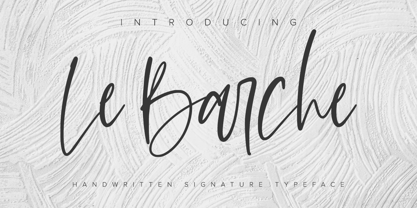 Le Barche is a modern handwritten font. With a classy and natural handwritten style, it brings a classy and chic typeface. Le Barche is best used for weddings, branding, logotype, and quotes. Features: - Beautiful Ligatures - PUA Encoded - Multilingual Support - Numerals and Punctuation
 - Cartager by Ditatype,
$29.00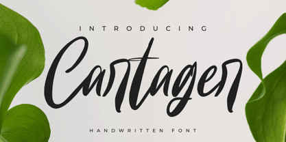 Cartager is a modern handwritten font. With a classy and natural handwritten style, it brings a classy and chic typeface. Cartager is best used for weddings, branding, logotype, and quotes. Includes: - Cartager (OTF) Features: - Beautiful Ligatures - PUA Encoded - Multilingual Support - Numerals and Punctuation
 - Better Saturday by Din Studio,
$29.00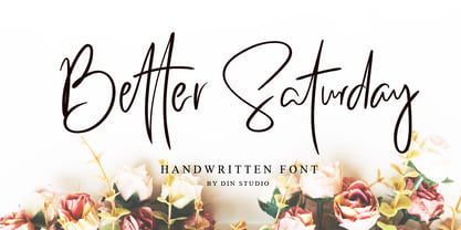 Introducing Better Saturday for your better work. With a classy and natural handwritten style, it brings a classy and chic typeface. Better Saturday is best used for weddings, branding, logotype, and quotes. Features: Beautiful Ligatures PUA Encoded Multilingual Support Numerals and Punctuation
 - Alissian by Ditatype,
$29.00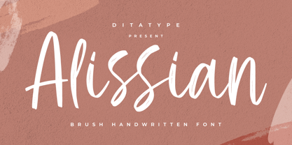 Alissian is a modern handwritten font. With a classy and natural handwritten style, it brings a classy and chic typeface. Alissian is best used for weddings, branding, logotype, and quotes. Includes: - Alissian (OTF) Features: - Beautiful Ligatures - PUA Encoded - Multilingual Support - Numerals and Punctuation
 - Perisland by Ditatype,
$29.00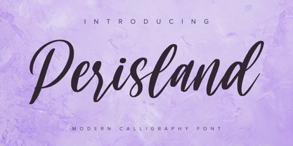 Perisland is a modern handwritten font. With a classy and natural handwritten style, it brings a classy and chic typeface. Perisland is best used for weddings, branding, logotype, and quotes. Includes: Perisland (OTF) Features: Beautiful Ligatures PUA Encoded Multilingual Support Numerals and Punctuation
 - Rocker stage by Jehansyah,
$9.00 This font is very beautiful if we combine it into a design that wants to appear bold, bold and unique, there are several alternatives that you can use to make this font as support for your design project.
 - Erotica by Lián Types,
$49.00 “A picture is worth a thousand words” and here, that’s more than true. Take a look at Erotica’s Booklet; Erotica’s Poster Design and Erotica’s User’s Guide before reading below. THE STYLES The difference between Pro and Std styles is the quantity of glyphs. Therefore, Pro styles include all the decorative alternates and ligatures while Std styles are a reduced version of Pro ones. Big and Small styles were thought for better printing results. While Big is recommended to be printed in big sizes, Small may be printed in tiny sizes and will still show its hairlines well. INTRODUCTION I have always wondered if the circle could ever be considered as an imperfect shape. Thousands of years have passed and we still consider circles as synonyms of infinite beauty. Some believe that there is something intrinsically “divine” that could be found in them. Sensuality is many times related to perfectly shaped strong curves, exuberant forms and a big contrasts. Erotica is a font created with this in mind. THE PROCESS This story begins one fine day of March in 2012. I was looking for something new. Something which would express the deep love I feel regarding calligraphy in a new way. At that time, I was practicing a lot of roundhand, testing and feeling different kinds of nibs; hearing the sometimes sharp, sometimes soft, sound of them sliding on the paper. This kind of calligraphy has some really strict rules: An even pattern of repetition is required, so you have to be absolutely aware of the pressure of the flexible pen; and of the distance between characters. Also, learning copperplate can be really useful to understand about proportion in letters and how a minimum change of it can drastically affect the look of the word and text. Many times I would forget about type-design and I would let myself go(1): Nothing like making the pen dance when adding some accolades above and below the written word. Once something is mastered, you are able to break some rules. At least, that’s my philosophy. (2) After some research, I found that the world was in need of a really sexy yet formal copperplate. (3) I started Erotica with the idea of taking some rules of this style to the extreme. Some characters were drawn with a pencil first because what I had in mind was impossible to be made with a pen. (4) Finding a graceful way to combine really thick thicks with really thin hairlines with satisfactory results demanded months of tough work: The embryo of Erotica was a lot more bolder than now and had a shorter x-height. Changing proportions of Erotica was crucial for its final look. The taller it became the sexier it looked. Like women again? The result is a font filled with tons of alternates which can make the user think he/she is the actual designer of the word/phrase due to the huge amount of possibilities when choosing glyphs. To make Erotica work well in small sizes too, I designed Erotica Small which can be printed in tiny sizes without any problems. For a more elegant purpose, I designed Erotica Inline, with exactly the same features you can find in the other styles. After finishing these styles, I needed a partner for Erotica. Inspired again in some old calligraphic books I found that Bickham used to accompany his wonderful scripts with some ornated roman caps. Erotica Capitals follows the essentials of those capitals and can be used with or without its alternates to accompany Erotica. In 2013, Erotica received a Certificate of Excellence in Type Design in the 59th TDC Type Directors Club Typeface Design Competition. Meet Erotica, beauty and elegance guaranteed. Notes (1) It is supossed that I'm a typographer rather than a calligrapher, but the truth is that I'm in the middle. Being a graphic designer makes me a little stubborn sometimes. But, I found that the more you don't think of type rules, the more graceful and lively pieces of calligraphy can be done. (2) “Know the forms well before you attempt to make them” used to say E. A. Lupfer, a master of this kind of script a century ago. And I would add “And once you know them, it’s time to fly...” (3) Some script fonts by my compatriots Sabrina Lopez, Ramiro Espinoza and Alejandro Paul deserve a mention here because of their undeniable beauty. The fact that many great copperplate fonts come from Argentina makes me feel really proud. Take a look at: Parfumerie, Medusa, Burgues, Poem and Bellisima. (4) Some calligraphers, graphic and type designer experimented in this field in the mid-to-late 20th century and made a really playful style out of it: Letters show a lot of personality and sometimes they seem drawn rather than written. I want to express my sincere admiration to the fantastic Herb Lubalin, and his friends Tony DiSpigna, Tom Carnase, and of course my fellow countryman Ricardo Rousselot. All of them, amazing.
 - 112 Hours by Device,
$9.00 Rian Hughes’ 15th collection of fonts, “112 Hours”, is entirely dedicated to numbers. Culled from a myriad of sources – clock faces, tickets, watches house numbers – it is an eclectic and wide-ranging set. Each font contains only numerals and related punctuation – no letters. A new book has been designed by Hughes to show the collection, and includes sample settings, complete character sets, source material and an introduction. This is available print-to-order on Blurb in paperback and hardback: http://www.blurb.com/b/5539073-112-hours-hardback http://www.blurb.com/b/5539045-112-hours-paperback From the introduction: The idea for this, the fifteenth Device Fonts collection, began when I came across an online auction site dedicated to antique clocks. I was mesmerized by the inventive and bizarre numerals on their faces. Shorn of the need to extend the internal logic of a typeface through the entire alphabet, the designers of these treasures were free to explore interesting forms and shapes that would otherwise be denied them. Given this horological starting point, I decided to produce 12 fonts, each featuring just the numbers from 1 to 12 and, where appropriate, a small set of supporting characters — in most cases, the international currency symbols, a colon, full stop, hyphen, slash and the number sign. 10, 11 and 12 I opted to place in the capital A, B and C slots. Each font is shown in its entirety here. I soon passed 12, so the next logical finish line was 24. Like a typographic Jack Bauer, I soon passed that too -— the more I researched, the more I came across interesting and unique examples that insisted on digitization, or that inspired me to explore some new design direction. The sources broadened to include tickets, numbering machines, ecclesiastical brass plates and more. Though not derived from clock faces, I opted to keep the 1-12 conceit for consistency, which allowed me to design what are effectively numerical ligatures. I finally concluded one hundred fonts over my original estimate at 112. Even though it’s not strictly divisible by 12, the number has a certain symmetry, I reasoned, and was as good a place as any to round off the project. An overview reveals a broad range that nonetheless fall into several loose categories. There are fairly faithful revivals, only diverging from their source material to even out inconsistencies and regularize weighting or shape to make them more functional in a modern context; designs taken directly from the source material, preserving all the inky grit and character of the original; designs that are loosely based on a couple of numbers from the source material but diverge dramatically for reasons of improved aesthetics or mere whim; and entirely new designs with no historical precedent. As projects like this evolve (and, to be frank, get out of hand), they can take you in directions and to places you didn’t envisage when you first set out. Along the way, I corresponded with experts in railway livery, and now know about the history of cab side and smokebox plates; I travelled to the Musée de l’imprimerie in Nantes, France, to examine their numbering machines; I photographed house numbers in Paris, Florence, Venice, Amsterdam and here in the UK; I delved into my collection of tickets, passes and printed ephemera; I visited the Science Museum in London, the Royal Signals Museum in Dorset, and the Museum of London to source early adding machines, war-time telegraphs and post-war ration books. I photographed watches at Worthing Museum, weighing scales large enough to stand on in a Brick Lane pub, and digital station clocks at Baker Street tube station. I went to the London Under-ground archive at Acton Depot, where you can see all manner of vintage enamel signs and woodblock type; I photographed grocer’s stalls in East End street markets; I dug out old clocks I recalled from childhood at my parents’ place, examined old manual typewriters and cash tills, and crouched down with a torch to look at my electricity meter. I found out that Jane Fonda kicked a policeman, and unusually for someone with a lifelong aversion to sport, picked up some horse-racing jargon. I share some of that research here. In many cases I have not been slavish about staying close to the source material if I didn’t think it warranted it, so a close comparison will reveal differences. These changes could be made for aesthetic reasons, functional reasons (the originals didn’t need to be set in any combination, for example), or just reasons of personal taste. Where reference for the additional characters were not available — which was always the case with fonts derived from clock faces — I have endeavored to design them in a sympathetic style. I may even extend some of these to the full alphabet in the future. If I do, these number-only fonts could be considered as experimental design exercises: forays into form to probe interesting new graphic possibilities.
 - Black Bolder by Hanzel Space,
$25.00 Black Bolder uses a font with a solid and strong impression. These letters are usually tall, bold, and easy to read considering that they are very suitable to be placed as titles, logos, labels, brands, advertisements, magazines or pamphlets. This font is easy to use to complement your work solutions. To enable the OpenType Stylistic alternates, you need a program that supports OpenType features such as Adobe Illustrator CS, Adobe Indesign & CorelDraw X6-X7.
 - Bumbon by Luxfont,
$18.00 Introducing unusual Sans Serif font family. Font is concise and minimalistic. But behind the apparent simplicity of the font is hidden the original feature in the form of modernized uppercase glyphs, which can be used as an accent in the header or logo. Pure letterings with excellent readability have 2 thicknesses. Font will emphasize the high status of the business and complement modern branding design, and the general versatility of the font provides for its widespread use in various directions and is combined with different styles in design. Balanced glyphs will fit into the typographic design and will not distract attention from the main point. Features: Bold, Bold Italic, Regular, Regular Italic Upgraded uppercase letters Kerning ld.luxfont@gmail.com
 - Ctoxina by FSdesign-Salmina,
$39.00 The Ctoxina family is growing. Due to the success the author decided to add an outline version of the font. The typeface is now available in 6 different styles: light, light italic, regular, italic, bold and bold italic. The Atoxina family is designed especially for the burgeoning market of starships and other space cruisers. The fonts are ideal for internal and external use (including zero-g and occasional bursts of cosmic rays), and with their simplified forms are expected to survive well in non-linear galaxies. With their unusual diagonal half-pixels the fonts are striking as abstract designs at astronomical sizes, where small text may be placed within the black holes formed inside the letters.
 - Shaky Hand Some Comic by TypoGraphicDesign,
$19.00 CHARACTERISTICS The kiddy and warmly character and the cute, huge points (amongst others punctuation), gives the typeface a high recognition value and uniqueness. APPLICATION AREA The warm, child-like, bold and striking sans serif font »Shaky Hand Some Comic« would look good at display size for headlines in magazines or websites, posters, packaging, covers or webbanner. TECHNICAL SPECIFICATIONS Headline Font | Display Font | Sans Serif Font »Shaky Hand Some Comic« OpenType Font with 340 glyphs alternative letters and ligatures (with accents & €) & 3 styles (regular, bold & 3d)
 - Killer Ants by Cool Fonts,
$24.00 There are two versions of Killer Ants, regular and bold. Regular is a very cool cracked up looking font that will be great for all kinds of stuff. Bold is on of the most distressed fonts I've ever seen - there's crap everywhere - adjust your leading (line spacing) so the grunge overlaps and you have one awesome effect. Yes, those dots are actually smashed ants. Killer!
 - NorB Marker by NorFonts,
$28.00 NorB Marker is a handwritten text font emulating a marker pen. The fonts set can be used with any word processing program for text and display use, print and web projects, apps and ePub, comic books, graphic identities, branding, editorial, advertising, scrapbooking, cards and invitations and any casual lettering purpose… or even just for fun! The fonts set features 4 weights: Regular Italic Bold Bold Italic
 - FeggoliteMono by Ingrimayne Type,
$6.95 FeggoliteMono is a decorative, monospaced typeface family with a small x-height and long descenders. Two styles (plain and bold but renamed in 2020 as light and regular) were created in 1994 and revised in 2010. In 2020 a bolder bold was added along with italics versions for each of the three weights. The design was an attempt to create a decorative typewriter font.
 - Havelock Titling by XO Type Co,
$40.00 Havelock Titling builds upon the essential geometry of Havelock , adding new weights for spacious, authoritative text. Made to combine with Havelock’s display capabilities for more traditional reading scenarios. Built on the same weight range as Rocinante Titling , which broadens your design options. Light matches Light, Bold matches Bold, and so on. Both Havelock and Havelock Titling collections are included in Havelock Complete for a lower price.
 - Octavia VV by STARSsoft,
$10.90 The "Octavia VV" font family includes Regular, Italic, Bold, and Bold Italic fonts. Sans serif font type. The whole font family includes a large set of additional characters and letters with diacritics. Standard and Latin Extended support such languages - English, Danish, Spanish, German, Norwegian, Polish, Portuguese, French, Swedish. Standard and extended Cyrillic are supported by languages - Russian, Belarusian, Bulgarian, Macedonian, Serbian, Ukrainian, Kazakh, Kyrgyz.
 - State Wide by Arkitype,
$10.00 Say hello to State, this family is inspired by sport and a further development on Comply Slab. This family of fonts has some bold letters as well as stylistic alternates to give your layouts some interesting variation. State comes in 3 styles, Regular, Soft and Rough each with 7 weights and italics. It was specifically designed with a wider structure for better appearance in small sizes and the extra attention to the detail was needed for the big sizes. Use State to get the delivery you need, whether its for print, online or Television.
 - Mister Honey by Alit Design,
$18.00 Introducing Mister Honey Typeface Mister Honey Typeface is inspired by the classic victorian font style combined with western style which makes the Mister Honey font look cool and unique. This font is perfect for a bold and vintage Victorian concept design. Can be used for the design of alcoholic beverage packaging, pomade designs, barbershops and so on with the Victorian classic concept. Apart from that this font is very easy to use in both design and non-design programs because all alternates and glyphs are supported by Unicode (PUA).
 - Dx Grove by Dirtyline Studio,
$20.00 introducing Dx Grove, a vintage-inspired font that seamlessly blends nostalgia with elegance, making it the perfect choice for your design projects. This timeless serif font comes in 4 Style regular and Condensed including the italic too. offering you versatility and style for your graphic design, branding, and packaging projects. Capture the essence of the past with Dx Grove free-spirited vintage charm, bringing a touch of yesteryear to your creations. Ideal for wedding invitations, branding, or projects that need nostalgic 90’s font aesthetics, this hand-drawn typeface is bold and versatile.
 - Ephemera Egyptian by Ephemera Fonts,
$20.00 Egyptian ephemera is a typeface inspired from basic block lettering, widely used in art and craft of sign writing. 5 styles available from light to bold. and for the first time it is also available as variable fonts. One of the uniqueness of this font is the small spur on each stem, and the terminal, which intends to simulate an entry and end brush stroke. OpenType features support such as Smallcaps, Tabular Figure, Superscript, and 2 alternate of ampersands. This typeface was created for Display needs, such as headlines, signage, logotype, badges design, packaging, etc.
 - Lanoline Script by Letterhend,
$16.00 Please meet Lanoline, a playful script typeface. As you can see, this typeface has a casual look yet still looks bold and stands out from the crowd. The swashes make the font looks even more unique. You can play around and mix and match the swashes, combining into a great logotype! Lanoline works perfect for you who needs a typeface for headline, logotype, apparel, invitation, branding, packaging, advertising and more. This typeface comes in uppercase, lowercase, with punctuation, symbols, numerals, stylistic set alternate, ligatures, and also support multilingual.
 - Monster Truck by Alphabet Agency,
$15.00 Monster Truck is a dominant looking bold italic font inspired by extreme sports. The 'in your face' presence of this font is ideal for use in designs looking to snatch people's attention especially in serious competitive sports, fitness, bodybuilding, toys and car wrap designs. The non-apologetic sharp edged spoiler like serifs, straight edges and bevel corners have made this one of the foundry's most popular fonts. The font is all caps and fufills MyFonts character requirements that include a large number of characters including numbers, punctuation and Latin international characters.
 - Racetrack by Type Innovations,
$39.00 Racetrack is the work of American type designer, Alex Kaczun, and was conceived as a result of developing a logo for a client. Alex was experimenting with a uniform grid pattern, outline and inline, connecting the dots which lead to this interesting typeface effect. Racetrack is a bold display font, which also works well at many point sizes. It has a futuristic appeal with straight lines and sharp corners. The uniform strokes, inline treatment and symmetry make for a powerful headline. The applications for this font design are endless.
 - Melon Honey by Alit Design,
$19.00 Introducing Melon Honey Typeface Melon Honey Typeface is inspired by the classic victorian font style combined with western style which makes the Melon Honey font look cool and unique. This font is perfect for a bold and vintage Victorian concept design. Can be used for the design of alcoholic beverage packaging, pomade designs, barbershops and so on with the Victorian classic concept. Apart from that this font is very easy to use in both design and non-design programs because all alternates and glyphs are supported by Unicode (PUA).
 - Recording Artist JNL by Jeff Levine,
$29.00 When 45 RPM records were the norm for a teenager’s music collection in the 1950s and 1960s, many discs had their labels printed by letterpress. Some record companies utilized a bold, condensed typeface set in all caps for the song’s title and other pertinent information. The digital version of this font is called Recording Artist JNL, and is available in both regular and oblique versions. A companion font loosely based on this type design [but with more original characters and a slightly lighter weight] is Promotional Copy JNL.
 - Heidar by Craft Supply Co,
$17.00 Unveil the Bold Elegance Serif Font – Where letters stand strong, strokes exude confidence, and design speaks with authority. Elevate your creations with this typographic powerhouse that turns words into captivating stories. This typeface is ideal for greeting card, packaging, brand identity, poster, or any purpose to make your art/design project look eye catching and trendy. Feel free to play with this typeface!
 - Charriot Deluxe by Jelloween,
$-Charriot Deluxe was released in early 2006 at deviantArt.com - where it received a Daily Deviation frontpage feature - and daFont.com. It has already been downloaded over 20.000 times and now it's your turn to try this sexy pixelfont, absolutely free of charge! Charriot Deluxe has all letters, numbers, punctuation and (currency) symbols to suit your needs and is best used at (any multiple) of size 10pt without anti-aliasing. - Artistic Sigature by HKL Studio,
$19.00 Artistic Signature is a modern, handwritten font with a magical emphasis. This font is perfect for creating signature logos and watermarks for photography studios or wedding invitations, best for signatures or initial logo branding. Artistic Signature includes a full set of beautiful handwritten upper and lower case letters, numbers, various punctuation and binding. All lowercase letters including initial and final strokes, have 54 bindings that give a realistic handwriting style.
 - White Star by Din Studio,
$29.00 Introducing White Star for your amazing design projects. With a elegant and natural handwritten style, it brings beauty and chic to your designs. White Star is best used for logotype, branding, wedding and quotes. Features: Beautiful Ligatures PUA Encoded Multilingual Support Numerals and Punctuation Note: Every swash and ligatures is already included in White Star I hope your design projects will be more beautiful with this White Star. Thank You!
 - Romantic Dates by Putracetol,
$28.00 Introducing a beautiful romantic script font called "Romantic Dates", a special fonts for valentine and wedding events. Come with open type feature with a lot of alternates and end swash, its help you to make great lettering. Romantic Dates best uses for valentine, wedding, invitation, heading, cover, poster, logos, quotes, product packaging, header, merchandise, social media & greeting cards and many more. This font is also support multi language.
 - Prat Prachim MF by Masterfont,
$59.00 Fluent, expressive calligraphy. Great rhythm of childish, comics like brush strokes. OpenType Pro Excellent support for Niqqud (Vowels). All marks are programmed to fit each glyph's shape and width. OpenType Pro includes new advanced features like Dagesh Hazak, ShevaNa, Qamatz Katan, Holam Haser and wide letters. Best used with Adobe InDesign CC that support complex Hebrew text. Please check these advanced features in this link: https://tinyurl.com/ybgdsxme