10,000 search results
(0.107 seconds)
- Torino by ITC,
$39.00The Torino font family was designed by Alessandro Butti in 1908 for the Nebiolo foundry in Turin. Torino is a narrow face in the Bold weight; the condensed weight is so narrow that it should be used in over 14pt. - Wrong by Monotype,
$15.99 Wrong is all about the improv. Made with tape segments this font has a real DIY feel to it. It’s bold, solid and square-jawed. Its modular appearance gives it a constructed strength and it's available with two sets of caps and stacks of attitude as standard.
 - Flighter by Mans Greback,
$59.00 Flighter is a bold sans-serif typeface, in a somewhat geometric and balanced style. It has speed and stability and should bring the thoughts to a mid 20th century traveler. Created by Måns Grebäck in 2017-2018, this high-quality font has support for hundreds of languages.
 - Palatine by Larin Type Co,
$14.00 Palatine - this bold display typeface is a stylish and original, multipurpose font in a modern style with many alternatives, ligatures and swash that are very attractive, with their help you can make your project unique. And also use the main set to highlight exactly what you need.
 - Bilbao by Borutta Group,
$29.00 Bilbao is a hybrid between sans, slab and mono fonts with geometric details. This typeface is defined by multiple features, which give it a friendly feeling. Bilbao is perfect for branding and display purposes. The entire family consist of 18 styles with italics from Thin to Bold.
 - Persephone NF by Nick's Fonts,
$10.00A bold headline font with a decidedly Greek flavor, based on an ATF font called Pericles. A great alternative to Lithos or Lithograph. Both versions of this font contain the Unicode 1252 Latin and Unicode 1250 Central European character sets, with localization for Romanian and Moldovan. - Redshine by Sign Studio,
$15.00 Redshine is a neat and bold script font. It has swash glyphs and alternate characters which will give you convenience when choosing a character for each design project. This font is PUA encoded which means you can access all of the glyphs and swashes with ease.
 - Peachy Mochi by Awan Senja,
$14.00 Introducing our newest cute typeface, Peachy Mochi, a Bold Quirky font. This font perfectly made to be in poster funny, and the other various formal forms such as invitations, labels, logos, magazines, books, packaging, fashion, make up, stationery, novels, labels or any type of advertising purpose.
 - Havilnar by Daily Studio,
$14.00 Havilnar is a modern bold font designed by Daily Studio. Havilnar typeface is very suitable for use in making headlines, branding, cover designs, and posters. The round edge and smooth surfaces make your projects look stunning. This font has over 200 glyphs with multilingual letters included.
 - Shabon Dama by Abdulrhman Saeed,
$19.99 Shabon Dama is a cheerful fun Arabic typeface, it bridges the gap between formal and fun, thus keeping it readable. It fits well with video games rated for everyone, kids comics and books, and cheerful marketing. Featuring three weights: Light, Regular, and Bold. ARABIC CHARACTERS ONLY.
 - Elephantmen by Comicraft,
$19.00 Worn and torn, dry and cracked, resistant to wind and rain... the skin of the elephant is a thing of dry beauty and ancient wisdom... During the gold rush, the phrase “Seeing the elephant” became synonymous with the high cost of each prospector’s dreams and hopes --- not only the prospect of wealth beyond the dreams of avarice in California but also the possibilities of encountering misfortune on the journey. Like the circus elephant, gold was an exotic sight, and seeking it was an unequalled experience, the adventure of a lifetime. Now we've created a font much like the skin of an Elephant and Adventure, Excitement and Really Wild Things are available in the pages of the comic book of the same name, Elephantmen.
 - Ma Braille by Echopraxium,
$5.00 The "Ma" in "Ma Braille" is used as a minimalist way to say "Negative Space". "Ma" in japanese arts is an "esthetical usage of emptiness". Thus this font explicits the negative space around visible braille dots in each glyph. A. Font user guide a.1. Lowercase glyphs { A..Z } In these glyphs, dots are represented as "black squares" while the negative space is displayed as 1 or 2 white filled polygons. a.2. Uppercase glyphs { a..z } In these glyphs, dots are represented as "white squares" while the negative space is displayed as 1 or 2 black filled polygons. a.3. Digits: they are just the same than a..j, but the "North US version" is also provided in ascii codes 0xE0..0xE4 (1..5) and 0xE7..0xEB (6..0). a.5. "Dashed Border": a.5.1. "Black dashed" border glyphs; { £, ¥, µ, Â, Ä, Ê, Ë, Î, Ï, Ô } a.5.2. "White dashed" border glyphs; { Ö, Õ, °, ô, ö, î, ï, û, u, õ } B. Posters Poster 1: "Font Logo" version 1, it displays "Ma Braille" text surrounded by the "black dashed border" glyphs. Poster 2: "Font Logo" version 2, it displays "MA" glyphs in big size and smaller "Braille" glyphs within "M" and within "A" as well. Poster 3: the classical pangram to test a font "The Quick Brown Fox jumps over the Lazy dog". Poster 4: Article 1 of the Human Rights: All human beings are born free and equal in dignity and rights. They are endowed with reason and conscience and should act towards one another in a spirit of brotherhood. Poster 5: the "Glyph set" (Border glyphs not included) with A..Z, a..z, digits and special characters.
 - Haigrast Serif by Mans Greback,
$59.00 Haigrast Serif is a font that combines classic and modern design elements to create a look that is both tasteful and fashion-forward. This serif font is regular but with a very modern feel, making it the perfect choice for designers looking to add a touch of sophistication to their work. The sharp, crisp lines and swash alternates in addition to the decorative letterings add a unique touch, making Haigrast Serif a versatile font that can be used in a variety of projects. Whether you're creating a stylish magazine layout, a cool fashion logo, or a balanced design piece, Haigrast Serif is the perfect font to make your work stand out. Designed by Mans Greback in 2023, this font is the perfect choice for designers who want to make a bold statement in their design work. The Haigrast Script family consists of six high-quality fonts: Regular, Italic, Bold, Bold Italic, Black and Black Italic The font is built with advanced OpenType functionality and has a guaranteed top-notch quality, containing stylistic and contextual alternates, ligatures and more features; all to give you full control and customizability. It has extensive lingual support, covering all Latin-based languages, from Northern Europe to South Africa, from America to South-East Asia. It contains all characters and symbols you'll ever need, including all punctuation and numbers.
 - Xutwef by Twinletter,
$17.00 Say hello to Xutwef, a superhero-style display font that will emphasize the strong and bold message of your projects. Whether in the world of film, gaming, or design, Xutwef is the perfect solution for creating extraordinary and eye-catching looks. With tough and bold characters, Xutwef presents a strong and eye-catching theme. Each letter is filled with inspiring power, taking your project to another level and creating an unforgettable impression on the audience. Xutwef offers not only a bold style but also special features that enhance your creativity. With the available ligatures and alternative characters, you can explore a variety of unique and interesting typography combinations. Apart from that, this font also supports multiple languages, allowing you to present a strong message to an international audience. Join the greatness of Xutwef and let your projects shine. With its incredible superhero style and superior features, this font will amplify your message and create an unforgettable impression. Don’t miss the chance to own Xutwef and turn your every design into an inspiring and impressive masterpiece. What’s Included : File font All glyphs Iso Latin 1 Alternate, Ligature Simple installations We highly recommend using a program that supports OpenType features and Glyphs panels like many Adobe apps and Corel Draw so that you can see and access all Glyph variations. PUA Encoded Characters – Fully accessible without additional design software. Fonts include Multilingual support
 - Bodoni Classic Ad by Wiescher Design,
$55.00 I became interested in designing Bodoni Classic because of a lazy graphic designer at Jacques Damase publishing house. He had to change a single letter on a bookcover about J. B. BODONI. The French call him Jean Baptiste instead of Giambattista! And that unknown graphic designer just took any old “J” from some newly cut Bodoni. All the new Bodoni cuts have square serifs, whereas the originals had rounded serifs and slightly concave feet. The single letter “J” with the squared off serif was for me like a road sign to start redesigning the entire Bodoni family. That’s exactly what I started in 1993 and a dozen years later I am finished. Okay, I am still adding new Bodoni Classics, but those are my personal additions. Yours very retro, Gert Wiescher
 - Bodoni Classic Initials by Wiescher Design,
$55.00 I became interested in designing Bodoni Classic because of a lazy graphic designer at Jacques Damase publishing house. He had to change a single letter on a bookcover about J. B. BODONI. The French call him Jean Baptiste instead of Giambattista! And that unknown graphic designer just took any old “J” from some newly cut Bodoni. All the new Bodoni cuts have square serifs, whereas the originals had rounded serifs and slightly concave feet. The single letter “J” with the squared off serif was for me like a road sign to start redesigning the entire Bodoni family. That’s exactly what I started in 1993 and a dozen years later I am finished. Okay, I am still adding new Bodoni Classics, but those are my personal additions. Yours very retro, Gert Wiescher
 - Bodoni Classic Chancery by Wiescher Design,
$55.00 I became interested in designing Bodoni Classic because of a lazy graphic designer at Jacques Damase publishing house. He had to change a single letter on a bookcover about J. B. BODONI. The French call him Jean Baptiste instead of Giambattista! And that unknown graphic designer just took any old “J” from some newly cut Bodoni. All the new Bodoni cuts have square serifs, whereas the originals had rounded serifs and slightly concave feet. The single letter “J” with the squared off serif was for me like a road sign to start redesigning the entire Bodoni family. That’s exactly what I started in 1993 and a dozen years later I am finished. Okay, I am still adding new Bodoni Classics, but those are my personal additions. Yours very retro, Gert Wiescher
 - Bodoni Classic Text by Wiescher Design,
$55.00 I became interested in designing Bodoni Classic because of a lazy graphic designer at Jacques Damase publishing house. He had to change a single letter on a bookcover about J. B. BODONI. The French call him Jean Baptiste instead of Giambattista! And that unknown graphic designer just took any old “J” from some newly cut Bodoni. All the new Bodoni cuts have square serifs, whereas the originals had rounded serifs and slightly concave feet. The single letter “J” with the squared off serif was for me like a road sign to start redesigning the entire Bodoni family. That’s exactly what I started in 1993 and a dozen years later I am finished. Okay, I am still adding new Bodoni Classics, but those are my personal additions. Yours very retro, Gert Wiescher
 - Bodoni Classic Hand by Wiescher Design,
$55.00 I became interested in designing Bodoni Classic because of a lazy graphic designer at Jacques Damase publishing house. He had to change a single letter on a bookcover about J. B. BODONI. The French call him Jean Baptiste instead of Giambattista! And that unknown graphic designer just took any old “J” from some newly cut Bodoni. All the new Bodoni cuts have square serifs, whereas the originals had rounded serifs and slightly concave feet. The single letter “J” with the squared off serif was for me like a road sign to start redesigning the entire Bodoni family. That’s exactly what I started in 1993 and a dozen years later I am finished. Okay, I am still adding new Bodoni Classics, but those are my personal additions. Yours very retro, Gert Wiescher
 - ITC Clearface by ITC,
$45.99 The Clearface types were originally designed by Morris Fuller Benton in 1907. Their forms expressed the Zeitgeist of the turn of the 20th century; typical and distinguishing characteristics are the forms of the a" and the "k." The ATF version did not include an accompanying Italic. In 1978, ITC's Victor Caruso was licensed by ATF to develop a new serif typeface and matching italic based on the forms of Clearface. The result was ITC Clearface, a serif typeface with marked stroke contrast and italic weights. The teardrop-formed endings of the lowercase a, c and f (also found in Caslon) define the character of the face. The type's design is also distinguished by its small -- almost slab -- serifs, a large x-height, and little stroke contrast. ITC Clearface, with its historical touch, is good for both texts and headlines, but its slightly condensed nature performs at its best when it is allowed its space.
 - Mangerica by Ndiscover,
$25.00This design incorporates different styles into a consistent look. A pinch of script, a little of geometric and some humanistic shapes as well create a very distinguishable sans-serif. It has an overall good feeling specially on the heavier weights that have intended contrast irregularities to create a 'cartoonish' look. On the intermediate weights the design will preform well on small font sizes because of its large counters, low contrast and large x-height, but as you go to the extremes you will see shapes full of personality that will pop out in large font sizes. The font is loaded with opentype features such as small caps, ligatures, alternates, old style figures, and much more. The italic version is deeply rooted in the calligraphic heritage of the Italics. This way the brush inspired strokes are emphasized as well as an overall calligraphic look. Far from being a mere slant, Mangerica Italic had every lowercase glyph redesigned as well as some uppercase, besides that, every glyph was optically adjusted to ensure not only aesthetics but functionality too. - Chroman by Larin Type Co,
$16.00 Chroma this is a modern and elegant typeface. It carries a bold weight and with it in highlight the main thing, make a title or logo and much more. It can also be more expressive and playful, thanks to the many alternates that are harmoniously combined in this font and make it more attractive and expressive. Try to change the alternatives, ligatures and you will get a lot of options for your project that will make it unique. This font is easy to use and has OpenType features.
 - Bastro by HansCo,
$15.00 Bastro is a bold retro serif fonts that feels casual and clean an incredible modern retro aesthetic. Use this Bastro serif font to add that special modern retro touch to any design idea you can think of! Masterfully designed to become a true favorite, this font has the potential to bring each of your creative ideas to the highest level! This font is PUA encoded which means you can access all of the glyphs and swashes with ease! Tutorial how to Install & use Alternate / Special Character : https://hanscostudio.com/tutorial/ Enjoy!
 - Norando by Larin Type Co,
$16.00 Norando this is a modern and elegant serif font. It carries a bold weight and with it in highlight the main thing, make a title or logo and much more. It can also be more expressive and playful, thanks to the many alternatives and ligatures that are harmoniously combined in this font and make it more attractive and versatile. Try to change the alternatives, ligatures and you will get a lot of options for your project that will make it unique. This font is easy to use and has OpenType features.
 - Heanffe by Letterara,
$12.00 Heanffe is a one-of-a-kind handwritten font with a beautiful feel. To maintain a true, hand lettered experience, this font includes the following ligatures: Alu, at, ch, dd, ee, ff, ll, oo, pp, ss, tt, ef, es, et, eth, ily, it, ith, om, ot, on, ou, ont, th, ov, ow, sh, st, ut, zz Just use your imagination, your project will become more alive and look Elegant than ever with one of the Heanffe font. Feel free to play with all the whole alternates! Heanffe also includes full set of uppercase and lowercase letters, multilingual symbols, numerals, punctuation. The font has smooth wet ink texture, so would be perfect for all designs. You can make a greeting card or a package design, or even a brand identity, craft design, any DIY project, book title, wedding invitation, identity card, packaging, Website or any purpose to make your art / design project look pretty and trendy.
 - Austerity by Heyfonts,
$15.00 Austerity Retro Script font is a vintage-inspired typeface that is perfect for creating classic design projects. Its elegant and curvy handwritten style makes it ideal for conveying a sense of nostalgia and timeless sophistication. This font is available in both regular and bold weights and includes uppercase and lowercase letters, numbers and punctuation symbols. Some of its features include: -Vintage Style: Austerity Retro Script font captures the essence of the golden age of typography with its retro-style design. It is perfect for creating vintage posters, product packaging, branding, and more. -Handwritten Appearance: The font has a unique and playful handwritten appearance, with smooth curves and a natural flow. It captures the essence of calligraphy and is perfect for conveying a sense of personal touch. -Bold and Regular Weights: Austerity font is available in both bold and regular weights, giving designers flexibility to mix and match them to achieve a wide range of styles. -Uppercase and Lowercase Letters: The font includes both uppercase and lowercase letters, making it easy to create a variety of typographic combinations for your designs. -Punctuation Symbols and Numbers: Austerity font also includes a range of punctuation symbols and numbers, making it a versatile typeface for a wide range of projects. -Multilingual Support: The font supports multiple languages, including English, French, German, Portuguese, Spanish and more. Overall, Austerity font is a perfect choice for designers who want to create a vintage feel in their design projects. Its handwritten style, bold and regular weights, and range of symbols and numbers make it a versatile and reliable font for any design project.
 - Makeba Retro Funky Groovy by Beast Designer,
$15.99 Makeba Retro Funky Groovy Font is a fun and funky display font that brings back the spirit of the 70s. Its bold, rounded letters feature groovy curves and playful embellishments that exude a retro vibe. This font is perfect for creating eye-catching titles and headlines for posters, album covers, and other retro-inspired designs. The font’s energetic and upbeat personality is sure to make any project stand out.
 - Drunk & Proud by Woodcutter,
$55.00 "Drunk and Proud" is a bold and rebellious typeface that embodies the essence of the punk movement. Its chaotic and distinctive letters are designed to challenge convention, adding a wild touch to your designs. With carefully incorporated accents and punctuation marks, this typeface maintains its versatility. Perfect for projects seeking a disruptive and daring image, "Drunk and Proud" is the ideal choice for posters, album covers, and edgy designs.
 - Brocks by Par Défaut,
$9.00Square in appearance but with soft vertices, Brocks is composed of more than 400 characters. From Latin Pro for multiple language usable. The latin alphabet is available, for uppercase and lowercase, in numerator, denominator and ordinal version. The same for the numbers with fraction features until 10 figures on each side. Exist in Light, Regular and Bold weights, in Right and Left slant version. All of this available in Variable version. - Asphaltica by Mevstory Studio,
$25.00 Asphaltica is a geometric sans serif font. This is a universal font that can be used for both headings and paragraphs, thanks to the customized kerning for bold style. The typeface includes uppercase multilingual letters, numbers and punctuation. I've found the font to be great for logos, titles and I enjoy using it with really wide spacing. Asphaltica is also included full set of: OTF, TTF Uppercase Lowercase Numbers & Punctuation
 - La Lou by Nantia.co,
$12.00 LALOU Greek Chubby Font is a fun decorative font. The font supports Greek character set and a Latin character set. This only uppercase font is ideal for bold graphic design statements. The cute, chubby feeling of the font makes it ideal for food packaging. Also, it can be used on social media content, for branding, poster design, for “hand-written” quotes and any other kind of product packaging
 - Stateside by Studio K,
$45.00 Stateside is a bold condensed serif with a vintage feel. It has an urban and, I like to think, urbane character which puts me in mind of classic Thirties architecture like the Rockefeller Centre or the Empire State Building. I did consider calling it Rockefeller, but the family might think it a bit of a liberty, and I can’t afford to get into a copyright battle with them!
 - Quintus by JOEBOB graphics,
$22.00 This font is an adaptation of the typeface I designed for TJX Europe, which was used in their branding campaigns for the TK MAXX stores all over Europe. Most characters were given a major facelift and also a few extra ligatures were added in the process. Quintus comes with a regular and a bold version so it offers more variety in use. It also works well in all caps.
 - Home Room JNL by Jeff Levine,
$29.00The inspiration for Home Room JNL was a 1950s-era package of die cut cardboard letters and numbers manufactured for educators by the Mutual Aids Company of Los Angeles, California. Pre-cut lettering was popular with teachers who used them in their classrooms for posters, bulletin boards, displays and flash cards. These bold, blocky letters are great for headlines or for recreating the look of school days past. - HWT Slab by Hamilton Wood Type Collection,
$24.95 These two extra bold fonts are classic slab serif wood type styles with one detail of difference. Columbian is an extra bold Clarendon wood type that was manufactured by many of the wood type manufacturers in the late 19th century. "Clarendons" feature bracketed or rounded serif joins whereas "Antique" was a class of typefaces that features squared off slab serifs. Some type designs have only minor differences from others. The Columbian design is essentially identical to Wm. Page & Co.'s "Antique no. 4", with the difference being the bracketed serifs. In researching material for the digitization of Columbian, we started with a 15 line font identified as "Columbian" shown in the Angelica Press wood type portfolio (printed in 1976). This font is in fact "Page Antique no. 4". Comparing Antique #4 to Columbian specimens from Hamilton and other manufacturers confirms the only real difference is the serif treatments. Therefore, both fonts are presented as a pair. Each font features a full Western & Central European character set.
 - Norwich Aldine ML by HiH,
$12.00 Norwich Aldine ML is a all-cap typeface with enlarged serifs, designed and produced in wood by William Hamilton Page of Norwich, Connecticut in 1872. Norwich Aldine ML is a fine example of the strength of decorative wood types: large, simple type forms that provide the visual boldness sought by advertisers of the Victorian period. While our marketing has gotten so very sophisticated, there is always a place for a simple, visually strong typeface. Although about 14 miles inland, Norwich, Connecticut lies at the head of the Thames River. The river is both wide and deep, and therefore was not bridged in the early 20th century. Until then, if you wanted to get from Groton on the west bank to the whaling port of New London on the east bank by land, you had to go by way of Norwich. Because of its size, the Thames is navigable all the way from Norwich to New London. Docks were built in Norwich around 1685 and the city became Connecticut’s 2nd largest port by 1800. With the construction of the Norwich & Worcester Railroad in 1835, Page could easily ship his wood type north by rail or south by coastal schooner. Included with our font, Norwich Aldine ML, are two 19th century printer’s ornaments of sailing ships similar to those that sailed up the Thames to Norwich. Reference: Moon’s Handbooks, Connecticut 2nd Edition (Emeryville CA 2004) The family has expanded from one to four fonts: 1. Norwich Aldine ML: the concept font, computer-sharp corners and smooth curves, as we imagine it was designed. 336 Glyphs including some reduced-width alternatives for better letter spacing. 2. Norwich Aldine Worn ML: the way actual wooden type would look after have been used for a while. 332 Glyphs 3. Norwich Aldine Distressed ML: the way the wooden type would look after it had really been used, perhaps abused. Alternatives to the more popular letters reflect the damage that typically occurs on a well-wormn font, with nicks, cuts and scratches and the overall wear that reduces the overall height and leads to uneven inking due to varying heights in the chase. A couple of bullets look like bullet holes. 345 glyphs. 4. Norwich Aldine Cyrillic: Cyrillic includes alll English and Cyrillic letters for MS Windows Code Page 1251, ISO 8859-5 and MacOS Cyrillic. 235 glyphs. We did Cyrillic because is was fun and we felt the basic design cried out for Cyrillic. While obviously subjective, we hope you will agree.
 - Calestra by Ditatype,
$29.00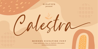 Calestra is a modern handwritten font. With a classy and natural handwritten style, it brings a classy and chic typeface. Calestra is best used for weddings, branding, logotype, and quotes. Features: - Beautiful Ligatures - Beautiful Swash - PUA Encoded - Multilingual Support - Numerals and Punctuation
 - Santtander by Ditatype,
$29.00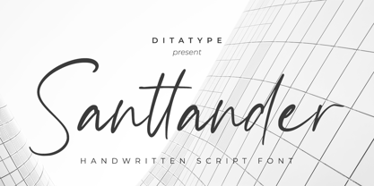 Santtander is a modern handwritten font. With a classy and natural handwritten style, it brings a classy and chic typeface. Santtander is best used for weddings, branding, logotype, and quotes. Includes: - Santtander (OTF) Features: - Beautiful Ligatures - PUA Encoded - Multilingual Support - Numerals and Punctuation
 - Whitelove by Ditatype,
$29.00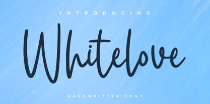 Whitelove is a modern handwritten font. With a classy and natural handwritten style, it brings a classy and chic typeface. Whitelove is best used for weddings, branding, logotype, and quotes. Includes: - Whitelove (OTF) Features: - Beautiful Ligatures - PUA Encoded - Multilingual Support - Numerals and Punctuation
 - Barelyn by Yumna Type,
$16.00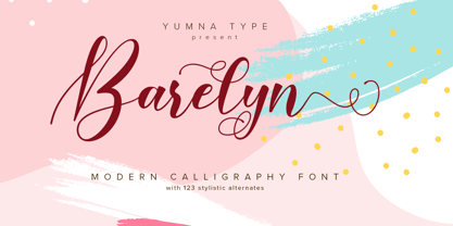 Barelyn is a beautiful and modern script. It brings a beautiful and modern typeface that best used for weddings, branding, logotype, and quotes.: Featured : Ligatures Beautiful Alternates + Swashes PUA Encoded Multilingual Support Numerals and Punctuation Beginning Swash and Ending Swashes (a-z)