10,000 search results
(0.021 seconds)
- ITC Ellipse Neo by Typorium,
$30.00 The Typorium presents a new optimized and enriched version of ITC Ellipse which first appeared in 1996 in the International Typeface Corporation typeface library. ITC Ellipse Neo design has been lightly modified. Three weights have been added (light, Medium, Extra Bold, including Italics) to the original Regular and Bold styles. ITC Ellipse Neo is both modern and classic. Modern in the unusual shape based on the geometric ellipse form. And classic in the structure of some letters like the lower cases c, e, g, o, s. These letters alone could come from a traditional typeface, but they fit perfectly with the atypical rest of the alphabet giving it a present-day and traditional mix. Furthermore, the ellipse shape fits naturally in the italic styles, giving the font an organic and fluid feeling. ITC Ellipse Neo offers OpenType features such as alternate characters for upper and lower case, and an extended accented character set to support many languages. Five weights have been created for each style to offer a wide range of graphic possibilities in a tidy digital footprint. Designer: Jean-Renaud Cuaz Publisher: Typorium MyFonts debut: December 15, 2020 Le Typorium présente une nouvelle version optimisée et enrichie d'ITC Ellipse qui est apparue pour la première fois en 1996 dans la bibliothèque de caractères de l'International Typeface Corporation. Le design de ITC Ellipse Neo a été légèrement modifié. Trois graisses ont été ajoutées (léger, moyen, extra gras, y compris les italiques) aux styles originaux Regular et Bold. ITC Ellipse Neo est à la fois moderne et classique. Moderne dans le dessin inhabituel basé sur la forme géométrique de l’ellipse. Et classique dans la structure de certaines lettres comme les minuscules c, e, g, o, s. Ces lettres pourraient provenir d'une police de caractères traditionnelle, mais elles s'intègrent parfaitement avec le reste de l'alphabet plus insolite en lui donnant un mélange de modernité et de tradition. De plus, la forme de l'ellipse s'intègre naturellement dans les styles italiques, donnant à la police une sensation organique et fluide. ITC Ellipse Neo offre des fonctionnalités OpenType telles que des caractères alternatifs pour les capitales et les bas de casse, et un jeu de caractères accentués étendu pour prendre en charge de nombreuses langues. Cinq graisses ont été créés pour chaque style afin d'offrir un large éventail de possibilités graphiques pour une empreinte numérique rigoureuse.
 - Dez Now Sans by Dezcom,
$28.00 Dez Now Sans is a humanistic typeface family that was begun in 2005 by Chris Lozos of Dezcom. Since then, it has been nurtured, revised, and expanded to include 12 weights in both upright roman and true italics totaling 24 variations. This allows the user to choose the weights which best work for type-size, output device, and reproduction process. There is often a difference of opinion on what the best weight to use for normal text when setting type. The truth is, there is more than one answer. When you consider the size, weight, leading and set width—along with paper and ink specifications, you may find the need for several. The subject matter of the text with the specifics of the target audience, also increase the demand for expanding choices. Dez Now Sans was designed with several potential text weights to address any circumstance. Dez Now Sans gives you a full and varied toolbox of fonts to choose from.
 - P22 Platten Neu by IHOF,
$39.95 The P22 Platten font family has been revisited and expanded by designer Colin Kahn. Platten is based on lettering found in German fountain pen practice books from the 1920s (you may have seen the similar Speedball books in the US). This round tip pen lettering is comparable to the basic forms used in grammar school teaching alphabets, but with a few original characteristics. The Italic version has even more of these unusual features. Geometric and simple yet casual and timeless. Perfect for many uses.
 - Now Appearing JNL by Jeff Levine,
$29.00Now Appearing JNL is a digital version of some hand-lettering spotted on an early 1960s ad for a Miami Beach night club. Its fun, casual appearance makes it perfectly suitable for any project that conveys a relaxed atmosphere. The font was intentionally not kerned, so the free-flowing form of the lettering is at its best, but it can be set tight by hand if a more compact look is desired. - Helvetica Now Variable by Monotype,
$328.99 Helvetica Now Variable Helvetica Now 2.0 builds on the groundbreaking work of 2019’s Helvetica Now release—all of the clarity, simplicity, and neutrality of classic Helvetica with everything 21st-century designers need. In this 2021 release, we introduce Helvetica Now Variable and add condensed weights to the Helvetica Now static fonts. Helvetica Now 2.0 includes 96 fonts in three distinct optical sizes (Micro, Text, and Display), now with 48 new condensed weights. The Helvetica Now Variable fonts include even more: 144 instances—48 normal, 48 condensed, and 48 compressed. Helvetica Now Variable gives you over a million new Helvetica styles in one state-of-the-art font file (over two-and-a-half million with italics!). Use it as an extension of the Helvetica Now family or make custom-blends from its weights (Hairline to ExtraBlack), optical sizes (four point to infinity), and new Compressed and Condensed widths. Create infinite shades of expression, incredible typographic animations, and ultra-refined typography. Its single font file makes it easier to use and wickedly fast. Load one file and access a million fonts—in a fraction of the size of a traditional font family. More freedom. More expression. More power. More. Helvetica. Now. Each one of the Helvetica Now static fonts has been carefully tailored to the demands of its size. The larger Display versions are drawn to show off the subtlety of Helvetica and spaced with headlines in mind, while the Text sizes focus on legibility, using robust strokes and comfortably loose spaces. Helvetica Now's Micro designs are simplified and exaggerated to maintain the impression of Helvetica in tiny type. There's also an extensive set of alternates, which allow designers the opportunity to experiment with and adapt Helvetica's tone of voice. The new Condensed weights put more type into smaller spaces—for intense emphasis, sophisticated contrast, or just everyday space-fitting. Helvetica Now 2.0 is, quite simply, more: more versatility; more power; and more creative possibilities. “For more than six decades, Helvetica has been the essential typeface,” says Monotype Type Director Charles Nix. “The release of Helvetica Now insures that it will be a typographic force for decades to come.”
 - Knew Font Jagged by Ingrimayne Type,
$9.00 KnewFontRagged is a distorted version of KnewFont.
 - Sewing Patterns 3 by Lauren Ashpole,
$15.00 Sewing Patterns 3 is the latest installment in the Sewing Patterns font series and this time it's all menswear. This dingbat was inspired by men's fashions from the 1920s to the 1960s. Like it's predecessors, the numbers take a quick dive into children's styles from those eras.
 - Neu Phollick Alpha by Typotheticals,
$4.00 - Neo Sans Cyrillic by Monotype,
$103.99The branding agency's client wanted an ultra modern"" typeface that was ""futuristic without being gimmicky or ephemeral,"" according to the design brief. Designer Sebastian Lester took on this intriguing custom font assignment, but soon, a bureaucratic decision cancelled the project. ""I was left with a sketchbook full of ideas and thought it would be a shame not to see what came of them,"" says Lester. He decided to finish the design on his own. Lester's research confirmed that the principal ingredient of an ""ultra modern"" typeface was simplicity of character structure: a carefully drawn, monoline form, open letter shapes and smooth, strong curves. To conceive a typeface that crossed the line from modern to futuristic, Lester decided to amplify these qualities. About a year after Lester's initial conceptual work, two highly functional and versatile typefaces emerged. These are Neo Sans and Neo Tech, designs Lester describes as ""legible without being neutral, nuanced without being fussy, and expressive without being distracting."" Both the Neo Sans and the more-minimalist Neo Tech families are available in six weights, ranging from Light to Ultra. Each has a companion italic, and Neo Tech offers a suite of alternate characters. While engineered to look modern as tomorrow, Neo Sans and Neo Tech display the functional and aesthetic excellence that earns them a place in the list of classic designs from the Monotype typeface library. - EF Zapping Net by Elsner+Flake,
$35.00 - Hybi4 Script Neo by Hybi-Types,
$3.99 This typically handwritten script fonts are based on my own handwriting. First release of the Hybi4-Script was back in 1999. Now it’s renewed and completed with many more special characters and a bold style.
 - Neo Sans Paneuropean by Monotype,
$114.99The branding agency's client wanted an ultra modern"" typeface that was ""futuristic without being gimmicky or ephemeral,"" according to the design brief. Designer Sebastian Lester took on this intriguing custom font assignment, but soon, a bureaucratic decision cancelled the project. ""I was left with a sketchbook full of ideas and thought it would be a shame not to see what came of them,"" says Lester. He decided to finish the design on his own. Lester's research confirmed that the principal ingredient of an ""ultra modern"" typeface was simplicity of character structure: a carefully drawn, monoline form, open letter shapes and smooth, strong curves. To conceive a typeface that crossed the line from modern to futuristic, Lester decided to amplify these qualities. About a year after Lester's initial conceptual work, two highly functional and versatile typefaces emerged. These are Neo Sans and Neo Tech, designs Lester describes as ""legible without being neutral, nuanced without being fussy, and expressive without being distracting."" Both the Neo Sans and the more-minimalist Neo Tech families are available in six weights, ranging from Light to Ultra. Each has a companion italic, and Neo Tech offers a suite of alternate characters. While engineered to look modern as tomorrow, Neo Sans and Neo Tech display the functional and aesthetic excellence that earns them a place in the list of classic designs from the Monotype typeface library. - Logopedia Now Rounded by Bülent Yüksel,
$19.00 What makes "Logopedia Now Rounded" unique is that it has a strong body, upper and lower case letters are the same size and work in perfect harmony. All letters in the character have "alternatives" in various numbers. This feature provides you variety in your designs. It is possible to take your designs to the next level by using "Logopedia Now Rounded". "Logopedia Now Rounded" is ideal for especially logo design, advertising and packaging, branding and creative industries, banners and billboards and signage as well as web and screen design. "Logopedia Now Rounded" provides advanced typographical support for Latin-based languages. An extended character set, supporting Central, Western and Eastern European languages, rounds up the family. The designation “Logopedia Now Rounded 500 Regular” forms the central point. "Logopedia Now Rounded" comes 3 weights and italics total 6 types. The family contains a set of 543 glyphs. Classes and Features, Stilistic Style, Fractions and Old Style Numerator just one touch easy In all graphic programs. "Logopedia Now Rounded" is the perfect font for web use. Be sure to check out the other siblings of "Logopedia". Logopedia Now Logopedia Now Rounded Logopedia Next Logopedia Next Rounded You can enjoy using it.
 - Maxima Now Pro by Elsner+Flake,
$59.00 The sans serif linear antiqua Maxima which was created in the beginning of the sixties by Prof. Gert Wunderlich for Typoart Dresden, was newly actualized in 2007 after more than 45 years. Many hands and heads were involved in the successful re-design of Maxima Now over a period of two years to assist the designers of the Elsner+Flake Design Studios in Hamburg, and the typeface family is now available. The re-design happened in close cooperation with Wunderlich who has given support to numerous projects in Elsner+Flake’s studio in Hamburg. A great deal of care was given to the necessary preliminary tasks such as the viewing of the original designs and print tests, the analysis of the digital Typoart data which had been in the possession of Elsner+Flake since 1985 and 1989, and a design conceptualization based on detail correlations, as well as the extension of the character complement. It had been Elsner+Flake’s goal to include as many of the existing Maxima cuts into the re-design program as possible. The result is an extended font family with 25 weights in EuropaPlus layout.
 - CHE LIVES! - Unknown license

- This Corrosion - Unknown license

- Note this - Unknown license

- Fight This - Unknown license

- Daddy Tie - Unknown license

- Rub This! - Unknown license

- this kettle - Unknown license

- TIE-Wing - Unknown license

- Gudeg Theo by Letterayu Studio,
$15.00 Gudeg Theo is a modern Slab serif style display font category. This font is very attractive. Perfect for cute quotes, packaging, branding, invitations, greeting cards, and more. Features : – Uppercase and Lowercase letters – Numbering and Punctuations – Multilingual Support – Works on PC or Mac – Simple Installation – Support Adobe Illustrator, Adobe Photoshop, Adobe InDesign, also works on Microsoft Word
 - And Then by Throndsen,
$10.00
- Tre Giorni by Eurotypo,
$60.00 Tre Giorni, is a variant of the "Due Giorni" font with the possibility of combining between the two. This useful writing font is very expressive, fresh, agile and organic. It comes in two styles: Solid and outline (just a little shine) Each font contains 571 glyphs with many OpenType features: standard and discretionary ligatures, stylistic alternates, decorative characters, old-style figures, small caps, titles, case sensitives, and ornaments. Specially designed for creating eye-catching headlines, logos, packaging, greeting cards, advertisements and websites. It also has good readability for longer texts.
 - Obnoxious Tie by PizzaDude.dk,
$16.00 That tie you wore in the 1990'ies...the one from the 1980'ies...perhaps even the one from the 1970'ies...could look obnoxious today - or maybe ... it's super fashionable these days! :) This Obnoxious Tie is a mix of upper- and lowercase ... well, that goes for the "lowercase" - the uppercase is uppercase, just as usual!
 - This year by Jadatype,
$10.00 This Year is a duo font that contains fine line script font and playful slab that had cute, playful, joy, youth, and bouncy feel. suitable for social media, branding, craft, products, handwritten, and so on. contains standard English letters, numbers, punctuation, and several accents that support multilingualism. Thank you!.
 - Black Tie by Scholtz Fonts,
$19.00 Black Tie is an art-deco font with the smooth sophistication of retro design. It is very readable and can be used at all sizes. It functions well as a display font and creates attention-attracting headers and subheaders. Black Tie comes in two styles: 1. Black Tie Regular: in which the caps and lower case have different baselines. Black Tie Regular is better for sub-heads and display. 2. Black Tie Baseline: in which all characters share a common baseline. This style is better for body text and smaller sizes. Fully professional, Black Tie contains a full character set Ñ Upper and Lower case, all numerals, punctuation, symbols and accented characters. It is suitable for layout work in all major European languages Ñ Spanish, Portuguese, German, French, Swedish and Italian (to name a few). The characters are spaced for readability and have been carefully kerned.
 - Bow Tie by Pedro Teixeira,
$16.00 Bow Tie, a slight textured, organic and elegant signature. This modern, stylish but legible script is handy for logo, poster, headlines, invitations, cards and all display needs. The OpenType Features are: stylistic alternates that cover all latin language and cyrillic, ligatures and discretionary ligatures.
 - Tee Franklin by Suomi,
$19.00 The British Vogue commissioned this typeface for their magazine re-design in 2001. After studying the originals of Morris Fuller Benton and the existing versions, this font was designed with all new thin weights. Just when the family was finished, Vogue informed that they had decided to use American Typewriter instead. Bastards. But here is a true classic typeface with a facelift. The pun intended. Tee Franklin has seven weights with obliques, the Heavy being just slightly heavier than the existing versions from Adobe and ITC, and moving down to totally new Ultra Light, using Luc(as) de Groot's formula to keep the weights optically correct. The glyphs are the same as the Morris Fuller Benton's original from 1902, except for the upper case Q, which was re-designed with a loop in the counter for added differentiation.
 - This Notes by Afkari Studio,
$13.00 Introducing This Notes - Handwritten Marker Note Font is a delightful testament to the artistry of handwriting, meticulously crafted to infuse your designs with an authentic, hand-drawn aesthetic. With a distinctive yet versatile style, This Note is poised to enhance a diverse array of design projects, serving as a conduit for creativity and expression. At its core, This Note embodies the charm of handwritten notes, capturing the nuances and imperfections that make each stroke unique. It's a natural flow and effortless elegance make it an ideal choice for a multitude of graphic endeavors, ensuring its relevance across various platforms and applications. Highlighted Features: - Complete set of uppercase and lowercase letters, numerals, and punctuation marks - Unique alternates and ligatures for added character variation - Compatible with both PC and Mac platforms - Hassle-free installation process - Seamless integration with Adobe Illustrator, Adobe Photoshop, Adobe InDesign, and Microsoft Word - No additional design software is required for full accessibility - Multilingual support encompassing characters such as ä, ö, ü, Ä, Ö, Ü, ß, ¿, and ¡ This Note transcends mere functionality; it becomes a catalyst for innovation and inspiration. Its versatility knows no bounds, seamlessly integrating into digital notes, quote designs, book covers, logos, posters, menu layouts, apparel designs, scrapbooks, comic illustrations, magazine headers, and numerous other creative avenues. The font’s adaptability is matched only by its ability to breathe life into every project it graces. Whether adorning a playful children's illustration or adding a touch of personality to a sophisticated magazine title, This Note lends an air of authenticity that captivates audiences. In conclusion, This Note Handwritten Marker Note Font isn’t merely a font; it's a conduit for creativity, a bridge between imagination and realization, poised to elevate your projects to new heights. Embrace its charm, leverage its versatility, and allow it to become the catalyst for your creative journey. Unlock the boundless potential of This Note, where each stroke tells a story and every design bears the mark of authenticity.
 - Shirt & Tie by Olivetype,
$18.00 Shirt & Tie is a cool, trendy looking handwritten font. This font looks fun and authentic, and it will enhance the quality of each of your posters, flyers, or print. This font is also supporting Multi-Languages, which includes: Afrikaans Albanian Catalan Danish Dutch English Estonian Finnish French German Italian Norwegian Portuguese Spanish Swedish Zulu. Thank You.
 - This Corrosion by K-Type,
$20.00 Distressed stencil font that looks wildly windswept, eaten away, or coarsely misprinted on fabric.
 - SL Che by Sudtipos,
$29.00SL Che is a homage to Ernesto Guevara de la Serna, “El Che”, who lived between 1928 and 1967. El Che turned into an universal icon through a memorable photograph which was reproduced and multiplied to the infinite. It was that way he became a synonymous of resistance, revolution and change for lots of generations. That "Che" comes back today by the hand of the genial Jorge Alderete, who designed heroic, laughing and cool variations of that popular first icon. SL Che unfolds like a fan of thousands of "Che", in a development plenty of metaphors. SL Che abridges a sum of original iconographic illustrations in True Type format, which masterly synthesizes the most important themes of the grand genius of the literature. SL Che takes part of the "Icons of Icons" Gallery, developed by SinergiaLab for Sudtipos - Sandy Toes by Putracetol,
$22.00 Sandy Toes - Quirky Summer Theme Font is a delightful typeface that transports you to the sunny shores of summer. This font features playful, rounded, and bold letterforms that capture the essence of fun and the warmth of the season. It's versatile and can be used on its own or combined with any of its eight vibrant variations. With eight distinctive variations inspired by summer, including palms, suns, beaches, pineapples, waves, starfish, and more, Sandy Toes is the perfect choice for children's themes, crafting projects, and designs that radiate fun, playfulness, and a burst of colorful energy.
 - Theo Stevanie by Mazkicibe,
$10.00 Theo Stevanie Font is Beautyful Sans Serif and modern font combined with a sweet touch and beautifully curved each letter. using a touch of soft curves so that it is pleasing to the eye designs. Theo Stevanie Font is great for: Wedding invitations, fashion magazines, logos, signatures, and suitable for watermark photography. Included with Theo Stevanie is a full set of Uppercase and ending lowercase Special Character, Ligature, to create a realistic look for your designs.
 - THD Senus by Tim Hutchinson Design,
$35.00 THD Senus is a modern, high contrast font that expresses a sophisticated and contemporary feeling. The font comes in ‘Roman’ and ‘Bold’ styles plus the softer versions of ‘Roman-Curve’ and ‘Bold-Curve’ – there is also a shadow style available as ‘Roman-Shaded’. The font is perfect for range of uses such as editorial, brand messages, packaging, promotions, campaigns etc.
 - Theo Ballmer by URW Type Foundry,
$39.99 The Theo Ballmer font family is based on Theo’s design ideas which were completed by his son Theo Ballmer (Thierry’s father), and digitized by Thierry, with the help of URW++ and their Ikarus technology. Theo Ballmer is available in 3 x 5 variants: condensed, regular, expanded each in 5 weights. Theo Ballmer is a masterpiece, which fills a historical gap and provides a real font family from the Bauhaus era.
 - THD Praxim by Tim Hutchinson Design,
$25.00 THD Praxim is a modern, condensed style, sans serif font that comes in four weights – thin/regular/bold/heavy. The font is perfect for header & subheadings, editorial, display, brand & identity, campaigns, apps & web. It has a clarity & confidence which can communicate a range of messages through different media channels.
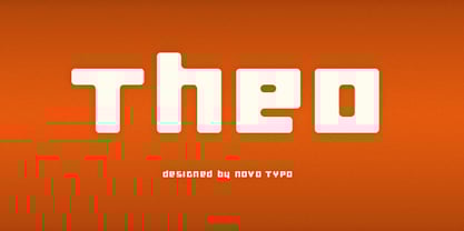
 - NT Theo by Novo Typo,
$26.00