10,000 search results
(0.039 seconds)
- Cumhuriyet by Fontuma,
$24.00 About the font family Cumhuriyet is an Arabic concept that means "the form of government in which the nation holds the sovereignty and uses it through the deputies elected for certain periods". The reason why I gave this name to the font is that 2023 is the centennial anniversary of the Republic of Turkey, which was founded by Atatürk. This typeface, which is sans serif, consists of three families: ▪ Cumhuriyet: Font family with Latin letters ▪ Cumhuriyet Pro: Font family including Latin, Arabic and Hebrew alphabets ▪ Cumhuriyet World: Font family including Latin, Cyrillic, Greek, Arabic and Hebrew alphabets Cumhuriyet is a family of multi-purpose typefaces designed in a geometric style. This font is an extremely useful font for media and digital media as well as for printed products. In this respect, the Cumhuriyet font can be used as a text and title font in publishing and printing areas, magazines, newspapers, books, banner and poster designs, and websites.
 - St Croce Pro by Storm Type Foundry,
$29.00 Our eye is able to join missing parts of worn letters back into undisturbed shapes. We tend to see things better than they really are. Thanks to this ability we ignore faults of those close to us as we can’t accept the fact that every once in a while we convene with an impaired entity. Typography is merely a man’s invention, hence imperfection and transience, albeit overlooked, are its key features. This typeface is based on worn-out letterings on tombstones in the St. Croce basilica in Florence. For hundreds of years, microscopic particles of marble are being taken away on the soles of visitors: the embossed figures become fossilised white clouds, fragments of inscriptions are nearing the limits of legibility. First missing are thin joins and serifs, then the main strokes finally slowly diminish into nothingness over time. Unlike an archaeologist, for whom even completely featureless stele is valuable, the typographer must capture the proper moment of wear, when the type is not too “new” but also not too much decimated. Such typeface is usable for catalogue jackets, invitations and posters. Calligraphy is a natural human trait. To write is to create characters of reasonable beauty and content, according to the nature of the writer. A natural characteristic of architecture is to create an aesthetic message very similar to the alphabet. A doric column, the gabled roof, the circle of the well plan: these are the basic shapes from which all text typeface is derived.
 - Phola Slab by RainBomb Studio,
$16.00 This modern slab serif typeface expands on the phola type family and complements it's siblings with style. Phola is a geometric san-serif display type family. It consists of 64 fonts and includes an extensive character set and multilingual support. Crafted with love this font family offers a numerous styles (Regular, Solid, Square, Diablo, Oblique, Outline, Clean) the family allows for extensive use cases. This OpenType font offer a fantastic options for users to create some unique artwork. Perfect for branding, Logos, displays, posters and other related projects.
 - Engrave by BaronWNM,
$14.00 Engrave is a vintage-style scrips font. This font is an elegant font, and has a luxurious impression with sweet curves on the alternate letters. "Engrave" is perfect for branding luxury fashion products, jewelry, and is also great for use as a lettering in logos and mockups. The use of this font is also not limited to that, but can also be used for writing book covers, movies, posters, taglines, etc. "Engrave" also has ligatures and alternatives that give each lowercase style a choice of styles and add a luxurious feel to this font.
 - Seiston by Skinny Type,
$19.00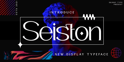 Seiston is the New Modern Typeface. This other Serif collection is perfect for your next branding project, great for your business. Gallient has smooth edges, so this font gives this style an authentically handcrafted feel. Seiston also features: - Lowercase - Uppercase - Numbers and punctuation marks - Multilingual Seiston is the perfect choice for people looking for a clean, modern, minimalist, elegant and beautiful design style. Suitable for almost any graphic design such as logos, branding materials, business cards, gift cards, t-shirts, covers, thumbnails, prints, posters, photography, quotes .etc Happy Designing
 - Crooked Hooks by Sarid Ezra,
$15.00 Crooked Hooks is all caps font with street style brush. It's contain uppercase and lowercase in different style, number, symbol, and also with multilingual support! Caps Only Fonts. There is a lot of stylistic ligatures in this font. This font also contain opentype feature for adding line under a word, You can access it from ligature, simply type underscore + number (1-3) in the middle of the text. For example: Mar_3ker. You can use this font for any project such as a branding, poster, or quotes! Happy Creating!
 - Ah, Olympus by Levi Halmos, the typeface that climbed out of the typography pantheon to grace us mere mortals with its divine presence! This font, much like the mythical abode it's named after, stand...
- Hebrew Sara by Samtype,
$26.00 This is calligraphic font. Good for posters and invitations. Best to use this font from 24pt size.
 - Fornire by Jehoo Creative,
$20.00 The Fornire family of typefaces grew out of a desire to provide a font that has a bold yet simple impression. For this reason, Anwar Patihan drew designs with a high foundation as letters based on humanist shapes and proportions. The letters are kept narrow to enhance the look, and the spacing between characters is narrowed for boldness. While the opentype Fornire feature has an alternate "A B E F P R" letter that looks very striking and easy to recognize, making the Fornire family very suitable for use on Posters, Cover designs, magazines, Banners, packaging designs, design considerations that he put into the Fornire family as well allowing it to perform well in a variety of other design environments. Fornier has a variety of weights ranging from Light, Regular, Medium, Bold
 - Anabella by RNS Fonts,
$33.00 Anabella is a typeface made for the Master’s Degree in Typography at the University of Buenos Aires. It is inspired by the posters of pizzerias located in Naples, Italy; in order to be used in the pizza franchise Giuseppe in Buenos Aires, Argentina. The font preserves and rescues gestural features of these posters, adding a vertical axis and high contrast, typical of the Italian types that arrived in the city product of the immigration. The stroke with brush provides a more organic quality to the sign and provides connotative features. The family has three variables for the different applications that may be required in a pizza place: Italic for bodies greater than 16 pt, Roman for short texts up to 14 pt, and Stencil for use in brands and titles. Anabella was selected to participate in the eighth typography biennial Tipos Latinos.
 - Thole by Twinletter,
$12.00 Introducing the Thole font, a very elegant and clean san serif family, with a characteristic width and graceful impression, for designs with feminine or masculine themes, this font will look strong and strong in your design projects. There is a strong impression in this font, both from the width of the letters, the corners in this font are also equipped with ligatures and alternates to complement your needs. This font is perfect for games, sporting events, branding, banners, posters, movie titles, book titles, quotes, clothing, logotypes, and more. of course, your various design projects will be perfect and extraordinary if you use this font because this font is equipped with a complimentary font family, both for titles and subtitles and sentence text. start using our fonts for your amazing projects.
 - GS Slim One Bestiary by GalaStudio,
$15.00 We, GalaStudio (Lilia & Galina) represent the SlimOne BESTIARY font from our MELTING FONTS collection. It is a decorative style version of the SlimOne font family, which we designed by playing with glyphs: we converted them into funny animals and thus created a "zoo". One can use the BESTIARY font for children's books and notebooks as well as for all kinds of funky advertising, social media, greeting cards and comics. INCLUDED: GS_SlimOne_Bestiary.otf GS_SlimOne_Bestiary.ttf Numbers, additional glyphs & basic punctuation are included. PERFECT FOR: using in books titles, textbooks, notebooks, different brochures and advertising, especially for kids, home-ware design, packaging design; magazines, posters and flyers titles; logos design, books design, fashion design, slogans etc. :) Multilingual support included for the languages based on Latin alphabet.
 - Content Creator by Dumadi,
$20.00 Content Creator – Playful Typeface is a comic themed font that can be used for your design needs. as the title suggests, this font is specifically for content creators to improve the quality of the designs and projects you are working on. Content Creator is perfect for design, logos, social media, brands, advertising, product design, handwritten quotes, product packaging, headers, posters, merchandise, and other designs. What’s Included : + Standard glyphs + Ligature + Web Font + Multilingual Accent + Works on PC & Mac, Simple installations Accessible in Adobe Illustrator, Adobe Photoshop, Adobe InDesign, even work on Microsoft Word. PUA Encoded Characters – Fully accessible without additional design software. Fonts include multilingual support + Image used: All photographs/pictures/vectors used in the preview are not included, they are intended for illustration purposes only. Thanks
 - Hermanz Titling by California Type Foundry,
$47.00 Hermanz™ Titling is inspired by the most majestic caps that Hermann Zapf ever drew. They are inscriptional caps, square caps, or “capitalis monumentalis”. These caps are some of the most beautiful letters made by one of the greatest talents of our time; so beautiful they deserve to be seen and appreciated by everyone. If you do any work for churches, wedding, funeral, anniversary, or other ceremonies, for the fine arts, exclusive clubs, or higher education—you will love how these letters make your brochures, pamphlets and announcements look. Hermanz Titling works for anything labeled "fine": fine dining, fine music, fine art (pamphlets, books, posters, cookbooks). It also fits well for religious topics: posters, events, websites, hymnals, for biblical; and ceremonies, religious or otherwise. Emotions It Can Communicate: • Importance • Timelessness • Special Event • Tradition • Reverence • Artistry • Beauty Released June 2021 on the Memorial of Hermann Zapf, as part of the California Type Foundry Memorial Series: Honoring the life and work of the great font designers. FONT STORY The Majestic Caps When I was on one of my visits to rare books rooms I found some large caps of Hermann Zapf, and I knew that I had to make a font inspired by these. I was surprised that no one had ever made them into a font. They were some of the most beautiful caps I had ever seen. These caps were surprisingly difficult to make. I thought it would take me a week or two; to get the detail and spirit right took significantly longer– but it was well worth the effort! When you print Hermanz Titling on a page, you will see what I mean. Even when printed digitally, it’s the closest thing to letterpress. You might even have some people thing it was printed by a traditional method with ink! (Note: Unless printed at very large sizes, this font is not recommended for actual letterpress, because the serifs are too thin.) If you do any work for churches, wedding, funeral, anniversary, or other ceremonies, for the fine arts, exclusive clubs, or higher education—you will love how these letters make your brochures, pamphlets and announcements look. Enjoy this breathtaking font, and may it help inspire people with your messages! –Dave Lawrence & the California Type Foundry
 - Dumper by LetterStock,
$25.00 Introducing "Dumper" - Your Original Hand-Drawn 60's Retro Bold Font Step into the bold and vibrant world of "Dumper," a font that seamlessly blends original hand-drawn craftsmanship with the iconic style of the 60's retro era. Ideal for posters, headlines, and vintage-themed branding projects, this font exudes a dynamic energy that adds a bold statement to your designs. Key Features: Original Hand-Drawn Craftsmanship: Each character in "Dumper" is crafted by hand, bringing a unique and authentic touch to your creations. 60's Retro Bold Vibes: Immerse your designs in the bold and lively spirit of the 60's, making "Dumper" a perfect choice for projects seeking a retro aesthetic. Why Choose "Dumper": Craft posters and headlines that command attention with bold and dynamic lettering. Design branding materials that transport your audience back to the vibrant 60's era. Establish a brand presence with a font that effortlessly captures the essence of retro boldness. Download "Dumper" Now and Let Your Designs Boldly Embrace the 60's Retro Vibe!
 - Summer of Love by Mysterylab,
$14.00 It's the Summer of Love all over again with this groovy psychedelic font. Designed in 2019, this typeface harks back to the carefree days of the late 1960s. Whimsical and offbeat with its swaying verticals, it nonetheless remains one of the more legible reimaginings of the genre, sporting all of the handlettered vibe of posters and album covers from the original hippie era, but with polished color and weight that evens out the legibility even at relatively small point sizes. Predominantly a unicase font, with a couple of alternate glyphs from upper to lowercase, Summer of Love works best as a large headline face, and benefits greatly from twisting and morphing the type blocks as was common during the original psych era. It's a real groove machine, baby.
 - Parenting JNL by Jeff Levine,
$29.00 Parenting JNL is a stylized Art Deco sans serif type design originally found on a vintage WPA (Works Progress Administration) poster designed by the Federal Art Project and touting the topic of "The Job of Being a Parent". Available in regular and oblique versions.
 - Ultra Break by Lumiks Design,
$15.00 Ultra Break is a handwritten all-caps font with condensed proportions and dynamic feeling, with a lot of ligatures available. The uppercase has the main letters and the lowercase has alternate letters. It is great for display, branding, packaging, advertising, sports, titles, posters, and more!
 - Ah, Berlin Email by Peter Wiegel, a font that dons its typographic trench coat and stylishly strides through the digital streets of Berlin, casting an air of retro-yet-futuristic sophistication. Craf...
- Leegione by Almarkha Type,
$35.00 Introducing The Neon Sci-fi Futuristic Font called Leegione A unique font with a futuristic style can make your futuristic logotype more interesting. Inspired by real world neon light signs, this font is perfect for adding your own glowing light effects or can be used to actually design real world neon signs. Leegione fonts with 9 unique ligatures are ideal for your project and will allow you to create beautiful designs, headlines, posters, logos, badges, and much more. It is also best used for posts, logos, posters, labels, and more.
 - PAG Revolucion by Prop-a-ganda,
$19.99Prop-a-ganda offers retro-flavored fonts inspired by lettering on retro propaganda posters, retro advertising posters, retro packages all the world over. This is perfect font for your retrospective project. PAG Revolucion has a boyish mood compared to other fonts of Prop-a-ganda series. It has short legs and large head, but because of its simplicity, it is legible font. Perfect for all of display. In 2012, Extended and optimized for multipurpose font family named Revolution Gothic which has lowercase, multi-language accents, five weights and italics can be available from Dharma Type. - Easy Peasy by Supersemarletter,
$10.00 Easy Peasy is a cute and playful display font. Relaxed and a little bit quirky, this font is the perfect fit for all of your logos, branding, posters, and crafty DIY projects. Honestly it works perfectly for headlines, logos, posters, packaging, T-shirts and much more. Font Features : • Regular version • Character set A-Z in uppercase and lowercase • Numerals & Punctuation • Accented Characters • Multiple Languages Supported • Format File: OTF Recommended to use in Adobe Illustrator or Adobe Photoshop. If you have questions, just send me a message and I'm glad to help. Best Regards, Supersemar Letter
 - Resalaty by NamelaType,
$12.00 Resalaty is a cute and fashionable handwritten font, created to help you designing makes gorgeous logos, posters, wedding invitations, blog posts, social media, apparel and more! In the near future, the Arabic version will be released soon!
 - Public Safety JNL by Jeff Levine,
$29.00 Public Safety JNL was inspired by a 1940s-era health poster issued through the WPA (Works Progress Administration). The font’s bold, blockish sans lettering commands attention and has been made available in both regular and oblique versions.
 - Dal Baati by Gunjan,
$69.00 "Indulge in the Delectable Delight of 'Dal Baati' Brushy Typeface - A Feast for the Eyes! Discover the artistry of 'Dal Baati,' an exquisite brushy typeface that serves up a delightful blend of elegance and rustic charm. Inspired by the flavors of Rajasthan, this typeface brings a touch of authenticity to your designs, evoking the rich cultural heritage of the region. With every stroke, 'Dal Baati' exudes a handcrafted allure, making it perfect for logos, branding, posters, packaging, and so much more. Its unique character and versatile nature add a pinch of spice to your projects, leaving a lasting impression on your audience. Captivate your viewers' senses with the flavorful aesthetics of 'Dal Baati.' Whether you're designing for a restaurant, food-related business, or any creative endeavor, this typeface elevates your work to new culinary heights. Embrace the distinct personality and mouthwatering appeal of 'Dal Baati' in your designs. Enhance your visual storytelling and give your projects the delectable touch they deserve. Take your creations on a flavourful journey today with 'Dal Baati' brushy typeface!"
 - XXII Grober Pinsel by Doubletwo Studios,
$29.99 XXII Grober Pinsel - Rough brush capitals The Grober Pinsel is simply what it’s called - a rough brush ("Grober Pinsel“ in german). Handwritten Capitals from A - Z and 0 - 9 in three character sets, upper-, lowercase and an alternates set. In addition comes a set of 10 line strokes and a couple of ligatures and alternates. On the whole this font gives you the possibility to make your design look very unique and handmade. The Pinsel is awesome on shirts, posters and stickers, your stylish fashion blog or cookbook, and everything that needs a bold lettered message. It loves big headlines and gives its best in dynamic logos and also he speaks a well central european. Also see: Behance-Project.
 - Vintage Reclame by Putracetol,
$32.00 Vintage Reclame is a vintage script font. As the name suggests, this font is inspired by classic billboards/boards. Besides that, I also combine it with a script style and it's a little irregular in its shape / bouncy style. I strengthen the vintage/retro impression with the character ligatures, there are 140 ligatures in this font. But if you want to use this font with a neater impression, you can disable this ligature feature. This font is perfect for projects with vintage/retro and classic themes. But this font is also suitable for logos, branding, greeting cards, invitation cards, advertisements, titles, healines, book titles, stickers, packaging, quotes, posters, t-shirts/apparel, billboards and others. This font is also support multi language.
 - HWT Roman Extended Fatface by Hamilton Wood Type Collection,
$24.95 The design of the first "Fat Face" is credited to Robert Thorne just after 1800 in England. It is considered to be the first type style designed specifically for display or jobbing, rather than for book work. The first instance of Fat Face in wood type is found in the first wood type specimen book ever produced: Darius Wells, Letter Cutter 1828. This style was produced by all early wood type manufacturers. The style is derived from the high contrast, thick and thin Modern style of Bodoni and Didot developed only decades previously. The extended variation makes the face even more of a display type and not at all suitable for text. This type of display type was used to compete with the new Lithographic process which allowed for the development of the poster as an artform unto itself. This new digitization by Jim Lyles most closely follows the Wm Page cut. The crisp outlines hold up at the largest point sizes you can imagine. This font contains a full CE character set.
 - Visual Arts JNL by Jeff Levine,
$29.00 Visual Arts JNL is a classic Art Deco typeface based on the hand lettering found on a 1930s-era WPA (Works Progress Administration) poster for Women Artists. The exhibit took place in the Federal Art Gallery in Boston, and was part of the arts project underwritten by the WPA to keep many creative people working during the Depression years.
 - Euripedes JNL by Jeff Levine,
$29.00 The Greek-influenced hand lettering on a 1930s WPA (Works Progress Administration) poster for the Federal Theater presentation of "Trojan Incident" inspired Euripedes JNL. The play was based on Homer and Euripedes, and was presented at the off-Broadway St. James Theatre (which opened in 1927 at 246 W. 44th Street on the site of the original Sardi's restaurant).
 - Meatball by Parkinson,
$25.00 Meatball is a fat and happy display font based on some lettering on a mid-20th century poster for the movie Bringing Up Baby. The lettering for the names of the stars, AudryHepburn, Cary Grant and Charles Ruggles, was the basis for Meatball. The sample was all caps and as it evolved, a lower case started to appear, etc.
 - Banknote 1948 by Ingo,
$39.00 A very expanded sans serif font in capital letters inspired by the inscription on a bank note Old bank notes tend to have a very typical typography. Usually they carry decorative and elaborately designed markings. For one thing, they must be practically impossible to forge and for another, they should make a respectable and legitimate impression. And in the days of copper and steel engravings, that meant nothing less than creating ornate, shaded or otherwise complicated scripts. Designing the appropriate script was literally in the hands of the engraver. That’s why I noticed this bank note from 1948. It is the first 20 mark bill in the then newly created currency ”Deutsche Mark.“ All other bank notes of the 1948 series show daintier forms of typography with an obvious tendency toward modern face. The 1949 series which followed shortly thereafter reveals the more complicated script as well. For whatever reason, only this 20 mark bill displays this extremely expanded sans serif variation of the otherwise Roman form applied. This peculiarity led me in the year 2010 to create a complete font from the single word ”Banknote.“ Back to those days in the 40’s, the initial edition of DM bank notes was carried out by a special US-American printer who was under pressure of completing on time and whose engravers not only engraved but also designed. So that’s why the bank notes resemble dollars and don’t even look like European currency. That also explains some of the uniquely designed characters when looked at in detail. Especially the almost serif type form on the letters C, G, S and Z, but also L and T owe their look to the ”American touch.“ The ingoFont Banknote 1948 comprises all characters of the Latin typeface according to ISO 8859 for all European languages including Turkish and Baltic languages. In order to maintain the character of the original, the ”creation“ of lower case letters was waived. This factor doesn’t contribute to legibility, but this kind of type is not intended for long texts anyway; rather, it unfolds its entire attraction when used as a display font, for example on posters. Banknote 1948 is also very suitable for distortion and other alien techniques, without too much harm being done to the characteristic forms. With Banknote 1948 ingoFonts discloses a font like scripts which were used in advertising of the 1940’s and 50’s and were popular around the world. But even today the use of this kind of font can be expedient, especially considering how Banknote 1948, for its time of origin, impresses with amazingly modern detail.
 - Durango Western by Sharkshock,
$100.00 This all caps display font is defined by its close spacing and thick serifs for a distinct appearance. Inspiration came from old movies set in the Wild West. The characters are tall in stature so works well in spots with limited space. Use Durango Western for a wanted poster, social media, or team logo. Basic/Extended Latin, European accents, punctuation, diacritics, kerning, and Cyrillic characters are included. The eroded version features varying levels of distress between the uppercase/lowercase and contains a few alternates. NOTE: Due to the level of detail in the eroded version temporary computer slowdown may occur.
 - Karolinus Fraktur by Cercurius,
$19.95 A slightly regularized digital version of a late Baroque Fraktur type, probably from the beginning of the 18th century, issued by the Norstedts type foundry in Stockholm in 56 point size as "Sju petit fraktur nr 2". This digital font is designed for rather large sizes, at least 30 points. The font includes accented letters for all Western languages, as well as a long s and the usual Fraktur ligatures, e.g. ch, ck, st, tz. The font can be used for logos, packaging, posters, restaurant menus, beer and wine labels etc. associated with traditional German and Scandinavian culture.
 - Whale Song by Hanoded,
$15.00 I grew up with the ‘Save The Whales’ slogan: I remember watching the news and seeing little Greenpeace dinghies taking on huge Japanese whalers, and activists clinging on for dear life. I haven’t heard that slogan for a while: maybe because whaling is soooo 1890’s, but also maybe because the world has other problems to address. Out of respect for the ‘Save The Whale’ activists, I named this fattish font Whale Song. Whale Song is a robust comic font. It was especially created for book covers, product packaging and posters and, of course, it comes with a whale of diacritics.
 - Rogliano by TipoType,
$25.00 Rogliano is an affable Slab Serif. On one hand it responds to the classic tenet of strong and direct alphabets of the Industrial Revolution period. While nourishing the text of a warm environment, it takes the freedom to flirt with lettering and lithographic posters of the Victorian era: due to its multiple stylistic alternatives, borders and decorative ornaments. This wide range of voices makes Rogliano a versatile typeface that can move from the mechanical to humanistic with absolute ease, and perform efficiently from branding to editorial design. Rogliano offers 14 weights with support for more than 200 latin languages.
 - Boldies by Illushvara,
$14.00 Boldies is a serif font, mixed the modern with the classic concept line serif. The Alternate shape will make your design look like Modern. But don't worry if you need the Design like Classic and Bold Serif, you just put the normal Uppercase and Lowercase. With many ligatures will make your design projects stand out! Add this font to your most creative ideas for Application, Art Gallery Poster or postcard, Architectural Logo Project, Classic Magazine, Product Skincare or Logotype you want to used! Support the Multilingual Language! If you have any question, don’t hesitate to contact me. Happy Designing !!! Thank You, Illushvara Design
 - Festivo LC by Ahmet Altun,
$19.00 With the lowercases of Festivo Letters Font Family, Festivo LC comes with new sketches, new shadows and also ornaments. Festivo LC Font Family is a handmade layered font which includes several textures and shadows. Different font types can be created using various combinations of Festivo LC Fonts and colors. The kernings and the metrics of Festivo LC Fonts are not the same as Festivo Letters' kernings and metrics. It is advised not to use them together. The various possibilities of the Festivo Font Family allows you to create a lot of great works such as posters, magazines, printings, t-shirts etc.
 - Fauna by Pasternak,
$12.00 Fauna is a stylish font inspired by hi-fi elements combined with square forms and straight lines. It also has the features of Constructivism, including solidity, emphasis on geometric shapes, and austerity. Bold futuristic characters make this font an ideal option for the development of a minimalistic and recognizable design, necessary for any modern project. It’s perfect for the creation of logos, titles, social media posts, posters, and ads. Due to the clear and eye-catching design of the characters, the font will surely attract your audience. It includes all basic symbols and characters. Plus, Fauna features proper kerning and supports several languages.
 - Trippy Hippie JNL by Jeff Levine,
$29.00 Don’t let the name “Trippy Hippie JNL” fool you. Although the type design fits well with the 1960s-70s hippie movement and the “love generation”, the design is actually straight out of a page from a vintage German lettering textbook entitled “50 Alphabete fur Technikur und Fachschulen” (loosely translated to “50 Alphabets for Technicians and Specialized Schools”). The novelty, free form shapes and stroke weights of this hand lettered alphabet fits well in creating 1920s period pieces or for designing a retro-inspired rock and roll concert poster. Trippy Hippie JNL is available in both regular and oblique versions.