10,000 search results
(0.055 seconds)
- Luminance by MAC Rhino Fonts,
$36.00 As a result of fascination for East European type design, MRF couldn’t resist to make a unique interpretation of a typeface named Pracht. Originally made by the Czech type designer Carl Pracht in 1941–43. Having a rather calligraphic style both in regular and italic, MRF preferred it to be more straightforward and modern-looking. The italic version was executed with traditional italic letters (a, f, g, k, v, w and y). The numerals were made in a classic manner as old-style figures. Can be treated as both a text and display font.
 - Fugues by TEKNIKE,
$39.00 Fugues is a modern monospace display font. The typeface is made from a basic line, circle and square geometry. Fugues Regular and Italic are inspired by straight geometric shapes and Fugues Rounded and Rounded Italic are inspired by organic geometry similar to works by Antoni Gaudí and Alphonse Mucha. The name is derived from the Latin “Fuga” meaning flight and its current meaning “compositions of many parts on a short theme and using counterpoint.” Fugues is great for display work, logos, film titles, sports, monograms, headings and posters.
 - Jazmín by Latinotype,
$29.00 Jazmín is inspired by "Globe Gothic" design yet features different proportions, curves, serif shapes and contrast, which give it a classy, playful and a more contemporary look. The family comes in two versions: an elegant font of 8 weights-ranging from Thin to Black-with matching italics, and an alternate, more playful counterpart with the same number of weights and italics. The whole Jazmín set contains 566 characters which support over 200 Latin-based languages. Jazmín is ideal for magazines, short text, logos, branding design, packaging and advertising.
 - Leophard by Arterfak Project,
$16.00 Create a great combination design with this font family! Leophard font family is a modern slab serif that is inspired by sporty design and vintage style. There are 6 different styles that you can apply in your design projects. This font is made with tenacious basic shapes, the visuality of strength, old school movement, and modern minimalist style. - Regular style - good for your titles, sub-headlines or body text for readability. - Bold style - recommended for your titles, naming, labels or logos. - Bold inline style - is cool for your big typographic designs that are showing the precision of the shapes. - Outline style - good for your additional text, or minimalism design purposes. - Shadow style - suitable for vintage logos, minimalist effects, and titles. - Stencil style - inspired by street art and letterpress design. Recommended for design project which visualizes strength and movement. Make a great combination on your label designs, brand, poster headlines, movie titles, storefront, monograms, sport designs and merchandise design.
 - FabFours by Ingrimayne Type,
$5.00 A tessellation is a pattern in which a shape or tile fits together with copies of itself to fill the plane with no gaps or overlaps. One type of tessellation is formed with sides of center-point rotation, that is, one half of an edge is rotated 180 degrees to form the other half. If a square template is made with sides of identical center-point rotation, there are exactly four shapes that are possible. If these shapes or tiles are fit together not edge to edge but vertex to vertex, the result is a checkerboard-like pattern of tiles and voids. However, the voids have four edges formed by the four possible shapes that the tiles can have, so the voids are limited to the same four shapes that that make up the tiles. The FabFours have 22 tile families that allow a wide variety of fascinating patterns. They form one, two, three, and four tile tessellation. Eleven of the seventeen symmetry groups can be formed with these patterns. In each tile family two of the shapes have two possible orientations, one shape has four possible orientations, and one has eight, for a total of 16 tiles. Each font has two families, one on letters A-P the other on a-p. For some of the families there are also other tiles using the same edge but using triangular and hexagonal templates. To get proper results, the leading must be set equal to the point size of the font. I discovered these fabulous families and their decorative possibilities as I was working on a book about tessellations. I have not been able to find anyone else who has written about these families of four and their decorative possibilities when arranged vertex to vertex.
 - African Jungle by Scholtz Fonts,
$19.00Dominated by a vigorous, african-inspired, jungle-like pattern, this contemporary, 21st century, sans serif font - African Jungle - contains an eclectic mix of elements from the 20th century. It combines gentle curves with base and caps-line transgressions but is substantially more rounded than in most commercial-style sans serif faces. Terminal strokes are slightly rounded and occasional elements are strongly rounded. The African-inspired pattern fill is suggestive of dense vegetation without being too literal. African Jungle is readable and can be successfully used for headers in presentations, magazines etc, and for display use in newspapers, advertising and promotions. Professionally kerned and spaced with 256 characters. - Summer Cherry by Letterara,
$13.00 Introducing a new beautiful calligraphy font, Summer Cherry! Created for the Summer season Summer Cherry is perfect for elegant logos, upscale packaging, wedding stationery, websites, and any other projects requiring a handwritten and luxurious touch. A wide range of swashes (a-z) and alternates (A-Z, a-z) are included so that you can give your logo or name a custom, hand-calligraphy look. Moreover, Summer Cherry was created to look as close to a natural handwritten script as possible by including 64 ligatures. With built in OpenType features, this script comes to life as if you are writing it yourself. You can see it in the picture shown.
 - Klapt by SevenType,
$24.99 Klapt is a geometric sans serif family that is soft on the outside and sharp on the inside. This family of four weights, includes an extended character set supporting most Latin languages even Vietnamese! Klapt, which can be bold or very elegant, is well suited for designs ranging from branding and corporate identity to editorial design and also web design. It is great for display purposes especially for headlines, posters, magazines, book covers, logos... you name it! Feel free to share your designs using Klapt or just get in touch via email to hi@seventype.com. Need extended Cyrillic support? We've got you covered https://www.myfonts.com/fonts/seventype/klapt-cyrillic/
 - Barosa by NREY,
$19.00 Hi, friends! Introducing new typeface - Barosa. It is a new display font with 2 styles and cool characters. Typeface designed as monolite, all descending and ascending elements has same size as most characters. Barosa has multilingual support includes cyrillic. Many ligatures make your typography most variable. Barosa Typeface was inspired by ethnic slavonic style which combining classic typography with awesome features bring classic touch on this culture. It works well with normal size text and for large displays or short words. You may combine uppercase and smallcase in the text body, as alternates symbols. The Barosa typeface is suitable for : product packaging, labeling, logo, classic shop, ethnic shop, titles, etc
 - Clay Handwriting Pro by SoftMaker,
$7.99 Digitized handwriting fonts are a perfect way to give documents the “very special touch”. Invitations look simply better when handwritten than when printed in bland Arial or Times New Roman. Short handwritten notes look authentic and appealing. There are numerous occasions where handwritten text makes a better impression. Clay Handwriting Pro is a beautiful typeface that mimics true handwriting closely. Use Clay Handwriting Pro to create stunningly beautiful designs easily. This typeface comes with alternative characters for sophisticated typography – all easily accessible as OpenType features. A “random” feature even allows for automated random switching between variations of the same character, resulting in type that looks authentically handwritten.
 - Emily In White by Juliasys,
$59.00 She did not live to experience her breakthrough as a poet, but today she is considered one of the pioneers of literary modernity – the American lyricist Emily Dickinson (1830–1886). She left behind a life’s work of manuscripts on scraps of paper, note pads and letters – and a last wish, that these were to be burned. Emily’s younger sister Lavinia did not fulfill her wish – and thus preserved the ingenious manuscript-objects for posterity. For Julia Sysmäläinen, designer of the award winning Kafka type family FF Mister K, Dickinson’s manuscripts were an inspiration and a source for creating her new typeface “Emily In White”. Emily In White – named after Emily Dickinson’s preference for white clothes – captures the most filigree letterforms of the poet’s multifaceted writing style. With hundreds of alternates and ligatures and a complex OpenType feature code it manages to revive the lively sequence of single and connected glyphs of a delicate handwriting which has been described as “breezing” and “reminding of bird tracks”. Emily in White is available in three weights designated I, II and III. For each weight, there is an associated Swashes font. See the PDF in the Gallery section for details. Language support Western and Central European, over 1800 glyphs.
 - Custer RE by Font Bureau,
$40.00 A book in the library of University of Wisconsin caught David Berlow’s attention. It was set in a clear text face - a predecessor of Bookman, cast by the Western Type Foundry who called it Custer. Upon noting how well the typeface worked in 6 and 7 points, he developed it into a member of the Reading Edge series specifically designed for small text on screen. Custer RE was a broad and approachable typeface drawn large on the body with a tall x-height to maximize its size when set very small.
 - Odile by Kontour Type,
$50.00 Odile is a text typeface with bracketed head and bracket-free bottom lower case serifs, a quality that counters rigidness most traditional slab serif typefaces possess. This contemporary design draws inspiration from an experimental typeface named Charter originally designed by the American book and type designer William Addision Dwiggins. It consisted of an informal lowercase alphabet, a narrow seemingly non-inclined vertical letter with script attributes, featuring non-joining letterforms. Dwiggins’ contemplated Charter as the italic companion to Arcadia, Experimental No. 221. The Charter project progressed sporadic stalled during the Second World War and came to a halt in 1955. Charter remained incomplete and was never commercially released. Assessing Charter’s whimsical design, its fragments were rethought and developed into a comprehensive text family. Odile Upright Italic reveals recognizable similarities shared by Dwiggin’s Charter and defines the design approach for the family. The steep calligraphic outstroke and low junctions off the stem as in the upright italic “n” or “r”, for example, are gradually lessened in the italic and moved up for the roman weights. The six optically balanced weights range from the delicate Light to stark Black, accompanied by display variants with feminine flair and ardent Ornaments. Two sorts of Initials, one amplified with interweaving swashes, the other more restrained, both are clearly derived from the Upright Italic. This mid-contrast serif offers a wide range of tools for text and display typographies with a palette of strict to playful. This family shines in magazine, book and display use. The graceful serifed type harmonizes perfectly with Elido, Odile’s sans companion. Sans and serif share the family array and OpenType features in perfect tune. Odile offers an extensive character set, numerous OT features including roman and italic Small Caps, five sets of numerals, alluring ligatures, and many more. OT stylistic variants (with accents) offer a one-story “a” for the roman weights, alternate “g” and “s” designs for the italics, and a variant “s” for the Upright Italic.
 - Stencil Package JNL by Jeff Levine,
$29.00 Stencil Package JNL has its design roots in the brand name hand-lettered on the paper sleeves for the short-lived Stencil-It line of lettering guides produced in 1955 as a direct competitor to Stenso Lettering Guides. Formed by Bernie Aronson [a relative of the Libauers who owned the Stenso Lettering Company and who once worked for them] along with a financial partner (noted artist) Sidney Levyne, the company was soon put out of existence by a court action. It re-emerged in 1956 as the E-Z Letter Stencil Company and existed until the 1990s. Stencil Package JNL is available in both regular and oblique versions.
 - Puntino by Fontador,
$18.99 A dotted script typeface Puntino is (maybe the first) dotted script typeface and not made up of grid-based dots. They are optical corrected and there is always the same distance between the dots, with the aim to create more harmonic letterforms. The dots also vary gradually in size to reflect the thickening and thinning of strokes, giving the letterforms a sophisticated overall look. Puntino comes up with 4 styles and is perfectly suited for logos, brands, congratulation cards … The language support includes Western, Central and Eastern European character sets, as well as Baltic and Turkish languages. OPEN TYPE FEATURES: Standard ligatures and contextual alternates should be activated.
 - Picastro by URW Type Foundry,
$39.99 Marit Otto about Picastro: The revolutionary typeface. Picastro is a fusion of Picasso and Castro. Don’t be alarmed by the second name! It is no political statement. Both characters represent different qualities in the typeface. The Picasso influence is the artistic, freestyle and frolic part. The Castro influence is the firm, square, perseverant look with a hint of propaganda to it. To combine two opposite inspirational sources (innovative versus persistent) makes the shape a bit edged. This typeface is very suitable for all kinds of graphic design (flyer, posters, CD covers and artworks) but also casual enough for (non academic) letter and text writing.
 - Punto by Fontador,
$24.99 Punto is not made up of grid-based dots. They are optical corrected and there is always the same distance between the dots, with the aim to create more harmonic letterforms. The dots also vary gradually in size to reflect the thickening and thinning of strokes, giving the letterforms a sophisticated overall look. Punto comes up with 3 weights and 3 italics and is perfectly suited for logos, brands, magazines and special for signage systems and mobile devices. The language support includes Western, Central and Eastern European character sets, as well as Baltic and Turkish languages. The little sister of Punto is Punto Poly : A layered type system for cromatic typesetting.
 - Gallivant by Jonahfonts,
$39.00 Slightly condensed with a taller lowercase, Gallivant carries itself very well. Similar to classic thick-and-thin san-serif faces with stems slightly facing inward. Note: OpenType variants may only be accessible via OpenType-aware applications.
 - Sweetener by Cyanotype,
$15.00 Add a sugary flavour to your designs with Sweetener; a sugary handwritten font inspired in modern brush lettering. Alternate between a script style and a non-connected style that keeps the same anatomy. Perfect for branding, titling, packaging, stationery, bullet journal, cards, magazine layouts and any project related with food, specially desserts and candies. Sweetener is PUA encoded, it has multilingual support for Latin and includes basic Cyrillic alphabet. Need a custom font? Mail me: damianguerrerocortes@yahoo.com
 - Bone Master by Attype Studio,
$7.00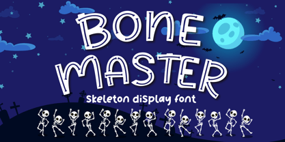 Bone Master is a Halloween display font with bone display on the glyph, perfect for any halloween events and promotions. Bone master is perfect for branding, logo, invitation, stationery, social media post, product packaging, merchandise, blog design, game titles, cute style design, Book/Cover Titles and more. Includes Multilingual Support for Afrikaans, Albanian, Catalan, Danish, Dutch, English, Estonian, Finnish, French, German, Icelandic, Italian, Norwegian, Portugese, Spanisch, Swedish, Zulu. Hope you enjoy with our font! Attype Studio
 - Kumo Sans by EchadType,
$10.00 Kumo Sans is a clear and comprehensible font stylized to mimic marker pen handwriting. The idea was to interpret swift and negligent hand movement in a distinct and easy to read familiar glyph silhouette. Family comes in three weights and italic slant option. Shadow version with outline and shadow effect is perfect for short catchy phrases, brand names and headlines use. Font contains Latin diacritics, Hebrew cursive writing, Bitcoin, Indian Rupee, New Israeli Shekel symbols, fractions etc.
 - Astor by Lab-Dot,
$24.99 New Eurostile! A redesigned Eurostile font, Astor font, was created inspired of one of most used fonts in the world. Idea was to make new, contemporary design of old Eurostile font which was created 1962. by designer Aldo Novarese. Main characteristics and features of Astor font are: beautiful design and contemporary font. May be used like display font, cargo font, OCR font. Most of glyphs have same thickness and high modularity in combining 2 or more glyphs. Good for architect’s projects, labeling, making environmental typography installations, for use of some interior or exterior designs, furniture designs etc.
 - Art Greco - Unknown license

- Sweettooth by Gleb Guralnyk,
$12.00 Hi! Introducing a script font named Sweettooth. It's fully handcrafted and has a natural look. Also it has several ligatures to make it more authentic. Thank you and have a great day!
 - La Belman by Gleb Guralnyk,
$14.00 Presenting a vintage font set named La Belman. It is composed of a clean version and one with rough textured effects. Lots of ligatures will help you make your lettering more unique.
 - Classy Wishes by Seemly Fonts,
$14.00 Classy Wishes is a display font. Classy Wishes is perfectly suited for stationery, logos, t-shirt, paper, print design, website headers, photo frames, flyers, music covers, posters, image sliders, and much more.
 - Manohara Pro by BBA Key,
$17.00 Introducing Manohara Pro Family, a new modern font. Manohara Pro is perfect for stationery, logos, t-shirts, paper, print designs, website headers, photo frames, leaflets, music covers, posters, image sliders and more.
 - Safina Bralyn by Arendxstudio,
$21.00 Safina Bralyn is a handwritten signature font which is very elegant and modern for you to use and your design interests be it for logos, branding names, posters, podcasts and so on.
 - Pleasing Moment by Seemly Fonts,
$14.00 Pleasing Moment is a striking display font. It is perfectly suited for stationery, logos, t-shirt, paper, print designs, website headers, photo frames, flyers, music covers, posters, image sliders, and much more.
 - Sworded by Fabulous Rice,
$35.00 Sworded is a font family of 8 fonts that was inspired by such diverse things as architecture, tombstones, video games, watching old movies or reading comic books. The art of creating beautiful letters has slowly declined with the rise of the digital age and its solid-colour, 2D fonts. And most of the time, the care given to typography in cultural products just isn't what it used to be anymore. This was the inspiration for Sworded, a family of 4 layerable fonts that can bring a feeling of depth to its letters, and offers endless possible combinations. Sworded Regular is the basic shape of all the characters. Sworded Deep gives an impression of depth to characters or acts on its own as an illusion. Sworded Bright can be used as the bright side of a bevel. Sworded Dark can be used to flesh out the dark side of a bevel. Sworded Shadowed is a contour font with a shadow effect. Sworded Wire is a wire font without depth indication. Sworded Outline is an outline font. Sworded Hatched is a variation of Sworded Shadowed with lines giving a gradient illusion. But of course, any font can be combined with any other font(s) to obtain various results. There are hundreds possible combinations with these eight fonts. Have fun!
 - Aeroko Variable by Monotype,
$279.99 Meet Aeroko, a slick variable typeface that evokes grit and speed, a dynamic play, a future–present competitive edge that evokes motorsport and all progressive brand design. This is a robust type system that creates memorable brand headlines. Powered by four display weights and three widths. Turbo-charged by a two-axes variable font. High performance brands can expect Aeroko to out-pace in every graphic condition. Aeroko is bold and assertive, it moves fast in headlines, it flexes when and where you need it. The forms are boxed and solid from Condensed to Wide, and they provide a distinct contrast when paired with rounder text fonts. Aeroko’s secondary power unit is harnessed from the ever adaptable variable font format. Variable font technology enables vast levels of typographic scale and expression, furthermore it allows Aeroko to react instantly in any digital space to maximize results. Aeroko evokes confidence, this is a typeface that actively encourages you to be courageous and daring with type in your own way. Brands demand distinct and robust typography, much in the same way that drivers demand pace. Aeroko meets these demands with ease, delivering assurance and weight across a valiant aesthetic. Aeroko is designed by Krista Radoeva and the Monotype Studio.
 - Aeroko by Monotype,
$49.99 Meet Aeroko, a slick variable typeface that evokes grit and speed, a dynamic play, a future–present competitive edge that evokes motorsport and all progressive brand design. This is a robust type system that creates memorable brand headlines. Powered by four display weights and three widths. Turbo-charged by a two-axes variable font. High performance brands can expect Aeroko to out-pace in every graphic condition. Aeroko is bold and assertive, it moves fast in headlines, it flexes when and where you need it. The forms are boxed and solid from Condensed to Wide, and they provide a distinct contrast when paired with rounder text fonts. Aeroko’s secondary power unit is harnessed from the ever adaptable variable font format. Variable font technology enables vast levels of typographic scale and expression, furthermore it allows Aeroko to react instantly in any digital space to maximize results. Aeroko evokes confidence, this is a typeface that actively encourages you to be courageous and daring with type in your own way. Brands demand distinct and robust typography, much in the same way that drivers demand pace. Aeroko meets these demands with ease, delivering assurance and weight across a valiant aesthetic. Aeroko is designed by Krista Radoeva and the Monotype Studio.
 - Corporative Sans by Latinotype,
$26.00 Corporative Sans typeface is developed by Latinotype Team. Corporative Sans is the new version of Corporative. This font has a marked personality and distinctive traits, what makes it suitable to be used at large text sizes. Since it is a condensed font, it can also be used in smaller sizes. Corporative comes with the Latinotype’s standard set of 350 characters, making it possible to use the font in 128 different languages. Corporative provides users with a wide range of characters, weights and widths for every project. By combining different variants, designers can achieve the best results. The family consists of 64 fonts: a basic family that includes 8 weights plus italics, an alternative family of 8 weights with matching italics and 2 condensed families, one regular and one alternative, both with italics. Latinotype has added new faces to its team. Latinotype Team now comprises: Rodrigo Fuenzalida, César Araya, Bruno Jara, Luciano Vergara and Daniel Hernández. Corporative was created by Latinotype Team and developed by Javier Quintana, Rodrigo Fuenzalida and César Araya, under the supervision of Luciano Vergara and Daniel Hernández.
 - Hubber by LomoHiber,
$16.00 Presenting my font called Hubber. This font has been inspirited by product retro posters from 60s-70s. I tried to make letters as much streamlined and gentle as possible. I hope you'll enjoy how sweet it came up. Hubber consists of such features as swashes, alternate glyphs, ligature, and additional shadow font. Hubber perfectly fits for retro designed logos, posters, prints. Hubber Features: Up to 19 alternates for each letter with swashes Contextual alternates feature will automatically match alternate letters depending on their position or pairing 21 ligatures Shadow effect font to save your time. Just place the layer with Shadow font behind Regular to make the shadow effect Carefully tuned kerning (preview above doesn't show it for some reason) If you have some issues, questions, please let me know: lhfonts@gmail.com Hope you'll enjoy using Hubber!
 - Serpentine by Image Club,
$29.99Dick Jensen (USA) designed Serpentine, is a contemporary-looking display font, for the Visual Graphics Corporation in 1972. With the rise of digital typesetting and desktop publishing, this typeface quickly became both popular and ubiquitous. This dynamic, wide, boxy design is identifiable via tiny triangular swellings at the stroke endings - what might be called semi-serifs. Serpentine is available in six different font styles: Light, Light Oblique, Medium, Medium Oblique, Bold, and Bold Oblique. Serpentine" is a greenish rock that sometimes resembles a serpent's skin, and is often used as a decorative stone in architecture. Though this font doesn't seem at all snaky or sinuous, it does have an architectural, stone-like solidity. The subtle, almost non-existent curves and semi-serifs keep it from being too stern or cold. Although the underlying strokes of each weight are similar, the six members of the Serpentine font family all present their own individual personalities. Serpentine Light lends itself well to text for onscreen displays, for instance, while the numbers from typeface's heavier weights are seen around the world on soccer jerseys! Additionally, the oblique styles convey a streamlined sense of speed, furthermore lending Serpentine well to sport and athletic applications (especially the faster, high-speed varieties). Because of its 1970s pedigree, Serpentine has come to be known as a genuine "retro" face. This makes the typeface even more appropriate for display usage, in applications such as logo design, magazine headlines, and party flyers. If you like Serpentine, check out the following similar fonts in the Linotype portfolio: Copperplate Gothic (similar serifs) Eurostile (similar width) Princetown (another "athletic" font) Insignia (similar "techno" feeling)" - Serpentine by Linotype,
$29.00Dick Jensen (USA) designed Serpentine, is a contemporary-looking display font, for the Visual Graphics Corporation in 1972. With the rise of digital typesetting and desktop publishing, this typeface quickly became both popular and ubiquitous. This dynamic, wide, boxy design is identifiable via tiny triangular swellings at the stroke endings - what might be called semi-serifs. Serpentine is available in six different font styles: Light, Light Oblique, Medium, Medium Oblique, Bold, and Bold Oblique. Serpentine" is a greenish rock that sometimes resembles a serpent's skin, and is often used as a decorative stone in architecture. Though this font doesn't seem at all snaky or sinuous, it does have an architectural, stone-like solidity. The subtle, almost non-existent curves and semi-serifs keep it from being too stern or cold. Although the underlying strokes of each weight are similar, the six members of the Serpentine font family all present their own individual personalities. Serpentine Light lends itself well to text for onscreen displays, for instance, while the numbers from typeface's heavier weights are seen around the world on soccer jerseys! Additionally, the oblique styles convey a streamlined sense of speed, furthermore lending Serpentine well to sport and athletic applications (especially the faster, high-speed varieties). Because of its 1970s pedigree, Serpentine has come to be known as a genuine "retro" face. This makes the typeface even more appropriate for display usage, in applications such as logo design, magazine headlines, and party flyers. If you like Serpentine, check out the following similar fonts in the Linotype portfolio: Copperplate Gothic (similar serifs) Eurostile (similar width) Princetown (another "athletic" font) Insignia (similar "techno" feeling)" - Cozmo Ground by HIRO.std,
$19.00 Cozmo Ground is a futuristic display font. This font describes about futurism, space, sci-fi, modern, simple, clean and easy to use. FEATURES - Uppercase letters - Numbering and Punctuations - PUA Encoded Characters - Multilingual Support - Works on PC or Mac USE Cozmo Ground works great in movie title, game title, headline, logotype, labels, magazine, packaging, apparel, and any projects that need futuristic taste. Enjoy using! Thanks. HIRO.std
 - After Nightfall by Hanoded,
$10.00 After Nightfall is a handmade fairytale font. It was called Bunting Nook first (after a spooky story of a black dog that haunts a town in Britain), but I figured it was a bit of a weird name, so I settled for After Nightfall. This font comes with some lovely swashes, which should be used sparingly. But that, of course, is entirely up to you.
 - Papa Flower by Adita Fonts,
$9.00 Papa Flower is a Display font Groovy Style with a great punch. Everything written in this font will be instantly recognizable and will attract attention. It will work great for comic book style, online games, cards, love shirts, posters, movie titles, eye-catching social media posts, or anything that requires youthfulness and courage. COMPATIBILITY Windows Apple/Mac Linux Easily convert to webfont Cricut Silhouette
 - Bocadillo by Hanoded,
$22.00 A Bocadillo is a sandwich. I guess I was craving one when I had to name this font! Bocadillo is a sweet Brush script. It is all caps, but upper and lower case are different and like to mingle. It is an ideal font for product packaging, posters, book covers, postcards and big ‘I love you’ billboards. Comes with a generous helping of diacritics.
