10,000 search results
(0.018 seconds)
- Sabon by Linotype,
$45.99 In the early 1960s, the German Master Printers’ Association requested that a new typeface be designed and produced in identical form on both Linotype and Monotype machines so that text and technical composition would match. Walter Cunz at Stempel responded by commissioning Jan Tschichold to design a new version of Claude Garamond’s serene and classical Roman. Its bold, and particularly its italic styles are limited by the requirements of Linotype casting machines, forcing the character widths of a given letter to match between styles, giving the italic its characteristic narrow f. The family’s name is taken from Jacques Sabon, who introduced Garamond’s Romans to Frankfurt. Sabon has long been a favorite of typographers for setting book text, due to its smooth texture, and in large part because Tschichold’s book typography remains world famous.
 - Estragon Pro by Stabenfonts,
$45.00 Estragon is a vivid sans-serif text face with venetian influences, suitable especially for books. It is remarkable for: its light slant, to the right, for most of the verticals, its small sized uppercase letters making it suitable for languages where they are often used (for example German,) and its just lightly inclined true italics. For a wide language support, Estragon contains a lot of accented characters including the polish kreska. It is generously equipped with ligatures, special and alternate characters as well as various kinds of numbers: besides the standard old-style figures to be set as part of text copy there are small-cap and tabular numbers as well as a set of fraction figures. Estragon comes with two weights, uprights and true italics, each with small-caps.
 - Duel by Subversive Type,
$13.00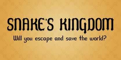 An epic battle between celtic and blackletter typography.
 - Bricius by Typefactory,
$14.00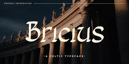 Bricius is a celtic style display font combined with a modern design, this font is modern, elegant and looks aesthetic. This unique display typeface is inspired by celtic styles. Use it for any design project that requires a personalized appearance!
 - Cadence by Elemeno,
$25.00Cadence was designed for a computer consulting company called Shamrock Solutions. The logo needed a Celtic font for the word "shamrock" that complimented the tech font used for the word "solutions." Most Celtic fonts didn't hold up well next to the tech font, which led to the creation of Cadence. Although inspired by Irish designs, Cadence is a sharp departure from traditional Celtic typefaces and in most contexts the inspiration isn't immediately obvious. - Lodgepole by Tall Trees Design Co,
$20.00 Lodgepole is a hand illustrated font family created by Zach Minard of Tall Trees Design Co. Inspired by timeless legibility and worn National Park signage. Lodgepole Regular and Book are designed to pair perfectly together, while both of these styles are available as Solid (With no internal texture) or Grit. Lodgepole Grit uses the strokes from the original pen-to-paper illustration for all texture, creating an authentic one-of-a-kind texture.
 - The Drips - Unknown license

- PF Bague Sans Pro by Parachute,
$79.00 PF Bague Sans Pro is a versatile monoline typeface with a distinct and eye-catching personality. Despite its inspiration from early 20th century geometrics, it diverts from the mechanical rigidity of those typefaces by incorporating humanist characteristics, such as subtle variations in stroke width and open counter shapes with vertical endings. This is a very clean and legible typeface with a warm and well-balanced texture which is ideal for intense editorial use in magazines and newspapers. Bague Sans’ most remarkable feature is its vast array of uppercase alternates and ligatures which truly shine when set at display sizes. This typeface is automatically transformed into a flexible, charming and stylish typeface with strong modern aesthetics. From classic to modern, from excessive to neutral. Bague Sans Pro is a multipurpose typeface which offers enormous possibilities and variations for editorial design, branding and corporate identity. Bague Sans Pro signifies freedom and personal style. This superfamily includes 18 weights from Hairline to Ultra Black with a consistent and well-refined structure. Each style consists of 1063 glyphs with more that 330 alternates and ligatures and an extended set of characters which support simultaneously Latin, Cyrillic and Greek. Download the complehensive PDF Specimen Manual to explore the unlimited text variations of Bague Sans Pro.
 - November Starlight by Set Sail Studios,
$14.00 Thanks for checking out November Starlight! A lovingly hand-painted script font, fantastically elegant & eccentric with a sprinkle of carefree fun. November Starlight doesn't play by the rules - with extra bouncy characters, long vertical brush strokes and authentic hand-painted edges, it's bound to make a bold statement on anything from greeting cards and invitations, to personalised logos and handwritten quotes. November Starlight consists of 4 fonts; November Starlight • A cursive font containing upper & lowercase characters, numerals and a large range of punctuation. November Starlight Alt • This is a second version of November Starlight, with a completely new set of lowercase characters. If you wanted to avoid letters looking the same each time to recreate a custom-made style, or try a different word shape, simply switch to this font for an additional layout option. November Starlight Clean & Clean Alt • Totally clean versions of each of the November Starlight fonts, with all rough brush textures removed. Perfect for specialised printing techniques such as laser & vinyl cutting, or simply for a silky smooth finish to your text. Special Characters are also available for several lowercase letters, with added beginning & end swashes - please see the character map image for a full list. These characters are accessible via software with a glyphs panel, e.g. Photoshop CC, Adobe Illustrator.
 - Morgow by Scriptorium,
$18.00Morgow is a decorative Celtic uncial font based on original hand lettering. It is similar to other uncial fonts, but the characters are embellished with traditional Celtic spiral designs. The font is appropriately named after a species of legendary Cornish sea serpent. - Maybug MS by Redcollegiya,
$12.00 Maybug is a Scandinavian font family which makes it great for any children's design: greeting cards, invitations, posters, textile prints or book covers. You can mix letters of all styles to get really funny and unusual compositions.
 - Grafema LC by Letter Collective,
$30.00 Grafema LC was designed by Jacklina Jekova & Todor Georgiev and published by Letter Collective. Grafema LC contains 16 styles and family package options. This Font Family Features: • 578 glyphs in 7 variants – upright, italic, textured, filled, rough, traditional contrast and inverted; • Handwritten with a calligraphic flat brush in 2 brush angles – 35° and 85°; • Extended Latin and Extended Cyrillic; • Coverage of multiple OpenType features – ligatures, stylistic alternates, and contextual alternates; • Suitable for web, print, motion graphics, etc; • Perfect for headlines, posters, packaging and greeting cards, etc. Grafema LC is a system of display typefaces consisting of 7 variants – upright, italic, textured, filled, rough, traditional contrast and inverted. Grafema LC started off as handwritten calligraphic works using a flat brush and variable angles of writing – 35° and 85°. It supports Extended Latin and Extended Cyrillic – more than 120 languages all together. The balanced natural texture of Grafema LC with unique details makes it perfect for headlines, but also suitable for long text. It is perfect for graphic design projects, like packaging, posters, events, blogs, social media and greeting cards. Grafema LC comes with a range of OpenType features – including old-style numerals, typographic features such as ligatures, stylistic and contextual alternates. The typeface is suitable for web, print and motion graphics.
 - Typothetical 1 by Typotheticals,
$8.00Another foray into the area of a comic based textface. - Elpiedra by Dharma Type,
$14.99 Nothing ventured, nothing gained. Smokey and rough textured grunge font.
 - Ballyhaunis NF by Nick's Fonts,
$10.00Lewis F. Day, in his 1910 classic Alphabets Old and New, filed this work by Laurence Schall under the category of Celtic-inspired, and surely it is both. This font included a few special extras, including a Celtic cross in the florin position, a Celtic knot is the dagger position, a shamrock as the asterisk, and a double shamrock in the double-dagger position. Both versions of this font include the Latin 1252 and Central European 1250 character sets. - Midpoint Pro by Mint Type,
$- Midpoint Pro is a soft sans-serif typeface with a modern technical look. Its spurless design creates a perfect balance between static rigid verticals and softened endings. The interplay of open and closed forms suggests increased legibility in small sizes and results in a vivid texture. The typeface will serve for a number of purposes, including posters, corporate branding or screen design of any kind like web or UI layouts. Midpoint Pro comes in 9 weights + oblique styles, each supporting numerous Latin-based languages as well as major Cyrillic languages. It is packed with OpenType features like ligatures, small caps, 4 sets of digits, 2 stylistic sets, superiors and inferiors, fractions, ordinals, respective punctuation varieties including all-cap punctuation, as well as language-specific alternates.
 - Retroactive by profonts,
$51.99 profonts Retroactive Pro is an all-caps texture font with four variations for each letter. This enables the user to create letter graphics that seem to have a unique handmade texture. Ideal for applications which are supposed to have a vintage or distressed look.
 - Melts Script Rough by Estudio Calderon,
$20.00 Melts Script Rough by Estudio Calderón is the textured version of Melts Script. It has a texture design in high definition that runs very good in any size and concepts. Good news! It includes a free version of “Melts Script Rough Sanscript One”. Specimen
 - Lawson Vintage by Okaycat,
$29.00 Okaycat Font Foundry proudly presents “Lawson Vintage”! A retro classic style font, perhaps futuristic, with vintage textured edges. containing European accents. Beautifully connected cursive with high legibility and style for your design, great for web, print and publication. See original Lawson without texture. Salon
 - Plantin by Monotype,
$29.99 Plantin is a Renaissance Roman as seen through a late–industrial-revolution paradigm. Its forms aim to celebrate fine sixteenth century book typography with the requirements of mechanized typesetting and mass production in mind. How did this anomalous design come about? In 1912 Frank Hinman Pierpont of English Monotype visited the Plantin-Moretus Museum in Antwerp, returning home with “knowledge, hundreds of photographs, and a stack of antique typeset specimens including a few examples of Robert Granjon’s.” Together with Fritz Stelzer of the Monotype Drawing Office, Pierpont took one of these overinked proofs taken from worn type to use as the basis of a new text face for machine composition. Body text set in Plantin produces a dark, rich texture that’s suited to editorial and book work, though it also performs its tasks on screen with ease. Its historical roots lend the message it sets a sense of gravity and authenticity. The family covers four text weights complete with italics, with four condensed headline styles and a caps-only titling cut. Plantin font field guide including best practices, font pairings and alternatives.
 - Ronnia by TypeTogether,
$45.00 One of the most remarkable characteristic of this humanistic sans serif is its versatility. Ronnia’s personality performs admirably in headlines, but is diffident enough for continuous text and small text alike. The heavier weights deliver very cohesive shapes, and they have been successfully used for branding and newspaper headlines. Its ten styles grant the designer a broad range of coherent color and texture variations in text blocks, necessary tools to solve complex information and editorial design problems. Ronnia has been mainly engineered for newspaper and magazine applications manifested in its properties: economic in use, highly legible, and approaching the reader with some friendliness and charm. Ronnia features about 800 characters per weight, including small caps, fractions, old style and lining numbers, scientific superior/inferior figures, and a set of symbols and arrows. It supports over 40 languages that use the Latin extended alphabet. Ronnia Basic is a reduced version of Ronnia. It is still an OT-font but without any particular features except of a set of ligatures, class-kerning and language support including CE and Baltic.
 - Preto Semi OT Std by DizajnDesign,
$- Preto Semi is an experiment. It is an attempt to create a readable type for text point sizes (other than sans-serif and serif). Preto Semi is not a Sans with added serifs or Serif with serifs removed. The use of the serifs is redefined and used for other purpose(s). The serifs became the extension of the stroke, they help to solve the spacing problem of sans-serif types and they use the primary function of serifs – keeping the eye on the baseline and emphasize the horizontal rhythm of the lines of text. Preto Semi is intended for magazines and editorial design, as other members of Preto family. Preto is an extensive type family, which explores the function of serifs on readability and legibility. Preto consist of three subfamilies: Sans, Semi and Serif. Preto is designed for multilingual typesetting. All of the subfamilies have equal gray value but different texture which can be use to differentiate languages. Preto sub-families have two text weights and two bold styles (Regular -> Bold, Medium -> Black). Every weight has a companion Italic style as well.
 - Preto Semi by DizajnDesign,
$24.00 Preto Semi is an experiment. It is an attempt to create a readable type for text point sizes (other than sans-serif and serif). Preto Semi is not a Sans with added serifs or Serif with serifs removed. The use of the serifs is redefined and used for other purpose(s). The serifs became the extension of the stroke, they help to solve the spacing problem of sans-serif types and they use the primary function of serifs – keeping the eye on the baseline and emphasize the horizontal rhythm of the lines of text. Preto Semi is intended for magazines and editorial design, as other members of Preto family. Preto is an extensive type family, which explores the function of serifs on readability and legibility. Preto consist of three subfamilies: Sans, Semi and Serif. Preto is designed for multilingual typesetting. All of the subfamilies have equal gray value but different texture which can be use to differentiate languages. Preto sub-families have two text weights and two bold styles (Regular -> Bold, Medium -> Black). Every weight has a companion Italic style as well.
 - Wonky by Ana's Fonts,
$16.00 The Wonky Font family is a set of 3 handmade fonts, made using three different materials: a pencil, a thin fineliner and a bold marker. Each font includes 3 variations for each letter and number, accessible through contextual alternates, for extra realism and fun. The pencil font is a SVG font, which allows for the texture of the pencil to be captured in a more authentic way, and is complemented with an extra doodles font. Wonky Font looks good at small sizes and will also look great in all caps texts. Use Wonky Font in designs such as postcards and notes, posters, logotypes, social media posts, branding and packaging. This font includes: a Wonky Pencil SVG font, with a vector alternative that preserves the texture a Wonky Thin font a Wonky Bold font a Wonky SVG Extras font, with 26 pencil doodles Software requirements for the SVG font: Photoshop CC2017+ // Illustrator CC2018+
 - Preto Sans OT Std by DizajnDesign,
$50.00 Preto is an extensive type family, which explores the function of serifs on readability and legibility. Preto consist of three subfamilies: Sans, Semi and Serif. Preto is designed for multilingual typesetting. All of the subfamilies have equal gray value but different texture which can be use to differentiate languages. Preto subfamilies have two text weights and two bold styles (Regular --> Bold, Medium --> Black). Every weight has a companion Italic style as well. Preto Sans OT Std The Sans version of Preto forms the basic skeleton of the family, it is decidedly simpler than the other styles (Semi and Serif). Although you can find many distinctive and unique elements in the details. The most visible elements are the tapered upper part of the letters. The capital letters have uniform widths achieving very different texture than traditional roman proportions. There are two different options for ligatures and alternative characters (J, Q, g, &) gives more variability for different languages.
 - Preto Sans by DizajnDesign,
$24.00 Preto is an extensive type family, which explores the function of serifs on readability and legibility. Preto consist of three subfamilies: Sans, Semi and Serif. Preto is designed for multilingual typesetting. All of the subfamilies have equal gray value but different texture which can be use to differentiate languages. Preto subfamilies have two text weights and two bold styles (Regular --> Bold, Medium --> Black). Every weight has a companion Italic style as well. Preto Sans The Sans version of Preto forms the basic skeleton of the family, it is decidedly simpler than the other styles (Semi and Serif). Although you can find many distinctive and unique elements in the details. The most visible elements are the tapered upper part of the letters. The capital letters have uniform widths achieving very different texture than traditional roman proportions. There are two different options for ligatures and alternative characters (J, Q, g, &) gives more variability for different languages.
 - Fuse V.2 Printed by W Type Foundry,
$25.00 Fuse Vol 2 Printed is an extension to the popular Fuse & Fuse Vol 2 type family. W Foundry worked alongside Julia Martinez Diana (Antipixel) to create a balanced and consistent texture throughout the whole family. All the typeface’s textures have been meticulously outlined to give a natural look mantaining the soft and round edges, making Fuse Vol 2 Printed more easy-going and spontaneous. It is perfect for large display usage due to the professional shapes of its outlines, which were hand-crafted glyph by glyph. Each character has its own printed style, which is not repeated in the accented characters, nor in other weights of this family. The typeface is designed with powerful OpenType features. Each weight includes alternate characters, ligatures, fractions, special numbers, arrows, extended language support, small caps and many more. Perfectly suited for graphic design and any display/text use. The 32 fonts are part of the larger Fuse superfamily.
 - Squad by Fontfabric,
$- Squad is a humanist sans serif with semi condensed proportions. Inspired by Adrian Frutiger’s perfectionist style this typeface is a harmonious breed of humanist heritage and contemporary simplicity. The balanced characteristics, clear and legible silhouette and simultaneously vivid appearance of Squad makes it perfect for any design purpose. The figures are evident — it consists of 18 styles from Thin to Black; covers Extended Latin, Cyrillic and Greek with span for more than 130 languages; flawless functionality and supporting many OpenType features, such as localizations, tabular numerals, inferiors & superiors, numerators & denominators, fractions, discretionary liga- tures, case sensitivity etc. Designers: Svetlin Balezdrov, Svet Simov Features: • Over 780 glyphs in 18 styles (Thin to Black) • Extended Latin, Cyrillic and Greek scripts for more than 130 languages; • High x-height and Semi Condensed proportions; • Moderate contrast and vertical stress; • Humanistic characteristics and open vertical terminals; • True form of italics; • Coverage of multiple OpenType features; • Perfect for text, headlines and web;
 - Quick Or Dead by Vozzy,
$5.00 A vintage look layered label font named "Quick or Dead". This font was inspired by American wild west history. The family includes six styles (including effect styles), for sample look at preview. This font will good viewed on any retro design like poster, t-shirt, label, logo etc. For using effects layers: - Type your text in Regular. - Copy that and paste at the same position. - Change the style to Shadow or Texture. Alternates and catchwords: - Capital letters are different than small (look to the preview). - Several small letters have alternates (look to the preview). - For the catchwords type the word (for sample 'with'), select that and turn on 'Discretionary Ligatures' on the 'OpenType' tab. Or paste it from 'Glyphs' tab in any place on your text. This in Illustrator. In Photoshop 'Discretionary Ligatures' you can find in the menu Type - OpenType.
 - Sacnoth by Intellecta Design,
$23.90 Sacnoth is a font inspired in the old knots celtic visual.
 - Camille by Arabetics,
$45.00 Camille was designed with exaggerated emphasis on letter vertical characteristic, by virtually eliminating the typical Arabic horizontal line look. This font glyph weights and look and feel are heavily influenced by early Kufic Quranic calligraphy style. Camille supports all Arabetic scripts covered by Unicode 6.1, and the latest Arabic Supplement and Extended-A Unicode blocks, including support for Quranic texts. This font family includes two letter spacing flavors: isolated for small text and overlapped for large or display text. The two spacing flavors have one weight each with a normal and a left-slanted Italic version. The script design of this font family follows the Arabetics Mutamathil Taqlidi style utilizing varying x-heights. The Mutamathil Taqlidi type style uses one glyph per every basic Arabic Unicode character or letter, as defined by the Unicode Standards, and one additional final form glyph, for each freely-connecting letter of the Arabic cursive text. Camille includes the required Lam-Alif ligatures in addition to all vowel diacritic ligatures. Soft-vowel diacritic marks (harakat) are selectively positioned with most of them appearing on similar high and low levels—top left corner—, to clearly distinguish them from the letters. Tatweel is a zero-width glyph.
 - Heavy Black by Panritype Studio,
$17.00 Heavy Black is all capital brush font, made from real brush pen with original texture. it can work with any design project, such as clothing or street wear logos, headlines, social media, quotes, and more. The original texture will give a strong impression on your design.
 - Puighut Brush by Realtype,
$11.00 Always handwritten fonts with an authentic look. Modern handwritten font with brush texture. Its authentic texture makes it the perfect choice for branding and digital design. This font is perfect for branding, logos, web, instagram, quotes, business cards, signs, headers, blogs, branding, invitations, and more! Thank you!
 - Pondang Brush by Realtype,
$23.00 Always handwritten fonts with an authentic look. Modern handwritten font with brush texture. Its authentic texture makes it the perfect choice for branding and digital design. This font is perfect for branding, logos, web, instagram, quotes, business cards, signs, headers, blogs, branding, invitations, and more! Thank you!
 - Fractus by Eurotypo,
$36.00 The requirements of Middle Ages scribes who copied and produced books in monasteries were fundamentally to preserve space, due to the high cost of the writing surface. During this long period of the development of Gothic forms, many other variations of the style of black letters appear: Textur or “Gothic-antique”, another group called Rotunda preferred by Italian and Spanish scribes. In 1490, the style "Bâtarde" (according to the the French classification) began to be widely used in Germany with more rounded shapes and named Scwabacher (probably derived from the city of Schwabach, but not certified) Fractur is a more condensed and narrower form than Schwabacher. This style is attributed to Johann Neudörfer of Nuremberg, cut in 1513; it was quickly imitated, therefore a few years later became to be a German national identity that extended over the next four centuries. The shape of its characters can be considered as a fusion of Texture and Schwabacher: the lowercase actually has medium strictly vertical and half curved strokes. The first expressions of the baroque influence this writing whose appearance of movement is due to the ornaments applied to the uppercase letters and the ascending and descending features of the lowercase. Despite having spent so many years and being a typeface not suitable for extensive reading texts, the Gothic Fractur has endured over time for possessing a strong and solid characteristic, as well as being closely linked to the spirit of gothic cathedrals of countries in northen Europe. In fact, it is probably that this expressive feature leads them to be chosen in the most varied graphic communication needs, which run from from banks and financial companies, insurers, law offices, publishers, newspapers and TV networks, till alcoholic drinks, funeral tombstones, packaging and even tattoos.
 - KG Flavor And Frames Seven by Kimberly Geswein,
$5.00 Decayed and stamped highly textured frames and decorations. Perfect for chalkboard art.
 - Stigsa Display by Seniors Studio,
$25.00 Stigsa Display is a high-contrast typeface inspired by transitional and contemporary typefaces. A vertical stress with sharp serifs, delicate and legible. Stigsa Display family consist of 35 fonts: 7 weigths and 5 widths. With 1143 glyphs each. Stigsa Display family with various styles will be an handy tool for a wide variety of designs. The typeface high contrast designed for use in big text sizes and medium sizes. Via the OpenType features allow for the implementation of typographic niceties such as small caps, tabular figures and oldstyle figures, ligatures, case-sensitive, fractions and extended language support.
 - Roxies by Gassstype,
$23.00 Hello Everyone, introduce our new product Font ROXIES is a Modern Font.This is a Textured Natural Style and classy style with a clear style and dramatic movement. This font ROXIES is great for your next creative project such as logos, printed quotes, invitations, cards, product packaging, headers, Logotype, Letterhead, Poster, Design this font is great for your creative projects such as watermark on photography, and perfect for logos & branding, in wedding designs,label ,product packaging, special events or anything that need handwritting taste. That is has charming, authentic and relaxed characteristic more natural look to your text You can activate Alternate OpenType panel.
 - Droid Serif by Ascender,
$92.99 The Droid Serif Pro Family (4 fonts) is a contemporary serif typeface family designed for comfortable reading on screen. The font is slightly condensed to maximize the amount of text displayed on small screens. Vertical stress, sturdy serifs and open forms contribute to the readability of Droid Serif while its proportion and overall design complement its companion Droid Sans. The fonts were designed by Steve Matteson, the Type Director at Ascender Corporation. The Droid Serif Pro Family (4 fonts) includes Latin 1 and WGL character sets, along with Old Style Figures (requires an application that support advanced OpenType typographic features).
 - Missing Stone by Pesic,
$29.00 Missing Stone features grunge rough, lapidary, antique look inspired by letters carved in stone plates. Capital glyphs are, although damaged, satisfactorily legible, whereas instead of lowercase letters, capital glyphs are placed, also featuring nearly abstract, hardly legible look, cross cut with rough horizontal lines and dots. The overall visual experience is rough, reminiscent of erosion of stone and disintegration. Capitals are legible and of small size, whereas the second group can be used only in bigger size, whereby rendering an interesting text texture in the course of alternate use. The font contains all the Latin accented characters used in European languages.
