10,000 search results
(0.019 seconds)
- Neufile Grotesk by Halbfett,
$30.00 Neufile Grotesk has its roots in some of the earliest commercially available sans-serif typefaces. This highly legible sans-serif design is well-suited for many display and text-based typographic uses. Users can apply the fonts effortlessly to a large number of messages and media, from advertising to book design. The typeface family ships in two different formats. Depending on your preference, you can install the typeface as a single Variable Font or use the family’s eight static OpenType font files instead. Those weights run from Extralight through Black. While the static-format fonts offer a good intermediary-step selection, users who install the Variable Font have vastly greater control over their text’s stroke width. The Neufile Grotesk Variable Font’s weight axis allows users to differentiate between almost 1,000 possible font weights. That enables you to fine-tune your text’s exact appearance on-screen or in print. But even the eight static fonts satisfy the need for flexibility, creating harmonious variations of texture and emphasis. Whichever format you choose, the Neufile Grotesk fonts include several sophisticated OpenType features. In addition to standard ligatures, there are a few discretionary ligatures and a stylistic set replacing “a”, “g”, and “R” with geometric-sans-style forms. Other features include numeral variants – there are proportional and tabular versions of lining figures and oldstyle figures – as well as fractions and numbers in circles. The fonts have arrows and a feature for setting case-sensitive forms, too.
 - SmoothyPro by Resistenza,
$39.00 Smoothy Pro, is a new version of Smoothy, our brushy textured font launched last summer. This summer we propose a smoother version without textures and also a light and slanted version
 - NorB Sans Expanded by NorFonts,
$32.00 NorB Sans Expanded is my first sans serif font, it's a friendly smooth sans serif font with 3 weights: Regular, Medium and Bold each with italic version. It includes over 1000 glyphs + OpenType features (Access All Alternates, Small Capitals From Capitals, Case-Sensitive Forms, Discretionary Ligatures, Denominators, Fractions, Historical Ligatures, Kerning, Standard Ligatures, Localized Forms, Numerators, Ordinals, Small Capitals and Superscript.) This font would be perfect for both texts and titles, and pairs beautifully with other fonts already in your library, especially handwritten and serif fonts. The resultant texture is lively but not intrusive, and makes for a friendly and readable text. You may use it in everything from logotypes to social media posts, website and magazine layouts to poster designs.
 - Adelbrook by Vibrant Types,
$36.00 Adelbrook is a dynamic serif typeface that keeps calm. It enriches text with the archaic structure of humanist type, because its characters arrange in a harmonious rhythm with a dynamic stroke, asymmetric serifs and stems that lean in the direction of reading. These characters have gravity and are firmly on the baseline. The tapered stems define a heaviness that end in emphasized foot serifs. Actually all the details are heftier the lower they are. This is particularly evident in a subtle vertical hairline variation, light or unapplied head serifs, and clipped upper dots. The clearness of the semi-serif italics with a brushy nature integrates perfectly in a subtle way. All these details result in a sophisticated text typeface with a sharp contemporary design.
 - Tooting Sans by HamburgerFonts,
$39.95 Tooting Sans is a well-crafted, contemporary humanist sans. Designed for the needs of editorial, advertising and signage, Tooting Sans is not only suitable for setting large amounts of text at small sizes, it also has a presence and robustness for powerful headlines. Tooting Sans has slightly condensed letters with clean lines, open forms and predominantly straight terminals, although some vertical strokes have angled terminals for variation. This helps to keep the flow of the copy alive whilst being economical with space and legible in both text and headline usage. Released as an OpenType font, Tooting Sans expands upon the standard sans serif character set to include Greek and Cyrillic glyphs, small caps, oldstyle figures, proportional figures, ligatures and improved support for Latin-based languages.
 - Dos Crayones by Fat Hamster,
$15.00 Dos Crayones - Hand drawn textured fonts Dos Crayones inspired by child crayons drawing. Textured fonts are perfect for your great projects, quotes, playful branding, children's products, fun greeting cards, packaging and more!
 - Squat by BA Graphics,
$45.00 Squat may be vertically challenged but hey, even the vertically challenged need love too! And you know what? Squat is worth much more than Diddley Squat! It gets the tough jobs done in half the vertical space with its sturdy, low profile. Randy Newman may not care for it, but Squat shows that short fonts got plenty of reason to live! So there.
 - Genre by Storm Type Foundry,
$26.00The official terseness and grey of Neo-Classical type faces will stand out when we narrow them. The consistently vertical shading of the letters suppresses one's desire for eccentricity, just like tea with bromine. It would, however, be wrong to consider Bodoni as the originator of this - vertically shaded - trend in type face production. In his Manual we can also find type faces with a slanted axis of shade, picturesque italics and a number of normal, more human type faces. It remains a mystery why his name is connected only with one of his many works. Genre's basic design is fairly light in colour, which is why it looks good in illustrated magazines and short texts and directly calls for graphically striking, contrasting headings. It shows off beautifully next to photographs, on diplomas and on printed materials connected with a person's death. - Mainsail by Melvastype,
$29.00 Mainsail is a handwritten brush script font. It is casually written with dry brush pen, so it has this nice texture and flow. Mainsail has lots of alternates to make it look more like real handwriting; four sets of lower cases and two sets of upper cases. Mainsail is great option for logos, headlines and packaging. You can also use it in longer texts where you need this casual handwritten look. It will also combine well with sans and serif fonts. Mainsail has OpenType features that automatically makes text look more authentic. Discretionary Ligatures replaces other of two identical letters following each other. Contextual Alternates will unleash the full cycle of the alternates. It will cycle all four lower case sets to make the text look as natural as possible. Mainsail has also underline strokes in separate font called Mainsail Swash. It includes combined 52 different underlines, strokes and circles. With these you can add the final punch to your design.
 - Pueblito by Corradine Fonts,
$15.00 Pueblito is a hand drawn font with a rustic and antique appearance. Was inspired from old books and newspapers but express a very own personality and not necessary represent a specific classic style. The family consists of twelve fonts in six weights plus a set of ornaments in order to compose all kind of texts. Using Pueblito in your projects, you can obtain an original aged flavor and just by adding a subtle texture effect will help you to obtain the desired vintage look.
 - Option by Vladimir Likh,
$10.00 Option is a modern condensed sans serif. Inspired by geometric architectural fonts. But despite the geometric construction every single letter was build based on optical evaluation. This approach makes Option more organic and lively in a text line. Option was created for wide spaces. Condensed and thin, but extremely sweeping vertically font makes your massage elegance and strong. The font functions great in many sizes and surroundings. The family comes in one weights plus italics. Creating of bold weight is underway. Options supports Cyrillic as well.
 - Fermata by Fermata Fonts,
$15.00 Fermata is an original calligraphic textface inspired by humanist serif typefaces from the 16th century, characterized by the translation contrast of a handwritten pen stroke, monumental Roman capitals, and true italics. Fermata has been modernized for 21st century textual requirements, with clean lines, moderated contrast, and a seamless blending of italics and lining characters into the text form, while still retaining the warmth and subtle idiosyncracies of the handwritten origins of old style serifs. The font was developed with invaluable advice and mentorship from Hannes Famira.
 - Sina Nova by Hoftype,
$- Sina Nova is the slimmer sister of Sina. It has a slightly vertical tendency, a higher x-height which makes it more open in small text sizes. Its economical proportions allow an even more universal application. Sina comes in 12 styles and in OpenType format. All styles contain standard and discretional ligatures, small caps, proportional lining figures, tabular lining figures, proportional old style figures, lining old style figures, matching currency symbols, fraction- and scientific numerals. Sina supports Western European, Central and Eastern European languages.
 - Papillon Woodcuts by Celebrity Fontz,
$24.99 Papillon Woodcuts is a digital revival of an ornate alphabet by French engraver Jean Michel Papillon dating back to 1760, when engraving was very fashionable in France. Each letter is displayed with a different themed background, such as a ship at sea; a fancy table topped with a bounty of fruits; flying birds; a parasol with flowers; playful cherubs; rich textured drapes and tapestries; and many more. These woodcut initials are especially beautiful when used at the beginning of a paragraph as in olden texts.
 - York Handwriting by Thinkdust,
$10.00 A hand-drawn font inspired by the menu from a tearoom in York. York Handwriting is simple but with accentuated features, creating an effect that is decorative and distinct while still being clear. Giving the look of chalk or wet-wipe pens, this font will provide you with texture to make your work stand out, almost literally. With York Handwriting, any design can be granted the humble, homely look of a small, side-alley tearoom, especially with the emphasised x-height helping the text to stand out.
 - Narevik by ParaType,
$30.00 Narevik consists of 7 styles -- 4 uprights (including black) and 3 italics. It’s a type of dynamic low contrast design with slightly rounded triangle serifs and drops which conveys to it a certain peculiarity. The vertical strokes have gentle intasis that brings additional softness to the shapes. The family was created by Armenian designer Manvel Shmavonyan and got its name after his daughters Nare and Arevik. It can be used in text composition as well as in display matters. Released by ParaType in 2011.
 - ITC Zipper by ITC,
$40.99Zipper is a striking font designed in 1970 by Phillip Kelly for the Letraset dry transfer sheets and it shows itself as a true child of the 1970s. The most distinguishing characteristic is the markedly robust horizontal stroke, heavier by far than the verticals. In a line of text, the figures present a close, stripe-like line, strongly dominated by the horizontal. Zipper is meant exclusively as a headline font and should be used in larger point sizes to highlight its unique, eye-catching characteristics. - Dulya by Pesotsky Victor,
$15.00 "Dulya" is a weird, funny and irrational font. The design of the letters is based on the handwriting which is usually taught in school but the letters' graphics are geometrically transformed to make them interesting. The font has many alternative characters, so you can very freely control the texture of the text. Dulya supports Basic Latin and Extended Latin, Cyrillic — in total about 90 languages are supported. The font has one Regular weight, alternative characters, Uppercase and lowercase. Dulya font was designed by Viktor Pesotsky.
 - Hachura by Outras Fontes,
$24.00 Hachura is a sketchy typeface designed by Ricardo Esteves. Its general proportions are based on the garalde models, with traditional roman serifs. It was initially made by hand using a drawing technique to create a font that simulates the unfinished aspect of a work in constant progress. This textured face is useful for display sizes, making a very visible presence. Because of its basic dimensions and careful distribution of black and white, it still also very readable in text sizes like 10 or 8 points.
 - Jadore Vous by Calamar,
$15.00 Jadore Vous is available in two versions: smooth and textured. This font particularly well suited for wedding invitations, cards, signature logos and other branding projects. Jadore Vous includes Upper and Lowercase Basic Characters, Numbers and Punctuation. It also includes large selection of ligatures and lowercase alternates that make your type look more like natural handwriting rather than a font. Jadore Vous is available for Western European, Central European and South Eastern European Languages. You can check your language typing characters in text box above.
 - Ganzhou by SSI.Scraps,
$39.00 Ganzhou is a great geometric sans with texture font with a natural stamp texture. This font is the perfect fit for all of your logos, branding, social media, and many others Thank You scrapstype
 - Muirne by Typomancer,
$20.00 Muirne, a cheerful semi-serif inspired by a Celtic calligraphy and figure. Font family contains from Light to Black weights and suitable Italic. With a dozen of alternates to enhance your typesetting with a Celtic touch.
 - Nagham by Arabetics,
$45.00 Nagham was designed using uniform glyph thickness throughout and exaggerated letter heights to offer a vertical look and feel. It supports all Arabetic scripts covered by Unicode 6.1, and the latest Arabic Supplement and Extended-A Unicode blocks, including support for Quranic texts. This font family includes two letter spacing flavors: isolated for small text and overlapped for large or display text. The two flavors come with two weights, regular and bold, each of which has normal and left-slanted Italic versions. The script design of this font family follows the Arabetics Mutamathil Taqlidi style utilizing varying x-heights. The Mutamathil Taqlidi type style uses one glyph per every basic Arabic Unicode character or letter, as defined by the Unicode Standards, and one additional final form glyph, for each freely-connecting letter of the Arabic cursive text. Nagham includes the required Lam-Alif ligatures in addition to all vowel diacritic ligatures. Soft-vowel diacritic marks (harakat) are selectively positioned with most of them appearing on similar high and low levels—top left corner—, to clearly distinguish them from the letters. Tatweel is a zero-width glyph.
 - Hiragino Serif by SCREEN Graphic Solutions,
$210.00 Hiragino Serif (Mincho) is a font adapted for the digital age. It was designed to permit finely detailed tuning that allows the sizes of both kanji and kana to be adjusted for greatest visibility. It also broadly satisfies the needs of modern graphic design in advertising, posters, pamphlets, magazines, and other such uses. The font makes the counters comfortably wide while gracefully raising the text's center of balance, ensuring that the typeset characters will be smooth and well-defined. It gives each line a modern impression thanks to a judicious balance of light and shade and draws out a vivid readability that makes it possible to comfortable push forward with one’s reading. Latin alphabet and numbers have all been originally designed so that the weights of typeface and the flow of the baseline between Japanese and Latin characters are extremely consistent. Of particular note, vertically formatted text that mixes both Japanese and Latin characters can be beautifully rendered using only this typeface. Thanks to the use of authentic and sophisticated basic design , it creates a different atmosphere by combination of optional unique kana typefaces.
 - Exceptional by Studio&Story,
$16.00 Exceptional Is a super trendy Handwritten font, Elegant & modern with gentle brush texture , Exceptional comes with a complete set of lowercase and uppercase alternates(Uppercase letters can be used alone), It gives you the option to customize your text and to make it much more unique (It's very fun). And more great extra is the bonus Swash, this set come with 26 swashes, which allows you to add elegant & trendy finishing touches to your work. It's the perfect choice for personal branding projects, product packaging, social media, fashion, advertising and more!...
 - Delima by Monotype,
$29.99The Delima font family has something of the Clarendon or Ionic influence but is distinguished by a lighter serif treatment. The contrast between thick and thin strokes is not pronounced, weight stress is vertical. Delima's serifs are short but strong, allowing close letter spacing to give good economy. Lowercase x-height is very generous, internal counters are open. This combines to give Delima excellent legibility in small sizes and an overall even colour when set in text. Delima works well for magazines, periodicals and display work in advertising, flyers and catalogues. - Madness Attitude by IKIIKOWRK,
$19.00 Proudly present Madness Attitude - Street Brush Type, created by ikiiko. Inspired by the brush strokes on the street, where the raw, rough lines show a strong character of freedom expression. The font has a sloppy & dirty stroked texture, so it fits perfectly for making a poster, magazine layout, youth stuff, sleeve cover, party flyer, quotes, or simply as a stylish text overlay to any background image. What's Included? Uppercase & Lowercase Numbers & Punctuation Multilingual Support Works on PC & Mac Enjoy our font and if you have any questions, you can contact us by email : ikiikowrk@gmail.com
 - Gold Night by Subectype,
$15.00 Gold Night Is A Natural Brush font. This is stylish brush font with a modern touch. With swift strokes and authentic dry textures, it's an irresistibly charismatic & confident font choice for a range of design projects. Gold Night is perfect for branding projects, homeware designs, product packaging, Signature, Clothing - or simply as a stylish text overlay to any background image. Ligatures are also available for several lowercase characters (double-letters which flow more naturally). These are only accessible via software with opentype capability or a glyphs panel, e.g. Photoshop/Illustrator.
 - Biffo by Monotype,
$29.99Biffo was designed by David Marshall and produced in 1964. The alphabet in handwritten style has the character of writing done with a broad tipped pen. The figures are round and flexible, even its vertical strokes have rounded edges, softening the look of the characters. The basic forms show parallels with a pear shape: generous in the lower third and thinning out as they move upward. Biffo is a unique, lively typeface perfect for personal correpondence and for communicating spontaneity. It is best for short and middle length texts as well as headlines. - Flowery Drop Caps by Celebrity Fontz,
$15.99The Flowery Drop Caps font is a set of highly ornate block letters with rich embedded flowery designs, perfect for Spring and holiday themes and publications or any text where you want to add some texture, pizzazz, and depth to make your message stand out. This one-of-a-kind font has the feel of a homemade embroidered or quilted design and comes with both upper and lower case letters to give you more design flexibility. (Numbers, special characters, and punctuation are a neutral sans serif typeface and are included for convenience only.) - Bell by URW Type Foundry,
$35.99 Bell is a facsimile of the typeface cut originally for John Bell by Richard Austin in 1788~ using as a basis the matrices in the possession of Stephenson Blake & Co. Used in Bells newspaper~ The Oracle~ it was regarded by Stanley Morison as the first English Modern face. Although inspired by French punchcutters of the time~ with a vertical stress and fine hairlines~ Bell is less severe than the French models and is now classified as Transitional. Essentially a text face~ the Bell font family can be used for books~ magazines~ long articles~ etc.
 - Rock It by Fenotype,
$29.95 Rock it! is a type family that let's you create instant graphic design for any ROCK, PUNK, HARDCORE, HORROR and so on -gig, poster, logo, and whatever you need. Just type your texts and combine all the tree versions for authentic look! Rock It! includes three ultra condensed sans fonts with different eroded textures and partially different letter shapes. Different versions of Rock It! are set as "Light," "Regular," and "Bold", where Light and Regular have eroded holes in them whereas Bold has "dirty print stains" all over the characters.
 - Leopard Varsity by Beast Designer,
$15.99 Leopard Varsity Font is designed to mimic the pattern of a leopard’s skin within the letterforms. Its unique characteristic lies in the intricate texture within the letters, resembling the spots or rosettes found on a leopard’s fur. Each letter incorporates these patterns in a way that adds depth and visual interest to the text, creating a bold and distinctive appearance reminiscent of the striking and organic design of a leopard’s coat. This feature makes it an eye-catching choice for projects aiming to evoke a sense of wildness, uniqueness, or adventurous spirit. **Uppercase
 - Santai by Gassstype,
$23.00 Hello Everyone, introduce our new product Font SANTAI is a Fun Display Font .This is a Textured Natural Style and classy style with a clear style and dramatic movement. This font SANTAI is great for your next creative project such as logos, printed quotes, invitations, cards, product packaging, headers, Logotype, Letterhead, Poster, Design this font is great for your creative projects such as watermark on photography, stationery, wedding designs,label ,product packaging, special events or anything that need handwritting taste. That is has charming, authentic and relaxed characteristic more natural look to your text.
 - Bastina Sindey by HansCo,
$17.00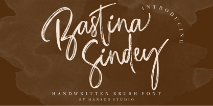 Bastina Sindey is a natural handbrush font. This texture is very detailed. You can get also the swash brushes include in this font pack. This font is suitable for logos, shirts, fashion, blogs, websites, product branding, posters, flyers, any print template or for text overlay to any background image. Comes with a full uppercase, lowercase, numbers and punctuation + standard multilingual support. It’s great for branding, logo designs, lettering, logotype, craft, posters, packaging and much more. We recommend using Adobe Illustrator or Photoshop. Tutorial how to Install & use Alternate / Special Character : https://hanscostudio.com/tutorial/ Enjoy!
 - Rathery by Scratch Design,
$15.00 Please welcome, Rathery Rathery is a textured handwritten script font made by Love. This font is detailed and has a beautiful shape. It will give you a summer vibe in your design. This font will be perfect for posters, invitations, branding, social media content, headlines, body text in magazines, logos and many more. What you'll get : Uppercase and lowercase Numbers & punctuation Multilingual support Alternates for lowercase Ligatures Please make sure you have your OpenType Ligatures turned on to see the magic of ligatures. Thank you for your purchase! Hope you enjoy our font!
 - Snowflake Drop Caps by Celebrity Fontz,
$15.99The Snowflake Drop Caps font is a set of highly ornate block letters with rich embedded snowflake designs, perfect for winter and holiday themes and publications or any text where you want to add some texture, pizzazz, and depth to make your message stand out. This one-of-a-kind font has the feel of a homemade embroidered or quilted design and comes with both upper and lower case letters to give you more design flexibility. (Numbers, special characters, and punctuation are a neutral sans serif typeface and are included for convenience only.) - Gothiks Round by Blackletra,
$50.00 Gothiks Round is the rounded version of Gothiks. It is a narrow 6-weight display sans-serif influenced by Texturas. The rhythm and verticality of Texturas can be easily identified on the letters with diagonal strokes like A N M K k V v W w X x Y y Z z: here they are all vertical. This kind of morphology was chosen because it accepts condensation in a very natural way, giving to this sans-serif a very unique personality. The intermediate weights can be used for short texts while extreme weights are excellent for big sizes. It has an extensive character set—with extensive language support—and many OpenType features like fractions, small capitals and different figure sets. Default figures align with lowercase. The typeface’s name refers to the plural of the word Gothic, which in turn can refer to both sans-serifs or Blackletter, depending on geographic location.
 - Woven by Ingrimayne Type,
$9.00 Woven is a geometrical typeface based on a simple tessellation or tiling pattern. The template for the letters has both vertical and horizontal symmetry and the tiling pattern has four-fold rotational symmetry. Variations of this pattern are popular with quilters and most have a woven look to them. To fit the letters into the template results in some distorted letters but it is the pattern that matters, not the individual elements of that pattern. With proper spacing, a block of text will fit together both horizontally and vertically. Woven is intended to be used with alternating letter sets and the OpenType feature of contextual alternatives does this automatically in applications that support it. The upper-case could be used alone but it unlikely that the lower-case characters could be used by themselves. The typeface is hard to read and would make a challenging font for word-search puzzles.
 - Caballero by Fabio Godoy,
$29.95 Typographical Caballero is a family created by Fabio Eduardo Godoy Angel, the concept is inspired by a type with firm and clear, with perfect posture and personality to be used by Graphic Designers and Architects, in terms of print, TV Corporate Identity, Merchandising - Other Projects. Ideal for antetétulos, titles, subtitles, texts from 12 Pts. Caballero Outline and Caballero Outline Italic, are presented as an option for antetétulos, titles and subtitles as well as short texts from 20 Pts. Caballero in his presentation Outline, allows wide range of applications in regard to the use of color, and be combined with Caballero Regular and Caballero Italic. Font Project Caballero, is set with a vertical and horizontal logic calligraphic lines, amount of contrast medium, antlers mullet and its completions are straight.