10,000 search results
(0.235 seconds)
- Andes Neue by Latinotype,
$29.00 Unlike its predecessor, Andes Neue contains a larger character set of 759 glyphs which support 219 Latin-based languages from 212 countries. The font comes in 4 variants that provide a wide stylistic range. Andes Neue is the most similar to the original Andes design. The Alt1 character set bears some similarity to the old Andes's (yet cleaner); Alt2 uses the alternates in the font as default glyphs; and Alt3 is a mixture of the other three variants that offers a balanced set of characters. Andes Neue also includes new accents and glyphs for a wider language support, and a set of small caps (in each variant). All of these features give the font a strong personality that helps make text look more appealing. Andes Neue varied weights work well with both short and mid-length text sections, providing a wide range of choices for any design project.
 - Capraia by CAST,
$45.00 Capraia is a book typeface, with a heavily quirky look when shown at big sizes, and with an irregular but attractive rhythm at text sizes. Capraia Book and Regular are designed specifically for continuous texts: Book meets a current preference of Italian publishers for lighter faces, while the slightly heavier Regular is intended for the wider international market. True to its vocation for publishing, Capraia has a big x-height, medium contrast and wide bracketed serifs. Furthermore, its slightly flattened curves, some unconventional roman letterforms (a, G, Q) and the 'slanted roman' italics, along with design details such as ball terminals, give to the whole family a very contemporary appeal. Originally the design was intended as a tribute to Caslon's Great Primer but at a certain point the designer was enthralled by Baskerville. Capraia is the unpredicted and original result of that intense experience.
 - Steady Sans by District,
$20.00 English by influence with an American disposition and modernist details, Steady Sans is a blend of styles from multiple eras. Decidedly expansive letterforms make for an overall lively presence. Fluid italics, multiple weights, and alternate forms provide a variety of tone for headline use and solid construction works well for text settings.
 - Grasstrack by Gassstype,
$33.00 Hello Everyone, introduce our new product Font Grasstrack This Is Rough Brush Font.This is a Textured Natural Style and classy style with a clear style and dramatic movement. That is has charming, authentic and relaxed characteristic more natural look to your text. You can activate 29 Ligatures and 5 Alternate glyphs OpenType panel.
 - MD Grotesque by Margarita Dyakovich,
$12.00 MD Grotesque is sans serif font family with a modern and minimalist feel with high readability. It’s extremely versatile and can be used for a big variety of design projects. Perfect for any simple text. It comes in 3 weights and its matching italics. Each style includes Latin and Cyrillic character set.
 - Witchcraft by Alan Meeks,
$45.00 Witchcraft is a classic Roman font in three weights and corresponding italics. The ‘v’,’w’,and ‘y’, use the old style join at the top reminiscent of Georg Belwe’s Roman design “Belwe”. The large x-height makes for a powerful headline font but excellent for text setting especially in the lighter weights.
 - PR Scrolls by PR Fonts,
$10.00 Inspired by food labels, signs and coats of arms, PR-Scrolls is a collection of images which can be used for framing text in contexts where antiquity, craftsmanship, or traditional quality are conveyed. There are several sets of glyphs which work together to make a variety of shapes, or banners of custom length.
 - Spectre by Letteralle,
$23.00 Spectre is an allcaps display font. With bold and sharp shapes, this font is able to bring a fierce and bold impression to your designs. Spectre is perfect for editorial projects, Logo design, Music Album, Clothing Branding, product packaging, magazine headers, or simply as a stylish text overlay to any background image.
 - Mengelt Basel Antiqua by Linotype,
$29.99 Inspired by the excellent serif fonts of the Basel printer of the 15th and 16 Century, Christian Mengelt designed the Mengelt Basel Antiqua. The typeface is a Renaissance Antiqua with stylistic reference to the historical model, but with the technical and typographic qualities of a modern text typeface with excellent reading quality.
 - Mengelt Basel Antiqua Paneuropean by Linotype,
$103.99Inspired by the excellent serif fonts of the Basel printer of the 15th and 16 Century, Christian Mengelt designed the Mengelt Basel Antiqua. The typeface is a Renaissance Antiqua with stylistic reference to the historical model, but with the technical and typographic qualities of a modern text typeface with excellent reading quality. - Latica Stamp by Vertigo,
$21.00 Latica Stamp is a rounded, display font, imitating stamped writing, with deformed lines. Body text looks clear and legible, but the best use is where there is a need to escape from the clichéd, classic, sharp font. It works well for bold projects, posters, billboards, press advertisements, websites, packaging. It provides multilingual support.
 - Thinkthin by Gassstype,
$27.00 Hello Everyone, introduce our new product Font Thinkthin This Is Display Thin Font.This is a Textured Natural Style and classy style with a clear style and dramatic movement. That is has charming, authentic and relaxed characteristic more natural look to your text. You can activate 2 Ligatures and 42 Alternate glyphs OpenType panel.
 - Blessing Night by Gassstype,
$23.00 Hello Everyone, introduce our new product Font Blessing Night This Is Simple Script Display Font .This is a Textured Natural Style and classy style with a clear style and dramatic movement. That is has charming, authentic and relaxed characteristic more natural look to your text. You can activate 14 Ligatures glyphs OpenType panel.
 - Garetc by Muksal Creatives,
$15.00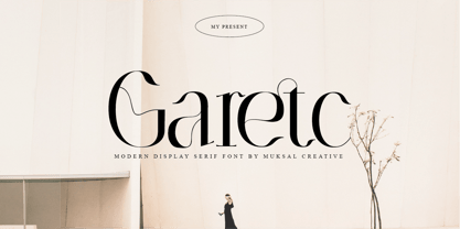 Garetc Modern serif Font typeface with beautiful alternate and ligature, special glyphs, ornament and multilingual support. It's a very versatile font that works great in large and small sizes. Perfect for editorial projects, Logo design, Clothing Branding, product packaging, magazine headers, or simply as a stylish text overlay to any background image.
 - Rolleston by Pepper Type,
$40.00 Rolleston is a rigid 42-style serif font family with peculiar spiky serifs. It comes in three optical sizes: Text, Title, and Display. Rolleston features extensive language support including Cyrillic, contains a variety of Opentype features, and an abundance of ligatures and alternative to choose from – for fancy headlines and elegant body copy.
 - Andralis ND by Neufville Digital,
$45.25 Andralis was designed by Ruben Fontana in tribute to the designer Juan Andralis. Its handcrafted, strong and robust appearance, maintains at the same time a friendly and human tone. It was specifically designed to perform well in long texts, also offering excellent results in headlines. Andralis is a Trademark of BauerTypes SL
 - Brillany by Solidtype,
$14.00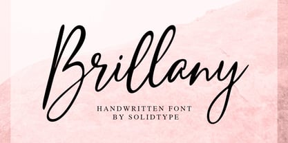 Brillany is a simple handwritten script font, modern and fashionable. This elegant font is legible and looks great as a headline or in body text. This font will perfect for many different project for blogging, social media, branding, wedding invites, cards etc. Including ligatures, uppercase and lowercase, punctuation and multiple languages support.
 - Fanditta by Gassstype,
$27.00 Hello Everyone, introduce our new product Font Fanditta This Is Rough Brush Font.This is a Textured Natural Style and classy style with a clear style and dramatic movement. That is has charming, authentic and relaxed characteristic more natural look to your text. You can activate 20 Ligatures and 21 Alternate glyphs OpenType panel.
 - Monoela by Interfont,
$40.00 Inspired by the mechanical typewriter, Monoela interprets its characteristics in a contemporary way — whether in body text or emphasis. Despite being a non-proportional typeface, Monoela guarantees good legibility, both for man and machine. Matter-of-factly and rational at first sight, Monoela's character becomes visible in striking shapes and unexpected proportions.
 - Antiga by FAEL,
$25.00 What happens when Roman and Art Nouveau heritage get together? Antiga happens. Combining an old style typeface with an elegant and modern touch, Antiga is ideal for magazines and newspaper headlines, or even book covers! With a delightful and versatile amount of ligatures and diacritics, Antiga will give your text a unique personality.
 - Devils Crew by Gassstype,
$25.00 Hello Everyone, introduce our new product Font Devils Crew it is All Caps Horror Font.This is a Textured Natural Style and classy style with a clear style and dramatic movement. That is has charming, authentic and relaxed characteristic more natural look to your text. You can activate 4 Ligatures glyphs OpenType panel.
 - Kenlan by Muksal Creatives,
$16.00 Kenlan Modern Bold serif Font typeface with beautiful alternate and Ligature, special glyphs, ornament and multilingual support. It's a very versatile font that works great in large and small sizes. Perfect for editorial projects, Logo design, Clothing Branding, product packaging, magazine headers, or simply as a stylish text overlay to any background image.
 - Rigide by Gerald Gallo,
$20.00 Rigide is a clean, contemporary, geometric, condensed font family. There are 6 fonts in the Rigide family, Rigide Light, Rigide Light Oblique, Rigide Medium, Rigide Medium Oblique, Rigide Bold and Rigid Bold Oblique. The Rigide fonts are ideal for headlines, titles, branding, small blocks of text or wherever a fresh font is desirable.
 - Dotmap by Type Associates,
$21.50 The inspiration for Dotmap came about while researching text size screen fonts for use on LCD and LED displays. Conforming strictly to a matrix there are no kerning pairs and all characters are positioned on a fixed increment providing the user an authentic grid effect. This font is suitable for screen or print.
 - Camilen by Muksal Creatives,
$14.00 Camilen Modern serif Font typeface with beautiful alternate and ligature, special glyphs, ornament and multilingual support. It's a very versatile font that works great in large and small sizes. Perfect for editorial projects, Logo design, Clothing Branding, product packaging, magazine headers, or simply as a stylish text overlay to any background image.
 - Bs Monofaked by Feliciano,
$37.92Monospaced become very popular among graphic designers. Nevertheless, I’ve noticed that in most cases that designers use monospaced typefaces is not because of their particular features caused by the strict rules of design — all characters share the same advanced width — rather because of it’s ‘electronic derived’ appearance. So, I decided to create a typeface that keeps the characteristics that, in my opinion attract designers to this particular sort of types, but deliberately break the main rule: characters do not share the same width — but they they look like they do! Characters are better balanced compared to truly monospaced types, giving more even typographic color while used in text setting. One weight might enough to please electronic type lovers. Designed in 2000. - Dizengof by Yinon Ezra,
$9.00 'Dizengof' is a Display Typeface, design to deliver a humanistic quality with a unique interpretation for the latin type. The Bold look of 'Dizengof' gives a magnetic visual impact, that is thanks to the strict attention of spaces within and between the letters. Can be used for logos, posters, on video, and of course - branding. The Bold look of 'Dizengof' gives a magnetic visual impact, that is thanks to the strict attention of spaces within and between the letters. Has 2 Stylistic sets.
 - Royal Stencil JNL by Jeff Levine,
$29.00 An image spotted on the internet of a brass shipping stencil for the Royal Quality Brand (for the John H. Fitch Company of Youngstown, Ohio – a coffee and spice merchant). The lettering style for “Royal Quality” was a hand-cut, condensed, slightly flared sans serif with various character flourishes, giving the letters a stylish, somewhat regal look. Expanding on this idea, a full character set was developed and redrawn digitally as Royal Stencil JNL, which is available in both regular and oblique versions.
 - Whisky Fudge by Braw Type,
$16.00 Whisky fudge is a tasty handmade font! With its smooth edges and fun style Whisky Fudge will make your creative projects look simply delicious! Giving your design ideas a more personal touch, it’s a great choice for gift tags, greeting cards and invitations. The font comes with a set of standard ligatures (including double letters) and 5 final form characters to add extra flavour to your words. Uppercase letters also look great on their own for added creativity. Enjoy!
 - Malino by Lafontype,
$25.00 Malino is a humanist sans serif that gives a slightly stiff and strong feel but still presents a harmonious blend. The main characteristic of Malino is the flat shape at the end of the letter (specific : inner side of the letter C, G, J, S, a, c, e, g and s) and still maintain the curvature of the outside (Overshoot) so that empty space ( Open Counter) looks wider and the level of readability produced is much higher.
 - Jugenstil Kunsthand by Scriptorium,
$12.00Jugendstil Kunsthand is based on a sample of late 19th century lettering in a style often associated with artists of the Jugendstil Art Nouveau movement in Germany. The characters are done in heavy outline with a rough-hand drawn look. The style is interesting because it shows the influence of the Arts and Crafts movement on Art Nouveau with many of the characters featuring alternate versions that nest together in a manner typical of Arts & Crafts lettering. - BAQ Rounded by Thinkdust,
$10.00 BAQ Rounded sets itself up as a simplistic and blocky font, but it hides a deeper form. With indents in all the right places, this font creates a double image in our mind, of the form we see and the form we know, letters that bulge into blobs and letters that are easy to follow. This double image results in a casual, over the top yet easy to read font designed for relaxing and carefree messages.
 - Resize by sizimon,
$15.00 Resize is a handmade typeface that is inspired from hand-drawn lettering. It is suitable for your awesome works such as product packaging, posters, social media posts, advertisements and product designs. It contains a full set of lower and uppercase letters, a large range of punctuation, numerals, and multilingual support, also has alternative characters. To enable the OpenType Stylistic alternates, you need a program that supports OpenType features such as Adobe Illustrator CS, Adobe Indesign & CorelDraw X6-X7.
 - Vedacity by Konstantine Studio,
$18.00 Vedacity is a sophisticated glamorous script font, with modern calligraphy style that you'll hard to resist like the nowadays trend. Inspired from the society behaviour who always craving for the trends but still want to show something different yet special from it. Yes, that's why it came with a bunch of Stylistic Alternates of each letters because everybody loves a choices, in a pack. And also the Ligatures for every double letters to get the seamlessly handwritten looks.
 - Quub by OneSevenPointFive,
$10.00 An excellent choice for Logo design, Headlines, Titles, All caps text, etc. Feedback: https://forms.gle/iY8Zswmsg689m95M8
 - Hebrew Maran by Samtype,
$49.00 The beautiful and elegant typeface is excellent use in wedding invitations, art, posters, and small texts.
 - Ayi Dingbats by Ayi Studio,
$10.00 Font family designed for ornament use in texts, with four variants, arrows, emoji, geometry and symbols.
 - Hebrew Sefirot by Samtype,
$49.00 The beautiful and elegant typeface is excellent use in wedding invitations, art, posters, and small texts.
 - Afarsemon MF by Masterfont,
$59.00 High legible and rounded font family to serve all your need from short text to signage.
 - Pronto MF by Masterfont,
$59.00 Beautiful round stems makes this font family an elegant choice, useful both for texts and headlines.