10,000 search results
(0.162 seconds)
- Gerusa by Scannerlicker,
$33.00 Gerusa is a sans-serif technical typeface family by Loligovulgaris.com. It features a 970+ glyph set per cut, with monospaced uppercase and text-suitable lowercase characters, a very complete set of diacritics, math glyphs and a full range of OpenType features. This family is OCR and ISO inspired, with an engineering/architectural feel, robust and pragmatic, with the usual technical ugliness chopped away.
 - Kaisar by Hazztype,
$21.00 Kaisar is a geometric sans serif typeface that draws inspiration from Eurostile or similar typefaces, with less boxy feels. It comes with 9 weights and matching italics and contains 400+ glyphs that support broad latin language. Kaisar was designed to give a corporate, technological, futuristic look, great for many contexts from web to print, as a headline or as a body text.
 - Astoria Classic Sans by Alan Meeks,
$45.00 The latest addition to the Astoria Range, Astoria Classic Sans has the same basic Characteristics as Astoria but with vertical stress. A sans-serif companion to Astoria Sans. Unlike Astoria, but like Astoria Classic, the Italics in form are old style yet with a modern look. Designed specificaly as a text face it still works very well as a headline font.
 - Alore by AB Studio,
$9.49 Alore is a modern serif font family in geometric design, based on the complimenting design of AB ONE. By focusing on the small details during the design, a font was made that comes with a very dynamic style, combining modern elements with classical serif elements. Use Alore for a wide range of your projects, from headlines all the way to messages and text.
 - Queensberry by Talbot Type,
$17.00 Queensberry is a contemporary take on the classic, Egyptian slab-serif style. It is a highly legible text font and an elegant display font at larger sizes. Its versatility is further enhanced by the free-flowing, bespoke italic, which is loaded with personality. Queensberry is available in a full family of five weights and includes a full range of accented characters.
 - Alfonsina by Eduardo Dulin,
$20.00 Alfonsina is a high contrast condensed didone typeface well-suited to classy magazines, short text, branding design, packaging and advertising. With a great set of alternates and swashes, allowing for more stylized designs. This font of thin serifs includes italic, strengthening the concept of its design. Alfonsina contains a set of more than 500 characters and supports a variety of languages.
 - Stay Golden by Rotterlab Studio,
$15.00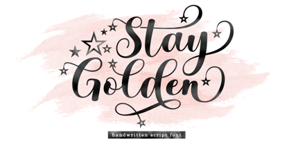 Introducing Stay Golden Script font in a smooth handwriting style and very pretty and classy. Stay Golden is perfect for branding projects, home appliance design, product packaging, use in business cards, invitation cards, etc. Simply as a stylish text overlay onto a background image or anything else that needs a touch of elegance. Thanks for checking! I really hope you enjoy it.
 - Zenaida by Hanken Design Co.,
$30.00 Zenaida is a distinctive display serif font adorned with stylized serifs, evoking a floral essence. Its graceful, flowing ligatures and stylistic alternates add an organic touch to text. Featuring a range of styles including Regular, Medium, Bold, ExtraBold, and an additional semibold weight, Zenaida offers versatility across various design applications, providing a diverse set of options to infuse character and distinction into projects.
 - The Franky Dunkey by Zeenesia Studio,
$17.00 The Franky Dunkey is a Bold style serif font with strong character and soft features. modern and classic serif font with a clear and bold look. It’s a very versatile font that works great in large. Perfect for editorial projects, Logo design, web font, clothing branding, product packaging, magazine headers, or simply as a stylish text overlay to any background image.
 - Numis by Tyler Jamieson Moulton,
$11.00 Numis was born out of a coin collecting hobby. A quick survey of coins from the late medieval to modern periods to today led to this unicase design. The rounded corners and smoothed edges are meant to evoke a the slightly worn letterfaces found on old coins; a process that tends to bolden the text before being rubbed away completely.
 - Mighty Courage by Zeenesia Studio,
$15.00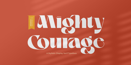 Introducing Mighty Courage Mighty Courage is a modern and elegant serif font. Mighty Courage is It's modern and classy font with a unique and deference look . Perfect if you need a dose of fun in your project. Perfect for editorial projects, Logo design, web font, clothing branding, product packaging, magazine headers, or simply as a stylish text overlay to any background image.
 - Brushelva by Mevstory Studio,
$25.00 Introducing Brushelva Classic Sans Serif Font , created by Lettercorner Studio. Thelma is a traditional font for the classic sans serif type. A simple font, with a thin size, adds an elegant and classy impression. This typeface is perfect for an elegant logo, branding, travel promotion, layout magazine, beauty product, packaging product, quotes, or simply as a stylish text overlay to any background image.
 - BD Supper by Typedifferent,
$45.00 "BD Supper" is a friendly and humorous geometric-organic sans serif typeface great for use on food packaging and in gastronomy-related topics. It features a wide selection of alternate characters to choose from. Use them as you like. With two weights regular and bold, «BD Supper» fits the needs to structure a body text with a headline and to create logotypes.
 - Forward Script by Bosstypestudio,
$14.00 Introducing Forward Script Forward Script with a smooth handwriting style and very pretty and lovely. Forward Script is perfect for branding projects, home appliance design, product packaging, use in business cards, invitation cards, etc. Just like a stylish text overlay to a wallpaper or anything that needs a touch of love. Thanks for checking! I really hope you enjoy it.
 - Kra Kra by 066.FONT,
$9.99 Kra Kra is a display font with a playful and extravagant style. With its daring and ornate letterforms, Kra Kra attracts attention and adds a touch of nonchalance to any project. This font is perfect for creative projects such as posters, invitations or branding materials, where a lively and distinctive text finish that catches the eye is desirable. Remastered in 2023.
 - Mystical Woods by Missy Meyer,
$12.00 Mystical Woods is a script and caps font duo. I went back to the basics for this one -- ink and a brush on paper. I cleaned up the letters enough so that there are no jagged edges, but left enough of the character to keep that inky look -- those are the Rough fonts. Then I went back through again and cleaned the heck out of them, making every line and curve smooth for our cut-crafting friends -- those are the Smooth fonts. Since these two fonts were written together with the same tools and style, you can also mix the script letters in with the caps letters! Each font comes with a full set of standard characters and punctuation, as well as over 300 extended Latin characters for language support. And the script fonts also have 45 double-letter ligatures!
 - Mallica by Josstype,
$11.00 Mallica Script, a Hand Lettered Calligraphy Font with beautiful waves and natural flow, has a unique letter style and has a softer and smoother character subtly connecting all the characters. Mallica Script has simple elegant swashes in separate letters. You can use graphic design software to access the alternate letter. Mallica Script is perfect for weddings, invitations, greeting cards, quotations, posters, branding, business cards, stationary, title design, header blogs, excerpts of art, envelopes, modern or design books, titles, pop vintage design, or other purposes to make your project/art design look beautiful and trendy. Mallica Script comes with 273 glyphs. This includes uppercase, lowercase, numbers, fractions, punctuation, multi-language support and OpenType features such as Standard ligatures, stylistic set, alternative style. If you have any questions, please feel free to contact me via email: joelpopon@gmail.com
 - Dokument Pro by Canada Type,
$29.95 Jim Rimmer aptly described his Dokument family as a sans serif in the vein of News Gothic that takes nothing from News Gothic. Building on that internal analysis, Dokument Pro is the thoroughly reworked and expanded of the original main set released in 2005, with different widths still in the pipeline. This new version updates Jim’s work to six Pro weights and their italic counterparts, each of which takes advantage of OpenType stylistic sets to introduce different degrees of graduation from gothic to humanist. Dokument Pro is now a unique text sans family, with an adaptable personality suitable for the kind of edgy, uncompromising corporate and media typography that just tells it like it is, instead of having to resort to the common contemporary luring and baiting tactics. Dokument Pro’s range of weights, styles and features (over 775 glyphs per font, built-in small caps, alternates galore, and support for over 45 Latin languages) allows for multi-application versatility and clear, precise emotional delivery. This is the kind of straight-shooter sans that should be in every designer’s toolbelt. For more details on the fonts' features, text and display specimens and print tests, consult the Dokument Pro PDF availabe in the Gallery section of this page. 20% of Dokument Pro’s revenues will be donated to the Canada Type Scholarship Fund, supporting higher typography education in Canada.
 - Predators Cuspid by Gleb Guralnyk,
$14.00 A vintage angry looking typeface named "Predators Cuspid". It has a grunge scratched texture effect. Protruding "fangs" can be achieved by using a capital letters. Thank you and have a nice day!
 - Sugarbell by PizzaDude.dk,
$20.00 Sugarbell is ready for your next project that needs a little extra handmade energy!
 - Tango MF by Masterfont,
$59.00 A super elegant and serif font will make your next book cover stand out.
 - Campuni by Identity Letters,
$29.00 A charming confidant. Italic, but without the slant. Campuni is a sans-serif typeface that can be described as an “upright italic”: its letters are modeled on the handwritten forms of italics—but without the slant. This gives Campuni a contemporary, charming, and trustworthy character. As with most modern sans-serif typefaces, Campuni’s design is based on low-contrast, almost monolinear strokes with a neat and clear appearance. This is where Campuni’s steep and tapered joints come in: with a bit of contrast, they provide the perfect foundation for a steady rhythm between characters—just like you’d find in meticulous handwriting. Careful spacing ensures that this rhythmic character is preserved on the page and on screen, making for a pleasant reading experience. It’s not just the letterforms that gain from Campuni’s calligraphic heritage, though. This typeface is packed with calligraphy-style swash capitals and end swashes on lowercase letters, as well as discretionary ligatures. These are available via OpenType, allowing you to spice up your logo or headline with a hint of calligraphy in a breeze. Despite its flawless legibility in body text, Campuni is definitely eye-catching in display sizes. (Decrease letterspacing for some additional punch.) Besides logo design, Campuni is a great choice for branding, advertising, packaging, corporate design, or even signage and wayfinding. The range of topics that Campuni excels in varies from food, leisure, retail, e-commerce, music, and travel to games, toys, childcare, and family-themed events. Campuni has got an Extended Latin character set, seven sets of figures, case-sensitive forms, arrows, and a few other advanced typographic features—622 glyphs in total. Its eight weights span from Thin to Black.
 - Rotis Semi Sans by Monotype,
$40.99 Rotis¿ is a comprehensive family group with Sans Serif, Semi Sans, Serif, and Semi Serif styles, for a total of 17 weights including italics. The four families have similar weights, heights and proportions; though the Sans is primarily monotone, the Semi Sans has swelling strokes, the Semi Serif has just a few serifs, and the Serif has serifs and strokes with mostly vertical axes. Designed by Otl Aicher for Agfa in 1989, Rotis has become something of a European zeitgeist. This highly rationalized yet intriguing type is seen everywhere, from book text to billboards. The blending of sans with serif was almost revolutionary when Aicher first started working on the idea. Traditionalists felt that discarding serifs from some forms and giving unusual curves and edges to others might be something new, but not something better. But Rotis was based on those principles, and has proven itself not only highly legible, but also remarkably successful on a wide scale. Rotis is easily identifiable in all its styles by the cap C and lowercase c and e: note the hooked tops, serifless bottoms, and underslung body curves. Aicher is a long-time teacher of design and has many years of practical experience as a graphic designer. He named Rotis after the small village in southern German where he lives. Rotis¿ is suitable for just about any use: book text, documentation, business reports, business correspondence, magazines, newspapers, posters, advertisements, multimedia, and corporate design.Today Rotis ia also available with pan european caracter set.
 - Rotis Semi Sans Paneuropean by Monotype,
$92.99Rotis¿ is a comprehensive family group with Sans Serif, Semi Sans, Serif, and Semi Serif styles, for a total of 17 weights including italics. The four families have similar weights, heights and proportions; though the Sans is primarily monotone, the Semi Sans has swelling strokes, the Semi Serif has just a few serifs, and the Serif has serifs and strokes with mostly vertical axes. Designed by Otl Aicher for Agfa in 1989, Rotis has become something of a European zeitgeist. This highly rationalized yet intriguing type is seen everywhere, from book text to billboards. The blending of sans with serif was almost revolutionary when Aicher first started working on the idea. Traditionalists felt that discarding serifs from some forms and giving unusual curves and edges to others might be something new, but not something better. But Rotis was based on those principles, and has proven itself not only highly legible, but also remarkably successful on a wide scale. Rotis is easily identifiable in all its styles by the cap C and lowercase c and e: note the hooked tops, serifless bottoms, and underslung body curves. Aicher is a long-time teacher of design and has many years of practical experience as a graphic designer. He named Rotis after the small village in southern German where he lives. Rotis¿ is suitable for just about any use: book text, documentation, business reports, business correspondence, magazines, newspapers, posters, advertisements, multimedia, and corporate design.Today Rotis ia also available with pan european caracter set. - Rotis Semi Serif Paneuropean by Monotype,
$92.99Rotis¿ is a comprehensive family group with Sans Serif, Semi Sans, Serif, and Semi Serif styles, for a total of 17 weights including italics. The four families have similar weights, heights and proportions; though the Sans is primarily monotone, the Semi Sans has swelling strokes, the Semi Serif has just a few serifs, and the Serif has serifs and strokes with mostly vertical axes. Designed by Otl Aicher for Agfa in 1989, Rotis has become something of a European zeitgeist. This highly rationalized yet intriguing type is seen everywhere, from book text to billboards. The blending of sans with serif was almost revolutionary when Aicher first started working on the idea. Traditionalists felt that discarding serifs from some forms and giving unusual curves and edges to others might be something new, but not something better. But Rotis was based on those principles, and has proven itself not only highly legible, but also remarkably successful on a wide scale. Rotis is easily identifiable in all its styles by the cap C and lowercase c and e: note the hooked tops, serifless bottoms, and underslung body curves. Aicher is a long-time teacher of design and has many years of practical experience as a graphic designer. He named Rotis after the small village in southern German where he lives. Rotis¿ is suitable for just about any use: book text, documentation, business reports, business correspondence, magazines, newspapers, posters, advertisements, multimedia, and corporate design. Today Rotis ia also available with paneuropean caracter set. - Rotis Semi Serif by Monotype,
$40.99 Rotis¿ is a comprehensive family group with Sans Serif, Semi Sans, Serif, and Semi Serif styles, for a total of 17 weights including italics. The four families have similar weights, heights and proportions; though the Sans is primarily monotone, the Semi Sans has swelling strokes, the Semi Serif has just a few serifs, and the Serif has serifs and strokes with mostly vertical axes. Designed by Otl Aicher for Agfa in 1989, Rotis has become something of a European zeitgeist. This highly rationalized yet intriguing type is seen everywhere, from book text to billboards. The blending of sans with serif was almost revolutionary when Aicher first started working on the idea. Traditionalists felt that discarding serifs from some forms and giving unusual curves and edges to others might be something new, but not something better. But Rotis was based on those principles, and has proven itself not only highly legible, but also remarkably successful on a wide scale. Rotis is easily identifiable in all its styles by the cap C and lowercase c and e: note the hooked tops, serifless bottoms, and underslung body curves. Aicher is a long-time teacher of design and has many years of practical experience as a graphic designer. He named Rotis after the small village in southern German where he lives. Rotis¿ is suitable for just about any use: book text, documentation, business reports, business correspondence, magazines, newspapers, posters, advertisements, multimedia, and corporate design. Today Rotis ia also available with paneuropean caracter set.
 - Gasco by Joelmaker,
$30.00 GASCO is a collection of natural handwritten letters inspired by the retro style of the 70s and 80s, the style seems to take us a little back to the manual era, this type of letter is very unique, you can change from modern to retro or vintage style with a combination of a collection of alternates so it is ready to help To make your design look elegant, in the image shown you can see what this letter can do. There is a condensed version and an italic version of the font included 9 Upright and 9 Italic weights, ranging from Sheer to Black, all coming in 1 Outline style. This font also comes with 1 more elegant display style.
 - Sand Forest by Authentype,
$12.00 Sand Forest is a display font with a full set of uppercase and lowercase letters, multilingual symbols, numerals, punctuation, and ligatures. Sand Forest elegant display font 9 family, classic and elegant style for poster design, magazines, branding concept. Features: Standard glyphs uppercase and lowercase letters Numerals, a large range of punctuation and ligatures. Lowercase letters include ending swashes. Works on PC & Mac. Simple installations, accessible in Adobe Illustrator, Adobe Photoshop, Adobe InDesign, even work on Microsoft Word. PUA Encoded Characters – Fully accessible without additional design software. Fonts include multilingual support for; ä ö ü Ä Ö Ü ß ¿ ¡ ____ Image used: All photographs/pictures/logo/vectors used in the preview are not included, they are intended for illustration purposes only. Hope you enjoy our font!
 - Umbero by NaumType,
$25.00 Umbero is an experimental geometric blackletter. Umbero was inspired by modern street art (by artists like Pokras Lampas, RETNA, etc.), gothic script and constructivism. It has an ornate and twitchy structure: you can not find two similar letters. Capital letters have even more complex structure, then lowercase, to the extent that you can even use them as initial letters with a different, more calm font if you want to achieve a medieval stylization in a contemporary way. Get Umbero if you need something extra for your design. Or vice versa use it as a starting point of your work. It’s a perfect choice for the mystic or contemporary logos, headlines, oversize typography, branding, identity, website design, album art, covers, posters, advertising, etc.
 - Shirataki by Fenotype,
$30.00 Shirataki is a soft pen script with clear round letter shapes and large display capitals. Shirataki has really low contrast -it’s almost monolinear. Shirataki is a clear and friendly display script ideal for logo, signature, packaging, poster or headline purposes. Shirataki uses Contextual Alternates to keep the connections smooth and it has Swash alternates for every standard letter. There’s even more alternates in glyph palette. There’s also a set of swash endings coded in Titling Alternates and set in lowercase letters. In addition there’s a selection of strokes set in uppercase A-H. Shirataki is PUA encoded so you can access extras in most graphic design softwares even without OpenType support. In case you were wondering Shirataki are Japanese yam noodles. Enjoy!
 - Make Fun Of Me by PizzaDude.dk,
$20.00 This 3D lettering font was done with my inky ballpoint pen. Comes with ligatures for double lettering and alternate letters in upper- and lowercase.
 - KG I And Love And You by Kimberly Geswein,
$5.00 Conversation hearts! Use ALL CAPS for even lettering. For bouncy letters, alternate uPpEr and LoWeR cases to make the letters bounce up and down.
 - Kg Pdx Bridgetown by Kimberly Geswein,
$5.00 This font is intended to be used with all of the lowercase letters. Alternate glyphs for each letter are contained in the capital letters.
 - Slantblaze Pro by Campotype,
$25.00 We Redesigned this Slantblaze-Pro. Slantblaze Pro is an exteme slanted display script with characteristics: Simple, Thick, Contrast, and Dynamic. First launched in 2011, and now we present it again in a new version to provide the best user experience. As italics (default), Slantblaze Pro has aloof challenge as a display font. It was designed as an alternative for headline, title in any purpose such as header, brands, packaging, identity, automotive logo, etc. What’s new and changed: This version 2.02 comes in a True Type OT-flavor version. The outline were designed to be smoother than before. Redesign of ‘C’, ‘E’, ‘F’, ‘G’, ‘T’, and some changes to all other smallcases Removed: question.sc, questiondown.sc, exclam.sc and exclamdown.sc assuming they will never be used Rewrite the features structure and adding some new related to all changes New swashed glyphs: A-Z The writing system of numbers is completed with the old-style version and each tabular and proportional method New contextual (calt) to an alternative look of “A" when combined with all lowercase. Also in this feature we have another way to access Ornaments is more interactive by combining dlig and calt features. Another new glyph may be access only in feature (salt)
 - Waltari by HiH,
$12.00 Designed by Heinz Konig, Waltari was released by the Rudhard'schen Giesserei of Offenbach A.M., Germany in 1900, and reflects all the flamboyant exuberance of that period. Waltari is a Jugendstil rotunda, combining its blackletter roots with a strong Roman influence in an effort to achieve a broader appeal than the traditional forms. As a rotunda, Waltari is easily read by readers who are not comfortable with the schwabachers and frakturs in common use in German printing. Waltari, with its decorative flourishes, has the amazing ability to be both traditional and youthful at the same time. Especially useful for for scrapbooks and invitations. The Waltari ML package includes: 1. Glyphs for ANSI 1250 Central European, 1252 Western Europe, 1254 Turkish and 1257 Baltic code pages. Total 319 glyphs. 2. Total of 472 kerning pairs. 3. OpenType GSUB features: Salt, dlig, hist and ornm. 4. Proportional Numbers 5. Alternate w and z. 6. Original design decorative ornaments The zip package includes two versions of the font at no extra charge. There is an OTF version which is in Open PS (Post Script Type 1) format and a TTF version which is in Open TT (True Type)format. Use whichever works best for your applications.
 - Kinglet by Atlantic Fonts,
$26.00 Digging a typeface with a sweet mood? Kinglet is sassy, hand-drawn, and sports a royally fun set of double letter ligatures. Like it's namesake, Kinglet is lively and lovable.
 - Showgirl JNL by Jeff Levine,
$29.00 Showgirl JNL was inspired by a photo of a 1940s-era Minsky's Burlesque theater. The neon letters on the marquee spelling out the word 'burlesque' exuded a wonderful period look.
 - Ribbons by Positype,
$20.00 Ribbon type. Holy grail of complex-lettering-turned typeface or an elusive Loch Ness monster that is often teased, possibly seen in the wild, but never confirmed? From the amazing lettering artist and author Martina Flor and masterful type designer Neil Summerour, comes the aptly named Ribbons. Ribbons is a sincere and well-conceived approach to providing a reliable solution to ribbon and ribbon-styled type for creative professionals when a lettering artist just isn’t available. Ribbons provides both flat and ‘folded’ options with the Regular and Fold styles, but then raises the bar with separate layer styles that will allow you to easily create the elegant back and forth movements produced with ribbon-style lettering we have all come to appreciate. These layer options are provided in both ‘smooth’ and ‘pleated’ connected styles. Flor and Summerour didn’t stop there. Each typeface was expanded with a number of stylistic alternates, additional swashed and flourished letters, ligatures, and even more in order to provide as many decorative options as possible to the creative. To round out the nine fonts available in the typeface and to ‘put a bow on it’, they’ve added a separate Shadow style and two different color fonts (available exclusively with family purchases).
 - Barn Owl by astroluxtype,
$20.00 Vintage, country, distressed or just plain worn out. The Texas general store on the side of the highway that has been there since 1954 and they're still selling old fashion bottled soda. A renovation/excavation at a downtown urban construction site reveals the old ad on exterior brick. Barn Owl provides the headline in your project with the ultimate in aged retro visualization. It is a basic minimal font set which includes only uppercase letterforms. It is a headline font best used above 36 points in size. The first of our “Trifonictype” (Tin Sign is the 2nd) there are three components to the font, Barn Owl Outline, Barn Owl Fill and Barn Owl Shadow. These can be used in different combinations for different effects, copy and paste type then indicate a different font each time. Paste in the front or back in application to see effects in combination. Fill and Shadow could be used with irregular letter spacing for various effects. Outline could be used with just Shadow for a another effect. Use your photo manipulation program to overlay and change the transparency of your headline. There are a few extended glyphs and barn(ding)bats in the lowercase letter strokes indicated in a poster sample, these are found only in the Barn Owl Outline. Download PDF manual for complete showing.
 - Sentinel by Comicraft,
$19.00 Common use(s) of Comicraft's All-new, All-different SENTINEL font include FACTOR-X, X-MAN, GENERATION NEXT and X-CALIBRE. Possible Side Effects: This font should not be used if you are trapped in a world you never made or a world full of people that hate and fear you. Prolonged exposure to this font during an Age of Apocalypse may cause fatigue, muscle soreness, first degree burns and immobility. Contraindications in Homo Superior may manifest as an outbreak of large purple automatons. Interactions: Before using this font in either regular or bold doses, notify your doctor of any recent exposure to mechanoids, synthezoids or paranoid androids. Reprogrammed Sentinel has improved spacing and kerning, Western & Central European accents, alternate lettershapes, and a new Interlocking Mode with over 100 connecting letter combinations!