10,000 search results
(0.022 seconds)
- Meroche by MlkWsn,
$15.00 Introducing - Meroche Sweet and Classsy Sans Display Family Meroche Sans Family consists of 4 weight : Thin, regular, medium and bold equipped with 20+ ligatures and alternative letters that look sweet and classy and are very good for your work such as logos, branding, packaging, posters, invitations, insta stories and your advertising needs. If there is anything you need to ask, you can contact me at mlkwsn999@gmail.com
 - Madita by Hubert Jocham Type,
$39.00 Madita started with the idea of an upright sans script. Unlike other script typefaces, some of the characters look fairly constructed. The endings are either vertical or horizontal. On the other hand there are the swashes of a flowing script woven into the sans stroke that create an interesting tension. Madita is surprisingly legible, even in smaller sizes. The upper case letters even work in all caps.
 - Legal by Linotype,
$29.99The Legal typeface family grew out a sans serif project that Hellmut G. Bomm began in the 1970s (his HGB Grotesk). This refined, industrial type family is well suited for short amounts of text, headlines, corporate identity and logo design. In small sizes, the typeface works like many other sans serifs, but with better differentiation between characters. The Legal family includes oldstyle figures and true italics. - CCS Neue Rinjani by Creative Corner Studio,
$29.00 Neue Rinjani is a all-caps sans serif with Wide Stretch contemporary typographic, vintage futuristic art-deco touch Streamline influence of the 1930s and 1940s. A mix from the old Euro-American signage/advertising letters and modern clean sans serif, carefully mousecrafted to bring you the genuine feel of the era. If you're into classic/vintage letter designs, then this typeface suits best for you.
 - Roselates by Maulana Creative,
$14.00 Roselates is a modern script and sans font duo. With light script and thin condensed sans stroke, fun character with some of ligatures. To give you an extra creative work. Roselates font support multilingual more than 100+ language. This font is good for logo design, Social media, Movie Titles, Books Titles, a short text even a long text. Make a stunning work with Roselates font. Cheers, MaulanaCreative
 - Fartage by Slide Shoot,
$9.00 Fartage Sans Serif is a balanced, smooth, elegant and stylish serif font. He has a beautiful character. It fits perfectly with invitation card designs, company logos, movie titles, movie names, business cards, book titles, brand names and various other designs. Fartage Sans Serif is a subtle serif font that exudes sophistication and elegance. Its stylish alternations and ligatures make this font the perfect partner for any project.
 - Displace 2.0 by Serebryakov,
$35.00 Displace 2.0 is a display sans-serif font family. Displace 2.0 is a humanistic sans-serif based on the calligraphic shapes with a pronounced handwriting contrast and open forms typeface. It has a natural thick-thin swelling and shrinking of the strokes as if it were draw calligraphicaly. Displace font family includes five weights with italics: Light, Regular, Medium, Bold and Black. Try it!
 - Khonsong by Jipatype,
$27.00 ขอแนะนำฟอนต์ Khonsong ฟอนต์แบบ semi-condensed sans serif ซึ่งผสมผสานความทันสมัยและอนาคตเข้าด้วยกันอย่างกลมกลืน ด้วยรูปลักษณ์ที่โฉบเฉี่ยวและร่วมสมัย ความกว้างแบบ semi-condensed ทำให้มีความสมดุลที่สมบูรณ์แบบระหว่างการประหยัดพื้นที่และความสามารถในการอ่าน ทำให้เป็นตัวเลือกที่เหมาะสำหรับการใช้งานที่หลากหลาย ตั้งแต่สื่อออนไลน์ไปจนถึงสื่อสิ่งพิมพ์ Introducing "Khonsong," a semi-condensed sans serif font that embodies a harmonious blend of modernity and futurism. With its sleek and contemporary appearance, Its semi-condensed proportions strike a perfect balance between space-saving efficiency and legibility, making it an ideal choice for various applications, from online media to print media.
 - Benn Beckman by Factory738,
$15.00 Beckman is a modern and minimalist sans-serif font family. The combination of minimal and geometric elements renders a modern design. Beckman includes 6 fonts, clean and modern caps, thereby creating more variability. This is irreproachable sans serif to diversify your headlines, branding visual identity, poster, logo, magazines and etc. Six weights Alternate glyphs Latin alphabets Thanks for looking, and I hope you enjoy it.
 - Apella Script by Scoothtype,
$10.00 Introducing the Apella Font Duo; Stylish & modern harmony of sans & script typography. With a tall, condensed sans-serif font and free-flowing script companion, Apella offers beautiful contrasting typography for a wide variety of design projects, including; logo & branding, packaging design, social media post, advertising & product design. Apella contains 3 font files, designed to serve as the perfect companion or strong standalone typography. Thank You.
 - Wasp by NaumType,
$29.00 Wasp is a super-display typeface, which in a few words can be described as well-structured calligraphic humanist sans. It's come to life as an idea to make calligraphy-oriented sans but consciously avoid any horizontal middle strokes. Wasp has a few alternates for each letter, which (despite its unruly nature) allows for finding a good-looking solution in almost any typographic situation.
 - ZT Mostion by Zelow Type,
$14.00 Introducing "ZT Monstion," a fusion of sans and grotesque styles, both in bold weight, radiating an essence of simplicity and modernism. Crafted meticulously, this typeface embodies the purity of sans-serif aesthetics while embracing the boldness of grotesque forms. Its carefully refined x-height and expertly smoothed angles create a mesmerizing balance, where minimalistic design meets commanding boldness. With each character empowered by the weighty black typography.
 - Linoma by FlehaType,
$21.99 Linoma is a handmade font duo consisting of a sans and a stencil version. Its rough and textured appearance derives from the linocutting technique. Use Linoma Stencil as headline or display font and Linoma Sans when you need text settings in smaller sizes. Linoma is suitable for packaging, books, magazines, products and branding projects. It supports most of Central European and Easter European languages.
 - Ebisu by Thinkdust,
$10.00 Ebisu is a sans serif family consisting of 10 different weights. Designed by Alex Haigh in 2010, and influenced by one of his original designs from 2008 Hiruko - Ebisu loses the soft sans serif curves, for a more robust geometric styling. But it’s much more than a geo-replica. The lowercase characters also have a more exaggerated sharpness that gives the whole family a unique look and feel. The kerning has been individually crafted for each letter, with vigorous attention - to ensure that each letter from is produced in a way that works with every member of the set, for a tightly knit sans serif family. It speaks many languages too. The open type features have an extended character set to support Eastern and Western European languages. With each weight conveying a different personality, Ebisu is set to become the modern new sans serif family to sit alongside you classics for versatility, cleanliness and a crafted edge.
 - Blame by Haksen,
$15.00 Blame is a strong font family and sophisticated sans also serif Each font in the family can stand on its own, dynamic and authoritative in their own right. Bison includes ten all-caps fonts: a weight (clean and rough version), two outlines, four italics. - Blame Sans Clean and Rough Regular - Blame Serif Clean and Rough Regular - Blame Sans Clean and Rough Italic - Blame Serif Clean and Rough Italic - Blame Sans Outline Regular and Italic - Blame Serif Outline Regular and Italic FEATURES : a weight / Italics / Outlines / Numbers & Punctuation / Extensive Language Support USE Blame works great in any branding, logos, magazines, films. The different weights give you full range to explore a whole host of applications, while the outlined fonts give a real modern feel to any project. Thanks for having a peek at Blame. I hope you enjoy it and feel free to take it for a spin below! As always, if you have any questions just send me a message! I’m glad to help :) Haksen
 - Adagio Slab by Borutta Group,
$25.00 The Adagio Family is a part of Mateusz Machalski’s, Warsaw Academy of fine arts Master Degree Diploma in multimedia studio, conducted by Professor Stanisław Wieczorek and his brave PhD student Jakub Wróblewski. Adagio is a modern type family. It consists of 3 main varieties: sans, serif and slab. Each has its own “true italic” set. All of the styles together have over 400 characters in 9 different thicknesses. The Adagio family was created mostly for company identities. The idea was to create a wide range of different varieties that are stylistically consistent. Adagio Slab - Slab variety combines qualities of the Sans and Serif varieties. It has the same contrast as Sans. As distinct from Serif, Adagio Slab contains strong, beamy and symmetrical serifs in the form of pillows. Thanks to large X height, and highly stretched descenders, it also works correctly in longer text, while its strong detail is good for headlines. Slab version is a great complement for Adagio Serif and Adagio Sans.
 - Aptifer Slab by Linotype,
$39.00 Aptifer Sans and Aptifer Slab are two 21st century typeface families created by Mårten Thavenius. Each family has seven weights, in roman and italic respectively, making 28 font styles in total. A heritage from two design traditions can be seen in Aptifer. One is the robust American gothic typefaces, like M. F. Benton’s, from around 1900. This is combined with the openness and legibility that comes from the humanist tradition. The sans serif part of the family, Aptifer Sans, is designed without excessive details disturbing the reading. Its sibling Aptifer Slab with its wedge slab serifs is more eye-catching but still suited for text settings. The italics fit well into the text flow of the roman. They are a bit narrower than the roman and have cursive characteristics. Both Aptifer Sans and Aptifer Slab are highly legible typefaces and can be used both in print and on screen. Featured in: Best Fonts for PowerPoints
 - Beorcana Pro by Terrestrial Design,
$40.00 Beorcana can be classified as a serifless roman, a stressed sans, a glyphic sans, or calligraphic sans. However it is classified, Beorcana derives not only from other stressed sans designs like Lydian, Amerigo and Optima, but also utilizes classic Renaissance proportions in both Roman and Italic, which facilitate extended reading. Beorcana is available in Display, regular Text and Micro styles. Beorcana’s Text styles offer comfort and liveliness in books, dictionaries, magazines and other reading-intensive settings. Display styles offer a stately and organic flavor for any application. Micro styles perform in tight and dense settings like dictionaries, bibles, maps and fine print. The name Beorcana is a variant of the Icelandic word for the Birch tree, and the related words for the Icelandic rune. Many variant spellings are used for the tree and the rune: Beorc, Berkanan, Birkana, Bercano, Bjork, Bjarka. The Birch was revered as a symbol of renewal, due to its role as a pioneer species in burned, boggy or otherwise unforested areas.
 - Madrea by Craft Supply Co,
$20.00 Introducing Madrea – Friendly Sans Serif Unconventional Charm Madrea – Friendly Sans Serif is anything but conventional; it introduces a unique and friendly twist to your designs. Irregular Shapes What sets Madrea apart is its irregular shapes, which establish a welcoming and friendly atmosphere. This makes it the perfect choice for designs seeking to break free from formality and monotony. A Breath of Fresh Air In the realm of sans serif fonts, Madrea is indeed a breath of fresh air. Its non-uniformity and organic feel breathe personality and approachability into your projects. Breaking Formality Madrea excels at breaking the chains of formality. It’s an ideal choice for design projects that demand a friendly and informal touch, effortlessly transforming the mundane into something captivating. In Conclusion In summary, Madrea – Friendly Sans Serif is your gateway to a non-uniform, friendly design experience. Its irregular shapes infuse character, warmth, and a refreshing departure from conventional design, ensuring that your creations are brimming with life and far from monotonous.
 - Silverline by Fenotype,
$18.00 Silverline Script & Sans Silverline Script is a hand drawn signature style script. Silverline is fast and expressive -it’s great for contemporary branding and advertising. Silverline Script is equipped with Contextual Alternates and Standard Ligatures that keep the script eloquent and connections smooth. Contextual Alternates and Standard Ligatures are automatically on. In addition Silverline Script has Swash Alternates for A-Z and a-z that can be used for extra flair. From Discretionary Ligatures you’ll find specially designed ligatures for “and”, “for”, “the”, “at” and “in”. Silverline Script is PUA encoded so you can access extra glyphs in any graphic design software. Another half of the Silverline family is Silverline Sans -a three weight ultra-condensed sans serif that works great with the Script. Silverline Sans is great for making sturdy text word blocks - a great type for any display use from magazine covers to packaging. Try combining Silverline Script with Silver Script -they make a nice contrast together.
 - Beorcana Std by Terrestrial Design,
$20.00 Beorcana can be classified as a serifless roman, a stressed sans, a glyphic sans, or calligraphic sans. However it is classified, Beorcana derives not only from other stressed sans designs like Lydian, Amerigo and Optima, but also utilizes classic Renaissance proportions in both Roman and Italic, which facilitate extended reading. Beorcana is available in Display, regular Text and Micro styles. Beorcana’s Text styles offer comfort and liveliness in books, dictionaries, magazines and other reading-intensive settings. Display styles offer a stately and organic flavor for any application. Micro styles perform in tight and dense settings like dictionaries, bibles, maps and fine print. The name Beorcana is a variant of the Icelandic word for the Birch tree, and the related words for the Icelandic rune. Many variant spellings are used for the tree and the rune: Beorc, Berkanan, Birkana, Bercano, Bjork, Bjarka. The Birch was revered as a symbol of renewal, due to its role as a pioneer species in burned, boggy or otherwise unforested areas.
 - Presse (Unregistered) - Unknown license

- AngeGardien - Unknown license

- BoumBoum (Free version) - Unknown license

- Dactylographe (Unregistered) - Unknown license

- Calebasse (Unregistered) - Unknown license

- FG Elias by YOFF,
$14.95FG Elias is an all caps font from handwriting which looks a bit angry I think. It has a size variation between the caps and lowercase. Works great for headers or text you want to emphasize. - Racerboy by Gassstype,
$27.00 Here comes a New Font,Introducing Racerboy is a Racing Themes Display Font .Racerboy has 2 is Normal and Slant styles is perfect for the purposes of designing templates, brochures, videos, advertising branding, logos and more.
 - Allora by Etewut,
$30.00 Allora is a serif based typeface with three font styles: regular, display, hair and double. Mix them as you want: integrate Allora to your website, create mobile app or just make an awesome print. Enjoy it!
 - Prisom by Illuminaut Designs,
$10.00 I really wanted to make my own condensed typeface for memes and such. I think i have succeeded. This typeface is so average looking that no one would suspect that it is in fact very radical.
 - Venture by Linotype,
$29.99Venture Script reflects Hermann Zapf's handwriting. It was originally written with a Japanese feltpen. And like with Zapf's typeface Noris Script he wanted to preserve the rough outline of the handwritten form in the final drawings. - Novido by Autographis,
$39.50 Novido is a new very elegant – extremely slanted – joining script with long ascenders and descenders. It is the male partner of Novita which is the less elaborate female partner of the pair. Great job! Congratulations Ladies!
 - Christmas Collection by Yoga Letter,
$16.00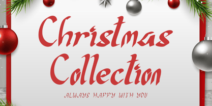 "Christmas Collection" is an elegant display font. This font is equipped with uppercase, lowercase, numerals, punctuation, and multilingual support. Very suitable for Christmas, Santa, weddings, engagements, stickers, logos, banners, branding, Halloween, autumn, winter, Valentine's, and others.
 - Pariphoom by Jipatype,
$27.00 ขอแนะนำ Pariphoom แบบอักษรอันโฉบเฉี่ยวและทันสมัย เหมาะสำหรับงานออกแบบหลากหลายประเภท ด้วยอักษรแบบ sans-serif condensed และมุมโค้งมน แบบอักษรนี้ให้ความสมดุลที่ระหว่างความเป็นทางการและความเข้าถึงได้ง่าย ชื่อปริภูมิมาจากภาษาไทย แปลว่า “Space” และเช่นเดียวกับชื่อของมัน ฟอนต์นี้สามารถให้พื้นที่มากขึ้นในงานออกแบบของคุณ ไม่ว่าคุณกำลังสร้างสื่อสำหรับสร้างแบรนด์ พัฒนาแคมเปญการตลาด หรือออกแบบเว็บไซต์ Pariphoom มอบความยืดหยุ่นและความอเนกประสงค์เพื่อให้ได้รูปลักษณ์ที่คุณต้องการ Pariphoom มาพร้อมกับรูปแบบที่แตกต่างกันถึง 18 รูปแบบ สิ่งนี้ทำให้คุณมีตัวเลือกมากมายและมีความยืดหยุ่นในการใช้งานในหลากหลายบริบท นอกจากนี้ ฟอนต์นี้รองรับหลายภาษาสำหรับภาษาต่างๆ มากมาย แต่นั่นไม่ใช่ทั้งหมด Pariphoom มาพร้อมกับฟีเจอร์ Opentype เจ๋ง ๆ เช่น Small Caps และ Tabular ซึ่ง Small Caps เป็นวิธีที่ยอดเยี่ยมในการเพิ่มความหลากหลายให้กับงานออกแบบของคุณโดยใช้ตัวพิมพ์ใหญ่แทนตัวพิมพ์เล็ก ในขณะเดียวกัน Tabular ก็สมบูรณ์แบบสำหรับการสร้างตารางและจัดตำแหน่งตัวเลขเพื่อให้ดูเป็นระเบียบมากขึ้น โดยรวมแล้ว Pariphoom ทำให้เป็นตัวเลือกที่ยอดเยี่ยมสำหรับนักออกแบบที่ต้องการสร้างผลงานการออกแบบที่น่าจดจำและมีประสิทธิภาพ Introducing Pariphoom, a sleek and modern typeface that is perfect for a wide range of design projects. With its condensed sans-serif design and rounded corners, this font offers a unique balance of professionalism and approachability. Derived from the Thai language, the name Pariphoom means "Space" and just like its name suggests, this font can give you more space in your design. Whether you're creating branding materials, developing marketing campaigns, or designing websites, Pariphoom offers the flexibility and versatility you need to achieve your desired look. Pariphoom comes with 18 different styles. This gives you plenty of options to choose from and the flexibility to use it in various design contexts. Additionally, this font offers multi-language support for a wide range of languages. But that's not all – Pariphoom comes with some cool Opentype features such as Small Caps and Tabular. Small Caps are a great way to add variety to your design by using small capital letters instead of lowercase letters. Meanwhile, Tabular is perfect for creating tables and aligning numbers for a more organized look. Overall, Pariphoom making it a great choice for designers who want to create memorable and effective design projects.
 - Radona by insigne,
$29.00 Radona is a blast from the 80’s that's rader than rad. Radona is the typeface version of Synthwave, an electronic music subgenre that takes influence from the 1980s but builds on it, resulting in a construct that lives in the minds of both those who have experienced it and those who haven't. Radona expresses a nostalgia for 1980s culture, attempting to replicate and appreciate the era's vibe, but extends it further with something new. This sans family has plenty of 80's flavor, but with some fresh twists to push it to the limit. Radona is a geometric sans-serif typeface. Radona has a few quirky characteristics, but it has a generally neutral tone and structure that makes it ideal for usage in print, especially when a contemporary look is desired. It looks amazing in both body text and headlines. The geometric grotesques that were popular in the 1980s served as inspiration. It's a typeface that's been crafted for usage in a range of design fields, from branding to packaging, and it can be used in anything from interfaces to apps. Radona is an excellent typeface for use on websites and other digital applications. Radona comes with a wide variety of styles and a large selection of stylistic alternatives, ligatures, small caps and other special features. Along with parachute pants, synthesized guitar riffs, and VHS scanlines, Radona brings back the 1980’s.
 - Magent by Craft Supply Co,
$20.00 Introducing Magent – Display Typeface A Fusion of Style Magent sets itself apart as a striking Display Typeface that seamlessly merges the timeless elegance of serifs with the contemporary allure of sans serifs. This extraordinary fusion not only shatters monotony but also injects a vibrant energy into your designs. Fun and Playful Typography Magent exudes an unmistakable aura of fun and playfulness. It’s the font to choose when you want to infuse your projects with a touch of whimsy and character. The result is content that not only stands out but also leaves a lasting and memorable impression. Endless Creative Versatility An outstanding attribute of Magent is its sheer versatility. This font effortlessly adapts to a multitude of design contexts, spanning from posters to branding and beyond. Its adaptability makes it a true chameleon in the world of creativity. Memorable and Engaging Magent’s dynamic blend of serif and sans serif elements guarantees that your content remains not only memorable but also engaging. It captivates your audience and leaves them with a vivid and enduring impression, ensuring they keep coming back for more. In Conclusion In summary, Magent – Display Typeface is a font that defies conventions. It’s a design masterpiece that harmoniously combines aesthetics with a playful spirit. Whether it’s branding, posters, or an array of creative projects, Magent is a one-of-a-kind font that captivates your audience and infuses your content with vibrancy and charm.
 - Aeonian by Adorae Types,
$40.00 Aeonian, designed by Emilia Adorno, was mostly inspired by the iconic morphology adopted by the arts of the 1920s. One hundred years later we can still see the resemblance between the wants and the needs of now and then to reach for the sky, to look ahead and enter the future in style. Now as then, we seek the right tools to do so, then once again, we embrace the rational, yet elegant and stylish forms of simplicity, geometry and symmetry. At the same time, there is a strong and growing need for a warmer approach to creating lovemarks. For that, Aeonian’s alternates hold attractive, soft and inviting shapes to an emotional appeal. Aeonian is a combination of all of them. A rational side entwined with an emotional one. Born a geometric sans, Aeonian ended up being a 2 in 1 font with a sans serif set and alternates reaching over 1200 glyphs. The entire family contains 6 weights, from thin to black, with its matching italics. It features a variety of ligatures to be used as connectors, specially for display. It also offers multilingual support, even for certain display ligatures. Later, Aeonian kept growing, with stylistic alternate sets of initial, mid and final glyphs. These are its arms to reach for infinity with a warm heart. The wide range of possibilities that Aeonian offers, makes it the best font for creating vast design systems with a rich visual language.
 - Linotype Aroma by Linotype,
$29.99From the designer, Tim Ahrens... I started designing this typeface about half a year after learning that Frutiger was not a new brand of sweets and that Garamond is not the name of a fragrance. In time it became clear that designing a sans serif must always be considered as a transformation of traditional serifed typefaces instead of deriving it from typefaces that have been derived from others which have been derived from others again. I did not want Aroma to be one of those odourless and tasteless typefaces wich sacrifice a natural feeling and the characteristic shapes of the letters to neutrality. I think that beauty often evolves unintentionally. For example, I am fascinated by the beauty of airfoils, which are actually a careful transformation of a bird's wing. I love their anorganic and abstract shape which still bears the essence and all the complexity of what they are modelled on. This is exactly the formal concept behind Aroma. Many of the outlines are actually parabolics. The small r, for example, consists exclusively of straight lines and parabolics. I decided to give Aroma more stroke contrast than it is usual for sans serif designs. Many strokes are slightly convex, which gives the font an anorganic feeling. The font was intended to have a feel similar to the antiqua. More specifically, it is based on Old Style Faces. The character of those fonts, which were cut during the Renaissance, is still inherent to Aroma. - Patihan Variable by Jehoo Creative,
$119.00 Introducing Patihan Variable, a variant that makes it easy for you to access fonts with sharp, strong, bold characters. Patihan Variable is a combination of three different styles – Sans, Slab, and Serif – which are united into 2 Axes weight axes and serif axes, where weight axes have instances: Thin, Extra Light, Light, Regular, Medium, Semibold, Bold , Extrabold, and Black. This font has beautiful Ligature and Stylistic Alternate settings, Patihan font is also equipped with the Smallcaps feature which gives more control over typography, allowing you to create elegant and unique typography. The sans version of this typeface is versatile and easy to read, with a minimalist but impactful aesthetic. The Slab version is characterized by its solid and powerful strokes, while the Serif style has that extra classic flair with elegant curves and a stark contrast to the look. Patihan Variable is optimized to make it easier to access each variation, all you have to do is slide the slide in the software, and then you can access the style you want. Without sacrificing easy readability, this makes it a great choice for headlines, titles, and any long-form content. Ligature settings and discretionary styling add an extra layer of sophistication, making this font a great choice for magazines, branding and advertising. Overall, this font is a great choice for those looking to make a lasting impression. Its versatility, readability and unique features make it an excellent choice for any project.
 - Distefano Slab by Tipo,
$60.00 Designed from the perspective of a multi-purpose font family, comprehending the slab-serif and humanist-sans subtypes, the Distéfano typefaces were specifically developed and subsequently tested considering the needs of editorial products, for both print and digital media. Includes a comprehensive program where formal, style, thickness and slant attributes are especially indicated for the composition of text and headings in newspapers, journals and magazines. For that reason, in addition to the more traditional weights, others, ranging from Light to Black were added. The identity and systemic criteria of this font family doesn’t fall short on diversity of specific solutions, flair and quirks for each variant, especially noticeable in the contrast of the italics to the roman styles. The original drawings of Distéfano date back to 1983; embodied in pencil on paper, provided only the alphabetical characters and punctuation signs for Spanish, and the Sans Serif family. By digitalizing them, their possibilities of use were widened, the set of characters of each typeface were considerably completed considering the current requirements for the majority of the latin and germanic languages, and the slab-serif family was developed. This type family bears the name of the most notable argentinian designer, and it is a homage to his work, that influenced the youth of the 50’s decade of the 20th century, and especially to him, whom I have always recognized as a friend, and a teacher.


