10,000 search results
(0.024 seconds)
- Flivver JNL by Jeff Levine,
$29.00Flivver JNL takes its name from the slang term applied to Model T's in the 1920s, and it's design is a first-cousin to Two Reeler JNL (inspired by lettering on titles from a Charlie Chaplin silent film). - Typist Code Prop by VanderKeur,
$25.00 The Typist Code SansSerif is part of a big family, the Typist Family. The family consists of a monospaced, a Slab Serif and a SansSerif version. The idea behind this family originated from the research into the design of typewriter typestyles, which is also the reason why the monospaced version was released first. Since it was decided from the start to make a SlabSerif and a SansSerif version of these monospaced fonts, it was also a logical consequence that the proportional variants also became available in these versions. The monospaced SansSerif fonts have been given the name 'Code' since they are designed to be used while writing code for a software program, for example. The proportional variants with each 6 weights of the Typist Slab Serif and Code (SansSerif) are now available. Although the name may seem a bit strange, it is a logical consequence from the monospaced variant. The SansSerif variant therefore has Typist Code Prop, written in full the Typist Code Proportional. After all, who wants to be bothered with long font names in their font menu. The entire Typist family is designed as a font for use in editorial and publishing publications. A lot of attention has been paid to the spacing and kerning of the fonts. Due to the many variants and weights, this font is versatile. Typist Font Family was designed by Nicolien van der Keur and published by vanderKeur design. Typist Slab Prop and Typist Code Prop contains each 6 styles (Thin, Light, Regular, Medium, Semi-Bold and Bold, each weight also designed as a true italic) and has family package options. The links to the monospaced version of The Typist are here: https://www.myfonts.com/collections/typistslabfont-vanderkeur https://www.myfonts.com/collections/typist-code-font-vanderkeur
 - spinwerad - Unknown license

- kawoszeh - 100% free

- Tinkerer by Ingrimayne Type,
$9.00 Tinkerer, TapedUp, and Rumpled are based on the template I used for several letterbat fonts—fonts made of wrenches and bolts, hammers, or paper clips. TapedUp can be thought of as a font made from masking tape, and Rumpled is the same design but the tape pieces are wavy. Tinkerer is the same design but with elements that resemble what might happen if one constructed letters from Tinker Toys. All are caps only, but some of the shapes on the lower-case keys differ from the corresponding shapes on the upper-case keys.
 - Hello Melky by Good Java Studio,
$20.00 Welcome to: Hello Melky - a Kids Display Font It's smooth, it's funny, it's fun, and it's very nice: it's Hello Melky - a Kids Display Font Mixed fonts with many possible combinations. Everything is made with the same brush, and everything is the same size as Hello Melky, so you can be sure they will work well together! It is suitable for you to use in making t-shirt design, quote, label, packaging, logo type, or long writing. Because we have compiled kerning and matrices that are tailored to your needs.
 - Anticode by Ronin Design,
$15.00 Anticode is a modern display font. Featuring a solid style and outline style. Anticode font will bring of your creative ideas to the highest level. This font is perfect for game/app designs, logo designs, poster and many more.
 - Chubby Cheeks - Unknown license

- Corset Pro by DBSV,
$67.00 The Corset Pro is not another font, but not exactly and the same, as the previous two (Khamai Pro, Aeolus Pro) but is simple a different... But it has common elements and is based on two earlier. A new style added is Inlier, has this advantage engagement with Βlack style in the same manner explained in Aeolus Pro. And this series is composed and includes 12 fonts with 625 glyphs each, with true italics and supports Latin, Greek and Cyrillic.
 - Cesium by Hoefler & Co.,
$51.99 An inline adaptation of a distinctive slab serif, Cesium is an unusually responsive display face that maintains its high energy across a range of different moods. The Cesium typeface was designed by Jonathan Hoefler in 2020. An energetic inline adaptation of Hoefler’s broad-shouldered Vitesse Black typeface (2000), Cesium is named for the fifty-fifth member of the periodic table of the elements, a volatile liquid metal that presents as a scintillating quicksilver. From the desk of the designer, Jonathan Hoefler: I always felt that our Vitesse typeface, an unusual species of slab serif, would take well to an inline. Vitesse is based not on the circle or the ellipse, but on a less familiar shape that has no common name, a variation on the ‘stadium’ that has two opposing flat edges, and two gently rounded sides. In place of sharp corners, Vitesse uses a continuously flowing stroke to manage the transition between upright and diagonal lines, most apparent on letters like M and N. A year of making this gesture with my wrist, both when drawing letterforms and miming their intentions during design critiques, left me thinking about a reduced version of the typeface, in which letters would be defined not by inside and outside contours, but by a single, fluid raceway. Like most straightforward ideas, this one proved challenging to execute, but its puzzles were immensely satisfying to solve. Adding an inline to a typeface is the quickest way to reveal its secrets. All the furtive adjustments in weight and size that a type designer makes — relieving congestion by thinning the center arm of a bold E, or lightening the intersecting strokes of a W — are instantly exposed with the addition of a centerline. Adapting an existing alphabet to accommodate this inline called for renovating every single character (down to the capital I, the period, and even the space), in some cases making small adjustments to reallocate weight, at other times redesigning whole parts of the character set. The longer we worked on the typeface, the more we discovered opportunities to turn these constraints into advantages, solving stubbornly complex characters like € and § by redefining how an inline should behave, and using these new patterns to reshape the rest of the alphabet. The New Typeface The outcome is a typeface we’re calling Cesium. It shares many of Vitesse’s qualities, its heartbeat an energetic thrum of motorsports and industry, and it will doubtless be welcome in both hardware stores and Hollywood. But we’ve been surprised by Cesium’s more reflective moods, its ability to be alert and softspoken at the same time. Much in the way that vibrant colors can animate a typeface, we’ve found that Cesium’s sensitivity to spacing most effectively changes its voice. Tighter leading and tracking turns up the heat, heightening Cesium’s sporty, high-tech associations, but with the addition of letterspacing it achieves an almost literary repose. This range of voices recommends Cesium not only to logos, book covers, and title sequences, but to projects that regularly must adjust their volume, such as identities, packaging, and editorial design. Read more about how to use Cesium. About the Name Cesium is a chemical element, one of only five metals that’s liquid at room temperature. Resembling quicksilver, cesium is typically stored in a glass ampule, where the tension between a sturdy outer vessel and its volatile contents is scintillating. The Cesium typeface hopes to capture this quality, its bright and insistent inline restrained by a strong and sinuous container. Cesium is one of only three H&Co typefaces whose name comes from the periodic table, a distinction it shares with Mercury and Tungsten. At a time when I considered a more sci-fi name for the typeface, I learned that these three elements have an unusual connection: they’re used together in the propulsion system of nasa’s Deep Space 1, the first interplanetary spacecraft powered by an ion drive. I found the association compelling, and adopted the name at once, with the hope that designers might employ the typeface in the same spirit of discovery, optimism, and invention. —JH Featured in: Best Fonts for Logos
 - Fontology by FSD,
$2.46 Fontology-E is an experimental font designed by Fabrizio Schiavi. It was created for the cover of the Fontology catalogue. Schiavi's need was to build an optical false modulation effect with versions of the logotype and typical rectangles of an empty font chart. The basic idea was to create a page that contained many rectangles in order to demonstrate the modulation. At the same time, it was important to understand that Schiavi inserted 8 versions of the same logotype each time the corresponding letter is digitized in e, a, d, f, g, h, c and b. The inside of the catalogue has the same layout and text, which is revealed by fanning the pages. Schiavi confess that Fontology-E is a highly experimental typefont.
 - East Anglia - 100% free

- Fleischmann Gotisch PT by preussTYPE,
$29.00 Johann Michael Fleischmann was born June 15th, 1707 in Wöhrd near Nuremberg. After attending Latinschool he started an apprenticeship as punchcutter in the crafts enterprise of Konstantin Hartwig in Nuremberg, which ought to last six years. For his extraordinary talent Fleischmann completed his apprenticeship after four and a half years, which was very unusual. 1727 his years of travel (very common in these days) began, during which he perfected his handcraft by working in different enterprises as journeyman. First location was Frankfurt/Main where he worked for nearly a year at the renowned type foundery of Luther and Egenolff. Passing Mainz he continued to Holland, where he arrived in November 1728 and stayed till he died in 1768. In Amsterdam he worked for several type founderies, among others some weeks for Izaak van der Putte; in The Hague for Hermanus Uytwerf. Between 1729 and 1732 he created several exquisite alphabets for Uytwerf, which were published under his own name (after his move to Holland Fleischmann abandoned the second n in his name), apparently following the stream of the time. After the two years with Uytwerf, Fleischmann returned to Amsterdam, where he established his own buiseness as punchcutter; following an advice of the bookkeeper and printer from Basel Rudolf Wetstein he opened his own type foundery 1732, which he sold in 1735 to Wetstein for financial reasons. In the following Fleischmann created several types and matrices exclusively for Wetstein. In 1743 after the type foundery was sold by Wetstein’s son Hendrik Floris to the upcoming enterprise of Izaak and Johannes Enschedé, Fleischmann worked as independent punchcutter mostly for this house in Haarlem. Recognizing his exceptional skills soon Fleischmann was consigned to cutting the difficult small-sized font types. The corresponding titling alphabets were mostly done by Jaques-Francois Rosart, who also cut the main part of the ornaments and borders used in the font examples of Enschedé. Fleischmann created for Enschedé numerous fonts. The font example published 1768 by Enschedé contains 3 titling alphabets, 16 antiquacuts, 14 italic cuts, 13 textura- and 2 scriptcuts, 2 greek typesets (upper cases and ligatures), 1 arabic, 1 malayan and 7 armenian font systems, 5 sets of musicnotes and the poliphonian musicnotesystem by Fleischmann. In total he brought into being about 100 alphabets - the fruits of fourty years of creative work as a punchcutter. Fleischmann died May 27th, 1768 at the age of 61. For a long time he was thought one of the leading punchcutters in Europe. A tragedy, that his creating fell into the turning of baroque to classicism. The following generations could not take much pleasure in his imaginative fonts, which were more connected to the sensuous baroque than to the bare rationalism of the upcoming industrialisation. Unfortunately therefore his masterpieces did not survive the 19th century and person and work of Fleischmann sank into oblivion. The impressive re-interpretation of the Fleischmann Antiqua and the corresponding italics by Erhard Kaiser from Leipzig, which were done for the Dutch Type Library from 1993 to 1997, snatched Fleischmann away from being forgotten by history. Therefore we want to place strong emphasis on this beautiful font. Fleischman Gotisch The other fonts by Fleischmann are only known to a small circle of connoisseurs and enthusiasts. So far they are not available in adequat quality for modern systems. Same applies the "Fleischman Gotisch", which has been made available cross platform to modern typeset-systems as CFF Open Type font through the presented sample. The Fleischman Gotisch has been proved to be one of the fonts, on which Fleischmann spent a good deal of his best effort; this font simply was near to his heart. Between 1744 and 1762 he created 13 different sizes of this font. All follow the same principles of forms, but their richness of details has been adapted to the particular sizes. In later times the font was modified more or less sensitive by various type founderies; letters were added, changed to current taste or replaced by others; so that nowadays a unique and binding mastercopy of this font is missing. Likewise the name of the font underwent several changes. Fleischmann himself probably never named his font, as he did with none of his fonts. By Enschedé this textura was named Nederduits, later on Nederduitsch. When the font was offered by the german type foundery Flinsch in Frankfurt/Main, the more convenient name of Fleischmann-Gotisch was chosen. In his "Masterbook of the font" and his "Abstract about the Et-character" Jan Tschichold refered to it as "Duyts" again. To honour the genious of Johann Michael Fleischmann we decided to name the writing "Fleischmann Gotisch PT" (unhyphenated). Developing the digital Fleischman Gotisch I decided not to use one of the thirteen sizes as binding mastercopy, but corresponding to the typical ductus of the font to re-create an independent use of forms strongly based on Fleischmann´s language of forms. All ascenders and descenders were standardised. Some characters, identified as added later on, were eliminated (especially the round lower case-R and several versions of longs- respectively f-ligatures) and others were adjusted to the principles of Fleischmann. Where indicated the diverse characters were integrated as alternative. They can be selected in the corresponding menu. All for the correct german black letter necessary longs and other ligatures were generated. Through the according integration into the feature-code about 85% of all ligatures in the type can be generated automatically. Problematic combinations (Fl, Fk, Fh, ll, lh, lk, lb) were created as ligatures and are likewise constructed automatically. A historically interesting letter is the "round r", which was already designated by Fleischmann; it is used after preceding round letters. Likewise interesting is the inventive form of the &-character, which is mentioned by Tschichold in his corresponding abstract. Nevertheless despite all interpretation it was very important to me to maintain the utmost fidelity to the original. With this digital version of a phantastic texturfont of the late baroque I hope to contribute to a blossoming of interest for this genious master of his kind: Johann Michel Fleischmann. OpenType features: - Unicode (ISO 10646-2) - contains 520 glyphes - Basic Latin - Latin-1 Supplement - Latin Extended-A - Latin Extended-B - Central European Glyhps - Ornaments - Fractions - Standard ligatures - Discretionary ligatures - Historical ligatures - Kerning-Table
 - Renny Hybrid - 100% free

- B de bonita shadow - Personal use only

- Source Code Pro - 100% free

- B de bonita - Personal use only

- Hollow Roachian Futhark - 100% free

- Double Porter by Fenotype,
$30.00 Double Porter - an elegant font collection. Double Porter includes following: • 6 fonts - a clean and textured version of each. • Ornaments • Catchwords • Ending swash ornaments for the script Double Porter is a clean cut script font with five strong sans fonts. All the fonts are designed to work nice together. Here’s a short introduction to the fonts: • Double Porter 1 -Clean connected script with Swash Alternates for caps and lowercase letters with ascender or descender. The Script also has Contextual Alternates that add variation & make the flow smooth. Contextual Alternates are automatically on. • Double Porter 2 -Wide Sans Serif font. • Double Porter 3 -Bold version of Double Porter 2 • Double Porter 4 -Semi condensed Sans Serif • Double Porter 5 -Condensed Bold Sans Serif • Double Porter 6 -Serif version of Double Porter 5 • Double Porter 7 -Set of 60 icons and ornaments • Double Porter 8 -Set of 68 Catchwords • Double Porter 9 -Set of 62 Ending Swashes and Strokes designed to go with Double Porter 1 - the script. In addition there is a “Printed” version of every Double Porter font. Printed versions are named Double Porter P x. Printed versions are exactly the same but the shapes have rugged outlines and a worn-out texture. Double Porter has wide language support including West European, Central European, Baltic, Turkish and Romanian character sets.
 - Perlmutter by Vic Fieger,
$25.99Perlmutter is a Hebrew and Yiddish font designed for the purpose of legibility at great distance. Included are niqqud, letters with dagesh, punctuation, sheqel sign, and aleph-lamed ligature. - P22 Stanyan by P22 Type Foundry,
$24.95 P22 Stanyan Autumn is a set of three fonts based upon a casual hand lettering text created for the deluxe 1969 edition of "...and autumn came" by Rod McKuen.
 - Rockids by Surotype,
$20.00 Rockids is a bold display typeface, Comes in two styles sharp and softed with bold characters, this font is perfect for headlines, posters, movie titles, Games, branding and others.
 - VideoTech by The Northern Block,
$12.80 VideoTech is an 8 font family consisting of 4 weights open and 4 weights closed. A heavyweight typeface that draws inspiration from loading computer games onto the Commodore 64.
 - Baroque Pearl by RMU,
$35.00 Inspired by Demeter’s Geperle Fournier, Baroque Pearl is a highly ornate display font of the same style which was carefully extended with Baltic, Turkish and Central European character sets.
 - Alterglam by Popskraft,
$18.00 Alterglam is one of my all time favorite fonts, although I didn't think so at first. The font appeared as a modification of my other default font. But over time, the font turned into an independent work. Moreover, the font began to live its own life and constantly demanded attention. So at the same time the Alterglam font is the most thoughtful and polished font in my collection. It is my pleasure to present this wonderful font set for exquisite designs. In the set there are 20 font sizes, which provides a rich typography. If you need a strict, but at the same time artistic font, Alterglam is the font of your choice.
 - Drafty Windows by Ali Hamidi,
$10.00 Drafty Windows is a cute, quirky and whimsical script font. Whether you use it for cartoon related designs, children games or just any creation that requires a lovely touch, this font will be an amazing choice.
 - Tetris Quadrate by Melissa Lapadula,
$19.95This font is influenced by the advancement in graphic computer technology that has evolved since the first basic pixilated computer games. This typeface aims to be bold and brazen. The fonts primary function is heading use. - Bandes by Sealoung,
$20.00 Bandes is a bold, thick lettered, retro styled display font. Whether you use it for cartoon related designs, children games or just any creation that requires a lovely touch, this font will be an amazing choice.
 - Factory Heroes by Ali Hamidi,
$10.00 Factory Heroes is a cool, playful and friendly display font. Whether you use it for cartoon related designs, children games or just any creation that requires a lovely touch, this font will be an amazing choice.
 - Amazingly Beautiful by Ali Hamidi,
$10.00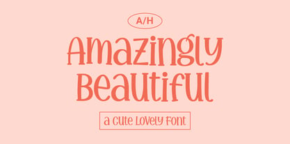 Amazingly Beautiful is a cute, quirky and whimsical display font. Whether you use it for cartoon related designs, children games or just any creation that requires a lovely touch, this font will be an amazing choice.
 - Shifty Notes by Ali Hamidi,
$10.00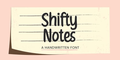 Shifty Notes is a cute and simple lettered handwritten font. Whether you use it for cartoon related designs, children games or just any creation that requires a lovely touch, this font will be an amazing choice.
 - Snowy Owl by Ali Hamidi,
$10.00 Snowy Owl is a cute, joyful and fun display font. Whether you use it for cartoon related designs, children games or just any creation that requires a lovely touch, this font will be an amazing choice.
 - Bank Sans EF by Elsner+Flake,
$35.00 With its extended complement, this comprehensive redesign of Bank Gothic by Elsner+Flake offers a wide spectrum for usage. After 80 years, the typeface Bank Gothic, designed by Morris Fuller Benton in 1930, is still as desirable for all areas of graphic design as it has ever been. Its usage spans the design of headlines to exterior design. Game manufacturers adopt this spry typeface, so reminiscent of the Bauhaus and its geometric forms, as often as do architects and web designers. The creative path of the Bank Gothic from hot metal type via phototypesetting to digital variations created by desktop designers has by now taken on great breadth. The number of cuts has increased. The original Roman weight has been augmented by Oblique and Italic variants. The original versions came with just a complement of Small Caps. Now, they are, however, enlarged by often quite individualized lower case letters. In order to do justice to the form changes and in order to differentiate between the various versions, the Bank Gothic, since 2007 a US trademark of the Grosse Pointe Group (Trademark FontHaus, USA), is nowadays available under a variety of different names. Some of these variations remain close to the original concept, others strive for greater individualism in their designs. The typeface family which was cut by the American typefoundry ATF (American Type Founders) in the early 1930’s consisted of a normal and a narrow type family, each one in the weights Light, Medium and Bold. In addition to its basic ornamental structure which has its origin in square or rectangular geometric forms, there is another unique feature of the Bank Gothic: the normally round upper case letters such as B, C, G, O, P, Q, R and U are also rectangular. The one exception is the upper case letter D, which remains round, most likely for legibility reasons (there is the danger of mistaking it for the letter O.) Because of the huge success of this type design, which follows the design principles of the more square and the more contemporary adaption of the already existing Copperplate, it was soon adopted by all of the major type and typesetting manufacturers. Thus, the Bank Gothic appeared at Linotype; as Commerce Gothic it was brought out by Ludlow; and as Deluxe Gothic on Intertype typesetters. Among others, it was also available from Monotype and sold under the name Stationer’s Gothic. In 1936, Linotype introduced 6pt and 12pt weights of the condensed version as Card Gothic. Lateron, Linotype came out with Bank Gothic Medium Condensed in larger sizes and a more narrow set width and named it Poster Gothic. With the advent of photoypesetters and CRT technologies, the Bank Gothic experienced an even wider acceptance. The first digital versions, designed according to present computing technologies, was created by Bitstream whose PostScript fonts in Regular and Medium weights have been available through FontShop since 1991. These were followed by digital redesigns by FontHaus, USA, and, in 1996, by Elsner+Flake who were also the first company to add cursive cuts. In 2009, they extended the family to 16 weights in both Roman and Oblique designs. In addition, they created the long-awaited Cyrillic complement. In 2010, Elsner+Flake completed the set with lowercase letters and small caps. Since its redesign the type family has been available from Elsner+Flake under the name Bank Sans®. The character set of the Bank Sans® Caps and the Bank Sans® covers almost all latin-based languages (Europe Plus) as well as the Cyrillic character set MAC OS Cyrillic and MS Windows 1251. Both families are available in Normal, Condensed and Compressed weights in 4 stroke widths each (Light, Regular, Medium and Bold). The basic stroke widths of the different weights have been kept even which allows the mixing of, for instance, normal upper case letters and the more narrow small caps. This gives the family an even wider and more interactive range of use. There are, furthermore, extensive sets of numerals which can be accessed via OpenType-Features. The Bank Sans® type family, as opposed to the Bank Sans® Caps family, contains, instead of the optically reduced upper case letters, newly designed lower case letters and the matching small caps. Bank Sans® fonts are available in the formats OpenType and TrueType.
 - One Mith by AZCRTV Studio,
$14.50 One Mith is a combination of two languages namely One (English) and Mith (Albanian) which means a myth which is a hope of the creation of this font which is no longer a myth anymore that we can make serif fonts. This font is included with a style signature font that will complement your design. This font is also very suitable in various types of designs especially designs that require feminine signature fonts such as designs for brand perfume, cosmetics, fashion, as well as women's magazines. Thankyou Abdul Azis
 - Shape Bit by ahweproject,
$12.00 This font is inspired by ancient games that still use pixel displays. This font can be used for various designs as needed, especially pixel-themed designs. In addition, the Shape Bit font can also give a retro feel to your designs.
 - Racing Foner by Multype Studio,
$24.00 Racing Foner is a racing sport display font. A strong, bold and unique style instantly gives your design power and uniqueness. This font perfect font for sport or racing themed projects, such as logo, poster, games, product design and much more.
 - Esta Pro by DSType,
$26.00The multi award winning ESTA is back, renewed and improved in OpenType format. Now named Esta Pro, is available in Regular, Italic, Bold, Bold Italic, Display and Swashes. Includes plenty of features, like SmallCaps, Alternates, Ligatures and CE characters. - Nameplate Stencil JNL by Jeff Levine,
$29.00 A vintage brass stencil for an individual or company named ‘Rodrigues’ was spotted in an online auction. The hand punched, condensed Roman lettering inspired the digital typeface Nameplate Stencil JNL, which is available in both regular and oblique versions.
 - Fd Hallway by Fortunes Co,
$15.00 Hallway inspired from vintage script combined with modern style, suite for adventure or classic feeling sport, sign painting, labeling, suitable for logo, product names packages, labels, old fashioned coffee shops, bars and everything with specific characteristics of past times.
 - Sketter by ARToni,
$19.00 Sketter is modern display typeface inspired by aerodynamic designs. Fall in love with its incredibly distinct and timeless style and use it to create spectacular designs!. the name Sketter adopted from Skeeter, Skater and Scooter those darted and weaved.


