10,000 search results
(0.022 seconds)
- White Dove Script by FadeLine Studio,
$18.00 White Dove Script is a modern script font with a sweet and smooth handwritten style. This font has been enriched with additional alternates characters up to 700 glyphs. White Dove Script is perfect for logos, branding projects, homeware designs, product packaging, mugs, quotes, posters, shopping bags, logo's, t-shirts, book covers, name card, invitation cards, greeting cards, and all your other lovely projects.
 - Stymie by Linotype,
$40.99In 1931, Morris Fuller Benton created the Stymie typeface for the American Type Founders (ATF). Stymie is a reworking of a slab serif type that was popular in Europe at that time, Memphis. For the past one hundred fifty years, slab serif types (sometimes called Egyptian or Egyptienne-style faces) have been a popular choice for headline text in newspapers, magazines, and advertising. - Foreign Film JNL by Jeff Levine,
$29.00 The Art Deco hand lettered opening credits for the 1936 French drama “La Belle Équipe” [English title: “They Were Five”] provided the inspiration for Foreign Film JNL, which is available in both regular and oblique versions. According to Wikipedia, the film “…tells the story of five unemployed workers who win the jackpot in the national lottery but their solidarity then proves fragile.”
 - Beliau by Yukita Creative,
$14.00 Beliau is a modern serif typeface that has been expressly designed for high-resolution displays and print media. With its elegant appearance and finely balanced proportions, it is perfect for headline text, corporate branding, and other design applications where a touch of refinement is required. - Affordable and versatile - Well known for its exceptional readability - Get one font for any occasion
 - Xanthippe NF by Nick's Fonts,
$10.00Extrabold and exuberant caps from a blackletter face rendered by Ross George in his perennial Speedball Text Book have been combined with a more restrained and traditional lowercase to create a unique and striking typeface that will definitely get noticed. Both versions of this font include the complete Latin 1252 and CE 1250 character sets, with localization for Romanian and Moldovan. - Retail Establishment JNL by Jeff Levine,
$29.00 The 1935 catalog for Vitrolite (a brand of pigmented structural glass) featured artist renderings of how the glass could be applied to business exteriors. One of the lettering styles used in these examples was an Art Deco lower case. This design has been turned into a digital typeface called Retail Establishment JNL and is available in both regular and oblique versions.
 - Ballard Avenue by Turtle Arts,
$20.00Ballard Ave is inspired by old vintage signage found in Ballard, Washington, an old neighborhood of Seattle. Ballard Avenue is a protected historical district filled with turn of the century brick buildings that have been converted into quaint shops and independent businesses. This alphabet is based on the antique signage that still exists on the sides of many of these buildings. - Chollistio by Letterara,
$14.00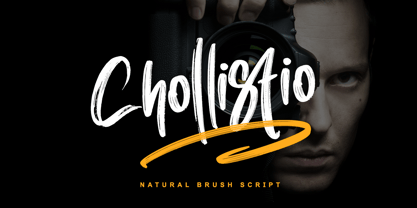 Chollistio is a handwritten font with a dry brush texture with rough details. This font has been designed to suit a variety of projects such as business branding, Instagram quotes, Christmas greeting, Poster, blog headers, Packaging, sports communities, film, photography, hobbies, and much more. This font is PUA encoded which means you can access all of the glyphs and swashes with ease!
 - Santa Mensch by Vic Fieger,
$1.99Let's say a San Francisco punk group used letters from a theatre marquee to create a flyer in 1979 for one of their shows. Then the flyer showed up in the background of a newspaper photograph, and the photo, twenty-five years later, was enlarged and the lettering on the flyer was turned into a font. Santa Mensch has arrived. - Your Everything by Yoga Letter,
$15.00 "Your Everything" is a very beautiful and unique calligraphy font. This font is decorated with a unique and attractive butterfly. This font is perfect for valentine, christmas, winter, wedding, photography, promotion, and others. The decoration on this font is very easy to use, because it has been specially designed and there are instructions for its use in the preview. Thank you:)
 - Stoopid Markers by Gassstype,
$28.00 Here comes a New font, Stoopid Markers is a Bold Market Typeface that is written casually and quickly. these strong Letters are made with Market Typeface on Procreate. Then crafted carefully drawn into a vector format. That is why Stoopid Markers has a charming, authentic, and relaxed characteristic more natural look to your text with a more natural look to your text.
 - Synopsis by Vasava Fonts,
$45.00 Synopsis draws inspiration on the classic proportions and letterforms of old romans. In addition to this a new modern twist has been infused to it, giving it a dimensional double stroke or virtual inline that makes the round parts twist in and out. Specially gorgeous in big sizes it brings the best from the past merging it with new ideas.
 - Brush With Death by Cyberian Khatru,
$20.00 This font was made possible by creating a custom brush in Illustrator. I started with a flat brush dipped in India ink to create the stroke. From a scan of that stroke I made a vector tracing which I then I altered as necessary to get the desired dimensions. The lower case letters have a thinner stroke than the capitals.
 - Cycles by Stone Type Foundry,
$49.00 Cycles was designed for use in books and other publications with lengthy texts and/or complex typography using different sizes of type. Different versions of Cycles have been designed which are optimized for setting at specific point sizes as was the practice in the days of metal type. Together with Stone Print, SFPL, and Arepo it makes up a superfamily of typefaces.
 - Candice by ITC,
$29.99Alan Meeks designed the Candice typeface in 1976. A groovy swirl of a font, Candice looks like an ice cream sundae topped with whipped cream. Candace is often seen on album covers, and has come to be associated with innumerable party hits from the 1970s. One thing is for sure: Candice is a child of it's times - flashy, lively, and fun! - Kwark by Hanoded,
$15.00 Kwark is a nice, cartoonesque outline font with a bit of grunginess. Yes, it is an all caps font, but upper- and lowercase letters differ in shape, so you can mix and match. The name is not really related to the way the font looks: kwark means 'curd' in Dutch. You think that sounds delicious? Well, then give Kwark a try!
 - Santral by Taner Ardali,
$39.00 Santral typeface has been designed with the idea of achieving the ideal balance of geometrical perfection and optical impression. The sharp and precise design of Santral leads to a clear and reliable communuciation with the reader. 12 weights and italic versions, including kerning values and Opentype layout features provide all typographic equipments to get the best result for the typographic layouts.
 - Helma by Yukita Creative,
$13.00 Helma is a display serif typeface that has been expressly designed for high-resolution displays such as digital and print media. With its elegant appearance and perfectly balanced proportions, it is perfect for the title text, corporate branding, and other design applications where a touch of refinement is needed. - Affordable and versatile - Renowned for its excellent legibility - Get one font for every occasion
 - Antipasto Pro by Zetafonts,
$39.00 Antipasto is a geometric sans serif font designed by Cosimo Lorenzo Pancini. The original family of three weights has been revised and expanded in 2017 with Antipasto Pro that now includes cyrillic and greek characters, open type features (small caps and old style numerals), six new weights from the hairline to the extrabold and an icons set in 8 weights.
 - Brigitta Signature by Letterara,
$12.00 Brigitta Signature is a handwritten font with a dry brush texture with rough details. This font has been designed to suit a variety of projects such as business branding, Instagram quotes, Christmas greeting, Poster, blog headers, Packaging, sports communities, film, photography, hobbies, and much more. This font is PUA encoded which means you can access all of the glyphs and swashes with ease!
 - Progelud by Beary,
$13.00 Hello guys Proudly presents our font Progelud. Progelud is mazing sans-serif look attractive and natural! Every single letters have been carefully crafted to make your text looks beautiful. It has beautiful and well-balanced characters and as a result, it matches a wide pool of designs. Progelud is PUA encoded, which means you can access all of the glyphs!
 - Unsanctioned by Alphabet Agency,
$15.00 Alphabet Agency proudly presents Unsanctioned; a distressed stencil font. The font has been designed in a bold stencil font style with an awesome distressed effect that gives the font a rugged look. Unsanctioned font is great for use in war, crime, urban and combat sports related themes. The font contains capital and alternative capital letters, numbers, punctuation and basic Latin international characters.
 - Stgotic by Latinotype,
$10.00 Stgotic, designed in 2006, was the first digital font designed by Daniel Hernández. It is a blackletter typeface designed for low resolution screen devices. Stgotic was designed to be seen at 8 pts (and multiples of 8). In the year 2006, it was recognized as the best screen font by the TipoGráfica magazine in the context of the Bienal de Letras Latinas.
 - Suomi Hand Script by Suomi,
$60.00 This script is made for mimicking handwriting with a fair amount of ligatures: there are more than 700 ligature pairs (or even more characters; I never really counted them) to help you to make very, very convincing lines of text without ever lifting a pen! It’s been a bestseller in FontShop for years, and now it’s available here as well!
 - London Court by Greater Albion Typefounders,
$16.50 London Court is a family of three 'Tudor Revival' display faces, inspired by an inscription seen underneath a clock in a splendid Tudor revival arcade in Perth, Western Australia. The resulting typeface designs are similarly 'Tudor Revival' or if you prefer 'Tudorbethan'- Roman with Blackletter details. Ideal for creating headings and posters which have an 'Olde-Worlde' feel with modern legibility.
 - Vincente by Dharma Type,
$19.99 Vincente is a contemporary but Didone-look serif with condensed proportion. Inspired by vintage iron works and antique botanical pictorial book. Very simple and orthodox letter forms with some charming accent such as can be seen in "y". Sophisticated curves but they have human warmth as if they are hand-crafted. Consists of six weights and supporting almost all latin languages.
 - A Likely Story by Comicraft,
$39.00 Finally an animated alphabet with a tall tale to tell -- perfectly suited to putting words in the mouths of mutts, talking tigers and anthropomorphic animal characters of all kinds. The precise thick and thin pen strokes of these eight versatile weights are well suited to gag strips, classic cartoons and maybe even that internet meme you've been thinking about for weeks!
 - Rogan by Brink,
$30.00 Rogan: A Robust Modular Sans Rogans clean lines started out as an exercise in modularity and geometric forms. This initial construction approach was then adapted to improve the functionality of the family; Breaking away from the strictly modular system in exchange for more refinement and clarity. The resulting forms display a refined contemporary feeling alongside a hi- tech industrial element.
 - Wyoming Macroni by Ingrimayne Type,
$14.95 Wyoming Macroni is the split-serif (or Tuscan) version of the Wyoming series. The Pegged version adds a horizontal spike through the middle of the stems, which has been a popular variation of this style. Included in the family are two shadowed versions. The ShadowedInside styles can be used in layers with the Shadowed styles to easily create two-colored letters.
 - Printers Plant Ornaments by Gerald Gallo,
$20.00 Printers Plant Ornaments was inspired by the decorative motifs used to fill in page space that have been around since moveable type printing commenced in the 15th century. All the ornaments are representations of plants. There is an assortment of 47 ornaments located under the character set keys. Under their respective shift + character set keys are the same 47 ornaments flopped.
 - The Duality by Alcode,
$20.00 The Duality is a script typeface, every letter has been carefully crafted to make your text look beautiful. This font is perfect for logos, badges, shirts, labels, clothing designs, etc Try The Duality, enjoy the richness of OpenType features and let her fun and elegant excitement make you happy and enhance your creativity! You can use this font very easily. Thank you.
 - Side A by bb-bureau,
$60.00 Side A – Bauhaus-inspired Experimental and spiky type in 3 sizes (1 - 1/2 - 1/3), designed by Benoît Bodhuin (An ideal use could be: Side A unit in 48 pt, half in 24 pt and A third in 16 pt, then bars would have the same width and spaces between the forms would be equal, but it’s just an ideal use)
 - Ornata C by Wiescher Design,
$39.50 Ornata C is the third of a series of old ornaments that I am trying to save from oblivion. I am not just scanning these, I am completely redesigning the ornaments from scratch, thereby eliminating imperfections. These ornaments have been first designed by a designer named Ben Sussan. The designs date back to about 1910. Your digitizing type-designing savior, Gert Wiescher
 - Hupp Fraktur by RMU,
$25.00 Otto Hupp's blackletter font, released by Klingspor in 1911, took its inspiration from the then dominating Art Nouveau designs. Some of its capitals express this with their lovely swash forms, and make this fraktur font less stiff. Hupp Fraktur contains a bunch of usefull ligarures, and by typing 'N', 'o' and period you get an oldstyle numbersign by activating the Ordinals feature.
 - Buffalo Bill by FontMesa,
$35.00 Buffalo Bill is a revival of an old favorite font that’s been around since 1888, the James Conner’s Sons foundry book of that same year is the oldest source I've seen for this old classic. If you're looking for the font used as the logo for Buffalo Bill’s Irma Hotel in Cody Wyoming please refer to the FontMesa Rough Riders font. New to the Buffalo Bill font is the lowercase and many other characters that go into making a complete type font by today’s standards. The Type 1 version is limited to the basic Latin and western European character sets while the Truetype and OpenType versions also include central and eastern European charcters. William F. (Buffalo Bill) Cody called America’s Greatest Showman was one of the United State’s first big celebrity entertainers known around the world, millions of people learned about the Old West through Buffalo Bill’s Wild West shows which traveled throughout the United States and Europe. William Cody, at age eleven, started work on a cattle drive and wagon train crossing the Great Plains many times, he further went on to fur trapping and gold mining then joined the Pony Express in 1860. After the Civil War Cody went on to work for the Army as a scout and hunter where he gained his nickname Buffalo Bill. In 1872 William Cody started his entertainment career on stage in Chicago along with Texas Jack who also worked as a scout, the Scouts of the Prarie was a great success and the following year it expanded to include Wild Bill Hickok and was eventually named The Buffalo Bill Combination. By 1882 Texas Jack and Wild Bill Hickok had left the show and Buffalo Bill conceived the idea for the traveling Wild West Show using real cowboys, cowgirls, sharpshooters and Indians plus live buffalo and elk. The Wild West shows began in 1883 and visited many cities throughout the United States. In 1887 writer Mark Twain convinced Cody to take the show overseas to Europe showing England, Germany and France a wonderful and adventuruos chapter of American history. The shows continued in the United States and in 1908 William Cody combined his show with Pawnees Bill’s, in 1913 the show ran into financial trouble and was seized by the Denver sheriff until a $20,000 debt (borrowed from investor Harry Tammen) could be paid, Bill couldn't pay the debt and the loan could not be extended so the assets were auctioned off. William Cody continued to work off his debt with Harry Tammen by giving performances at the Sell’s-Floto Circus through 1915 then performed for another two years with other Wild West shows. William F. Cody passed away in 1917 while visiting his sister in Denver and is buried on Lookout Mountain joined by his wife four years later. Close friend Johnny Baker, the unofficial foster son of William Cody, began the Buffalo Bill Memorial Museum in 1921, over the years millions of people have visited William Cody’s grave and museum making it one of the top visitor attractions in the Denver area. William F. Cody romantisized the West creating the Wild West love affair that many still have for it today through books and cinema.
 - Castillian by Haksen,
$20.00 Castillian is the family of modern serif style with Uppercase and Lowercase feel nice balanced. Provide alternates font in uppercase and lowercase variant style make the design letter looks incredible. Honestly it works perfectly for headlines, logos, posters, packaging, T-shirts and much more. Recommended to use in Adobe Illustrator or Adobe Photoshop with opentype feature. Ligatures feature is default setting in Adobe Illustrator or Adobe Photoshop in Uppercase character. So when you want not to use the ligatures. Open glyphs panel : In Adobe Photoshop choose tool Window Character and then please klick fi symbol In Adobe Illustrator choose tool Window Type Open Type and then please klick fi symbol How to access Alternates Character? Open glyphs panel : In Adobe Photoshop choose tool Window glyphs In Adobe Illustrator choose tool Type glyphs If you have questions, just send me a message and I’m glad to help. Have a great day, Haksen
 - Wolverhampton by Greater Albion Typefounders,
$12.50 Wolverhampton is a new Neo-Victorian face from Greater Albion Typefounders. It's something of an example of starting with a small idea and running with it. This family of three typefaces (Regular, Small Capitals and Capitals) was inspired by a line of lettering seen on a late 19th Century enamel advertisement made by Chromo of Wolverhampton (hence the family name). The family grew, topsy-like, from a recreation of these initial fifteen capital letterforms to the three complete typefaces offered here. The three typefaces are ideal for advertising and poster work with a Victorian, Edwardian, or 'Steam-punk' theme. They would also be eminently suitable for signage inspired by the same eras or (as we've seen a number of our other typeface families prove very popular) for book covers of period related novels and historical works. Finally, these slender elegant display faces are just plain fun!
 - ZF Ydor by The Zyme,
$23.50 ZF Ydor font family has been created to give a crafty, hand drawn look to your project. Its characters have been drawn by hand to give them a warm and authentic look. It was designed as a generic handwritten font; almost a mild handwritten font. The creation of ZF Ydor started for a specific work of our design firm, for which we needed a font that was handwritten, easy to read, and did not seem to be childish or comic, as several handwritten fonts do. ZF Ydor comes in five basic weights, is intended to work best in print materials as well as websites and digital apps, for small family companies, organic products and others. It also feels comfortable with short or large texts, in small and large sizes, due to clear and rounded characters. It supports all Latin language and the Greek too.
 - Delicato Pro by MAC Rhino Fonts,
$59.00 In many aspects, built in a traditional way. Still, some modern details have been implemented which classic designs sometimes lack. The prime goal was to make a strong text font for books and longer texts in general. This fact does not exclude the possibilites for use elsewhere. Throughout history existing designs have often been the source of inspiration for newer ones. Delicato is no exception and looking closely, similarities can be found in the lowercase of Jeremy Tankard’s Enigma and the stems of Petr van Blokland’s Proforma. The goal is to respect these sources and turn the the typeface into something new with a unique and personal touch. Most text faces carry a basic set of weights like Regular, Italic, Bold and Small Caps. MRF wanted to expand that a little bit further and added a Medium, Alternates and a set of Ornaments to make the family complete and versatile.
 - Degdegan by Haksen,
$18.00 Degdegan is a futuristic classic bold script style with unique alternates feel nice balanced. Provide many variant ligatures style make the design letter looks incredible. Honestly it works perfectly for headlines, logos, posters, packaging, T-shirts and much more. Recommended to use in Adobe Illustrator or Adobe Photoshop with opentype feature. Ligatures feature is default setting in Adobe Illustrator or Adobe Photoshop in Uppercase character. So when you want not to use the ligatures. Open glyphs panel : In Adobe Photoshop choose tool Window Character and then please klick fi symbol In Adobe Illustrator choose tool Window Type Open Type and then please klick fi symbol How to access Alternates Character? Open glyphs panel : In Adobe Photoshop choose tool Window glyphs In Adobe Illustrator choose tool Type glyphs If you have questions, just send me a message and I’m glad to help. Have a great day, Haksen