10,000 search results
(0.031 seconds)
- FS Pele by Fontsmith,
$50.00 Iconic Conjuring memories of chunky typefaces from the late-60s and early-70s, and named after the world’s greatest footballer of that and probably any other era, FS Pele is one of a set of Fontsmith fonts designed specifically for headlines and other prominent applications. “We wanted to create fonts that could be integral to the design of posters, album covers and magazines,” says Jason Smith. Welcome to FS Pele, iconic, like its namesake (though, perhaps, a little less nimble). Big Pele, little Pele There was only one Pele. But there are two sizes of FS Pele. FS Pele One, with the finer counters and details, adds considerable weight and style at large sizes, especially in big block headlines on posters. FS Pele Two’s thicker “slots” make it a better choice for smaller-sized text. A load of blocks FS Pele began as an exercise by Phil Garnham in turning squares into legible letters, via the least means necessary. The idea extended his ideas about logo-making, and the search for a stamp-like brand mark that lends authority, stability and instant identification. “The thought that the type was a 2D/3D jigsaw of slotted, architectural pieces was almost an after-thought. I wanted to create a strong, stacking, block aesthetic for the most contemporary poster design. “At the time there were a lot of designers creating their own versions of the same thing but I wanted to take the blocker forms to the next step, and infer a more legible text without sacrificing the idea.”
 - FS Pele Variable by Fontsmith,
$199.99Iconic Conjuring memories of chunky typefaces from the late-60s and early-70s, and named after the world’s greatest footballer of that and probably any other era, FS Pele is one of a set of Fontsmith fonts designed specifically for headlines and other prominent applications. “We wanted to create fonts that could be integral to the design of posters, album covers and magazines,” says Jason Smith. Welcome to FS Pele, iconic, like its namesake (though, perhaps, a little less nimble). Big Pele, little Pele There was only one Pele. But there are two sizes of FS Pele. FS Pele One, with the finer counters and details, adds considerable weight and style at large sizes, especially in big block headlines on posters. FS Pele Two’s thicker “slots” make it a better choice for smaller-sized text. A load of blocks FS Pele began as an exercise by Phil Garnham in turning squares into legible letters, via the least means necessary. The idea extended his ideas about logo-making, and the search for a stamp-like brand mark that lends authority, stability and instant identification. “The thought that the type was a 2D/3D jigsaw of slotted, architectural pieces was almost an after-thought. I wanted to create a strong, stacking, block aesthetic for the most contemporary poster design. “At the time there were a lot of designers creating their own versions of the same thing but I wanted to take the blocker forms to the next step, and infer a more legible text without sacrificing the idea.” - Pagewalker by Kostic,
$40.00 The name of the font is chosen to suggest its main purpose—setting multiple pages of text. All the features in this family were made with that in mind—legibility, distinct italics, small caps and various OpenType features, all make this font a useful tool for typographers. On the other hand, for packaging, posters, logotypes, etc. setting heavier weights in large size brings out its display qualities. Pagewalker is very legible and appears to be larger than other text typefaces. That is because the lower-case characters are made large compared to the capital letters. This means it can be used for setting text in, e.g. 9 pt size—while appearing to be 10 pt, but occupying less space. Pagewalker has a character set to support Western and Central European languages, and an extended set for monetary symbols which, in combination with tabular numbers, is perfect for financial reports. Each weight includes small caps, ligatures, proportional lining and oldstyle numbers, tabular figures, fractions and scientific superior/inferior figures.
 - Throrian Formal - 100% free

- Throrian Commonface - 100% free

- Ivory by FaceType,
$24.00 Ivory is inspired by a beautiful typeface used in an illustrated compendium about pomology from 1882. We separated the elegant “Swashes” from the letters – use it together with “NoSwashes” to get two-colored initials. Please note that the kerning of NoSwashes works only together with Swashes. To achieve the two tone effect shown in the samples, you need to use an application that supports layers. For example, Adobe Illustrator, Adobe InDesign, Adobe PhotoShop, CorelDRAW, and Quark. Some of the preview images were made by Arina Karen Renata Palilingan.
 - Beat Boy by PizzaDude.dk,
$18.00 Searching for some company? Beat Boy is ready to take action - He wants to put that beat to your designs. I am not sure which category Beat Boy fits in...is it graffiti? Comicbook text? Something for candy labels? Cute posters or hardcore skater flyers? ... the purposes of use could be many!
 - Subtitle by Type.write.type,
$8.00 Subtitle is a handdrawn slab serif that contains condensed and wide width capital letters in one font. With slightly wobbly lines, Subtitle is designed to be legible at a variety of sizes to give that quirky, fun feel to any informal occasion or brand. Central, Eastern and Western European language support included.
 - DonJulio by Autographis,
$39.50 DonJulio is a handwritten most-of-the-time connecting script, that dates back to the 1930s in Germany. We tried to keep it as true to the original as possible, conserving the shaky and uneven appearance of those days. DonJulio can be mixed together with its very embellished sister font Donna Julia.
 - Diotima LT by Linotype,
$29.99Diotima was designed by Gudrun Zapf von Hesse in 1948, the italic even earlier, in 1939. Diotima is a festive font particularly well-suited to invitations, programs and poems. The delicate italic draws attention to text which should be emphasized. Zapf von Hesse’s Ariadne Initials and Smaragd are perfect complements to Diotima. - Embossanova by Emboss,
$29.00 Embossanova was initially sketched to be a monospaced typeface but quickly took on a life of its own. It developed serifs and numerous arcs and stroke weights. I wanted it to retain a pre computer/unmathematical feel so there is a slight variation on curved characters and their relationship to the X height.
 - Bold Groove by Wasabib Type Foundry,
$17.00 Is a typeface that carries powerfull message in a modern graphic style with ease. it uniquely combines simplicity and sophistication. BOLD GROOVE has everything you need to add creativity and personality to your design while being easy to read. Let Bold Groove impress your viewers and help deliver your message with strong impact.
 - Renaissance Caps BA by Bannigan Artworks,
$19.95This is a revival font of a sixteenth century typeface. I kept this font as close as possible to the original letters, including the imperfections and irregularities, to preserve the look of antiquity. Some of the letters of the original sample were missing and had to be created from the available letters. - Lemah Teles by Letterafandi Studio,
$14.00 Lemah Teles is a display font. It is a tough-looking font with a strong brush touch, ready to rock every design you want to create. It is perfect for logos, quotes, posters, clothing, and so much more! Add it to any of your creative projects, and be amazed by the generated outcome!
 - MGN Humble by Morgana Studio,
$17.50 MGN Humble is a sans-serif type that provides room for users to express their experimental and playful side. The pixelated strokes engage venturously with the need to communicate excitement; a perfect set for clothing, gaming, technology, and experimental poster use. Currently available in a beta version and to be developed further.
 - Herokid by W Type Foundry,
$29.00 Herokid is a grotesque style font, inspired by classic fonts like Helvetica, Impact and Univers, with a dynamic, versatile and flexible personality. It ranges from Thin to Heavy, and from UltraCompressed to UltraExpanded. It’s a huge family, with 96 variants adaptable to kinds of design projects providing flexibility for their creation. Consider Herokid your new workhorse, you will be able to generate high-impact headlines, subtitles and/or text; all with the same font family. The mixture of wide and condensed sets allows for versatile combinations and can give great movement to a design, while the regular weights can be used for text bodies. The heavier weights also stand out, with its very full shapes with small counterforms, ideal for big headlines.
 - Appleton by Decade Typefoundry,
$35.00 Back to 1880-1900 when a number of events were coming together, the country was evolving from a local market economy to mass merchandising, rail systems were being built and color lithography was becoming more affordable. The first rail cars full of oranges were being shipped from Southern California to the East - what a treat during a cold winter’s day. Labels were pasted on every fruit crate and these labels had large images of oranges and orange groves. With technological advances in soldered cans, canneries popped up all over the country. In order to market their products many California Canneries pooled their resources to form the California Fruit Canners Assn. in 1899. This font was inspired from that era. Loaded with alternates, swashes, stylistic and multilingual support.
 - Rodeo Clown by FontMesa,
$25.00 Rodeo Clown is a revival of an old classic font that you may have known under the name of Carnival. The Rodeo Clown family includes Fill fonts that you may layer behind the letters to add color or set to white so any background image doesn't show through the letters. The half fill should be layered on top to change the color of the top inlay design. The fill font for Rodeo Clown may also work as a stand alone black weight. In our sales images you'll see a sample of the fill font being used, we've intentionally offset the fill font to give it a misaligned printed look which was common to see with fill fonts in the 1800's
 - MickeyMono by Mussett,
$2.99As as a computer programmer, it is my job to stare at screens of text all day. For my first font, I completed a simple monospaced font, Debug, based on my own handwriting. Mickey Mono is much more ambitious: I wanted a humanist design - something with organic curves. It had to be clean and fresh. It had to have the advantages of Debug, like distinctive numerals (to distinguish between 8 and 3) and huge punctuation characters (so I could read complicated Perl one liners). Mickey Mono would be a good friend to me as I struggled through difficult coding tasks. It has a wide range of Latin Extended characters and diacritics, so it can speak French, Portuguese, and Ruby. Enjoy! - Ever West by Andrew Tomson,
$10.00 Meet the new font family! This font came to my mind while I was sitting in line at the dentist. There are often different magazines at the front desk to read and pass the time while waiting. One of those magazines turned out to be about fashion. When I opened it on a random page, I saw beautiful pictures. But you know what the first thing that catches my eye? The font! The font in which the headline or quote is written. After you read it, you look at everything else. And I wondered what my font would be in this case. I present to you my version of a font for fashion lettering. Good luck and love to you, friends!
 - Dever by insigne,
$24.00 Dever’s brute, industrial lines are rounded up in this new typeface from Jeremy Dooley. Dever combines plenty of inspirations. It’s the flair of the Wild West melded with a shout out to the sign painters and package lettering artists of the 1800s. Dever’s big, bold, and handy frame moves through all three of the family’s strapping members. First is the sans. No doubts on what this brother’s like. Dever Sans is as straight-forward as you’ll find in this family with its four separate weights and numerous distressed options. The second of the kin’s a bit of half-breed, you might say. Pointed serifs bring a sharpness to this outfit. Rounding out the family is Dever Wedge, a bit of wild rodeo all its own. This poke’s a quick draw with any of its 107 font, and with it’s auto-replacing alternates, no two repeating characters are alike. You’re guaranteed a great show anytime Dever leaves the chute. The route to Dever was long, with many a switchback. The Wedge variant was designed first, shelved, then developed into Plathorn. But I wanted to return to those brutish forms and decided to round out the family with a sans, serif and plenty of other options. Any of the Dever family have an extended character set including Central and Eastern European languages. The strong faces have specially adapted sub-families, too, so they’re bound and determined to have an outstanding impact at whatever size you use ‘em. It’s a hard ride ahead corralling all those words. Be sure and add these able-bodied boys to your posse today!
 - Raqmi by Arabetics,
$45.00 Raqmi was designed as a serif like font with relatively uniform glyph thicknesses, perfect simplified straight lines and curves, and emphasized isolated letters. This font family supports all Arabetic scripts covered by Unicode 6.1, and the latest Arabic Supplement and Extended-A Unicode blocks, including support for Quranic texts. It includes two weights: regular and light, each of which has normal and left-slanted Italic versions. The script design of this font family follows the Arabetics Mutamathil Taqlidi style utilizing varying x-heights. The Mutamathil Taqlidi type style uses one glyph per every basic Arabic Unicode character or letter, as defined by the Unicode Standards, and one additional final form glyph, for each freely-connecting letter of the Arabic cursive text. Raqmi includes the required Lam-Alif ligatures in addition to all vowel diacritic ligatures. Soft-vowel diacritic marks (harakat) are selectively positioned with most of them appearing on similar high and low levels—top left corner—, to clearly distinguish them from the letters. Tatweel is a zero-width glyph.
 - VTC-KomikaHeadLinerChewdUp - Personal use only

- Fillmore kk - Personal use only

- Norden Retro Round by Asgeir Pedersen,
$14.99 Norden Retro Round is based on Norden Round, but Retro comes with an added perspective, giving it a "retro-futuristic" look. It has a lower x-height than its parent, due to it being slightly tilted. Norden Retro Round can be used in any setting, but given its lively style, it will excel as a display font; in headings, titlings, logos and so on.
 - Sugar Free by PizzaDude.dk,
$17.00 Don't be afraid to taste something sugar free - most times you will be surprised how good it tastes! My Sugar Free font may not look as very much at first glance - but play around with the Regular and Italic versions (and notice the 4 different versions of each letter, that automatically cycles as you type!) and you will see how lively the font is!
 - Keong by Grontype,
$12.00 Keong is a creative and attractive font, made using handwriting techniques, Unique and elegant. The writing can be used for various projects, such as flyer Project, or it can be used to print on clothes. just put it on top of your creative idea and make your project happen. Features : alternative and ligature character multilingual support unique style Thankyou for getting this font Regard. Grontype
 - Okay A by Okaycat,
$24.95 Okay-A lets you make 3D letters that look to be fastened down with screws. Inspired by the angular futuristic shapes of Japanese Katakana letters, this angular font is bold and square. Okay-A lets you easily make multicolour logos or signs as the styles can be overlaid. It features extended characters, containing West European diacritics & ligatures, making it suitable for international environments & publications.
 - Merry Melody by Comicraft,
$19.00 Sufferin' Succotash, was that five minutes already?! Seemed to us like that lunatic cartoon went by faster than a roadrunner being pursued by a wily coyote or a hare brained bunny dodging short sighted hunters during wabbit season. Adorn your favorite duck, pig, cat, tweeting bird or skunk with the warming strains of our merry melody font or it'll be all over for all you folks.
 - Ubik by Présence Typo,
$36.00Ubiquity: the possibility to be in several places at the same time; this could be the definition of a typeface like Ubik. Its applications are numerous and various: books, magazines, posters but also architecture and signs. Ubik is a grotesk sans serif with a “nordic taste”: shapes pure and somewhat square. The nonexistent contrast between thin and thick strokes gives it a discreet rustic look. - Buttery Signature by Fontysia,
$13.00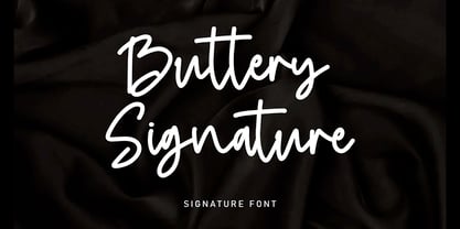 Buttery Signature is a unique and elegant monoline font, this font was created by being inspired by a signature by someone, then developed into a work that can be used by many people. It comes with an elegant and unique style which is perfect to make any design stand out! This font is perfect for branding, wedding invites, magazines, mugs, business cards, quotes, posters, and more.
 - Fairytales Script by Dhan Studio,
$25.00 Fairytales Script is a beautiful handmade typeface, organic and dancing baseline with different swashes that can be applied to the beginning and ends of all lowercase. For the separate swashes font, type lowercase a-z for the beginning swashes and end swashes. This fonts can be used for various purposes.such as headings, signature, logos, wedding invitation, t-shirt, letterhead, signage, lable, news, posters, badges etc.
 - Djoker State by Letterara,
$8.00 Djoker State is a cool typeface which can be used for various purposes such as: quotes, advertising, headings, logos, badges, posters, book covers, newspapers and much more! Don't wait anymore, put it in your shopping basket :) and follow me, because there will be many promos! Thanks for checking out my store, and feel free to get in touch if you have any questions! thomasaradea@gmail.com Thank you :)
 - Variable by MADType,
$34.00 Variable is a sans-serif monoline typeface family that can be used in a variety of typographic environments. The UltraThin weight is perfect for use at large sizes in magazines or anywhere a hairline effect is needed. The Black weight feels reminiscent of wooden router lettering. Variable is very versatile due to its calming curves and can be used in print or on-screen environments.
 - Reva Pro by Arodora Type,
$20.00 Reva is an extremely aesthetic font that will warm you up. As well as being suitable for use in every field, Reva will be a good friend in your logo designs. In addition, magazines, brochures, posters will not leave you alone in your work. Reva will represent you well thanks to the round and hot images in the paragraphs. Also multilingual support, ligatures and more await
 - Bridgest by Attract Studio,
$20.00 Bridgest is an old and modern style serif created with a desire for quality fonts. The number of alternatives is enormous, from simple styling alternatives to swashes, fasteners and substitutes. Bridgest being a very versatile font with its classic shape and modern features, this font will be ideal for a variety of design projects from blog graphics, stylish quotes, wedding stationery, art prints and many others.
 - Borensa by Arterfak Project,
$28.00 Introducing Borensa. our brand new serif exploration with reversed contrast and unique shapes. Inspired by the historical books and vintage signage. Borensa is classically elegant to be applied to formal designs and can be used for the headline and long text. This font also has some alternates characters to give you some options in making the design. You can use Borensa for editorial, label, invitation, newspaper, books, poster, flyer, signboard, logo, branding, merchandise, apparel, and many more! We recommend you to use a program that has OpenType support such as Photoshop, Illustrator, Indesign, CorelDraw, etc. Featured : Uppercase Lowercase Numbers & symbols Accented characters Stylistic alternates Ligatures. Thank you for your support and have a nice day!
 - Samuri by Twinletter,
$15.00 SAMURI is our newest font with Japanese style features, developed with an exotic and relaxed shape, this font is extremely attractive to match your extraordinary project, using this font will instantly make your project look exquisite, charming, and everyone will be glad to view the look. Unlike the rest, your project will be one-of-a-kind. Logotypes, food banners, branding, brochure, posters, movie titles, book titles, quotes, and more may all benefit from this font. Of course, using this font in your various design projects will make them excellent and outstanding; many viewers are drawn to the striking and unusual graphic display. Start utilizing this typeface in your projects to make them stand out.
 - Founder by Serebryakov,
$19.00 Founder is a neutral sans-serif font family consisting of 6 weight categories. The font was created for use on his own website, but eventually the account went on public sale. The original purpose of the font was not intended to be a multi-tool. However, now everything necessary has been added to it so that it can be safely used in projects. Founder supports more than 50 Latin-based languages, as well as Belarusian, Russian and Ukrainian Cyrillic. Gothic sans aesthetics give Founder a natural and relaxed feel that business fonts lack today. The font is perfect for cases when you need to dilute the silence of modern digital environment or just to complement the author's illustrations.
 - Roclante Display by FoxType,
$12.00 Roclante Display is a Brand New Elegant Typeface with a powerful font family. It has a dependable and uncompromising style, with controlled letterforms and modern touches. It looks amazing in logos, magazines, and movies. Roclante Font would be perfect for branding, headlines, Captions, paragraph, and posters. The various weights allow you to experiment with a wide range of applications. It's created to make an impression without sacrificing its beauty and readability. It's shown a clean, minimalist, warmth, quirky, yet still purposed to be versatile The Typeface includes Six Weights - UltraLight, Light, Normal, Medium, DemiBold, & Bold. All offer wide language support, upper and lower cases, numerals and extended punctuation. Thank you for taking the time to look into the font.


