1,447 search results
(0.015 seconds)
- Motora Sans by Hubert Jocham Type,
$39.00 Many of my typefaces like Narziss and Mommie and also NewLibris or Verse are rather feminine. With Motora Sans I wanted to be the opposite. Masculine with a smell of gasoline and sweat. Technical and angular. Strong and self-confident. The weights are laid out in the usual way I create my families. 9 weights up to a strong UltraBold, all with italics. What was the inspiration for designing the font? A typeface you would long for in a men's magazine. What are its main characteristics and features? Legible constructed sans serif with German industrial and heritage. Usage recommendations: Corporate branding and magazines and other publications.
 - PGF Orqquidea by PeGGO Fonts,
$29.00 For usage details feel free to download the technical Specimen document https://peggofonts.com/pdf/PGF-Orqquidea-Manuscrita_Specimen.pdf PGF Orqquidea Manuscrita is a font mainly based on the calligraphy hand- made by the Chilean designer, calligra- pher and teacher Marcela Aguilera (Lanascribe) complemented by the il- lustration and type design work made by Pedro González (Peggo FontsTM). As part of the creation of the “Orqquidea family”, which contains a Sans, a Script, complemented with an ornaments and decorations sets, in addition to a huge set of typographic resources de- signed to enrichyour layouts in the cre- ation of graphic pieces such as labels , packaging, editorial work, retail graph- ics and branding design.
 - Alna by Skrr,
$35.00 Alna is an All Caps Display typeface born with a daily calligraphic sketch exploration focused on recurrent diagonal stroke and reverse contrast inspired by Bastarda and 16th century French Caractères de Civilités forebears St Augustine Civilité. The customised retail typeface offers a stable but full of life feeling. Equiped with a bag full of ligatures for reading optimisation, Alna owns whimsical personality and rhythmic shines at large sizes. Technical use: For optimised readibility, Alna uses ligatures features (liga) to replace (by default) sequences of characters with a single ligature glyph. The longest ligature sequence is three letters. Some combinations can induce problems, especially with long words.
 - Mazaeni by Kereatype,
$14.00 Mazaeni is a bold serif font family that includes 5 Weight regular to Extra Black which is inspired by something simple, elegant, usable, and versatile. Mazaeni is a daring and playful display typeface perfect for logotypes, posters, and editorial use. Includes wide language support, optional ligatures, OpenType alternates, and more. One thing to note about Mazaeni is the letter spacing. It was intentionally for clean reading if you wanted to use it for the body type, so I recommended setting the spacing a little tighter for display use (around -5 to -25 should do!). All typefaces from Kereatype include free updates, new features, and free technical support.
 - Southwark by Hanoded,
$15.00 London is one of my favourite cities, so it was about time I named a font after it. Well, technically, I named a font after one of London’s districts. Southwark comes from the Anglo-Saxon word Suthriganaweorc, which means ‘Fort of the men of Surrey’. The font Southwork is a handmade Clarendon. I used a Japanese brush pen to create the outlines. I gave the glyphs texture by filling them in with a brush and Chinese ink. Southwark, therefore, has an uneven look and a brushy texture. It looks good on just about anything, but posters, greeting cards and product packaging come to mind.
 - JAF Mashine by Just Another Foundry,
$42.00 Although at first sight Mashine is a strict, "non-design" typeface, this display font is not as geometric as it seems. The use of serif-like terminals and unusual joints gives the design a unique look. This all-caps font provides stylistic alternates for most letters. If you type larger amounts of texts you should activate the Contextual Alternates OpenType feature to have the variants replaced automatically. By choosing best fitting letter pairs intelligently a fluid text composition is achieved. The fonts are provided in OpenType format. Each font contains 470 glyphs. Technically, they follow the Adobe Pro fonts and provide the same glyph set and OpenType functionality.
 - BB Anonym (Pro) by Bold Studio,
$49.00 BB Anonym™ (Std/Pro) is based on the research and realizations of the BB Noname™ Typeface and complements the font family with a rounded version. The idea and design are based on the principle of outsourcing and encryption: an intermediate step in the design process and production is inserted: "Designer, reseller, client". The process is not visible to the end user, but it affects the visual result. Compared to the sharp version, the font looks simpler and the craft and technical requirements are more complex. ● 3 Variants: designer, retailer, client ● 20 Stylistic-sets ● 17 Styles ● 39 OpenType features ● 93 Languages support ● 16,371 Glyphs (963/style)
 - Selektor by Tour De Force,
$25.00 Selektor is a small font family characterized as geometrical sans. Inspired and after that designed with charm of technical letters, it contains a few letters with specific endings that gives Selektor a peculiar impression. Global overview of Selektor says it's a neutral, corporate, stable, well balanced font family, but not cold and heartless to leave readers without remembrance on its characteristics. It is fully appliable in all kinds of publications, from long texts in paragraphs to titles and product names. Contain 3 weights - Light, Regular and Bold and matching Italics. All family members include Small Caps and Fractions as well as additional OpenType features.
 - Selektor Slab by Tour De Force,
$25.00 Selektor Slab is small font family created as logical extending of the Selektor font family. Inspired and after that designed with the charm of technical letters, it contains a few letters with specific endings that gives Selektor Slab peculiar impression. Global overview of Selektor Slab says it’s a neutral, corporate, stable, well balanced font family, but not cold and heartless to leave readers without remembrance on its characteristics. It is fully appliable in all kinds of publications, from long texts in paragraphs to titles and product names. Available in 3 weights - Light, Regular and Bold and matching Italics. All family members include Small Caps and Fractions as additional OpenType features.
 - NeoGram by The Northern Block,
$29.00 Neogram is a modern neo-grotesque type family inspired by the early roots of Swiss design. The concept was to create a neutral typeface that would demonstrate great clarity while understated in its intended use and application. Stroke contrast is slightly increased, with a more geometric letter shape giving a warmer and more robust personality. Neogram is now available as version 2.0 (2021); the remastered letterforms meet a higher level of technical standards demanded by modern-day users. Details include nine weights with matching italics, three variable widths, 540 characters, five variations of numerals, Opentype features inferiors, superiors, fractions, case-sensitive punctuation, and language support covering Western, South and Central Europe.
 - Hostetler Fette Ultfraktur Ornamental by Intellecta Design,
$18.90 I digitized and revitalize Hostetler Fette Ultfraktur Ornamental from the classical type specimen book from Rudolf Hostetler. He was a Swiss type designer, author of “The Printer’s Terms” designed by Jan Tschichold, of “Technical Terms of the Printing Industry” (5th edition was printed in 1995), and of "Type: eine Auswahl guter Drucktypen; 80 Alphabete klassischer und moderner Schriften" (Teufen, Ausser-Rhoden: Niggli, 1958). He also wrote "Type: A Selection of Types" (1949, fgm books, R. Hostettler, E. Kopley, H. Strehler Publ., St. Gallen and London) in which he highlights type made by European houses such as Haas, Enschedé, Deberny and Nebiolo. Jost Hochuli wrote his biography.
 - Monopol by Suitcase Type Foundry,
$39.00 The type family consists of six well-distinguished weights, from hair-thin all the way to the one black as the deepest night. In line with the current trend, it touches all boundaries, it stretches beyond technical possibilities and in extremes, it is almost illegible – the counters are reduced to a hairline. All italics have the same proportions as their corresponding regular styles, which emphasises the block-like appearance of the set text. Monopol was designed to thrive on posters, exhibit stands, book covers, magazines, and in complex visual styles. Its twelve styles make it an ideal tool for creating a dynamic composition using solely typographic means.
 - Slanted ITALIC Shift by TypoGraphicDesign,
$19.00 CONCEPT/CHARACTERISTICS The constructed, clear and modern character of the typeface based on the basic form of the triangle. The motto is geometrically and italic. APPLICATION AREA The modern, futuristic and constructed font „slanted ITALIC shift“ would look good at display size for poster, flyer, comics and graphic novel lettering and logos. Headlines in magazines or websites, packaging, music covers or webbanner etc. TECHNICAL SPECIFICATIONS Headline Font | Display Font | Geometric Font „slanted ITALIC shift“ OpenType Font with & 308 glyphs & 6 styles (thin, light, regular, medium, bold, black). Alternative letters, symbols and ligatures (with accents & €) FONT IN USE www.typographicdesign.de/font-in-use-slanted-italic-shift/
 - Nofela by DYSA Studio,
$18.00 Nofela is a Handwritten Brush Script font. This another collection of script is perfect for your next personal branding project, excellent for your business. Nofela have a smooth edges, so this font gives an authentic handcrafted feel style. Nofela is perfect choice for people looking for clean, modern, minimalist, elegant, beauty design styles. Suitable for almost any graphic designs such as logo, branding materials, business cards, gift cards, t-shirt, cover, thumbnail, print, poster, photography, quotes .etc sans-serif, legible, geometric, clean, sans, modern, display, grotesque, corporate, branding, magazine, contemporary, text, headline, elegant, sans serif, grotesk, advertising, classic, swiss, poster, logo, editorial, technical, logotype
 - Breuer Condensed by TypeTrust,
$30.00 Breuer Condensed is a mechanical sans ideal for captions and headline settings, and may also be suitable for moderate lengths of body copy with its comprehensive offering of OpenType features. The italics are optically adjusted obliques with a selection of augmented lowercase glyphs to provide a warmer read. The overall design ensures a distinct aura of technical precision in a personable tone. This family of eight fonts is designed to accompany the Breuer Text and Breuer Headline sets released in 2007. Breuer Condensed offers a 76% narrower footprint compared to Breuer Text and is fine-tuned to render typographic color equivalent to each sibling Text weight.
 - Verismo by Martin Verstraaten,
$20.00 Verismo (Italian for ‘realism’, from vero, meaning ‘true’) is a genre of operas with scenarios based on contemporary everyday life. This font is inspired by old school sign painting techniques. In addition, the font has a contemporary look and can therefore be used in many different designs.
 - Verismo Inline by Martin Verstraaten,
$20.00 Verismo (Italian for ‘realism’, from vero, meaning ‘true’) is a genre of operas with scenarios based on contemporary everyday life. This font is inspired by old school sign painting techniques. In addition, the font has a contemporary look and can therefore be used in many different designs.
 - Ancient Totem Two by Putracetol,
$24.00 Ancient Totem is Ethnic Tribal Font With Two Model Font. Ancient Totem has a fun character and display typeface. Ancient totem is a font inspired by traditional tribal and ethical styles. This font is perfect for projects with tribal and ethnic themes. But this font is also suitable for logos, branding, greeting cards, invitation cards, advertisements, titles, healines, book titles, stickers, packaging, quotes, posters, t-shirts/apparel, billboards and others. This font can be used and supported in various programs and OS, such as procreate, cricut, windows, macOS and others. This font is also support multi language.
 - Nuixyber Glow Next - Personal use only

- Sector 017 - 100% free

- Oramac - Personal use only

- Mahamaya - Unknown license

- Display Dots - 100% free

- Kutai by Eko Bimantara,
$18.00 Kutai is an explorative typeface that created to pursue unique display typeface fuse with ethnic look. It's consist of three styles or instance; Normal, Tall and Taller which have different height between each other, especially the x-height.
 - Andovine by Stringlabs Creative Studio,
$25.00 Andovine is a strong and powerful display font with a vintage feel. Fall in love with its raw authenticity. Andovine is a handbrush font with authentic style. This font is made with a brush pen with very careful techniques, so the results are charismatic and have enchanting characteristics.
 - Midsole SC by Grype,
$16.00 Geometric/Technical style logotypes have been developed for car chrome labels since the early 1980’s, but automobile companies don't monopolize the style by any means. Shoe companies have a foothold in the geometric sans serif styles as well, and range from straightforward to full of techno styled play. Nonetheless, these logotypes all lack an expansive family which shows off all the logotypes are and what they "could" be and do. And that's where we come in. The Midsole SC Family finds its origin of inspiration in the CONVERSE shoe company logo, or an older version of their logo, and from there we expanded it into a 40 font family of weights, widths, and obliques. Midsole pays homage to the styling of the earlier logotype, including unicase variations to match the original look, while further evolving beyond the brand inspiration to yield a family that pulls on modern and historical styles. It adopts a sturdy yet approachable and recognizable style with its uniform stroke forms and curves, and goes on to include smallcaps, numerals, and a comprehensive range of weights, creating a straightforward, uncompromising collection of typefaces that lend a solid foundation and a broad range of expression for designers. Here’s what’s included with the Midsole SC Family bundle: 489 glyphs per style - including Capitals, SmallCaps, Numerals, Punctuation and an extensive character set that covers multilingual support of latin based languages. (see the 10th graphic for a preview of the characters included) Stylistic Alternates - alternate characters and unicase variants for a less standardized text look. 4 weights in the family: Light, Regular, Medium & Bold. 4 obliques in the family, one for each weight: Light, Regular, Medium & Bold. Here’s why the Midsole SC Family is for you: - You’re in need of stylish sans font family with a range of weights and obliques. - You’re love that older CONVERSE letter styling, and want to design anything within that genre. - You’re looking for an alternative to Eurostile & Handel Gothic. - You’re looking for a clean techno typeface for your rave poster designs. - You just like to collect quality fonts to add to your design arsenal.
 - Midsole by Grype,
$16.00 Geometric/Technical style logotypes have been developed for car chrome labels since the early 1980’s, but automobile companies don't monopolize the style by any means. Shoe companies have a foothold in the geometric sans serif styles as well, and range from straightforward to full of techno styled play. Nonetheless, these logotypes all lack an expansive family which shows off all the logotypes are and what they "could" be and do. And that's where we come in. The Midsole Family finds its origin of inspiration in the CONVERSE shoe company logo, or an older version fo their logo, and from there expanded it into a 40 font family of weights, widths, and obliques. Midsole pays homage to the styling of the earlier logotype, including unicase variations to match the original look, while further evolving beyond the brand inspiration to yield a family that pulls on modern and historical styles. It adopts a sturdy yet approachable and recognizable style with its uniform stroke forms and curves, and goes on to include a lowercase, numerals, and a comprehensive range of weights, creating a straightforward, uncompromising collection of typefaces that lend a solid foundation and a broad range of expression for designers. Here’s what’s included with the Midsole Family bundle: 489 glyphs per style - including Capitals, Lowercase, Numerals, Punctuation and an extensive character set that covers multilingual support of latin based languages. (see the 10th graphic for a preview of the characters included) Stylistic Alternates - alternate characters and unicase variants for a less standardized text look. 4 weights in the family: Light, Regular, Medium & Bold. 4 obliques in the family, one for each weight: Light, Regular, Medium & Bold. Here’s why the Midsole Family is for you: - You’re in need of stylish sans font family with a range of weights and obliques. - You’re love that older CONVERSE letter styling, and want to design anything within that genre. - You’re looking for an alternative to Eurostile & Handel Gothic. - You’re looking for a clean techno typeface for your rave poster designs. - You just like to collect quality fonts to add to your design arsenal.
 - Race Sport by Namara Creative Studio,
$24.00 Race Sport is a modern techno display font, strong and unique style instantly add power and movement to your projects. It’s perfect font for sport or racing-themed projects, such as logo, poster, games, product design and much more.
 - Racing Sunday by ahweproject,
$10.00 Racing Sunday is a modern techno display font and unique style that instantly add power and movement to your projects. Racing Sunday is very suitable for automotive magazine covers, racing game covers, logos & branding, product design, labels, and so on.
 - Tuesday Spirit by SSI.Scraps,
$24.00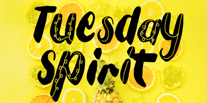 Tuesday Spirit is a unique and fun display font. It will add a charming touch to your upcoming summer crafting projects. This font is PUA encoded which means you can access all of the cute ethnic alternate glyphs with ease!
 - Andtioh by Andfonts,
$19.00 Andtioh is my vision of sci-fi font. I want to propose the idea of simplicity and techno in two ways. I think this font can find its place in logos and names and will make your business look innovative.
 - Bitelephant by Kah Khiong Design,
$13.00 Bitelephant is a type of pixel font with Slab Serif. It's unique pipeline characteristic, result a bold & simple font. It's bitmap give a retro game looks, but with a futuristic feel. Suitable for any fun, sci-friction, techno, game & digital theme.
 - Chinese Shangai by Nirmana Visual,
$24.00 Chinese Shangai Inspired by China & Japan Calligraphy. Each characters carefully crafted with delight full technique and visual touch to make your design works have oriental and stylish looks. Chinese Sahnagi Perfectly fit for your Chinese / Japanese projects, Logo, Branding, Restaurant, Asia Town decoration, anytime you need an instant vibe of it.
 - Chevalier LP by LetterPerfect,
$39.00 Chevalier LP is a revived decorative face with a European lineage. Its patterned and shaded 'fatface' letterforms exhibit the continent's 19th century fascination with elaborate engraving techniques, often used on currency as a deterrent against counterfeiting. It is not without reason that Chevalier conjures up images of bank notes and finance.
 - TT Lakes Neue by TypeType,
$39.00 Introducing TT Lakes Neue in version 2.0! Please note that the TT Lakes font has been removed from platforms, but you can still order it by sending a request to the studio's commercial department: commercial@typetype.org We have released a continuation of the geometric sans serif inspired by Finnish functionalism. The new version provides more opportunities, because we not only increased the character set and improved the font technically, but also reworked its visual character. What changed? Font character. TT Lakes Neue 2.0 has become calmer, as we have removed the display details in the characters of the main set, making the font more versatile. New stylistic sets were created, thanks to which the nature of the font can be controlled, making it more expressive. Changed the forms of the characters "Кк", "ЖЖ", "Дд", "Лл", lowercase "b" and alternative "g". Added alternative forms for all types of the number "1", for the characters "Mm", "DD", "Ll". Added technological character sets, with which the font looks stylish and expressive. You may notice that in these sets, the forms of lowercase characters with arches (r, m, n) are changed, and there are gaps in the places of infusions and connections of all characters. Scope of application. The scope of TT Lakes Neue 2.0 have become even more diverse, because the sans serif has become more neutral in character and more functional. TT Lakes Neue 2.0 is the perfect font for the gaming industry. Suitable for game interfaces of different genres. Technological sets can be used in architectural projects, in the headlines of posters and magazines, on outdoor signs. The font is suitable for logo design, looks great in branding. Character set and technical characteristics. We have significantly improved the set of the font, increasing the number of characters from 736 to 921. The font has become more functional due to the updated technical stuffing and new features, of which there are now 36 instead of 24. Added characters of extended Latin, fractions, arrows. Created new kerning and hinting. Updated variable font. Added new OpenType features. The TT Lakes Neue font has 5 subfamilies: Compressed, Condensed, Regular, Extended, Expanded. In total, there are 91 styles in the font: 9 upright and 9 slanted in each subfamily and 1 variable font. Each style has 921 characters and 36 OpenType features.
 - Ultraproxi by Typodermic,
$11.95 Looking for a typeface that conveys a technical and austere vibe without sacrificing design flexibility? Look no further than Ultraproxi, the cutting-edge typeface that draws inspiration from the high-speed computer printers of the mid-20th century. Designed with the precision and clarity required for high-speed printing, Ultraproxi captures the essence of the IBM 1403 chain printer, with its metal type slugs linked in a chain that whirled rapidly over an ink ribbon. The result is a typeface that conveys both speed and accuracy, perfect for modern design applications. But Ultraproxi is more than just a nostalgic homage to a bygone era of computing. Its semi-monospaced design is uniquely suited to the needs of modern graphic designers, allowing for a technical demeanor without the drawbacks of traditional monospaced typefaces. With six weights and italics, Ultraproxi offers unparalleled versatility and flexibility. Whether you’re designing a sleek and streamlined UI or a complex data visualization, Ultraproxi is the typeface of choice for designers who demand both style and substance. So why settle for a boring, generic typeface when you can have Ultraproxi? With its unique blend of technical precision and design flexibility, this typeface is sure to impress even the most discerning design enthusiasts. Most Latin-based European, Vietnamese, Greek, and most Cyrillic-based writing systems are supported, including the following languages. Afaan Oromo, Afar, Afrikaans, Albanian, Alsatian, Aromanian, Aymara, Azerbaijani, Bashkir, Bashkir (Latin), Basque, Belarusian, Belarusian (Latin), Bemba, Bikol, Bosnian, Breton, Bulgarian, Buryat, Cape Verdean, Creole, Catalan, Cebuano, Chamorro, Chavacano, Chichewa, Crimean Tatar (Latin), Croatian, Czech, Danish, Dawan, Dholuo, Dungan, Dutch, English, Estonian, Faroese, Fijian, Filipino, Finnish, French, Frisian, Friulian, Gagauz (Latin), Galician, Ganda, Genoese, German, Gikuyu, Greenlandic, Guadeloupean Creole, Haitian Creole, Hawaiian, Hiligaynon, Hungarian, Icelandic, Igbo, Ilocano, Indonesian, Irish, Italian, Jamaican, Kaingang, Khalkha, Kalmyk, Kanuri, Kaqchikel, Karakalpak (Latin), Kashubian, Kazakh, Kikongo, Kinyarwanda, Kirundi, Komi-Permyak, Kurdish, Kurdish (Latin), Kyrgyz, Latvian, Lithuanian, Lombard, Low Saxon, Luxembourgish, Maasai, Macedonian, Makhuwa, Malay, Maltese, Māori, Moldovan, Montenegrin, Nahuatl, Ndebele, Neapolitan, Norwegian, Novial, Occitan, Ossetian, Ossetian (Latin), Papiamento, Piedmontese, Polish, Portuguese, Quechua, Rarotongan, Romanian, Romansh, Russian, Rusyn, Sami, Sango, Saramaccan, Sardinian, Scottish Gaelic, Serbian, Serbian (Latin), Shona, Sicilian, Silesian, Slovak, Slovenian, Somali, Sorbian, Sotho, Spanish, Swahili, Swazi, Swedish, Tagalog, Tahitian, Tajik, Tatar, Tetum, Tongan, Tshiluba, Tsonga, Tswana, Tumbuka, Turkish, Turkmen (Latin), Tuvaluan, Ukrainian, Uzbek, Uzbek (Latin), Venda, Venetian, Vepsian, Vietnamese, Võro, Walloon, Waray-Waray, Wayuu, Welsh, Wolof, Xavante, Xhosa, Yapese, Zapotec, Zarma, Zazaki, Zulu and Zuni.
 - Mallovice by Javatypestd,
$19.00 Mallovice a ethnic display font is a font made with a unique, strong ethnic character so that users can feel different characteristics Mallovice would be perfect for photography, watermark, social media posts, quotes, cover book, tshirt, branding, logos & branding, invitation, product designs, label, stationery, product packaging, special events or anything that need handwriting taste. What’s Included : - Web Font - Standard glyphs - Ligature and Stylish Set - Works on PC & Mac - Simple installations - Accessible in Adobe Illustrator, Adobe Photoshop, Adobe InDesign, even work on Microsoft Word. - PUA Encoded Characters – Fully accessible without additional design software. - Fonts include multilingual support Thank you for your purchase! Hope you enjoy our font!
 - F2F Madame Butterfly by Linotype,
$29.99The techno sound of the 1990s, a personal computer, font creation software, and some inspiration all came together to inspire the F2F (Face2Face) font series. Alessio Leonardi and his friends had the demand to create new unusual typefaces, which would be used in the leading German techno magazine of the day, Frontpage. Even typeset as small as 6-points, in nearly undecipherable layouts, it was a pleasure for the kids to read and try to decrypt the messages. F2F Madame Butterfly is a font with a heavy, or dark, appearance. The darkness is brought about by the overlapping bits of glyph forms that make up each letter in the typeface. - High Crush by Namara Creative Studio,
$20.00 A visual reflection of progress and dynamism, Elevate your design projects to the next level with our cutting-edge bold techno display fonts. Suitable for a wide range of applications. Whether you’re designing sports event posters, tech product labels, or esports team branding, these fonts will make your content stand out. Features : Bold, Strong & Techno Display Typeface Versatile & Unique Design Alternates, Ligatures & Multilingual Support with PUA Encoded Capture attention, and make a bold impression with these fonts. Start creating the future today! Note : To be able to access ligatures and the alternate letters, please make sure the software you are using can support opentype features.
 - Berkmire AOE by Astigmatic,
$19.95 1970’s Techno-typography finds its rebirth in Berkmire AOE. From its beefy weight to its narrow and sometimes unusual counter cuts, Berkmire AOE started as a digitization of a film typeface called Belden by LetterGraphics. This bulky techno typeface was taken from its limited character set and fleshed out to include an expanded language glyph set. The Capital letterforms seem to push the edge of readability, while the lowercase falls more in line. The letterforms of Berkmire AOE are easy to convert to paths and extend various stems, making this revival something you can really let your imagination run wild with for your designs.


