10,000 search results
(0.041 seconds)
- Niquitta Mirzani by Arterfak Project,
$17.00 introducing Niquitta Mirzani, a brand new font combination Script and Sans. The script means signature because the letterform created with quick handwriting, wide, signature-like. The sans serif designed with condensed shapes, semi-bold that gives a large space to be combined with the script one. You can mix and match this font with any layout possibilities. top-bottom, left-right, headline-tagline, or side by side. Niquitta Mirzani script carefully crafted with additional alternates and ligatures that allow you to create a natural typographic design. This font duo is perfect for display such as apparel, name cards, headline, logo, packaging, labels, signage, quote, and many more! The versatile design for many themes such as romantic, professional, formal, or playful! Fonts featured : Uppercase Lowercase Smallcaps Numbers & punctuation Multilingual PUA encoded Swashes Stylistic set 01-03 Ligatures.
 - Binggo Wood Display by Genesislab,
$20.00 Bingo Wood Display in totality and elegance. One of my newest first releases, hand drawn with pinpoint accuracy. Bingo Wood has the perfect amount of simplicity and subtlety for your next project. It perfectly represents retro and vintage aesthetics. I recommend this font for logos, invitations, and your next home decor project that requires a touch of compact alternative combinations! Include Format: - Bingo Wood Display. otf Bingo Wood appears with a total of 593 Glyph characters available: Basic Latin, Extended Latin A, Punctuation, Open & Close Punctuation, Dashes & Quotes, Super Script & Sub Script, Currency, Numbers, Math Symbol, Designer Favorites Case Sensitive Forms, Discretionary Ligature, Denominators, Standard Ligature, Numerators Stylistic Alternates Set, 1, 2, 3, Sup Script, Super Script, Swash Get inspired by the images above and feel free to share with me what you get using this font.
 - Good Karma by Positype,
$15.00 Good Karma (its namesake) will be extended to you as you use this new relaxed script family. Produced from hand and sumi brush of Neil Summerour, Good Karma is a natural brush textured font family. Good Karma is filled with a lot of heart, reliable and genuine movements, and a wide range of letter options to befit any project needing an honest hand-lettered look. Each typeface comes with an additional set of stylistic alternates (upper AND lowercase) that harmonize wonderfully when you have the Opentype Ligature feature active. Additionally, special double-letter ligatures have been produced for specific combinations in need of more expressive flair, as well as a few swashes that work with the economical strokes originally produced from the sumi brush. To further expand the usefulnesss of this peaceful script, a separate Caps/Small Caps font has been added that provides the simple contrast needed to bring the script fonts forward. Rather than limit the personality of this script, various styles have been produced to complement the original Regular—Upright, Wide, Wide Upright, and the aforementioned Caps fonts are included in hopes of helping you find the perfect variation needed for your composition. Good Karma is the first release of the Positype Relaxed Script Collection of typefaces—all focused on fluid, effortless script fonts for simple use.
 - Delirian by Andrey Sharonov,
$35.00 Delirian Script & Ornaments Delirian is elegant script with contemporary mood and perfect forms, inspired by immortal classic calligraphy. Not too thin and not too thick, good balanced and variable, born for luxury and beauty. In my examples I show how this script can be used. It's great for logotypes, branding, wedding invitations, romantic cards, alcohol labels, packaging, spelling of names and others. Delirian Script comes with beautiful Uppercase and Lowercase letters, numbers and punctuation. In addition to the main character set, there are 158 alternates characters, 36 ligatures and 10 lengths of end-swashes. You also get Ornament set of 26 elements which harmoniously complements original script. Multilingual Support Script support Western European characters and works with following languages: English, Croatian, Danish, Dutch, Estonian, Faroese, Filipino, Finnish, French, German, Hungarian, Icelandic, Irish, Italian, Norwegian, Polish, Portuguese, Slovenian, Spanish, Swedish, Turkish. OpenType Stylistic Alternates works on the principle of simple combinations with activated Standard Ligatures option in OpenType panel (Adobe Photoshop, Adobe Illustrator). To get alternate just add for example number 2 (two) after any letter. Every Uppercase has 1-2 variations and Lowercase about 3-4 alternate characters. For example: A2 A3 - Uppercase; a2 a3 a4 - Lowercase; a.1 a.2 - Lowercase with underline. _1 _2 _3 - End-swashes Ligatures works with activated Discretionary Ligatures option in OpenType panel. This special features don't work in Microsoft Word.
 - Megalito Slab ExtCond - Personal use only

- Champagne & Limousines - Personal use only

- Droid Sans - 100% free

- Diediedie - Unknown license

- LT White Fang - Personal use only

- Fester by Fontfabric,
$150.00 Get inspired with Fester Behance presentation After several years of iterations, our brand new sans family of 16 styles is ready to take over with vector excellence! Fester is a semi-condensed Grotesque developed to beam big messages across the galaxy with a clear, bold voice. Emerging as if from the future, this low-contrast sans warps slick lines and sharp terminals into unexpected geometric shapes for extra flair. Ranging from Thin to Heavy, the typeface is loaded with 8 weights + italics, one variable style, over 760 glyphs, and Extended Latin + Cyrillic for flawless work at hyper-speed. Fester syncs with designs that feature big type, sharp layouts, interfaces, outlines, and raster images to help decipher any cutting-edge idea and make a memorable first contact. Family overview: 8 weights (from Thin to Heavy) + italics Extended Latin Cyrillic 760 glyphs Variable Font 1 free font - Fester-ExraLight 130+ languages OpenType Features: Localized Forms Subscript and scientific inferiors Superscript (Superiors) Numerators and Denominators Fractions Lining Figures Tabular Figures Oldstyle Figures Case-Sensitive Forms Standard and Discretionary Ligatures Stylistic Alternates Contextual Alternates Slashed Zero
 - Greek by Scholtz Fonts,
$8.95The Greek font started from an experiment with designing fonts based on a geometric grid. I joined the points on the grid with straight lines to form the various characters and found that this resulted in a font that closely resembled Greek writing (derived from inscriptions carved in stone) of ancient times. I continued to develop this theme but I now accentuated the look and feel of Greek writing. The three styles shown are the results of this development. I did not kern or letterspace the individual letters since this would have been out of character with the orignal Greek writing. This means that the font is mono-spaced. At a later stage I may produce more refined and "modern" versions of these fonts. Surprisingly, the Greek SCF styles are very readable. The font is fully professional in terms of its character set. It contains over 235 characters - (upper and lower case characters, punctuation, numerals, symbols and accented characters are present). In fact, it has all the accented characters used in the major European languages. - Quiel by Ardyanatypes,
$15.00 QUIEL is a font inspired by modern and retro styles blended with elegance. With its dynamic shape, this font is suitable for any design to showcase a stylish, retro, or classic ambience. With nine available weights, QUIEL can easily be adjusted to suit various design preferences. The advantages of QUIEL are not only in its appealing appearance but also in its flexibility in terms of language. This font supports multiple languages, making it easy to use in different countries and languages. Furthermore, QUIEL comes with ligatures and alternate styles, which can enhance the visual appeal of your designs. The inclusion of alternative fonts also provides a range of options for combination. QUIEL is highly suitable for branding projects and various design needs, such as business cards, name tags, advertisements, posters, invitations, branding, logos, magazines, merchandise, and presentations. The unique modern letterforms of QUIEL allow for interesting combinations with various other font types. With its diversity and flexibility, QUIEL is the perfect choice to elevate the visual aspect of your designs, providing an elegant and captivating touch.
 - Mr Gabe by Leksen Design,
$- Check out Mr Gabe in motion! Mr Gabe is a typeface designed to dance. Not that it’s a flamboyant display face, but that it has a liveliness, especially in its heavier weights, that dances across the page. And the letters include a selection of exuberant flourishes that can be used to kick up a ruckus or make a sweeping gesture. Mr Gabe is a high-contrast serif typeface with vertical stress, a “modern” face in traditional type terms. Even in the regular weight, the contrast between thick and thin strokes is very obvious. Designer Andrea Leksen has given many of the lowercase letters ball terminals, teardrop shapes that make Mr Gabe seem decorated even when most of its letter forms are conservative. If you need more bells and whistles, or perhaps revolving mirror balls and dancing shoes, you can explore the font’s collection of ornaments and decorative borders. Mr Gabe comes in four weights, from Regular to Black, with italics for each. Each font includes over 57 ligatures, 31 illustrations and borders, small caps and proportional oldstyle numerals.
 - State Machine by Barnbrook Fonts,
$30.00 State Machine is a display typeface inspired by lettering applied to American and Russian Cold War-era military vehicles. It also features an alternate character set inspired by 1970s hand-made political banners. The name State Machine is a term found in both political theory and computer programming. The theoretical definition describes the political and bureaucratic organisation of a state as well as the repressive state apparatuses such as the military and police. Max Weber describes the state as "a human community that (successfully) claims the monopoly of the legitimate use of physical force within a given territory". In computer programming, a state machine is a mathematical model of computation used to design computer programs. It is conceived as an abstract machine that is in one of a finite number of states. It can change from one state to another when initiated by a triggering event or condition. Taken at a wider conceptual level, when these two definition are combined the meaning becomes analogous to a tool (such as a philosophical idea) with which to transform a society.
 - Soin Sans Neue by Stawix,
$40.00 10 hours a day for almost as long as one anniversary of the Olympics to harvest the experience of designing many typefaces, thinking process and refining the craftmanship throughout these years. From Soin Sans that has been designed and released in 2011 until now, it has come to the right time to push a typeface like Soin Sans itself beyond the boundary, in terms of both usage and equipped features to serve many context of design as perfect as us, Stawix Foundry can offer to you. Soins Sans Neue is the evidence of how Stawix Foundry grows. If one seeks for a type that portrays a simple look, modern but still have a touch of humanist and a little pinch oldstyle, this little one of ours, Soins Sans Neue is the answer we have prepare for you. Technically, we are fully armed with c2sc, cpsp, frac, onum, salt and many more to minimize the chance of choosing other fonts in the project that requires diversities. Without further ado, please welcome Soins Sans Neue!
 - Gutenberg A by Alter Littera,
$- This is a free abridged edition of the full-featured Gutenberg B and Gutenberg C fonts. Although (as the name suggests) it was originally conceived as the first release in the B42-type series, it actually represents the colophon to this series. In addition to having a narrower scope, the font differs from its full-featured predecesors in both letter and word spacing, as well as in glyph design, using exclusively straight lines for every glyph and providing a significantly rough appearance at medium to large point sizes. The font includes the usual standard characters for typesetting modern texts, as well as a few special characters, alternates and ligatures that can be used for typesetting nearly as in Johann Gutenberg’s 42-line Bible and later incunabula. Please note that the use of this free font is subject to the same terms and conditions as those for Alter Littera’s pay fonts. Specimen, detailed character map, OpenType features, and font samples available at Alter Littera’s The Oldtype “Gutenberg A” Font Page.
 - Garota Sans SC - Personal use only

- View Roman Black - Personal use only

- Statos - Personal use only

- Stockscript by K-Type,
$20.00 An elegant yet down-to-earth script based on the pen lettering of the writer, Christopher Stocks.
 - Leona by Autographis,
$39.50 Leona is a handwritten script, that has been tweaked here and there to make it more smooth.
 - Madang Lovers by Ardian Nuvianto,
$19.00 Madang Lovers is a lovely script font with a cute feel. Get inspired by its nostalgic charm!
 - Clarista by Nissa Nana,
$21.00 Clarista is a stunning script that will turn any design project into an authentic piece of art.
 - Mea Culpa by TypeSETit,
$24.95 One of the most elegant script styles found. This beautifully formal font is perfect for high society.
 - Flavour by Hubert Jocham Type,
$29.90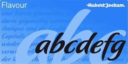 Flavour is an elegant brush script headline typeface. It is ideal for food packaging and product branding.
 - Golden Love by Autographis,
$39.50 Golden Love is a modern, compact script with short ascenders and descenders but nevertheless very good readability.
 - KG Makes You Stronger by Kimberly Geswein,
$5.00 Crayon-style script handwriting. Can also work as a colored pencil or chalk handwriting. Perfect for teachers!
 - Postal JNL by Jeff Levine,
$29.00Postal JNL lets you print out initials, words or phrases emulating postage stamps. Although there's a limited character set, it can be used along with Printing Set JNL to match any additional word copy. - Lady Boss Cyrillic by Ira Dvilyuk,
$18.00 Just a few days ago, it was cold, but today it feels like spring is almost here. With these tender feelings, I want to present you Lady Boss Cyrillic script a delicate, feminine thin modern handwritten font. Lady Boss script font contains the Cyrillic glyphs too. Its hand look style makes it perfect for use in all your design projects be it logos, signatures, labels, packaging design, blog headlines. Also, it will look great in mugs, cards, gorgeous typographic designs, wedding stationery and much more. Lady Boss script contains a full set of uppercase and lowercase letters, - which can be used to create a handwritten look. The Cyrillic part of the font contains the uppercase and lowercase letters and 9 letters with long tails. Also Cyrillic part of the font contains 10 Cyrillic ligatures. Lady Boss _symbols is a font with over 50 unique, hand-drawn illustrations and elements that can help you to make your design unique and matchless. Combine and merge swashes and illustrations to create your own designs and make borders, frames, dividers, logos, and more (just use A-Z and a-z keys in the included Lady Boss symbols font). A different symbol is assigned to each uppercase or lowercase standard character, so you do not need graphics software, just type the letter you need. Multilingual Support for 31 languages: Latin glyphs for Afrikaans, Albanian, Basque, Bosnian, Catalan, Danish, Dutch, English, Estonian, Faroese, Filipino, Finnish, French, Galician, Indonesian, Irish, Italian, Malay, Norwegian Bokmål, Portuguese, Slovenian, Spanish, Swahili, Swedish, Turkish, Welsh, Zulu. And Cyrillic glyphs support for Russian, Belorussian, Bulgarian, and Ukrainian languages.
 - Picture this: you're about to pen a love letter, the old-fashioned way. You dip your quill in ink, but instead of pressing it to parchment, you tap away at your keyboard and, voilá, out comes Jayne S...
- BoinkoMatic, designed by the creative team at Fontocide, is a font that exudes a playful and whimsical charm, infused with a spirited sense of fun and creativity. This typeface is distinguished by it...
- DNP Shueitai by DNP,
$225.00 Shueitai is a typeface that has been undergoing development for more than a century, starting from the days when Dai Nippon Printing Co., Ltd. (DNP) was still known as Shueisha. As Japan underwent rapid modernization during the early years of the Meiji era, Shueisha, believing that printing was a business befitting a modern civilized society, began operations with a focus on letterpress. Before long the company expanded into developing its own typefaces. In 1912 it completed a full range of Mincho type, in sizes from Sho-go (#0 size, 42pt) through Hachi-go (#8, 4pt), which it called "Shueitai" a new style that came to form one of the two mainstreams of Japanese typefaces and continues to have a significant influence on font design even today. The Shueitai typeface is distinguished by abundant variations matching the size of type and the changing demands of the times. Whether it is the spirited and powerful Sho-go, the delicate and flowing San-go (#3, 16pt), or the bright and solidly reassuring Shuei-Mincho L, all Shueitai typefaces share a vibrant brushwork that adds an expression of eloquence and a burst of brilliance to every printed word. Currently, Shueitai is composed of 17 kinds of fonts useful for various purposes. The world has witnessed vast changes in the environment surrounding the printed world, with the tran-sition first from letterpress to Desktop Publishing, and most recently to e-books. But no matter how this environment might evolve, the written word remains the basis of communication, and the importance of beautiful and readable typefaces stays unchanged. In preparation for the changes that will inevitably come during the future, DNP will continue to evolve the Shueitai designs from now on. Through its continual reinvention, Shueitai, a typeface consistently adopted at the vanguard of the industry, perhaps represents Japanese innovation at its very best.
 - Eastside by TypeArt Foundry,
$45.00 Printed text from the Old West.
 - KG Piece By Piece by Kimberly Geswein,
$5.00 A neat, upright printed handwritting font.
 - Alabama Book by Krafted,
$10.00 Looking for a cute and playful font to delight your guests? If you’re hosting a baby shower, birthday party, or need a versatile font for printed materials - then we’ve got the font that’ll make your branding sparkle! Introducing Alabama Book - A Cute Playful Font This adorable, fun, and stylish font can be used for a host of different content needs and projects. Create gorgeous party invitations, printed quotes, standout packaging, or beautiful t-shirts! You can even use it to create amazing headings, logos, resumes, and social media graphics. Inspire your audience, clients, or guests with this beautiful, statement font. What you’ll get: Multilingual & Ligature Support Full sets of Punctuation and Numerals Compatible with: Adobe Suite Microsoft Office KeyNote Pages Software Requirements: The fonts that you’ll receive in the pack are widely supported by most software. In order to get the full functionality of the selection of standard ligatures (custom created letters) in the script font, any software that can read OpenType fonts will work. We hope you enjoy this font and that it makes your branding sparkle! Feel free to reach out to us if you’d like more information or if you have any concerns.
 - VLNL Bint by VetteLetters,
$35.00 Kornelis de Vries, a headmaster from the Dutch province of Friesland, cultivated new potato breeds that he named after pupils in his school. In the early 1900s he came up with the tasty Bintje (a Frisian girl’s name) and it became a big success – in Belgium and France it has remained the most popular potato for french fries to this day, more than a century since its introduction. Donald Roos took 10 kilos of fresh Bintje potatoes and cut the Bint typeface by hand with a short, sharp knife. He then inked each character once and printed it twice; the second, lighter printing is accommodated in the lower case alphabet. The Bint family offers a script to make the letters bounce up and down the baseline; with OpenType functionality the font randomly chooses each character from the upper- or lowercase alphabet. ‘Tabular lining figures’ will activate a series of negative numerals in boxes; ‘Discretionary ligatures’ activates specially designed letter combinations like ‘www’ as well as arrows and stars. Bint has a distinct, slightly rough handmade appearance, making it useful for a wide range of designs.
 - 1509 Leyden by GLC,
$49.00 This script font was inspired by the type used in Leyden by Jan Seversz to print Breviores elegantioresque epistolae [...], author Francesco Filfelo, circa 1509. The original font contains all lower case characters, except w, eth, thorn, lslash, oslash and so... and almost upper case. In addition, one set of small lombardic initials were also nearly complete. It take place instead of the Bold style (in only one package)offering a real and rare complete historical printing set... The original small "a" hight was 2,8 mm !, the upper case hight no more than nearly 5 mm, the initials hight almost 15 mm, covering nearly two lines. This font includes "long s", naturally, as typically medieval and also a few ligatures, but not any variants. We have entirely recreated some characters, upper, lower and initials, to fill gaps. It is used as variously as web-site titles, posters and fliers design, publishing texts looking like ancient ones, or greeting cards, all various sorts of presentations, menus, certificates, as a very decorative, elegant and unusual font, besides its historical scrupulous reality... This font supports enlargement as well as small size.
 - URW Dock Condensed by URW Type Foundry,
$35.99URW Dock Condensed is the matching complement for the URW Dock. Including 20 additional condensed styles the URW Dock Condensed is the space-saving alternative in the URW Dock family. URW Dock is a contemporary geometric type family rooted in the square sans genre. Inspired by the square sans typefaces of the 60s, it is a reinterpretation and enhancement particularly designed for today’s requirements of a multipurpose font: to work excellent in print and screen environments. Including a wide range of styles, an extended character set and a careful composition, it has the ability to give brands, artworks, and interfaces a modern, professional and unique touch. Its high legibility and clear informative and technological appearance are perfectly suitable for infographics, signage and way-finding systems. And especially when embedded in app, gaming and infotainment software it will display its strength. While the upright styles communicate a clear, instructional and informative message, the italics express an industrial, dynamic and forward-thinking spirit. An extensive language support, several figure sets and a wide range of OpenType Features will make the URW Dock font family a perfectly suitable partner for a wide range of print, web and app projects. - Beauty Club by Cultivated Mind,
$25.00 Beauty Club is a modern font collection that includes four serif weights, a thin signature brush script and free marketing words. Beauty Club Brush is a hand-painted script that includes 7 ligatures and 26 alternates. The brush script works great paired with the serif fonts. Try the Beauty Club free font for beauty marketing and social media. It’s a great font for promoting your beauty brands. Fonts and posters designed by Cindy Kinash. See font details below. VERSIONS: American (US) and Extended Latin Pro (Standard) FREE WORDS FEATURES: 57 free words useful for beauty marketing and social media promoting. Keyword examples include beauty, makeup, free, love and sale. Intended use for: beauty, fashion, apparel, marketing, music, social media, websites, magazines, sales, film and packaging. BRUSH SCRIPT AMERICAN (US) Shorter version Thin hand-painted brush script 7 ligatures and 26 alternates OpenType Includes the common alphabet, numbers, American symbols and punctuation. BRUSH SCRIPT EXTENDED LATIN PRO (Standard) Extended version of the American (US) version. Thin hand-painted brush script 7 ligatures and 26 alternates OpenType Includes Latin Pro characters for Albanian, Basque, Catalan, Cornish, Croatian, Czech, Danish, Dutch, English, Esperanto, Estonian, Feroese, Finnish Scots, French, Gaelic, Galician, German, Greek Transliterated, Hawaiian, Hungarian, Icelandic, Indonesian, Irish, Italian, Latvian, Lithuanian, Maltese, Nynorsk Bokmal Norwegian, Polish, Portuguese, Romanian, Slovak, Slovenian, Spanish, Swedish, Turkish, Welsh. SERIF AMERICAN (US) Shorter version OpenType Includes the common alphabet, numbers, American symbols and punctuation. SERIF EXTENDED LATIN PRO (Standard) Extended version of the American (US) version. OpenType Includes Latin Pro characters for Albanian, Basque, Catalan, Cornish, Croatian, Czech, Danish, Dutch, English, Esperanto, Estonian, Feroese, Finnish Scots, French, Gaelic, Galician, German, Greek Transliterated, Hawaiian, Hungarian, Icelandic, Indonesian, Irish, Italian, Latvian, Lithuanian, Maltese, Nynorsk Bokmal Norwegian, Polish, Portuguese, Romanian, Slovak, Slovenian, Spanish, Swedish, Turkish, Welsh. TIPS: Try the OpenType brush script alternates/ligatures by turning on the feature in your preferred program that supports ligatures. DISPLAY- Pair the Beauty Club brush script with the serif fonts as large headline text for optimization. FONT USE- Use Beauty Club for beauty, fashion, apparel, marketing, music, social media, websites, magazines, sales, film and packaging."
 - Prillwitz Pro by preussTYPE,
$49.00 Johann Carl Ludwig Prillwitz, the German punch cutter and type founder, cut the first classic Didot letters even earlier than Walbaum. The earliest proof of so-called Prillwitz letters is dated 12 April 1790. Inspired by the big discoveries of archaeology and through the translations of classical authors, the bourgeoisie was enthused about the Greek and Roman ideal of aesthetics. The enthusiasm for the Greek and Roman experienced a revival and was also shared by Goethe and contemporaries. »Seeking the country of Greece with one’s soul«. All Literates who are considered nowadays as German Classics of that time kept coming back to the Greek topics, thinking of Schiller and Wieland. The works of Wieland were published in Leipzig by Göschen. Göschen used typefaces which had been produced by until then unknown punch cutter. This punch cutter from Jena created with these typefaces master works of classicist German typography. They can stand without any exaggeration on the same level as that of Didot and Bodoni. This unknown gentleman was known as Johann Carl Ludwig Prillwitz. Prillwitz published his typefaces on 12th April 1790 for the first time. This date is significant because this happened ten years before Walbaum. Prillwitz was an owner of a very successful foundry. When the last of his 7 children died shortly before reaching adulthood his hope of his works was destroyed, Prillwitz lost his will to live. He died six months later. His wife followed him shortly after. The typeface Prillwitz as a digital font was created in three optical styles (Normal, Book and Display). The typeface Prillwitz Press was created especially for a printing in small sizes for newspapers. »Prillwitz Press« combines aesthetic and functional attributes which make written text highly readable. It was originally designed for a newspaper with medium contrast to withstand harsh printing conditions. Its structure is quite narrow which makes this typeface ideal for body text and headlines where space is at premium. For the Normal – even more for the Book – a soft and reader-friendly outline was created through a so-called »Schmitz« and optimized in numerous test prints. The arris character and the common maximal stroke width contrast of the known classicist typefaces (Didot/Bodoni) were edited by the study of the original prints. This was also done in order to reach a very good readability in small type sizes. This typeface is perfectly suited to scientific and belletristic works. Accordingly it has three styles: Regular, Bold and Italic as Highlighting (1). The typeface Prillwitz is a complete new interpretation and continuing development of the conservated originals from 1790. They have been kept in the German Library in Leipzig. It was always given the priority to keep the strong roughness and at the same time optimizing the readability of this striking font. The type family has all important characters for an efficient and typographic high quality work. ----------- (1) Accentuation of particular words or word orders (e.g. proper names, terms etc.). Typographic means for Highlighting could be Italic, SmallCaps or semi-bold.


