10,000 search results
(0.044 seconds)
- Puchiflit by sugargliderz,
$44.00 Puchiflit is a typeface disguised as a pen script. I didn't create this typeface by importing the letters on paper and tracing them into a computer with a draw application. So I think it's a pseudo-pen script typeface. By the way, I used a famous Japanese maker's felt-tip pen as a reference for line widths. I thought, "Isn't this what it would look like if I wrote with this pen? I drew a line in the draw application while fantasizing about this.
 - Bringtong by Josstype,
$13.00 Bringtong is a brush script inspired by Hot Rod lettering and sign painting. Bringtong is a very versatile script: it includes end swashes, swash caps, small caps, lots of alternate characters and underline option. It has over 362 glyphs. Bringtong is bouncy and smooth and has a very organic feel. You have a lot of options to customize it and that makes it perfect for logos, packages and titles. If you have any questions, please feel free to contact me via email: joelpopon@gmail.com
 - Goldshift by Maulana Creative,
$10.00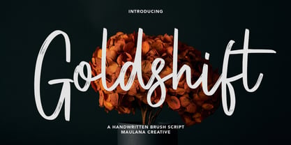 Goldshift is a modern handwritten brush script font, With a rough brush stroke and fun characters. It has Opentype features of ligatures and extra swash, makes it a perfect choice for branding and digital designs. Use this font for logos, social media, websites, blogs, instagram, social media, business cards, branding, and more! Goldshift font support multilingual more than 100+ language. and good pair for your secondary text font with sans or serif. Make a stunning work with Goldshift handwritten brush script font. Cheers, MaulanaCreative
 - Gillfloys by Maulana Creative,
$12.00 Gillfloys is a simply casual signature script font. With regular mono-line stroke, slant and fun character with a bit of ligatures and a bit much ligatures in Gillfloys Alt. To give you an extra creative work. Gillfloys font support multilingual more than 100+ language. This font is good for logo design, Social media, Movie Titles, Books Titles, a short text even a long text letter and good for your secondary text font with Script. Make a stunning work with Gillfloys font. Cheers, MaulanaCreative
 - Fuller Brush NF by Nick's Fonts,
$10.00A snappy single-stroke alphabet from The New Lone Pine ABC of Showcard and Ticketwriting, which Aussie author C. Milnes suggested should be executed with a well-loaded brush, provided the inspiration for this loose, lilting retro script. Its condensed letterforms and tight spacing allow for larger headlines than most brush scripts, and its bouncing baseline adds an extra dollop of visual fun. The PC Postscript, Truetype and Opentype versions contain the complete Latin language character set (Unicode 1252) plus Central European (Unicode 1250) languages as well. - Nearland by Uncurve,
$20.00 Nearland is an aesthetic vintage Script font. Inspired from the past, elegant signage, gold leaf art, sign painting, lettering, logo and old label product. Nearland Script comes with tons of alternates characters and special alternate (i) lowercase is a ending swash thats to make more eye cacthy. Finally BOOM..!! you get a great design for your project. Nearland It's suitable for authentic logos, headings, sign painting, posters, letterhead, branding, magazines, album covers, book covers, movies, apparel design, flyers, greeting cards, product packaging, badge and more.
 - Humanity by Aminmario Studio,
$20.00 Introducing Humanity font is modern handwritten with a random thickness and charming gesture. This font was created to look as close to a natural handwritten script, as possible by including lowercase alternates, ligature and underlines. Perfect for any awesome projects that need hand writing taste. Comes with regular and italic. With built in Opentype features, this script comes to life as if you were writing it yourself. Don't hesitate if you have any questions. Thanks for checking out this font. I hope you enjoy it! AminMario
 - Sherbet BF by Bomparte's Fonts,
$39.00 Sherbet BF is a robust, bouncy handwritten-style script with an enthusiastic voice. A number of Automatic Ligatures and Contextual Alternates, are included in the font, along with Stylistic Alternates for lowercase letters g, and y. Enable these features in OpenType-savvy programs (such as InDesign CS+, Illustrator CS+ and QuarkXpress 7 and later) to enhance your typography. As with most scripts, it is not recommended that word settings be in all uppercase, but rather in settings of initial capitals together with lowercase letters.
 - Nirbon Duo by Maulana Creative,
$16.00 Nirbon is a Retro sans and script font duo. With Rough sans stroke and medium contrast script stroke, fun character with a bit of ligatures and alternates. To give you an extra creative work. Shorebird font support multilingual more than 100+ language. This font is good for logo design, Social media, Movie Titles, Books Titles, a short text even a long text letter and good for your secondary text font with sans or serif. Make a stunning work with Nirbon font. Cheers, Maulana Creative
 - Human Diary by HIRO.std,
$19.00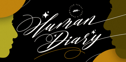 Human Diary is a handwritten script font. This font describes about casual, luxury, elegant, stylish, dynamic, easy to use and will bring a good harmony when the letters are connected and paired each other. FEATURES - Uppercase and Lowercase letters - Support Opentype Features - 34 Ligatures - Alternate Lowercase - Swash - Numbering and Punctuations - PUA Encoded Characters - Multilingual Support - Works on PC or Mac USE Human Diary works great in any wedding invitations, branding, logotype, magazine, photography, and any projects that need elegant script taste. Enjoy using! Thanks. HIRO.std
 - Sunday Vibes by HIRO.std,
$21.00 Sunday Vibes is clean, bold, funky script. This font describes about stylist, fun and elegant, catchy, dynamic, humanist, readable, easy to use and will bring a good harmony when the letters are connected and paired each other. FEATURES - Support Opentype Features - Support Ligatures - Stylistic Alternates - Numbering and Punctuations - PUA Encoded Characters - Multilingual Support - Works on PC or Mac USE Sunday Vibes works great in any logotype, magazines, apparel, social media posts, advertisements, product packaging, product designs, label, and any projects that need funky script.
 - Eve Adam by HIRO.std,
$16.00 Eve Adam is a lovely script font. This font describes about elegant, classy, dynamic, stylish, catchy, feminist, easy to use and will bring a good harmony when the letters are connected and paired each other. FEATURES - Support Opentype Features - Support Ligatures - Uppercase beginning swash - Lowercase beginning and ending swash - Numbering and Punctuations - PUA Encoded Characters - Connecting heart - Multilingual Support - Works on PC or Mac USE Delissa Beauty works great in any wedding invitations, branding, logotype, quotes and any projects that need lovely script taste.
 - Bastardre Hand by DC Design,
$32.00Bastardre Hand is a beautiful calligraphic face based on medieval miniscule script. With characters closer together yet still recognizable and easy to read, this font works well for illuminated text designs and wherever the look of a scribe's hand is desired. Bastardre Hand has punctuation and diacritics for: Afrikaans, Albanian, Bassa, Cebuano, Danish, Dutch, English, Estonian, Faeroese, Finnish, Flemish, French, Frisian, Gaelic, German, Haitian Creole, Hiligaynon, Hmong, Indonesian, Italian, Iloko, Kurmanji Kurdish (Roman script), Marshallese, Norwegian, Papiamento, Portuguese, Spanish, Swahili, Swedish, Tagalog, Trukese, Wolof, Xhosa, Zulu. - Beautinela by Almarkha Type,
$29.00 Beautinela Script is a beautiful mono-line font, perfect for logo design, branding, clothing design, signature, posters, wedding invitations and so much more! My goal with this font was to create an easily legible script font which would work for a wide variety of purposes. This font retains my personality within the characters as they were initially based off my own handwriting and later tidied up to create a set of consistent characters. Having that handmade feel and personal touch certainly gives it a hint of authenticity.
 - Paulette by Rosario Nocera,
$22.99 Paulette is a script typeface, the capital letters are completely unpublished, some of them have a smile-similar ornament (A,F,O,H,Q,B,C,P,G), whereas minuscule letters are inspired to Edwardian font script. The font is very versatile and is very suitable for typographic compositions with large letters and for medium and small ones. It includes a complete series of internationals letters, 342 glyphs and 6 new ligatures. Paulette is an elegant letter and it's available in two versions, regular and eroded.
 - Blue Bronx by Putracetol,
$24.00 Blue Bronx - Bold Vintage Scipt Font. Blue Bronx is a bold vintage script font. Blue Bronx is font we combine vintage with luxury script font. Blue Bronx can be used in various projects with retro or vintage and luxury themes. Such as logos, branding, posters, packaging, book covers, clothes/apparel, quotes, titles and others. Blue Bronx come with clean and rough font version. Come with Opentype feature with a lot of alternates, its help you to make great lettering. This font is also support multi language.
 - Sivellin by Melvastype,
$39.00 Sivellin is an elegant brush script with a lots of alternates, swashes and small caps. All in all it has over 1,300 glyphs. Sivellin has round and soft letterforms, low x-height and quite a generous spacing to get that elegant and very legible result. Because of all the alternates Sivellin is a very versatile script font. It can look very straightforward or with added Swashes very flamboyant. Or something between. It gives you options to customize your typography and designs the way you like.
 - Palisade by profonts,
$51.99 Palisade Pro is a new, very elegant script family developed and manufactured in OpenType Pro format by profonts studio. Each of the eight weights contains approximately 1250 characters! The character range includes the complete Latin layout for Western and Eastern Europe, including the Baltic states, Romania and Turkey. Moreover, the character set contains a large selection of handcrafted ligatures (about 450 per font!), character combinations and alternative characters, which make this attractive script perfect for OTF-enabled applications such as InDesign and Quark Xpress version 7and later.
 - Jefferys York by Maulana Creative,
$15.00 Jefferys York is a signature script font With clean monoline stroke, condensed, upright and fun character. It has Opentype features of ligatures and lowercase alternates, To give you an extra creative work. Jeffreys York script font support multilingual more than 100+ language. This font is good for logo design, Social media, Movie Titles, Books Titles, a short text even a long text letter and good for your secondary text font with sans or serif. Make a stunning work with Jeffreys York signature font. Cheers, MaulanaCreative
 - dT Delicatta by dooType,
$40.00 Easy to use, but hard to miss. That’s dT Delicatta. An elegant script face that adds a special touch to any message. Script typefaces usually come packed with endless features and, more often then not, all those possibilities take their toll on the designer or art director. With usability in mind, we kept dT Delicatta simple and straightforward to use while delivering refined shapes that enhance your or your client’s communication. dT Delicatta is a revised, improved and virtually new font of our old classic Delicatta
 - 1815 Waterloo by GLC,
$38.00 This script font was inspired by a few manuscripts and letters written by French representatives or ministers after the defeat of Napoleon at Waterloo. It is an attempt to offer a typical handwritten script from this period. This font can be used variously as website titles, in the design of posters, fliers and greeting cards, as well as for menus, certificates and letters as a very decorative, elegant and unusual font. This font supports large sizes as well as small ones, remaining clear and easy to read.
 - Stand Against by Maulana Creative,
$15.00 Stand Against Handwritten Graffiti Font Stand Against is a street display graffiti script font. With back slanted mono-line stroke, fun character with a bit of ligatures and alternates. To give you an extra creative work. Stand Against font support multilingual more than 100+ language. This font is good for logo design, Social media, Movie Titles, Books Titles, a short text even a long text letter and good for your secondary text font with script or signature. Make a stunning work with Stand Against font. Cheers, MaulanaCreative
 - Vadelma by Melvastype,
$29.00 Vadelma is a script type family of four fonts. It is inspired by brush lettering and has soft and friendly looks. Vadelma can be used for branding, packaging and where ever you need a legible and smooth script font. Vadelma has lots of ligatures, swashes and alternative characters that will make your design unique and beautiful. You can also buy Vadelma as Variable Font and adjust the weight of Vadelma smoothly between Light and Bold weights. Notice that you need design software that supports Variable Fonts.
 - Larianti by Subectype,
$16.00 Larianti Monoline Handwritten Font - a new modern & fresh script with a handwritten and script style making this font looks elegant, natural, and stylish. Larianti is perfect for photography, watermark, social media posts, advertisements, logos & branding, invitation, product designs, label, stationery, wedding designs, product packaging, special events or anything that need handwriting taste. What's Included : Larianti 4 Font Styles Multilingual Support Opentype Features I hope you enjoy this font. If you have any questions please don't hesitate to drop me a message. Thank You, Subectype
 - Notes and Quotes by Ana's Fonts,
$14.00 Notes And Quotes is a font duo that includes a bold typewriter font and a casual script font. The contrast between the fonts makes it a striking pair, perfect for logotype design, modern branding and packaging, quotes and social media posts. Notes And Quotes includes 6 fonts: a handwritten script font with a slant alternative and a bonus set of handwritten doodles (underlines, circles, words and short sentences, etc) a bold typewriter font with a "jumpy" alternative and a set of bonus misprints and grungy elements
 - Bathella by Arunatype,
$15.00 Bathella script is the perfect font choice for businesses that want to convey an image of elegance, luxury, and style. The font's smooth and fluid lines create a sophisticated and refined appearance, making it ideal for high-end branding and marketing materials. Bathella script's exquisite details and graceful curves make it a favorite among designers who seek to create an impression of exclusivity and class. Whether used in logos, invitations, or advertisements, Bathella script is sure to leave a lasting impression of quality and luxury.
 - Sidehustle by Maulana Creative,
$14.00 Sidehustle is casual script font, with clean bold mono-line stroke, slant and fun character. It has Opentype features ligatures of character and some lowercase alternative option, To give you an extra creative work. Sidehustle script font support multilingual more than 100+ language. This font is good for logo design, Social media, Movie Titles, Books Titles, a short text even a long text letter and good for your secondary text font with sans or serif. Make a stunning work with Sidehustle font. Cheers, MaulanaCreative
 - Bright Flicks by Nathatype,
$29.00 Bright Flicks is a delightful script font that embodies a playful and whimsical spirit. With its rounded letterforms and charming swings at the ends of some letters, this typeface adds a joyful and lively touch to your designs. The defining feature of this script lies in its rounded shape, which gives the font a friendly and approachable appearance. The letterforms flow smoothly, creating a sense of fluidity and movement. Each letter flows into the next, creating a harmonious and lively composition. The uppercase letterforms are crafted with precision and creativity, maintaining legibility while embracing the playful nature of the font. Adding to its character are the swings at the ends of select letters, adding a touch of playfulness and spontaneity. Bright Flicks captures the essence of creativity and imagination. The rounded shapes evoke a sense of warmth and friendliness, while the swings at the ends of certain letters add a touch of whimsy and fun. This font brings a sense of joy and positive energy to your designs. You can also enjoy the various features available in this font. Features: Stylistic Sets Ligatures Multilingual Supports PUA Encoded Numerals and Punctuations Bright Flicks fits in logos, branding materials, packaging, and any design project that aims to evoke a sense of cheerfulness and creativity. Whether you're working on invitations, greeting cards, posters, or any project that needs a touch of playfulness, this font will bring a vibrant and lively vibe. Find out more ways to use this font by taking a look at the font preview. Thanks for purchasing our fonts. Hopefully, you have a great time using our font. Feel free to contact us anytime for further information or when you have trouble with the font. Thanks a lot and happy designing.
 - RePublic by Suitcase Type Foundry,
$75.00In 1955 the Czech State Department of Culture, which was then in charge of all the publishing houses, organised a competition amongst printing houses and generally all book businesses for the design of a newspaper typeface. The motivation for this contest was obvious: the situation in the printing presses was appalling, with very little quality fonts existing and financial resources being too scarce to permit the purchase of type abroad. The conditions to be met by the typeface were strictly defined, and far more constrained than the ones applied to regular typefaces designed for books. A number of parameters needed to be considered, including the pressure of the printing presses and the quality of the thin newspaper ink that would have smothered any delicate strokes. Rough drafts of type designs for the competition were submitted by Vratislav Hejzl, Stanislav Marso, Frantisek Novak, Frantisek Panek, Jiri Petr, Jindrich Posekany, and the team of Stanislav Duda, Karel Misek and Josef Tyfa. The committee published its comments and corrections of the designs, and asked the designers to draw the final drafts. The winner was unambiguous — the members of the committee unanimously agreed to award Stanislav Marso’s design the first prize. His typeface was cast by Grafotechna (a state-owned enterprise) for setting with line-composing machines and also in larger sizes for hand-setting. Regular, bold, and bold condensed cuts were produced, and the face was named Public. In 2003 we decided to digitise the typeface. Drawings of the regular and italic cuts at the size of approximatively 3,5 cicero (43 pt) were used as templates for scanning. Those originals covered the complete set of caps except for the U, the lowercase, numerals, and sloped ampersand. The bold and condensed bold cuts were found in an original specimen book of the Rude Pravo newspaper printing press. These specimens included a dot, acute, colon, semicolon, hyphens, exclamation and question marks, asterisk, parentheses, square brackets, cross, section sign, and ampersand. After the regular cut was drafted, we began to modify it. All the uppercase letters were fine-tuned, the crossbar of the A was raised, E, F, and H were narrowed, L and R were significantly broadened, and the angle of the leg and arm of the K were adjusted. The vertex of the M now rests on the baseline, making the glyph broader. The apex of the N is narrower, resulting in a more regular glyph. The tail of Q was made more decorative; the uppercase S lost its implied serifs. The lowercase ascenders and descenders were slightly extended. Corrections on the lower case a were more significant, its waist being lowered in order to improve its colour and light. The top of the f was redrawn, the loop of lowercase g now has a squarer character. The diagonals of the lowercase k were harmonised with the uppercase K. The t has a more open and longer terminal, and the tail of the y matches its overall construction. Numerals are generally better proportioned. Italics have been thoroughly redrawn, and in general their slope is lessened by approximatively 2–3 degrees. The italic upper case is more consistent with the regular cut. Unlike the original, the tail of the K is not curved, and the Z is not calligraphic. The italic lower case is even further removed from the original. This concerns specifically the bottom finials of the c and e, the top of the f, the descender of the j, the serif of the k, a heavier ear on the r, a more open t, a broader v and w, a different x, and, again, a non-calligraphic z. Originally the bold cut conformed even more to the superellipse shape than the regular one, since all the glyphs had to be fitted to the same width. We have redrawn the bold cut to provide a better match with the regular. This means its shapes have become generally broader, also noticeably darker. Medium and Semibold weights were also interpolated, with a colour similar to the original bold cut. The condensed variants’ width is 85 percent of the original. The design of the Bold Condensed weights was optimised for the setting of headlines, while the lighter ones are suited for normal condensed settings. All the OpenType fonts include small caps, numerals, fractions, ligatures, and expert glyphs, conforming to the Suitcase Standard set. Over half a century of consistent quality ensures perfect legibility even in adverse printing conditions and on poor quality paper. RePublic is an exquisite newspaper and magazine type, which is equally well suited as a contemporary book face. - Cardo - Personal use only

- Armalite Rifle Pro by CheapProFonts,
$10.00 Military style stencil type, badly bruised by shotgun fire, wear and tear. Now ready for action in more languages! Vic Fieger says: "The original letterforms were not the famous military stencil, but were drawn freehand then scanned into Photoshop. Next, they were altered using a series of brushes before being imported into a font. This font has been used in the Flash games Pandemic and Artillery." ALL fonts from CheapProFonts have very extensive language support: They contain some unusual diacritic letters (some of which are contained in the Latin Extended-B Unicode block) supporting: Cornish, Filipino (Tagalog), Guarani, Luxembourgian, Malagasy, Romanian, Ulithian and Welsh. They also contain all glyphs in the Latin Extended-A Unicode block (which among others cover the Central European and Baltic areas) supporting: Afrikaans, Belarusian (Lacinka), Bosnian, Catalan, Chichewa, Croatian, Czech, Dutch, Esperanto, Greenlandic, Hungarian, Kashubian, Kurdish (Kurmanji), Latvian, Lithuanian, Maltese, Maori, Polish, Saami (Inari), Saami (North), Serbian (latin), Slovak(ian), Slovene, Sorbian (Lower), Sorbian (Upper), Turkish and Turkmen. And they of course contain all the usual "Western" glyphs supporting: Albanian, Basque, Breton, Chamorro, Danish, Estonian, Faroese, Finnish, French, Frisian, Galican, German, Icelandic, Indonesian, Irish (Gaelic), Italian, Northern Sotho, Norwegian, Occitan, Portuguese, Rhaeto-Romance, Sami (Lule), Sami (South), Scots (Gaelic), Spanish, Swedish, Tswana, Walloon and Yapese.
 - Ribbons by Positype,
$20.00 Ribbon type. Holy grail of complex-lettering-turned typeface or an elusive Loch Ness monster that is often teased, possibly seen in the wild, but never confirmed? From the amazing lettering artist and author Martina Flor and masterful type designer Neil Summerour, comes the aptly named Ribbons. Ribbons is a sincere and well-conceived approach to providing a reliable solution to ribbon and ribbon-styled type for creative professionals when a lettering artist just isn’t available. Ribbons provides both flat and ‘folded’ options with the Regular and Fold styles, but then raises the bar with separate layer styles that will allow you to easily create the elegant back and forth movements produced with ribbon-style lettering we have all come to appreciate. These layer options are provided in both ‘smooth’ and ‘pleated’ connected styles. Flor and Summerour didn’t stop there. Each typeface was expanded with a number of stylistic alternates, additional swashed and flourished letters, ligatures, and even more in order to provide as many decorative options as possible to the creative. To round out the nine fonts available in the typeface and to ‘put a bow on it’, they’ve added a separate Shadow style and two different color fonts (available exclusively with family purchases).
 - Atyp BL by Suitcase Type Foundry,
$39.00 The sources of inspiration for the Atyp typeface are spread out widely both stylistically and chronologically. The basic proportions of the uppercase refer to the elementary geometric constructions of the Bauhaus. The subtle details in the drawing of the characters and the microscopic adjustments, which evoke the illusion of uniformity and mechanical purity, pay homage to the rationalism of the typefaces popular in the International Style. The increased contrast of the joints of the bowls and shoulders in the Display weight, which in certain diagonal curves transition into almost deconstructive permutations. For a change these take delight in doing things on purpose, teasing readability and breaking the rules of the new millennium's typography. Atyp was created by adapting a typeface originally made for a commercial television station. The potential of the neutral grotesque, proven by its excellent readability on screens, gave the impetus for its preparation into an extremely wide character set. Coherence across all eight key masters lays the groundwork ideally for using the variable font format. The key benefits of this technology are a significant reduction in data consumption in the case of web fonts, as well as an unlimited access to the full range of styles, which in turn is a significant benefit in the area of responsive design.
 - Totoey by MKGD,
$13.00 Most of my fonts tend to skew more to the darker side in terms of themes and uses. So, as a challenge, I took it upon myself to design a font through the eyes of my wife. Josephine, having a sunny and carefree disposition, gave this font her blessing as being certifiably fun and cheerful. The name of the font comes from the Cantonese translation for "peach" (tow); and saying it twice (toto) is just a cuter way of putting it. Sort of like "Peachy". It's been my nickname for Josephine for as long as I can remember. Totoey has a glyph count of 390 and supports the following languages; Supported Languages: Afrikaans, Albanian, Asu, Basque, Bemba, Bena, Bosnian, Catalan, Chiga, Colognian, Cornish, Croatian, Czech, Danish, Embu, English, Esperanto, Estonian, Faroese, Filipino, Finnish, French, Friulian, Galician, German, Gusii, Hungarian, Icelandic, Indonesian, Irish, Italian, Kabuverdianu, Kalaallisut, Kalenjin, Kamba, Kikuyu, Kinyarwanda, Latvian, Lithuanian, Low German, Lower Sorbian, Luo, Luxembourgish, Luyia, Machame, Makhuwa-Meetto, Makonde, Malagasy, Malay, Maltese, Manx, Meru, Morisyen, North Ndebele, Norwegian Bokmål, Norwegian Nynorsk, Nyankole, Oromo, Polish, Portuguese, Romanian, Romansh, Rombo, Rundi, Rwa, Samburu, Sango, Sangu, Scottish Gaelic, Sena, Shambala, Shona, Slovak, Slovenian, Soga, Somali, Spanish, Swahili, Swedish, Swiss German, Taita, Teso, Turkmen, Upper Sorbian, Vunjo, Walser, Zulu
 - FS Koopman Variable by Fontsmith,
$299.99New York to London via Europe The hardworking FS Koopman is a crossbred workhorse which draws inspiration from Swiss and Germanic grotesks, American gothics and early British grotesques, but refuses to fit neatly into any of these categories. Its neither one nor the other, but all of the above. Fontsmith designers Andy Lethbridge and Stuart de Rozario decided to take the characteristics they admired from each category and distill them down into one functional family. Neo meets Neue FS Koopman aims to swim against the tide of Helvetica-ish derivatives by bringing some personality and soul to a genre that all too often ends up feeling bland and sterile. FS Koopman subtly embraces the quirkiness and charm often seen in early twentieth century designs but pairs this with the functionality of later pioneers of the genre. It’s a grotesque isn’t it? The term grotesque surfaced around the early 1800s and refers to the early sans serif designs that many initially believed were strange or ‘grotesque’ due to their lack of elegant serifs. Later variations became known as neo-grotesques and this moniker stuck around even after they gained mass popularity. Some American variants became known as gothics. FS Koopman takes cues from all three categories and blends them into one cohesive design. - Artisinal by Stiggy & Sands,
$24.00 Artisinal, not to be confused with the term artisanal, is our revival of the Art Deco typeface known as Cubist Bold, by John W. Zimmerman for Barnhardt Bros. & Spindler in 1929, breathes new life into a classic. The original metal cast typeface was designed without a lowercase, as well as some wedge serif capitals made for not always perfect pairings. We've created a lowercase that blends well with the original design to give the typeface more usability. We've also created a fully sans version of the capitals as the default set, and moved the original wedge serif capital styles to a contextual alternates feature. And we created a few stylistic alternates for lowercase characters like the u and y and their accented styles. See the 5th graphic for a comprehensive character map preview. Opentype features include: - Full set of Inferiors and Superiors for limitless fractions. - A Standard lining figure set. - A collection of basic f Ligatures. - Stylistic Alternates for variations of several characters such as u and y. - Contextual Alternates for the original wedge variations of capitals that will mix in where appropriate. Approx. 450 Character Glyph Set: Artisinal comes with a glyph set that includes standard & punctuation, international language support, and additional features
 - Sedid Pro by Fontuma,
$24.00 Sedid, “solidity; It is an Arabic term meaning “righteousness”. In particular, the correctness and soundness of a word is indicated by this word. The fact that I gave this name to the writing family is to point out its accuracy and robustness. This typeface, which is sans serif, consists of three families: ▪ Sedid: Font family containing Latin letters ▪ Sedid Pro: Font family including Latin, Arabic and Hebrew alphabets ▪ Sedid World: A family of typefaces including Latin, Cyrillic, Greek, Arabic and Hebrew alphabets Those who have versatile works should meet the Sedid Pro writing family to meet a new face of writing and make a difference to their work. This font is serious, elegant and solidly built. The Sedid Pro font family can be used as text and header fonts in publishing, digital media and websites. Sedid Pro also has a nice-looking, flexible, geometric face with smooth lines and transitions. The inner and outer spaces of the font are proportioned so that the text can be read easily. Sedid Pro font family consists of 14 fonts, seven plain and seven italic. The font family includes open type features, as well as a large number of ligatures, small caps, modifiers, and currency symbols of many countries.
 - Tag Banger by Okaycat,
$12.50 TagBanger WADE1 is the first in a short graffiti font series. This series will showcase the hand-styles of various mature street artists that Okaycat is working with. This first release highlights the style of one such graffiti writer, WADE1, who has an eclectic writing style after many years proliferating street art. Long-term graffiti artists develop their own style over their careers, spending as many endless hours honing their letter-forms as any full-time professional typographical artist. Style, individuality, and originality are everything. These attributes are key to the graffiti artist's tao. A writer who copies, or "bites" loses respect -- their work will be painted over or "crossed out" by all other writers. Okaycat's TagBanger series aims to demonstrate just how widely these individual styles can diverge, likely due, at least in part, to the social pressures of a community that ruthlessly punishes copycats. WADE1's tags were transformed into vector format from a generous sampling of their most recent scrawls. Our TagBanger series may not be composed of the most legible or beautiful fonts, but we imagine there are uses for these whenever highly unusual handwriting is needed. TagBanger WADE1 is extended, containing the full West European diacritics & a full set of ligatures, making it suitable for multilingual environments & publications.
 - Mir by Juliasys,
$22.00 Мир is Mir. The Russian word Мир (Mir) means both World and Peace. The rendezvous of the two terms seems quite unique and utopistic today, but it is comforting to see that it was natural at some time deep down in Russian history. Bits of both meanings were going through my mind while I was designing this typeface. Mir’s character set is multiscript – Latin, Cyrillic and Greek – and extends to many parts of the linguistic world. In fact it covers more than 100 languages. Stylistic consistency between the language systems make typographic border crossings painless even where national borders are still closely guarded. And in regions where mathematics, physics or chemistry are to be expressed, a rich set of OpenType features lets Mir master also these situations. Serious things are best be said in a relaxed, unpretentious way. So Mir doesn’t put on a show. Mir has authority without being authoritarian, it is serious but not stern. It can explain difficult things and stay calm and down to earth at the same time. Mir Medium has another useful feature: It can be freely downloaded and used by anybody anywhere. You can test the Mir Family with free Mir Medium and get more styles when you need them. @juliasys
 - Condell Bio Poster by Letritas,
$5.00 Condell Bio Poster is part of the bigger Condell family: a project that involves series of typographies that started to be conceived and developed since 2006. It also includes a bigger legibility version and a sans serif. Condell Bio is very versatile and can be used in the agroindustrial production. Thanks to its strongness and its charm, it can be used in different projects where a short and powerful message is required. For instance in a brand marketing campaign. The Condell project follows in terms of time the design of Comalle (a font also designed by Juan Pablo de Gregorio in 2006), but if we compare them, Condell seems to look for a major range of uses rather than a mere stylistic inspiration. And even if it keeps in its shape some organic forms, Condell seems to be much more similar to a sans serif traditional typography. Condell's fat and soft forms and its nice endings, inspired through spontaneous brush strokes, give it a very peculiar pleasant connotation. Its Italic (10 degrees inclination) have been produced singularly, not automatically calculated by the software. Condell Bio Poster is composed of 2 styles: the regular and the italic. Each one of them have 599 characters and is composed of 206 languages.
