10,000 search results
(0.013 seconds)
- Farm Days Out by Epiclinez,
$18.00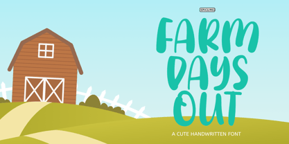 Farm Days Out is a cute and playful font. Suitable for your crafting projects.
 - TA Bankslab by Tural Alisoy,
$33.00 The building of the Northern Bank of St. Petersburg's Baku branch was built in 1903-1905. It was the first Art Nouveau-style building in Baku, Azerbaijan. Later the bank was transformed into the Russian-Asian Bank. After the oil boom in Baku in the 19th century, branches of many banks and new banks were opened in the city. The branch of the Northern Bank of St. Petersburg was among the first banks that was opened in Baku. N.Bayev was the architect of the building for the branch of the Northern Bank of St. Petersburg located at Gorchakovskaya 3 in 1903-1905. The building currently houses the Central Branch of the International Bank of Azerbaijan. My purpose in writing this is not to copy and paste the information from Wikipedia. What attracted me to the building was the word "Банкъ" (Bank) written in Cyrillic letters, which was also used in Azerbaijan during the Soviet era. The exact date of the writing is not known. Every time I pass by this building, I always thought of creating a font of this writing someday. I had taken a photo of the building and saved it on my phone. I did a lot of research on the font and asked a lot of people. However, some did not provide information at all and some said they did not have any information. I was interested in the history of this font but I do not know if this font really existed or it was created by the architect out of nowhere. If there was such a history of this font, I wanted to recreate this font and make it available. If not, I had to create it from scratch in the same way, using only existing letters on the building. Finally, I made up my mind and decided to develop the font with all letters I have got. It was difficult to create a font based on the word, Банкъ. Because in the appearance of the letters, the midline of the letters on A, H, K was very distinct, both in the form of inclination and in more precise degrees. The serif part of the letters, the height of the upper and lower sides, differed from each other. I don't know whether it was done this way when the building was constructed or it happened over time. I prepared and kept the initial version of the font. I took a break for a while. I started digging on the story of the font again. Meanwhile, I was researching and got inspired by similar fonts. Unfortunately, my research on the font's history did not yield any results. I decided to continue finishing up the font. After developing the demo, I created the font by keeping certain parts of these differences in the letters. In addition, I had to consider the development of letters in the Cyrillic, as well as the Latin alphabet, over the past period. Thus, I began to look at the appearance of slab-serif or serif fonts of that time. In general, as I gain more experience in developing fonts, I try to focus on the precision of the design for each font. In recent years, I specifically paid attention to this matter. YouTube channel and articles by Alexandra K.'s of ParaType, as well as, information and samples from TypeType and Fontfabric studios on the Cyrillic alphabet were quite useful. I gathered data regarding the Latin alphabet from various credible sources. I do not know if I could accomplish what I aimed at but I know one thing that I could develop the font. Maybe someday I'll have to revise this font. For now, I share it with you. I created the font in 10 styles. 7 weight from Thin to Extra Black, an Outline, Shadow, and Art Nouveau. The Art Nouveau style was inspired by the texture in the background used for the text on the building. The texture I applied to capital letters adds beauty to the font. If you like the font feel free to use it or simply let me know if your current alphabet doesn't support this font.
 - Liberta TA by Elsner+Flake,
$40.00 Between 1958 and 1961, Herbert Thannhaeuser developed the typeface Liberta for Typoart as a broadly conceived newspaper type which established itself quickly. Its positive adaptation by publishing houses and printing companies was based, next to its agreeable and reader-friendly general impression, also on a relatively robust typeface character which does not sacrifice its power of impression and elegance even when confronted with poor paper and printing qualities. In the 1970s, a bullish and robust design style took over the area of consumer goods which then required a corresponding advertising face. Harald Brödel re-worked the Liberta Ultra for phototypesetting, and, with great sensitivity, designed a matching cursive variation. Both types work especially well as an attention getter for advertising and for emphasis purposes.
 - TA KotodamaF by Skill Information"S",
$99.00 TA-kotodama is designed by Masahiko Yamada who is a famous and popular graphic designer. It is a 4 weight family. 「TAことだま」は、グラフィックデザイナーである山田正彦がデザインしたデザイナーズフォントでファミリーとして4書体ある日本で人気のフォントである。
 - TA Fabricans by Tural Alisoy,
$25.00 TA Fabricans graphic presentation at Behance TA Fabricans font is based on Film Fiction Semi Expanded font. The font also supports the Hebrew alphabet. The Display version comes only in the Latin alphabet. I tried to prepare the font carefully. I specifically searched for the Hebrew alphabet. I benefited from my Israeli colleagues. I believe that my font will be successful. Please check and if you have any additional requests or complaints, please write to me. t@taft.work TA Fabricans works great for branding, magazines, headers, logos, TV, UI, web, badge, packaging, headlines, posters, t-shirt/apparel etc. TA Fabricans offers you options to explore a whole host of applications and gives a real modern feel to any project. Family overview: 36 fonts, 9 weights (from Thin to ExtraBlack) + Condensed, Expanded, Display Latin, Hebrew Display font without Hebrew Multilingual 4 free font Localized Forms with NLD, PLK OpenType Features: Localized Forms Contextual Alternates Tabular Figures Subscript Scientific inferiors Superscript (Superiors) Numerators Case Sensitive Forms Standard and Discretionary Ligatures Stylistic Alternates Kern Ordinals
 - Seibi Ai by Nihon Literal,
$169.00 This typeface combines the rhythmic movement of Mincho and the simplicity of Gothic, with a rounded finish for a touch of elegance and style. 明朝のリズム感とゴシックのシンプルさに加え、ラウンド処理することでエレガントでおしゃれなイメージを求めた書体です。タテ画は太く、ヨコ方向はそれより細く、ハネなどはさらに細く、という三段階処理が施されています。昭和50 年(1975 年)頃、レタリング文字として開発。その後デザイン調整を経てフォント化されました。
 - TA Kirigirisu by Skill Information"S",
$99.00 TA-kirigirisu is the most popular designed font in Japanized font. TA-kirigirisu is one of the representative works designed by Yasushi Saikusa who is famous as a typographer in Japan. TA-kirigisu is used in book covers, flyers, POP advertising, TV commercials, and Web designs everywhere in Japan. It looks superficially imbalanced, but then it also projects an image of attachment. TAキリギリスは、日本語のデザイナーズフォントの中で一番人気の有るフォントです。 フォントのデザインは、有名な七種泰史がデザインした代表作品のフォントです。 日本国内では、本の表紙、フライヤー、POP、TVのCM、Webデザインなど至る所で使われています。 一見アンバランスに見えるデザインが愛着のある可愛らしさを伝えます。
 - Goudy AI by URW Type Foundry,
$35.99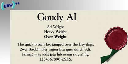
- TA Kenisans by Tural Alisoy,
$35.00 TA Kenisans is a combination of two fonts. You can create very good works with Geometric and Grotesque style. This typeface also equipped with useful OpenType features such as Ordinal, Superior, Stylistic Alternates, Proportional Figure, Fraction, Tabular Figure, Numerator & Denominator. Each font file covers Western & Eastern Europe Latin language, as well as other Latin based languages – over 200 languages supported! This is a new real multi-purpose typeface that will be perfect for logo, packaging, greeting cards, presentations, headlines, lettering, posters, branding, quotes, titles, magazines, headings, web layouts, mobile applications, art quote, typography, advertising, invitations, packaging design, books, book title, & nearly any other type of creative design you’re working on.
 - TA Typefire by Tural Alisoy,
$- Typefire font will be known as TA Typefire from now on. Additionally, Cyrillic, Caucasian Albanian scripts and some glyphs were added. I made some slight modifications to letters. I hope you like it. Much love! TA Typefire is perfectly suited for editorial design, branding, magazines, logos, headings and more. TA Typefire OT Features: aalt, calt, case, dlig, dnom, frac, kern, liga, locl, numr, ordn, salt, sinf, ss01, ss02, ss03, subs, sups Supported Languages: Western Europe, Central/Eastern Europe, Baltic, Turkish, Romanian, Cyrillic, Caucasian Albanian Amount of glyphs included 456 Latin Plus languages supported 94% Latin Plus diacritics included 88% source: underware TA Typefire graphic presentation at Behance
 - AI Wood by Alphabets,
$17.95These six faces are interpreted from examples shown in Rob Roy Kelly's "American Wood Types" They are not merely scanned copies, but have been redrawn from scratch with various optical adjustments. Kelly points out that the true glory of the American Wood Types are the negative spaces, which are, in their dynamic active forms, the antithesis of the anemic flimsy letters produced by type foundries in the 19th century. The Alphabets Wood Types are designed with digital manipulation in mind. Stretch, curve and distort at will! These designs were released prior to similar revivals from Adobe. Each font has two full alphabets (one full height, one smaller) and numerals. However, certain points and accents will not be found. - Baskerville AI by URW Type Foundry,
$35.99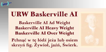
- TA KokoroF by Skill Information"S",
$99.00 TA-kokoro is very popular in Japanized font. TA-kokoro is designed by Yasushi Saikusa who is famous as typographer and based with Maru-gothic. TA-kokoro expresses yet cuteness. TAこころは、日本語のデザイナーズフォントの中で大変人気の有るフォントです。 タイポグラファで有名な七種泰史がデザインしたフォントで、丸ゴシックのデザインをベースにして更に可愛らしさを表現したフォントです。
 - TA Charged by Tural Alisoy,
$20.00 Consisting of 5 fonts in 5 weights, it features an extended charset of over 520 glyphs, covering multilingual support, including Western European, Central European, and Southeastern European. Complete with advanced open type features like stylistic alternates, discretionary ligatures, ordinals, small caps, fractions, and case-sensitive forms. The elegant and refined details seen in this font provide a new aesthetic input, satisfy contemporary style, and give a range of choices for luxury typographic projects. This font is perfectly suited for high-impact headlines. Advance open-type features are stunning on logos, branding, magazines, website, etc. Supports languages: Afrikaans, Albanian, Asu, Azerbaijani, Basque, Bemba, Bena, Bosnian, Catalan, Cebuano, Chiga, Colognian, Cornish, Corsican, Croatian, Czech, Danish, Dutch, English, Estonian, Faroese, Filipino, Finnish, French, Friulian, Galician, Ganda, German, Gusii, Hungarian, Icelandic, Ido, Inari Sami, Indonesian, Interlingua, Irish, Italian, Javanese, Jju, Jola-Fonyi, Kabuverdianu, Kalaallisut, Kalenjin, Kinyarwanda, Kurdish, Latvian, Lithuanian, Lojban, Low German, Lower Sorbian, Luo, Luxembourgish, Luyia, Machame, Makhuwa-Meetto, Makonde, Malagasy, Malay, Maltese, Manx, Maori, Morisyen, North Ndebele, Northern Sami, Northern Sotho, Norwegian Bokmål, Norwegian Nynorsk, Nyanja, Nyankole, Occitan, Oromo, Polish, Portuguese, Romanian, Romansh, Rombo, Rundi, Rwa, Samburu, Sango, Sangu, Sardinian, Scottish Gaelic, Sena, Shambala, Shona, Slovak, Slovenian, Soga, Somali, South Ndebele, Southern Sotho, Spanish, Swahili, Swati, Swedish, Swiss German, Taita, Taroko, Teso, Tsonga, Tswana, Turkish, Turkmen, Upper Sorbian, Vunjo, Walloon, Welsh, Western Frisian, Wolof, Xhosa, Zulu
 - KG Change This Heart - Personal use only

- Play Day - Personal Use - Personal use only

- KG Ray of Sunshine - Personal use only

- 7 days fat rotated - Unknown license

- Lewis F. Day 191 - Unknown license

- 3 theHard way RMX - Unknown license

- AW_Siam English not Thai - Unknown license

- KR Apple A Day - Unknown license

- Three the Hard way - Unknown license

- 7 days fat oblique - Unknown license

- Do not eat this - Unknown license

- Day Of The Tentacle - Unknown license

- Stays In The Cave! - Unknown license

- Ranger Rays Rocketeers SRF by Stella Roberts Fonts,
$25.00 Ranger Rays Rocketeers SRF was originally a freeware font on Jeff Levine's old site, but needed a lot of reworking and cleanup to be user-friendly. Jeff did all of the fixes and provided this charming retro-style font of space-age dingbats to the Stella Roberts Fonts project. The net profits from my font sales help defer medical expenses for my siblings, who both suffer with Cystic Fibrosis and diabetes. Thank you.
 - Yule Like This NF by Nick's Fonts,
$-Just in time for the Holiday Season, here's a FREE font with word art, clip art and border elements to dress up your next project. Enjoy! - KG Ray Of Sunshine by Kimberly Geswein,
$5.00 Teen handwriting with heart accents and unique styling.
 - 1920 My Toy Print by GLC,
$38.00 This family was inspired by a small French "toy print" box, with rubber stamp characters, from the 1920s. The set contained only capital letters, no accented letters and limited punctuation. We have reconstituted a complete modern standard set. The doubling of each usual character in each style (A-Z/a-z and numerals) gives a rich and variously uneven appearance, looking like the results of the real use of those old rubber stamps. The bold style may be used as a reinforcement, mixed with Normal style without disadvantage, allowing four choices for each usual letter... The original size is 6mm (about 17 pts).
 - Nothing You Could Say by Kimberly Geswein,
$5.00 Neat printed handwriting.
 - Day And Collins Logotypes by Jeremia Adatte,
$20.00 Please Note: as this is a picture-only font, there are no latin alpha/numeric glyphs. Each wood type manufacturer had their own selection of original Logotypes or Catchwords designs. These are taken right from the original source material, an extremely rare 1910 catalog of an English wood type maker called Day & Collins in London. As the name says it, these words are intended to attract attention, to spice up posters, packaging or advertisement designs. I made these available for the digital age, leaving the original texture of printed wood type at the highest detail possible.
 - MTF Hip Hip Yay by Miss Tiina Fonts,
$10.00 Hip Hip Yay is a fun and quirky display color font capable of taking any product out of the ordinary! Use it on bold and bright creations such as banners, posters, covers, titles, magazines, etc.
 - Three Day Pass JNL by Jeff Levine,
$29.00Three Day Pass JNL is another addition to the large collection of stencil fonts from Jeff Levine. This design was based on a 1980s clone of a popular lettering guide first sold in the 1950s. To the untrained eye, many of the stencil designs look the same - but there are subtle nuances in the shapes of the letters and numbers that makes each font unique and slightly different. - New Car Tag JNL by Jeff Levine,
$29.00 Around 2018 or 2019, the State of Florida introduced new letter and number characters on its auto plates. Inspired by this change, Jeff Levine Fonts offers up a digital version of this lettering named New Car Tag JNL, which is available in both regular and oblique versions (for those who want a more sporty look). Some people prefer a rounded 'zero' to differentiate between the regular zero and the letter 'O'. You can find this alternate character located on both the solid bar and broken bar glyphs.
 - If This Be Doomsday by Comicraft,
$19.00 THE END IS NIGH! Judgment Day has come and this planet has been CONDEMNED! Do not conspire to hide what remains of your paltry world from my eyes! Know you not that NONE may thwart my will? Of what import are brief, nameless lives -- to DOOMSDAY?? Death is Certain! Apocalypse is UNAVOIDABLE. At last, my cosmic hunger will be sated, if only briefly! This planet shall SUSTAIN me until it has been drained of all elemental life! SO SPEAKS DOOMSDAY! But do not fret. Even if the Domesday Book has been closed on your planet... your utter destruction is being made available in Font form, I call it IF THIS BE DOOMSDAY, and I will deliver it to you via comicbookfonts.com in Regular, (Roach) Chew and Outline weights. Never let it be said that DOOMSDAY is without mercy. Features: Three weights (Regular, Chew & Outline) with small cap characters and Western & Central European international characters.
 - P22 Way Out West by P22 Type Foundry,
$24.95 Howdy pardner! Giddy-up and lasso yerself these renegade typefaces. Created by renowned illustrator David Lyttleton , this set presents an Englishman's unique vision of the American West. Perfect for your next hoe-down, barn raising or Western-themed cricket match.
 - Have a Nice Day by Cultivated Mind,
$20.00 Have A Nice Day is a handwritten font created by Cindy Kinash. This font features three font styles (Basic/Tall/Wide) and comes in three weights (Light/Regular/Bold). All three font styles can be used together as one unique and fun font! This font also includes a set of fun hand drawn ornaments like smiley faces, flowers, leaves, insects, frames, captions, desserts, food, clouds, and catchwords that will surely brighten your day! Enjoy!
 - Vintage Price Tags JNL by Jeff Levine,
$29.00 Vintage Price Tags JNL comprises three sets of numbers in both ribbon, circle and star patterns which, when combined will produce point-of-sale price elements. The designs were re-drawn from examples found in an old wood type catalog, and are now collected in digital format. Ribbon-style numbers are found on the upper case keys. A through J have the large numbers, K through T are the smaller, underlined numbers. The remaining upper case keys contain the dollar sign, cents sign and the phrases "each", "for", "dozen" and "pair". On the lower case, the circle set of combination numbers are on the following keystrokes: The keys a through j are the left side semi-circle numbers and the "k" key is a blank left side semi-circle. The l through u keys are the right side semicircle numbers and the "v" keystroke is a blank right side semi-circle. The star set is on the standard numbers keys for the left side of the star, with the right side characters on the corresponding shift keystrokes for the number keys. In following the original design examples, a cents sign follows the numbers on the right side of the circle or star sets. The lower case w through z contain a left side star blank, a left side star with $1, a right side star blank and a right side star with small double zeros (to comprise a star shaped price tag for $1.00).


