10,000 search results
(0.041 seconds)
- Sugarbang by astroluxtype,
$20.00 The 1960’s and 1970’s are the inspiration for Sugarbang! Everything from music packages, beach party movies of the 60’s to cereal box art of the 1970’s are reflected in the kooky style that this font evokes. Sugarbang! is built on a random baseline so letterforms bounce up and down adding to the “zany” look of the design. Look to the second font, Koo Koo Puff, to be the next release in the Cerealboxx collection. Available now. It is a minimal font set which includes uppercase and lowercase letterforms. Suggested uses for the font would be above 42 points in size. Please note its normal tight spacing and that cap “T” and cap “L” have been specially kerned to account for the overhang of certain other letterforms. Sugarbang! - just add milk and it’s sugar frosted font goodness.
 - Typek by Agnieszka Ewa Olszewska,
$25.00 Typek is a sans serif typeface for the lovers of minimal design and great curves. Typek outlines' professional shapes are perfect for large display usage.. Perfect for branding, posters, web and publications. The idea is to treat the letters' stroke create absorbing and interlaced shape. The design of small interfering in letters' construction makes Typek unique. Typek contains uppercase, diacritics and digits. The Typek Family is in two versions: Regular and Outline. Outline version can be an interesting addition and decoration for the Regular version.
 - Channe by BaronWNM,
$16.00 Channe is a display serif font. a blend of straight and curved shapes that look contrasting and elegant. Channe has a unique shape on the capital letters "A, B, F, H, P, Q, and several other letters. It also has several ligatures with a unique blend. Channe font is very suitable for use on labels of cosmetics, fashion, jewelry products, and several other products. Also suitable for posters, magazine covers, book covers, business cards, invitations, and several other things that demand a formal and elegant impression.
 - Wishes Script by Typesenses,
$32.00 Plenty of swashes, ligatures, beginning and ending shapes, Wishes is a wit option for invitations, cards, stationery, fashion and apparel, among a wide range of uses. The curves of the cursive style are neither too solemn or pompous, its grace and playfulness are more 1950s than 1750s. This family offers the designer an additional decorative toolkit full of frames, ribbons, hearts, flowers and ornaments, plus a collection of caps and small caps. Wishes Script Pro includes the complete set of Script characters plus Ornaments and Caps. The family offers optically optimized Display and Text styles for each of the weights: Light, Regular and Bold. Use professional software that widely support Open Type features. Otherwise, you may not have access to some glyphs. For further information about features and alternates, see the User Guide Use Wishes to express your greetings!
 - Codex by Linotype,
$29.99 Codex was designed by Georg Trump and introduced by the font foundry C.E. Weber in 1954. Based on the German Gothic script of the 13th century, this font has the character of handwriting. Its capital letters are extremely big in comparison with the lower case, hence good for contrast in short text, however, this characteristic makes the font better suited to languages which use fewer capital letters.
 - Ritz Stencil JNL by Jeff Levine,
$29.00Browsing online auctions and other webs sites often unearths wonderful examples of lettering from the past. A perfect example is Ritz Stencil JNL, modeled after a page from a 1930s-era lettering book. Although this font has similar characteristics to other better-known designs, there are enough unique differences to let it stand on its own as a great example of the Art Deco era. - Liberta TA by Elsner+Flake,
$40.00 Between 1958 and 1961, Herbert Thannhaeuser developed the typeface Liberta for Typoart as a broadly conceived newspaper type which established itself quickly. Its positive adaptation by publishing houses and printing companies was based, next to its agreeable and reader-friendly general impression, also on a relatively robust typeface character which does not sacrifice its power of impression and elegance even when confronted with poor paper and printing qualities. In the 1970s, a bullish and robust design style took over the area of consumer goods which then required a corresponding advertising face. Harald Brödel re-worked the Liberta Ultra for phototypesetting, and, with great sensitivity, designed a matching cursive variation. Both types work especially well as an attention getter for advertising and for emphasis purposes.
 - Mestika Arabic by Boharat Cairo,
$20.00 Mestika is a resinous spice, in Arabic means gum, the name is Mestika cause the mestika has a mixture of sharp edges and cursive connections, that mixture gives the typeface an edge to stand out, a low contrast sharp design with 9 weights making it works well with text and headlines. The design is a collaboration with the Iranian designer Kamyab Jafari, The typeface is a modern design, and has a wide range of ligatures and features for better justifications. The typeface comes with 9 weights, and works in variable axes, the typeface now supports only Arabic-based languages, but in the near future, it would support Latin-based languages, the Typeface is based on Naskh calligraphy, something in between the Iranian and the Arabic styles.
 - Fong Shay Noon JNL by Jeff Levine,
$29.00 Fong Shay Noon JNL is a non-traditional approach to an Oriental-styled font as there are some letter forms with curves and others with straight lines. The name derives from a Chinese restaurant in North Miami Beach, Florida during the 1960s, which in turn took its name from a play on a Yiddish phrase.
 - Jungle Land by Garisman Studio,
$20.00 Jungle Land combines attractive curves with a fresh urban edge; delivering a stylish display script which is guaranteed to add an eye-catching appeal to your logo designs, brand imagery, quotes, product packaging, merchandise & social media posts. Features: - Uppercase & Lowercase letters - Numbers & Punctuation - Ligature - Simple installation Work for PC and MAC - PUA Encoded Open
 - Algeron by Jolicia Type,
$19.00 Algeron is a thin serif font with an ethnic feel and a modern twist, many alternates choices so that you can combine according to your style. Give your text some elegance and personality and also you can use discretionary ligatures curves add a unique style Algeron include file : - Full uppercase, lowercase, numbers, punctuation + multilingual letters.
 - South Rattingson by Hanzel Space,
$25.00 Introducing the latest product "South Rattingson" this font is made by handwriting to make it look professional and looks natural as well as curves that have characters in each letter. "South Rattingson" is perfect for branding projects, homeware designs, product packaging - or simply as a stylish text overlay to any background image. Thank you!
 - Westward JNL by Jeff Levine,
$29.00 Westward JNL is an interesting variation on the popular wood type known as a French Clarendon style, or more popularly known as Western or Circus lettering. Based on an A-Z set of wood type pieces, this novelty approach of curved and wavy horizontal strokes is sure to grab attention when applied to headlines.
 - Monotes by Aqeela Studio,
$15.00 Monotes is an upper and lower serif font with balanced curves. Like all of my fonts inspired by letters from the good old days, but still has a strong modern look. A variety of alternative styles allow for versatile design options and work perfectly for headlines, logos, posters, packaging, T-shirts, postcards and more.
 - Frankfurter by ITC,
$40.99 Frankfurter font is the work of designer Alan Meeks. The most distinctive feature of this informal, sans serif typeface is its curved or rounded terminals. The letters look best when set closely together. Frankfurter Medium is well-suited to a variety of display applications and comes in four weights, regular, medium, highlight and inline.
 - Balter Serif by Art Grootfontein,
$19.00 Balter Serif is a hand-drawn layered typeface family inspired by sign painting, 1960’s movie posters and jazz album lettering. It can look fresh and modern or exquisitely vintage. Combine upper, lowercase and alternates to create a handmade custom lettered look, then layer the styles using colors to add value and depth to your designs ! Balter Serif works perfectly in short headlines. It is suitable to create a wide range of projects from posters to branding, logos, packaging, magazines and more. Features Uppercase & Small caps Numbers & Symbols International Glyphs 60 Alternates & swashes 70 Ligatures 30 Letter combinations Quick tip for layered fonts in Adobe Illustrator : Click and drag out a text frame to start (don’t just click with the cursor on the page). Then select the stacked text frames, go to Type in the menu bar > Area Type Options > Offset: First Baseline and select “Fixed”.
 - Plinc Buffalo by House Industries,
$33.00 Just as its eponymous ancestors graced vast Western vistas, Buffalo fills broad horizontal typographic topography with distinctive dignity. Buffalo’s migration across a visual landscape that straddles two millennia saw it survive the threat of extinction similar to its mammalian ancestors and emerge with rotund relevance. Now fortified with modern character sets and digital flexibility, nothing espouses an artisanal post-western industrial craft renaissance quite like Buffalo. Legendary lettering artist and type designer Ed Benguiat created the original film version of Buffalo for Photo-Lettering Inc. Working under the direction of the current Photo-Lettering partners, Dutch type designer Donald Roos digitized and expanded Buffalo while expertly maintaining the organic nuances found in the original version. Like all good subversives, House Industries hides in plain sight while amplifying the look, feel and style of the world’s most interesting brands, products and people. Based in Delaware, visually influencing the world.
 - California Personal Use - Personal use only

- Enlighten - Personal use only

- MicroMieps - Unknown license

- Martinelli by Mazkicibe,
$12.00 Luis Martinelli Serif and Script Font is Beautyful Serif and Script modern font combined with a sweet touch and beautifully curved each letter. Equipped with stunning character alternatives to make your design more strikin. using a touch of soft curves so that it is pleasing to the eye. Luis Martinelli Font is great for: Wedding invitations, fashion, magazines, logos, signatures, and suitable for watermark. photography, branding, merchandise and so on. Type and type now to pour your creative ideas.... Features: Uppercase, Lowercase, Numeral, Punctuation, Multilingual, Alternates, Ligatures & PUA Encoded. Obtained file format: Otf, Ttf
 - 2 Prong Tree - Unknown license

- Swollen - Unknown license

- Quinoa by Catharsis Fonts,
$29.00 Quinoa is display typeface by Catharsis Fonts that unites the seemingly opposed concepts of clean geometric architecture and organic humanist warmth. While it is designed for display and editorial purposes, its accessible forms make for comfortable reading even at small text sizes. Its exuberant adaptive "f", "j", "Q" and refreshing titling alternates bring display text to life. Quinoa covers multilingual Latin, Cyrillic, Greek, Hebrew, Arabic, and Armenian. The Quinoa family spans four stylistic cuts (Quinoa, Quinoa Titling, Quinoa Round, and Quinoa Text) with matching hand-slanted obliques, each of which comes in nine weights. The Titling cut offers a number of alternate capital letter designs with lowercase-inspired forms for a refreshing unicase look, and the Round cut additionally removes the spurs from arched letters like n. The text cut introduces true diagonals and a two-storey "a" for a more sober, reading-friendly look. A host of other OpenType features including ligatures, contextual alternates, small caps, figure sets, and character variants are built into all cuts. Furthermore, the small caps of Quinoa, Quinoa Titling, and Quinoa Text are available as dedicated font files under the names "Quinoa SC", "Quinoa Unicase" and "Quinoa Text SC" for ease of use. Acknowledgements: I am thankful to the TypeDrawers and the Typografie.info communities for great feedback and support. In particular, Thorsten Daum has been tremendously helpful with suggestions and quality control. Thanks to Craig Eliason and Jan Willem Wennekes for their help with the Latin, Alexander L. Stetsiuk for Cyrillic, Ofir Shavit and Jonathan N. Washington for Hebrew, Khaled Hosny for Arabic, and Hrant H. Papazian for Armenian.
 - Botanika by Suitcase Type Foundry,
$75.00The motivation behind the Botanika family was the desire to create a text version of the Magion font. Although the glyphs were originally drawn using the same proportions, they were subsequently adjusted in order to improve legibility. The font retains certain characteristics of the original, such as the top serif on the “i” and the similar bottom serif on the “l”. Lowering the x-height lent the family a new and original character. The italics are slightly more condensed than the regular weight, without losing the austere grace of the regular weight. They are distinct enough to stand out in the text. Alternative characters can be selected to spice up the setting, or conversely to subdue headlines by using more traditional letter shapes. Small caps are available as well. The monospace version is a 10 pitch font: at 10 pt type size 10 characters fit exactly into the width of one inch, meaning that individual letters Take up 60 % of an em in width. The family is provided with matching italics. The modifications made during the OpenType transition included the addition of missing glyphs to cover the Suitcase Standard set and adding relevant kerning pairs, plus redrawing the bold weight and the accents. Despite its lower x-height, the font is often used for setting medium to long texts. Its slightly archaic feel lends text set in Botanika an air of novelty, which may be the reason why it is so popular in extensive corporate identity systems. If you are looking for an alternative to the cold, neutral sans serifs which are so popular these days, Botanika is the perfect choice. - Hermann by W Type Foundry,
$29.00 Hermann is one of our most readable typefaces so far. Since last year, the W Design team had been examining closely the possibility of developing a text font. Thus, we dug into concepts within some of our favorite novels, such as The Steppenwolf and Brave New World, written by Hermann Hesse and Aldous Huxley respectively. Ideas like duality, surrealism, and wildness mainly appeared. With these concepts in mind, we analyzed carefully the typefaces used in both Hesse’s and Huxley’s creations; Sabon and Garamond showed up catching our attention and, of course, awakening our admiration. Consequently, the challenge was to combine the key features of these fonts with the concepts already identified. At first, we made a text font which was suitable to compose long texts. However, we realized that we needed to refine some characteristics to convey all the ideas. A full set of capital discretionary ligatures was designed, which convert Hermann in a display font when is required. We also designed swashes (from A-Z) and final forms (in letters h, k, m, n, r and x in romans, and in letters a, d, e, h, i, l, m, n, r, t, u, x and z in italics), conveying more dynamism and versatility when it comes to composing visually. Hermann was designed not only to be accurate in terms of legibility but also to be wild and bold. That is why we took a big leap and designed from the beginning a font that is inspired by the world of 20th-century novels, using the name of one of its greatest exponents, Hermann Hesse.
 - Titanium Motors by Monotype,
$29.99 There is almost no other font that conveys a sense of speed better than the bold but dynamic letters of Titanium Motors™ by Steve Matteson. Use this headline font to create exciting software titles, logos and user interfaces.
 - Ziro by Wilton Foundry,
$29.00Ziro expresses itself boldly and spontaneously. It consists of two different sets of capitals to help create natural handwriting effect. The letter "I" is treated like a lowercase "I" and the letter "O" has a dot in the center. The lowercase variation does not have a dot in the center for those less adventurous applications. Ziro is loose and raw in larger sizes and therefore has many useful applications that may include restaurant logos, menus, boutiques, packaging, etc. - Spur Wide JNL by Jeff Levine,
$29.00 Spur Wide JNL was modeled from an example of hand lettering from the antique French alphabet book L'Art du Tracé Rationnel de la Lettre. Heavy Roman style letters with spurs (often referred to as Latin) were most popular with sign painters and show card writers in the early part of the 20th century. Spur Wide JNL is available in both regular and oblique versions.
 - Audica by Aqeela Studio,
$20.00 Audica is an exquisite vintage-style script font that exudes timeless elegance and sophistication. Its flowing cursive strokes and intricate details add a touch of charm to any design project. Perfect for invitations, logos, branding, and packaging, this font evokes a sense of nostalgia while maintaining a modern edge. With Audica, elevate your creations with its graceful and captivating allure.
 - Sassa Mixed by Celebrity Fontz,
$24.99Uninhibited by typographic demands, this artistic font freely expresses individual creativity. The use of line in conjunction with deceptively simple patterns of squares or dots and the occasional solid infilling gives the letters a lively vigor lacking in many modern designs. The joins between the letters' uprights and curves and the balance between thin and thick strokes are executed with impressive simplicity. The alphabet letters were inspired by Swiss art from 1939. The numbers were patterned after a design cut in stone dating back to the year 1692, while the punctuation and mathematical characters are a simple and modern typeface that is both pleasing to the eye and a whimsical contrast to the other characters. - Brilliant Worth by Hanzel Space,
$25.00 Brilliant - Lettering Script Font We're Introducing the "Brilliant" Font we created in 2023. To talk more about the character of this font, please see a preview of how each Glyph in the font will look when applied to a design. This font has a vintage touch and a modern look to each letter, slightly rounded and neat shapes in each curve, plus a Stylistic feature at the end of the letters. We design this font in such a way that it is suitable when used for design projects so that it looks very attractive. And you can also use this font for logos, branding, brochures, names on product packaging and so on. Uppercase & Lowercase, Numeral, Punctuation, Miltilingual, Swash
 - Paperclip Wire by Blackout,
$20.00Paperclip Wire is a great font for anyone looking to have a straightforward yet elegant look. All letters consist of Capitals yet the uppercase letters are exaggerated. Because of the nature of the font I suggest using it in no less than 20 pt. font. However, because it is simple it can easily be read when printed. This typeface was developed loosely based on a paper clip itself. the x-height was determined based off the size ratio of the clip and the cap height was based off of a paper clip as it is folded open. The overall shape is straight lines and subtle curves, all relating to each other to allow for a constant flow of letters. - Owl by Pesic,
$29.00 Owl is an amusing, childish, ornamental font whose features include spontaneity of thick, curved and smooth strokes with sharp edges. This font includes lowercase and uppercase capital letters. Character map contains all Latin and Cyrillic glyphs of European languages. It is suitable for various headings designed for children: logotypes, books, packages, leaflets, posters, T-shirts, television, advertisements.
 - Shearman Std by UFF,
$25.00 Shearman STD has a simple design, based on industrial fonts, in particular at the typewriters fonts. It's a geometric font with curves elimination, noting in particular the O and Q letters. It has smooth angles and clean forms which combine in a font with modern appearance. It include five weights with two italics and an extended European character set.
 - Rezpector by Garisman Studio,
$5.00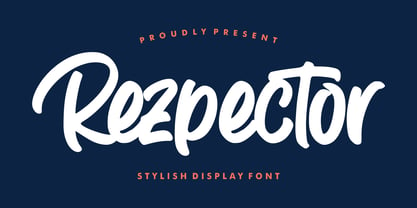 Introducing Rezpector - Stylish Display Font Rezpector combines attractive curves with a fresh urban edge; delivering a stylish script which is guaranteed to add an eye-catching appeal to your logo designs, brand imagery, quotes, product packaging, merchandise, social media posts and more. Uppercase & Lowercase letters Numbers & Punctuation Ligature Simple installation Work for PC and MAC PUA Encoded Open
 - Concavex by Ingrimayne Type,
$9.00 ConcavexCaps is a whimsical bold display typeface family in three styles that are designed to used in layers. It is caps-only, with the upper-case and lower-case keys differing for the BCGKRS characters. Horizontal elements of the letters are straight and vertical elements are curved, flaring either in or out. ConcaveWarp is a distorted form of ConcavexCaps.
 - Arts District JNL by Jeff Levine,
$29.00 Although the model for Arts District JNL was a set of wood type, the design influence is clearly from the Art Nouveau era. Note the combination of unusual flat and curved sides on many letters. Decorative, yet legible; Arts District JNL works well with any period piece or as a pleasant alternative to traditional headline fonts.
 - Bleecker Street NF by Nick's Fonts,
$10.00This late Victorian typeface flirts with Art Nouveau sensibilities, as evidenced by the graceful curves and the decorative crossmembers in several of the uppercase letters. The result is a font that combines simple, understated elegance with a no-nonsense, workmanlike stance. Both versions of the font include 1252 Latin, 1250 CE (with localization for Romanian and Moldovan). - Amy by AVP,
$19.00 Developed from the simplest possible curves, Amy is a wide hand lettered style with tall straight ascenders and generously looped descenders. The capitals are centred horizontally with the lower case. A handful of ligatures helps copy to flow for easy reading and optional proportionally spaced numerals make the font suitable for quite lengthy chunks of copy.


