10,000 search results
(0.033 seconds)
- Groovy Tuesday JNL by Jeff Levine,
$29.00 Hand lettering from the 1965 movie poster for “The Loved One” – a classic 1960s spurred serif design with added curly-tailed terminals was the working model for Groovy Tuesday JNL – available in both regular and oblique versions.
 - Miss Donna by Scholtz Fonts,
$15.00 Miss Donna - contemporary, powerful, versatile and casual. Curvy, sassy, fast-talking, and utterly useable, she takes you into the world of movie posters, decor ads, fashion posters and tags, greeting cards and invitations. Her lines are bold, clean and legible. The Miss Donna family comes in four styles: - REGULAR - clean good lines and generous curves - for decor ads, greeting cards, copy - NARROW - slim (more compact), and elegant with contained curves - for greeting cards, invitations, copy - BLACK - bold statement, round, generous curves - for movie posters, fashion posters - BLACK CAPS - especially designed for "all-caps" printed text. Use for headings & subheads. Miss Donna Black Caps contains capitals in two sizes and this gives you the ability to generate text of two types: - a correctly spaced and kerned upper case, OR - a TRUE Small Caps -- as opposed to the false Small Caps produced by a well-known word processing application. In a correctly proportioned Small Caps the stroke width should not be reduced in the same proportion as the letter height is reduced. The stroke width of the small capitals should rather be equal or close to the stroke width of the corresponding upper case characters. Note: When using script fonts it is NOT usually advisable to use text in ALL caps. The best effects for headings and subheads are obtained with an initial upper case letter followed by lower case characters. BUT, Miss Donna will still produce excellent results with all caps if you are using an application that supports kerning. If you are using upper and lower case then it is not necessary to use kerning, although it may make a slight difference on occasion. Miss Donna contains over 235 characters - (upper and lower case characters, punctuation, numerals, symbols and accented characters are present). It has all the accented characters used in the major European languages.
 - Penmanshift JNL by Jeff Levine,
$29.00Penmanshift JNL by Jeff Levine is actually a semiscript - a vertical text font with the curved lines of a script alphabet, but the look and feel of a poster letter. - Danu by Phoenix Group,
$12.00 Danu font is a font with a traditional style with a minimalist approach, this font is inspired by Javanese script with curved letters and some dots in it.
 - Linguista by Rockboys Studio,
$23.00 Linguista is a gorgeous monoline script, full of personality and curves. It features a natural flow that makes it perfect for any project that requires a handwritten feel.
 - Hatchet Job by Wing's Art Studio,
$10.00 Hatchet Job - A Halloween Brush Font Unleashed onto an unsuspecting public this Halloween, Hatchet Job is a brush font inspired by the slasher and cabin-in-the-woods horror movies and comics typical of the 1970s and 80s. This textured all-caps design takes its visual style from old cabins, ghost ships and axe-splintered wood that can only spell danger! With a bold brush strokes and frayed edges, it offers the tools to leave your readers nerves in tatters! The Hatchet Job font family includes all-caps uppercase and lowercase characters, along with numerals, punctuation, symbols and language support. Also included are a complete set of alternative characters and additional paint marks, drips and splashes. Wingsart Studio Design Tip! The uppercase and lowercase characters work great when mixed in an alternating fashion, with shapes that combine to create a dynamic, un-hinged look that's perfect for the Halloween season. Add the alternatives and paint marks into the mix and you'll have yourself a title or header design that looks truly custom-made.
 - Carlista Buttery - Personal use only

- Janda As Long As You Love Me - Personal use only

- Many Weatz - Personal use only

- Twilight - Unknown license

- KG Falling Slowly - Personal use only

- Action Is - 100% free

- Nineteen Ten Vienna - Unknown license

- Amadeus - Unknown license

- GlitzyCurl - Unknown license

- Paulinho Pedra Azul - Unknown license

- Bottled Moon by Tour De Force,
$29.00 Bottled Moon is display serif typeface full of possibility. It is lively family containing Regular and Italic styles. By it's design, Bottled Moon took inspiration from vintage typefaces and their specific charm, with catchy details like curly terminals and gently curved sharp serifs. All characteristics of Bottled Moon together give combination with dose of calligraphy, working horse serif typeface and display OpenType features. Works pretty well in small sizes, keeping it's uniqueness and legibility. Whether you're looking for typeface for whiskey label, wedding invitation, restaurant branding or parfume package, Bottled Moon recommends itself with original Initials, shadowed Stylistic Set and pack of adjustable Borders together with classical Fractions.
 - Die Lara by Ingo,
$27.00 A girl’s handwriting written on the iPad Writing changes – throughout history over centuries, but also from generation to generation. Each new generation of students learns to write the basic forms of the letters a little differently than their predecessors. The role model is also changing. The cursive handwriting taught in school is getting closer and closer to printed type. The children no longer learn the forms of cursive handwriting required for connected writing, but first the “block letters”, only later should they develop their own individual handwriting from this, which many of them no longer do. And the writing tool is also changing. Of course, script looks different when children no longer learn to write on paper with a fountain pen, but on a tablet computer with the “pencil”. The writing experience is completely different, and the “material properties” are different too. There is practically no writing resistance that would make it difficult to move against the direction of writing. "Die Lara" was created based on the template by Lara Mörwald from the winter of 2023. The font version "Black" corresponds to the handwritten original, all thinner variants up to the wafer-thin "Hairline" are derived from it. In the variable font, the intermediate forms can be selected steplessly. In order to preserve the handwritten character of the font, "Die Lara" contains several alternates to most letters and numerals, so that different character forms alternate in the typeface. If the "ligatures" function is activated in the app (which is the default in most programs), these alternates appear automatically as you type. There is also an alternative "swashed" variant of some letters. So you can set somewhat livelier accents at the beginning or end of a word. "Die Lara" also contains fractions and tabular figures.
 - Shelldon - Personal use only

- Bohemia - Personal use only

- Goulong - Unknown license

- 1540 Mercator Script by GLC,
$38.00 This font was inspired by the so-called Litterarum latinarum, quas italicas, cursoriasque vocant, scribendum Ratio (Louvain 1540), a manual intended for calligraphers by the well known scientist Gerhard Mercator. It was a magnificent “Cancellaresca corsiva” design, enriched with many alternates, final loops and ligatures. We have added a lot of accented and other characters required for modern use that did not exist in the original.
 - Rieven by Delve Fonts,
$29.00 Designer Steven Skaggs wanted a versatile uncial typeface that was not simply decorative. Traditionally, a true uncial is a majuscule form, entirely lacking in ascenders and descenders. However, by designing Rieven Uncial, Skaggs found a way to use the true uncial as inspiration but retained a lowercase look and feel. Typically, uncials do not have italic forms but in order for Rieven to be a truly versatile face, it was imperative that it should be accompanied by an italic. The italic form owes much to the historical roots in the letra antigua cursiva of the 15th century humanist masters. Rieven Uncial was awarded a Certificate of Excellence in Type Design in the 2010 TDC2.
 - Chottlen Script by Mans Greback,
$69.00 Chottlen Script is a vintage script typeface. Drawn and created by Toni Studio and Mans Greback in 2022, this cursive lettering has a sympatic character and a down to earth personality, perfect for your retro logotype or a rustic article headline. The Chottlen Script font family consists of Regular and Italic, and comes with multiple decorative swashy letters. Use * and # after any letter to make a tail. Example: Signature# Use _ anywhere in a word to make a swash. Example: Love_letter Use multiple underscores to make different swashes. Example: Hand_____writer The font is built with advanced OpenType functionality and has a guaranteed top-notch quality, containing stylistic and contextual alternates, ligatures and more features; all to give you full control and customizability. It has extensive lingual support, covering all Latin-based languages, from Northern Europe to South Africa, from America to South-East Asia. It contains all characters and symbols you'll ever need, including all punctuation and numbers.
 - Itaca by Tipo Pèpel,
$21.00 Known sometimes as “utopia”, “journey” other times, but also named with name´s place where one wants to go, “Ithaca” home of Ulysses. Typographic Cartesian coordinates are usually two, from the skeleton, the narrower, to the black, the widest. Nowadays, Maese Patau had traveled a road made by four Cartesian axes of typographic geography. A road from thick to thin, from expanded to condensed, to offer us a new family, a larger and extensive series than the traditional family. 48 “relatives” in a pure neo-grotesque font, with a large “eye” that makes it especially suitable for display. Solid hinting in small sizes due to it´s pure and simple basic forms. The jazzy cursive, available in all weights, looks as a simply slanted letter, but when works in conjunction with its regular version, generates an outstanding typographic game. As usual, Maese Patau offer us a extensive typeface in weights, extensive on supported languages, and all kind of OpenType´s capabilities.
 - Voluta Script by Adobe,
$35.00Voluta Script is the work of Austrian designer Viktor Solt, created for use in a guide to the Austrian Gallery at Castle Belvedere. A volute (Latin voluta") is a spiral or scroll-shaped ornament used in the Baroque architecture of Castle Belvedere, similar to the swashes in this typeface. The castle was the historic residence of Prince Eugene of Savoy, one of the great military commanders of the 18th century and a prominent figure in Austrian history. When asked to create a typeface based on the calligraphy of the period to illustrate Eugene's epic, Solt turned for inspiration to Kurrent writing, a cursive blackletter style. Solt created a hybrid style that embodies the rhythm and basic forms of its ancestors, with large capitals, dark vertical strokes, and flourished beginning and ending characters. The typeface was designed to be used in sizes of 24 points and greater. Voluta Script allows designers to evoke the Baroque era or to lend a hint of majestic grace to contemporary typesetting." - To Be Continued by Comicraft,
$29.00Trapped in a world they never made, the characters in our Story So Far have been engaged in final battle with their Arch Enemies... the characters known only as ToBeContinued. Will our heroes survive? Will justice prevail? Will the forces of good defeat the forces of darkness...? To Be Continued... - Venetian 301 by ParaType,
$30.00 Venetian 301 is the Bitstream version of the Centaur type family. Centaur was designed by the American book designer Bruce Rogers on the basis of Venetian typefaces of 1470 of Nicolas Jenson. Beautiful Italic based on a face by Ludovico degli Arrighi was developed by Frederic Warde who was an American calligrapher and typography researcher was added as Italic to Centaur. Adapted for mechanical composition by English Monotype in 1929. Its lettershapes owe much to pen-drawn letters of Italian humanist minuscule and cursive. This elegant humanist face is useful for the finest typography both for book text and display matter. Cyrillic version included small caps was developed for ParaType in 2003 by Dmitry Kirsanov.
 - Nimbus Sans Arabic by URW Type Foundry,
$35.99 Nimbus Sans ME is the expansion within the Nimbus Sans family for the Middle East range: Arabic (incl. Farsi) and Hebrew. Volker Schnebel has designed both scripts, which each include five upright and five cursive styles. The design is contemporary and fits the Latin Nimbus Sans. Besides the basis characters, the Arabic also includes the presentation forms: the variations for initial, medial and final letters. The correspondent OTF features are included in the fonts. All three scripts are perfectly combinable. Nimbus Sans is one of the best supported and most favored URW fonts ever. It is available as a Global Font in 4 weights and contains up to 65.000 characters per font.
 - Moon Phases - Unknown license

- Floralscript by Wiescher Design,
$29.00 »Floralscript« is an english copperplate script decorated with flowers and curly leaves.
 - Pepperminta by PizzaDude.dk,
$16.00 A curly and playful sans serif font with blurry lines. Fits nice to anything that has to do with products for kids! Comes with 3 different versions of each lowercase letter, and they automatically cycle as you type
 - Summer Sugar by Selvia Design,
$15.00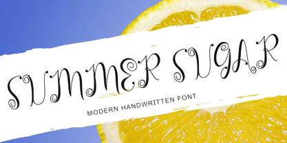 "Summer Sugar" is a unique, curly handwritten font. This font is equipped with uppercase, lowercase, numerals, punctuation, and multilingual support. It is suitable for summer, graduation, Christmas, the 4th of July, memorials, banners, branding, stickers, ornaments, and others.
 - Hayseed by Typadelic,
$19.00Round and square, curly and straight are contradictory in terms but aptly describe this unclassifiable typeface from Typadelic. Readable at small sizes but meant for display purposes, Hayseed will fill the bill in a variety of design applications. - Formative by Studio Few,
$24.00 Sharp angular terminals, squared off bowls, and a balance of curved paths with straight. Formative is a grotesk with charm. Includes a stylistic set featuring standard 'text' style terminals.
 - Corporaet by Characters Font Foundry,
$25.00 CFF Corporaet is a corporate brand typeface that comes in 5 sans serif weights; Light, Regular, SemiBold, Bold & Black. Its character is warm, friendly, humane, clear and soft. The humanistic design style is rooted in the cursive style of handwriting, clearly visible in letters such as the e, f, g and y. The spurless letters round it off. Striking characters, such as the z, and small quirky details make it both a corporate and a friendly typeface. The proportions of each character are carefully constructed in such a way that they're balanced and create an even colour in text. That’s why it works extremely well with long body copy. Making it a hero for magazines and editorial design challenges. The Corporaet fonts can be applied in large sizes for print or web, bringing out the refined details that give the fonts its distinctive personality.
 - Quatre by Blank Is The New Black,
$15.00 Quatre is a clean, friendly, monoline display script with a number of subtle but significant features. Originally based on the style of cursive you may or may not have been taught in middle school, Quatre has a clean geometric flow to it while containing a robust set of OpenType features such as ligatures, swash capitals, and stylistic alternates that give it a unique look. With over 700 glyphs, coverage for over 30 languages, arbitrary fractions, contextual alternates and more, Quatre will have you covered for whatever situation you may run into. I mean, probably. I can’t know every single weird way you might be trying to use it. The point is, it’s got all of the bells and whistles you could reasonably hope for. Make sure you open up the OpenType panel in Illustrator, Photoshop, and InDesign to make use of all of those features.
 - FS Truman by Fontsmith,
$80.00 Beyond broadcast Like Truman Burbank, the star of The Truman Show, FS Truman was born for TV. You’ll know it from Sky One’s on-screen trails and announcements, but it’s just as at home in other media. Its starting point was the skeleton of a highly legible, space-saving, corporate font with some of FS Dillon’s geometric discipline built in. Its distinctive tone of voice and “ownability” are in its boxy but friendly shapes, and characters with hybrid features. FS Truman’s weights and widths were honed to work at TV screen resolutions. A face for TV it may have been, but this is a font that works on every level, on screen, in print, in headlines, in listings, in longer text, in tight corners and open spaces. The space-saver Compact, condensed but crystal clear, FS Truman comes into its own where a lot needs to be said in not a lot of space. Its letter spacing allows the type room to breathe, even at small sizes, while its fulsome x-height and diminutive descenders pave the way for tighter leading. A natural for headlines and titles over three or four lines. “Hybrid” features With every font, Fontsmith look for crafty new ways to imbue letterforms with a consistent character. The idea with FS Truman was to introduce “hybrid” features. In open letters such as “c” and “s”, for example, the top terminals have straight, vertical cuts while their lower terminals have a more angular, cursive finish. Boxy, spacious forms with unusual curves and angles create not just highly legible and efficient letters but strongly distinctive ones, too.
 - Hoplight by Smith Hands,
$20.00 Hoplight is a friendly, curvy, hybrid. A fusion of the cool character of a roman, with the flow and informality of an italic. Throughout Hoplight, many sharp serifs have been replaced by dot style serifs, to allow the contours of the letters to flow seamlessly into the terminations. Hoplight embodies a sense of playful ease.
 - CarnivalFest by Artyway,
$19.00 Introducing the "CarnivalFest" font, the perfect addition to any party or celebration! This colorful and playful font features rounded letters in a variety of bright hues, making it perfect for birthday invitations, carnival posters, and party headlines. Add a touch of fun and excitement to your event with "CarnivalFest"! Your download font file with: - Colored letters - Punctuation coverage - Alternate symbols with bubbles - Multilingual


