10,000 search results
(0.029 seconds)
- Qalisso by Letterena Studios,
$9.00 Qualisso is a modern and classic serif font with a unique style & modern look. This typeface is perfect for an elegant & luxury logo, book or movie title design, fashion brand, magazine, clothes, lettering, quotes, and so much more.
 - Olifant by Hipopotam Studio,
$25.00 Typeface originally designed as a monospace font (single standard width for all glyphs). We needed that for a project where letters stood directly above each other. Eventually it became proportional, and only the digits have a fixed width.
 - Flivver JNL by Jeff Levine,
$29.00Flivver JNL takes its name from the slang term applied to Model T's in the 1920s, and it's design is a first-cousin to Two Reeler JNL (inspired by lettering on titles from a Charlie Chaplin silent film). - Juicebash by Bogstav,
$17.00 It's tall, legible and handmade - and on top of that, charming as heck! Each letter has rounded corners, which leaves a pleasant and smooth look. Juicebash is legible, even at very small sizes and it has multilingual support
 - Sagha by YonTypeStudio Co,
$15.00 Sagha is a retro styled, thick lettered handwritten font, crafted to give your headlines and logotype projects a stylish touch. This font reads as strong, confident, and dynamic and can add tons of nostalgic character to your designs
 - Shogi by Attractype,
$14.00 Attractype presents Shogi, a beautiful modern serif font, which has sharp shapes and high contrast. Suitable for easy-to-read text or attractive displays. Shogi comes with some beautiful ligatures that make your letter projects even more special.
 - Trelink by Letterena Studios,
$17.00 A serif modern and classic typeface that has its own unique style & modern look. This typeface is perfect for an elegant & luxury logo, book or movie title design, fashion brand, magazine, clothes, lettering, quotes, and so much more.
 - Pitlines by Mevstory Studio,
$20.00 Pitlines is a display fonts collection. Pitlineswill perfect for many project: fashion, magazines, logo, branding, photography, quotes, blog header, poster, advertisements, etc. Files Includes: Pitliness Regular.otf Pitlines Italic.otf What's Included? Uppercase & alternate uppercase letters, numbers, punctuation Multilingual support
 - P22 Operina by IHOF,
$24.95 Operina is based on a 16th-century lettering model of the scribe Ludovico degli Arrighi (Vicentino Ludovico degli Arrighi) used in his 1522 instructional lettering book, "La Operina da Imparare di scrivere littera Cancellarescha." This book contains what is considered to be the earliest printed examples of Chancery Cursive. Rather than try to reproduce a perfect, smooth, type-like version of Ludovico's hand, which has been attempted in the past, the designer opted to leave in some rough edges and, thereby, create a look that mimics the endearing artifacts of quill and ink lettering on parchment. When reviving an old style, a designer is faced with many challenging decisions, such as whether to aim for ultimate authenticity or to modify the alphabet for modern use. The decision here was to create a font that resembles the 16th-century Italian hand-lettering master's, but is also useful to the contemporary user. Because the letters U u W w J j and our modern Arabic numerals were not in use during the advent of these original letterforms, these had to be interpolated. To make a complete and useable font set, we also had to fashion many of the extra and diacritical characters to match the look of the alphabet. There are three fonts in this set: Romano(simple), Corsivo(more complex), and Fiore(swash). Romano is the most subdued, it contains Roman looking caps and has lining figures. Corsivo is more elaborate, it has more decorative capital letters and an alternate version of the lowercase with longer ascenders and descenders, and old style figures. Fiore, the swash font, is the most elaborate with the longest ascenders and descenders. You may not wish to use the Fiore version on its own, especially as all caps; it is meant to enhance the other two alphabets because it contains the most elaborate capitals and has many extra ligatures. P22 Operina Pro is an OpenType version that contains over 1200 characters. It features Small Caps, Old Style Figures, full European, Cyrillic and Greek character sets and a new OpenType first with automatic Roman Numerals. Just type any number and with the feature, it will convert to Roman Numerals!
 - Steinweiss Script by Alphabet Soup,
$59.00 Steinweiss Script began its journey towards daylight when Michael Doret was asked by Taschen Publishing to do cover lettering for the huge commemorative edition they were putting together on the work of Alex Steinweiss—“The Inventor of the Modern Album Cover”. The lettering was to be created to appear similar to the famous “Steinweiss Scrawl” the calligraphy that Steinweiss had used on countless album covers. While designing this piece of lettering, Michael realized that there was great potential for a font that was designed in the spirit of that famous “scrawl”. Through his contacts at Taschen Publishing, he was fortunate enough to be able to contact the Steinweiss family, and get the official Steinweiss approval to proceed with his “Steinweiss Script” project. Michael decided that in addition to giving the font his name as an homage, that he would donate a portion of the proceeds from the sale of this font to the man himself: Alex Steinweiss. Read more about the background of Steinweiss Script in Steven Heller’s article in Imprint. Steinweiss Script is a family of fonts in three weights: Light, Medium, and Bold. Additionally, within each weight there are three variations: Simple, Fancy, and Titling. These variations relate to the size/ratio of the caps to the lowercase, the complexity of those caps, and the size of the ascenders/descenders on the lowercase characters. These variations add usefulness to the font, making it accessible not just for headlines, but for longer passages of text as well. For a better understanding of its unique features please download The Steinweiss Script Users Guide from the Gallery section. PLEASE NOTE: the three Steinweiss Script fonts are cross-platform fonts which depend to some extent on certain advanced OpenType features, therefore they can be used to their full potential only with programs that support those features. When setting Steinweiss Script one should almost ALWAYS select the “Standard Ligatures" and “Contextual Alternates” buttons in your OpenType palette. See the “Read Me First!” file in the Gallery section.
 - Hamlet by Canada Type,
$24.95Based on a specimen of an obscure and uncredited old face called Kitterland, Hamlet is one of those curiosities hardly ever noticed in the world of modern fonts, the kind that infuses a variety of historic Blackletter and calligraphy traits in an otherwise Roman alphabet. Such typefaces, what few of them exist, are almost always classified by typophiles as traditional decorative Roman alphabets. We beg to differ. We think such hybrids are fascinating enough to deserve a classification of their own. And we think today's aspiring letterers and type designers would benefit from paying special attention to this kind of hybrid alphabet, not only because it has much more hand than machine in it, but also because it is a prime example of how to succeed in mixing different lettering techniques into one self-contained and distinctly functional alphabet. As in any efficient mixture of lettering methods, Hamlet ended up with characters that are uniquely its own, such as the cupped A, M, V, W and Y, the very luscious and inviting curves on the arms of E, F, L and T, both single- and double-story forms of the a, and the humblest, friendliest g and y ever. A dozen alternate characters are sprinkled throughout the character set, so check out the map for a few pleasant surprises. We also made the Handtooled and Headstone styles because we thought these friendly forms were just crying out for such treatments. The Handtooled version turned out quite lovely, if we may say so ourselves, perhaps even better than the main font. The Headstone version is available as a free bonus to those who purchase the complete Hamlet package. All Hamlet styles come with lining figures as well as old style ones. Hamlet comes in all popular font formats. The OpenType fonts contain push-button swapping alternates and figures, which come in handy in software programs that support this kind of thing. - Maiola by TypeTogether,
$49.00 Being inspired by early Czech type design, Maiola is clearly a contemporary typeface, that is mindful of its historical heritage, implementing old-style features and calligraphic reminiscence, more frankly so in the Italic. Nevertheless, through its personality, it attempts to create a welcoming tension on the page, without shouting too loudly at the reader. It handles its expressive tendencies with care and in doing so increases its usability, with legibility being of great importance. Subtle irregularities of the letterforms enhance furthermore the dynamic spirit and liveliness of the typeface. With the advent of Opentype, allowing for bigger character-sets and better language support, as a natural consequence, Maiola Multiscript covers Latin A, Cyrillic and Greek. Although basically independent from each other, they are, however, designed in the same spirit as the Latin, and harmonize well in multilingual text settings. The update to this beautiful font family includes the addition of over 240 glyphs featuring new ornaments, stylistic alternates, ligatures, superior letters, fractions and more. Furthermore, several glyphs were significantly improved and the kerning was fine tuned for better performance. Originally released in 2005, Maiola was an immediate success. It won the renowned TDC competition in 2004 where it was also recognized as a “judge’s choice”, was part of the touring exhibition e-a-t, and was selected in the Creative Review design competition in 2005.
 - Hand Scribble Sketch Times by TypoGraphicDesign,
$19.00 CHARACTERISTICS A state-of-the-art OpenType-Feature (like Contextual Alternates (calt) and Stylistic Alternates (salt)) of “Hand Scribble Sketch Times” is, that each uppercase and each lowercase letter has automatically alternated two variations to bring humanly-random characteristics of handwriting to life. The character of the rough, ruggend and raw handwritten classic serif typeface is a very unique warmly atmosphere. An pro-version of the font “Hand TIMES”. APPLICATION AREA warmth, love, handmade. For support of human warmth. Of cooking recipes, menus in the restaurant across party flyer, music cover Art to logo (word marks), headings in magazines and websites. TECHNICAL SPECIFICATIONS ? Font Name: Hand Scribble Sketch Times ? Font Weights: Regular, Rough, Invert ? Font Category: Grunge Serif Display for Headline Size ? Font Format: OTF (OpenType Font for Mac + Win) ? Glyph coverage: 601 ? Language Support: Basic Latin/English letters, Central Europe, West European diacritics, Baltic, Romanian, Turkish ? Specials: Alternative letters, Standard & Discretionary Ligatures, extras like symbols, dingbats, Old-style Digits, Lining Figures, accents & €, incl. OpenType-Features like Contextual Alternates (calt), Glyph Composition/Decomposition (ccmp), Discretionary Ligatures (dlig), Kerning (kern), Standard Ligatures (liga), Numerators (onum), Ordinals (ordn), Stylistic Alternates (salt), Stylistic Set 01 (ss01), Stylistic Set 02 (ss02), Stylistic Set 03 (ss03), Slashed Zero (zero), Lining Figures (lnum), Tabular Figures (tnum), Old Style Figures (onum), Proportional Figures (pnum) ? Design Date: 2013 ? Type Designer: Manuel Viergutz
 - Paverify by Esintype,
$14.00 Paverify is an all-caps geometric slab serif display face inspired by a particular pavement tile component which is evoking a blocky “I” letter. All other characters were interpreted based on its look and drawn accordingly. There are three uppercase Roman fonts in different weights and widths substantially. With the additional versions, type family consisting of 7 fonts in total. Over 220 Latin, Cyrillic and Greek script languages supported. Each font contains an extensive multilingual support with more than 1600 glyphs and OpenType features, including number forms, fractions, and stylistic alternate sets those provide different looks by the typographic preferences. For the lowercase letters there are small caps variants, i.e., shorter caps. These also have identical glyphs and matching marks to enable “Small Capitals From Capitals” feature. Narrower Medium and Bold styles was produced to accompany the Black first design. Paverify comes with an ornaments font named as “Extras”, which contains geometric graphical elements, i.e., paver stone patterns, banner/sticker background sets, star comps and a collection of catchwords to simplify creating feature rich layouts. As is known as interlocking paver in certain regions — a rectangular shape with the distinctive diagonal tabs — transcribing the simplest letter to draw into the whole alphabet was a challenging task. Not only it was the single thing that can be used as a source, considering its thick form in roughly 1.2:1 proportions compared to the sophistication of letterforms was the challenge. Starting point was keeping design consistent while both avoiding and preserving a particular appearance to achieve a similar texture, basically a repeating pattern on the streets. In contrary of a traditional approach, Paverify tend to have more contrast than the other slab serifs which helps to reduce massive stem weight of the source form. This look contributes to its hand painted sign effect achieved in a certain degree, which may otherwise impractical to transform because the source material is an inorganic, static form by definition. Tight and even spacing of the pavement tiles was inspirational for the kerning balance of the letters. Although the lighter weights have more space between the letter pairs, black weight adjusted as to be close to each other as the original grid. Tight spacing can be ignored by using Capital Spacing OpenType feature for the Outline versions as layer fonts. In one stroke, this gives an extra space between the letters to avoid diagonal armed letter terminals overlap. Black typographic colour and texture gives a sturdy appearance to the lines, it is useful for the projects where a robust display faces preferred for the titling, strong headlines, letter stacks, dropcaps, initials, short names on materials such as advertisements, book covers, posters, logotypes, wordmarks, package designs, and more in print or digital. Paverify can be paired as a complimentary face in a combination with broader type systems, where vintage look compositions and woodcut style fusions requiring an extra stunning texture.
 - Ollie by Eclectotype,
$40.00 Meet Ollie, a casual signage script whose friendly, bouncy exterior belies a heart of sophisticated OpenType programming. This font is designed to make the most of OpenType savvy applications, and as such is recommended for professional design use. Or to put it another way: Make sure that contextual alternates and ligatures are always turned on! Ollie includes about 900 glyphs, many of which are automagical substitutions to keep the text flowing smoothly, and to pseudo-randomly pick different glyphs to avoid repetition. With contextual alternates turned on (as they should be by default), most lowercase letters will alternate between at least two different forms. The powerful OpenType programming makes the font itself ‘look back’ (up to eight characters) on previously used letters; typing “banana” will give you three different a’s and two different n’s (the last a is a special ‘end form’ character). The calt feature controls many other ‘special effects’ which all add together to give a smooth-flowing, hand-lettered look. These effects include start and end forms (and indeed, ‘loner’ forms) of many letters, which are automatically substituted in at beginnings or ends of words, or when the previous or next letter doesn't connect. Another special feature tests to see if there is room for the crossbar of t (or tt ligature) to extend further over the previous or next letter, or both, as is often the case. The last main effect of the calt feature is to substitute certain letters typed before any ‘e’ character, to make for a more natural connection (see the pe combination in ‘Eclectotype’ in the first poster). Ligatures should be on by default, for a much nicer looking tt combination, and a few others besides. The swash feature should be used sparingly (one glyph at a time, really) to apply a more extravagant look to g,j and y in the lower case, and quite a few of the upper case too. Oldstyle figures are included, as well as the lining defaults. Now to delve into the stylistic alternates... These are all included in the salt feature, or for uses of applications that support them, separated into stylistic sets thus: ss01 - (with swash feature on) L and G swashes get even swashier. ss02 - standard s changes to a connected script s form. ss03 - r takes on a script form. ss04 - z also gets a scriptier look. [the previous three sets also change any versions of s, r or z with diacritics] ss05 - a useful underline function. When enabled, typing two or more underscores will extend a cool underline under the previous letters. More underscores = longer underline. ss06 - the Polish script lslash changes to its more standard form. ss07 - E, S and B change to a more top-heavy alternate form. ss08 - An alternate form for A characters. ss09 - Alterative rounder forms of M and N. ss10 - An alternate ampersand. That about wraps up the features. Now all that’s left is for you to license the font and get experimenting!
 - Honest John's - Unknown license

- Captain Howdy - Unknown license

- Mystic Prophet - Unknown license

- Victor Moscoso - Unknown license

- Collegiate - Unknown license

- Graduating Class JNL by Jeff Levine,
$29.00 Graduating Class JNL was inspired by the hand lettered titles found on a 1934 high school yearbook from Richmond Hill, NY called "The Senior Dome". This Art Deco era type design is available in both regular and oblique versions.
 - Parks Department JNL by Jeff Levine,
$29.00 A WPA (Works Progress Administration) sponsored Water Carnival taking place in Central Park in the 1930s had "Department of Parks, City of New York" in the thin Art Deco hand lettering which is now available as Parks Department JNL.
 - See You Again by Seemly Fonts,
$14.00 See You Again is a brand new and thin lettered display font. See You Again is perfectly suited for stationery, logos, t-shirt, paper, print design, website header, photo frame, flyer, music cover, poster, image slider, and much more.
 - Morpho by ErlosDesign,
$19.00 Morpho - A Display Typeface by erlosDESIGN Morpho is a beautiful modern display typeface. It includes uppercase and lowercase letters, numeral, a large of punctuation and also multilingual support. Perfects for poster, web design, magazine cover, branding and many more.
 - Gaela by Letterena Studios,
$17.00 Gaela is a modern and classic serif typeface with a unique style and modern look. This typeface is perfect for an elegant & luxury logo, book or movie title design, fashion brand, magazine, clothes, lettering, quotes, and so much more.
 - Lithos by Adobe,
$35.00Old Greek inscriptions were Carol Twombly's inspiration when she created Lithos, which appeared with Adobe in 1990. The alphabet is composed exclusively of capital letters, which can also be used as initials combined with other fonts, such as Caslon. - Baronessa by Juraj Chrastina,
$39.00 Baronessa is a handmade font with a “once-upon-a-time” world feeling, warm and friendly but not excessively childish. No swashes or ornaments, subtle irregularity and carefully chosen letter shapes make it sweet and funny but not crazy.
 - Kadya by TM Type,
$12.00 Kadya is a very detailed and thin lettered script font. Get inspired by its beautiful style and use it to create lovely designs. This font is PUA encoded which means you can access all the glyphs and sweeps easily!
 - Malito Fashion by Ake,
$15.00 Malito Fashion is an elegant, thin lettered and stylish serif font. It is defined by smoothness and delicacy and is perfect for fashion branding or editorial designs. Add it confidently to your projects, and you will love the results.
 - Sekek by Gholib Tammami,
$14.00 Sekek is a cute display font. It embodies playfulness and authenticity and is the perfect choice for any children’s activity or school project. Add this chunky lettered font to your designs and notice how it makes them come alive.
 - Grazia by Autographis,
$39.50 Grazia is a joining script with zero contrast. That means that I designed the line of the letters so, that they look equally thick all the time. The script is almost upright and has this 1930s look to it.
 - Nameplate Stencil JNL by Jeff Levine,
$29.00 A vintage brass stencil for an individual or company named ‘Rodrigues’ was spotted in an online auction. The hand punched, condensed Roman lettering inspired the digital typeface Nameplate Stencil JNL, which is available in both regular and oblique versions.
 - Domina by 4RM Font,
$24.00 Inspired by the of brutalism design, this font is made with an expanded width, with the authenticity of each letter, making this font look strong and brutal, suitable for use in the application of titles, posters, billboards and more.
 - Wargika by Letterena Studios,
$17.00 Wargika is a modern and classic serif font with a unique style and modern look. This typeface is perfect for an elegant & luxury logo, book or movie title design, fashion brand, magazine, clothes, lettering, quotes, and so much more.
 - Pullman by Scriptorium,
$18.00Pullman is based on turn-of-the-century lettering reminiscent of the signage on some luxury Pullman-style train cars of that period. It is a heavy script font with a lot of character and an authoritative, elegant look. - Linear Tektu by TeGeType,
$19.00 The basic idea of this type family was to keep the "ductus" of the fraktur calligraphy only. And to adapt it to draw a sans serif typography which still keep the magic rhythm and colour of the original letters.
 - Lordranga by Letterena Studios,
$10.00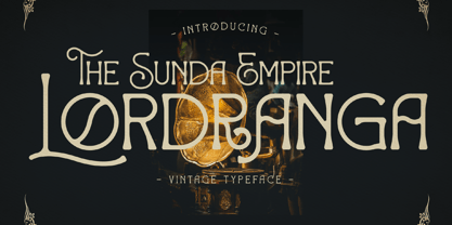 Lordranga is a distinct and vintage styled serif font, with a unique style & modern look. This typeface is perfect for an elegant & luxury logo, book or movie title design, fashion brand, magazine, clothes, lettering, quotes, and so much more.
 - Marslow by JprintStudio,
$20.00 Marslow is a modern look font with a futuristic vibe, bold and clean. Get inspired by its incredible youthful vibe. Add this lettering font to your designs and watch how it comes to life and your creations stand out!
 - Play Ground by Wacaksara co,
$12.00 Play Ground is a fancy hand-lettering script font with cute styles this font is great for your next creative project such as logos, printed quotes, invitations, cards, product packaging, headers, Logotype, Letterhead, Poster, Apparel Design, Label, and etc.
 - Stylish Nouveau JNL by Jeff Levine,
$29.00 Free form Art Nouveau hand lettering found on many early-1900s ads for various personal care items manufactured by the Colgate Company were the design inspiration for Stylish Nouveau JNL, which is available in both regular and oblique versions.


