10,000 search results
(0.068 seconds)
- Houstonville by Veteran Type,
$14.00 Houstonville is the debut letterfrom of Veteran Type. Design by Abdul Rochman a.k.a Veteran Type. This font is inspired by ancient letters in the 19th century. This font is very suitable for designs with ancient concepts, such as print, logo design, and others. This consists of : 20 stylistic set 520 ± glyph count Multilingual support Support for multiple languages Math Symbol Numerals & Punctuation I am very grateful, to my friend and mentor, namely Spencerandsons a.k.a Gilang Purnama, for sharing their knowledge, time, and teaching me. Thank you again Spencer and Sons, always be great !!!
 - Brooklyn Pirates by IKIIKOWRK,
$17.00 Proudly present Brooklyn Pirates - Street Type, created by ikiiko. A hipster typeface using handwriting in street and urban style, with a large selection of swashes that you can wear however you like. This type is very suitable for making a brand logo, poster design, magazine header, sleeve cover, flyer, quotes, or simply as a stylish text overlay to any background image. What's Included? Uppercase & Lowercase Numbers & Punctuation Alternates & Stylistic Multilingual Support Enjoy our font and if you have any questions, you can contact us by email : ikiikowrk@gmail.com
 - Mother Bones by IKIIKOWRK,
$19.00 Proudly present Mother Bones - 90s Type Grunge Vibes, created by ikiiko. Mother Bones inspired by the handwriting style of the 90s, where the Seattle sound trended with a raw, wild and free style. With spontaneous strokes and unique lines, this font has strong vibes of 90s era. This type is very suitable for making a poster, magazine layout, brand logo, sleeve cover, party flyer, quotes, or simply as a stylish text overlay to any background image. What's Included? Uppercase & Lowercase Numbers & Punctuation Multilingual Support Works on PC & Mac
 - Broadletter JNL by Jeff Levine,
$29.00Modern digital typography pushes many designers to try and achieve visual perfection with their lettering. In the days of wooden type, the premise was more in creating a font that "sold" the message (possibly, in part due to the lack of advanced tooling to achieve uniformity). In many styles of wood type (such as the one used as a model for Broadletter JNL), there are vast differences within the character design, weight and symmetry from letter to letter. This is now looked upon as "old fashioned" and "charming" - part of the appeal of this typeface. - Eckhardt Dualine JNL by Jeff Levine,
$29.00 While searching online for vintage type inspirations, an image was spotted of an old letterhead for a steel manufacturing company. The hand lettering of the word 'Ludlum' only offered D,L,M and E as visual examples, but from this Jeff Levine has designed Eckhardt Dualine JNL - a Deco-flavored dual-line type font. As with a number of other releases that emulate hand-lettering or sign painting, Jeff has named this font in honor of his good friend, the late Albert Eckhardt, Jr.; who ran Allied Signs in Miami from 1959 until his passing.
 - Cat Burglar PB by Pink Broccoli,
$16.00 Cat Burglar is another off-kilter sans-serif font by Pink Broccoli, this time inspired by the titling of a 1961 Looney Tunes cartoon called "The Pied Piper of Guadalupe". As with some of my previous type designs, it is a typographic drunken stumble, wonderfully and awkwardly stumbling across designs, surprising with each letter typed. With an extensive character set, and offbeat letter weighting, Cat Burglar is fun to typeset with, with a collection of double letter ligatures, as well as discretionary ligature combinations that add to the quirky playfulness.
 - Supaduper PB by Pink Broccoli,
$16.00 Supaduper PB is a font inspired by some wonderfully funky hand-lettered greeting cards from the 1980's. The delightfully awkward and animated playfulness of this lettering style was maintained throughout the fleshing out from the original specimens - and I think you're going to have a lot of fun typing with this. Even if you haven't seen these old greeting cards, the lettering style has a familiar visual to it. Bring back a little nostalgia, add a little wonkiness, or just have fun typing with Supaduper PB today!
 - Stagehand JNL by Jeff Levine,
$29.00 Too often, familiarity in type design can fool us into mislabeling similar styles of lettering. The Art Deco years provided many variations of the thick-and-thin alphabet, and we tend to lump all of them together as being "a version of Broadway", as this is the most popular of the genre. However, if one looks closely at each design, they will see variations of line thickness, angles and even individual character design. One such variation is Stagehand JNL, based on a set of wood type and now presented in digital form.
 - Impact Wide by Geoffrey Lee,
$21.00Impact wide was developed from the designer's original drawings for the production of 'Impact' metal type, with many detail changes because of the density of the letters. These include the restoration of the bevelled i and j dots of the original. Character maps show some useful alternative characters in both roman and italic. Included are a crossbar numeral 1, mirror quotes and some sorts which were cast in metal but never reproduced in digitized versions of the typeface. There is also a font-specific Euro symbol. (Impact is a trademark of The Type Museum, London). - Susan Sans by ParaType,
$30.00 An original text and display type family was designed for ParaType in 2008 by Manvel Shmavonyan to be used together with Susan and Susan Classic, earlier released type families by the same author. This is a low-contrast sans serif font with open letterforms. Its shape is distinguished by rounded upper parts of lower case. Susan, Susan Classic and Susan Sans forms a super family coordinated on weight, style and proportions. Susan Sans is well suited for short and middle range text composing as well as for use in advertising and display typography.
 - Blank Page by Ergibi Studio,
$21.00 Blank Page Font Duo, these fonts are of two types serif and script. Display Serif inspired by famous logo, This typeface has been made carefully to make sure its premium quality and luxury feel. The ligatures on serif makes this typeface unique and stands out rather than the regular serif font, perfectly for headlines, wedding, social media, logos, posters, packaging, T-shirts,coffee shops, restaurants, magazine’s headers, signs or gift/post cards,cafe’s and weddings or any type of advertising purpose. if you have any questions, don’t hesitate to contact us Ergibi Studio
 - LTC Francis by Lanston Type Co.,
$24.95 Francis is a design previously offered by the Lanston Type Co. in the early 1990s. It is a revival of a 1955 Günther Gerhard Lange design, but with a heavier overall weight. Coming out of retirement, it has been fully reworked and refined with elegant curves and an expanded character set. This font works well at small sizes and larger display sizes for everything from wine labels to personal stationery. This type evokes the elegant sophistcation of the Jazz age and pairs well with a Martini and a fine selection of charcuterie.
 - Pantera by Lián Types,
$39.00 ROARRR! THE STYLES -Pantera Pro is the most complete style, and although its default look is mono-rhythmic it gets really playful and crazy like the examples of the posters by just activating the Decorative Ligatures button in the Open-type Panel of Adobe Illustrator. However, I recommend using also the Glyphs Panel because there you'll find much more variants per letter. Pantera Pro is in fact, coded in a way the combination of thicknesses will always look fantastic. -Pantera Black Left, and Pantera Black Right are actually “lite” versions of Pantera Pro: They have very little Open-Type code, so what you see here is what you get. Pantera Black Left has its left strokes thick, while Pantera Black Right has its right strokes thick. -Pantera White is a lovely member in this family that looks lighter and airy, hence its name. With the feature Standard Ligatures activated (liga) the font gets very playful. -Pantera Caps is based on sign painters lettering and since it follows the same pointed brush rules as the other styles, it matches perfectly. -Pantera Claws like its name suggests, is a set of icons that were done by our dear panther. THE STORY It is said that typography can never be as expressive as calligraphy, but sometimes it can get close enough. I tend to think that calligraphic trials, in order to work well as potential fonts, need first to go through very strict filters before going digital: While calligraphy is synonym of freedom (once its rules are mastered), type-design, in the other hand, has its battlefield a little tighter and tougher. When I practice pointed brush lettering, there are so many things happening on the paper. And most of them are delicious. The ones who know my work may see that although many of my fonts are very expressive, my handmade brush trials are much more lively than them. With that in mind, this time I tried to go further and rescue more of those things that are lost in the process of thinking type when first sketches are calligraphic. I wondered if I could create something wild, hence its name Panther, by understanding the randomness that sometimes calligraphy conveys and turning it to something systemic: With Pantera, I created an ordered disorder. Like it happens a lot in many kinds of lettering styles, in order to enrich the written word the scribe mixes the thickness of the strokes and the width of the letters. Like one of my favorite mentors say (1), they make thoughtful gestures Some lively strokes go down with a thick, while some do that with a thin. Some letters are very narrow, meaning some of them will need to be very wide to compensate. Why not?. The calligrapher is always thinking on the following letters, and he/she designs in his head the combination of thicks and thins before he/she executes them. He/she knows the playful rhythm the words will have before writing them. It takes time and skill to master this and achieve graceful results. Going back to the font, in Pantera, this combination of varying thicknesses and widths of letters were Open-Type coded so the user will see satisfactory results by just enabling or disabling some buttons on the glyphs panel. I'm very pleased with the result since it’s not very easy to find fonts which play with the words' rhythm like Pantera does, following of course, a strong calligraphic base. I believe that if you were on the prowl for innovative fonts, this is your chance to go wild and get Pantera! NOTES (1) Phrase by Yves Leterme. In fact, it’s the title of a book by him. EPILOGUE Esta fuente está dedicada a mi panterita
 - Neon Backlight by Ditatype,
$29.00 Neon Backlight is a stunning display font that brings the mesmerizing beauty of neon lights to your typography. With its bold uppercase letterforms and a luminous backlight, this typeface demands attention, creating a captivating visual experience that leaves a lasting impression. The defining feature of Neon Backlight lies in its vibrant neon backlight effect. Each letter is imbued with a radiant glow that casts a captivating hue, evoking the nostalgic charm of neon signs illuminating the night. The luminous backlight adds depth and dimension, creating a sense of depth that draws the viewer in. Inspired by the enchanting allure of neon lights, Neon Glow exudes a futuristic energy. The font captures the vibrant spirit of urban nightlife and the excitement of bustling city streets. The neon glow infuses each letter with an electrifying aura, creating a striking visual impact that is both contemporary and timeless. Each letter of Neon Backlight is carefully crafted to balance the neon aesthetic with legibility. The uppercase characters are bold and easily recognizable, ensuring your message remains clear and impactful. The neon backlight enhances the overall composition, making the font truly come alive with an irresistible glow. Features: Ligatures Multilingual Supports PUA Encoded Numerals and Punctuations Neon Backlight thrives in designs that embrace a dynamic and vibrant style. Whether you're creating posters, signage, logos, or digital artwork, this font will add a dazzling element that sets your project apart. It particularly shines in applications related to nightlife, entertainment, fashion, and retro-themed designs. The bold strokes and clean lines exude confidence, making this font perfect for headlines, titles, and statements that demand attention. Find out more ways to use this font by taking a look at the font preview. Thanks for purchasing our fonts. Hopefully, you have a great time using our font. Feel free to contact us anytime for further information or when you have trouble with the font. Thanks a lot and happy designing.
 - Xenara by Typodermic,
$11.95 Introducing Xenara—a typeface born from the mechanical precision of vintage calculators and electric typewriters of the 1970s. Designed with technical applications in mind, Xenara features stolid letterforms and rounded ends that communicate a cold, businesslike style with scientific precision. Xenara’s unique design elements include an alternate barless “A”, trident “M”, zigzag “E”, and square “S”, which are available when you use the OpenType alternates feature. These details add a level of technical sophistication to your work that is unmatched by other typefaces. Available in both Regular and Bold weights, Xenara is the perfect choice for projects that require a technical look and feel. Whether you’re creating data-heavy reports, technical manuals, or scientific publications, Xenara will ensure your message is delivered with the utmost precision. Choose Xenara for a typeface that speaks to the essence of science and technology with a timeless design that will endure for years to come. Most Latin-based European writing systems are supported, including the following languages. Afaan Oromo, Afar, Afrikaans, Albanian, Alsatian, Aromanian, Aymara, Bashkir (Latin), Basque, Belarusian (Latin), Bemba, Bikol, Bosnian, Breton, Cape Verdean, Creole, Catalan, Cebuano, Chamorro, Chavacano, Chichewa, Crimean Tatar (Latin), Croatian, Czech, Danish, Dawan, Dholuo, Dutch, English, Estonian, Faroese, Fijian, Filipino, Finnish, French, Frisian, Friulian, Gagauz (Latin), Galician, Ganda, Genoese, German, Greenlandic, Guadeloupean Creole, Haitian Creole, Hawaiian, Hiligaynon, Hungarian, Icelandic, Ilocano, Indonesian, Irish, Italian, Jamaican, Kaqchikel, Karakalpak (Latin), Kashubian, Kikongo, Kinyarwanda, Kirundi, Kurdish (Latin), Latvian, Lithuanian, Lombard, Low Saxon, Luxembourgish, Maasai, Makhuwa, Malay, Maltese, Māori, Moldovan, Montenegrin, Ndebele, Neapolitan, Norwegian, Novial, Occitan, Ossetian (Latin), Papiamento, Piedmontese, Polish, Portuguese, Quechua, Rarotongan, Romanian, Romansh, Sami, Sango, Saramaccan, Sardinian, Scottish Gaelic, Serbian (Latin), Shona, Sicilian, Silesian, Slovak, Slovenian, Somali, Sorbian, Sotho, Spanish, Swahili, Swazi, Swedish, Tagalog, Tahitian, Tetum, Tongan, Tshiluba, Tsonga, Tswana, Tumbuka, Turkish, Turkmen (Latin), Tuvaluan, Uzbek (Latin), Venetian, Vepsian, Võro, Walloon, Waray-Waray, Wayuu, Welsh, Wolof, Xhosa, Yapese, Zapotec Zulu and Zuni.
 - Our Love Word by Putracetol,
$24.00 Our Love Word - Quirky Love Font Our Love Word - Quirky Love Font is a unique and playful font designed for those who want to add a touch of whimsy to their design projects. This font is perfect for those looking to create designs that are romantic and fun. If you're looking for a font that is perfect for Valentine's Day or wedding-related projects, then Our Love Word is a great option. It would also be ideal for invitations, posters, logos, quotes, product packaging, headers, merchandise, social media posts, and greeting cards. One of the best features of Our Love Word is its versatility. It comes with three different versions of the font, each with a different layout of the word "love". This allows you to choose the best version of the font for your specific design needs. Additionally, the font includes uppercase and lowercase letters, as well as a variety of alternate characters and ligatures. In the font package, you will find three different file types: Our Love Word otf, Our Love Word ttf, and Our Love Word woff. This ensures that you can use the font on a variety of different devices and software programs. If you're looking to add a touch of whimsy and romance to your design projects, then Our Love Word - Quirky Love Font is the perfect choice. With its playful design and versatile features, it's sure to add a touch of fun to any project. In summary, Our Love Word - Quirky Love Font is a unique and playful font that is perfect for Valentine's Day, wedding-related projects, and a variety of other design projects. It's versatile and comes with three different versions of the font, as well as alternate characters and ligatures. With its playful design and romantic feel, it's sure to be a hit with anyone looking to add a touch of whimsy to their designs.
 - LTC Ornaments Two by Lanston Type Co.,
$29.95 LTC Ornaments Two is the first Lanston Ornament font which uses OpenType features to assist in decorative border creation. The ornaments themselves features designs of Fournier and other classic fleurons and ornaments whose origins date back to the earliest printers.
 - P22 Ching Mang by IHOF,
$24.95 Ching Mang is a cartoon character created by Hajime Kawakami for a magazine in Japan in the 1980s. This picture font features various expressions of this fun creature. It features solid and outline variations for multi-color overlay effects in layout.
 - Fiolyta by Agny Hasya Studio,
$10.00 Fiolyta is a modern and classy script typeface featured with upper case and lower case, numerals, punctuation, and OpenType Features. Perfect for your design projects like logos, branding, advertising, product designs, stationery, photography, art quotes, wedding designs, fashion designs, and more.
 - Mariyam by MotionTail,
$18.00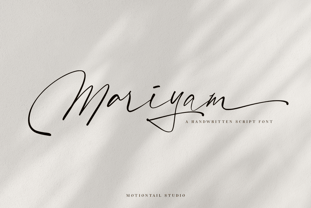 Mariyam Signature font a beautiful typeface awesome character. Mariyam Signature font it’s perfect for namecard, poster, logo, magazine, cover, banner, tshirt and headers, or even large-scale artwork. Features: • OpenType Features • Uppercase & Lowercase • Numeral & Punctuation • PUA Encoded • Multilingual support ÀÁÂÃÄÅÇEÈÉÊËIÌÍÎÏNÑOØÒÓÔÕÖUÙÜÚÛWYÝŸŸÆ
 - Paradizo by Surplus Type Co,
$9.00 Paradizo is an elegant serif font that features regular & oblique versions. This font features a large number of alternates & ligatures which will help you create unique luxurious designs with ease. Great for editorial design, branding, web design, product design & much more!
 - Autobahn Std by AVP,
$18.00 Autobahn is a robust masculine sans of near monoline thickness and angular characteristics. Autobahn Std has a full Latin 1 character set but no CE, Cyrillic or Opentype features. For the extended character set and Opentype features, see Autobahn Pro.
 - Dialog Anila by Prioritype,
$12.00 Simple and eye-catching display fonts for your design touch. You can apply it to packaging designs, posters, logos, quotes, merchandise etc. See some of the previews above for reference. Features: -Uppercase -Lowercase -Numeral -Punctuation -Multilingual -PUA Encoded -Opentype Features
 - Punkstoric - Personal use only

- Spoonge Punk - Personal use only

- Microphone Check by IKIIKOWRK,
$19.00 Proudly present Microphone Check - Marker Type, created by ikiiko Microphone Check is inspired by the bold and expressive signature strokes of the 90s street hip hop movement. In that era, freestyle marking was a method of self-expression that was closely associated with the underground graffiti scene. This typeface perfectly encapsulates the vitality, attitude and resilience of life on the streets. Sharp lines with bold, bold bodies characterize this type of marker, allowing for substantial fills and bright colors to stand out on any surface. It gave them the opportunity to express their originality and creativity while leaving their mark on the urban environment. This type is very suitable for making a street wear brand, book cover, movie title, magazine layout, poster, quotes, or simply as a stylish text overlay to any background image. What's Included? Uppercase & Lowercase Numbers & Punctuation Alternates & Ligature Multilingual Support Works on PC & Mac
 - HWT Gothic Round by Hamilton Wood Type Collection,
$24.95 Gothic Round was first introduced as wood type by the George Nesbitt Co. in 1838. The font is a softened variation of a standard heavy Gothic typeface. The style evokes a much more recent history of the 1960s and 70s and can be seen in such places as donut shops and on children's toys as well as inspiration for such fonts as VAG Rounded. Gothic Round has not previously been available as a digital font until now. The font was digitized by Miguel Sousa from a wide variety of historical sources, including visits to the Cary Collection at RIT (Rochester, NY), WNY Book Arts Center (Buffalo, NY) and the Hamilton Wood Type Museum (Two Rivers, WI). The result is a very solid and contemporary font with a 175 year history. For more information about this release, check out the Hamilton Wood Type Foundry website .
 - Whisky Trail by Vozzy,
$10.00 Introducing a vintage look label font named "Whisky Trail". All available characters you can see at the screenshot. This font have 7 styles - Regular, Full, Shadow, Light, Shadow FX, Light FX and Print. This font will good viewed on any retro design like poster, t-shirt, label, logo etc. For using effect layer: Type your text in Regular. Copy that and paste at the same position. Change the style to Light FX or Shadow FX. After that you can choose different colors for Regular font and Shadow or Light effects. For the catchwords type the word with space before and after word (for sample ' with ', or ' with2 ' for alternate view of catchword), 'Discretionary Ligatures' on the 'OpenType' tab must be turned on. Or paste it from 'Glyphs' tab in any place on your text. This in Illustrator. In Photoshop 'Discretionary Ligatures' you can find in the menu Type - OpenType. Thank you!
 - P22 Curwen by IHOF,
$24.95 P22 Curwen was originally designed by an unknown designer. This version was created by Colin Kahn. P22 Curwen Poster is a digitized version of a rare wood type used by the Curwen Press in England in the early 20th Century for poster work. The font was known to have been cut in 6 sizes—from 3-line (3/4 inch) to 16-line (3 inch) in height. The font was based from impressions made of the 6-line type. P22 Curwen Maxima is a hyper-stylized re-interpretation of Curwen Poster by Colin Kahn. As a post-modern poster type, it evokes an organic nature within a novel maximalist framework. It is reminiscent of early phototype display faces with an illogical three-dimensionality which serves to give the font continuity. The capitals are buried beneath stylistic wood shavings complementing the sculpture like quality of the lowercase. Perfect for (almost) any project.
 - Monkton Book Condensed by Club Type,
$36.99 Packing more copy in a narrow space is the main reason for using a condensed type. Characters with a more ovular shape tend to be less wide than their circular counterparts and will allow for more letters per line. In narrow columns for example, this typeface can provide up to 25% more copy than the regular typeface in the same space. Another reason is when a larger type size is called for — used sparingly it is useful for headings or headlines. For emphasis, narrower letters can provide a stark contrast in the flow of reading, creating impact while retaining typographic character. Condensed types can specially useful in tables and charts because typically both use few words in each block. If space now allows, you may think about the luxury of a larger point size. This optimizes space while keeping your typography more easily legible.
 - Museum Fournier by T4 Foundry,
$16.00Museum Fournier is inspired by a set of Rococo capitals designed by Pierre Simon Fournier le Jeune circa 1760. The matrices are part of a set imported to Sweden by J.P. Lindh in 1818 from Breitkopf & Härtel in Leipzig, Germany. They are now in the Nordiska Museum in Stockholm. Type designer Torbjörn Olsson has expanded the original 31 lead matrices in the collection to 55 characters. Please note that the font contains capitals only, no lower case letters and no figures either. Museum Fournier is an OpenType creation, for both PC and Mac. Swedish type foundry T4 premiere new fonts every month. Museum Fournier is our ninth introduction. Museum Fournier is part of the growing Museum type family. Museum also includes three different border fonts, an ornament font with some of Granjon's arabesques and Museum Tertia Cursive, an exquisite 1700's typeface with modern additions. - Alta Mesa by FontMesa,
$25.00Alta Mesa is a revival of an old type design from the 1800's that was sold by most of the type foundries in the US and Europe of that time period so it is difficult to know the foundry of origin. New with this version are the fill fonts and plain styles, the fill fonts may be used as stand alone fonts, however the letter spacing is much wider, the plain versions are recommended if you desire a solid black weight. The regular Fill font is in registration with the Regular and Open versions while the Fill L font is in registration with the L and Open L versions. This was a very charming font in its time which was heavily used on old billheads and letterheads. We're pleased to bring this type design, which hasn't been used for over 100 years, into the digital world today. - Eckhardt Poster Text JNL by Jeff Levine,
$29.00 Eckhardt Poster Text JNL continues Jeff Levine's series of sign painter-oriented fonts, named in honor of his good friend Albert Eckhardt, Jr. (who ran Allied signs in Miami, Florida from 1959 until his passing). Sign painters are the true heroes of lettering, for they make the alphabet and style fit the job. Printers and layout artists were constricted by metal and wood type; that is until photo lettering, then digital type opened up unexplored territories in design possibilities. There is a unique charm (and nowadays pretty much a lost art) to hand-lettering word copy in a way that draws the eye like an arrow to a target. Even a simple sanserif such as Eckhardt Poster Text JNL can have the effect of that hand lettering when applied to posters and pages with plenty of white space and matching type designs of the period.
 - YAKSOM by Twinletter,
$17.00 Yaksom is a classic serif font that exudes timeless beauty and a captivating modern style. The perfect solution for projects that require an elegant classic modernism theme. With a proportional and elegant serif design, Yaksom conveys timeless elegance in every letter. Every detail is exquisitely detailed, creating a look that embodies the refinement and elegance of an irreplaceable classic era. Yaksom is also equipped with stunning features. Beautiful ligatures add a creative touch and enrich the look of a font, while alternative variations provide unique styling options. Extensive multilingual support also ensures that Yaksom can be used fluently in multiple languages. Are you looking for a font that combines classic elegance with a dazzling modern twist? Yaksom is a perfect choice. With a stunning classic serif style, creative features such as alternate ligatures and variations, and the ability to support multiple languages, this font will quickly grab the attention of your prospects and create a stunning aesthetic impression in the blink of an eye. What’s Included : File font All glyphs Iso Latin 1 Alternate, Ligature Simple installations We highly recommend using a program that supports OpenType features and Glyphs panels like many Adobe apps and Corel Draw so that you can see and access all Glyph variations. PUA Encoded Characters – Fully accessible without additional design software. Fonts include Multilingual support
 - IM FELL FLOWERS 1 - Unknown license

- HWT Borders One by Hamilton Wood Type Collection,
$24.95 Wood Type Catalogs of the 19th century often offered tools and accessories alongside alphabets of wood type. Probably the most closely related was wood type borders and ornaments. Decorative Borders were often sold by the foot and accompanied by corner pieces that matched the designs. These borders could be assembled in almost any size dimensions as needed. The digital version uses the same principals of modular assembly to create the exact size border that is needed. Along with the borders, included in this font are a selection of "streamers". These banners would have been made to order with the font designs reversed out along a horizontal banner with decorative end caps. The digital version allows for a modular assembly by selecting choice of end caps and then typing the = as many times as needed to achieve the desired length. 10 styles of 9 piece borders can be created in any size variations as well as 8 styles of streamers in any desired length. Some of the designs can be mixed and matched for unusual contemporary design interpretations of these historic styles. It is recommended that the line height (leading) is set to the same size as the point size setting, this will visually lock all elements together.
 - Declaration Of Independence by Celebrity Fontz,
$17.99The Signers of the Declaration of Independence font is a collection of all 56 signatures that appeared on America's Declaration of Independence. A must-have for autograph collectors, desktop publishers, lovers of history, or anyone who has ever dreamed of sending a letter, card, or e-mail to a friend or family member "signed" as if by one of the signers of America's Declaration of Independence. This unique font puts every signature on that history-altering document at your fingertips in the form of a high-quality Open Type font. Our fonts behave exactly like any other font on your system and are installed and selected the same way. No special software is needed. Each signature contained in our fonts is mapped to a regular character on your keyboard. Just as with any True Type or Open Type font, you can resize the signature, change its color, etc. Open any Windows application, select the installed font, and type a letter, and you will see the President's signature appear right there on your page where you placed your cursor. Painstaking craftsmanship and an incredible collection of hard-to-find signatures go into this one-of-a-kind font. We're confident you will enjoy it. Please note that this font is intended for entertainment purposes only. - Syntax Next Paneuropean by Linotype,
$103.99Syntax was designed by Swiss typographer Hans Eduard Meier, and issued in 1968 by the D. Stempel AG type foundry as their last hot metal type family. Meier used an unusual rationale in the design of this sans serif typeface; it has the shapes of humanist letters or oldstyle types (such as Sabon), but with a modified monoline treatment. The original drawings were done in 1954; first by writing the letters with a brush, then redrawing their essential linear forms, and finally adding balanced amounts of weight to the skeletons to produce optically monoline letterforms. Meier wanted to subtly express the rhythmical dynamism of written letters and at the same time produce a legible sans serif typeface. This theme was supported by using a very slight slope in the roman, tall ascenders, terminals at right angles to stroke direction, caps with classical proportions, and the humanist style a and g. The original foundry metal type was digitized in 1989 to make this family of four romans and one italic. Meier completely reworked Syntax in 2000, completing an expanded and improved font family that is available exclusively from Linotype GmbH as Linotype Syntax. In 2009 the typeface family was renamed into a more logical naming of "Syntax Next" to fit better in the Platinum Collection naming." - American Presidents by Celebrity Fontz,
$19.99The American Presidents font is a collection of the signatures of all 44 U.S. Presidents. A must-have for autograph collectors, desktop publishers, lovers of history, or anyone who has ever dreamed of sending a letter, card, or e-mail to a friend or family member “signed” as if by one of America’s Presidents. This unique font puts the signatures of America’s Presidents at your fingertips in the form of a high-quality Open Type font. Our fonts behave exactly like any other font on your system and are installed and selected the same way. No special software is needed. Just as with any True Type or Open Type font, you can resize the signature, change its color, etc. Each signature contained in our fonts is mapped to a regular character on your keyboard. Open any Windows application, select the installed font, and type a letter, and you will see the President’s signature appear right there on your page where you placed your cursor. Painstaking craftsmanship and an incredible collection of hard-to-find signatures go into this one-of-a-kind font. We're confident you will enjoy it. Please note that this font is intended for entertainment purposes only. - Epica Pro by Sudtipos,
$49.00 Epica is a contemporary interpretation of the Venetian Renaissance types. A humanist type family with a contemporary design. This family encompasses different typographic scenarios with emphasis in style and functional equilibrium. Its letterforms show the visual richness of Epica that includes some calligraphic reminiscences perfectly legible in small and display sizes. Its strong personality makes it distinguish, because it perfectly combines the elegance of antique typographies and the forcefulness of contemporary ones. This family has been designed in two different moments. Epica Serif, which have a more classical design, was finished 5 years ago in its first version. The first sketches were drew 8 years ago during the Master of Type Design at the University of Buenos Aires. Through the years was re design in several times to the point of reaching its current version. On the other hand, Epica Sans was completed in 2020 and is the counterpart of Epica Serif. A complementary system designed to enrich the serif version and give new options for hierarchy and composition. This is a versatile type family perfectly fit for books, editorial, and usage in print and on screens. It possesses great legibility in body texts, which makes it ideal for extended reading and supports a variety of languages.


