10,000 search results
(0.037 seconds)
- Throw My Hands Up in the Air - Personal use only

- Outta Control Caps - Unknown license

- Kraboudja - Unknown license

- Zodiastic - Personal use only

- Bottix - Personal use only

- Mail Ray Stuff - Unknown license

- Monkey Chunks - Unknown license

- Halter Pinchy - Unknown license

- rhino dino - Unknown license

- Liquidy Bulbous - Unknown license

- Willy 2 - Personal use only

- Kicking Limos - Unknown license

- Aquarium - Unknown license

- Pupcat - Unknown license

- Linear Curve Fatty - Unknown license

- KR Trick Or Treat - Unknown license

- Slinked - Unknown license

- Sergeant SixPack - Personal use only

- Chilluns - Unknown license

- KR Crayons - Unknown license

- Math Donuts - Unknown license

- LetterOMatic! - Personal use only

- CharlieChan - Unknown license

- Newsreel Caps JNL by Jeff Levine,
$29.00
- Major Production NF by Nick's Fonts,
$10.00
- Comet Bloom by Scratch Design,
$14.00
- Lichtspiele by Typocalypse,
$29.00
- Gamy by Twinletter,
$12.00
- De Arloy by Storictype,
$16.00
- Bornholm Sandvig by Trine Rask,
$25.00
- Bornholm Tejn by Trine Rask,
$25.00
- Sunshine Susie JNL by Jeff Levine,
$29.00
- Monster Scratch by Letterara,
$12.00
- Flying Sausage by Remedy667,
$18.00
- Blackson by Arterfak Project,
$25.00
- Aplomb by Scholtz Fonts,
$18.20 - Western Nightmare by Woodcutter,
$55.00
- Moneer by Inumocca,
$15.00
- Gothic Story by Mvmet,
$10.00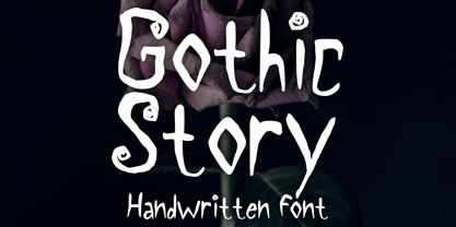
- Redriver by Niznaztype,
$9.00


